Photography by Crate47
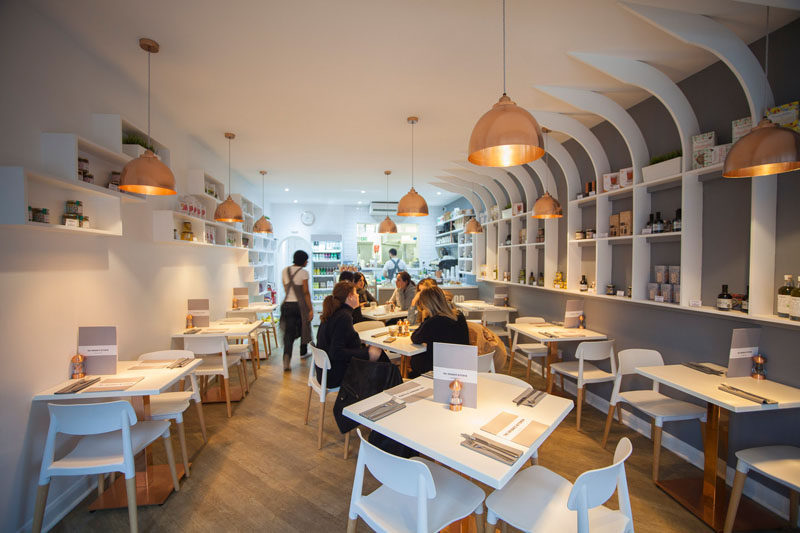
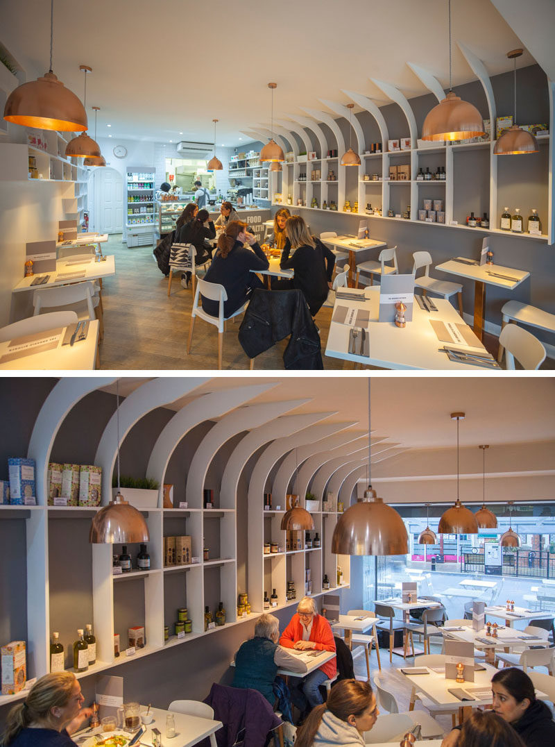
When designing The Organic Kitchen, an organic restaurant in Essex, England, design firm Liqui wanted to create a natural feel that fits in with the healthy lifestyles of the people who dine there.
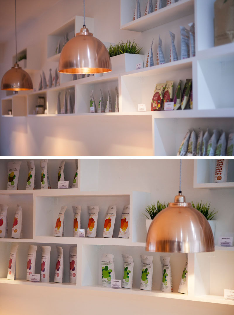
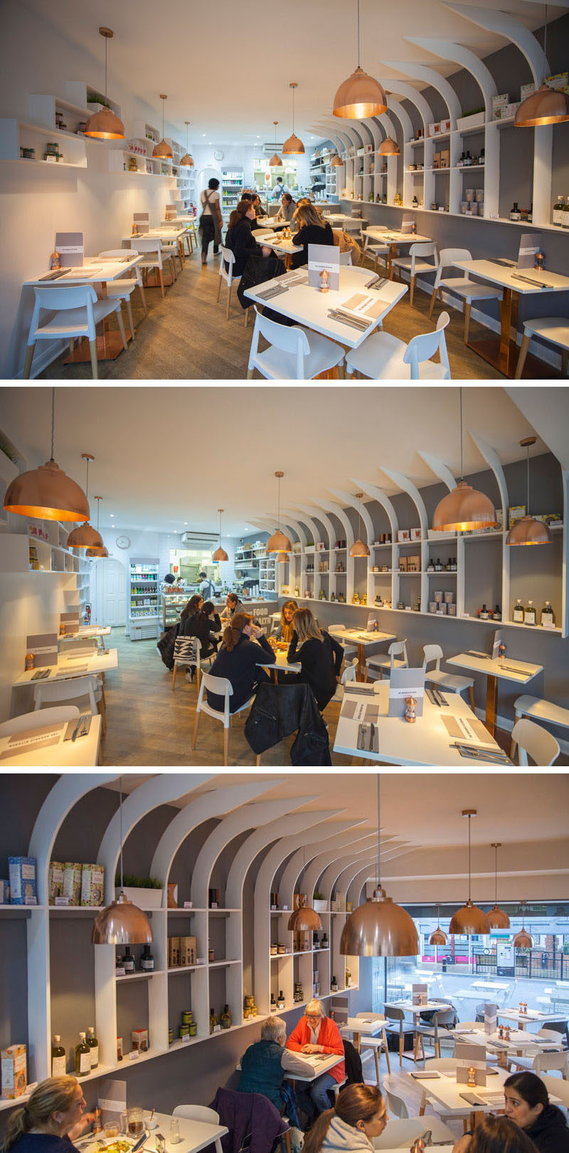
To achieve the right feel, the designers used white and grey on the walls, furniture, and shelves, wood on the floors and chair legs, and copper accents in the form of light fixtures, table stands, and salt and pepper shakers. The combination of these materials make the interior feel both natural and contemporary.
Photography by Crate47
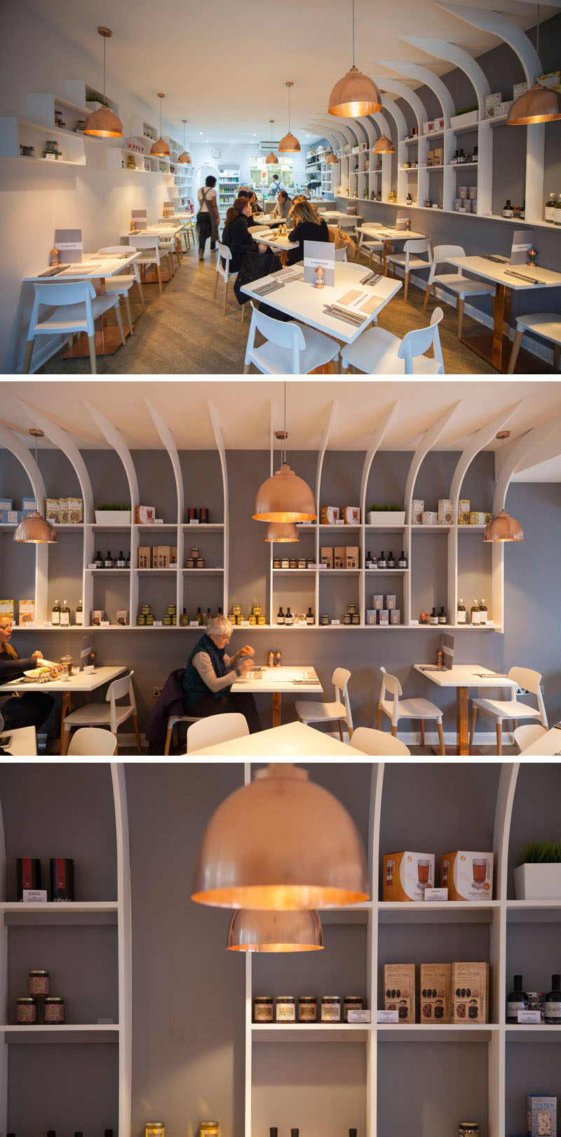
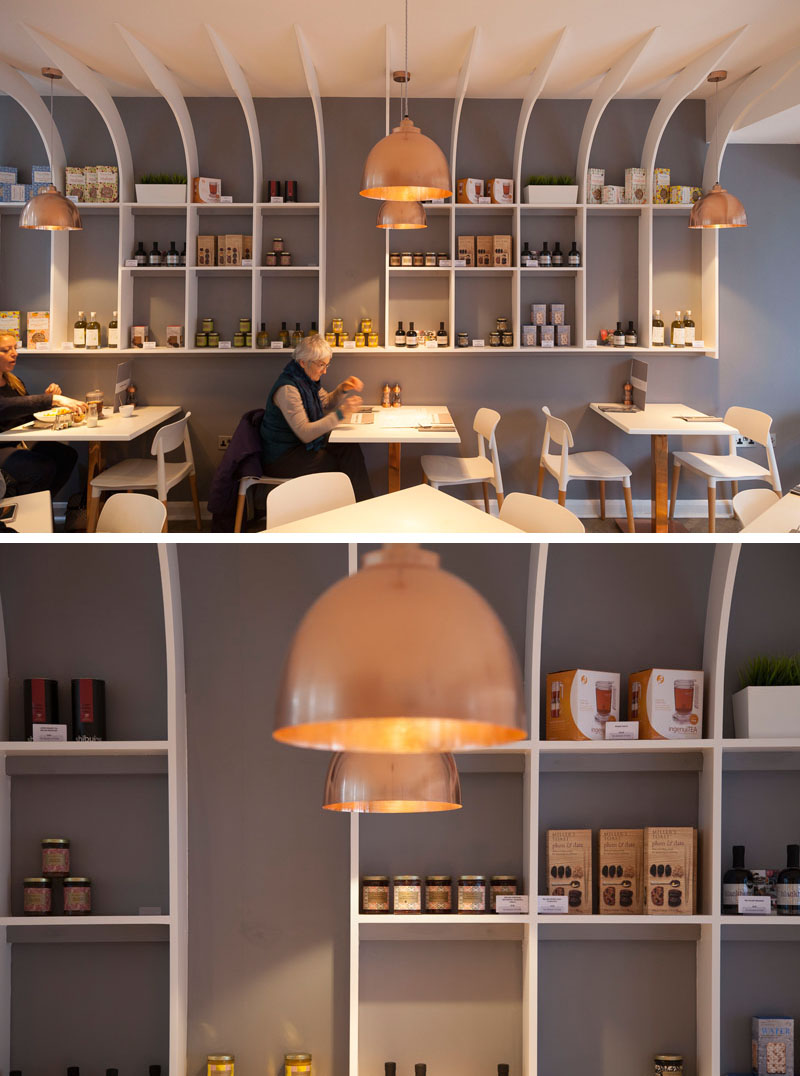
One of the main features in the restaurant is the long sculptural shelving unit that houses products and greenery. The white shelving also really pops against the grey accent wall.
Photography by Crate47
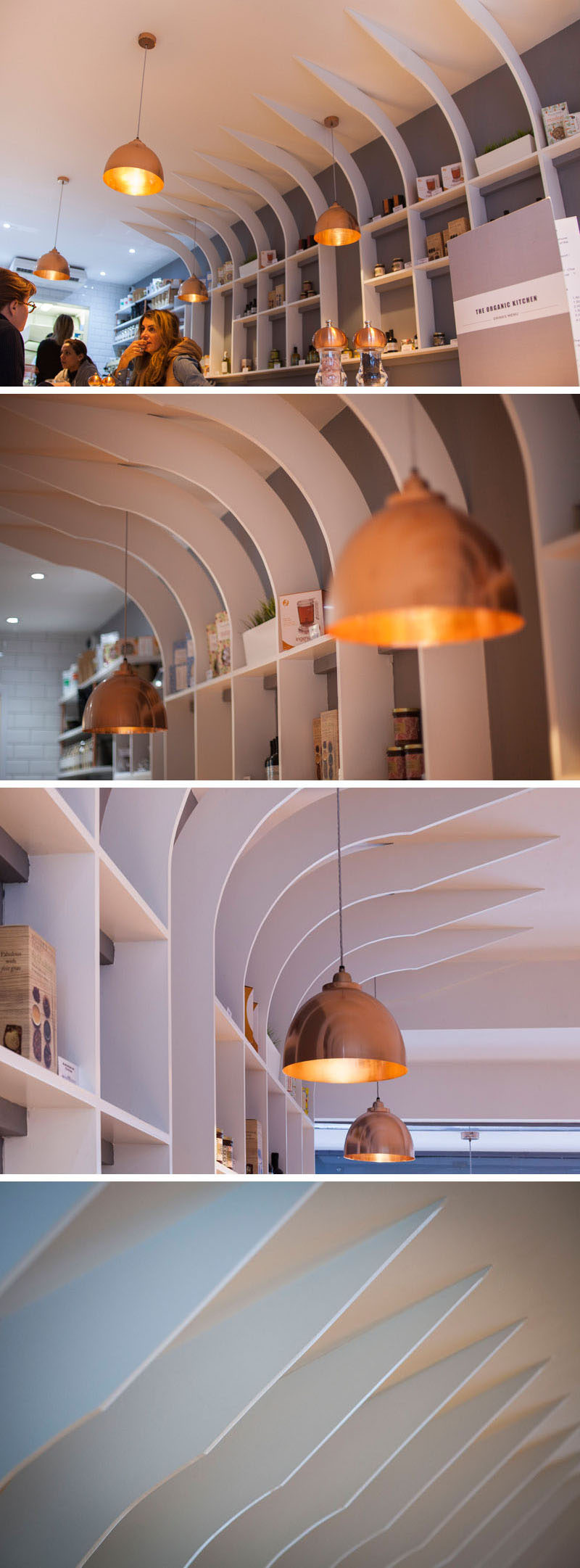
The narrow shelves make sure that space in the restaurant isn’t compromised and the curved vertical fins add dimension and intrigue to the walls.
Photography by Crate47
At the back of the restaurant, more shelving holds smaller products and plants, and is lit up by the same copper pendant lights found throughout the rest of the interior.
