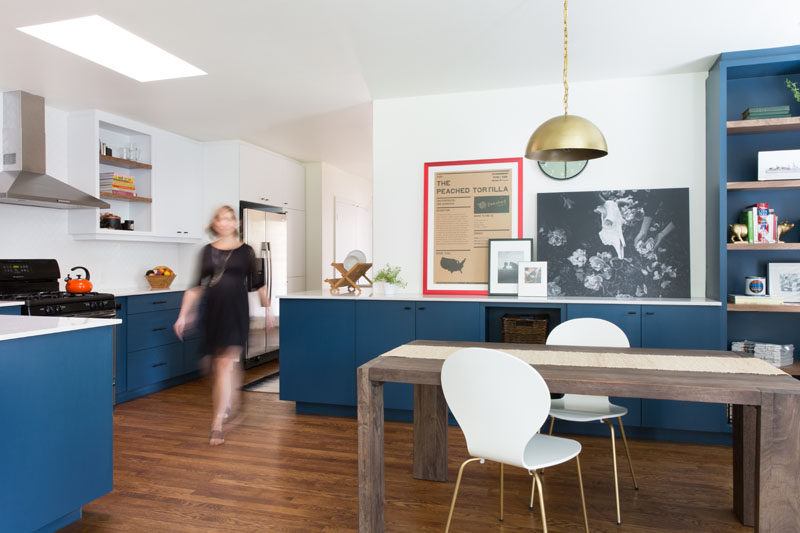
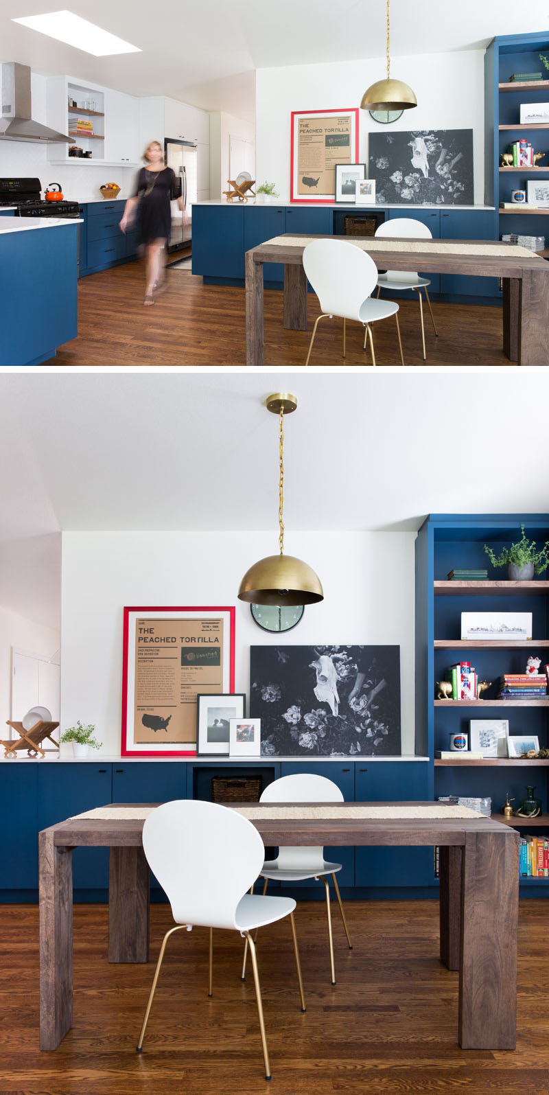
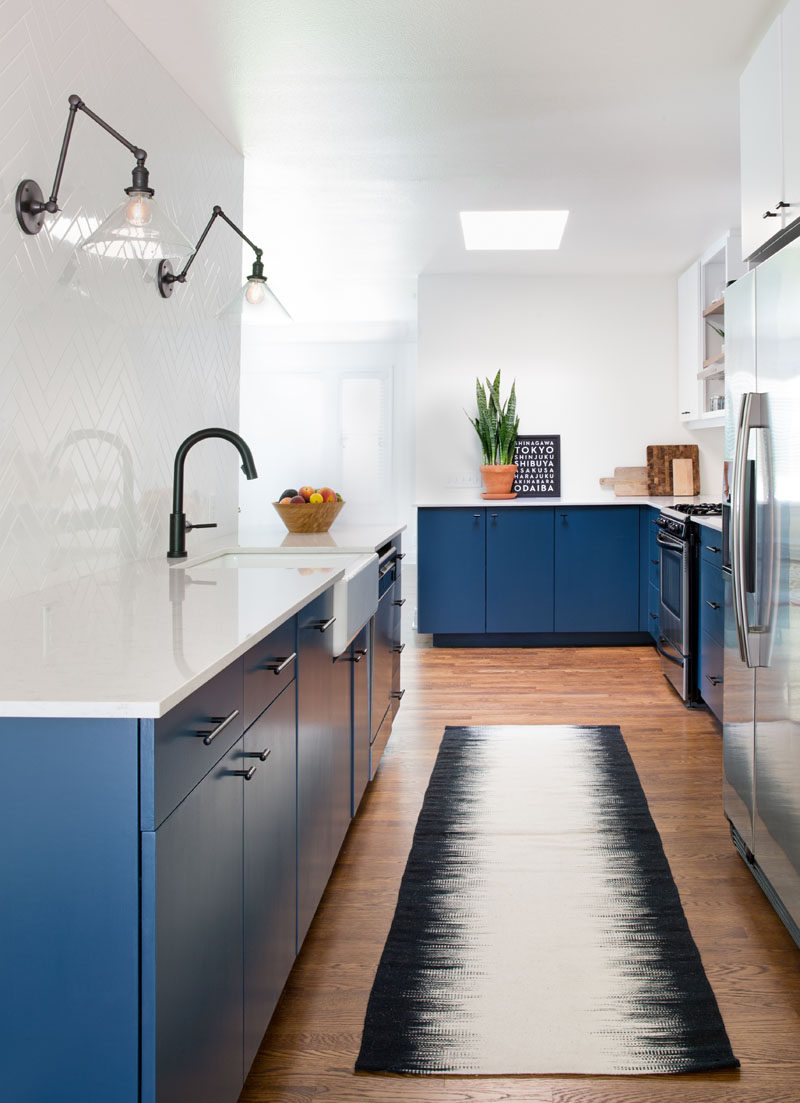
In an attempt to create a more open and brighter kitchen in a 1920s Austin home for a chef and his wife, architecture and design firm Design Hound transformed a tiny, dark, secluded kitchen into one full of color and life.
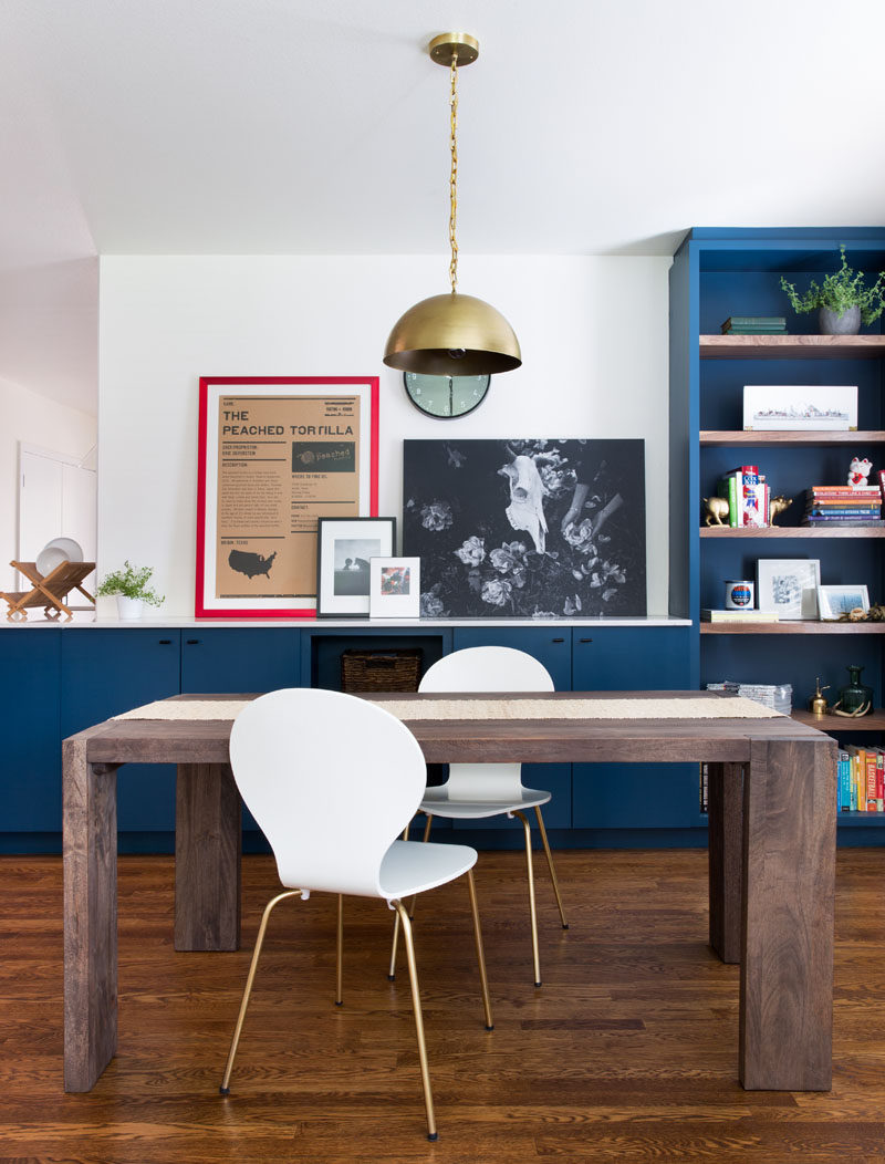
The blue cabinetry, black hardware, and brass accents create a simple yet sophisticated look in the kitchen while pops of color, like the red frame and colorful book on the shelf, bring in a touch of excitement and fun.
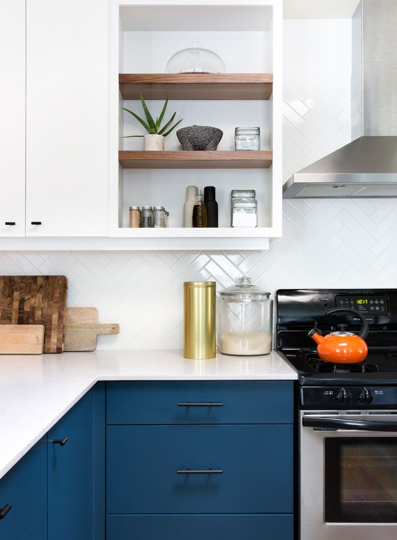
Simple white tile arranged in a herringbone pattern covers the wall behind the sink and makes up the backsplash around the rest of the kitchen. It creates a contrast against the dark hardware and navy cabinets to make the space look clean and contemporary.
A combination of open and closed shelving give the home owners freedom to display certain objects and keep the most frequently used herbs and spices easily accessible while hiding everything else out of sight.
