Photography by Edgard Cesar
Eduardo Mederios Arquitetura e Design have recently completed the interiors of Duju Patisserie in Goiania, Brazil.
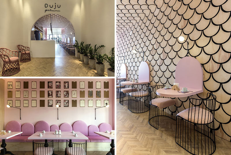
Drawing inspiration from the ‘u’ in the logo, the interior design features a variety of u-shaped elements.
Photography by Edgard Cesar
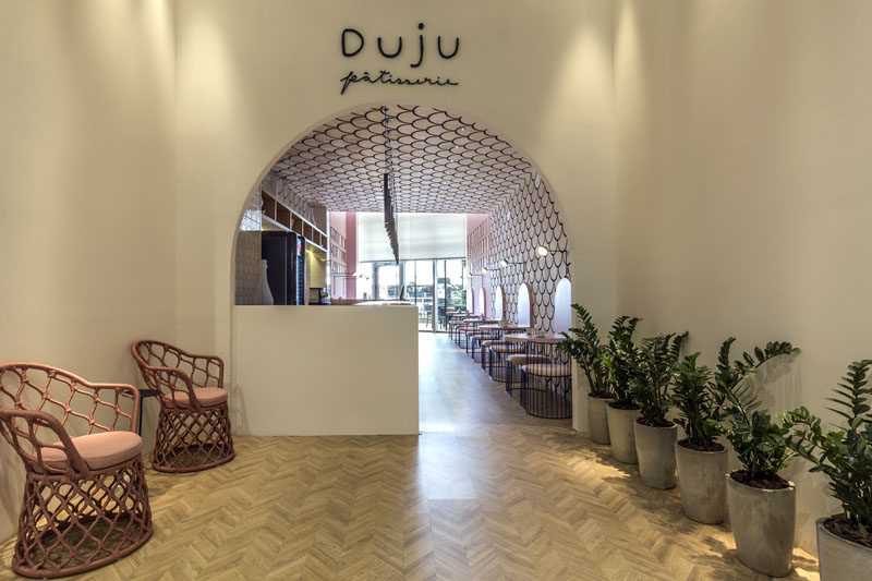
The first of the u-shaped elements is the arch that welcomes you to the patisserie.
Photography by Edgard Cesar
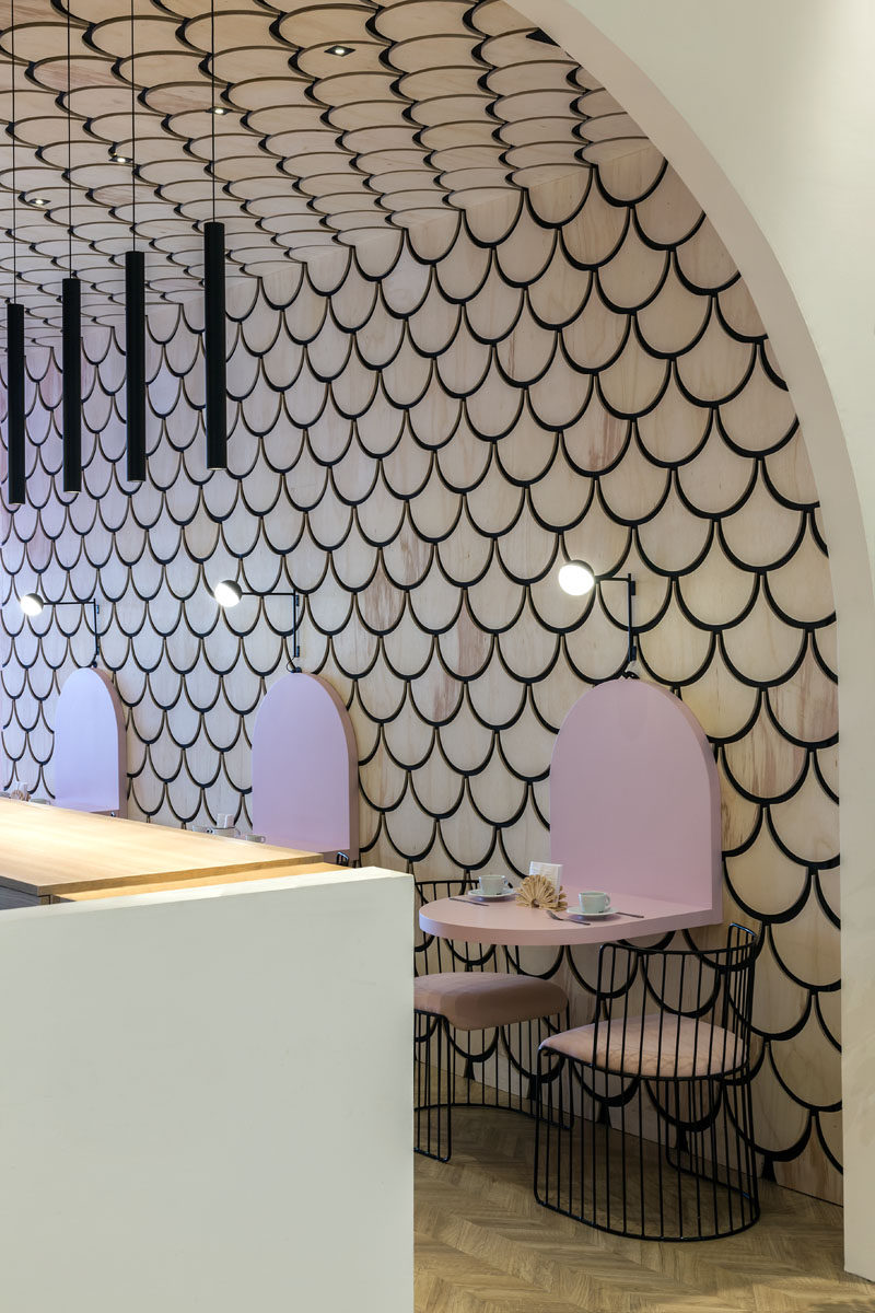
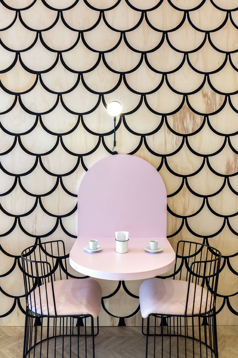
The next element is a graphic wood accent wall that features the u-shape, also known as a scalloped or fish scale pattern. The wall design wraps from the wall up onto the ceiling and over to the service area.
Photography by Edgard Cesar
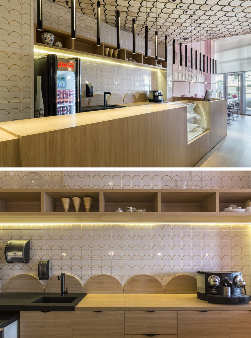
On the opposite wall is the service area, that has a tiled back wall and wood details with the u-shape. Hidden lighting under the mounted wall shelf and a line of individual pendant lights above the service area, help to keep the space bright.
Photography by Edgard Cesar
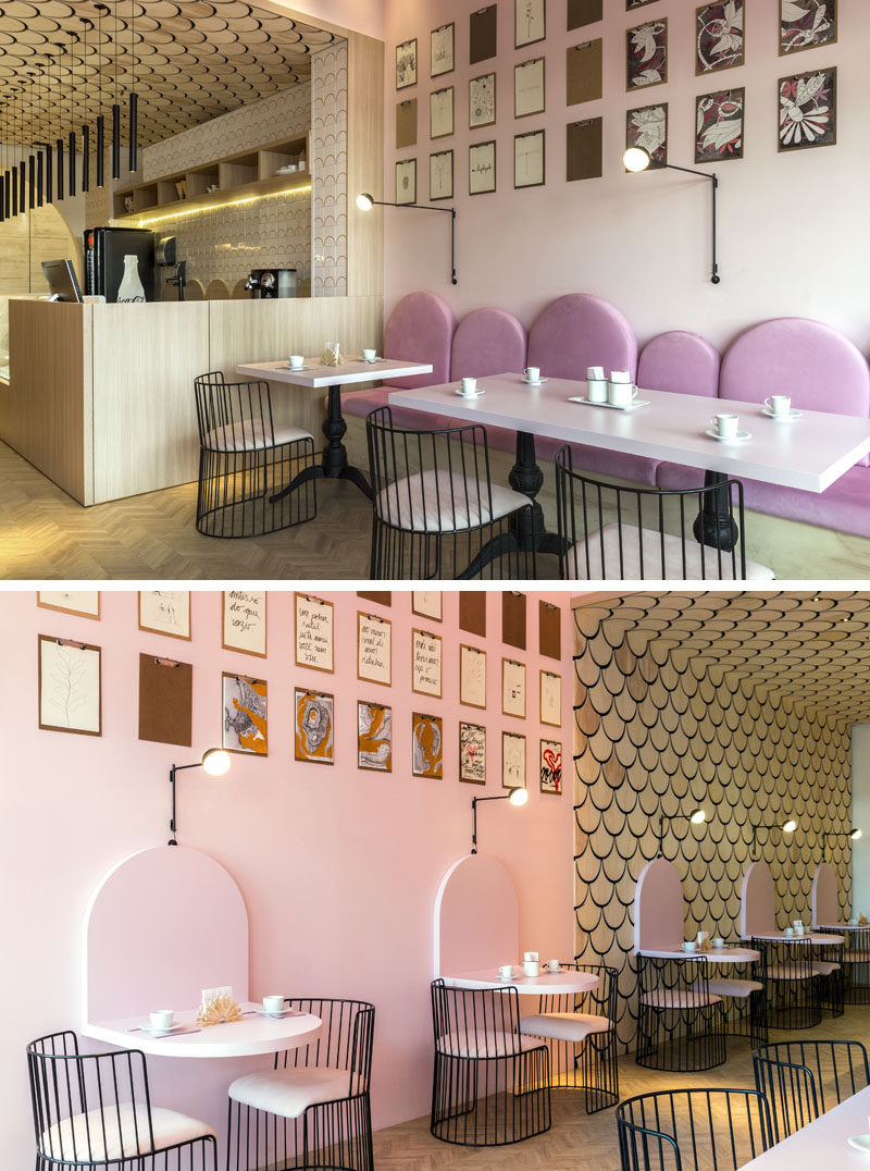
Off to the side of the service area is a seating area with pink bench seating with u-shaped backrests.
Photography by Edgard Cesar
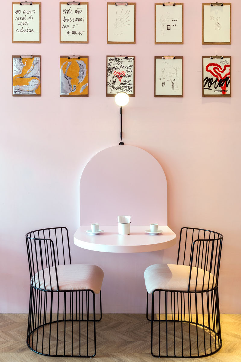
Not only is the u-shape featured on the walls, it’s also featured in the furniture, like the u-shape of the chairs.
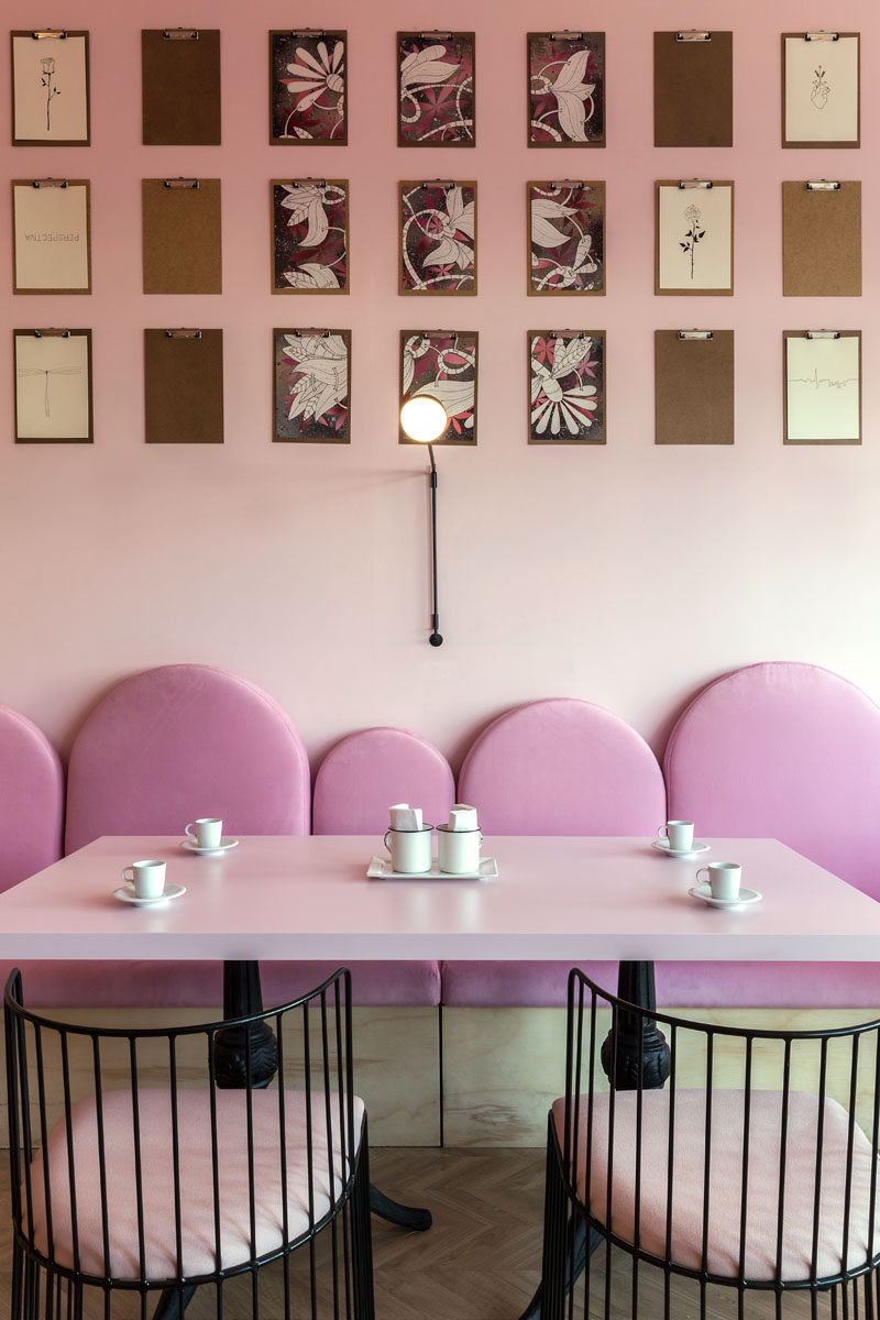
The designers also included a way for the customers to interact with the space, instead of inserting ready-made pictures, they had the idea of hanging several wooden clipboards, and invited some customers to draw or write whatever they want in these ‘blank screens’.
Photography by Edgard Cesar
The u-shape is also reflected in design of the wall mounted tables, that have rounded edges to match the shape found throughout the patisserie.
