Design firm Brandon Agency together with interior designer Anna Domovesova have created Simple, a casual fast-food restaurant in Kiev, Ukraine.
From the designers
Client: Fast-food restaurant of a new generation. Kitchen is focused on simple and original food from local, seasonal ingredients.
Challenge: The task was complex: in addition to the name, logo and corporate identity we had to develop an interior design. We focused on a close-knit team working with interior designer Anna Domovesova. We started at the same time, analyzing, checking and adjusting to each other’s steps and global course in general. This approach gave us an opportunity to get an integral product, where all details sustain and complement each other.
Naming
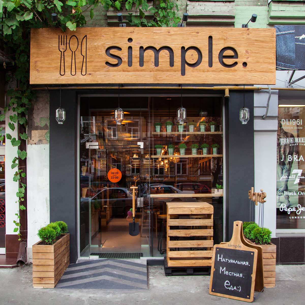
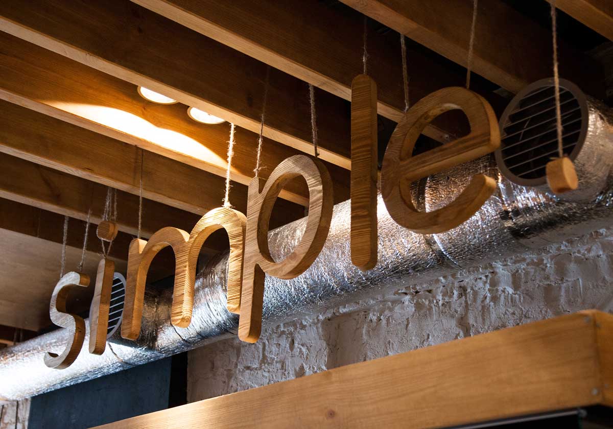
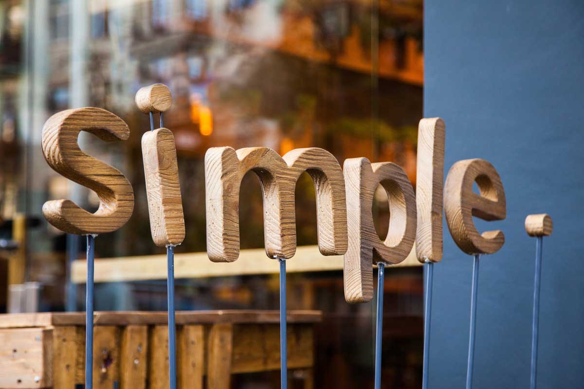
The name of the restaurant had to express its spirit and to be up-to-date: it was important not to get into farm and vegetarian themes. After several variations, the name “simple.” was approved. The power of this name is in its simplicity, which is supported by the attitude of a friendly brand with a human face and communications.
Guideline
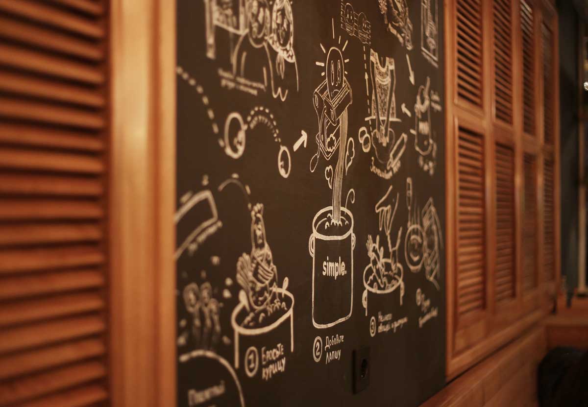
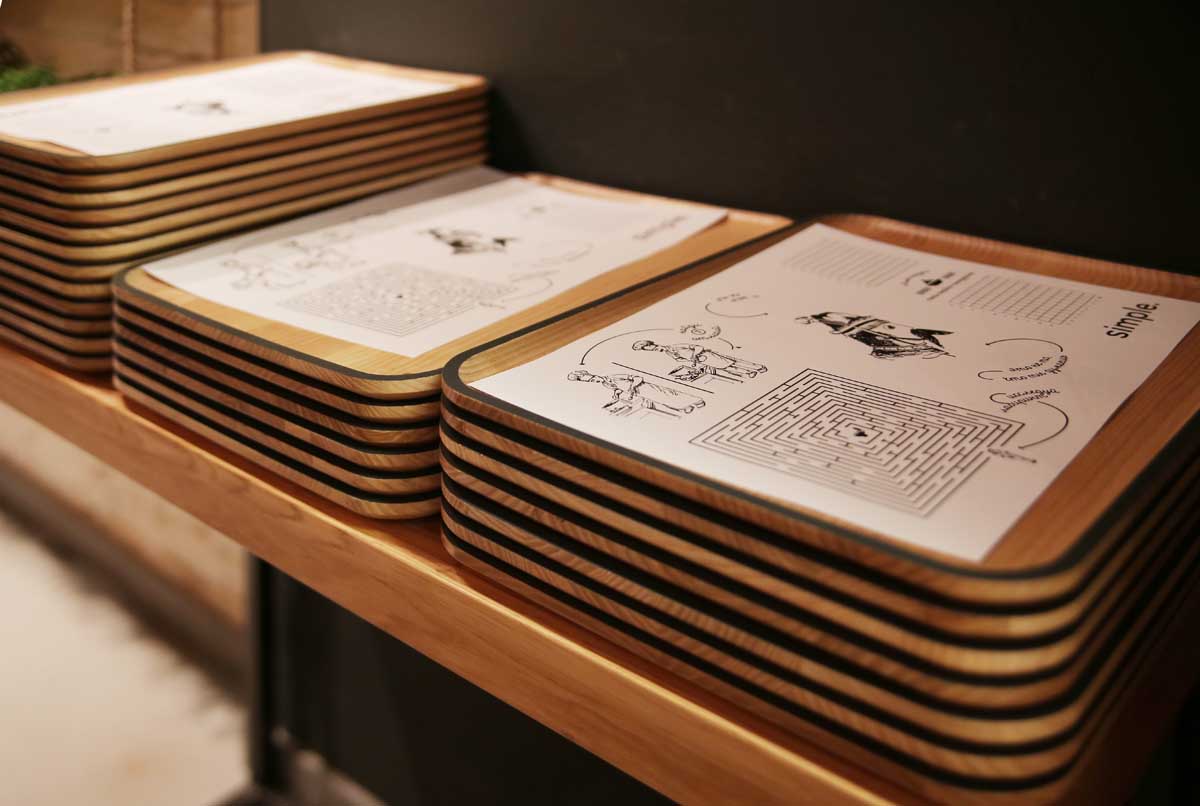
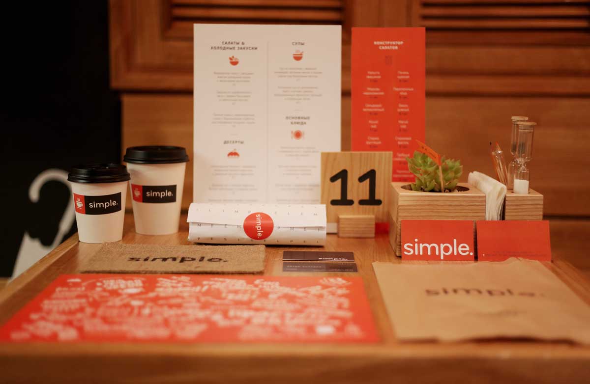
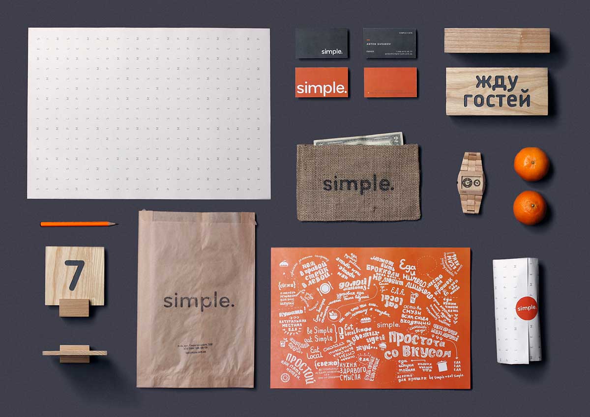
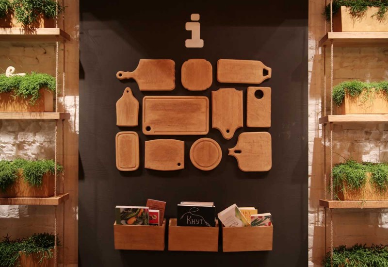
There was a thick guideline developed for Simple. restaurant. It includes not just common standards for logo, colors, fonts and pattern application, but many more. We developed few sets of icons, illustrations, the detailed description on communication usage, game sets, stickers, few types of menu and many more.
The interior design solution
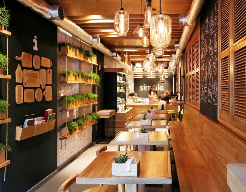
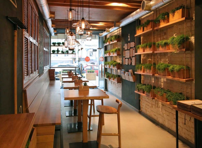
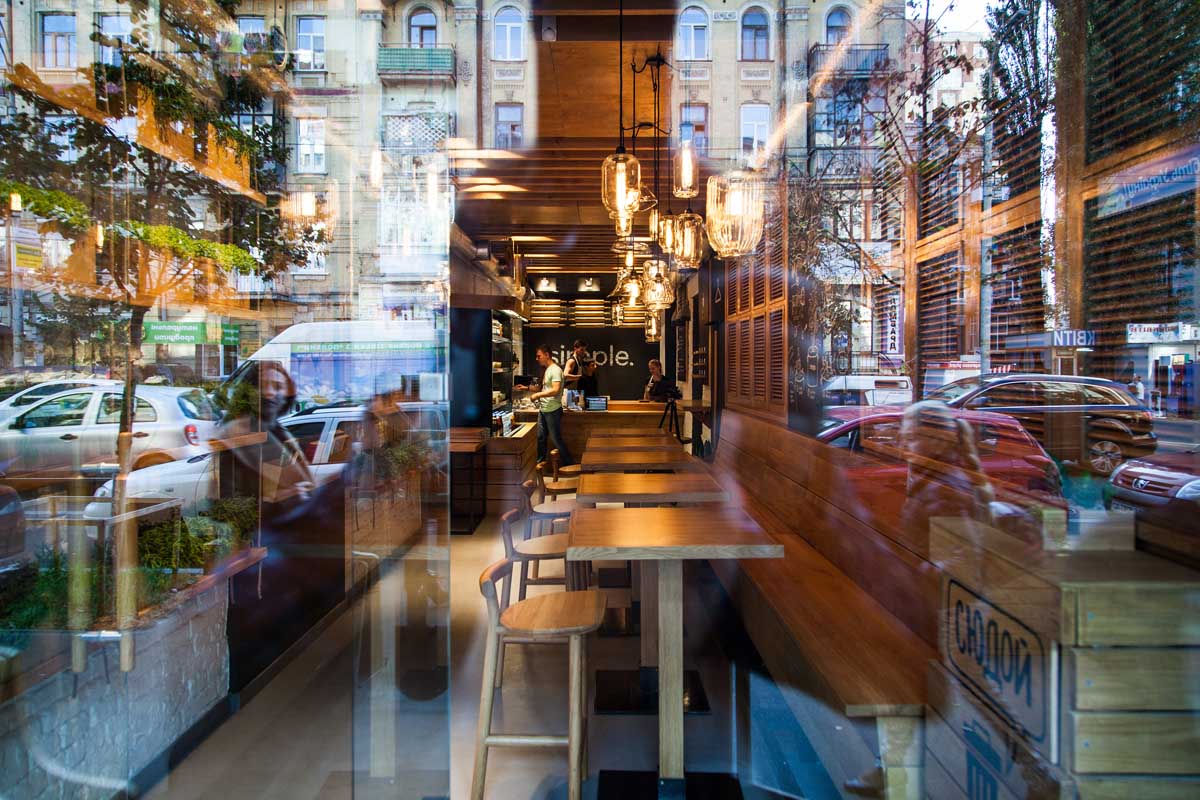
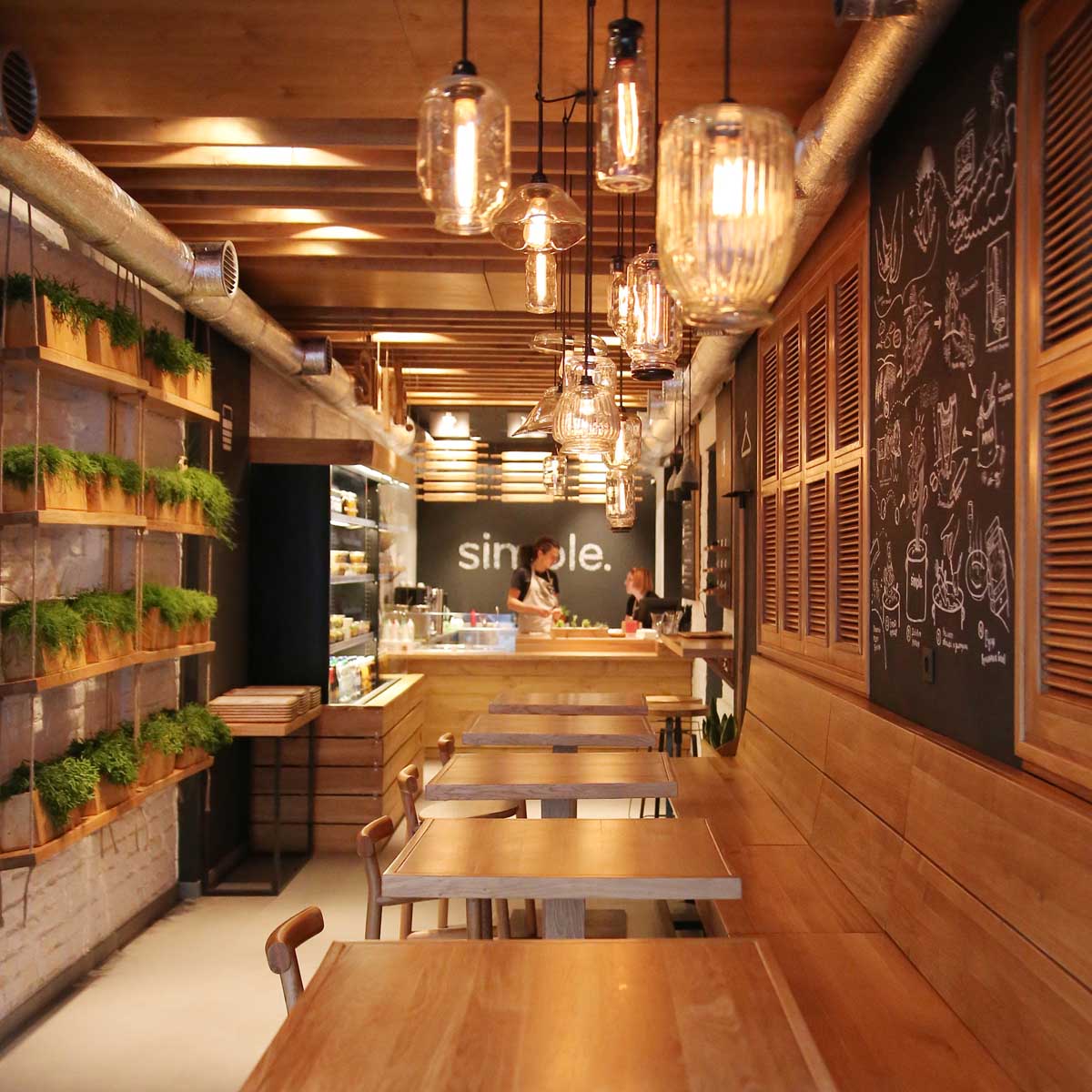
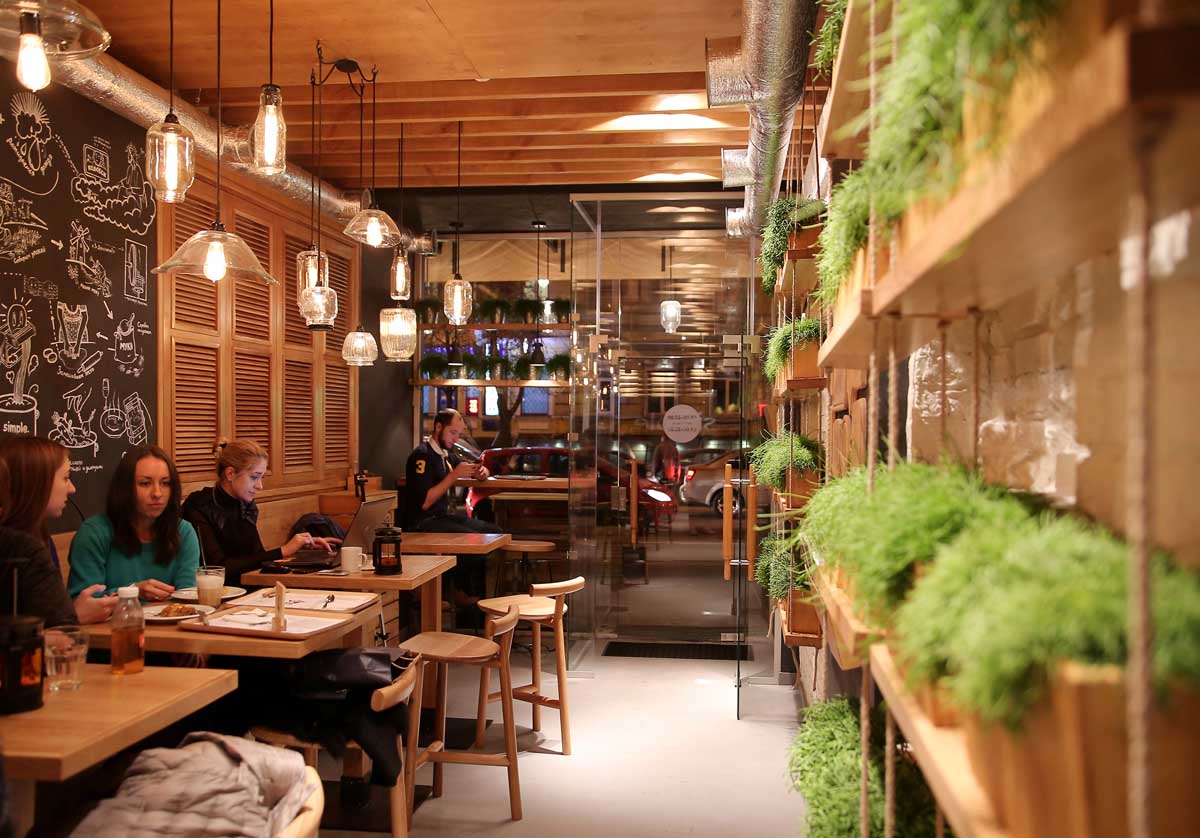
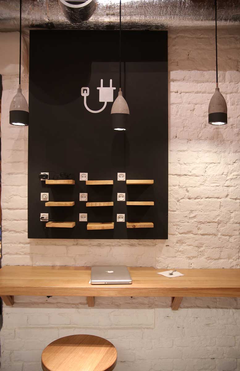
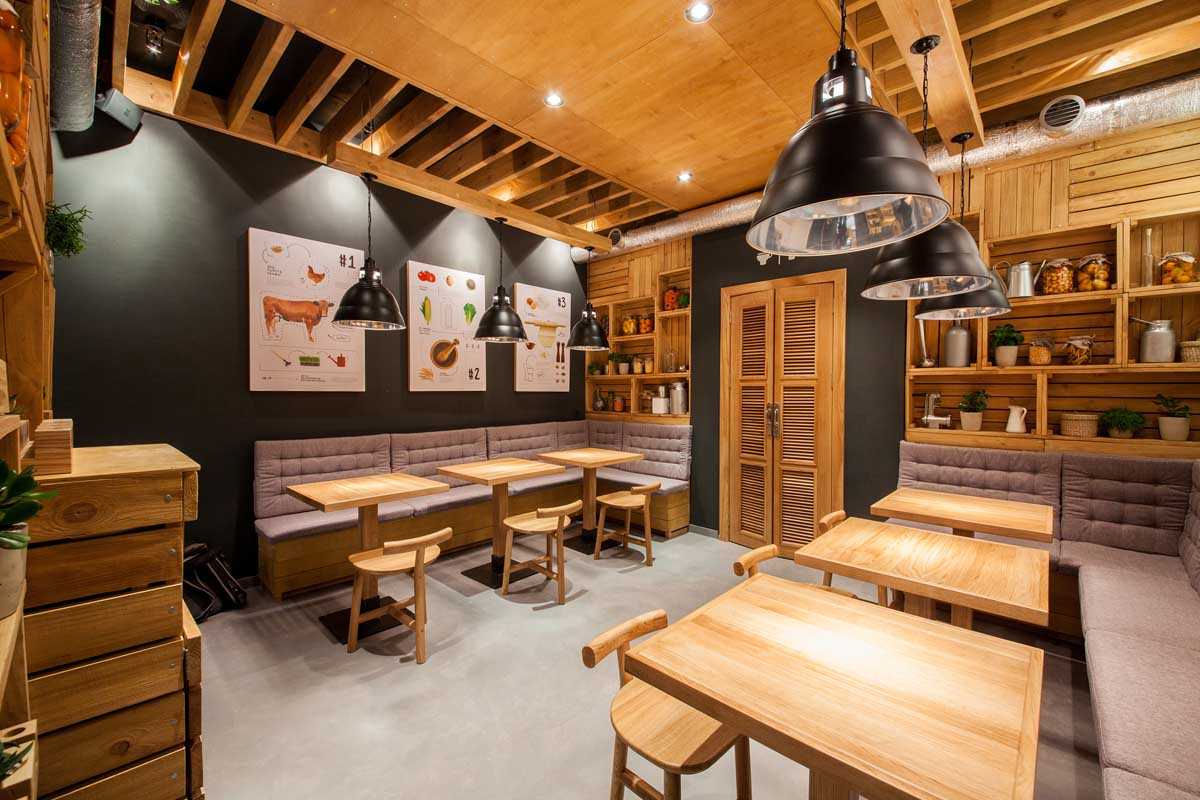
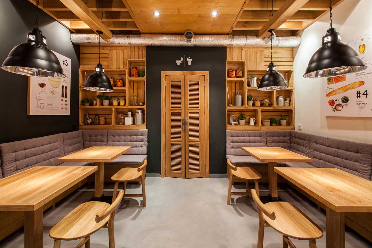
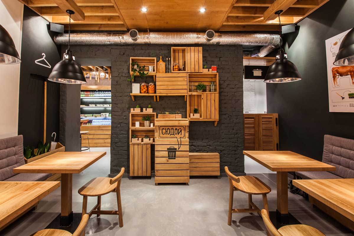
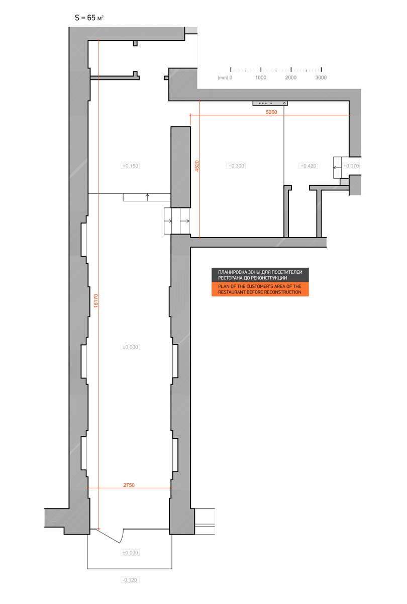
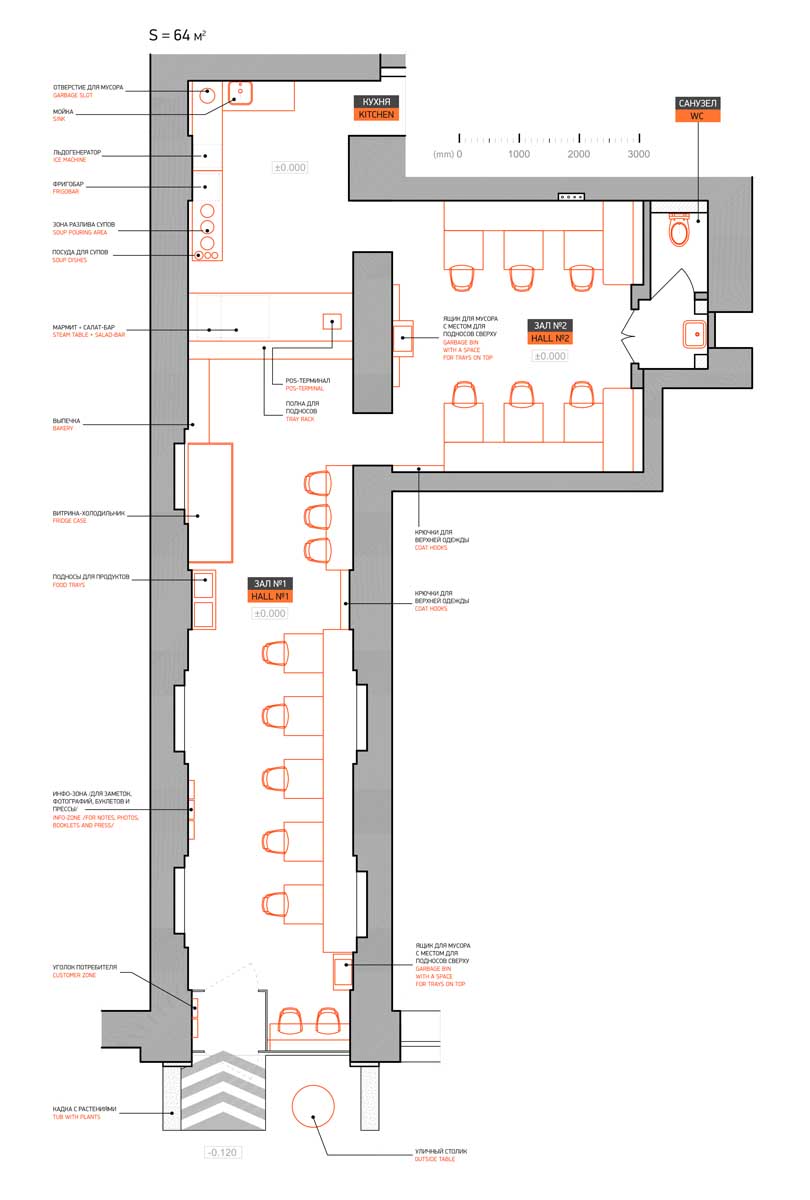
The location for the restaurant was picked in a central part of Kiev, in one of the old brick buildings. Years ago the compartment for the main hall used to be a passage from the street to the courtyard, which caused its unusual very narrow shape. This hall was 16 meters lengthwise and 2.7 meters crosswise, so the task to make this space comfortable and useful was quite tough. We worked on functional scheme and tried to turn flaws into benefits. Since the restaurant was aiming for partial self-service, the customer was supposed to go through certain steps to put together the meal. We staked on the shape of the main hall together with simple and easily understandable navigation, or rather leading icons.

Details
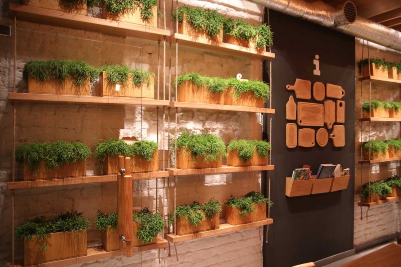
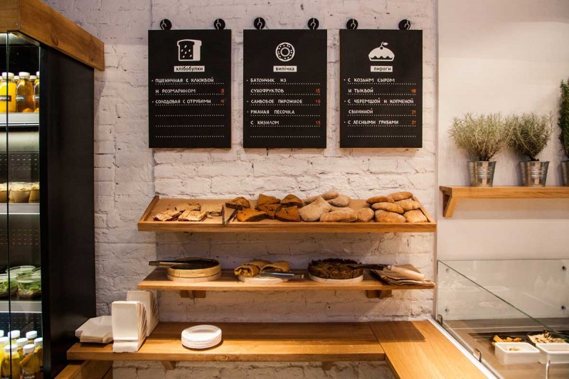
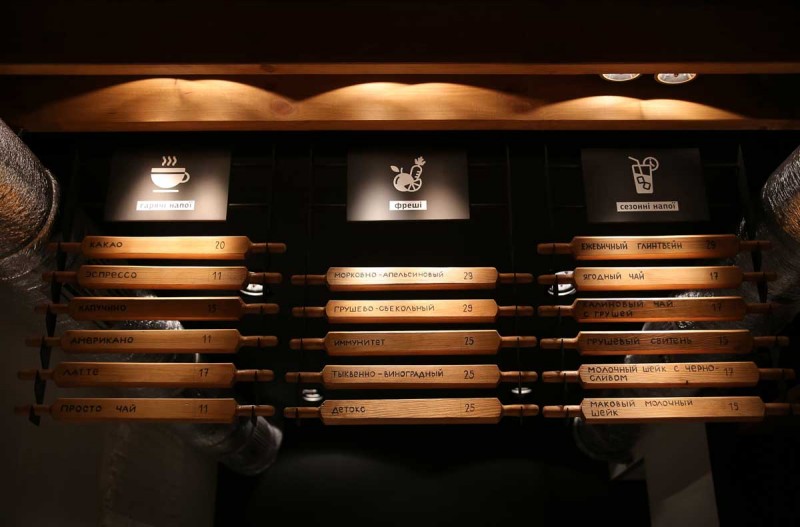
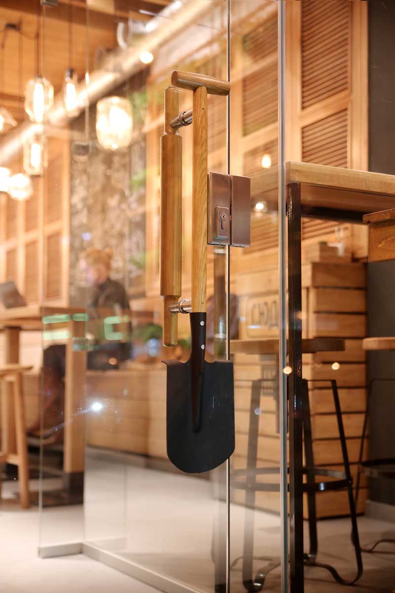
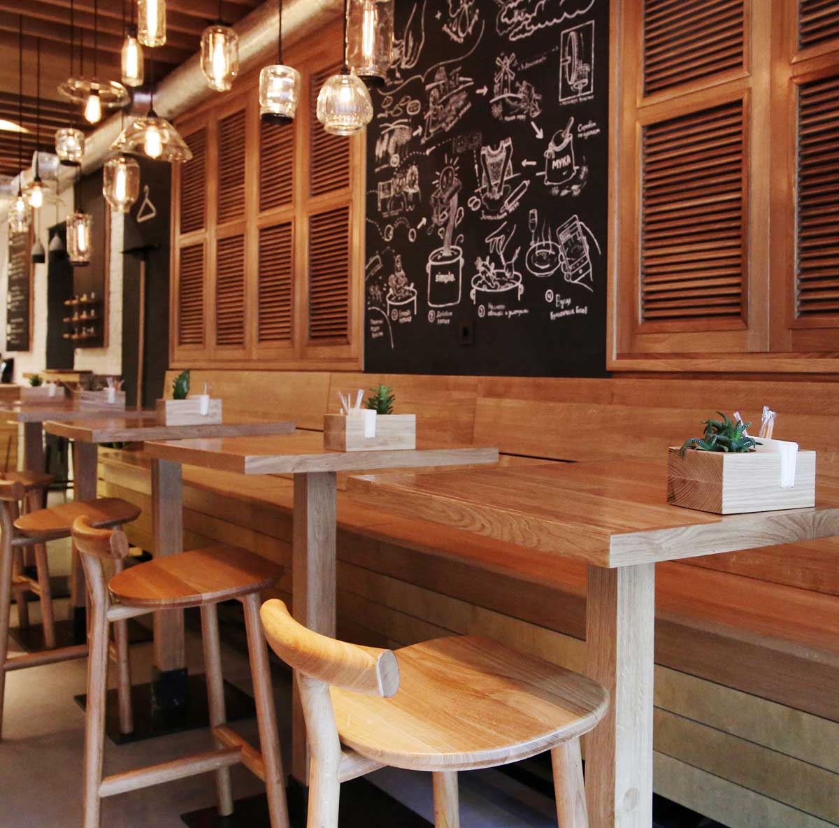
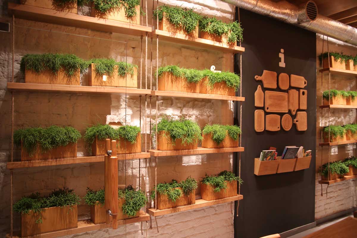
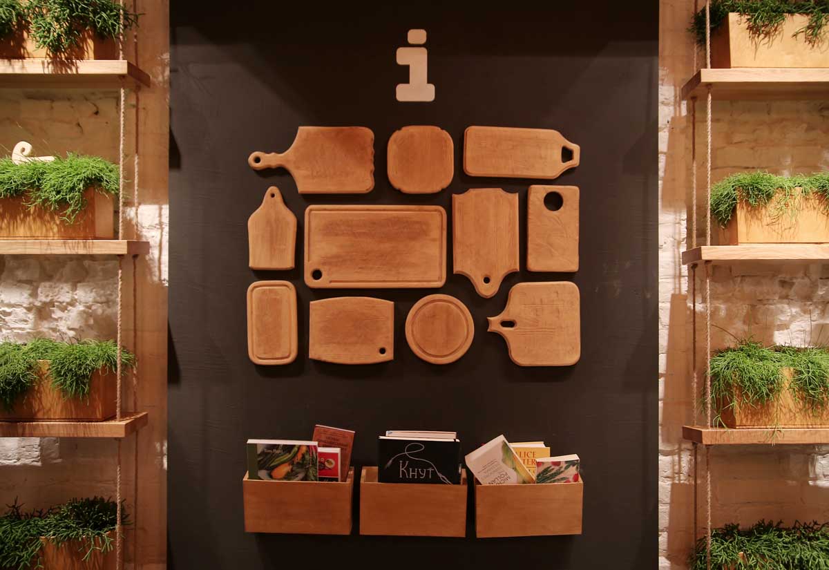
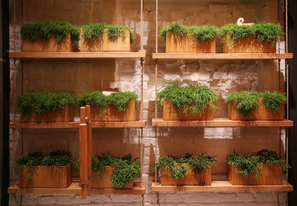
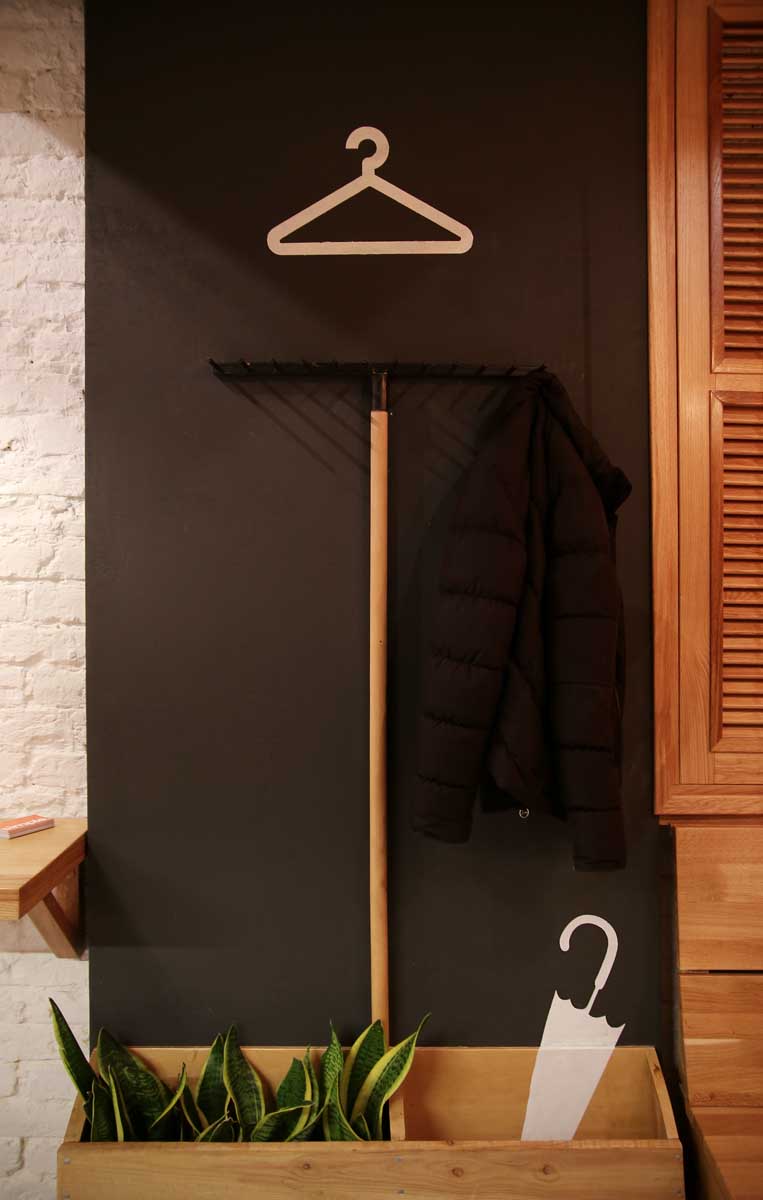
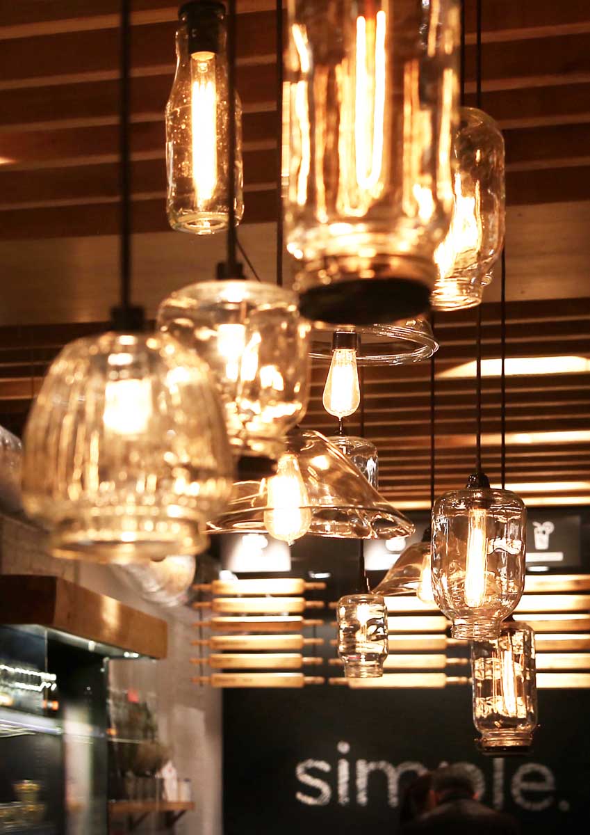
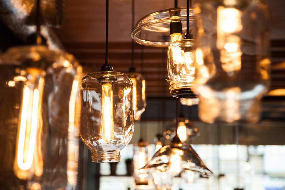
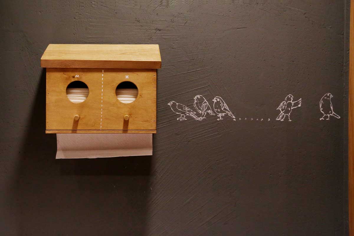
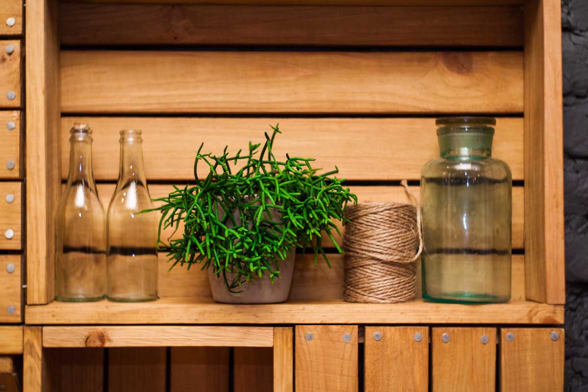
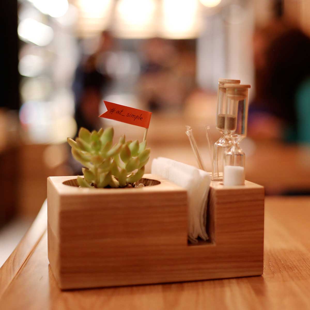
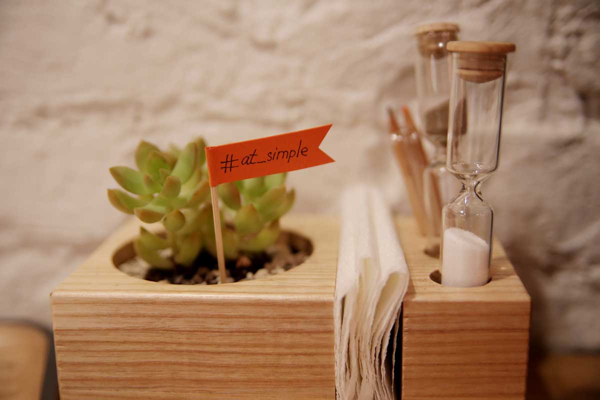
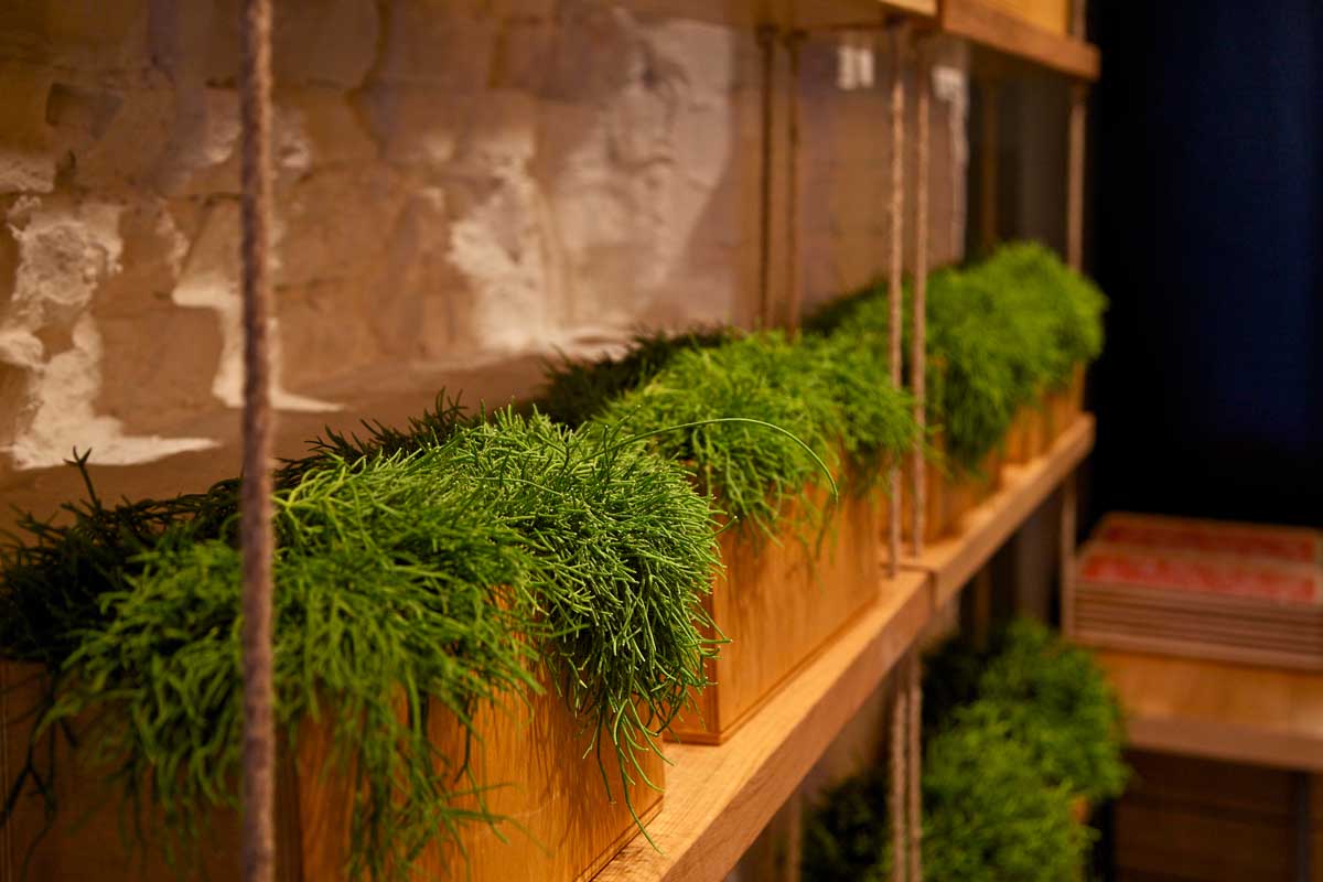
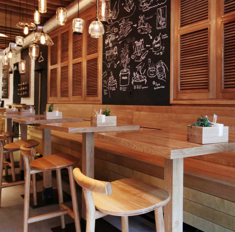
The idea of the restaurant is “be simple, eat simple”, it implies cooking from local, fresh, not preserved products, but in unusual combinations. For this reason, we used natural colors and simple materials like wood, plywood, craft paper, etc. without complicated refinement. We also decided to look at usual details from a different point of view. That’s how we got a shovel as a door-handle, rakes as coat hooks, rolling pins as a menu for drinks, concrete lamps made of recycled plastic bottles and so on. We honestly bought all that at the market and adjusted in the interior.
WC
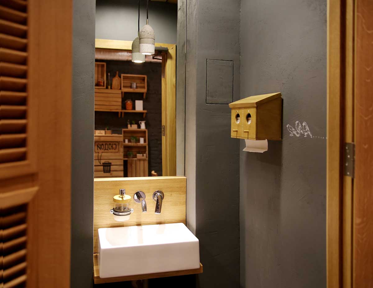
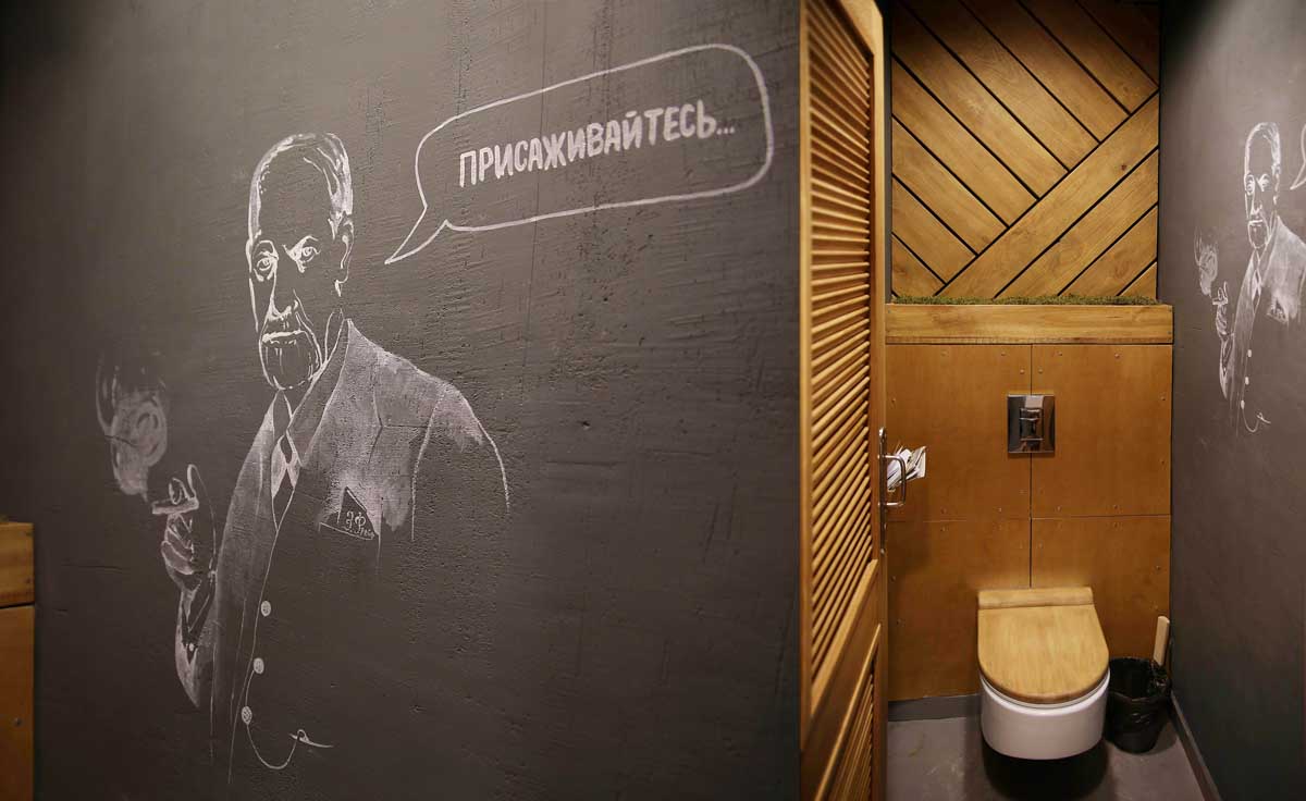
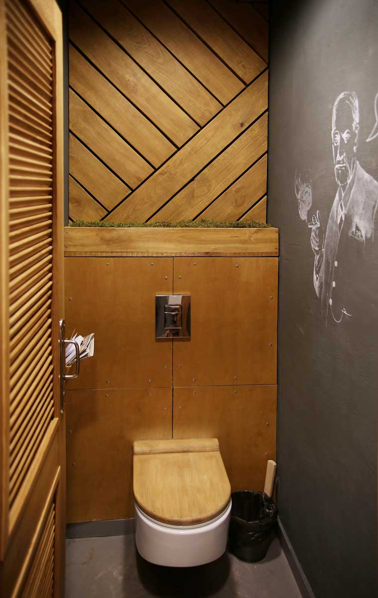
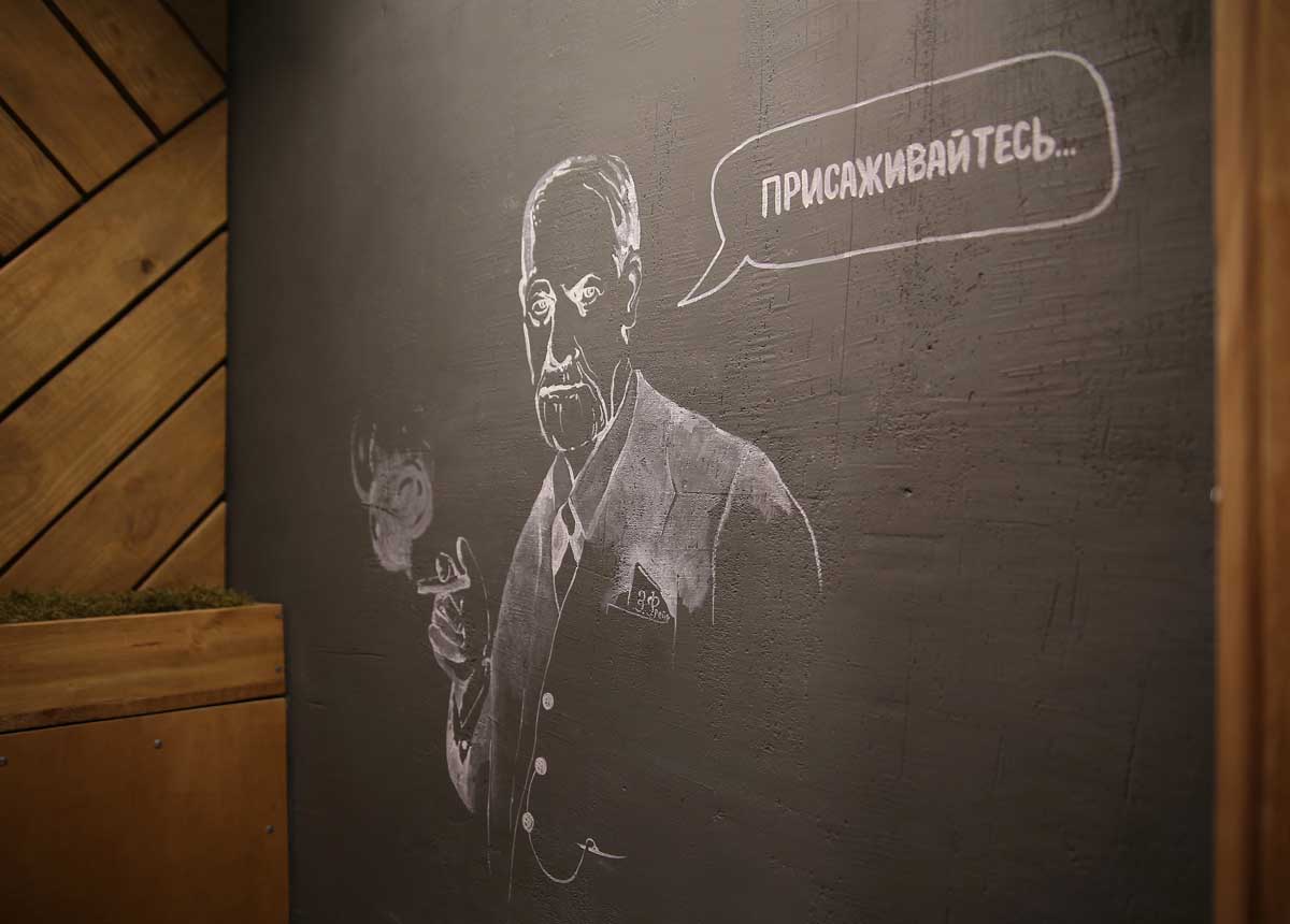
The water closet is a bit out of the main idea. Unlike other rooms where everything is simple, this place is…not that simple. It’s a room to relax, calm down and let unconscious out… No wonder that the visitor is met by Sigmund Freud that kindly offers to take a seat.
Design: Brandon Agency and Anna Domovesova

