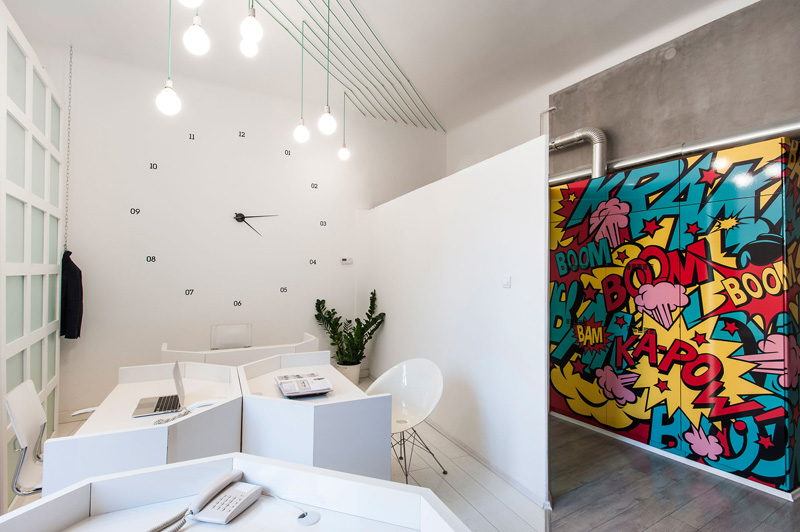
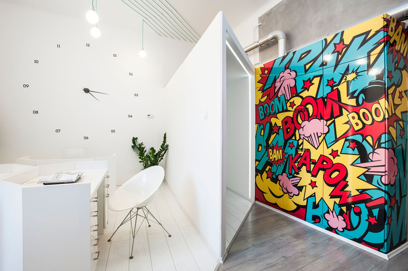
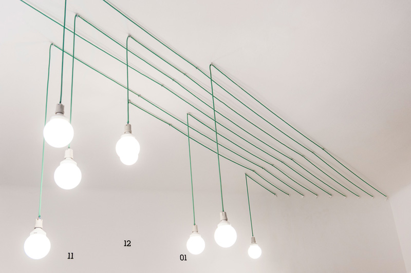
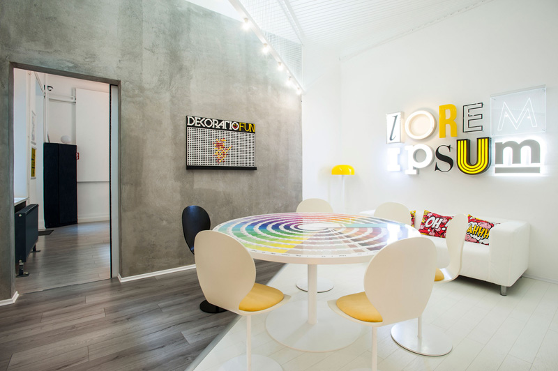
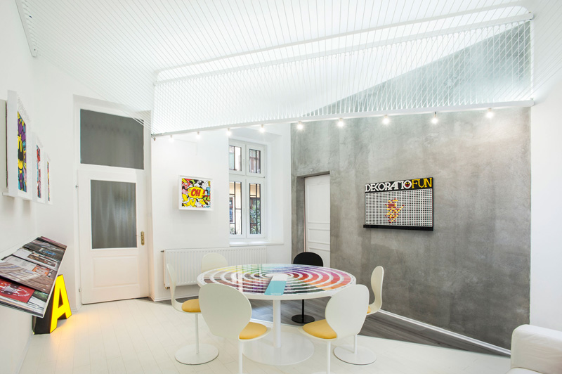
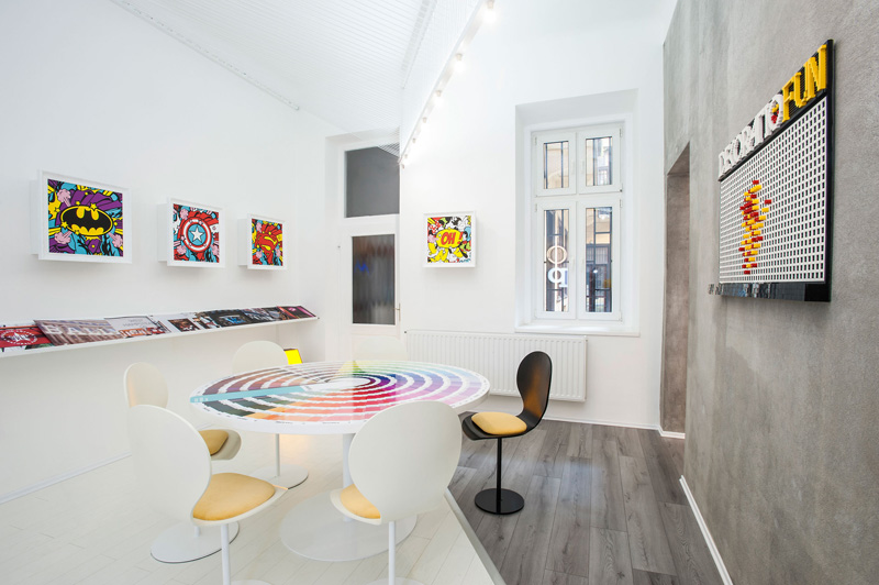
Design firm KISSMIKLOS have completed their design of an office for DekoRatio Branding & Design Studio in Budapest, Hungary, that features graphics and artwork inspired by pop culture and comic books.
Here is the designer’s description
With my partner studio, the DekoRatio Branding and Design Studio we wanted to create an experience that inspires ambitious companies to use better design and to demonstrate how design can have a huge positive effect on their business.
That’s why the number one goal was to design a space that offers a creative experiences and serves as a showroom for interior design and decoration.
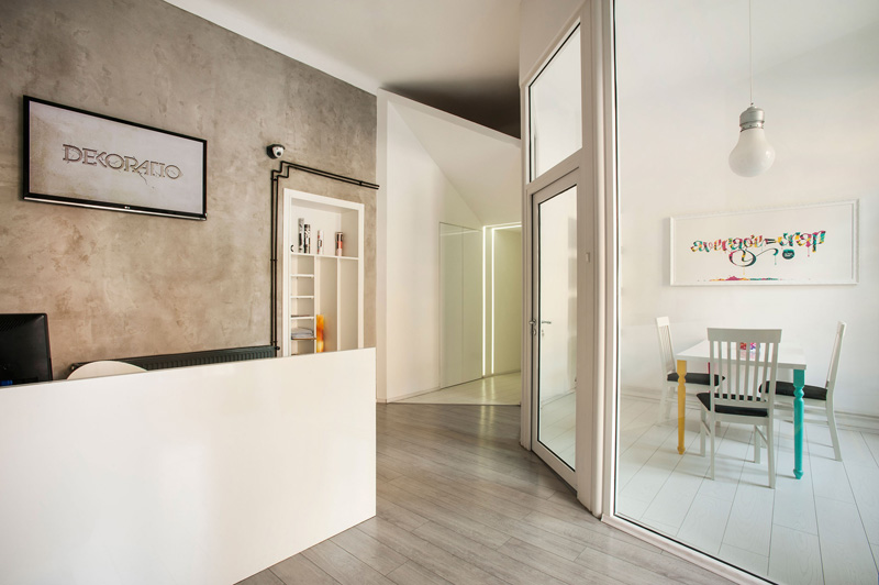
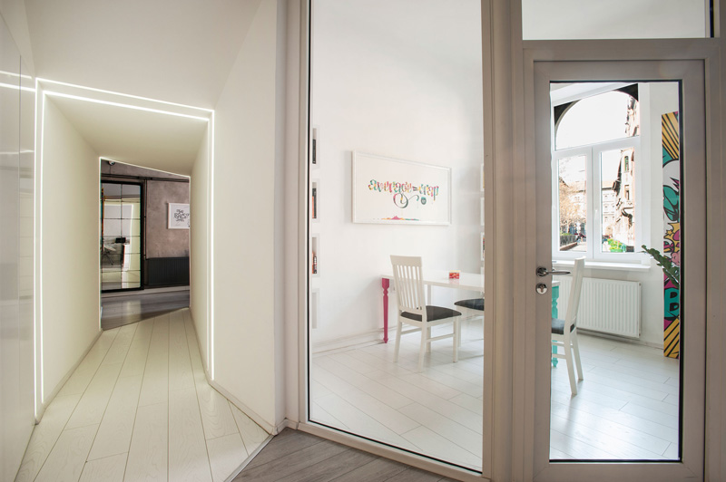
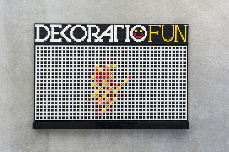
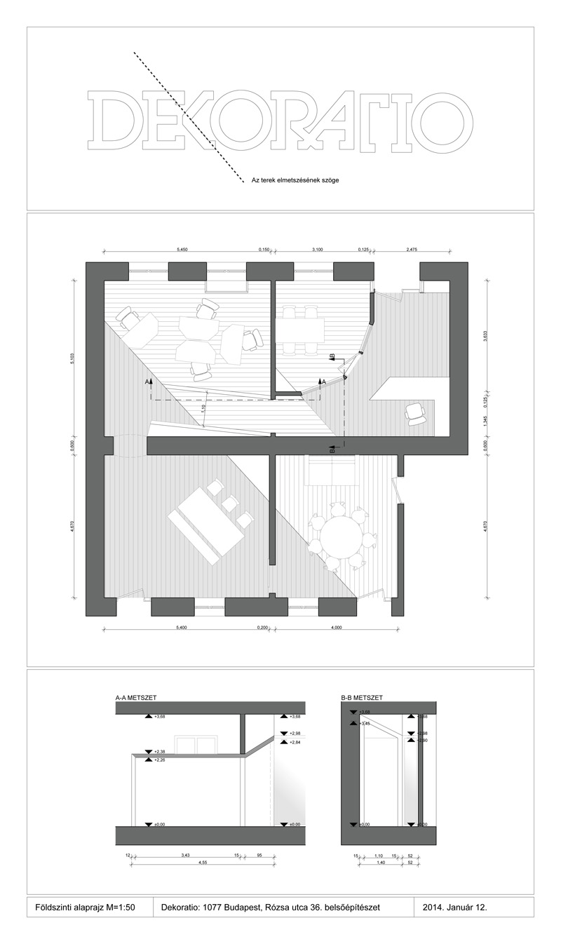
In the interior a line cuts through the space in the angle of the “K” from the DekoRatio logo. It divides the rooms between a clear white office space and an industrial space. This separation express the Studio’s main characteristic: its capacity to do both brand strategy and design and also the actual production of signs and prints.
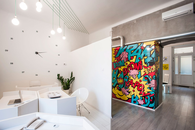
A corridor was built in the same angle to connect the reception with the rest of the studio and also to separate out a space for the account manager team. Its special shape in the reception is designed to create a visual image that “draws” the visitor into the studio.
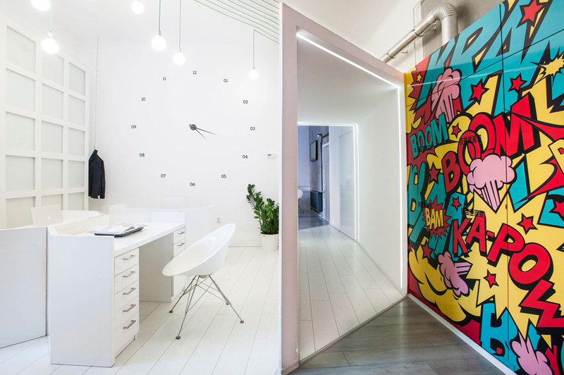
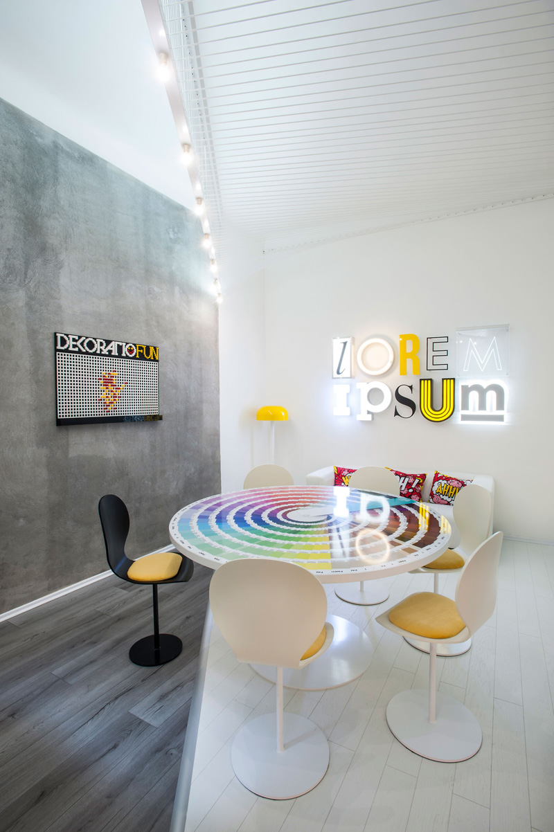
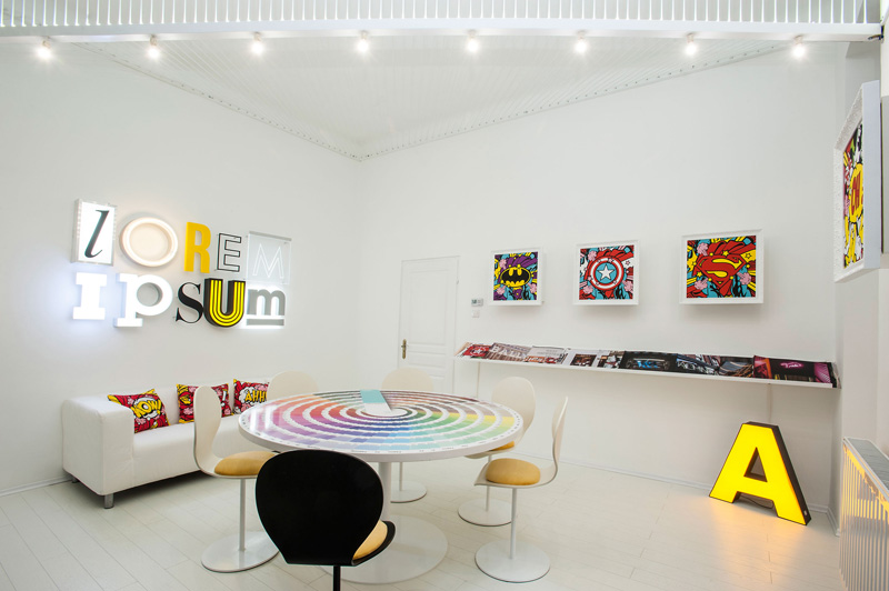
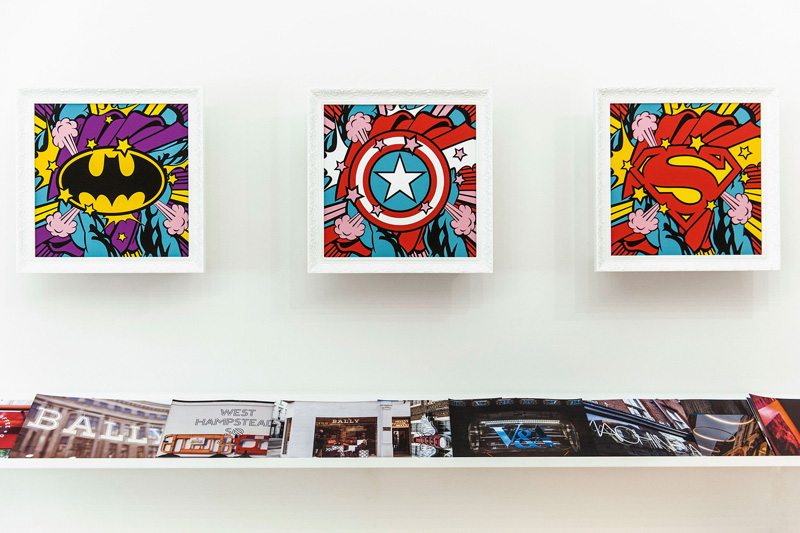
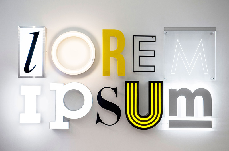
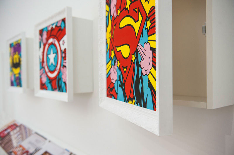
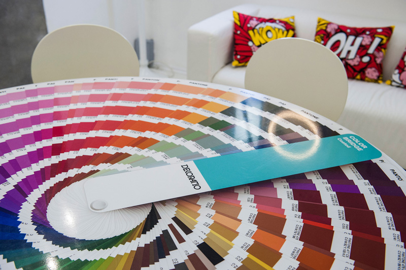
Several references to branding and the design profession appear around the studio: the Lorem Ipsum sign on the wall or the round meeting table that is designed as a big Pantone Palette. The symbols of the world famous superhero characters are also a tribute to the extraordinary branding achievement of Disney, Marvel and MC.
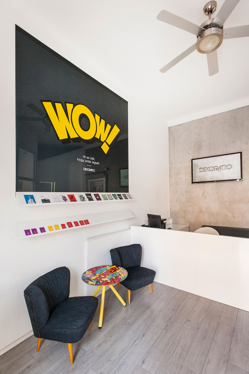
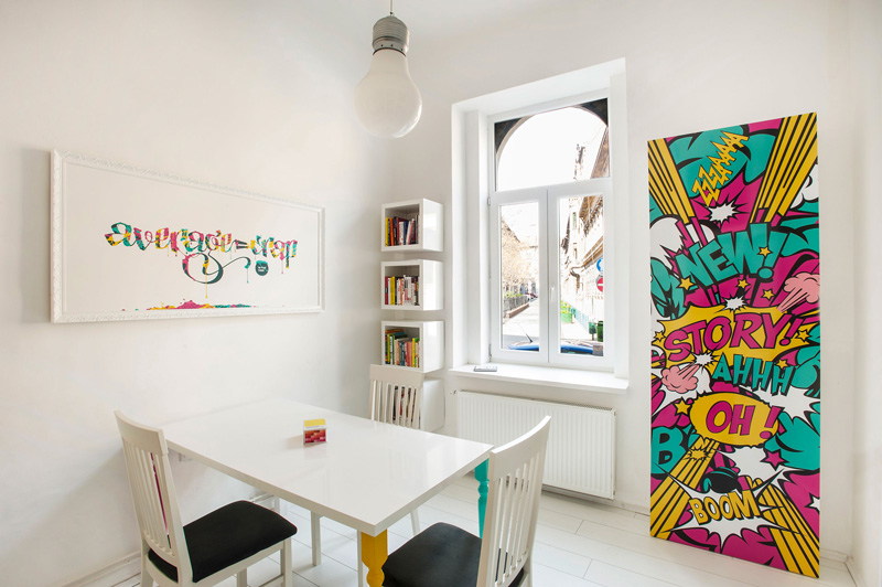
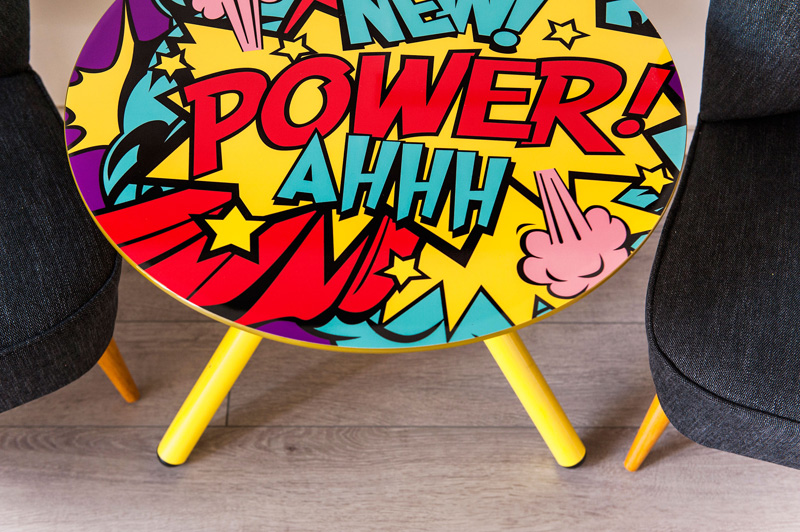
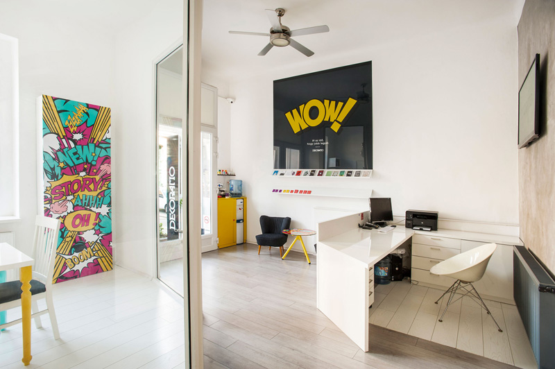
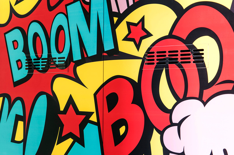
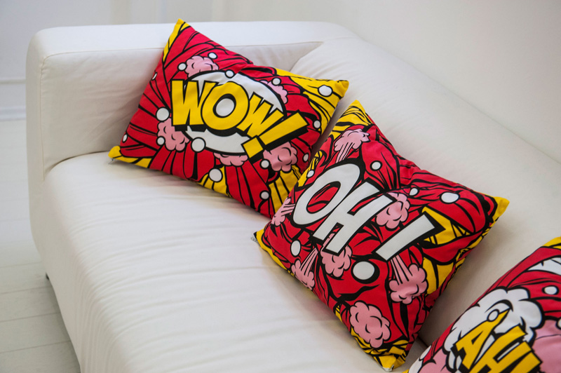
Comics are used throughout the studio as a reference to the role POP culture played in America in the evolution of applied art and advertising. In each room there is some comic illustration that has a connection with function of the room. The cupboard that serves to hide the boiler is covered with the word BOOM, in the meeting room, where stories are born, the main word is STORY, and the little table on which the complimentary chocolates are has the word POWER on it.
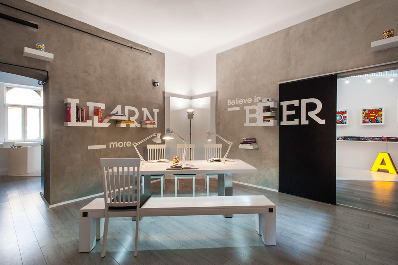
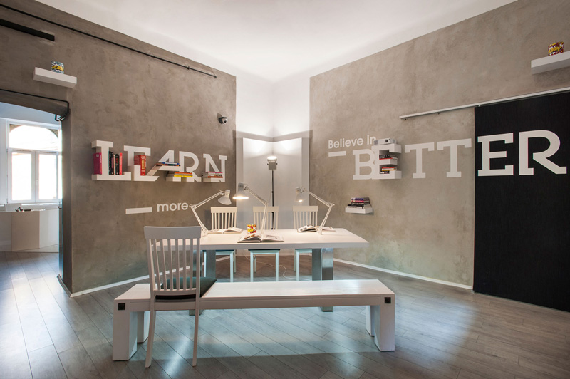
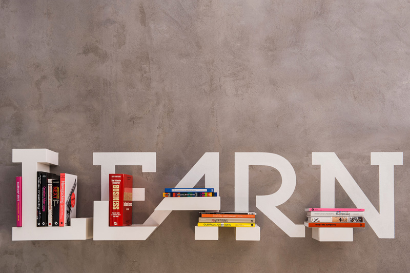
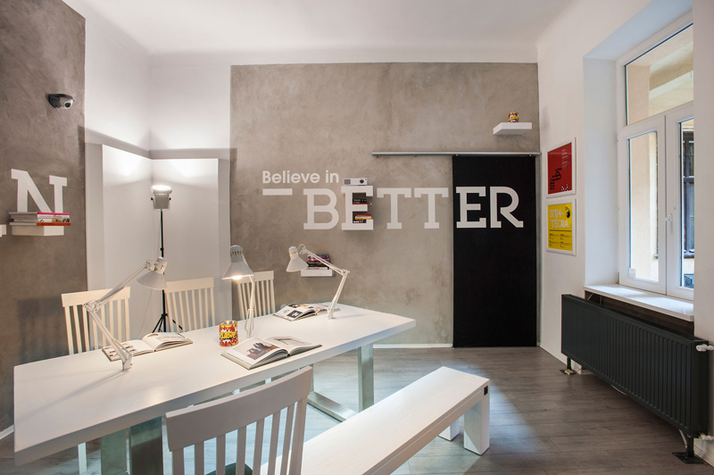
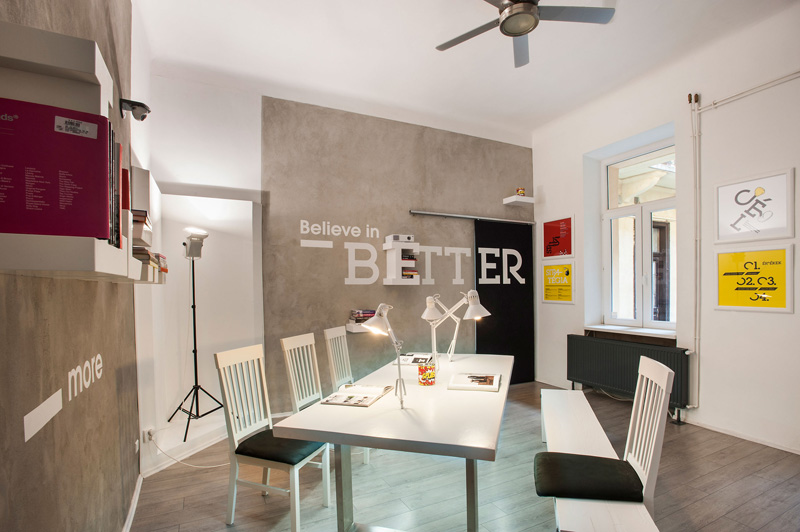
In the library-style social room the bookshelf was custom made from the letters of LEARN. Which is accompanied by a big “Believe in BETTER” sign that abbreviates to “Believe in BEER” as a sliding door opens across it.?Designed typos with the Studio’s mottos, strategy and goals appear around interior. They form part of the employer’s branding effort, but they also give clients and other visitors a feel for the personality and values of the Studio.
Design: KISSMIKLOS
Photography by Balint Jaksa
