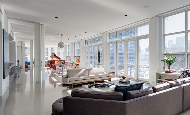
Architect Ed Kopel has transformed three individual apartments into a full-floor unit for a family that loves art in Brooklyn, New York.
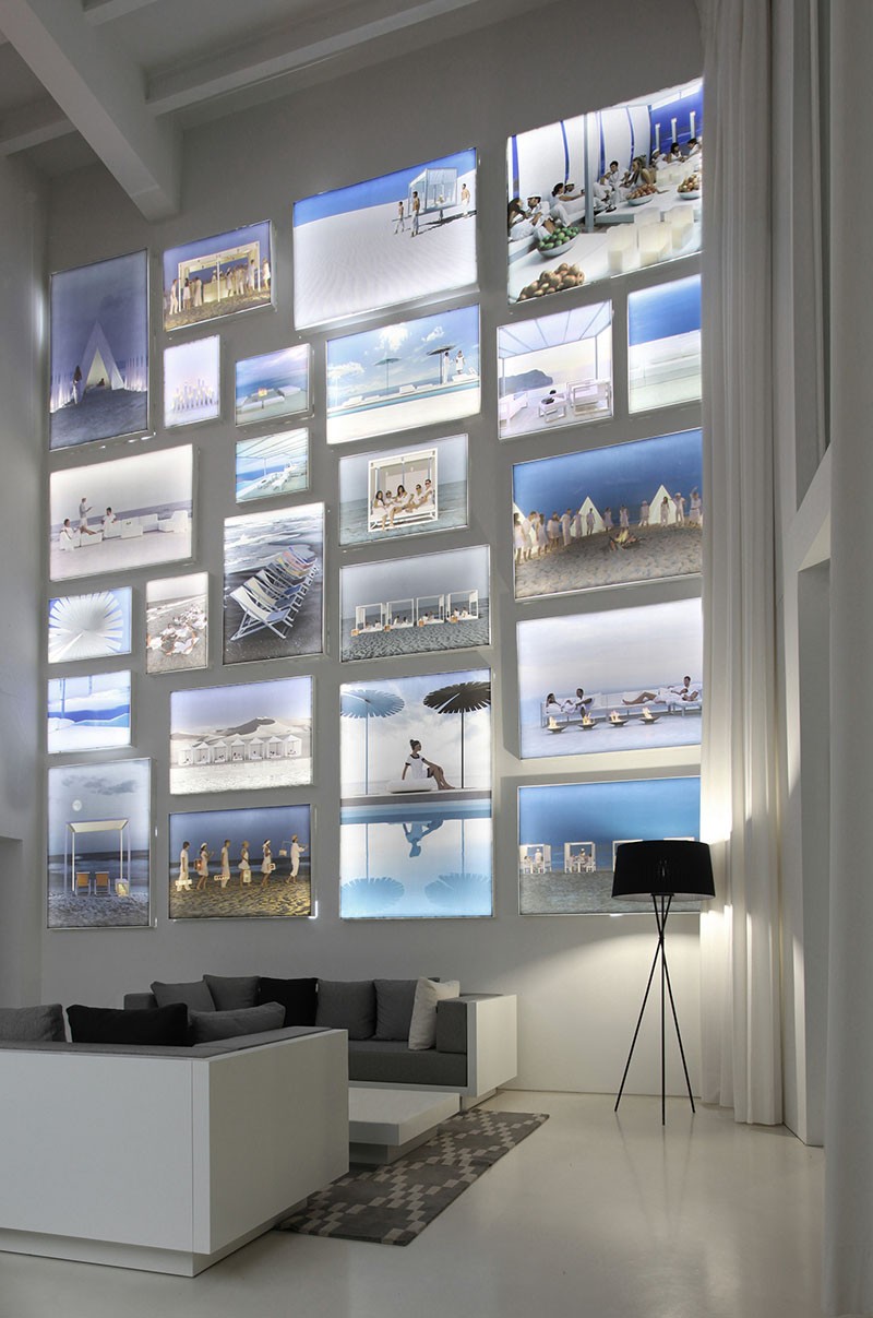
Design Detail – A Wall Of Illuminated Backlit Photos
Hey contemporist friends! Here’s a dramatic decor idea for you. This home by Borja Garcia Studio has a double-height feature wall of illuminated backlit photos.
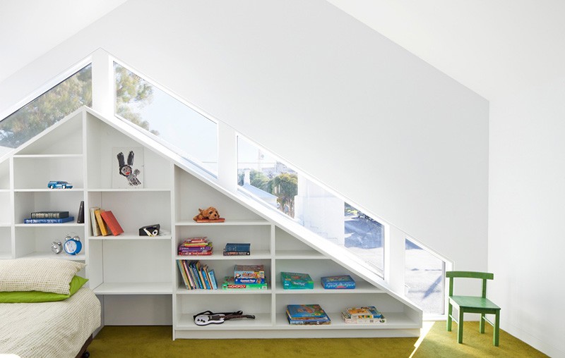
Design Tip – Follow The Lines
Our eyes naturally love to follow lines, and our minds are at ease when we spend time in rooms where the elements are in harmony with each other.
For example, these shelves in a home designed by Simon Couchman Architects, follow the lines of the unconventional windows in this children’s room. They relate to each other. They compliment each other. As a result, when we enter a room like this, our minds are peaceful.
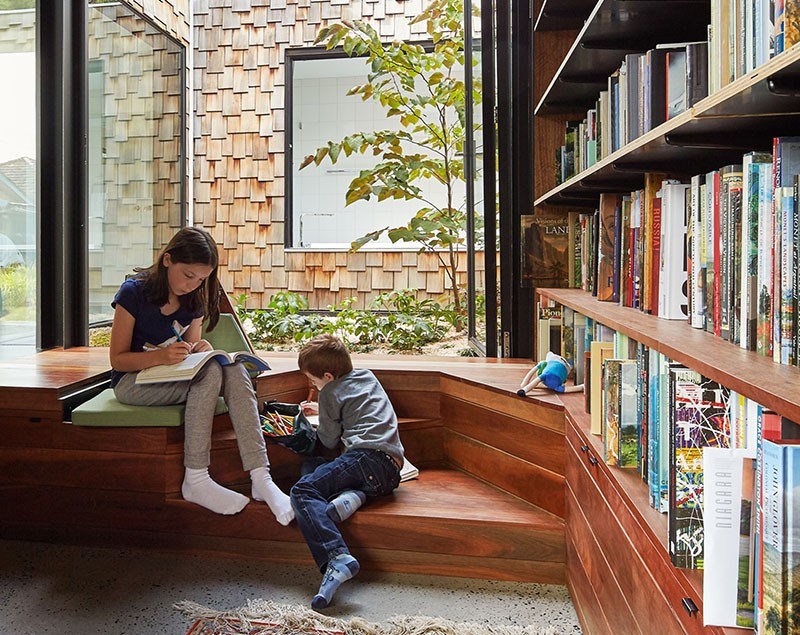
This Home’s Study Library Is An Oasis Of Learning
Set slightly apart from the rest of the house, the study library in this home by Andrew Maynard Architects, is lined with dark spotted gum wood that has an age and a wisdom about it, that sets the tone for a place of quiet thought and contemplation.
Design Detail – A Multi-Purpose Cantilevered Cabinet
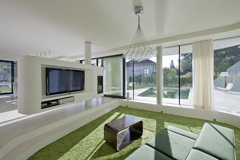
This cabinet, in a home by Caramel Architects, is like the Swiss Army Knife of cabinets. It’s a space divider, an entertainment unit, a liquor cabinet, and has a fireplace on the end. As if all that wasn’t enough, the whole thing is just hanging in space, because it’s cantilevered, which is a fancy way of saying that it’s only supported on one end.
An Apartment Interior For A Couple Of Empty Nesters
Nancy Snyder of Bon Brise Design, has designed the interior of a condo in the Bucktown neighborhood of Chicago, for a couple that down-sized from a large home after their children went to college.
