Photography by Meagan Larsen Photography
Dyer Studio Inc. has completed the remodel of a kitchen that was dated and too dark for the family that lives in the house.
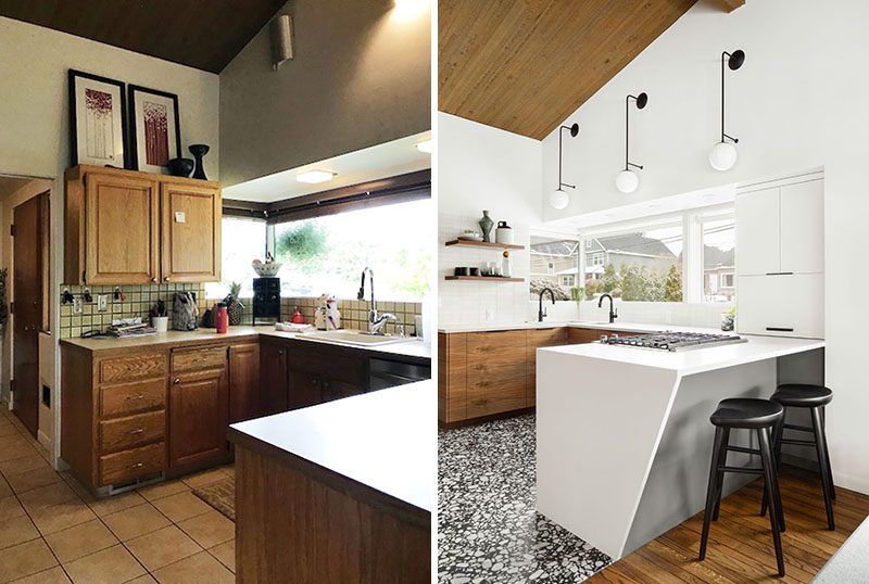
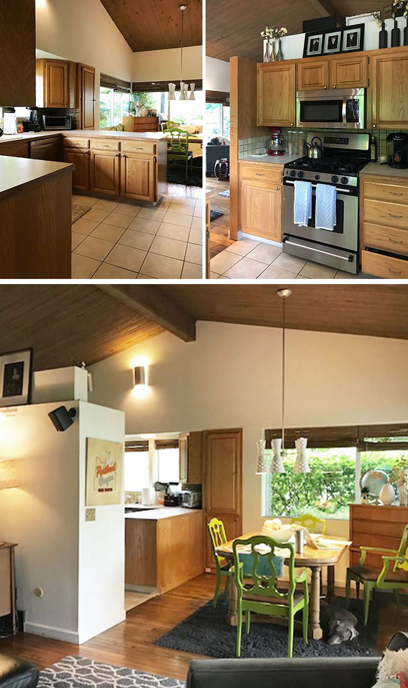
The ‘before‘ kitchen had a u-shaped layout with wood cabinets that separated the kitchen from the living room. Here’s what it looked like before.
Photography by Meagan Larsen Photography
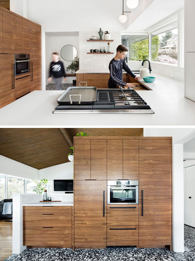
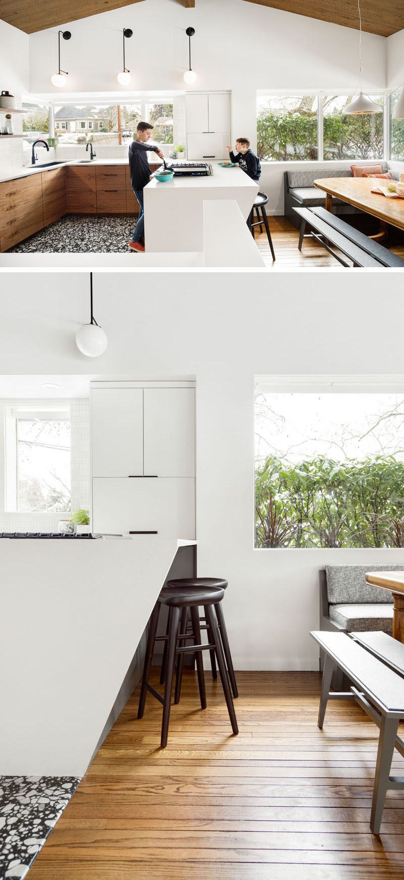
The updated kitchen is a lot brighter, with some of the upper cabinets removed and replaced with floating wood shelves that match the wood cabinets. The work stations were re-organized, and everything from finishes to appliances to lighting was updated.
Photography by Meagan Larsen Photography
Everything was shifted when the designers moved the stove top to the peninsula, that now has room for seating. This resulted in the sink being positioned in the corner under the windows. The designers had difficulty sourcing one in the desired dimensions and budget, so they paired two sinks together, a large single basin alongside its bar-sized version, which maximized functionality and space.
Photography by Meagan Larsen Photography
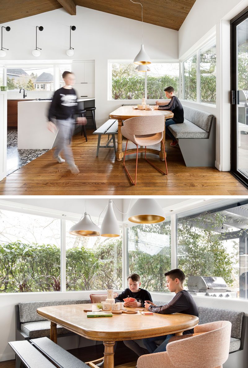
Adjacent to the kitchen is the dining area, that’s been updated with banquette seating that lines the corner, and multiple white pendant lights that highlight the table.
