Photography by Jasper Sanidad
Sometimes when designing a space you want to highlight an area or have a bit of fun with the design, and that’s what Studio O+A did when they were designing the San Francisco offices of Yelp.
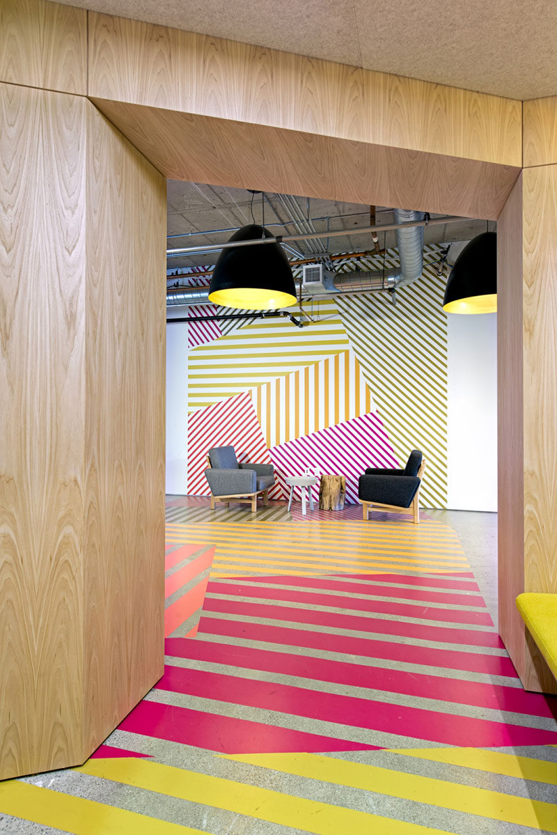
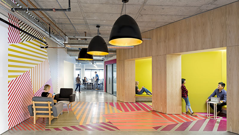
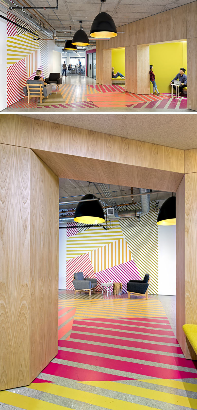
In this area of the office, they were inspired by Amsterdam’s Bloemenmarkt and the Dutch tulip fields that are full of multi-colored and geometrical patterns. The designers recreated this look in a fun pattern that wraps from the walls down onto the floor.
By doing this they were able to define a seating area in a hallway and add some color to the otherwise plain wood, white and concrete palette.


