Carterwilliamson Architects recently completed a family home in Rozelle, a suburb of Sydney, Australia.
Project description
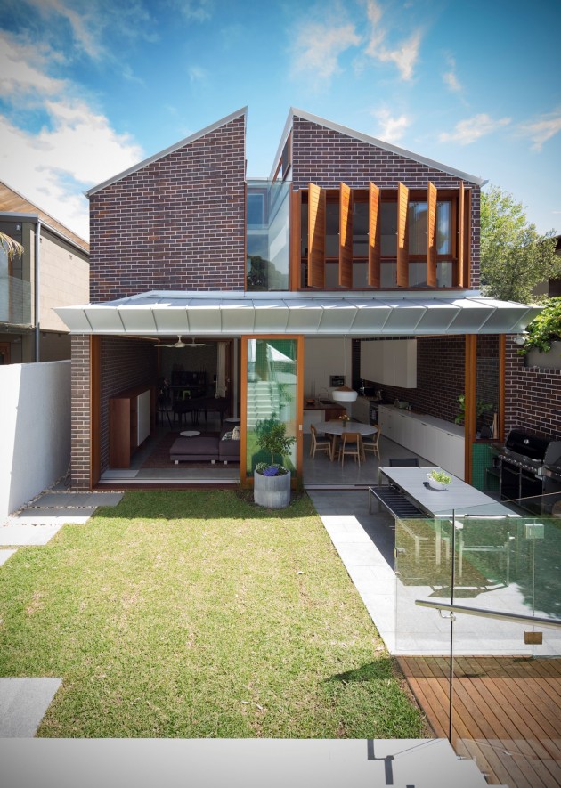
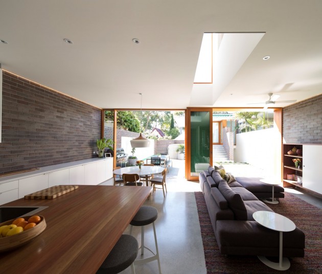
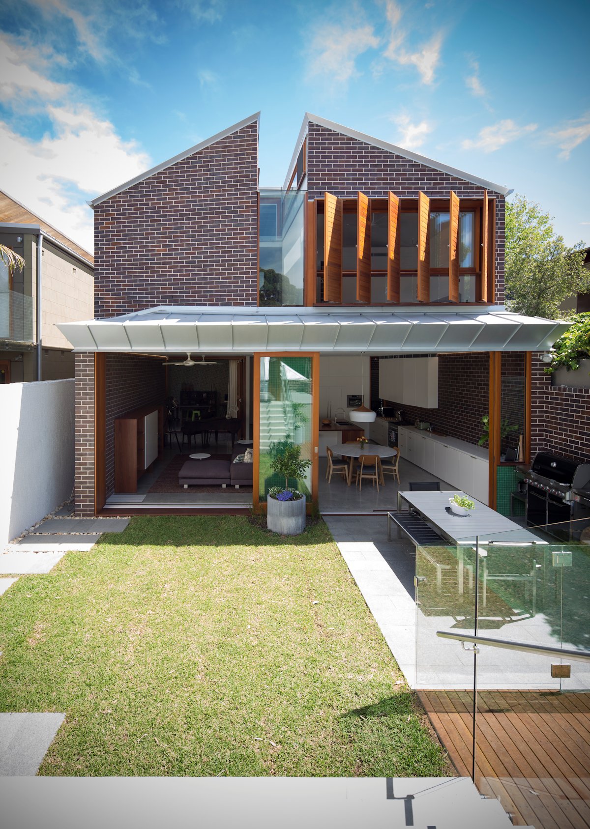
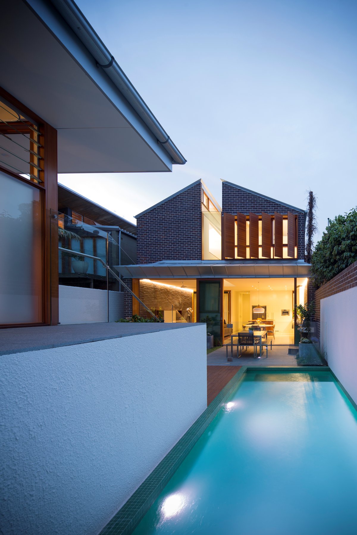
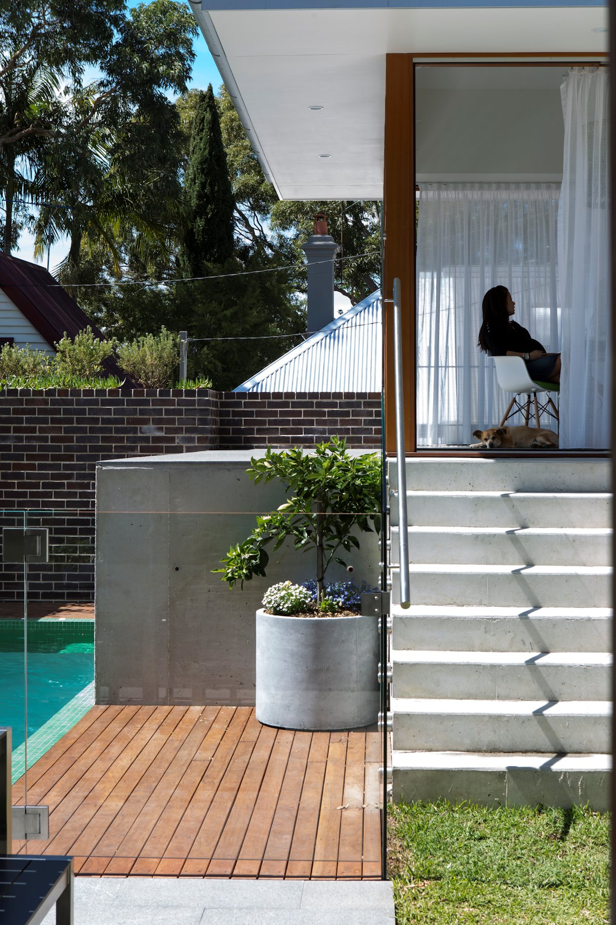
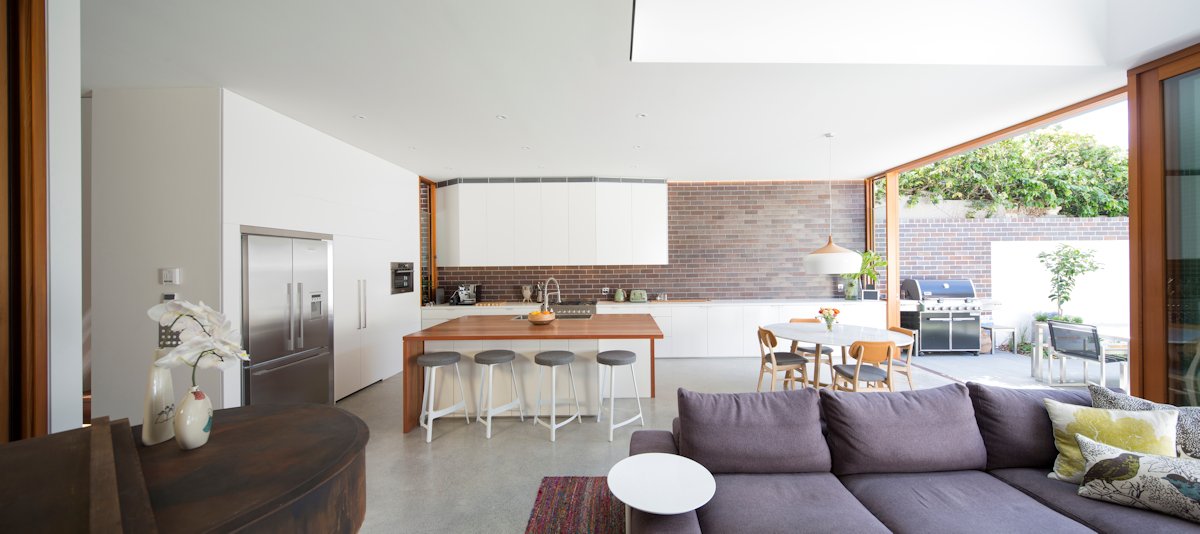
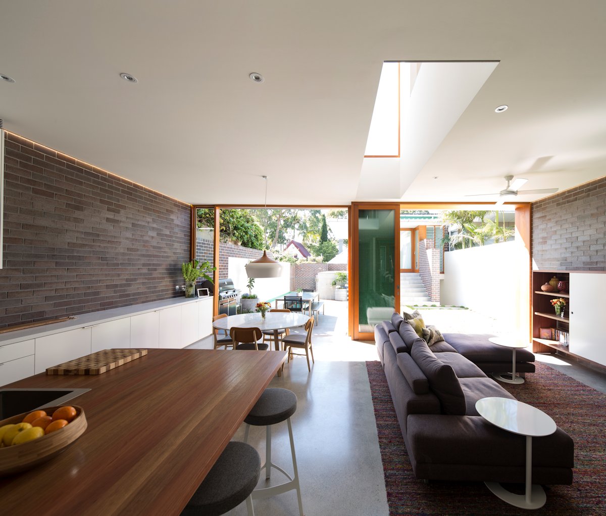
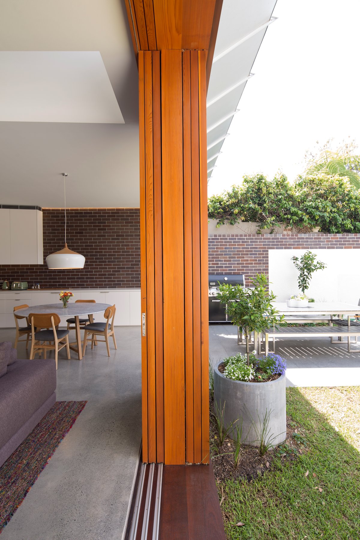
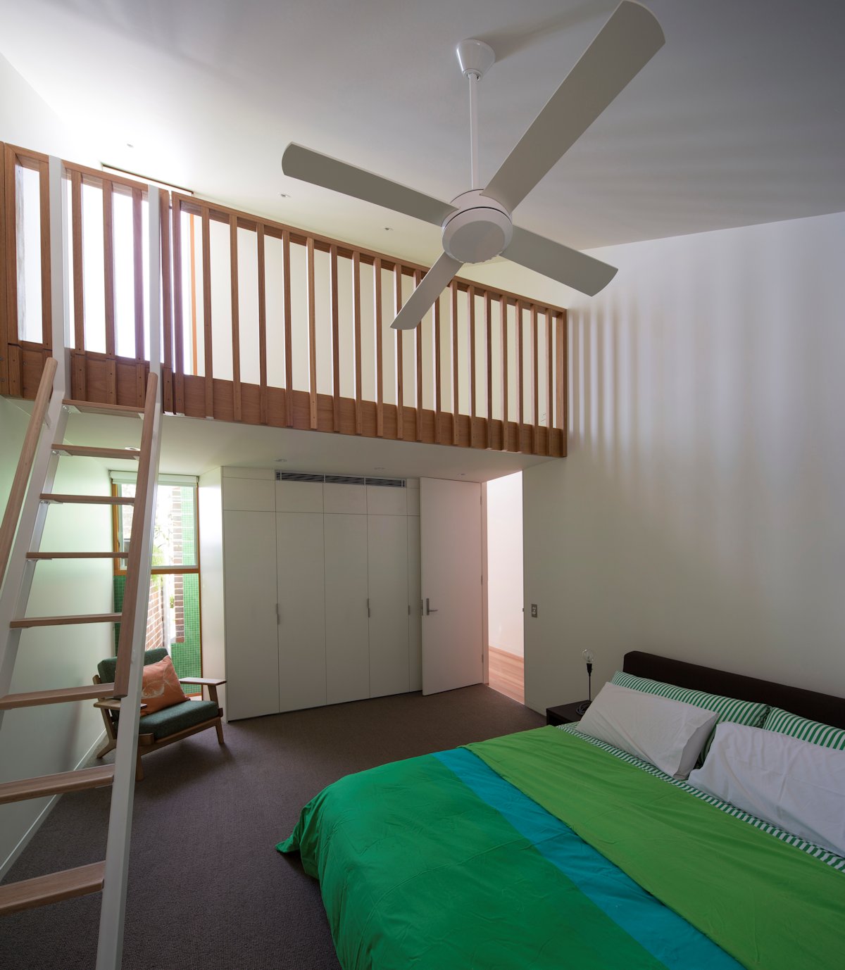
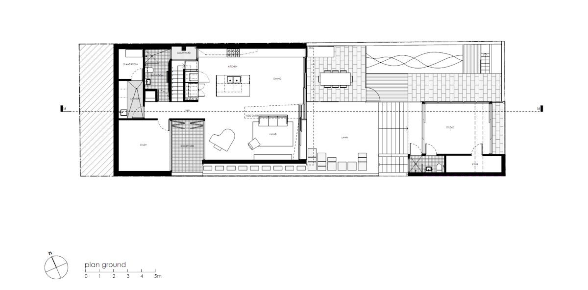
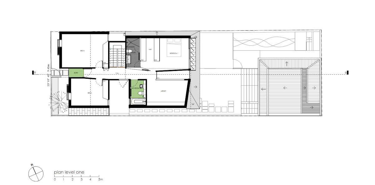
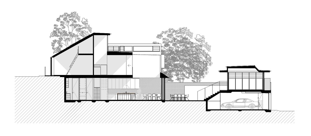
The site falls by two storeys from Hartley St to the lane at the rear; creating a unified living plane was one of the key design gestures in this project. Kitchen, living and dining engage with the courtyard-like garden with a studio sitting atop the garage at the rear boundary, creating an amphitheatre back to the main house. Upstairs the spaces are quiet and restful; bedrooms and a secluded, contemplative library divided by a glazed void with views to the sky.
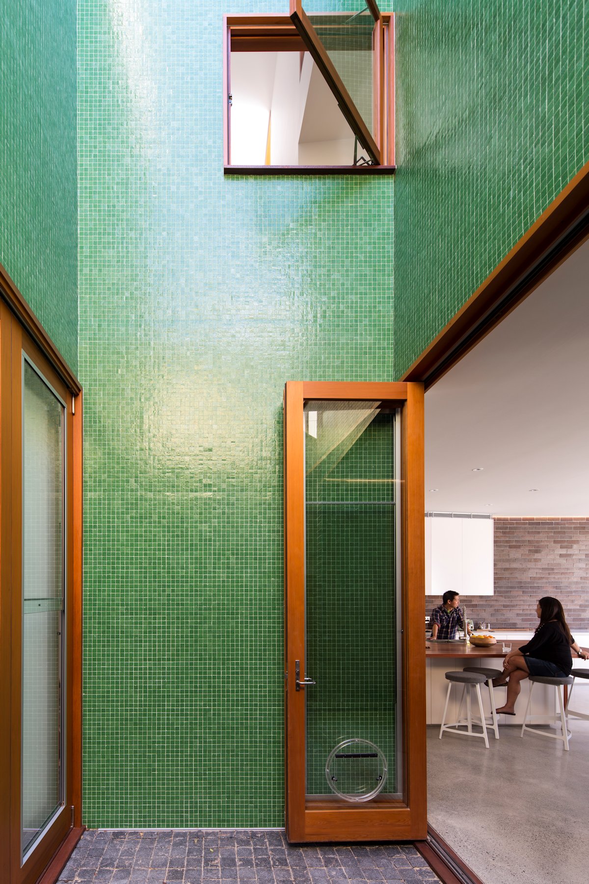
Though the site has a double frontage, it was challenged for light and series of voids, courtyards and lightwells have been designed to liberate the plan. The tiled courtyard off the florist’s workshop and living space is cool and restful, whilst a tiny lightwell with cascading planting addressing the two-storey stair draws in snatches of bright northern light. At the rear the house is cleaved in two by an internal lightwell and glazed void which swallows light deep into the home and programmatically defines the open plan spaces of the ground floor.
One of the great successes of this home is that it accommodates a wide range of programs in a relatively small footprint; well suited to our client’s lifestyles. There is plenty of room to grow their family and to house their steady flow of overseas visitors as well as a home office and florists studio- both of which can be converted to additional bedrooms or living spaces as required.
A generous timber island anchors the living spaces of the home; part workspace, part sculpture and impromptu dinner table, it is the locus for family life.
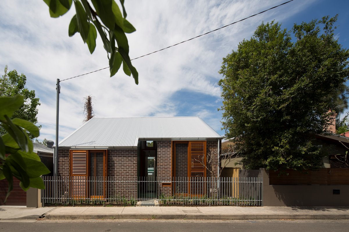
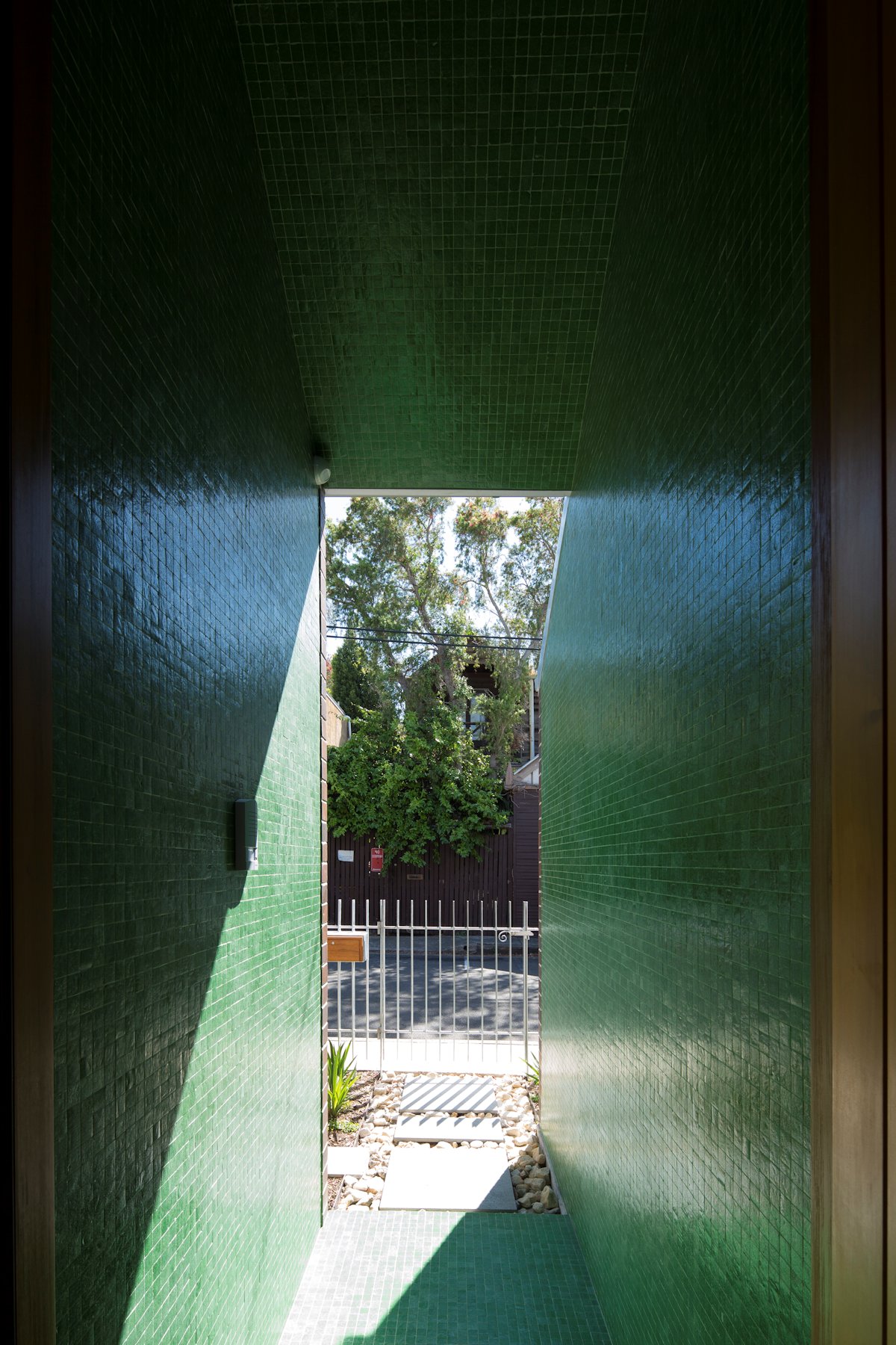
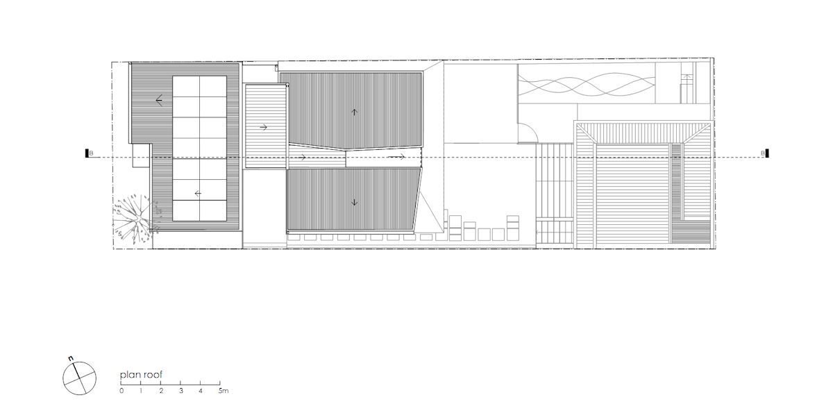
At it’s Hartley St address the Green House takes it’s cues from nearby raking roof-forms, matching alignments and setbacks to compose a facade that is both contemporary and sympathetic to the streetscape. The single storey street frontage belies the generous two-storey home concealed behind the modest ridgeline.
The studio/garage typology is common in the rear lane and is positioned to address both the lane and the home, whilst maintaining a green band of vegetation consistent with neighbouring properties. The studio form and boundary walls give the rear yard a secluded feel delightfully at odds with the home’s dense urban context.
Our client’s busy lives meant that it was important the home was low maintenance. The house is clothed in robust face brick and glass mosaic tiles that are easily hosed down to wash away accumulations of salt and dirt and which provide colour and texture to the building and give it a playful, graphic patterning.
The clients are thrilled that the most common compliment they get from visitors is about the quality of light throughout the home. The old house had been dark and damp and it was key to the brief that the new home dispel these associations.
Though the home has a strong sense of connection to the outdoors, the external spaces are compact and constrained. Landscaping was particularly important to our client who works as florist, it needed to be low maintenance but also provide colour and texture to the home.
The collaboration with Melissa Wilson Landscape Architects maximised the potential of the outdoor spaces and addressed a variety of tricky microclimates. It included the creation of bespoke timber garden boxes that hang in the shady, green courtyard, adding to the lush feel of the space.
The clients invested in ideas like the green mosaic tiles, face bricks and timber windows which give the home so much of it’s colour and character. Though these items appear expensive at face value, long term they are financially and environmentally efficient choices, their cost and embodied energy being amortised over a long life-span and their inherent robustness reducing the need for intensive, ongoing maintenance.
This home was built with a “build-it-once and once only” approach, designed to amortise the embodied energy of its parts and materials over a long life-span. Although it is generously sized it is spatially efficient, incorporating a range of programs and allowing our clients to work from home, reducing the frequency of their commute.
The home operates passively through much of the year with the courtyard plan and glazed lightwell providing myriad opportunities for cross-ventilation and abundant natural light.
Architect: Carterwilliamson Architects
Project Team: Shaun Carter, Lisa Merkesteyn, Kellie Beatty
Photography by Brett Boardman
