Canadian design firm Level Studio has shared photos of a loft apartment located in a building that was once home to offices but has been converted into residential apartments.
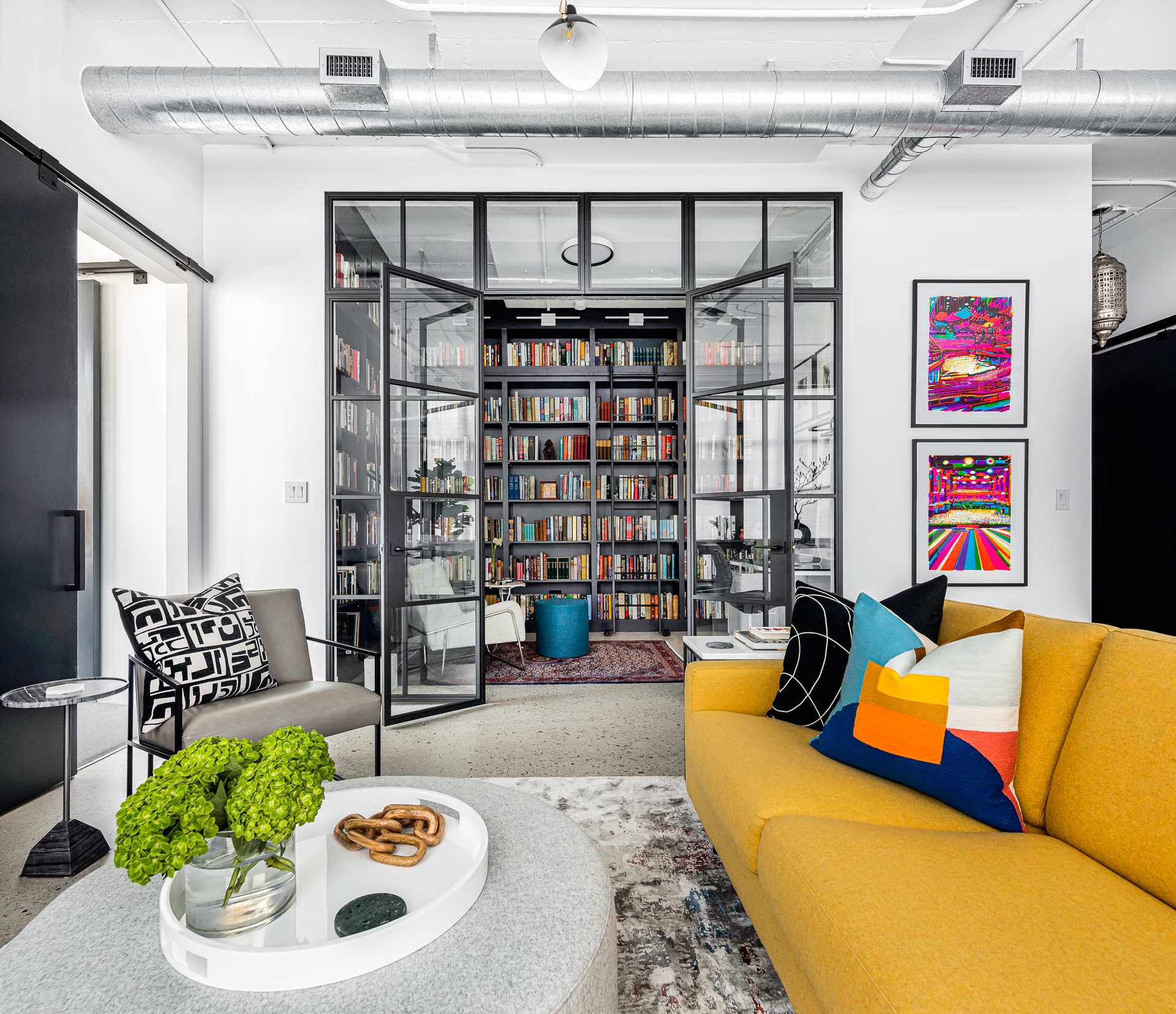
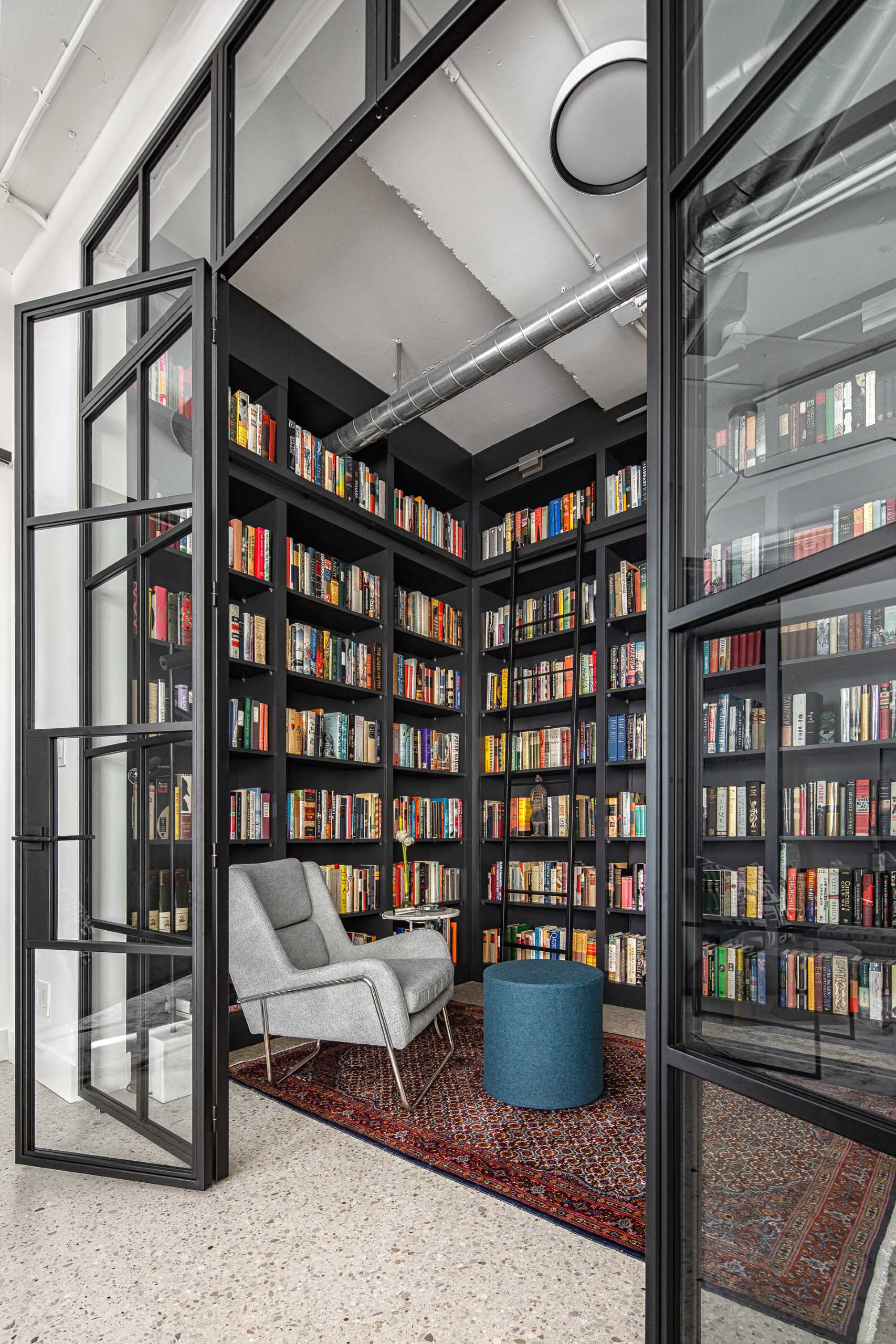
One of the eye-catching design elements that caught our eye, is the library and home office. Originally a den with a much smaller opening, the designers opened up the room to really exaggerate the height of this loft.
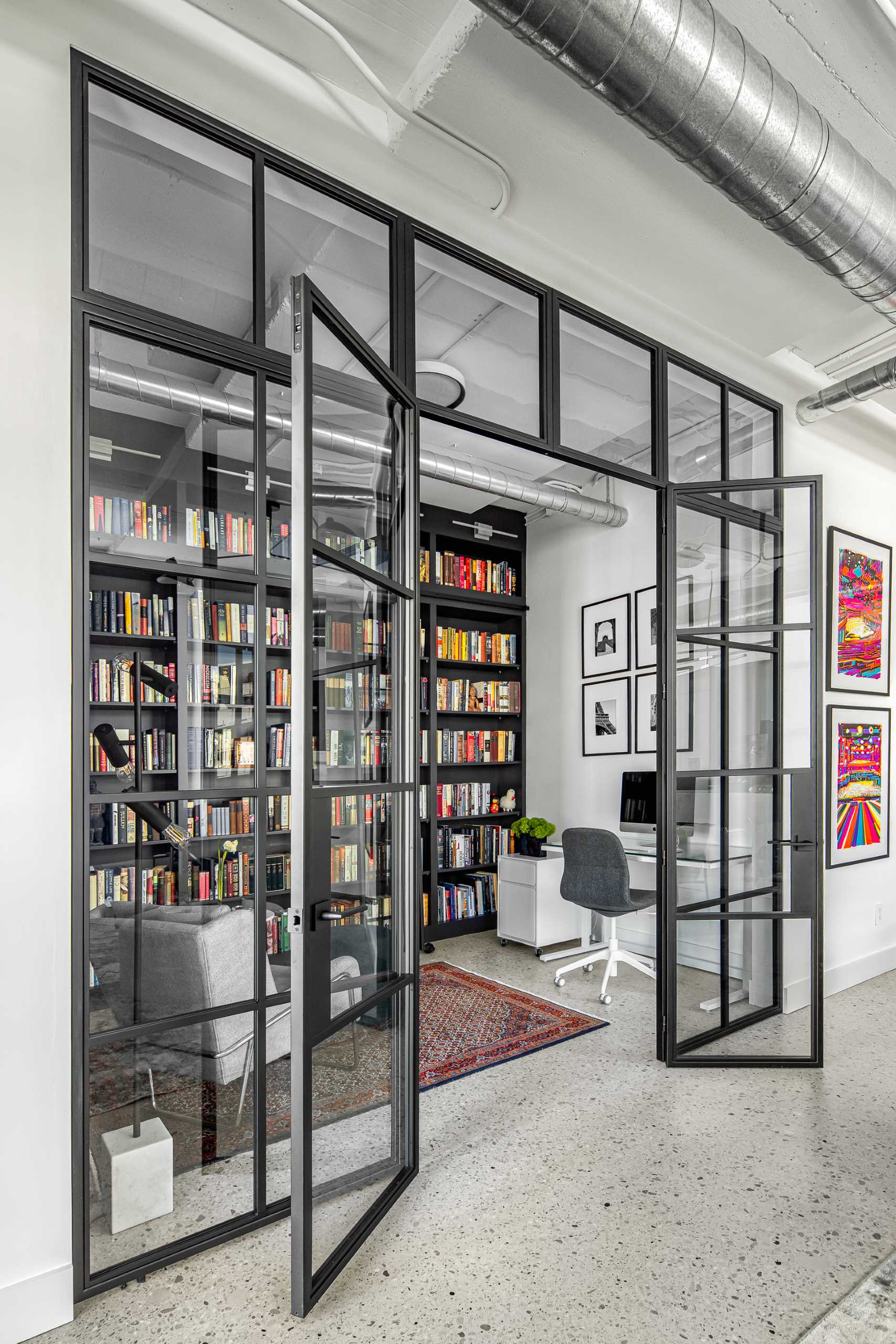
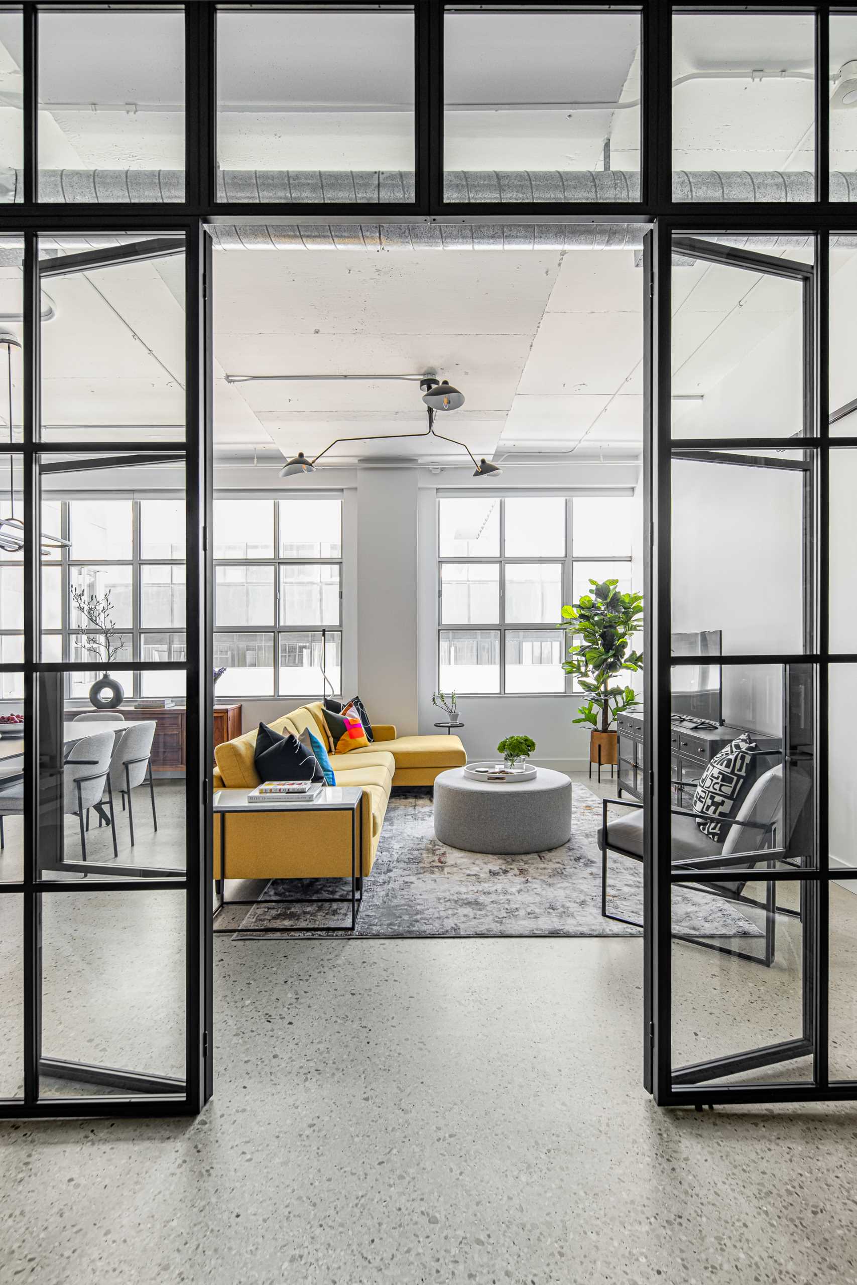
A custom window and door system measuring 10’ by 10’ was designed with their metalsmith team to bring as much natural light into this room as possible and incorporate the industrial aesthetic.
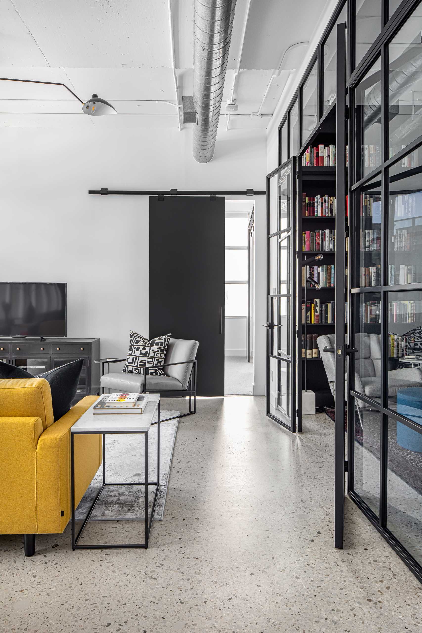
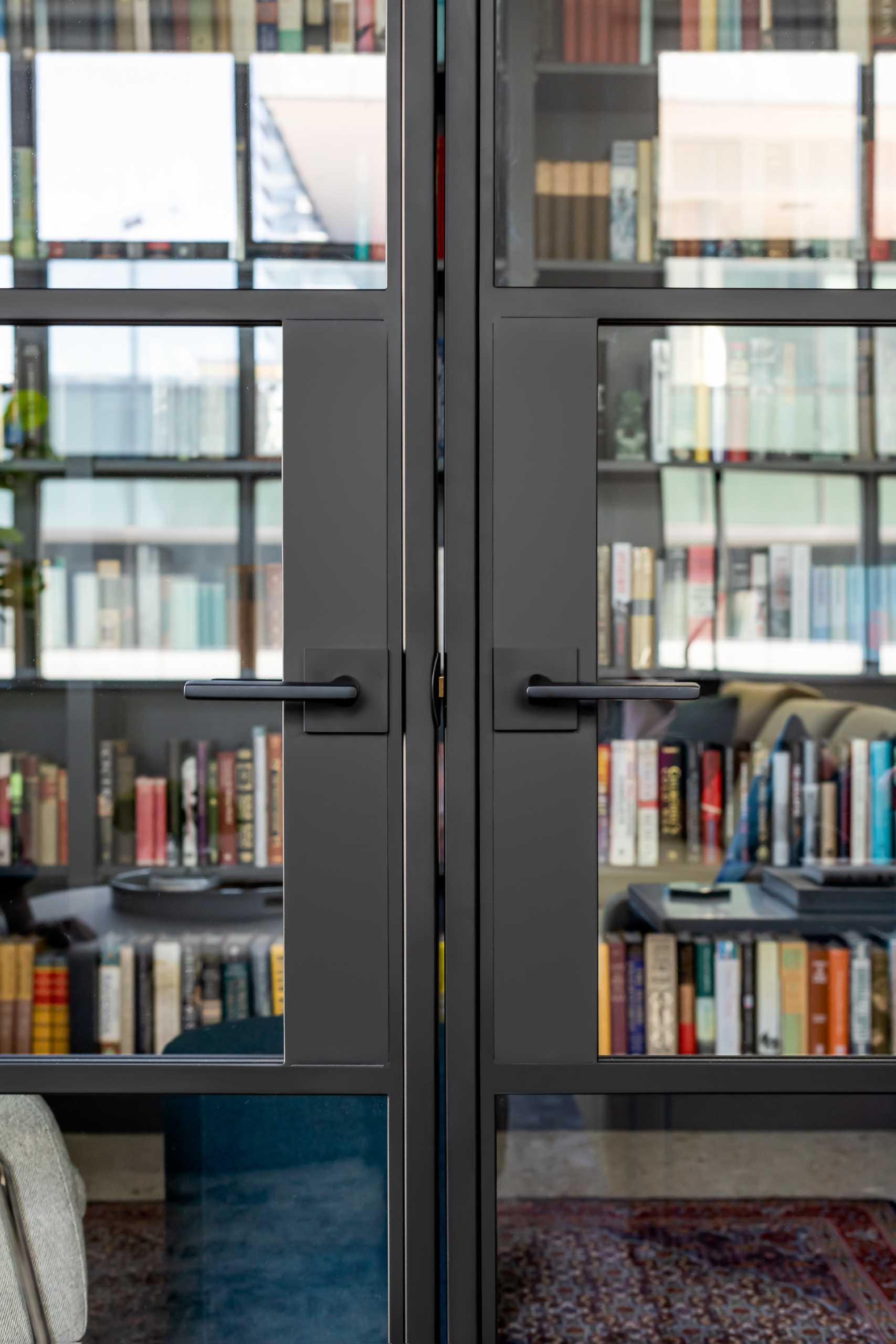
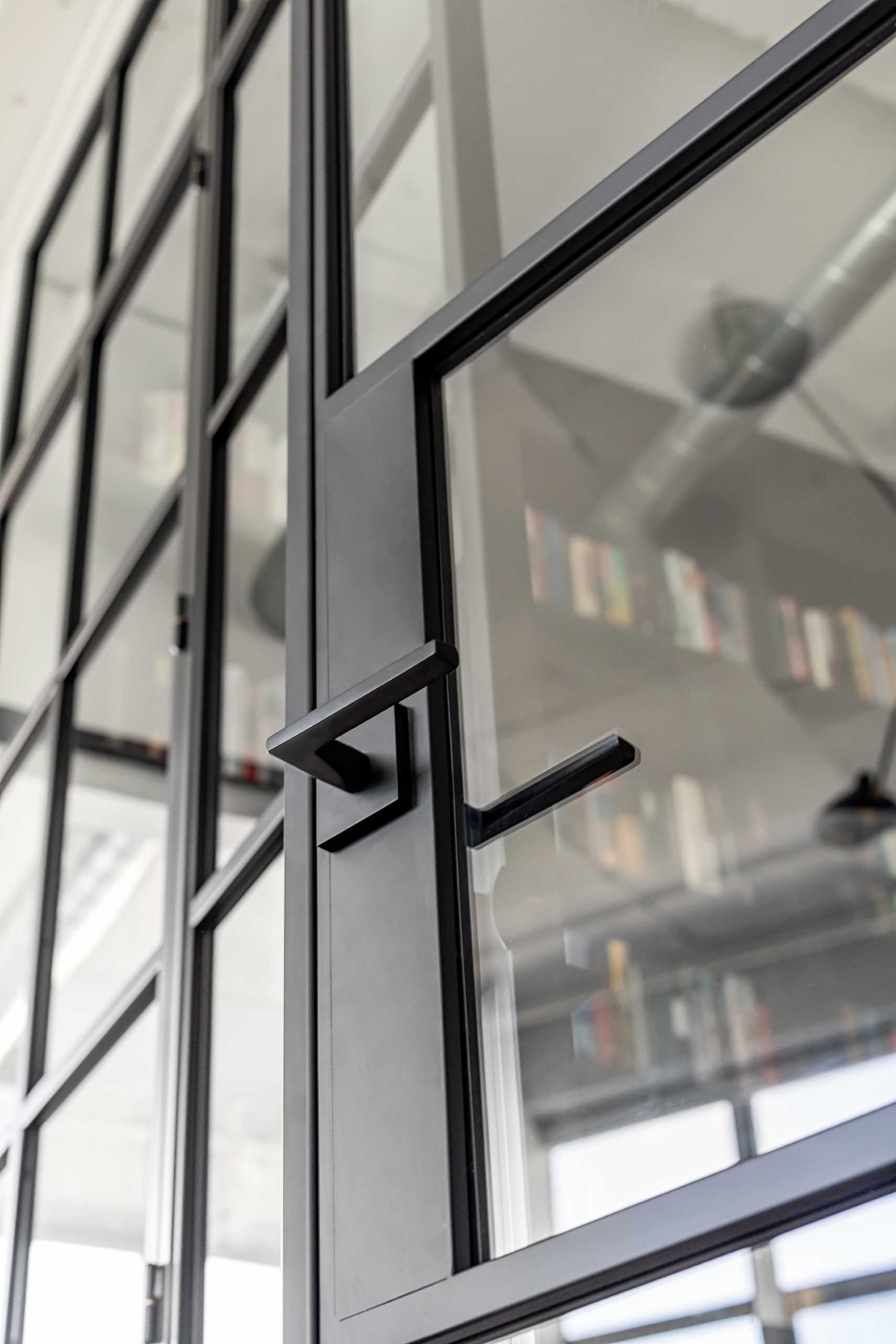
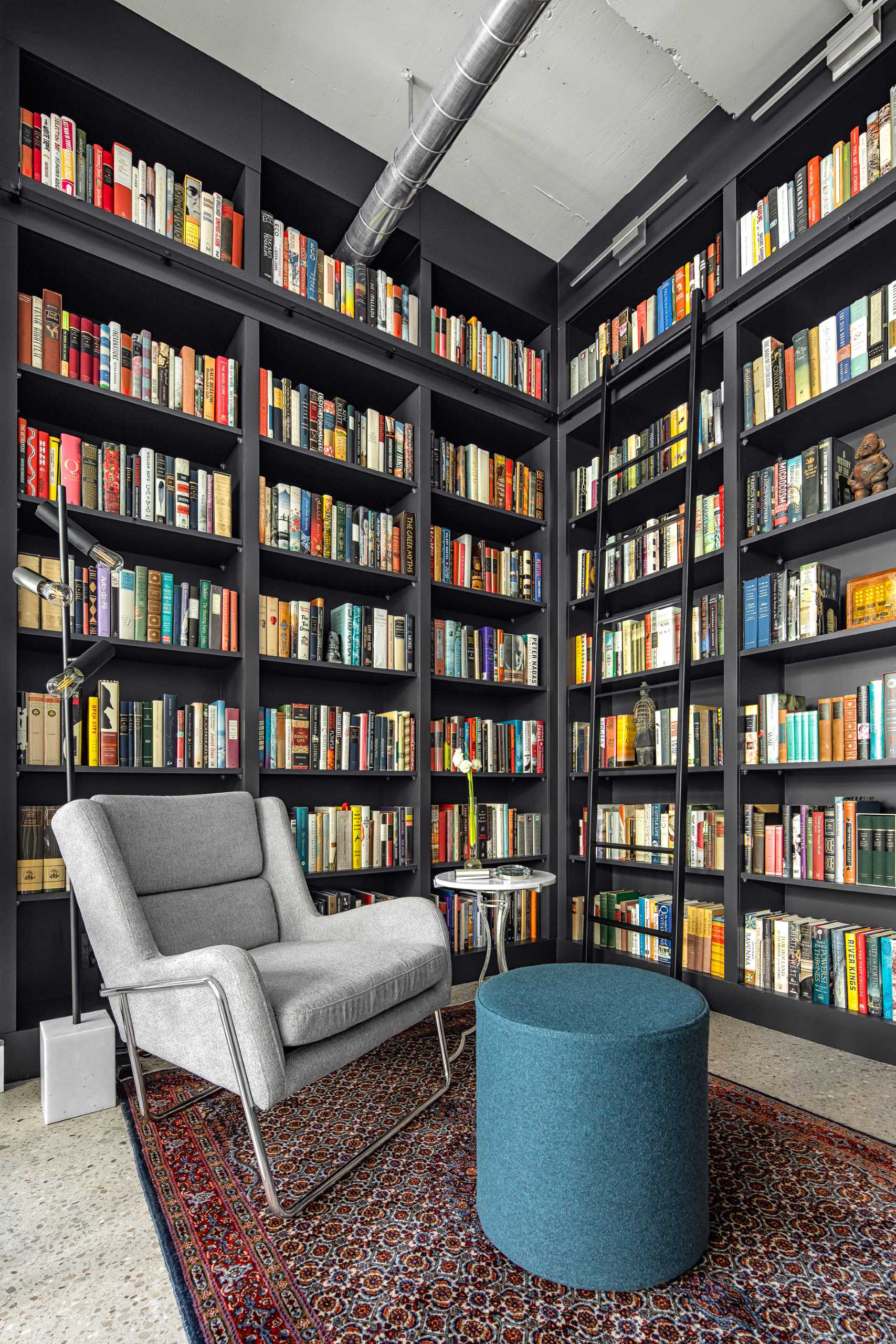
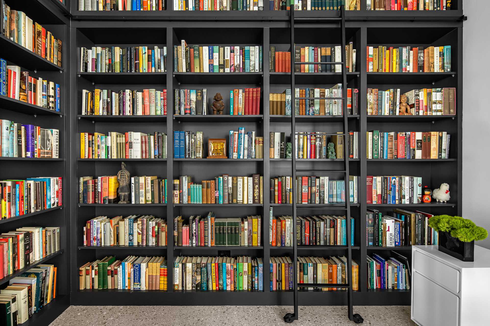
Custom-designed shelves house the client’s extensive book collection and special care was taken into consideration as the designers had to work with the existing HVAC and conduit locations, in addition to the ceiling height changes from the concrete slab poured.
The home office is positioned against an empty wall and has art with black frames to match the shelving.
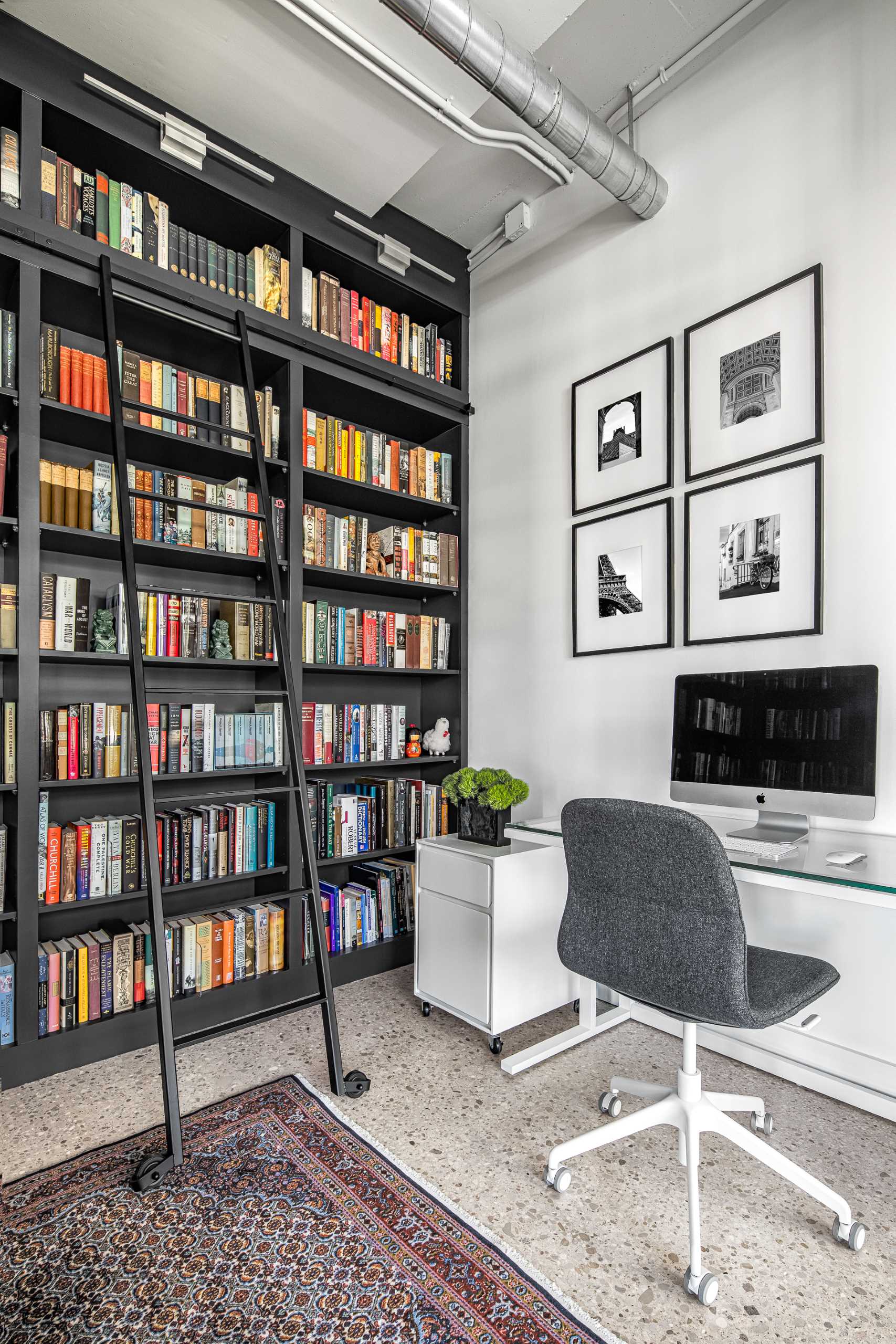
The clients also dreamed of having a ladder in their library which the designers were able to include with such a high space to work with.
Let’s take a look at the rest of the loft interior…
In the entryway, the designers worked with the existing sliding doors and rails in this unit, which were originally a dated yellowish natural wood color. Their solution was to prime and paint them black so they spoke with the other elements in the loft.
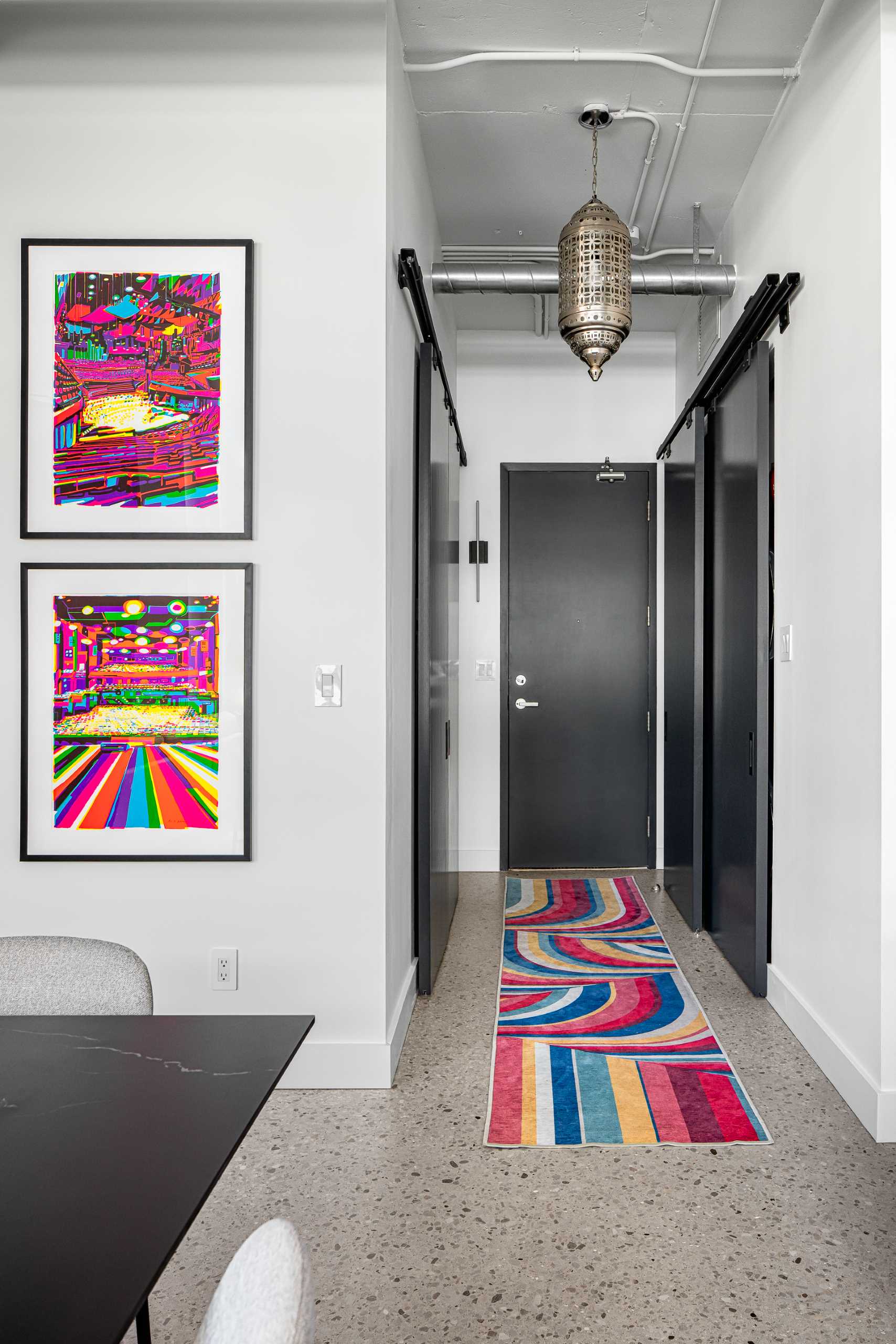
Throughout the interior, like in the open dining area, the designers kept the existing concrete floors and refinished them in epoxy to maintain the look and feel of an industrial loft.
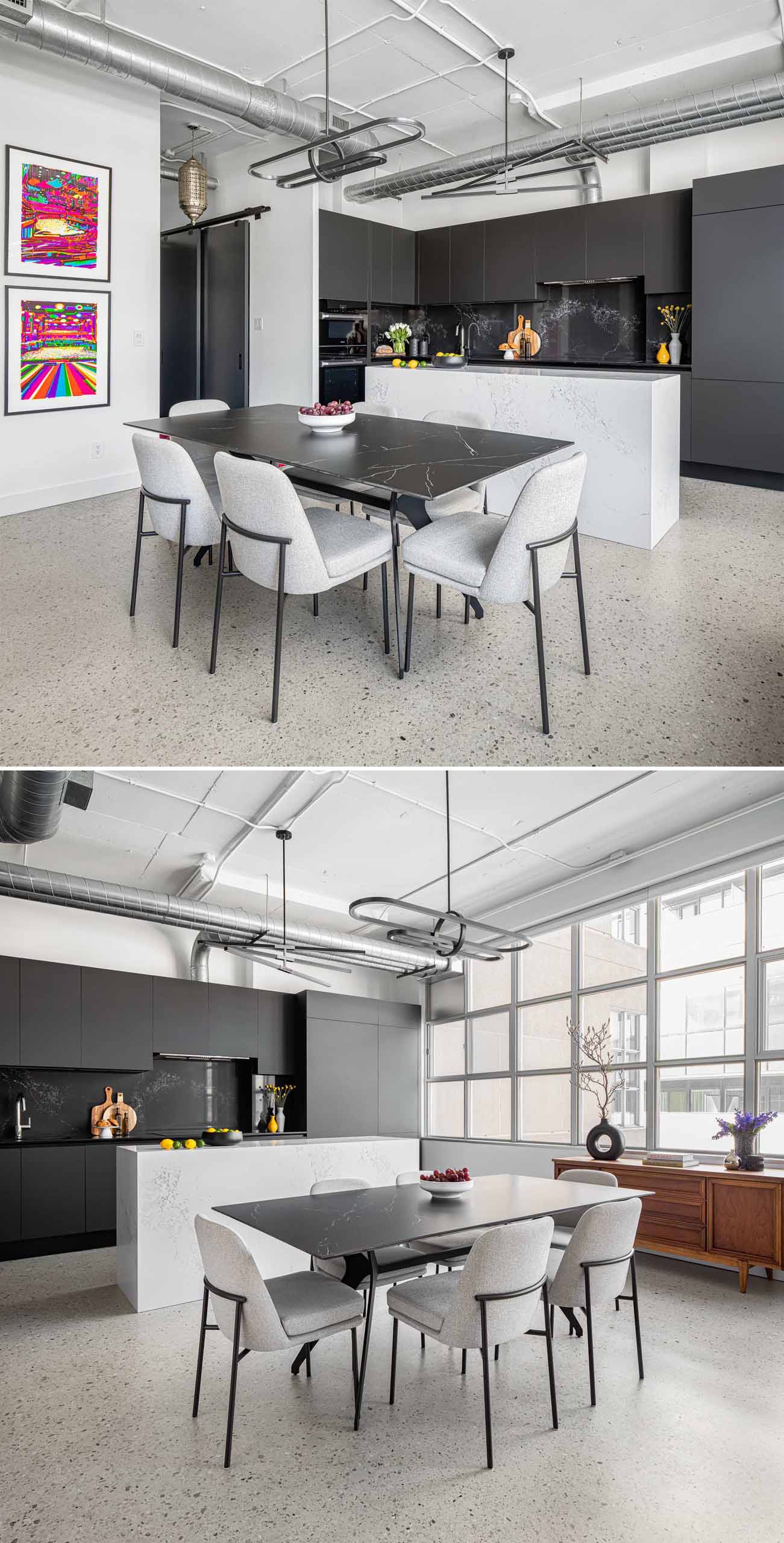
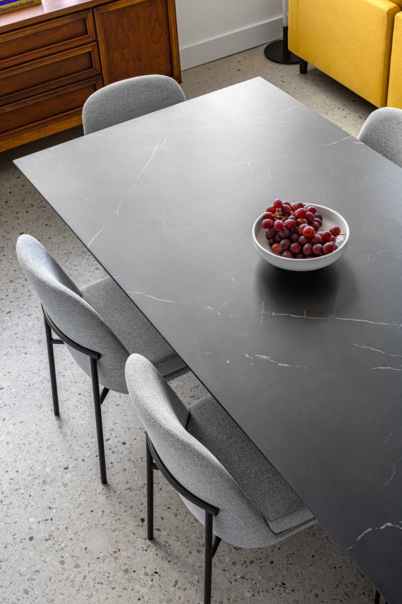
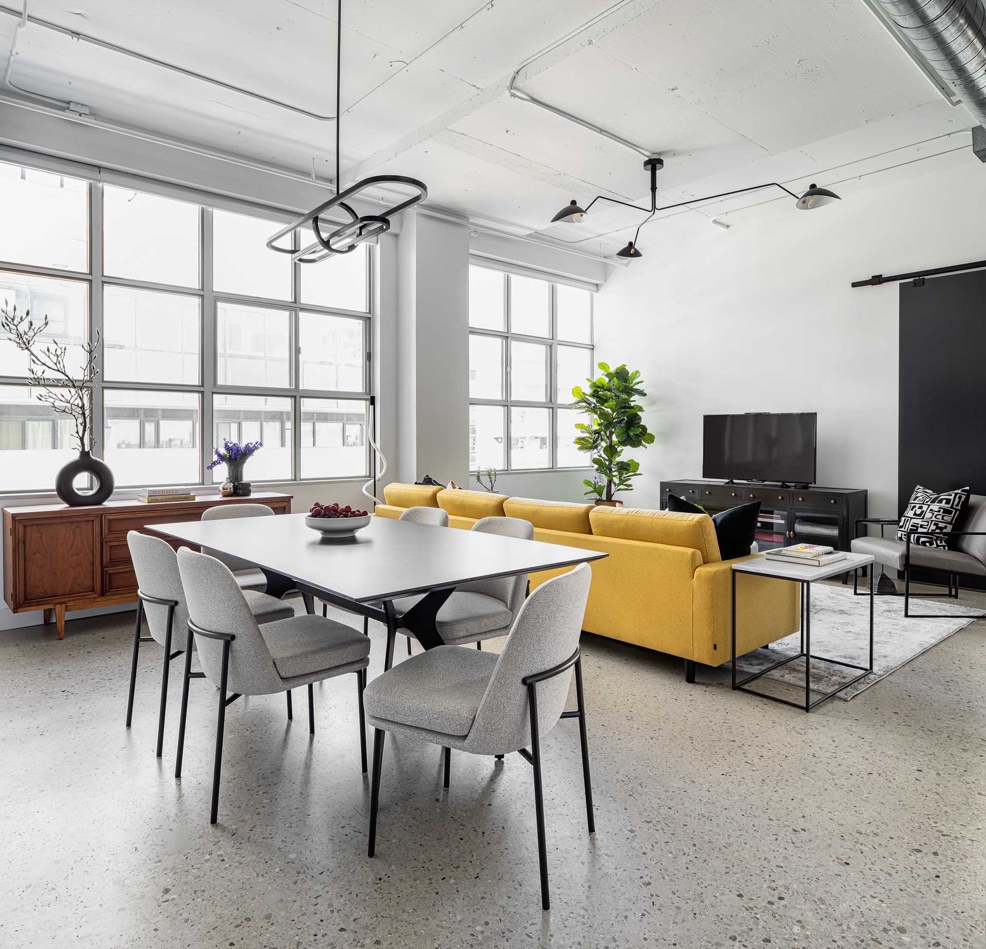
The dining area has been furnished with a black ceramic dining table with dramatic veins which is surrounded by more subtle grey upholstered chairs.
A trio of unique pendant lights that designate the kitchen, living, and dining areas in the open-concept loft.
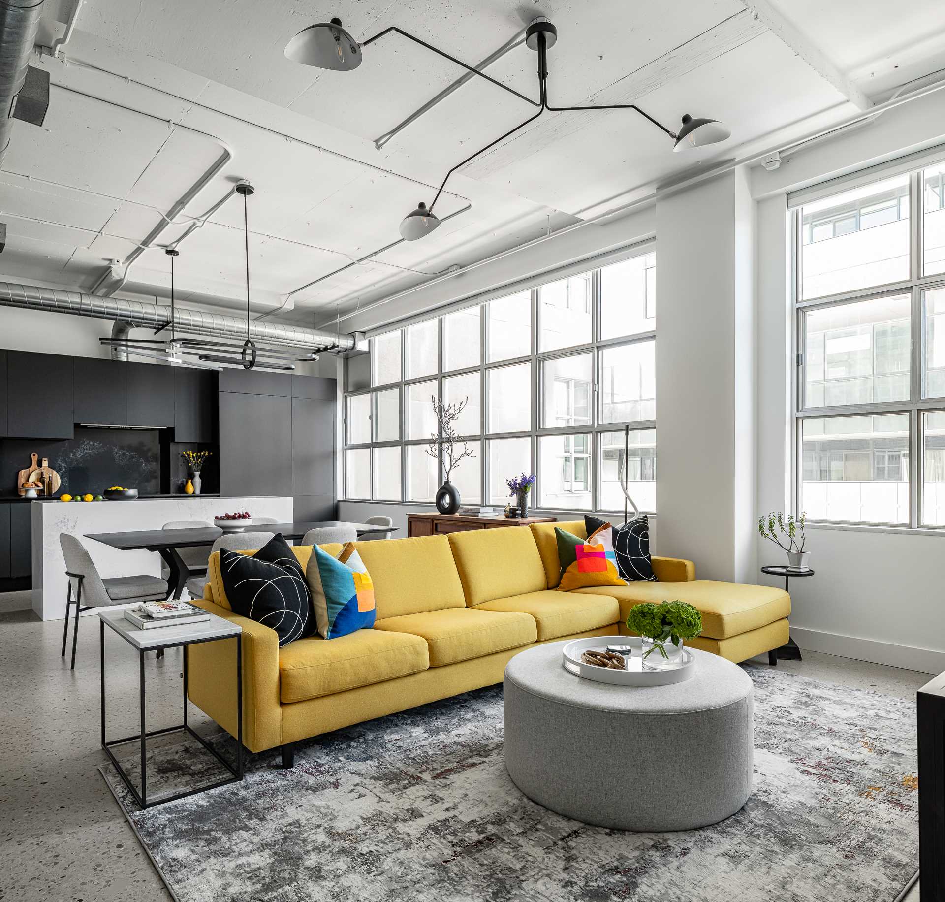
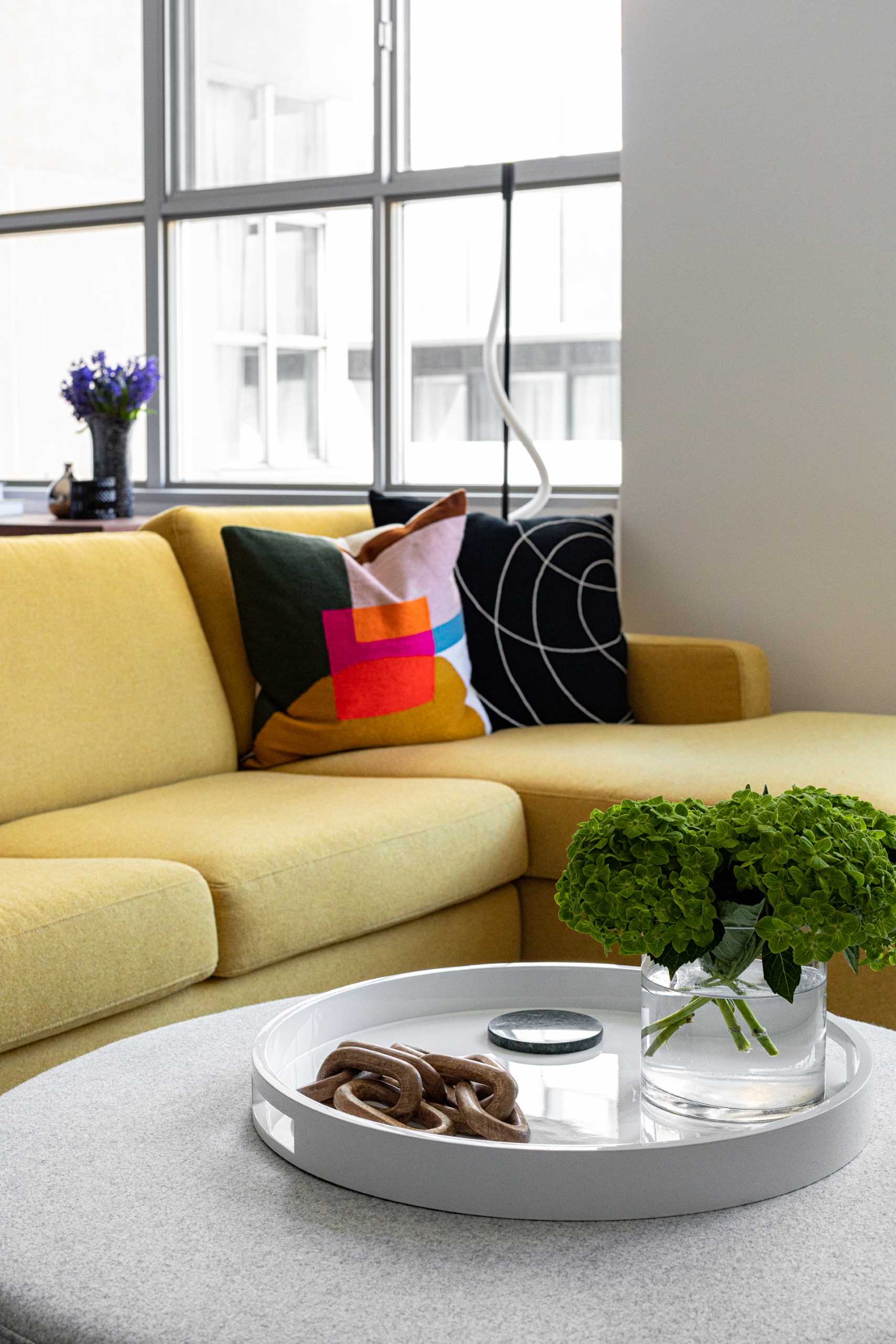
The living room is home to a bright yellow sectional, as well as a large rug by Christoph Niemann.
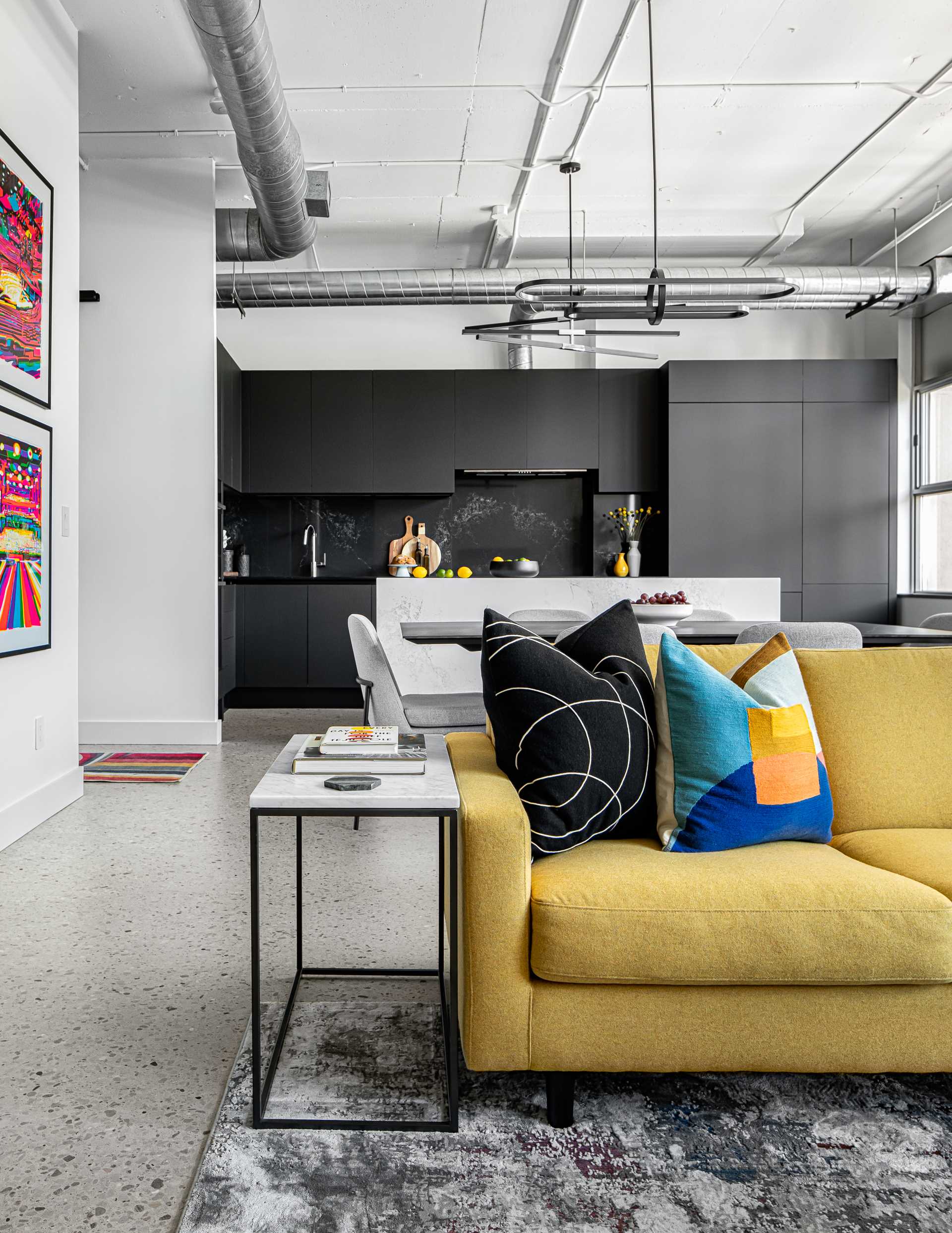
In the kitchen, located on the other side of the dining area, the designers completely renovated and re-configured the kitchen appliance locations to create a more functional flow.
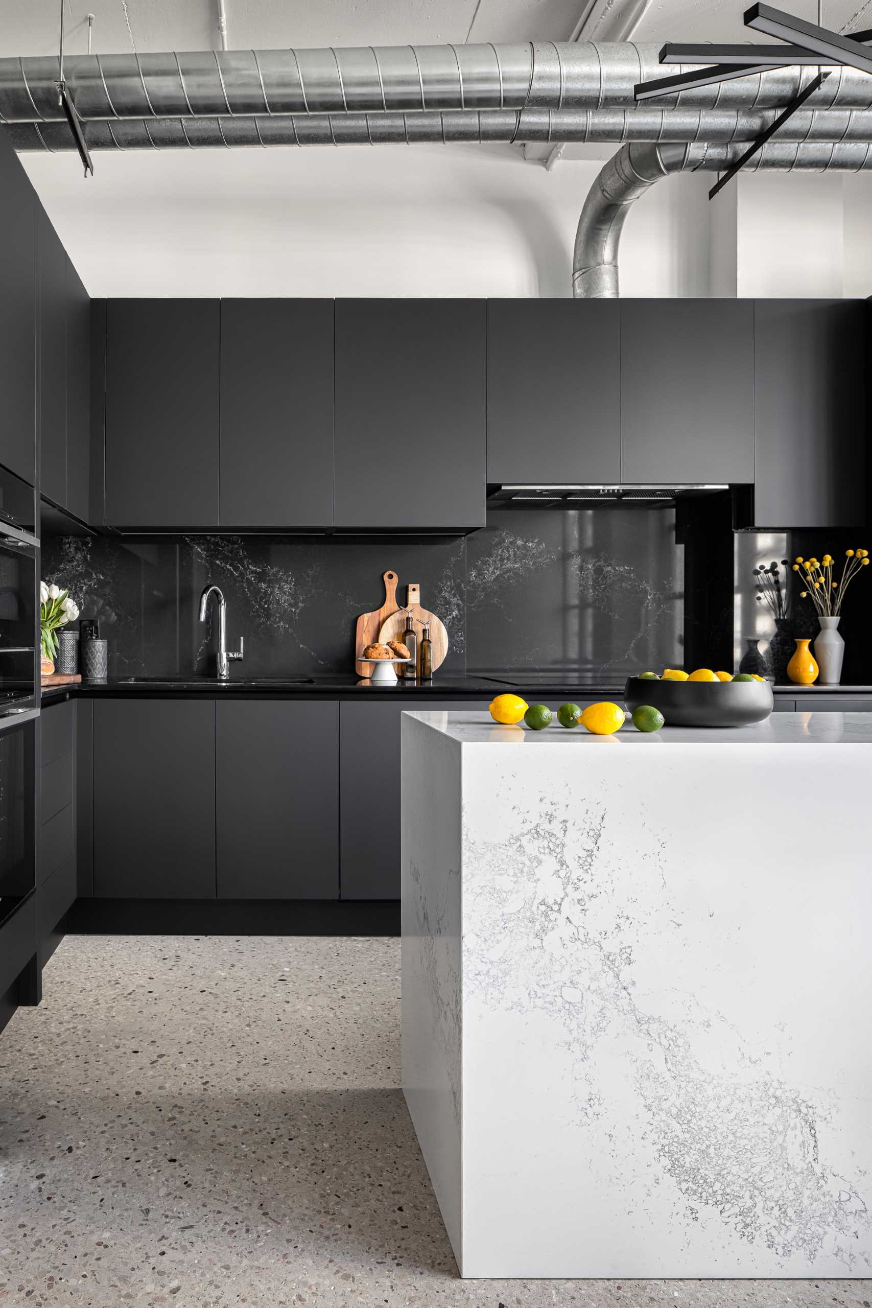
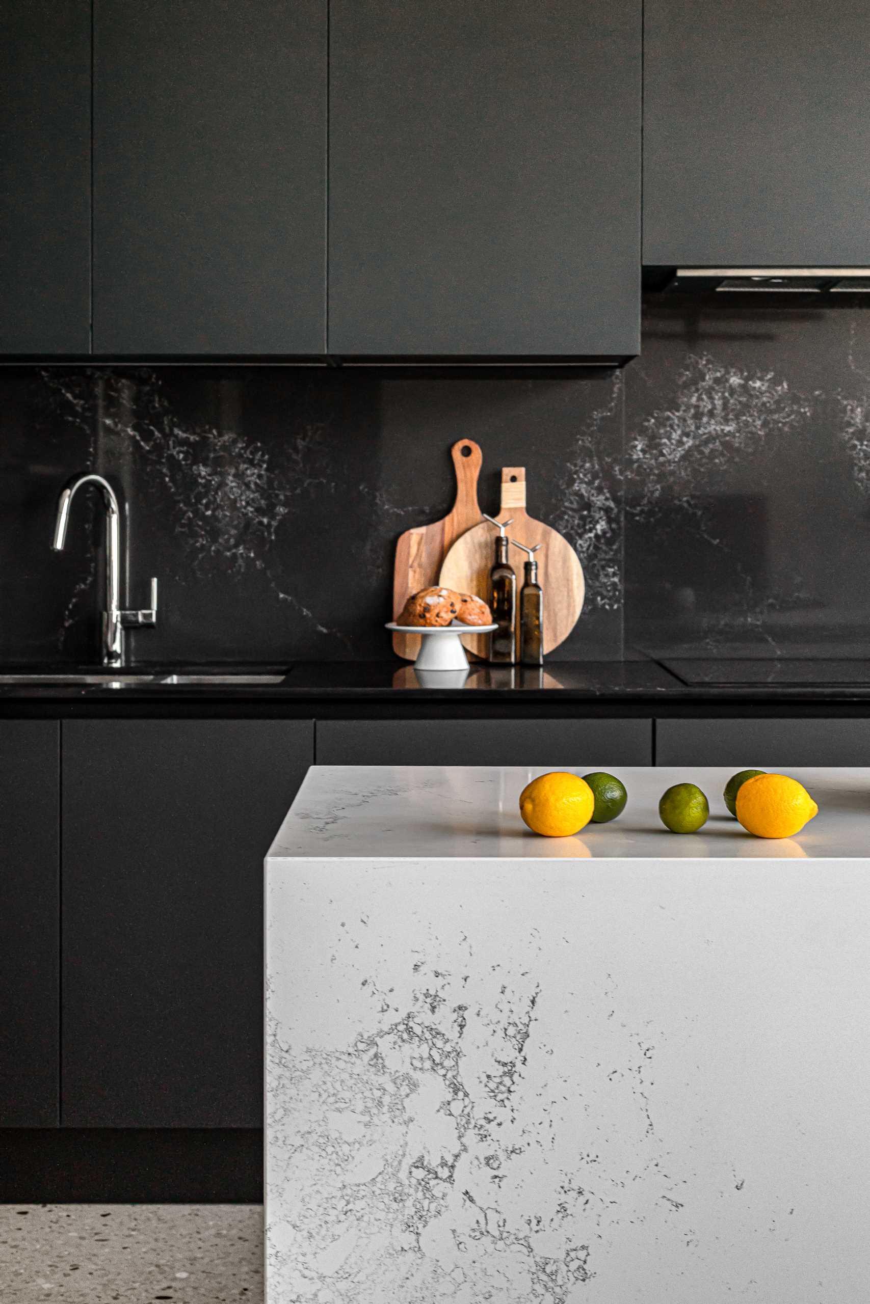
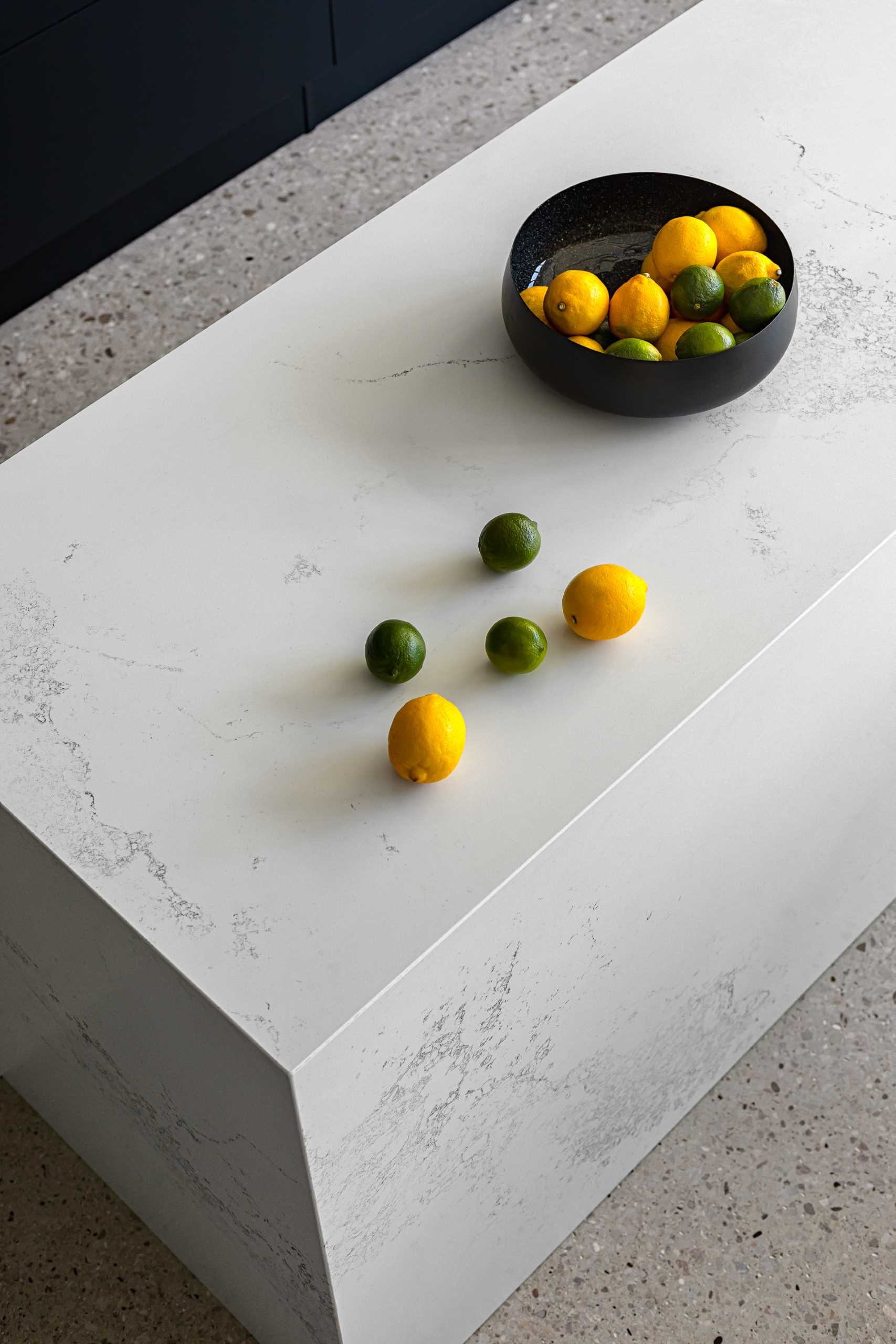
The client requested a bold black kitchen which the designers balanced with a large white island. The stone used for the island as well as the countertops and backsplash, both black and white, are of the same complimentary line so the veins match.
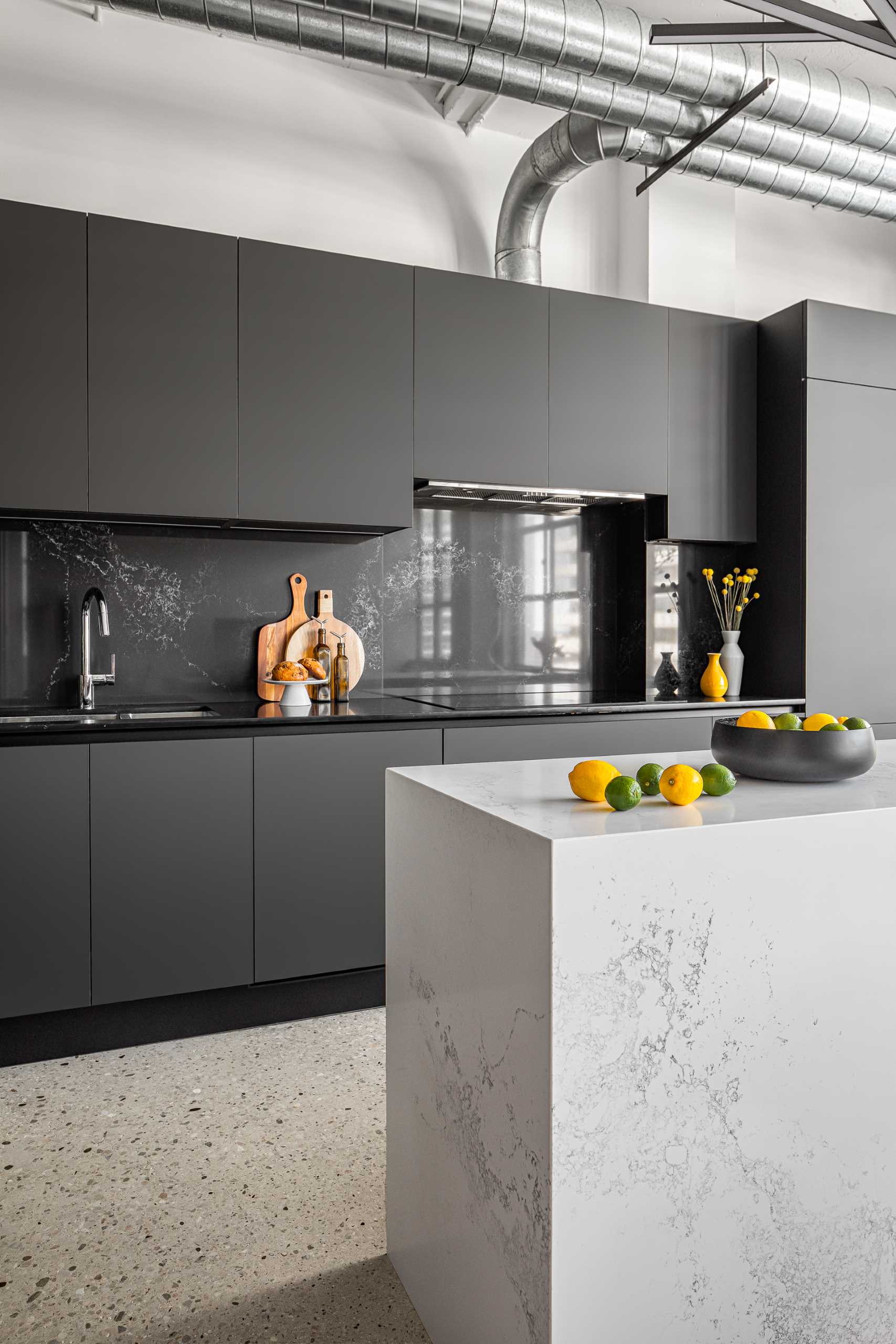
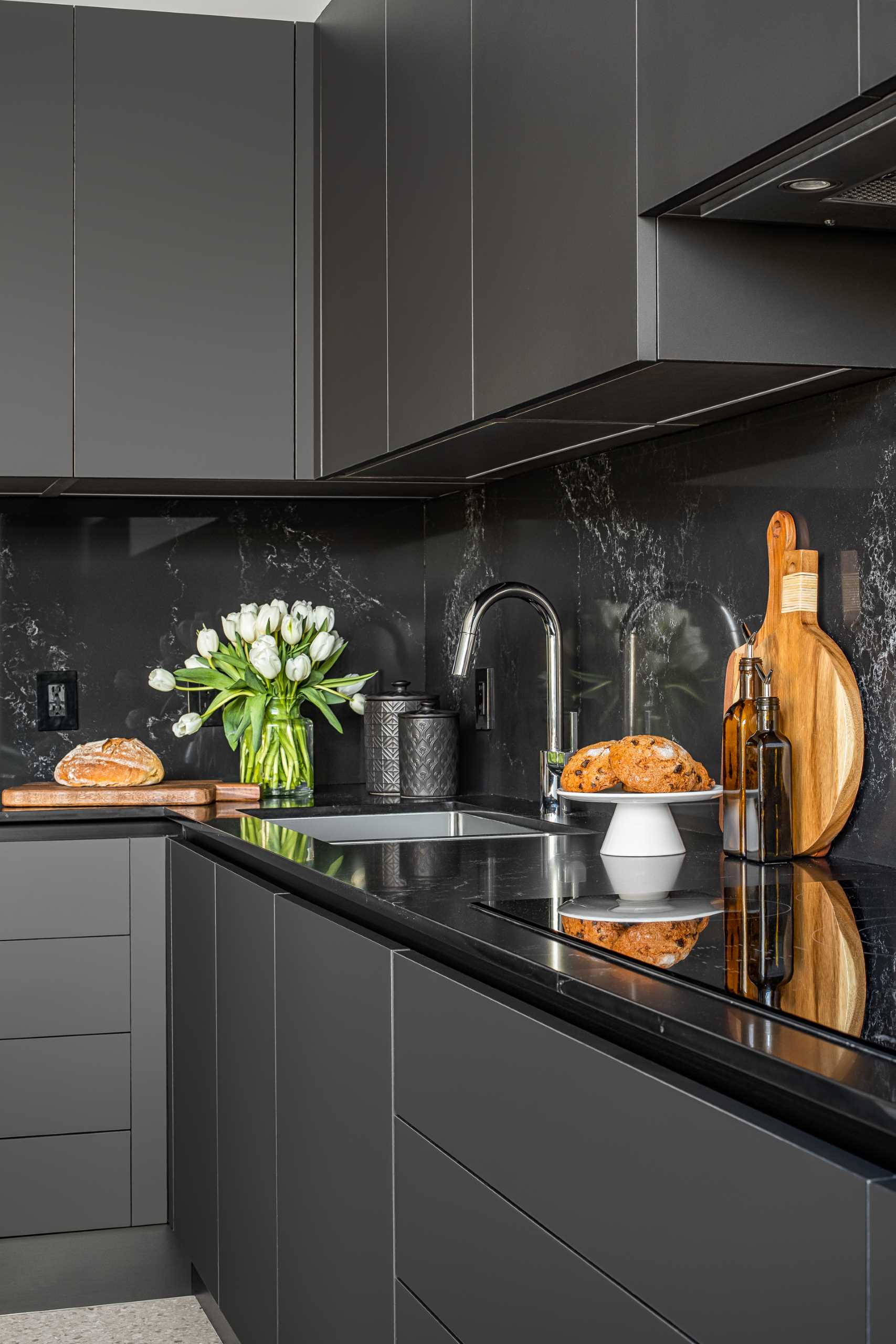
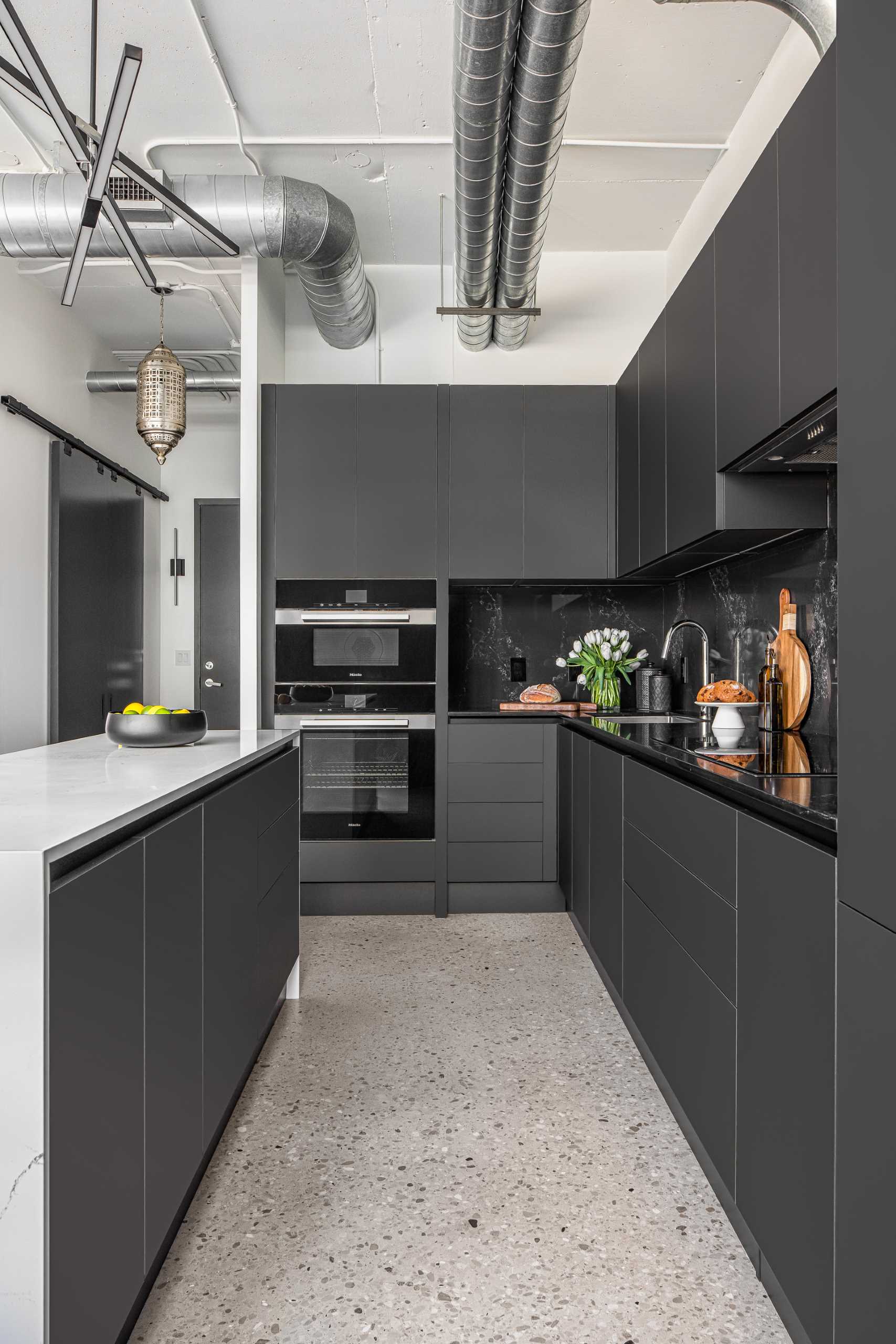
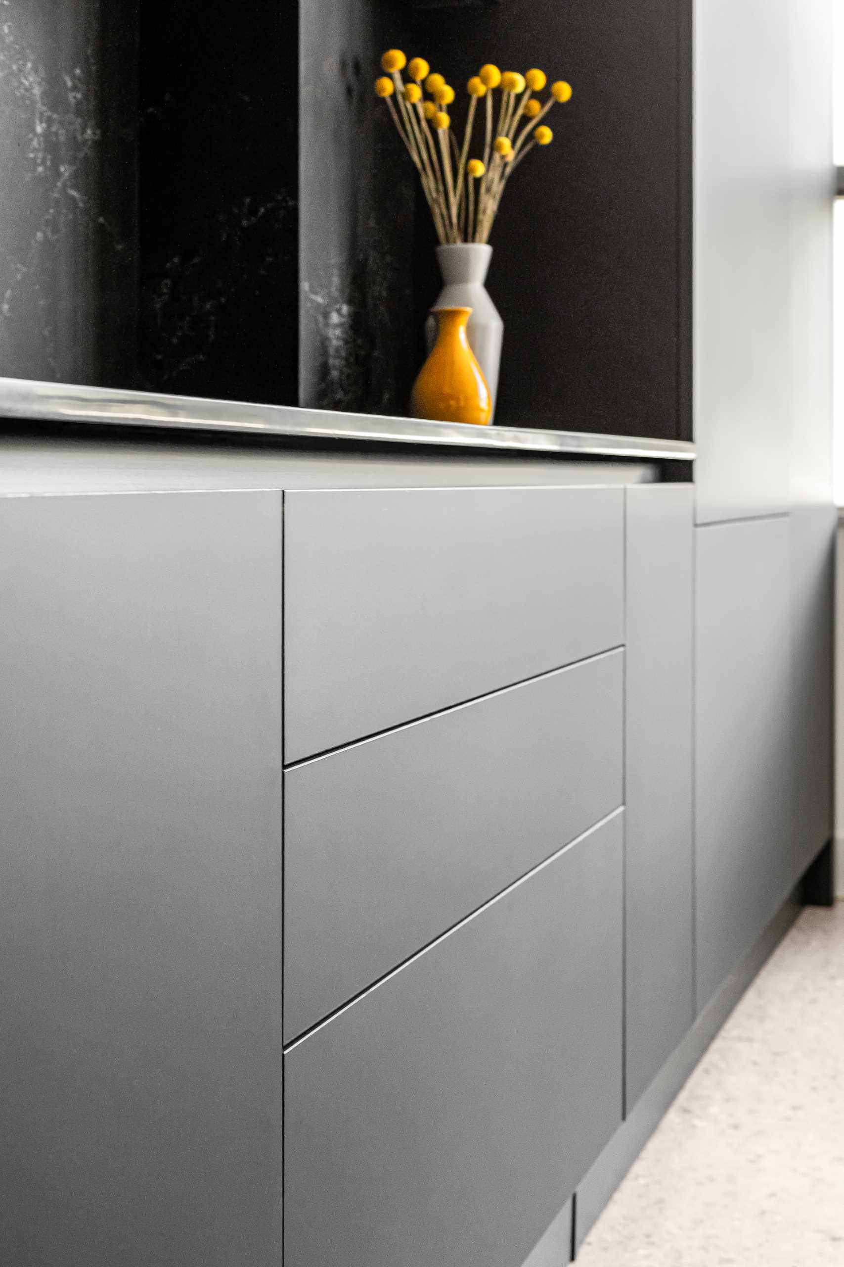
Another request from the client was to have no hardware pulls in the kitchen, which resulted in the inclusion of all integrated panel-ready appliances, push-open cabinetry, and fingertip pulls.
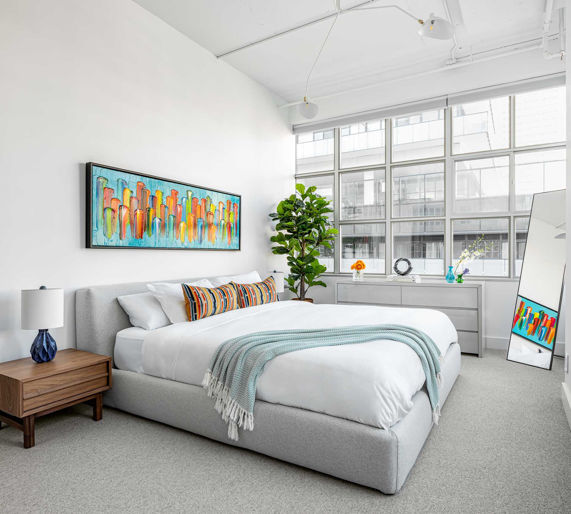
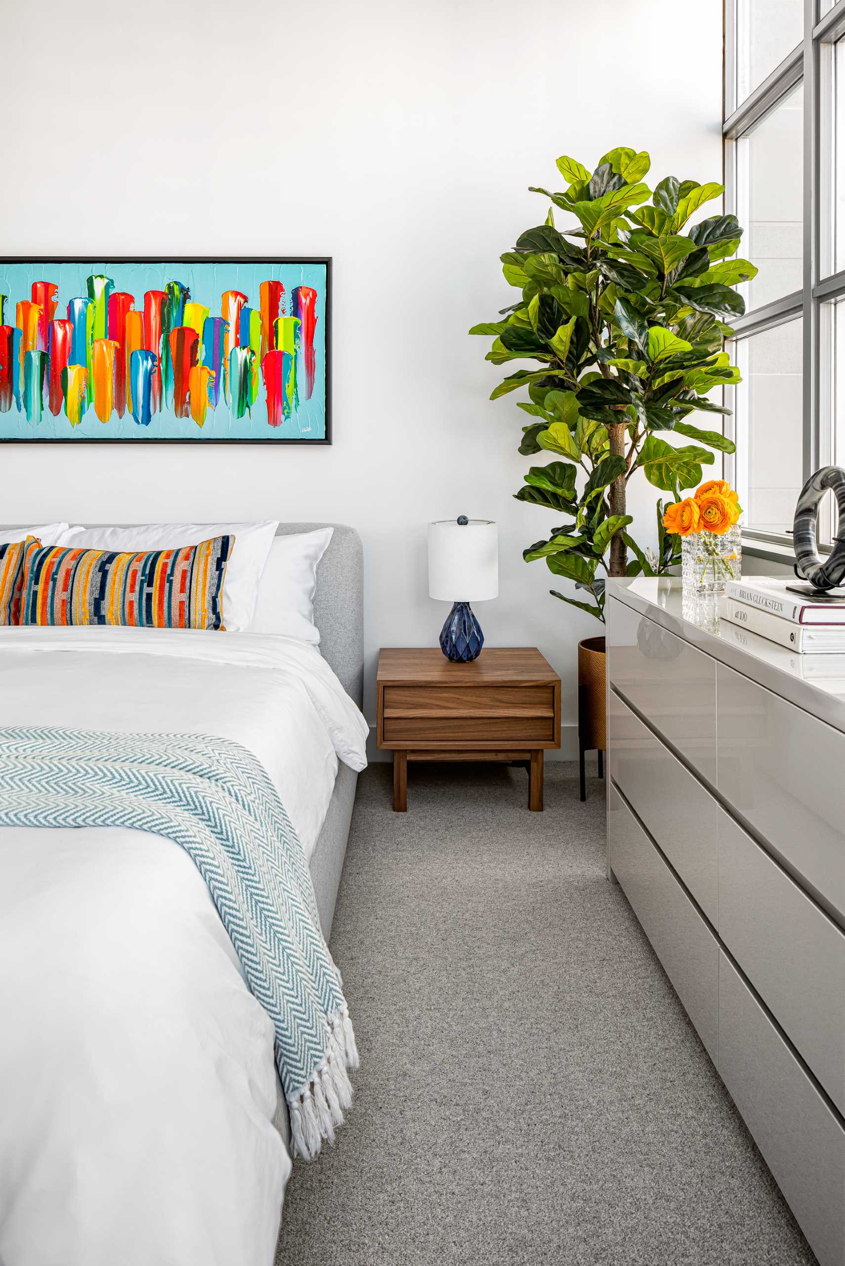
The primary bedroom has a more subtle color palette, with a large king bed in a soft grey wool fabric. A colorful artwork piece the client owned hangs overhead with walnut accent tables on either end.
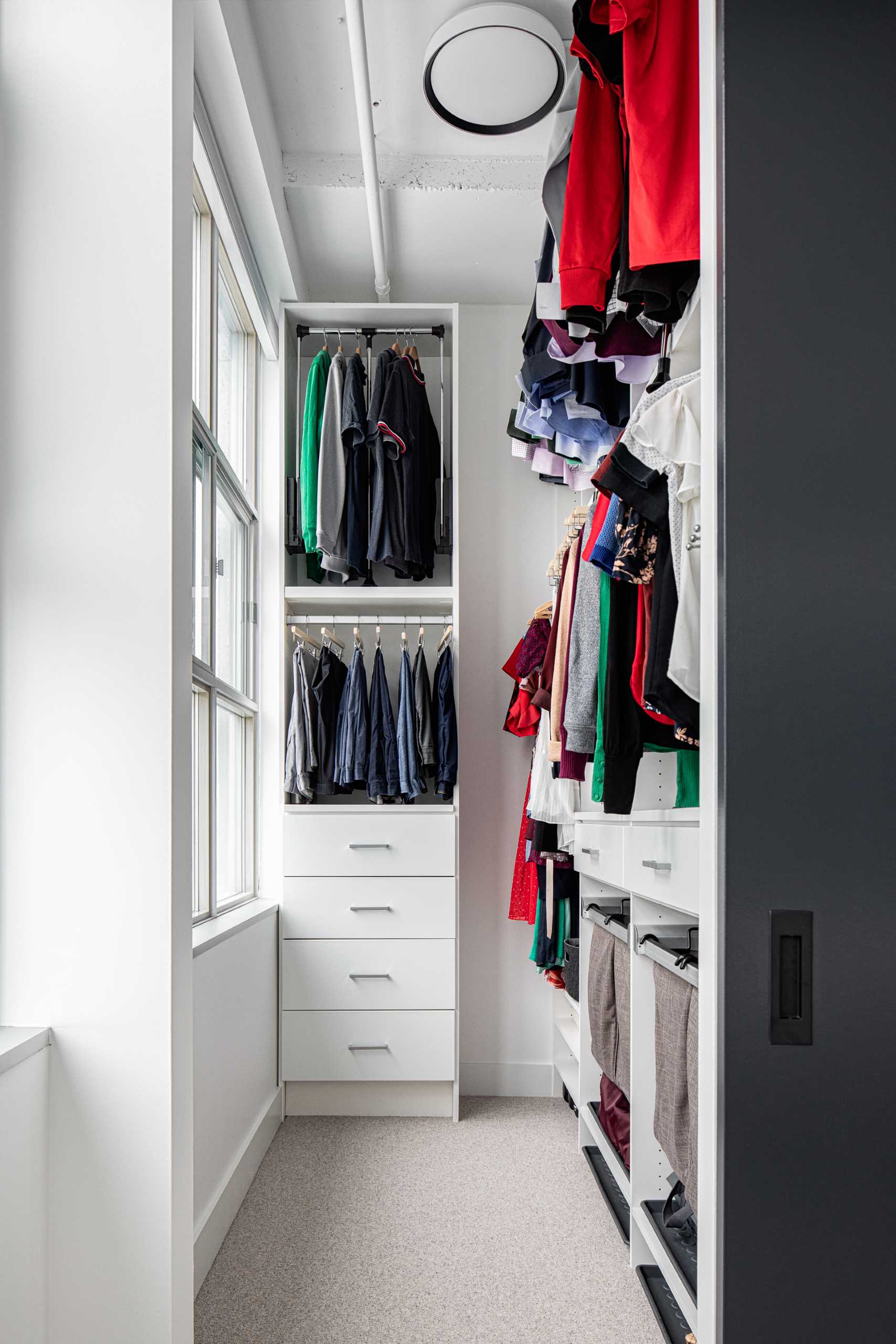
A walk-in closet makes use of the high ceilings to have the most storage space possible.
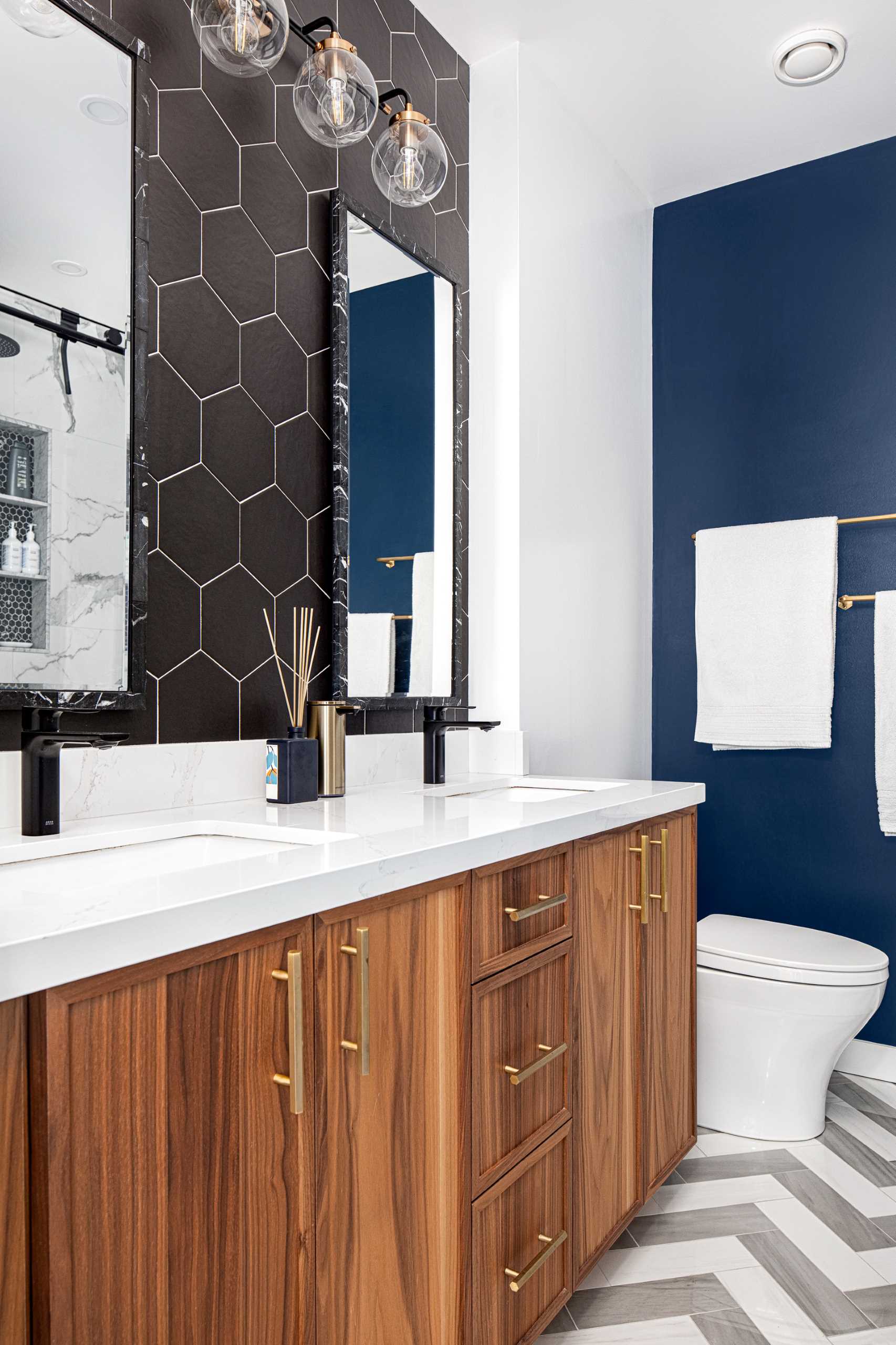
In the bathroom, black hexagonal tiles with white grout line the wall, while another wall, painted a deep blue adds a touch of color.
