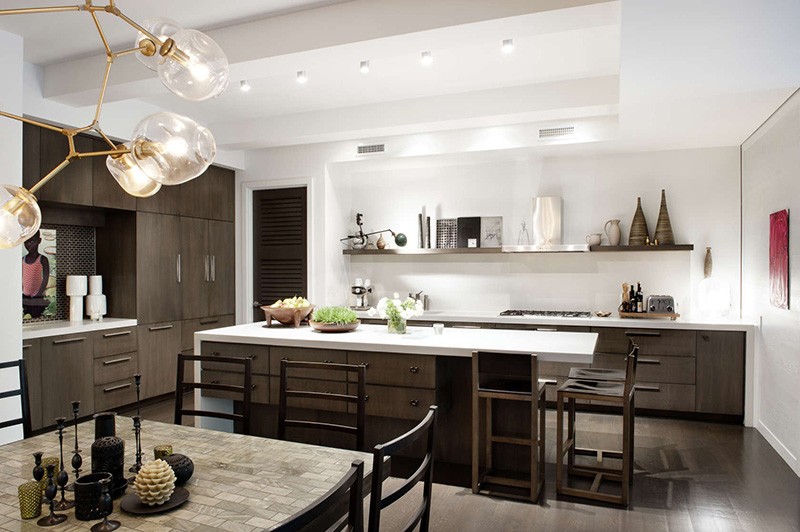
Did you notice the range hood/exhaust in the photo below? Probably not, because the designer, Steffani Aarons, placed shelving on either side, and as a result, it just blends into the scene instead of awkwardly standing out like so many of the range hoods we see in kitchens. Balance is a key principle of design, and the shelves on either side of the range hood help to balance the composition. Also notice the items placed on the shelves roughly match the height of the hood exhaust? That’s not just a lucky coincidence, that’s a designer introducing elements so that nothing in the scene overpowers, or seems heavier than any other part.
Design: Steffani Aarons of DHD Architecture + Interior Design
Photography: Emily Andrews
