Photography by Peter Bennetts
Austin Maynard Architects have designed this modern house in Melbourne, Australia, for a client and their family that wanted a home that they could live in for at least the next 25 years.
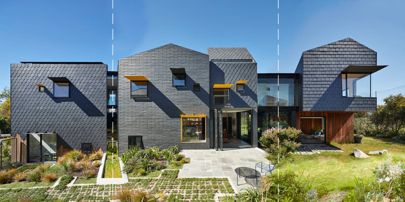
The house, which is broken up into sections, has been designed so that it could adapt to the clients young children as they grow into adulthood, and as a place that could accommodate grandparents in the near future.
Photography by Peter Bennetts
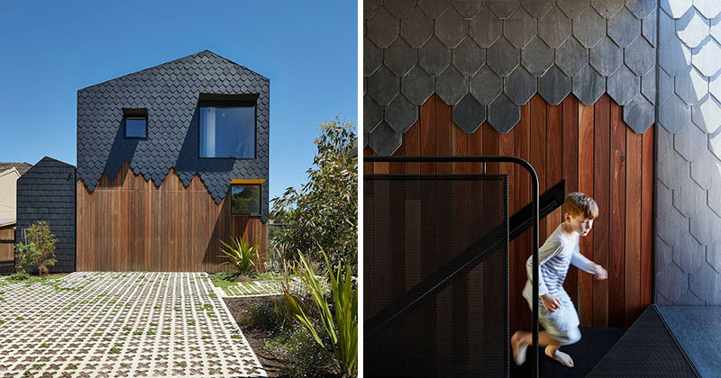
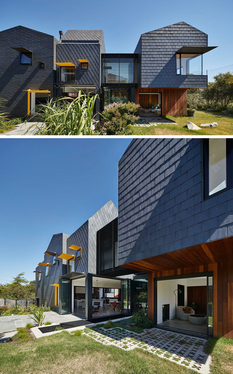
Covering the exterior of the home is a variety of dark grey slate in different patterns, with some sections having a staggered finish to show the wood underneath, especially at the side of the home where the garage is located.
Photography by Peter Bennetts
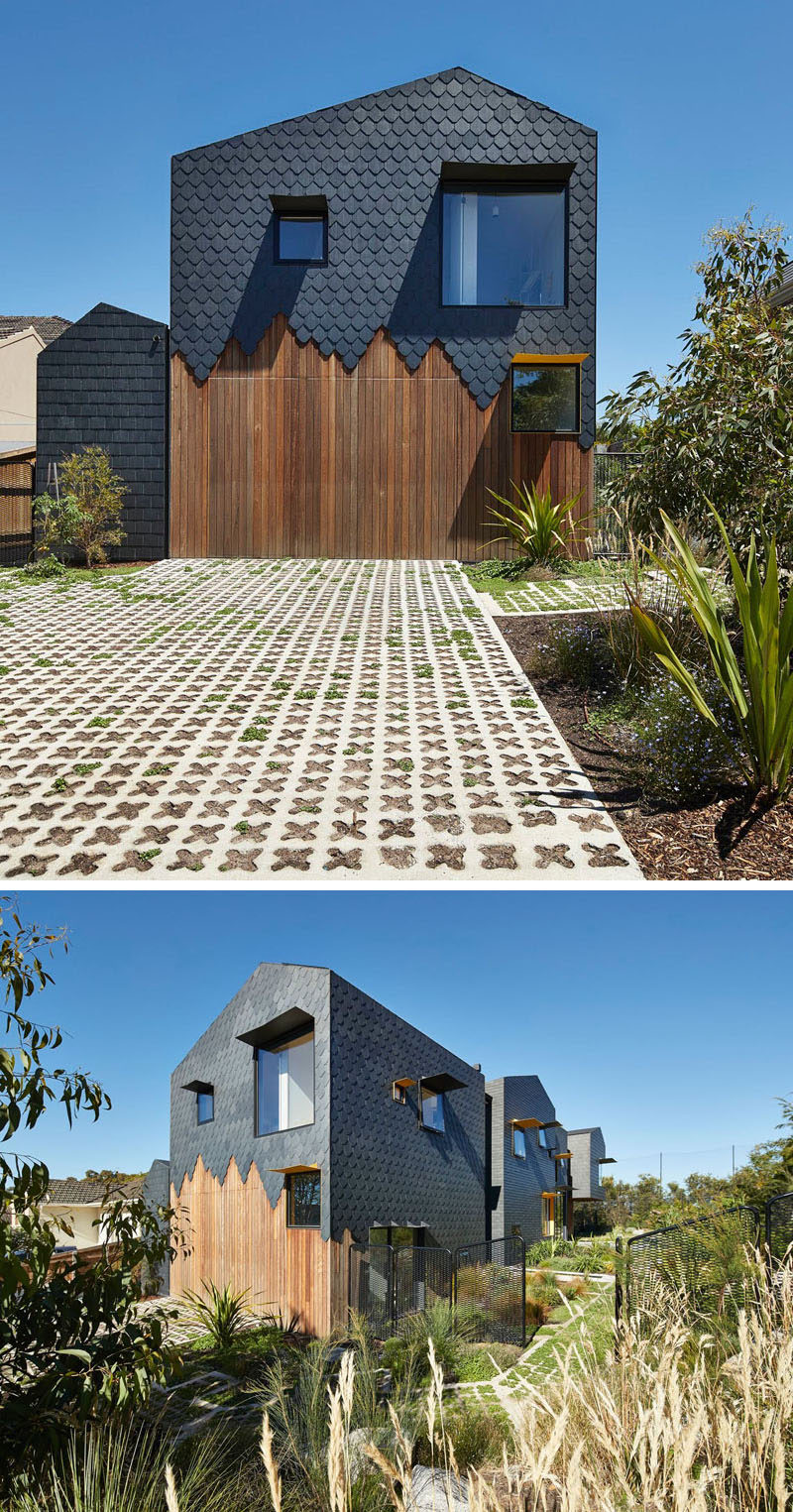
Here’s another look at the slate work that covers the home, and from this angle, you can see how the patterns of the installation change depending on the section of the house.
Photography by Peter Bennetts
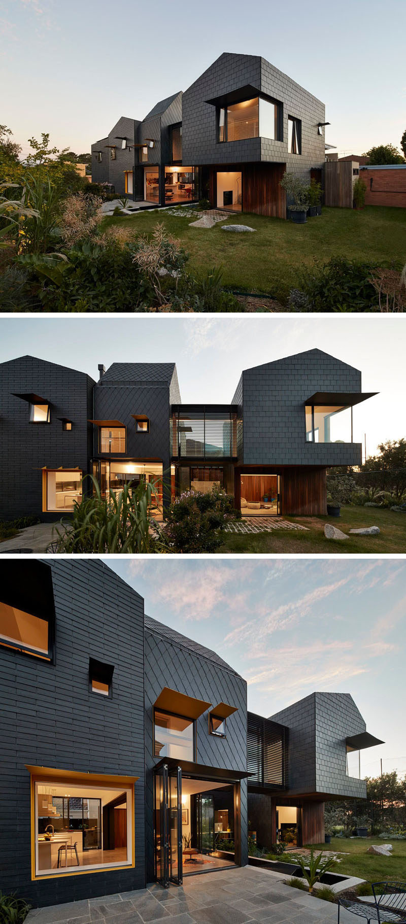
At night, the interior lights of the home create a warm glow and highlight the windows and various parts of the home that are open to the outdoors.
Photography by Peter Bennetts
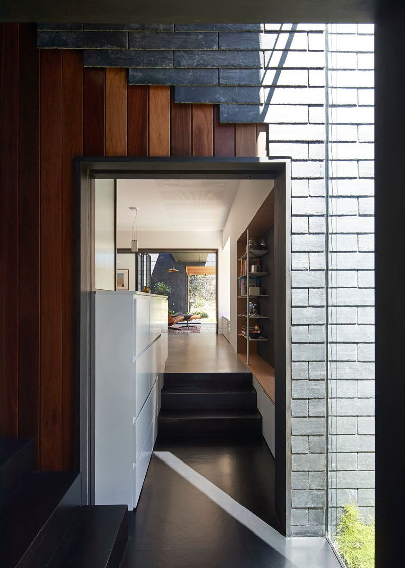
In some parts of the interior of the home, there are glimpses of the exterior materials flowing through to the interior.
Photography by Peter Bennetts
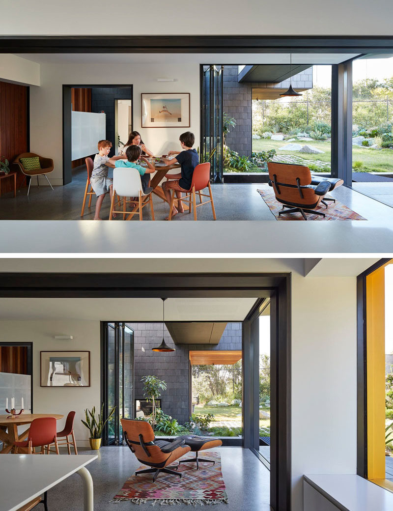
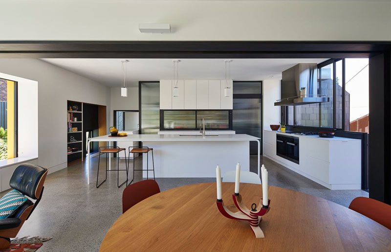
The main dining area has folding doors that open up to the backyard.
Photography by Peter Bennetts
Next to the dining area is the kitchen, with white cabinetry and a large island with plenty of space for extra seating.
Photography by Peter Bennetts
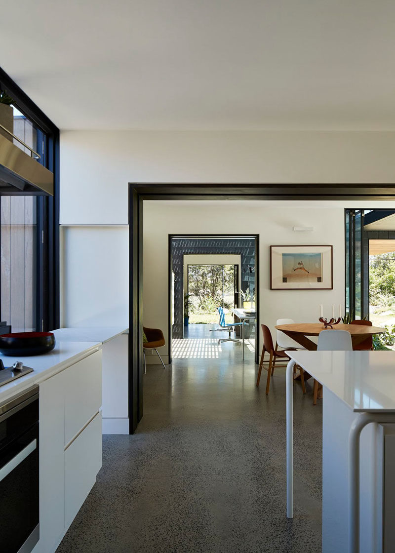
Beyond the kitchen and dining room is a music/living room that can be turned into a granny flat (apartment) for when the grandparents move in. It has its own bathroom and direct, wheelchair-friendly, garden access.
Photography by Peter Bennetts
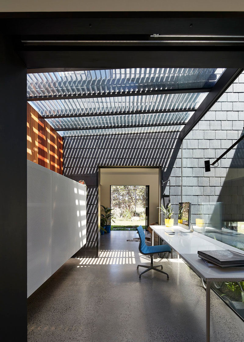
Separating the dining area and the granny flat is a home office that is flooded with natural light.
Photography by Peter Bennetts
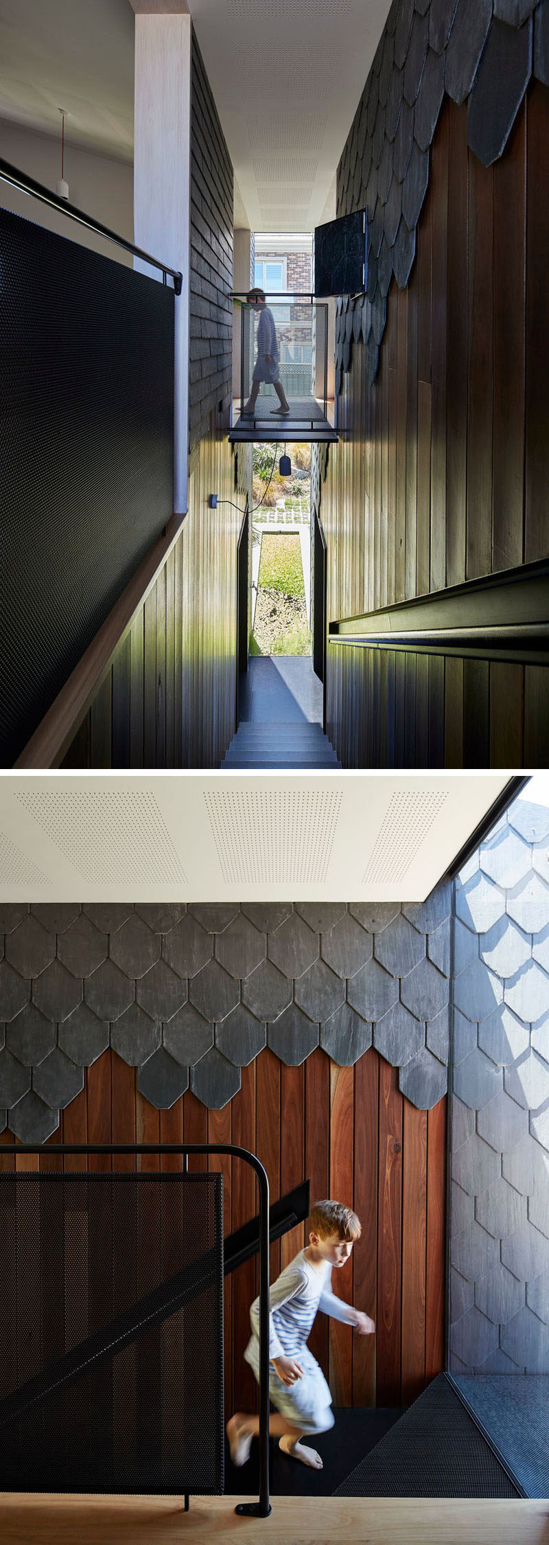
Here’s a look at another separation of the various sections of the house. This separation, that features the exterior materials inside, features stairs to the second floor of the home.
Photography by Peter Bennetts
Upstairs, there’s a living room with a hanging black fireplace that matches the black window frames.
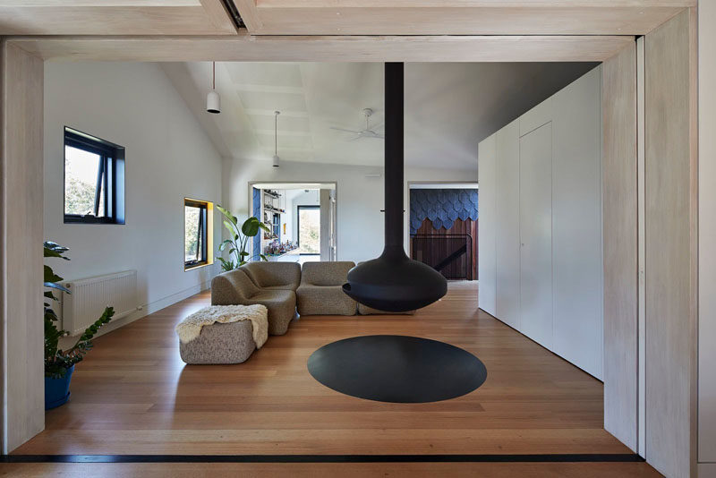
Photography by Peter Bennetts
On one side of the living room are the children’s bedrooms.
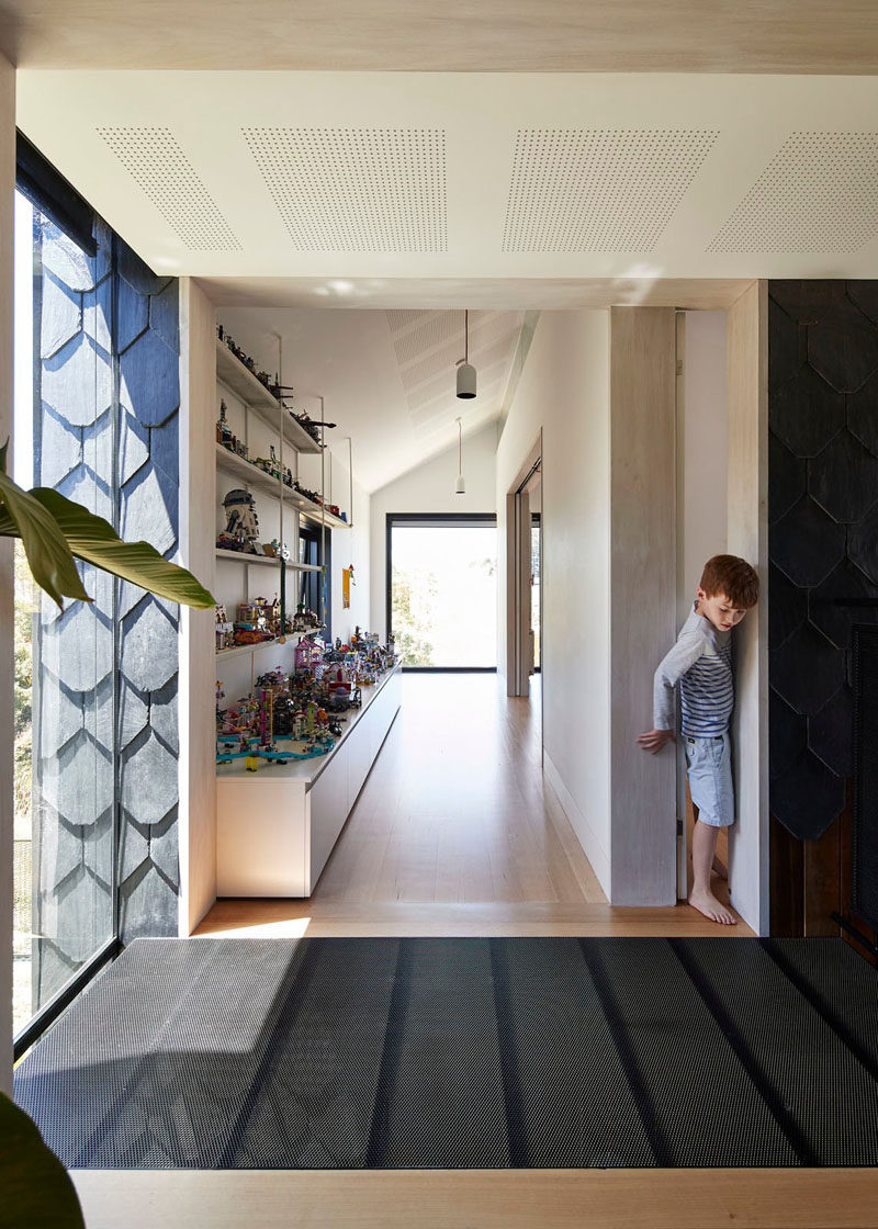
Photography by Peter Bennetts
Before reaching the bedrooms, there’s a section of the floor that’s perforated to look down to the lower floor. This allows sunlight from the tall vertical window to fill the staircase too.
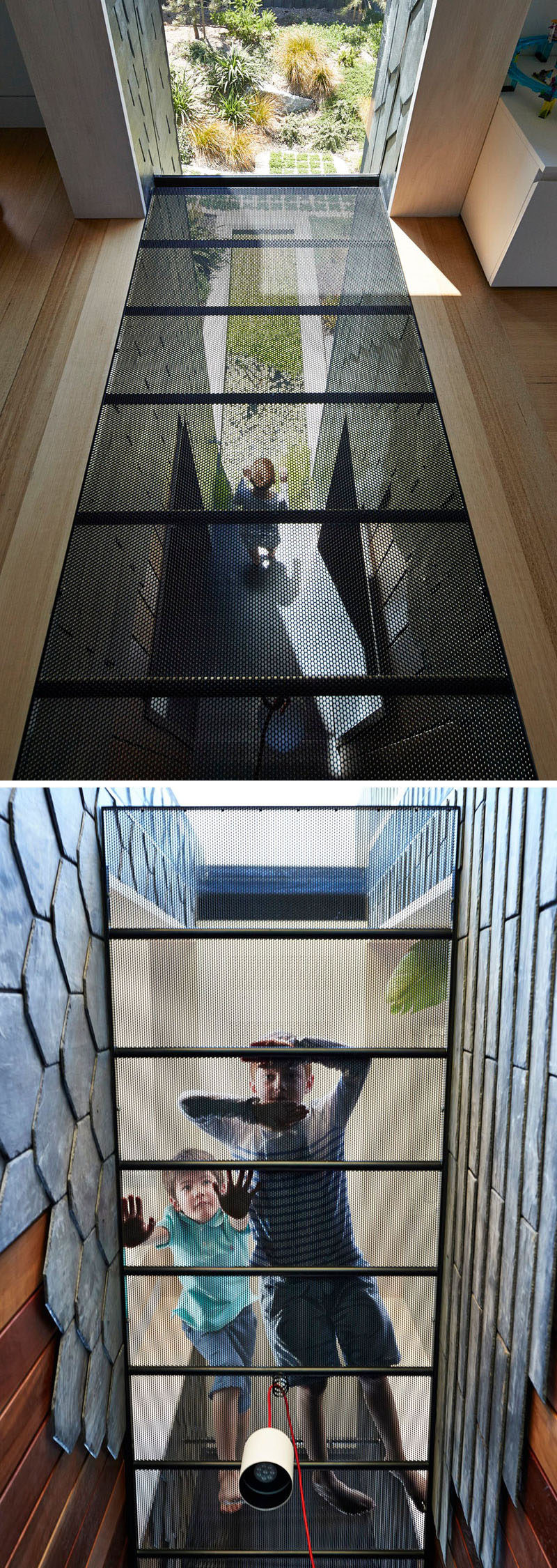
Photography by Peter Bennetts
Here’s a look at the kid’s bedrooms, that can be opened up to each other, the hallways, the study and the living area. This will make it easy to change the function of these rooms as the children grow.
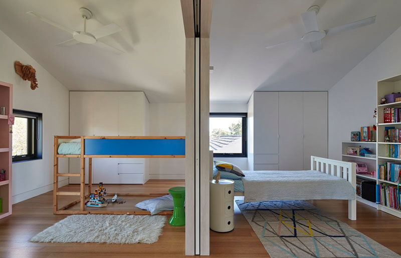
Photography by Peter Bennetts
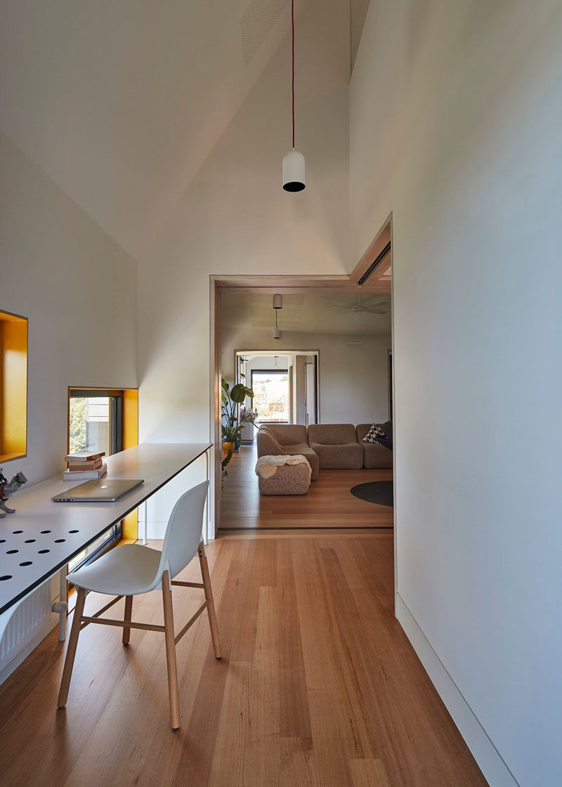
On the opposite side of the living room is the study that can also be sectioned off.
Photography by Peter Bennetts
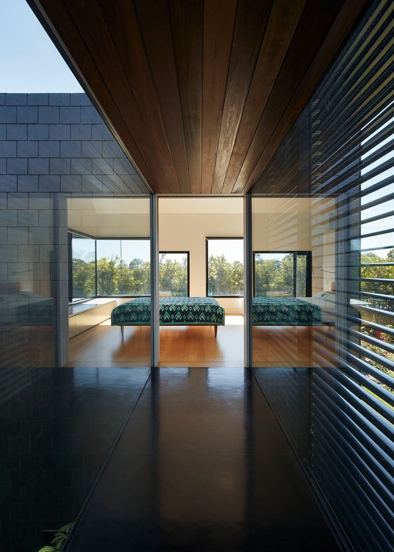
To reach the private master bedroom (or parent’s room) there’s a bridge that must be crossed, that also provides views of both sides of the home.
Photography by Peter Bennetts
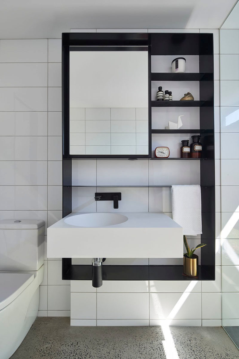
Here’s a look at one of the bathrooms in the home, where white tiles have been paired with a black wall cabinet for a bold and contrasting look.
