Richard Beard Architects and The Wiseman Group has sent us photos of a project they recently completed in San Francisco, California, that involved updating a historic Victorian-era home.
Over the span of several years, the house underwent a complete restructuring and received a new interior layout to accommodate a large family.
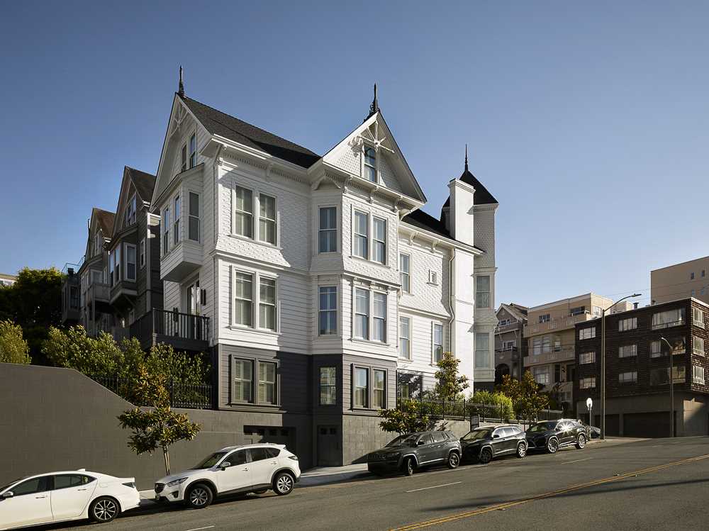
The first step in the renovation involved lifting the home to create a multi-car underground garage and basement, while also allowing for a more spacious interior layout.
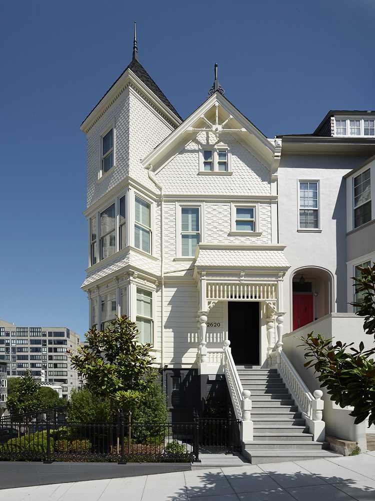
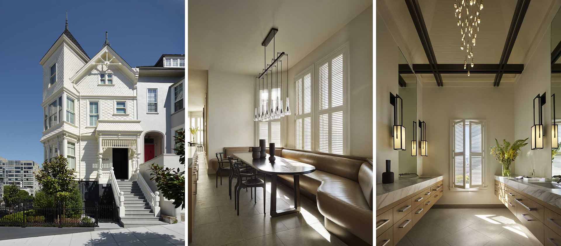
The exteriors were repaired and preserved according to the Secretary of Interior Standards for the treatment for historic properties. The lower portion of the exterior was painted a dark charcoal color, contrasting with the clean, bright white of everything above.
The jet-black front door harmonizes with the base color and serves as a transition between the classic exterior and the contemporary interiors within.
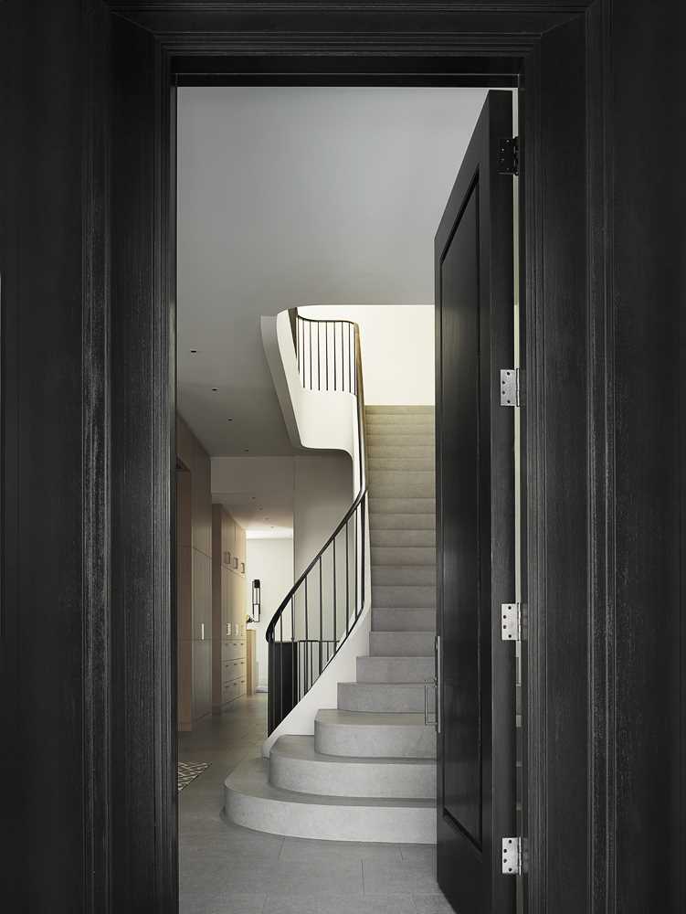
The interiors have been furnished in a minimalist style, with Paul Wiseman, the interior designer for the project explaining “We didn’t pull any Victorian details into the interior, the idea was that the interior was a counterpoint to the traditional exterior.”
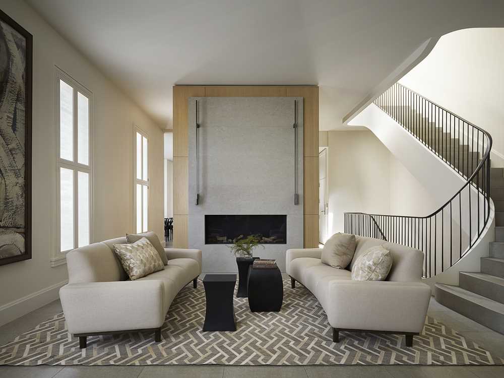
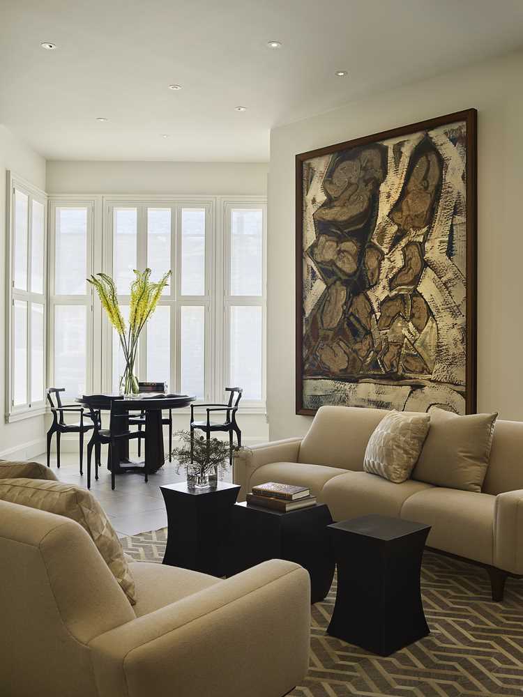
The foyer includes a sitting area with a fireplace, a large art piece, and a table and chairs by the windows.
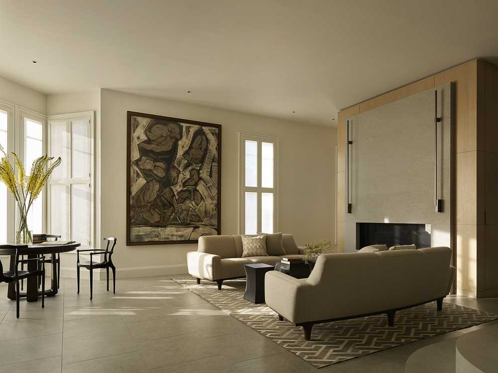
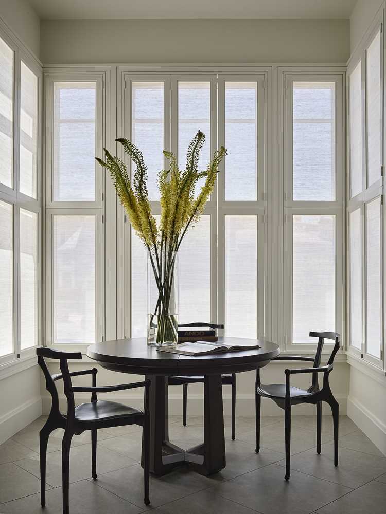
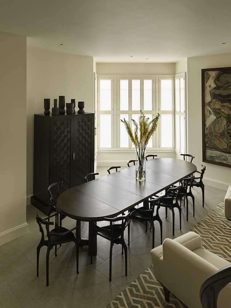
The table and chairs enjoy the natural light from the windows on three sides, and when needed, the table can be expanded into a large 12-person dining table.
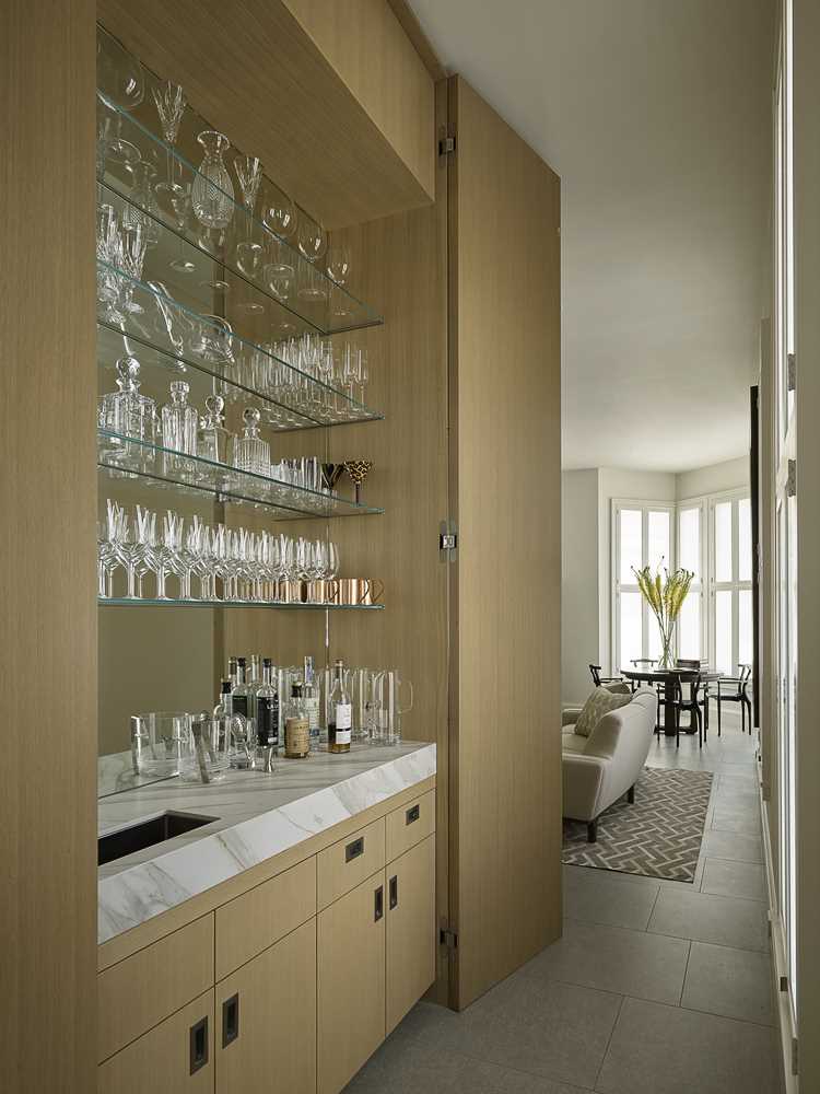
Nearby in the hallway that connects the living/dining area and the kitchen, there’s a custom cabinet that hides a wet bar with a mirror back and glass shelves.
The hallway opens up into the kitchen and a banquette seating area that wraps around the wall.
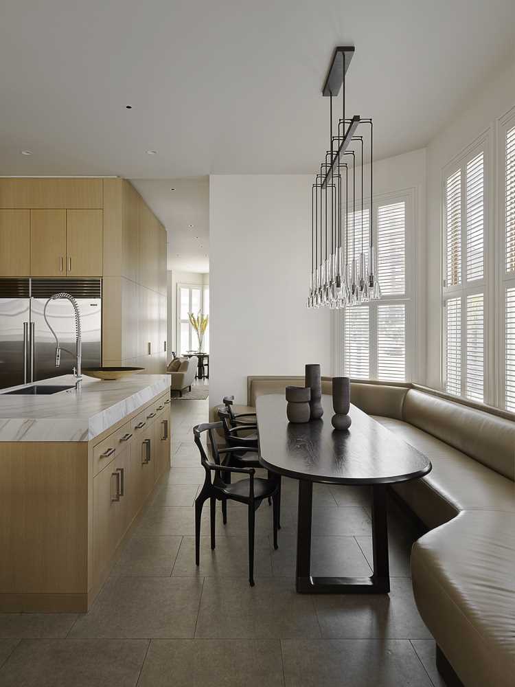
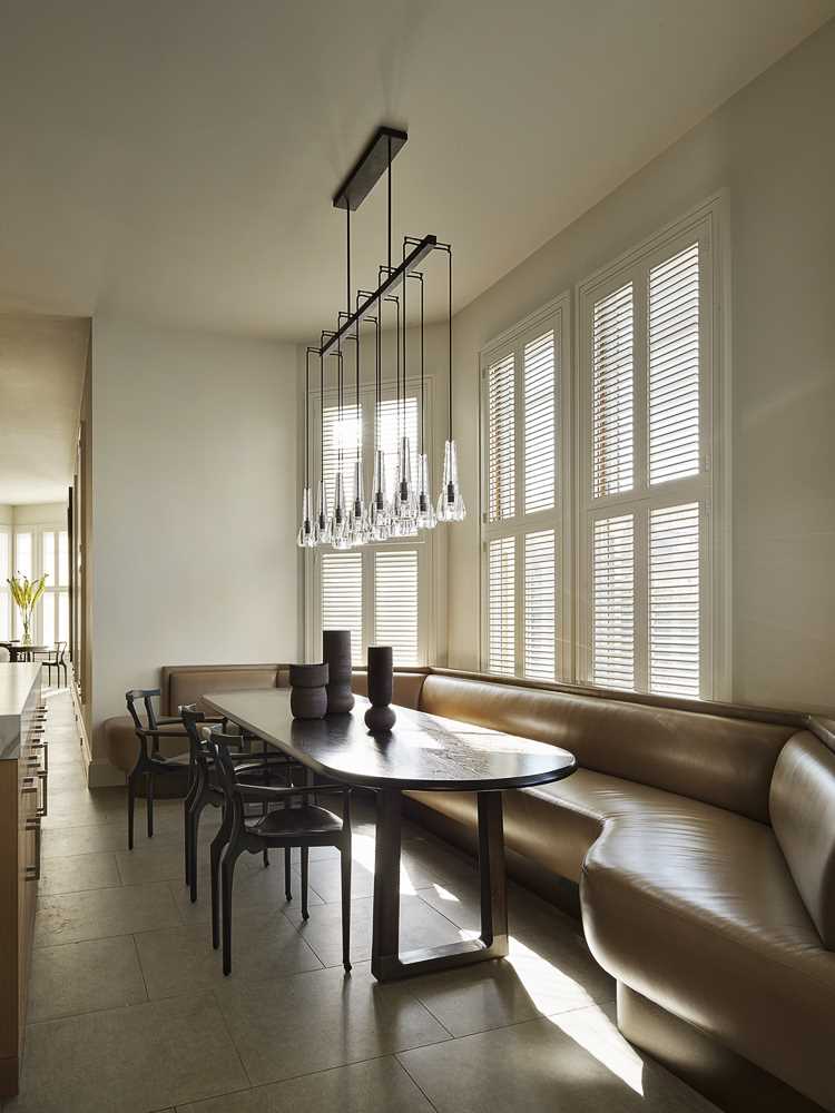
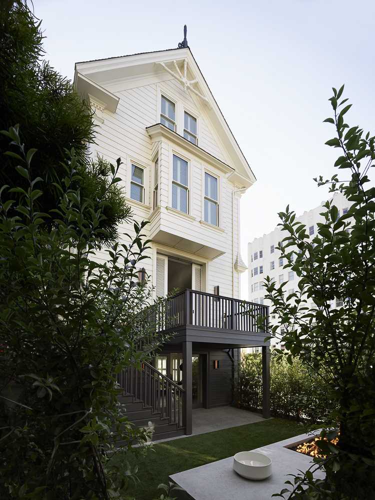
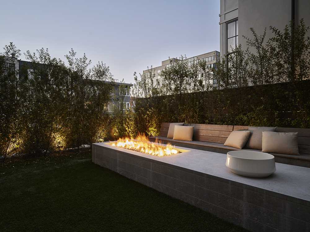
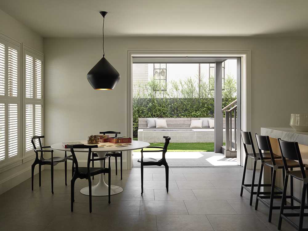
This area leads into a more casual dining area that opens to the yard, where an outdoor firepit and benches expand the living spaces.
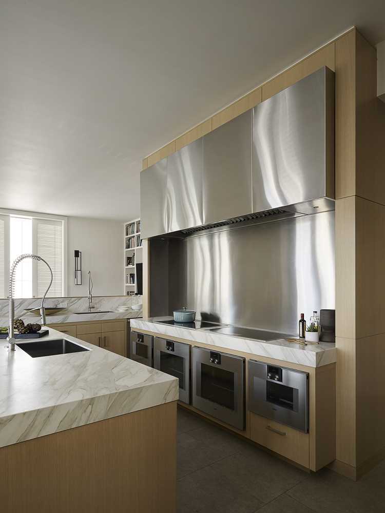
The kitchen combines stainless steel elements with wood cabinets for a contemporary look.
The four stories of the home are connected by a curvilinear staircase. “The stair was an opportunity to create a more open and continuous flow of space between floors, a spatial quality uncommon in historic houses,” notes Richard Beard, the lead architect for the project.
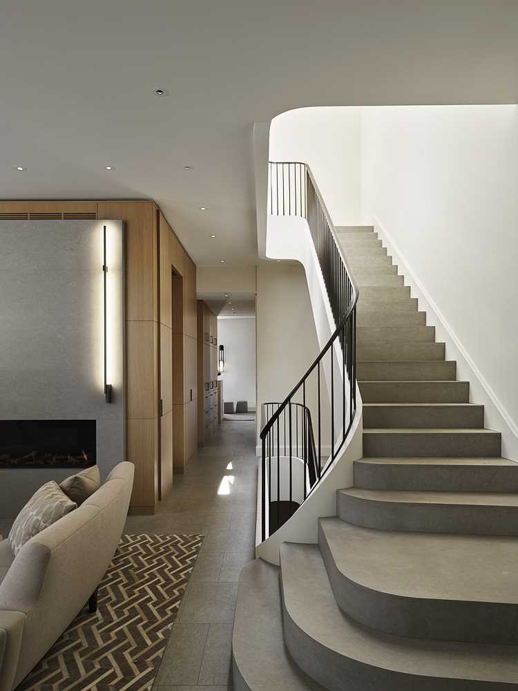
The curves of the staircase are complemented by a handrail crafted by Chris French Metal.
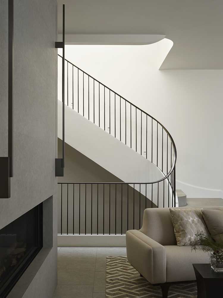
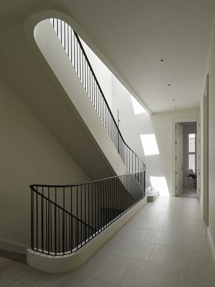
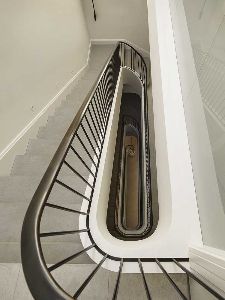
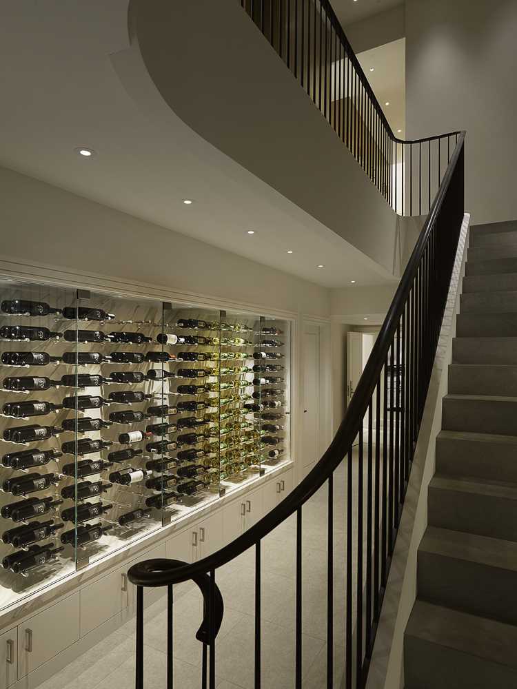
A stairway travels between the primary suite on the 4th floor and a wine wall and game room on the lowest floor.
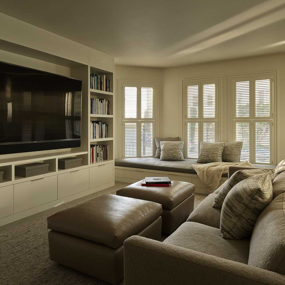
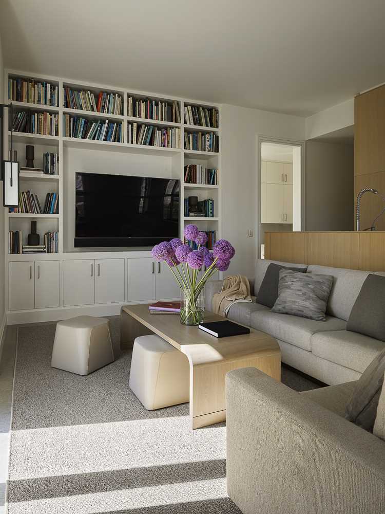
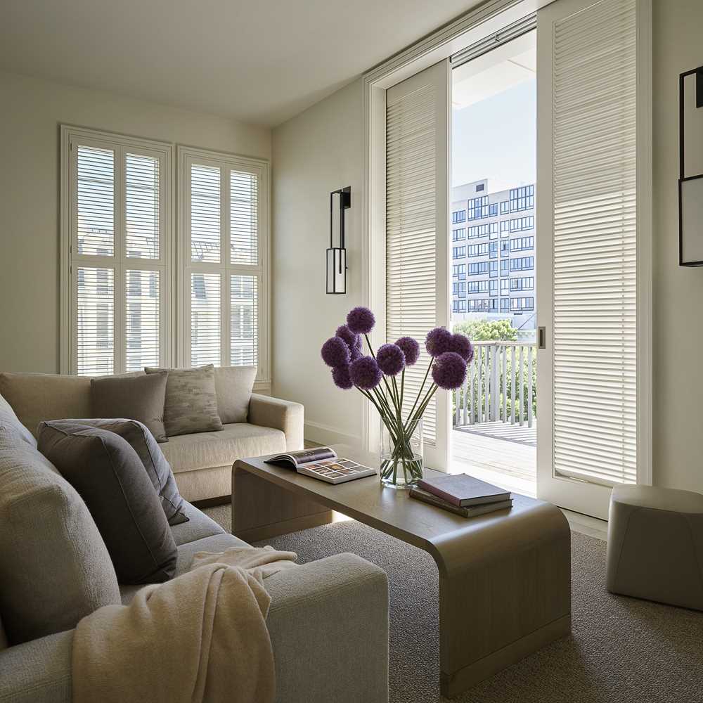
The home also includes a variety of TV rooms, that both have built-in cabinetry surrounding the television.
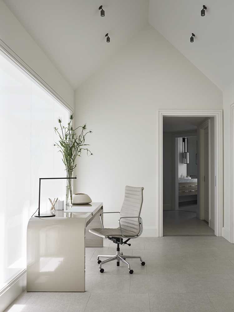
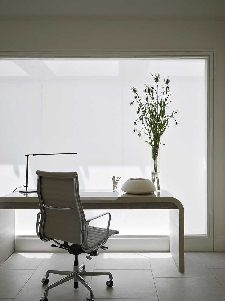
A light-filled home office has a vaulted ceiling.
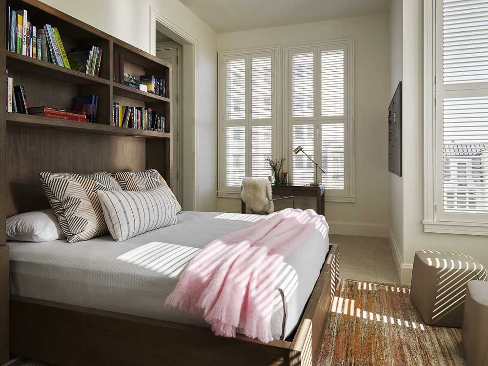
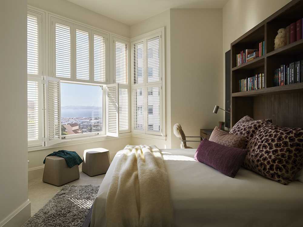
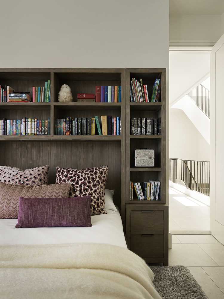
In one of the bedrooms, there’s a dark wood bed frame and headboard that contrast the light walls, while the view becomes the focal point.
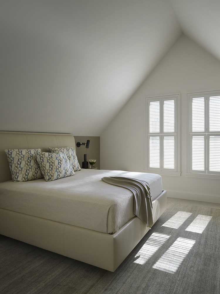
In another bedroom, the cathedral ceiling and light-colored walls make the room feel large.
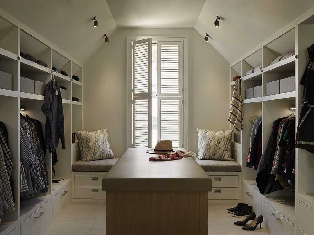
There’s also a walk-in closet with built-in open shelves on each side and a bench by the window.
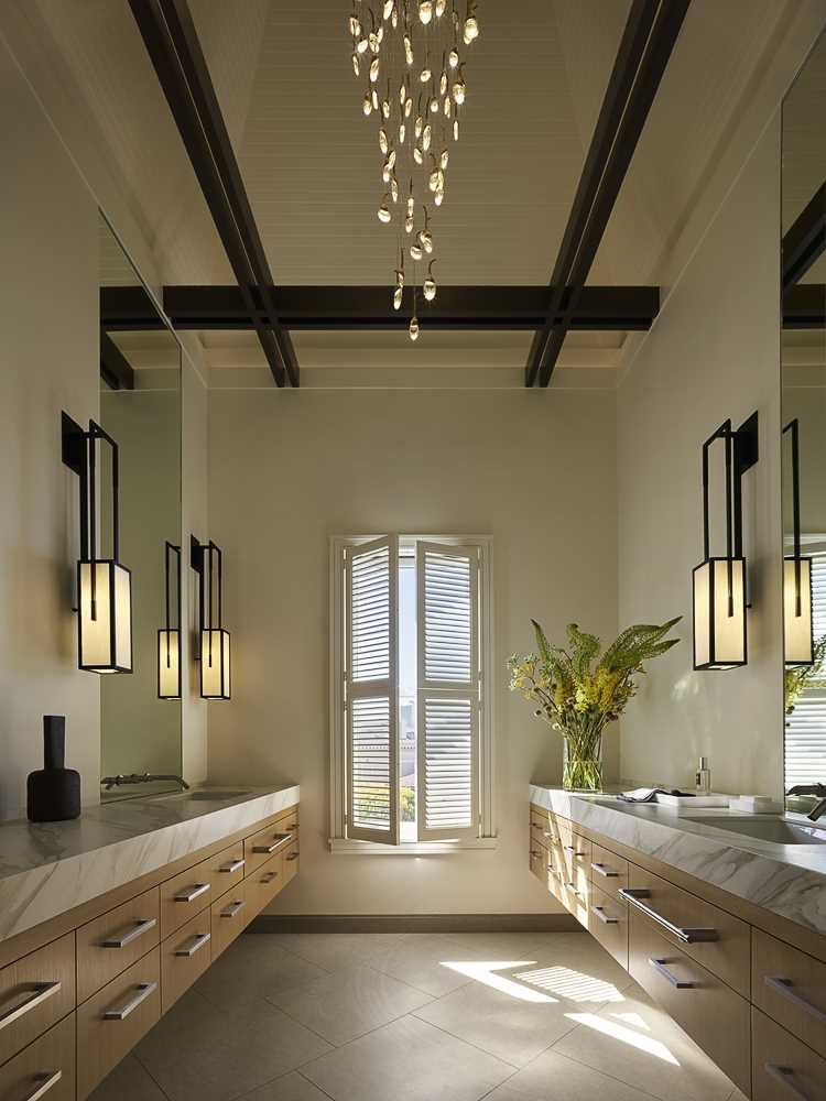
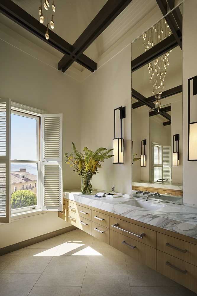
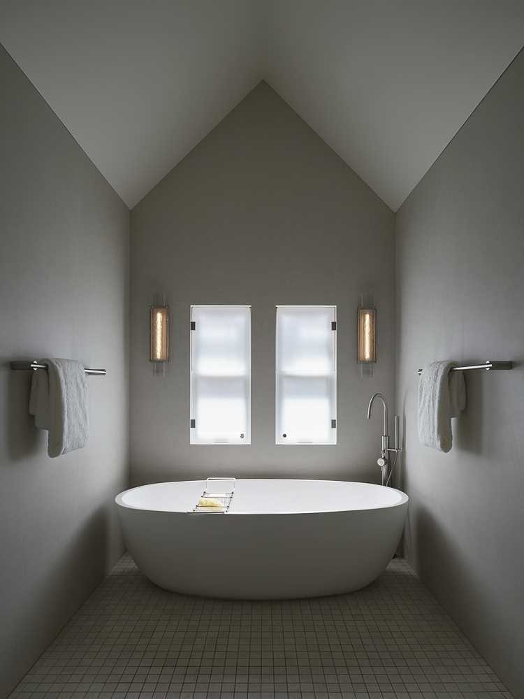
The design team placed the primary bath in the turret of the home, with modern light fixtures creating a dramatic interplay between the new and old elements of the residence.
