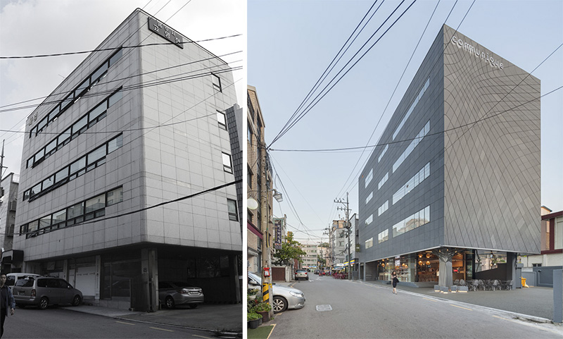
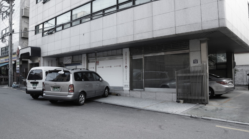
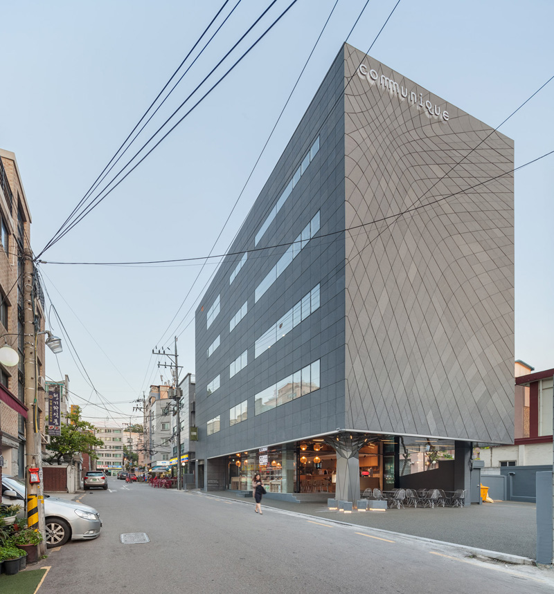
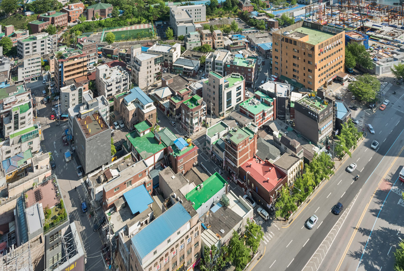
DaeWha Kang Design have completed the transformation of a dull 1980’s era office building in Seoul, South Korea, into a contemporary building covered in creative touches.
The architect’s description
DaeWha Kang Design has completed their first project in the Far East. The new Communique Headquarters in Yongsan, Seoul will house a public relations firm of fifty staff, as well as an indoor-outdoor ground floor cafe and rooftop event space intended to breathe new life into the surrounding area.
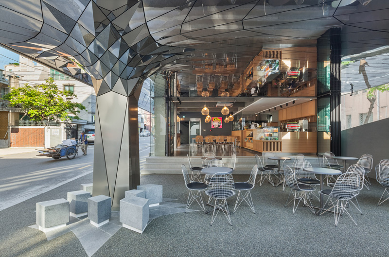
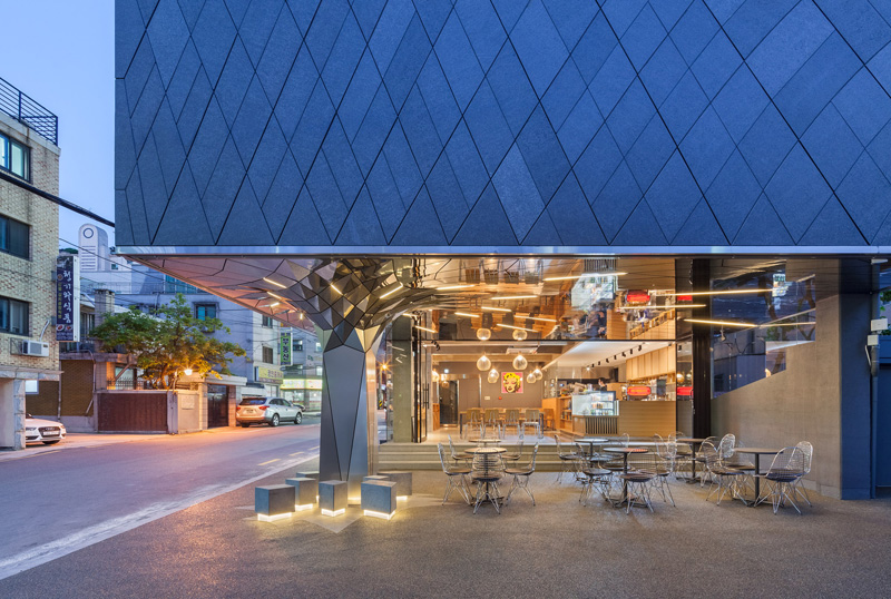
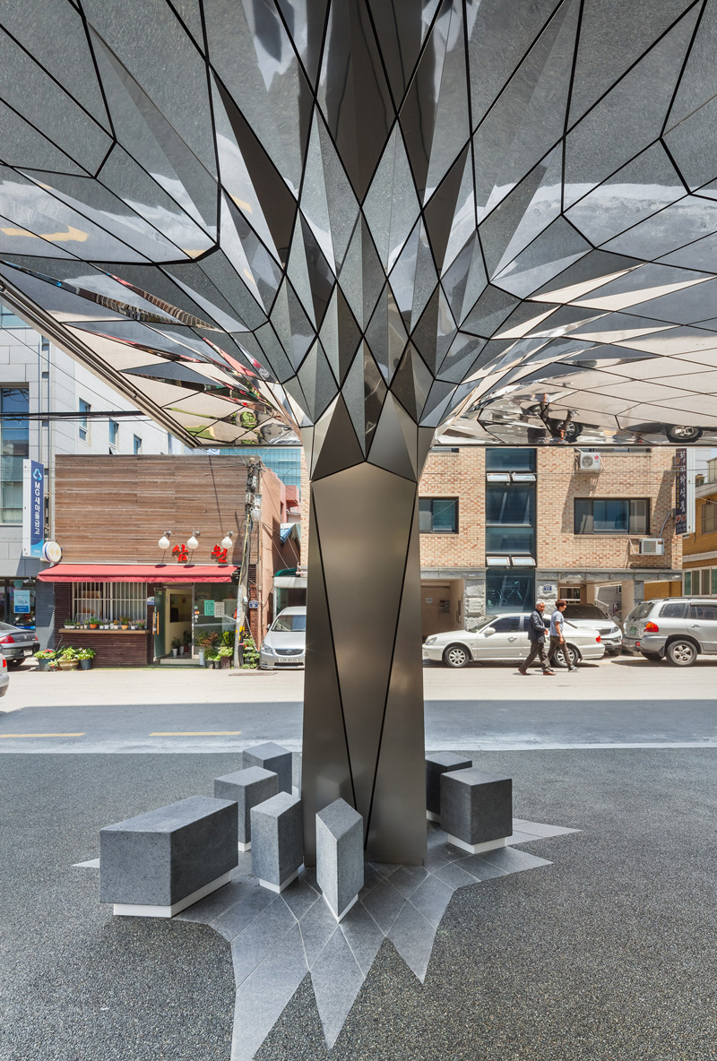
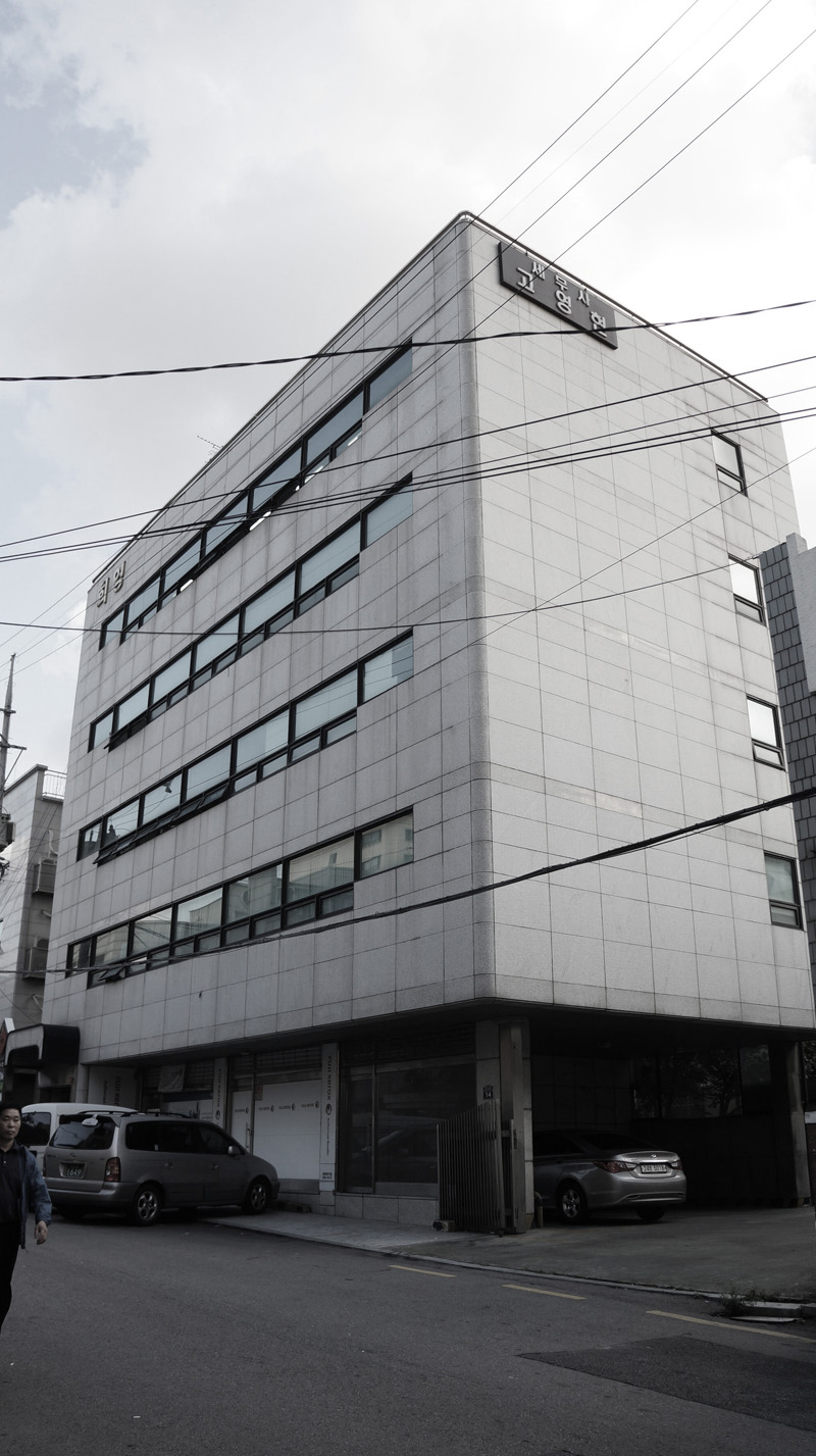
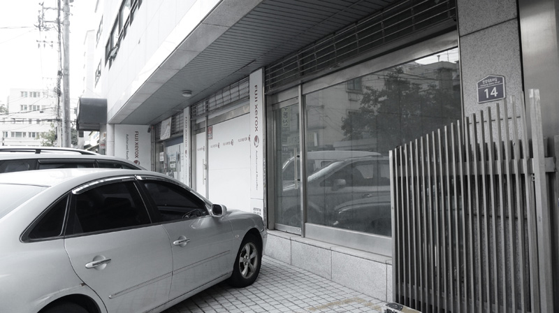
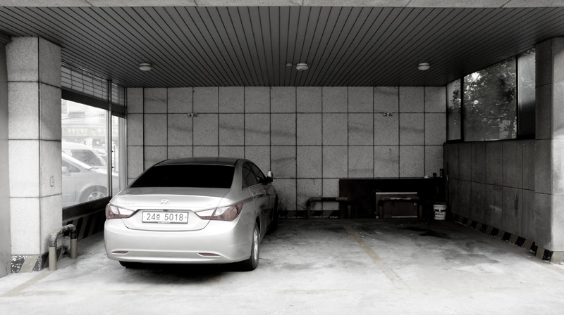
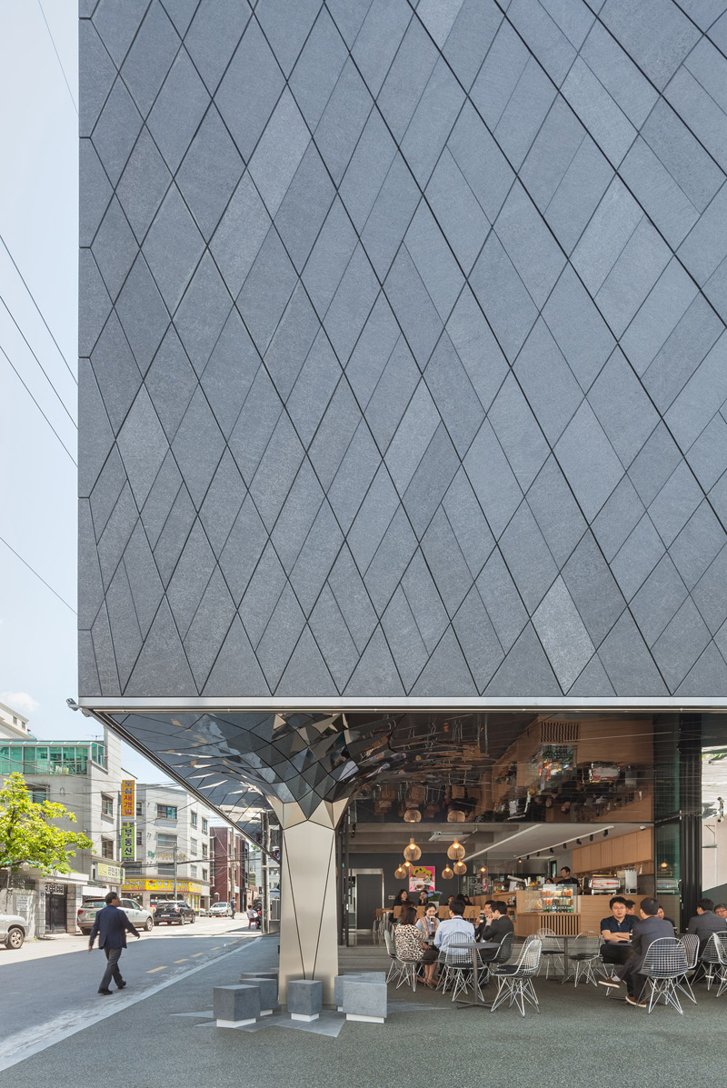
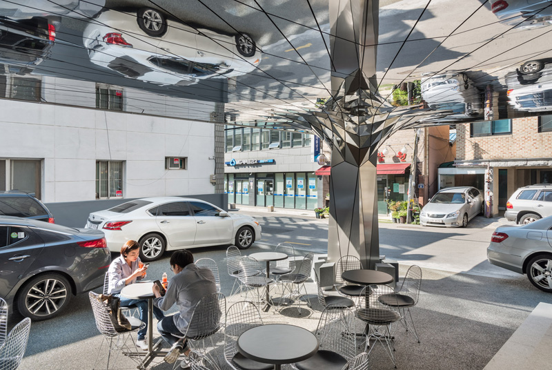
The architects have undertaken a full recladding and gut renovation of a 1980’s era office building, bringing the building envelope up to today’s environmental standards and creating a bold visual statement within an old and run-down neighbourhood. A formerly neglected car park under the building overhang has been transformed into a crystalline space of tessellated stainless steel, filled with light and a bold play of reflections.
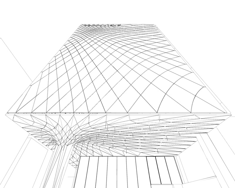
The challenge of the outdoor cafe design was to create a welcoming and memorable place in spite of the low clearance of the existing undercroft and local regulations that required maintaining the deep overhang. A solution of cladding the ceiling in mirrored stainless steel panels doubles the perceived height of the space, while an existing central column provides a sculptural focal point.
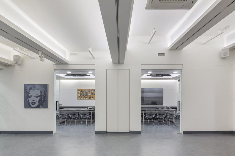
The café glazing on the ground floor is designed for maximum engagement with the outside. Floor to ceiling glass faces the main street, while bi-fold doors open directly out onto the sheltered terrace under the mirrored overhang. The basement houses a multi-function space that can be used by employees for meetings, overflow visitors to the cafe, and hired to local small businesses who need sporadic or temporary meeting spaces.
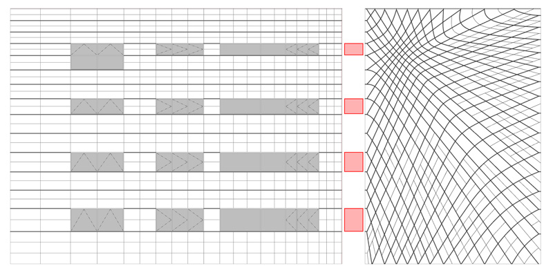
Cutting edge design and fabrication technology was used to provide a sound construction logic to the expressive forms, and the folding of panels and the gradation of their size are all driven by the demands of geometric curvature and economy of material.
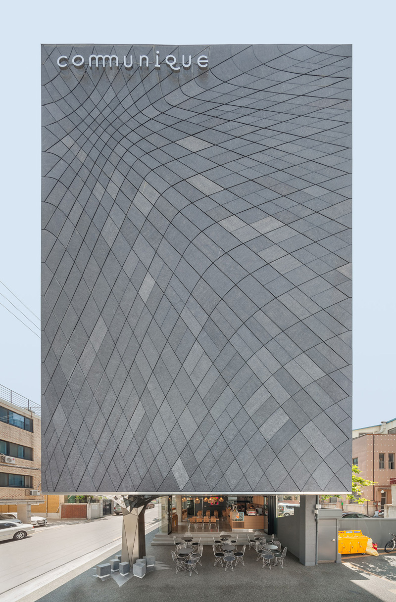
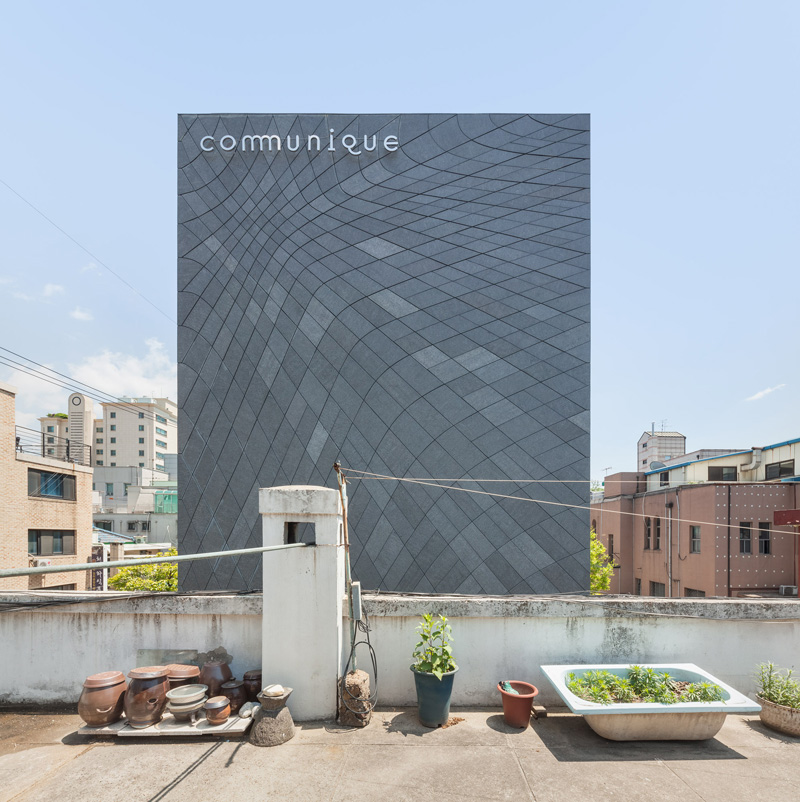
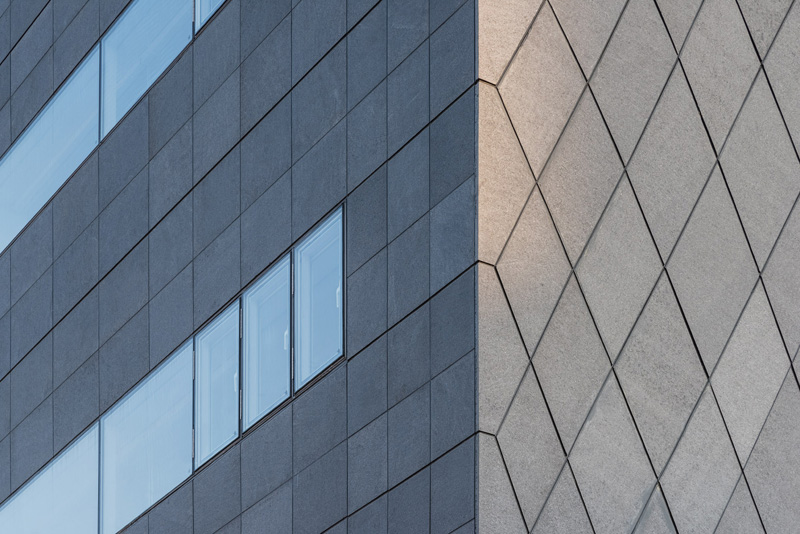
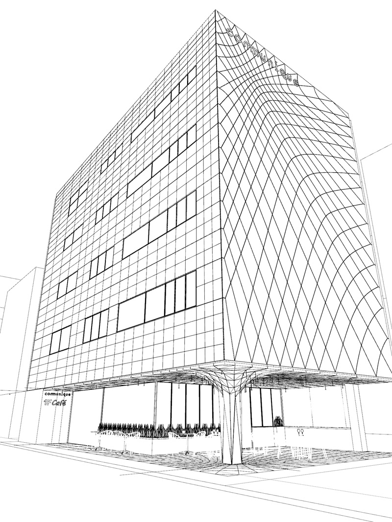
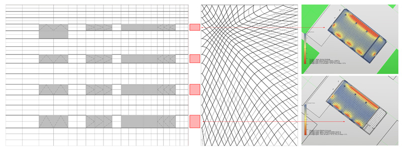
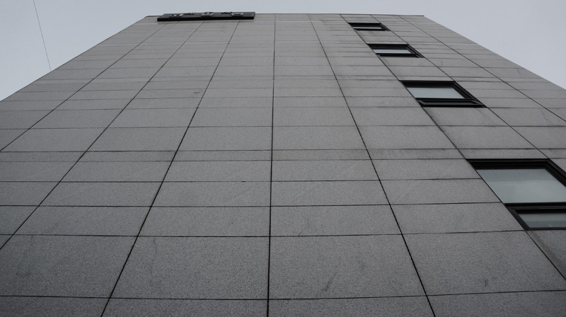
The same distorted grid generates the granite panelisation of the primary facade. In this case, flat granite panels reduce in size towards the most visible part of the building, but also provide a dynamic array that has a strong environmental rationale.
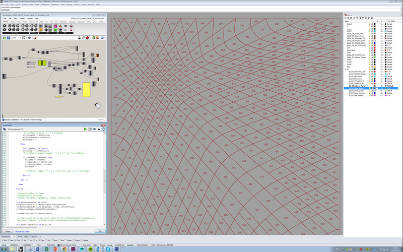
As the west facade wraps to the long north facade, the distortion creates ribbon windows of different heights, with less glazing at the top to minimise glare effects on the interior, and more glazing towards the bottom to provide daylighting where it is most needed. Algorithmic design was used to create secondary subdivision grids within the granite pattern, easing material sourcing and installation, and greatly saving costs.
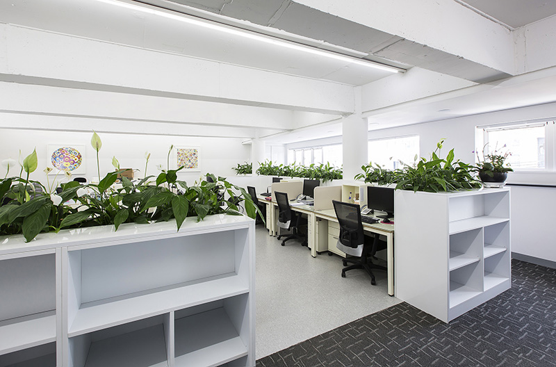
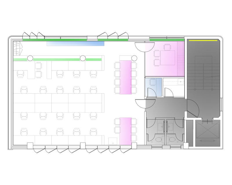
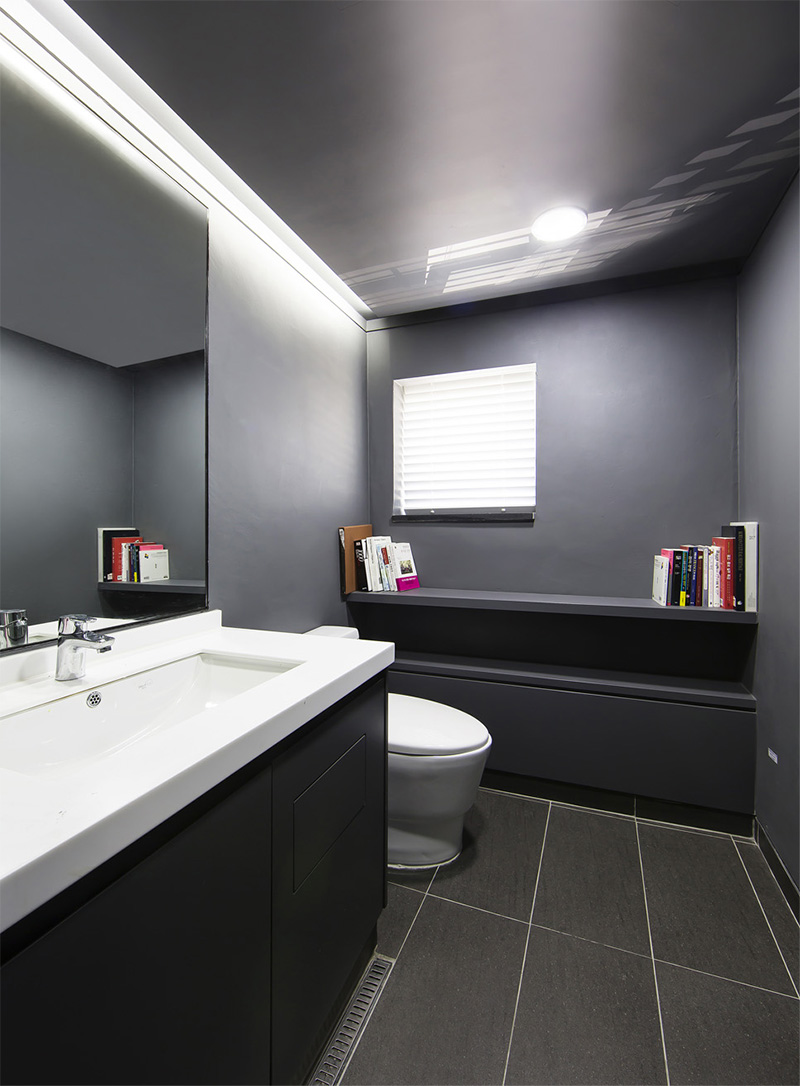
The interior concept is organised around the principle of improving employee well-being and productivity through design. While working within the constraints of an existing structure, the layout provides both traditional meeting rooms and single-person phone-booth style meeting rooms to help employees manage noise disruptions and sensitive phone calls. Creative collaboration spaces allow for informal working and meeting within the main working area as well.
Recent academic research has linked improvements in employee health and well-being with access to views of living nature within the workspace. The storage systems of the office spaces are all integrated with Spathiphyllum lilies, proven by NASA scientists to clear the air of five of the most common gaseous indoor toxins.
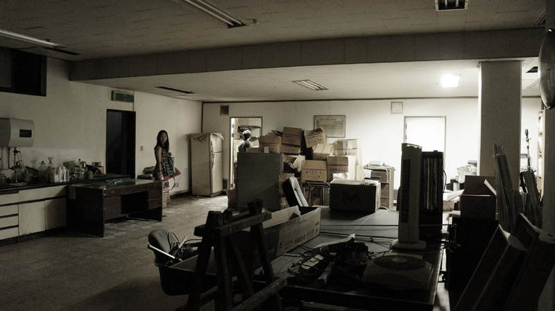
This integrated approach to biophilia makes the living plants a part of the space, and also creates some small areas for rest and contemplation within the busy working day. Air quality is further enhanced by removing the previously existing dropped ceiling to increase total air volume in the space.
Computational fluid dynamic simulations were used to orient the window opening directions in a way that creates a subtle yet dynamic circular flow of fresh air through the offices. The architect and client worked together to do comparative air quality studies as well as statistical analysis of employee absenteeism in the previous and new offices.
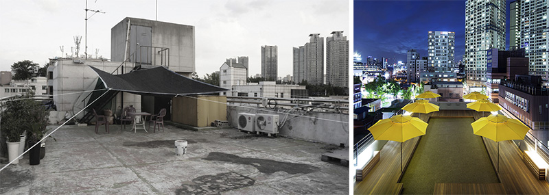
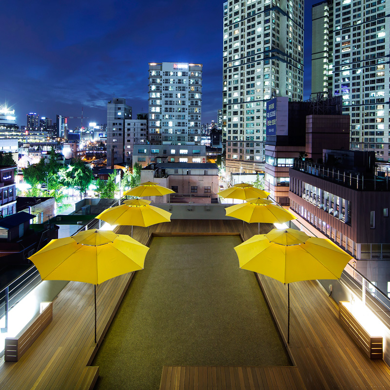
The roof terrace is designed with a subtle nod to the Korean hoerang courtyard typology, with a meditative perambulatory wooden deck surrounding a central court paved in gravel.
The Drawings
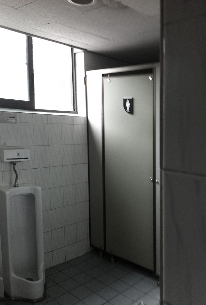
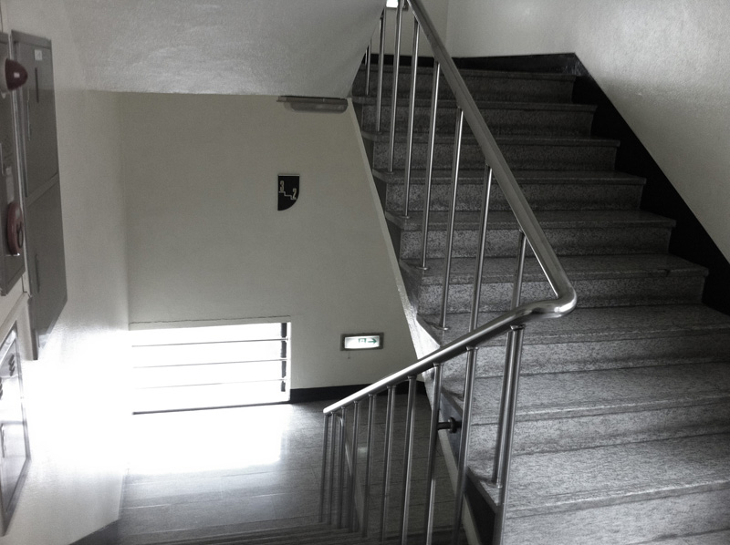
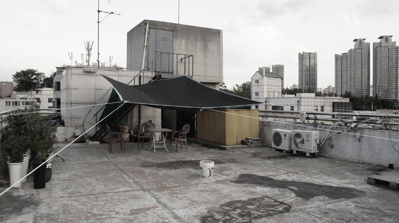
The Before Photos
The After Photos
Design Architect: DaeWha Kang Design
Local Architect: Chowon Architecture
Sustainability Consultant: Younha Rhee
Innovation Benchmarking: Michal Wojtkiewicz
Photographs copyright Kyungsub Shin, 2015
All text and images ©2015 DaeWha Kang Design
