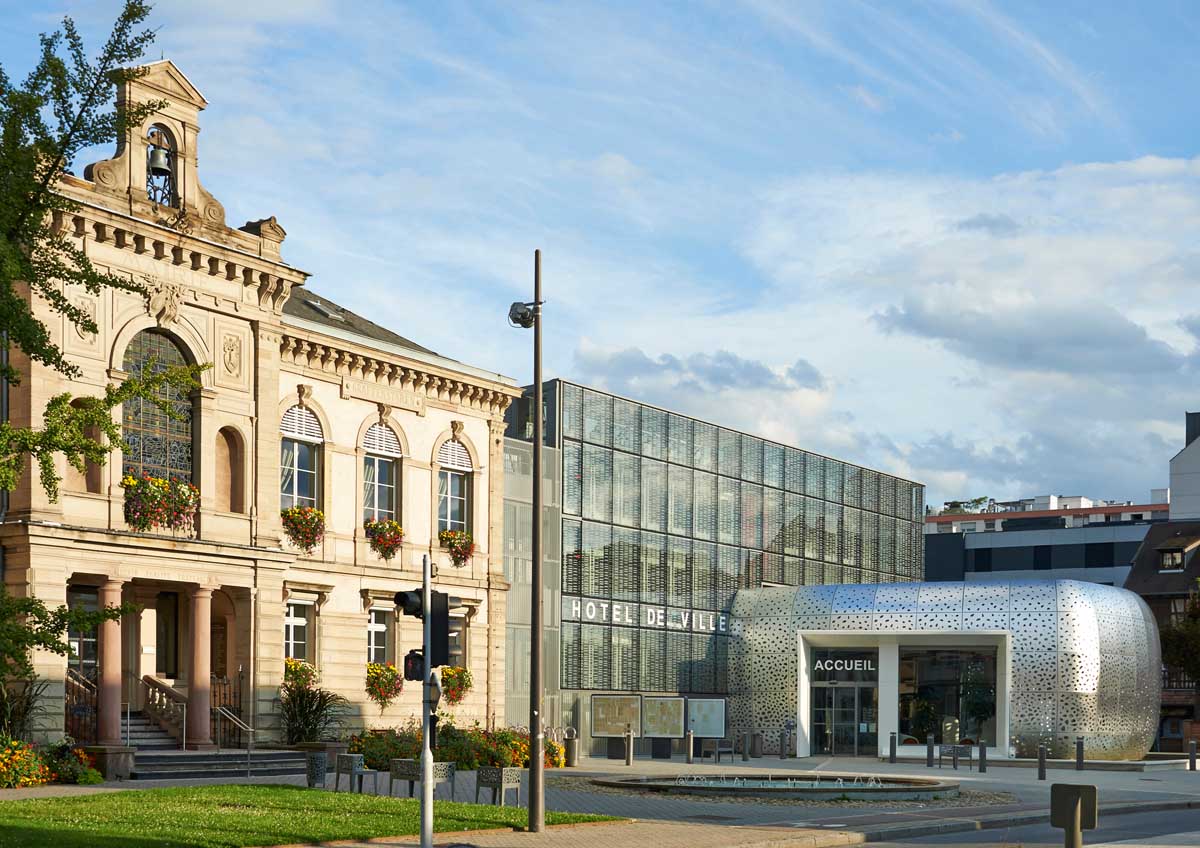
Atelier Filippini have completed the rehabilitation and extension of the city hall, located in Illkirch-Graffenstaden, France.
From the architects
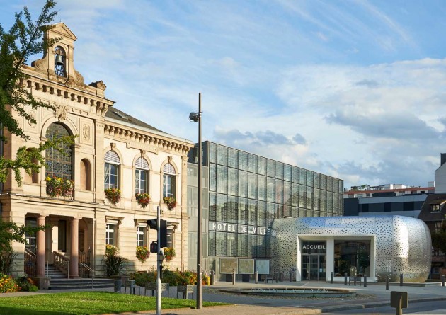
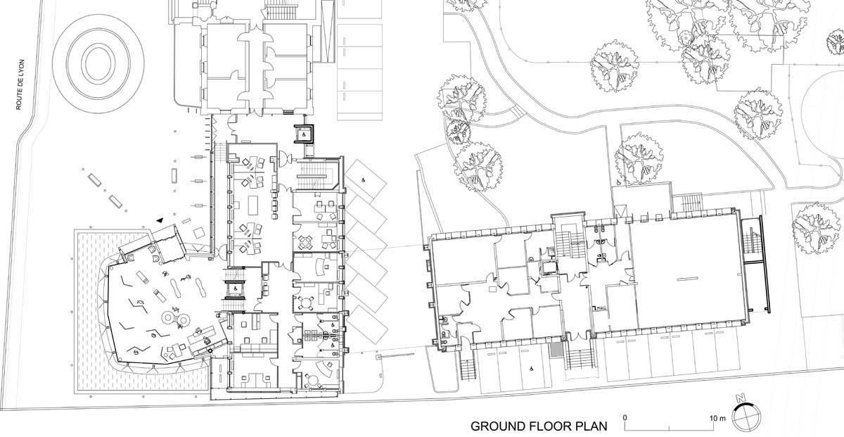
The rehabilitation and extension of the city hall aims to connect three very different buildings: one dating back to the 19th century and two others dating back to the 1970s. By adding a new reception structure and by improving the thermal performance and visual aspect of building envelopes, this project creates a new image of the city hall, in addition to a modern, open vision of administrative services.
Creating a landmark, portraying an image
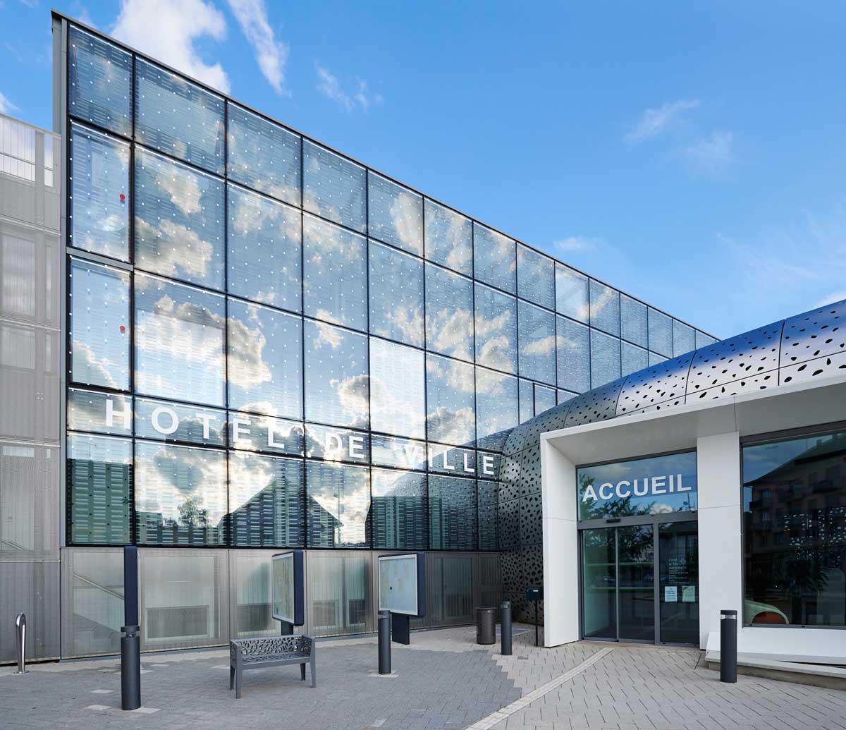
The project’s different components all transmit a contemporary image of the city hall. The glass façades, stainless steel structure and mesh used for connecting elements have been designed as aspects of a new urban landmark that ensures the city is seen in a modern light. This approach is supported by a visual communication strategy featuring dramatic lighting. Light-emitting diodes, which can be used in many different configurations, illuminate the glass façade, the stainless steel shell and the water feature. The new public reception area is located in the lower level of the building so visitors can enjoy interactions on a more human scale. The idea is not to impress, but to welcome. However, this does not mean the architectural project cannot be distinctive or even unique, as befitting the representative nature of this kind of building.Separating structures
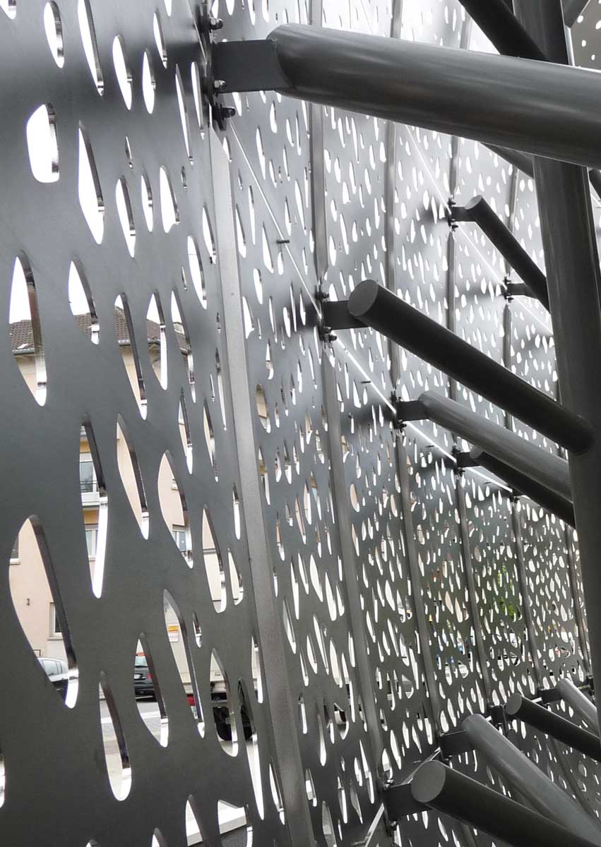
To enhance the site’s different architectural entities, low volumes have been created to link existing buildings. A stainless steel mesh covers all connecting and transitional elements, and is used to protect the lower floor of the glass façade. The structure suspended between the two 1970s buildings is not just a passageway. It is also a transitional zone where indoor and outdoor meeting rooms, rest areas, waiting rooms and loggias can easily be transformed for private or public use.Developing private outdoor areas
Small terraces are dotted around the buildings. In addition to being used by staff during breaks, they create openness and views to and from outdoor areas. The large terrace above the reception area – both mineral and vegetable – can be used for official ceremonies and weddings.Highlighting heritage value
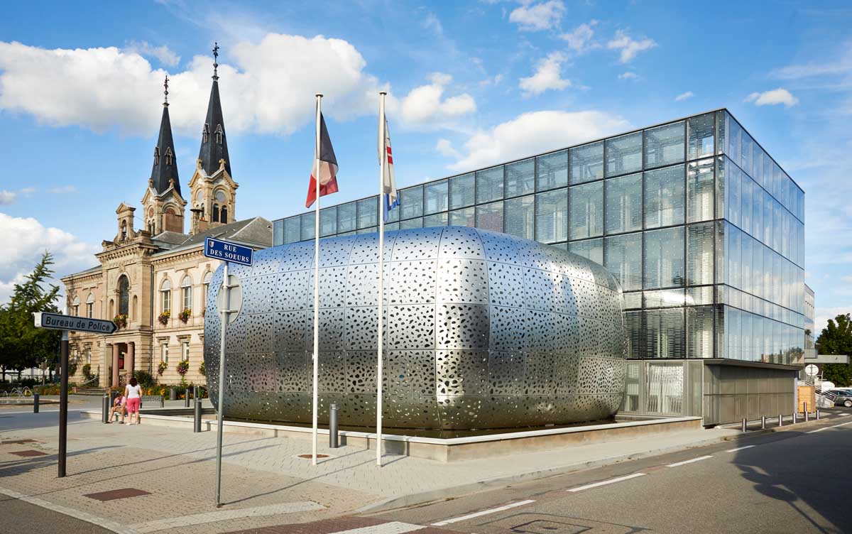
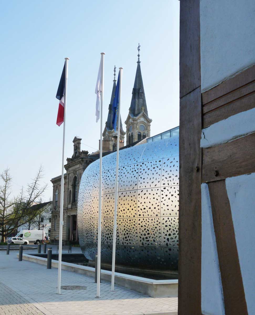
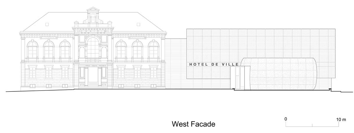
Today, the site is home to three buildings that were constructed using three completely different styles. One of our priorities was to portray a single, coherent establishment, while respecting the heritage value of the 19th-century building. Consequently, the two modern buildings were given new metal/glass skins featuring screen-printed façades and stainless steel mesh covering connecting and transitional elements. The glass façade is set back from the historical facade. This respectful attitude to the older edifice also ensures direct sunlight is provided to all offices. This approach highlights the autonomous nature of the new reception area, which is housed in an architectural structure that is stylistically different to all pre-existing buildings. Its curved shape and ethereal form absorbs and highlights the differences in surrounding buildings. It is another historical element in the existing composition and does not detract from the monumental nature of the adjacent building.Creating a stainless steel shell
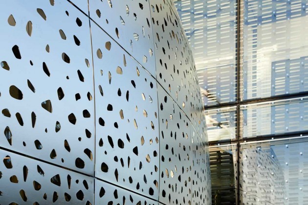
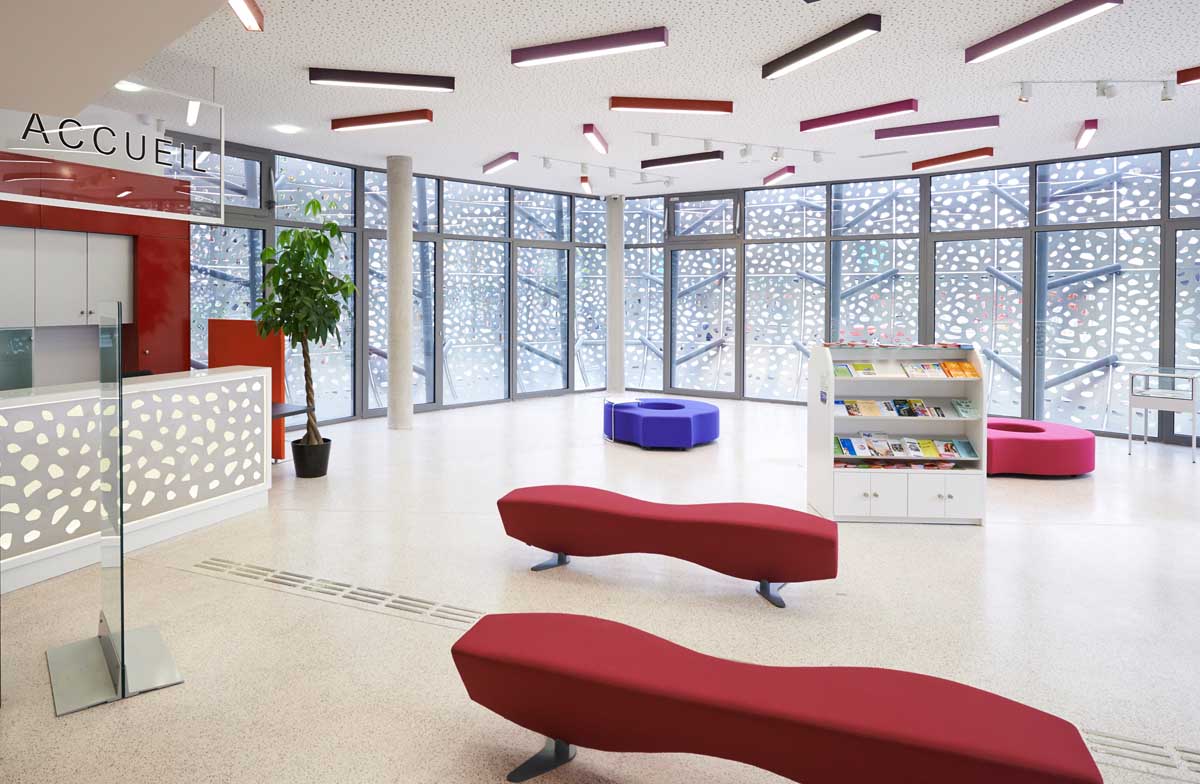
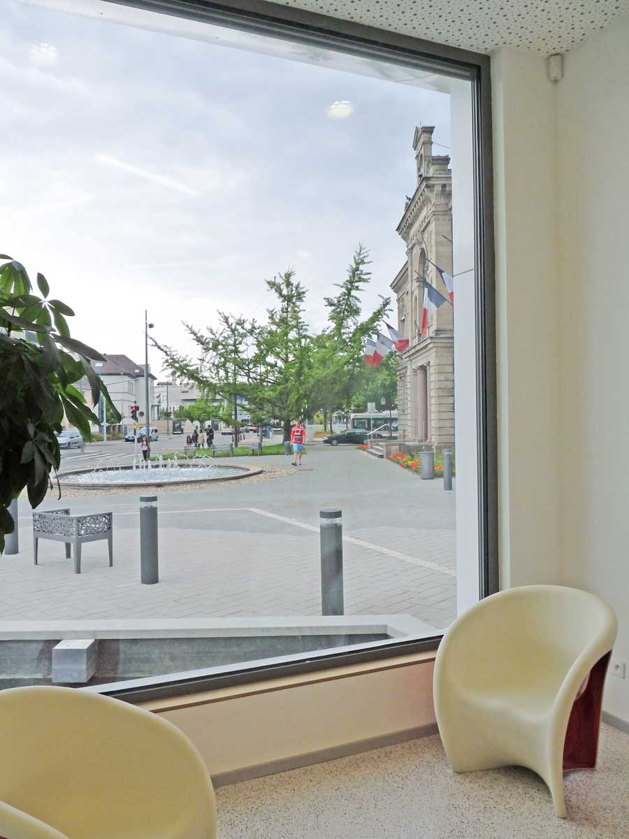
The shell is like a carved object – a protective metal skin that is both strong and delicate. Made of stainless steel, its curved form creates an impression of softness, calling up images of work by the artist Anish Kapoor. Facing the city, the shell reveals and reflects urban areas. Its anamorphic surface projects slightly deformed images of the square, surrounding buildings and the constantly changing sky. Although it looks like a precious object, it is very strong (it is fabricated using 5mm steel sheets). The shell, which was designed in 3D, was made to measure for the project. It is suspended with pinpoint precision on steel tree structures and has no physical contact with the reception structure or the ground. The shell was fabricated and finished using techniques reminiscent of the city’s industrial and mechanical heritage. Inside, perforations in the shell’s envelope filter the light entering the building while still allowing visitors to enjoy views of urban areas. Outside, the shell seems to float on the water that surrounds it. This material does not need any maintenance or further treatment. Any dirt or dust can be removed by spraying it down with water.Installing a double-skin façade
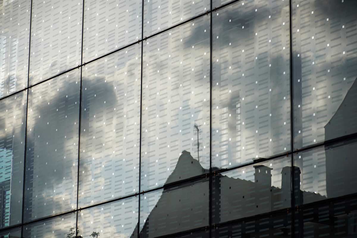
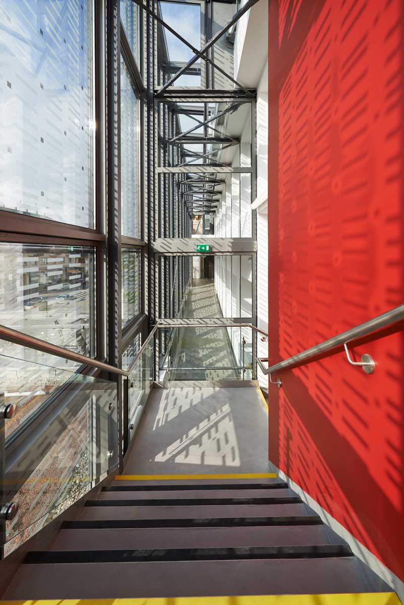
The Atelier Filippini is especially committed to thermal performance, implementing innovative solutions like the one installed at the Maison des Ensembles in Paris (2010). Here, in Illkirch-Graffenstaden, an envelope has been added to the outside of the main building, creating a passageway for people and technical gallery and improving the building’s thermal properties. The new skin is composed of a “breathable” screen-printed glass façade with built-in venetian blinds. Two different patterns have been printed onto the glass: frosted rectangular shapes and shimmering squares. In this way, the façade changes to reflect the passing hours and seasons, adapting to different light conditions. Air enters vents at the base of the building. In winter and mid-season, it is captured and heated before being directed to the double-flow ventilation system where it in turn heats incoming air. In summer, air is released outside through roof vents. The system is managed by a computerised building management system, which also adjusts the position of venetian blinds in the façade and the double-flow ventilation system.Enhancing facades
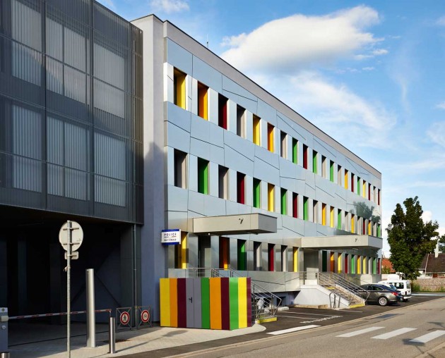
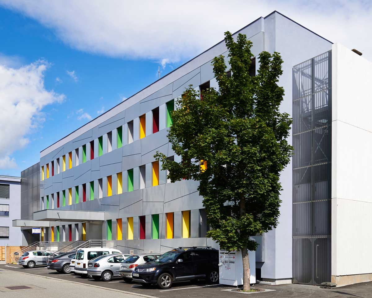
In our project, there are no “secondary” façades, as they are all visible from public space. The façades of the Centre Social et Administratif (administrative and social centre) were originally built using prefabricated concrete slabs containing little thermal insulation. Their appearance clearly indicated the building’s 1970s origins. This called for an intervention that was both functional and aesthetically pleasing. Consequently, metal-look aluminium composite cladding with high-performance thermal insulation was installed on the facades of the building. The irregular layout and clearly marked joints combine with the colourful window recesses to create a uniquely customised facade. Each window has an adjustable brise-soleil sunshade that can be used to deflect sunlight, especially in summer. On the east side of the building, a new metallic stairway has been created. It is sheltered by a white moulded concrete wall, which has been erected to reduce noise from the future tramline.Accessibility for all
The term “disability” covers a wide range of situations, not just people with reduced mobility. The Atelier Filippini is very aware of this issue and constantly seeks to produce designs that incorporate elements making its buildings accessible to all. For the Illkirch-Graffenstaden city hall restructuration project, this led to a unique interior design developed in coordination with the contracting authority. Each floor and department features a different colour scheme to make it easier for visually impaired visitors to find their way around the building.Interior fittings
Custom-designed furniture has been produced especially for this project. This includes the reception desk with panelled lighting, display stands in the reception area, desks in open-space areas and furniture in the mailroom.Comfort
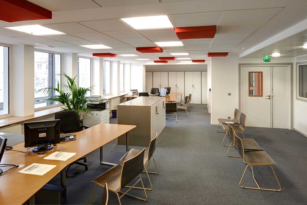
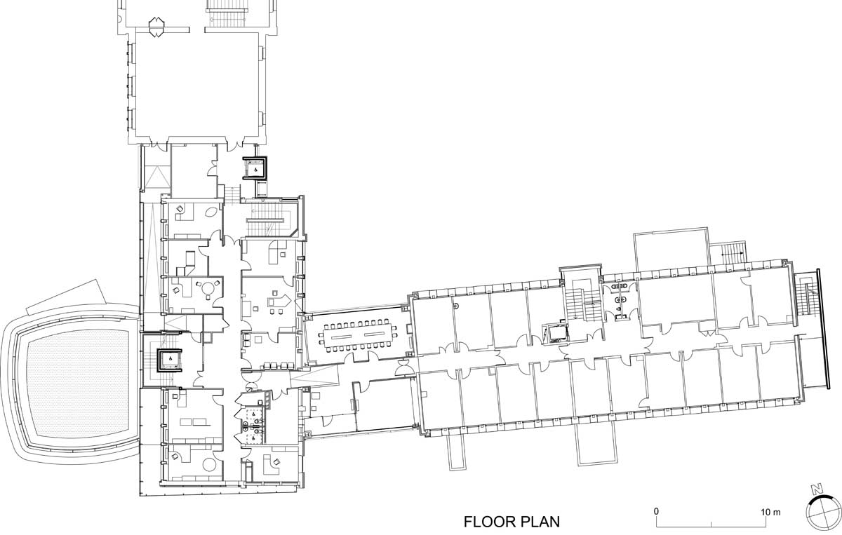
The architectural project not only gives the building a contemporary look by using innovative materials and creating the reception structure. It also involves a complete reorganisation of internal areas in order to simplify the ways visitors and staff move around and use different spaces, improving indoor comfort. Hallways all have natural lighting as a result of new openings in the middle and at both ends. Special attention has been paid to acoustic performance. Partition walls between hallways and offices exceed minimum standards. To improve the workplace environment, sound-absorbing material has been installed in ceilings for the acoustic correction of meeting rooms, open-space offices and the reception area. All offices have acoustic ceilings.Environmental Quality
Special attention has been paid to using environmentally friendly techniques, including double-skin facades to trap pre-heated air and reduce the need for heating in winter and mid- season. Air enters a double-flow ventilation system with a heat exchanger. The system is managed using a building management system and temperature and sunlight sensors. Exterior walls are insulated using 20cm of insulating material on vertical surfaces. High performance double-glazed windows with argon gaps have been used. The main façade’s “breathable” windows have built-in venetian blinds. Adjustable brise-soleil sunshades or outdoor blinds have been installed on all façades in order to control solar gain. A storage system collects rainwater during storms. This is then used to water outdoor areas. A green roof covers the reception structure, improving its thermal and acoustic qualities. An automatic watering system has been installed. The project also uses low-energy lighting and water-saving taps and toilets.
Architect: Atelier Filippini – Renato Filippini
Photography by © Christian Creutz
Images by Atelier Filippini

