Borja Garcia Studio have designed the Olhöps Craft Beer House in Valencia, Spain.
The designer’s description
This project rises with the hopes of creating a new kind of store to have craft beer. A place to enjoy a beer, alone or in good company, in an environment with unique characteristics in the industry.
Concept and Space / / The starting point of the project was analyzing the traditional home-workshop diagram. In this type of home-business, the access was through the business area, then you would cross the back shop before getting to the home and finally the inner patio or corral. The proposal for this project is based on this diagram, but flipped over.
This way, we are creating a sequence of spaces that begins with a small terrace that serves as an access doorstep and that gives way to the area that represents the home or main room. Once we have overtaken the area of the bar, the central axis of this project, you arrive to the shop/workshop, placed in the final area of the whole store.
These two main areas (home and workshop) create a spacious and clear inner area assembled through a transverse sliding movement all over its central area that allows harbor the service areas and create the necessary spatial sequence thanks to the extreme depth of the store.
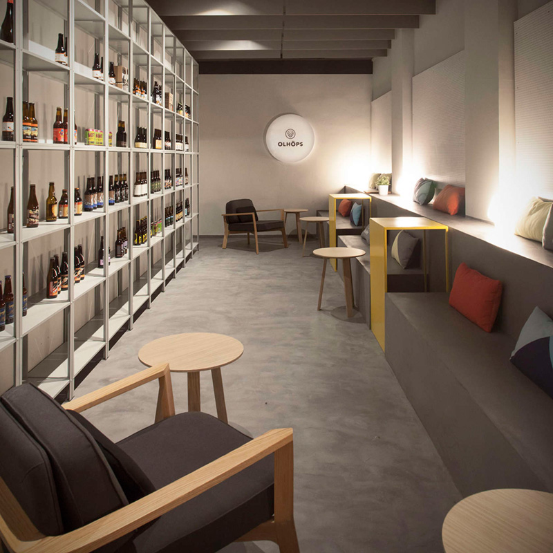
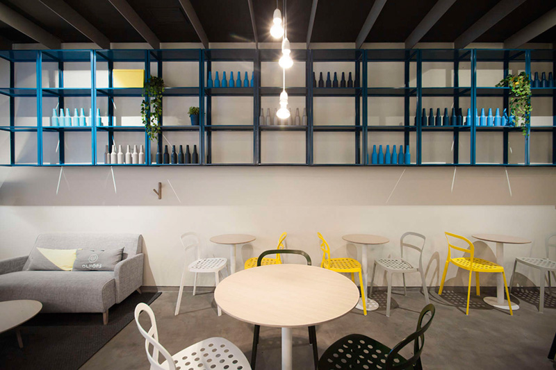
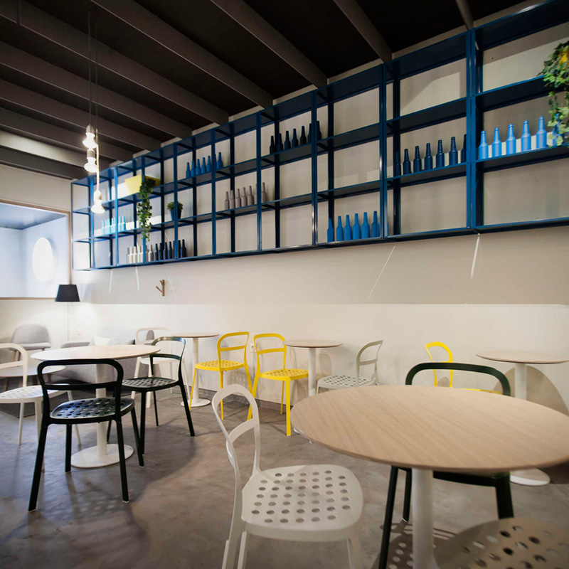
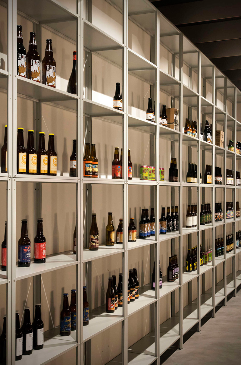
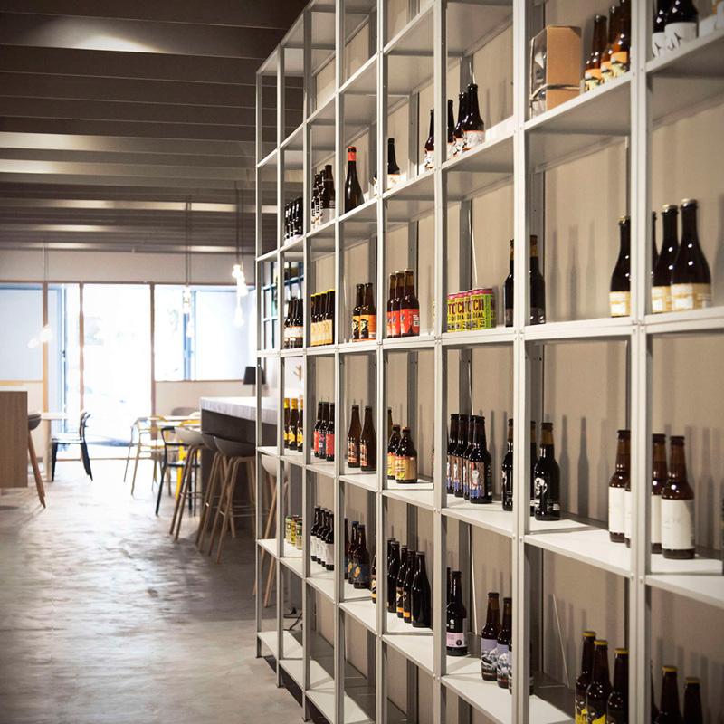
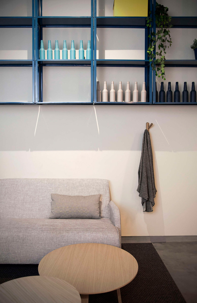
Identity // There are three elements that give its identity to this project: The first element is a shelf that goes through all the store in its whole dimension, defining the use of each area and setting a constant rhythm in all the store. In the main room it appears as an elevated element in the space, creating a domestic atmosphere.
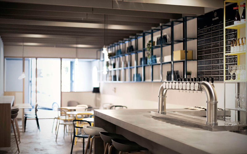
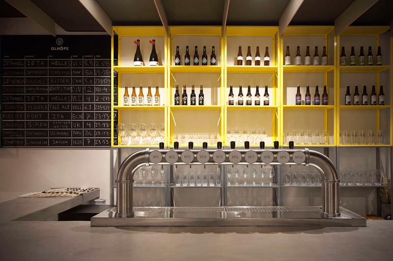
From the counter bar it takes up all the vertical surface of the wall, being useful as bar furniture. In the last area, it appears as the storage element of the shop/workshop, transforming the bottle designs into a texture that dominates the space as a tapestry.
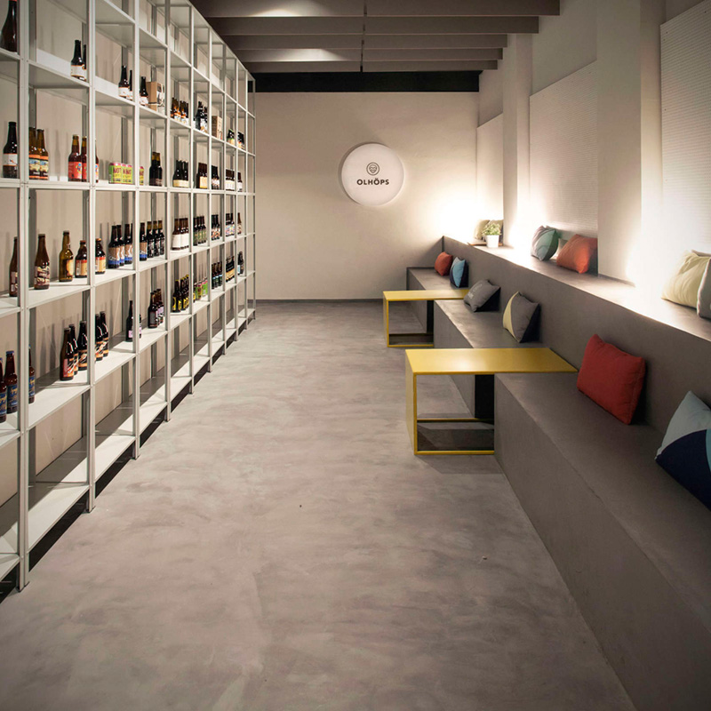
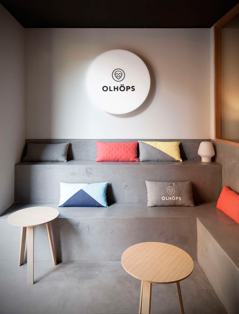
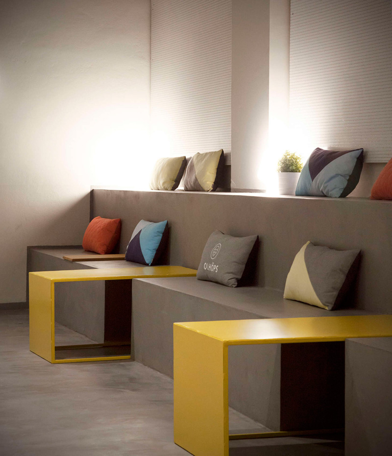
The second element is an innovative seat system as a kind of stands, which is used both in the entrance as in the workshop area. The objective of this flexible space is just that it can be transformed depending on the needs: tasting area, presentations, private events or just an area where people can hang out in a casual way.
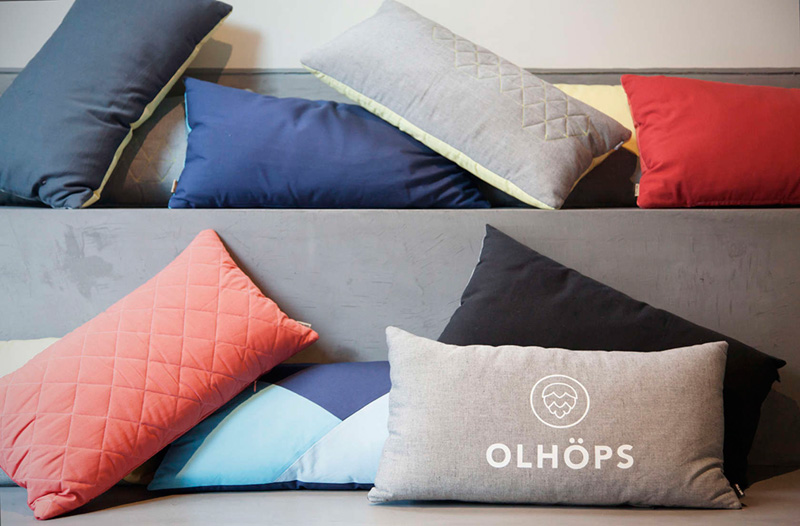
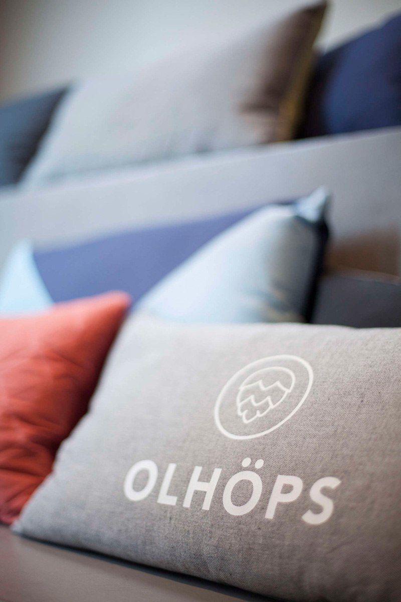
Finally, the chromatism, studied in depth, of the whole project. A series of carefully chosen colors will be present in a harmonious way in each element and space area. From the color of the shelves to the cushions. The vivid color palette adds proximity and improves the whole store. The balance between yellow, blue, coral and grey tones works as chromatic acupuncture over the grey canvas that provides the concrete floor.
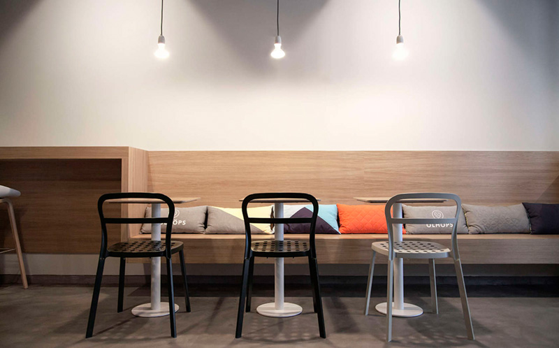
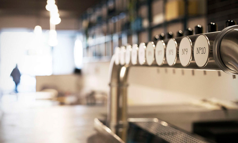
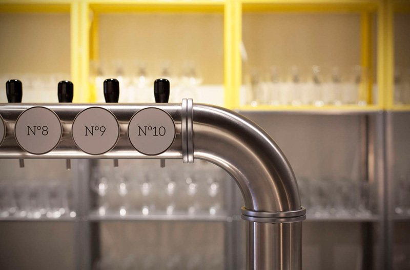
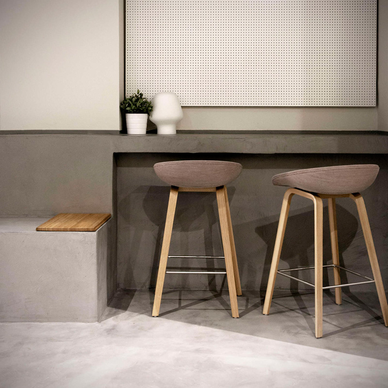
Materials // The super matt whitened oak wood – present in all the furniture and the entrance carpentry – contrasts with the micro concrete floor that covers all the space from the floor to the counter bar and the stands, giving continuity to the project. The counter bar includes the core of Olho¨ps, a bridge of 10 stainless steel beer taps that dominates the area as if it was a command post. It is the representation of the business model and, no wonder, it commands from the geographic center of the space.
The furniture includes pieces designed by the same studio for the Valencian brand Punt and with other elements that have been personalized for the project. In the same way, the cushions, present in the whole walkthrough, are the result of a collaboration with the brand Mula Jane.
Design: Borja Garcia Studio
