Architecture firm EL Studios, has recently completed the modern remodel of a three-story row house from the 1880s that’s located in the historic Dupont Circle neighborhood of Washington, D.C.
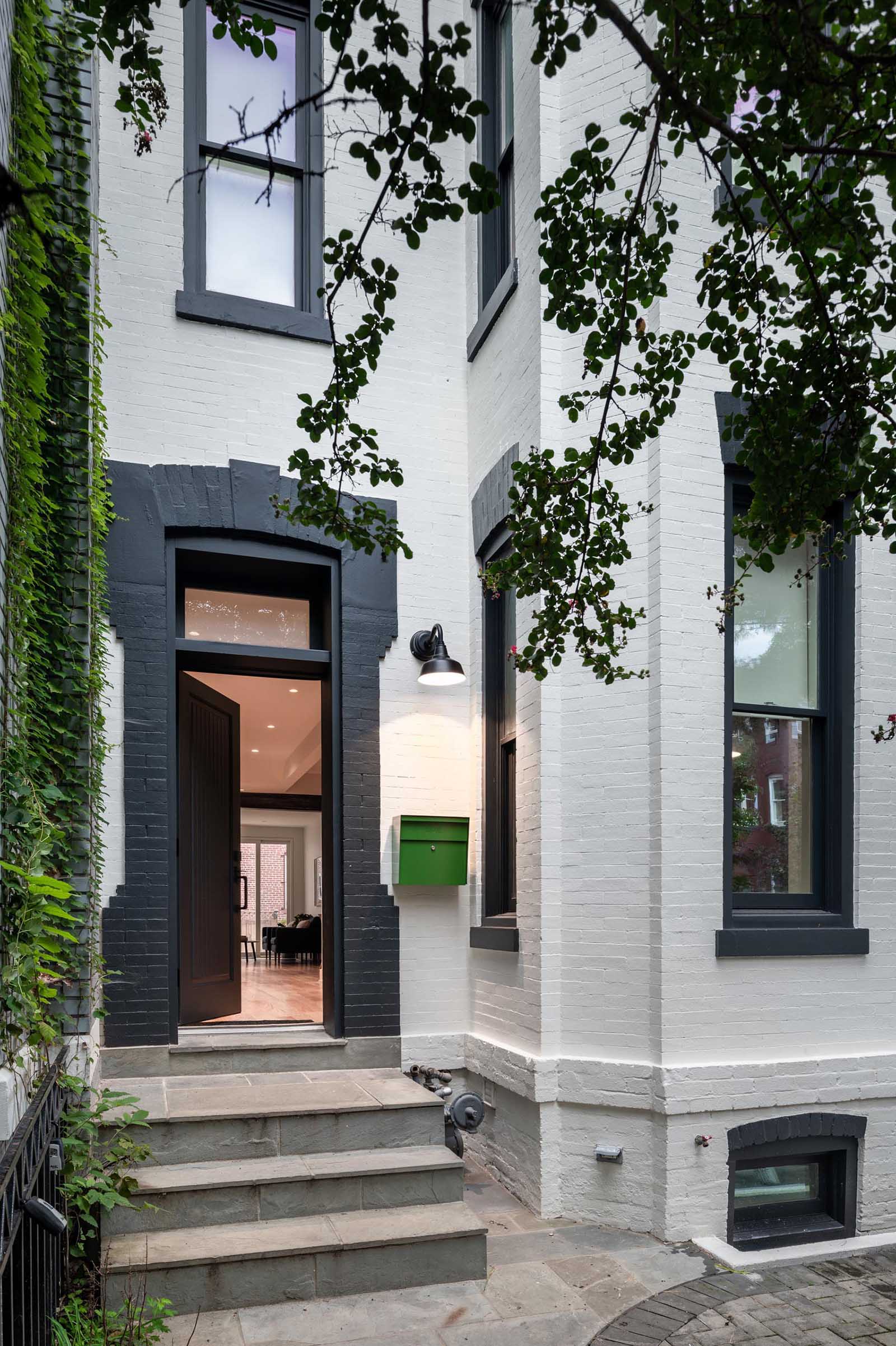
Before we take a look at the remodeled interior, here’s a view of the painted brick exterior and front door.
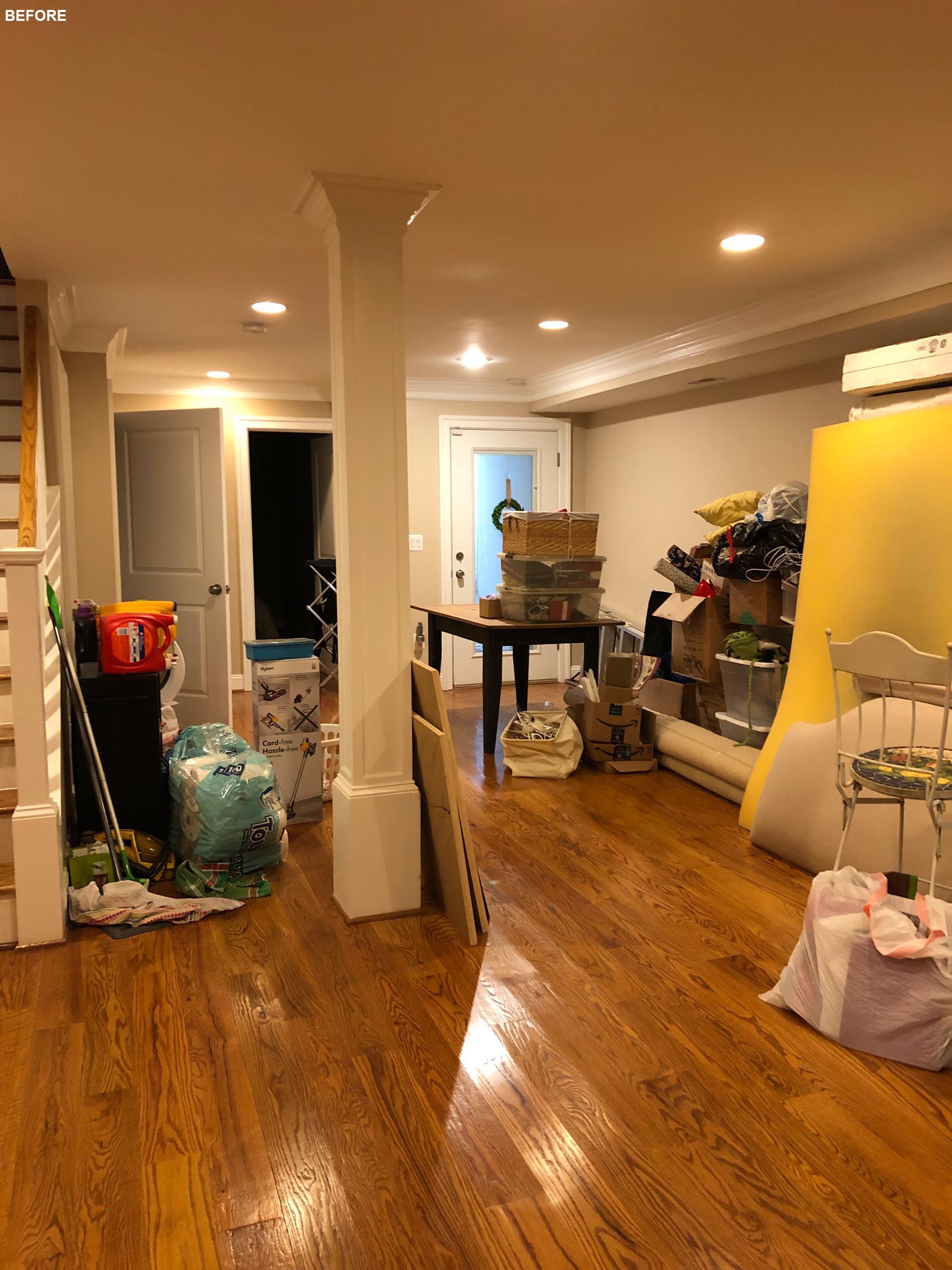
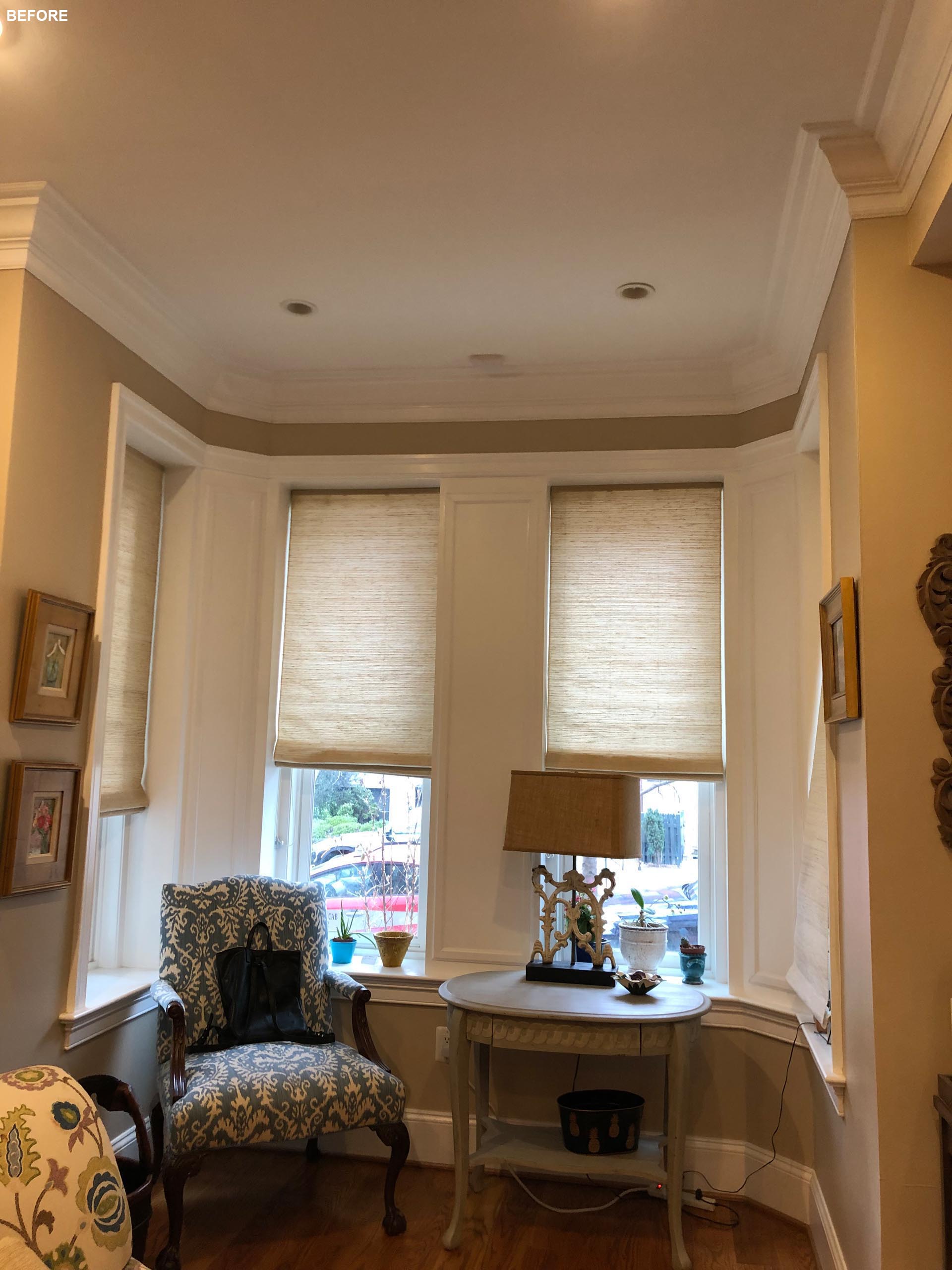
Here’s a look at the interior BEFORE the remodel…
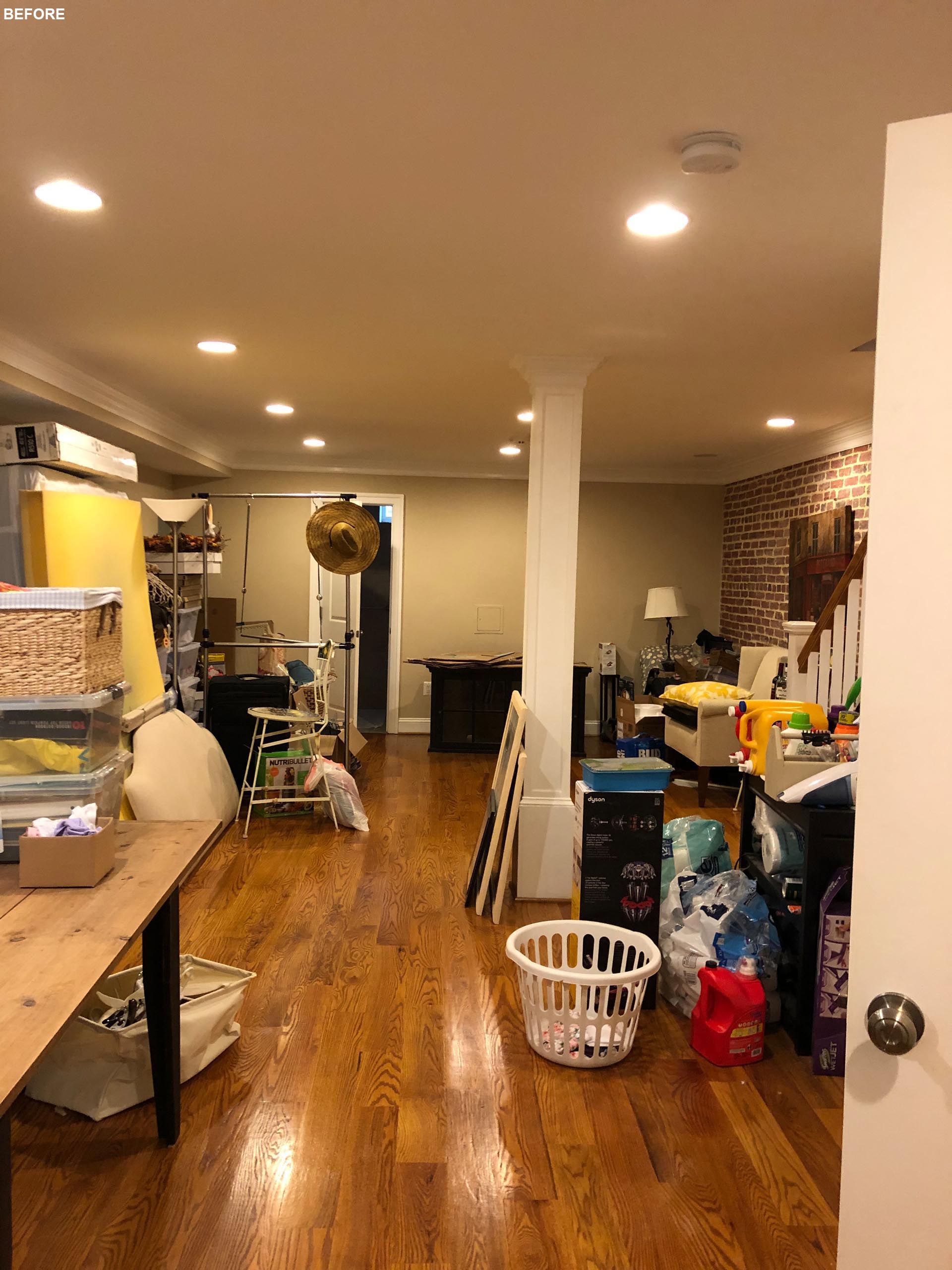
The renovation focused on rethinking and optimizing the existing elements of the home. Various areas of the home were relocated within the existing house footprint to create a more livable area with greater connections to the outdoors. The living area shifted to be adjacent to the rear garden wall so the parents could keep a watchful eye on their children at play, while the dining area now provides a separation between the kitchen and living room.
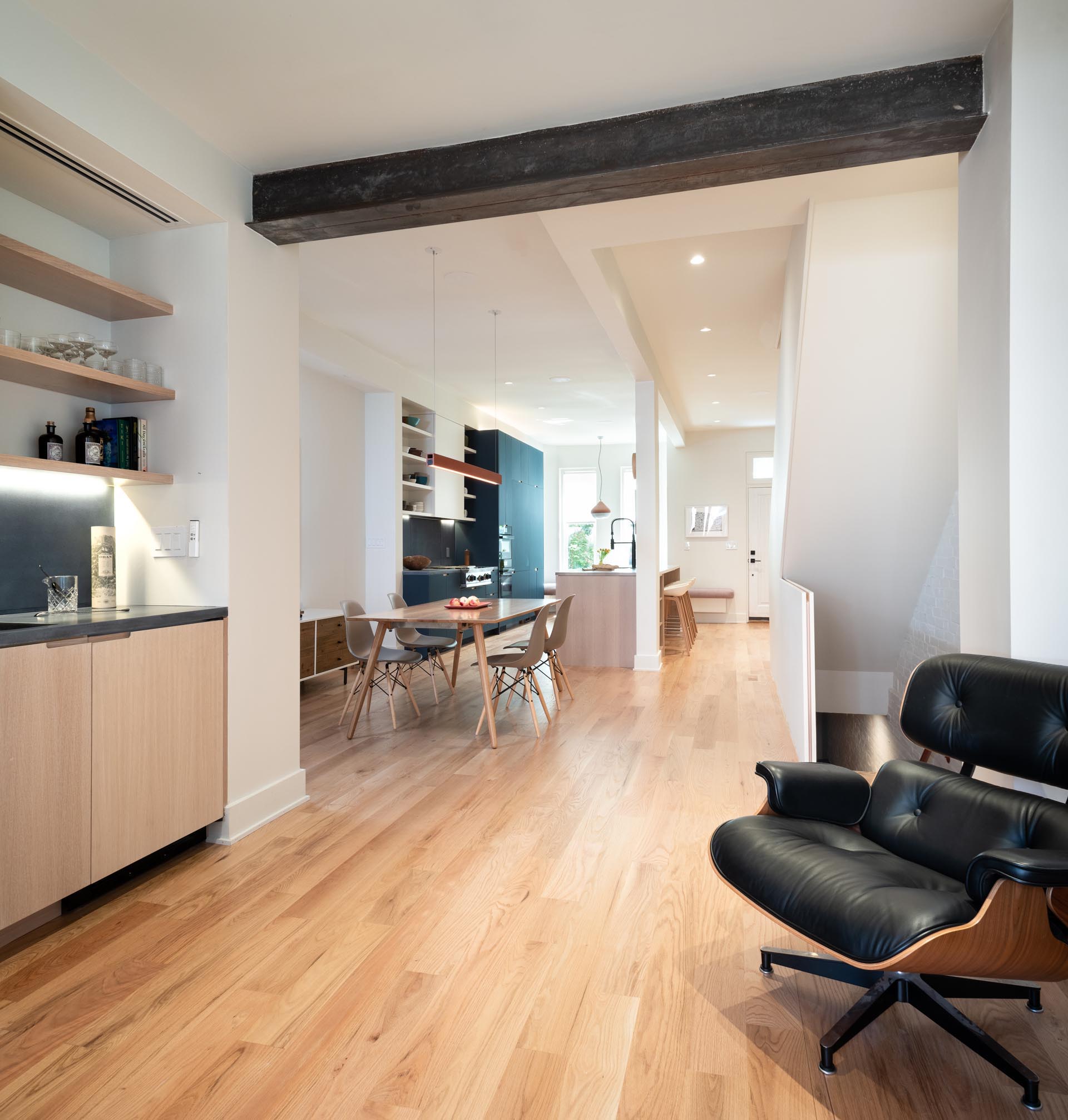
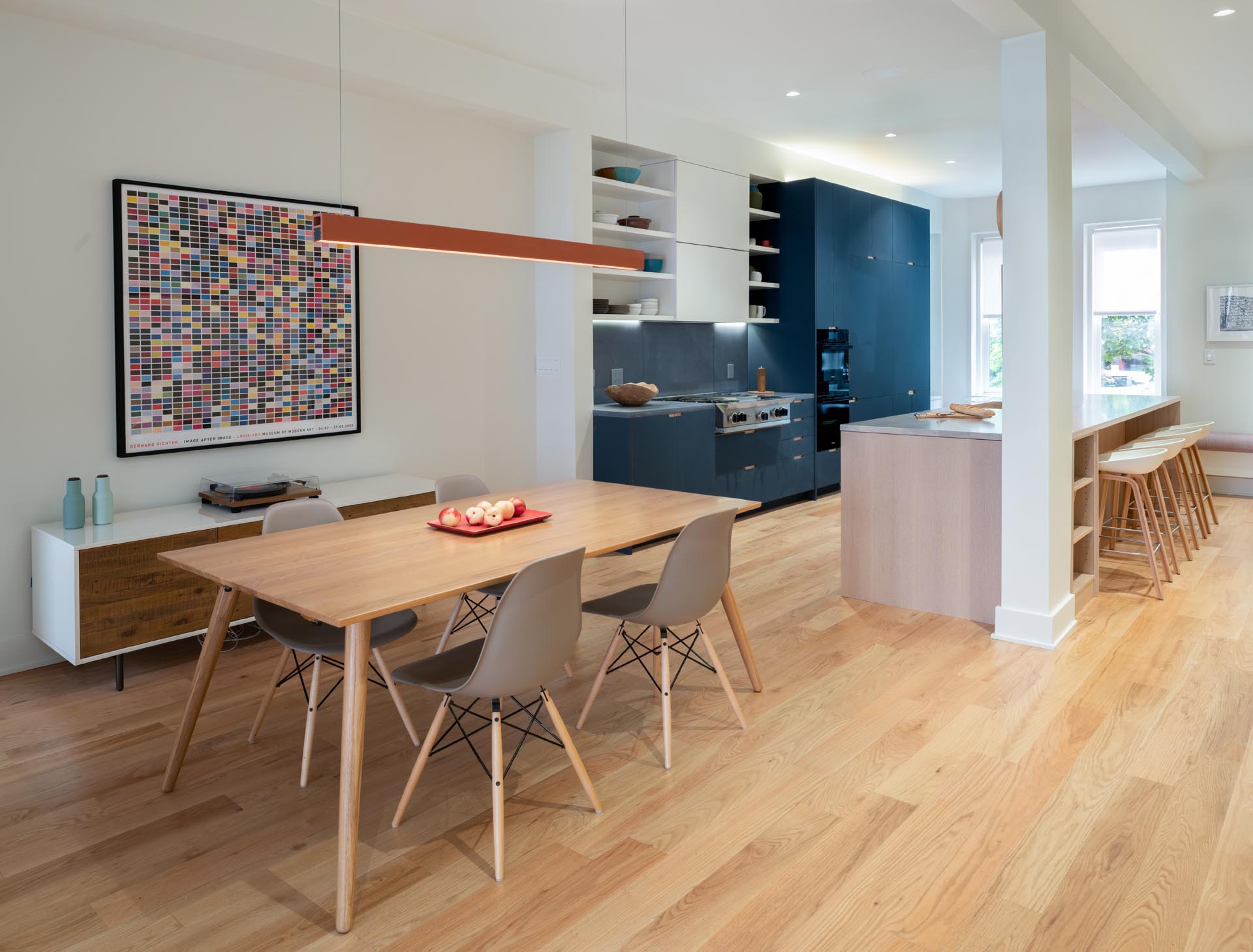
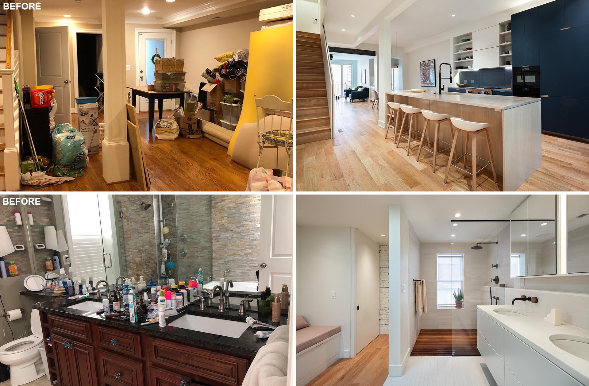
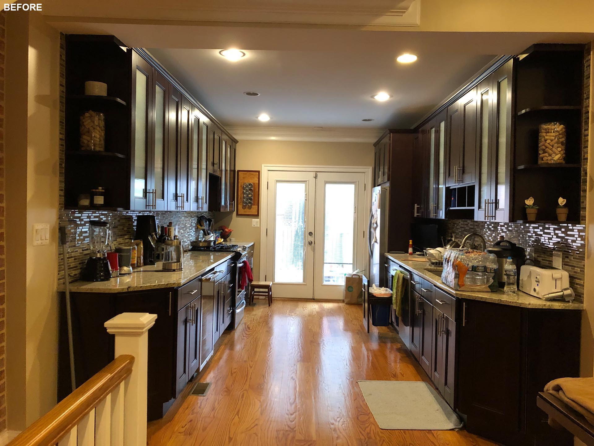
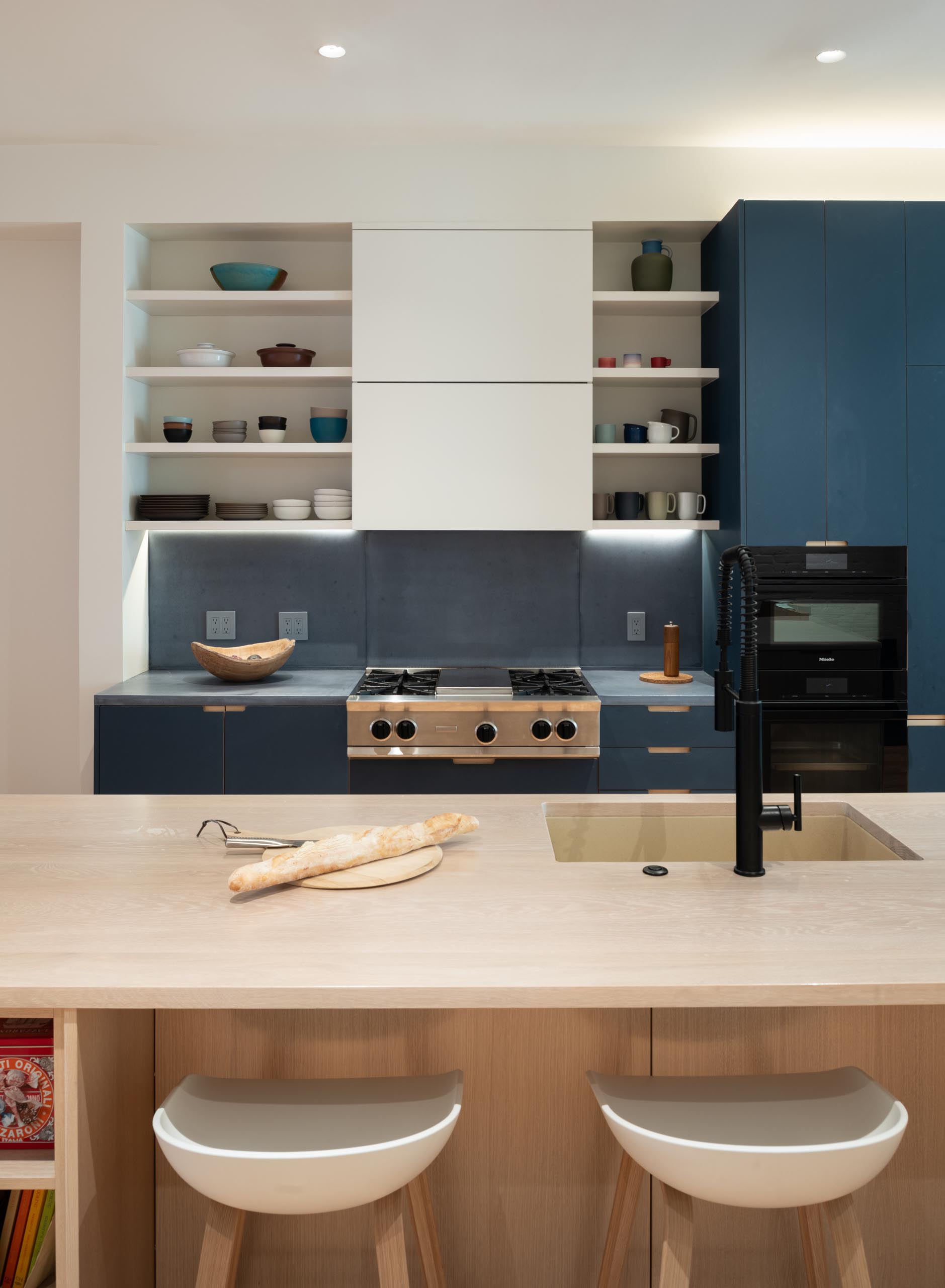
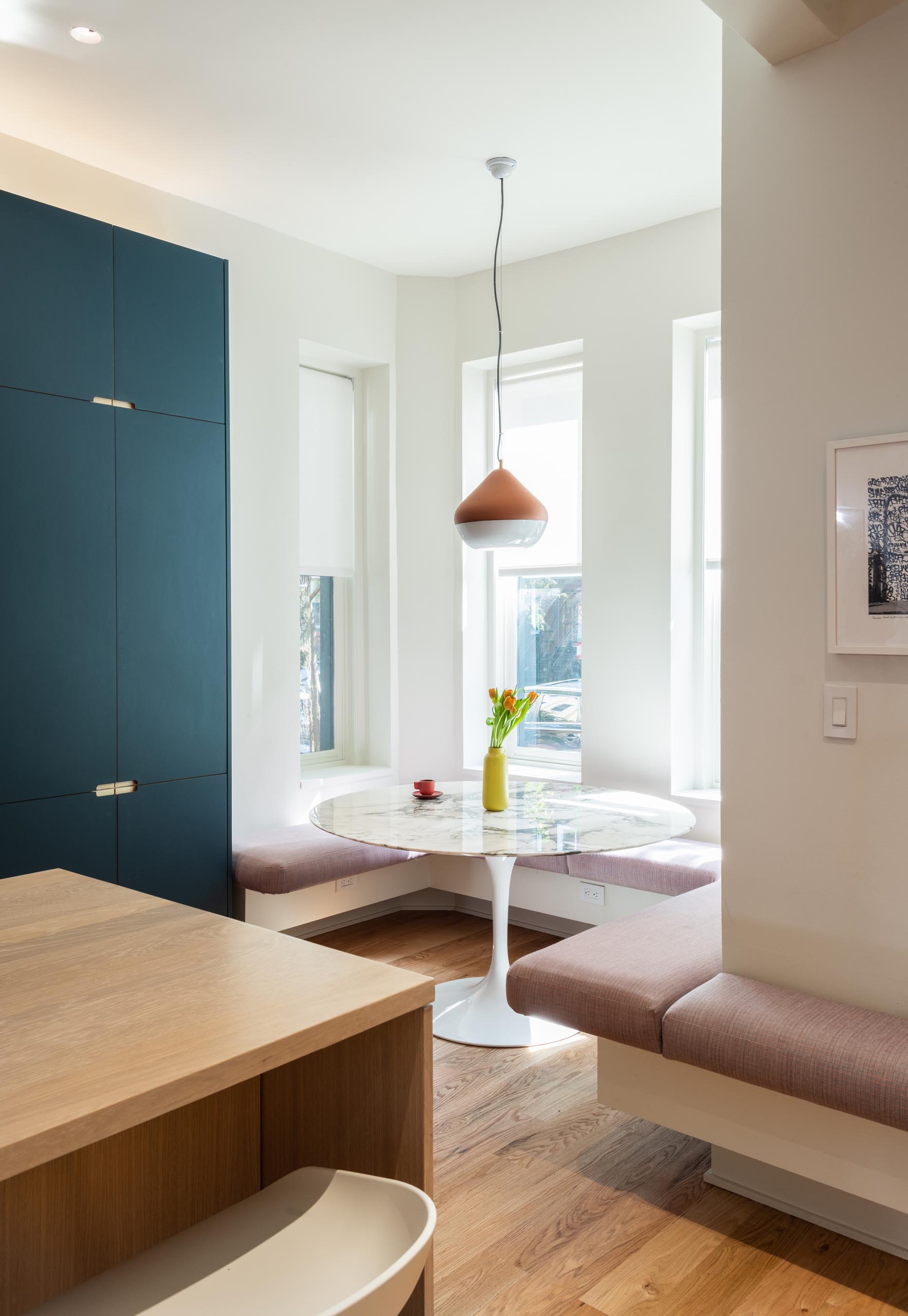
The kitchen shifted to the street frontage, engaging an existing bay window as a window seat for family mealtimes. The new kitchen includes blue and white cabinets, gray countertops and backsplash, and a wood island with seating.
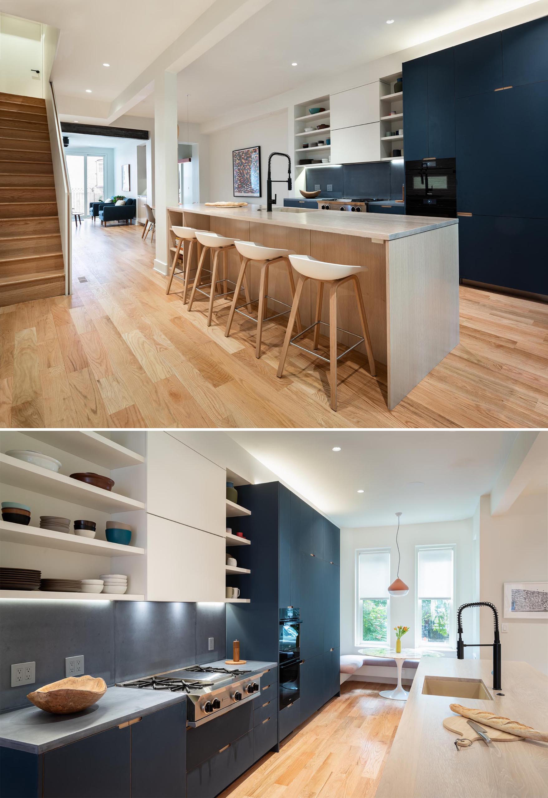
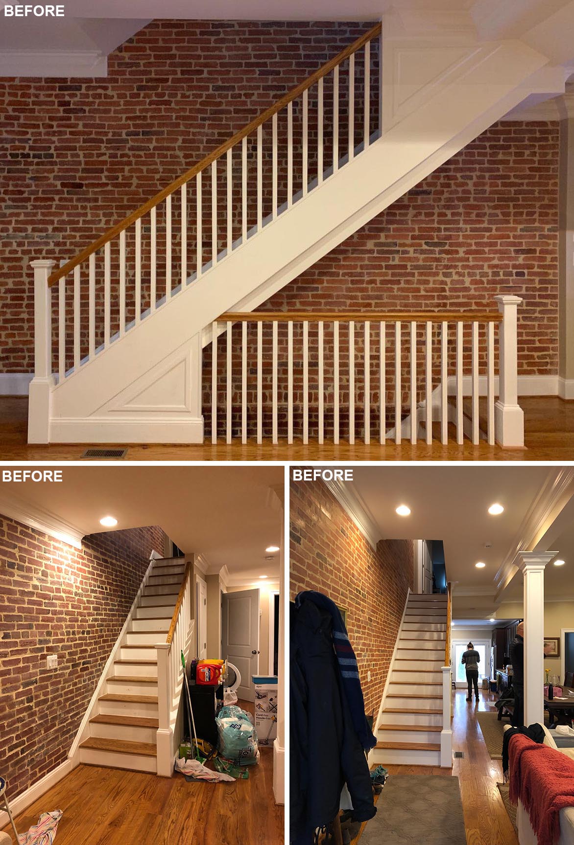
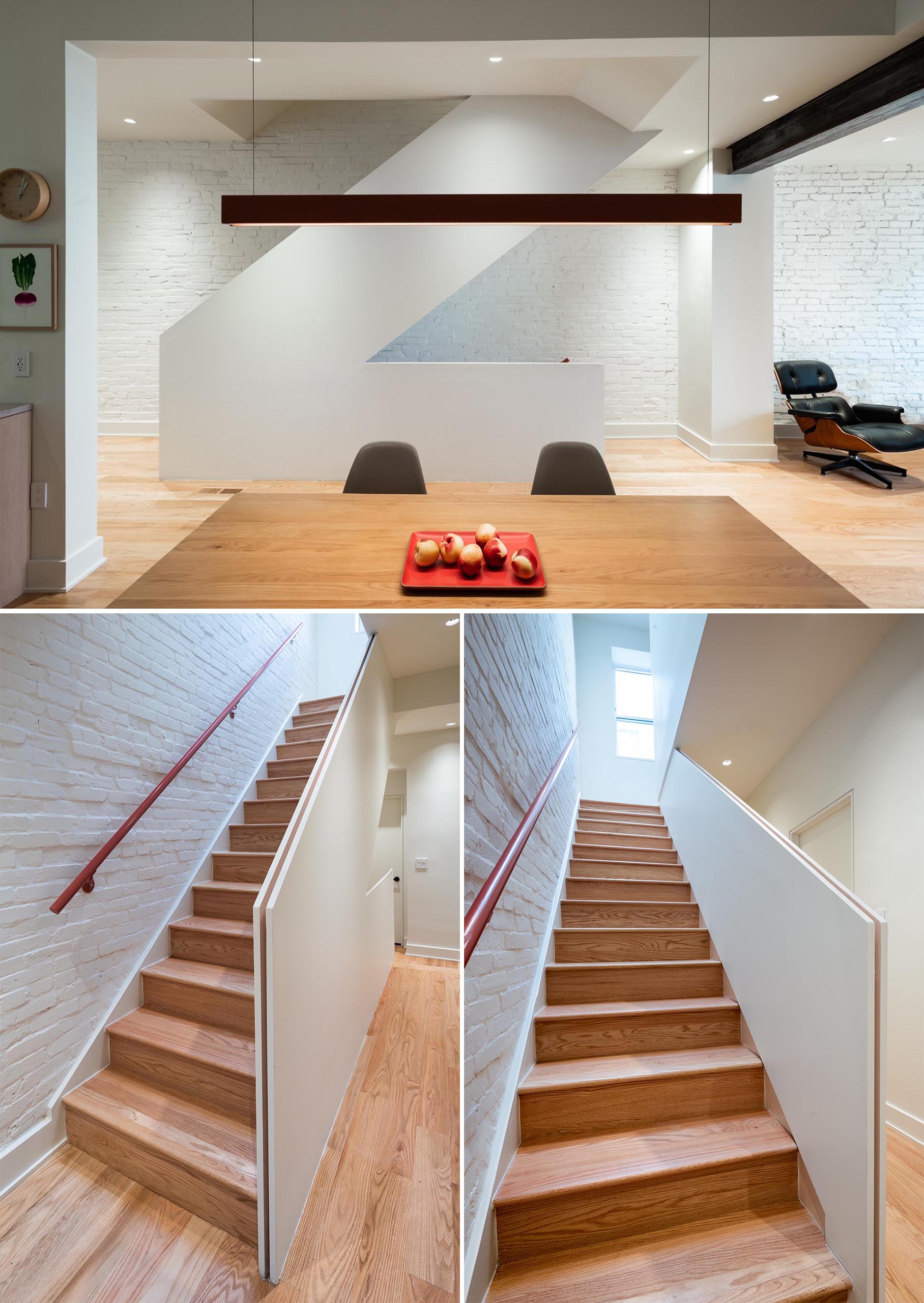
Excess elements were stripped away, and one example of this is the staircase, where the handrails and intricate details were removed and replaced by a simple flat facade, and colorful pink handrails were added. The backdrop for the stairs has also transformed from raw brick to painted brick, adding a sense of brightness to the space.
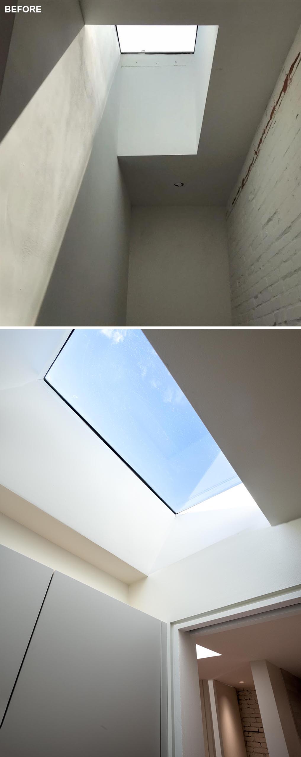
Existing skylights on the third floor remained, with a new master suite sculpted around them.
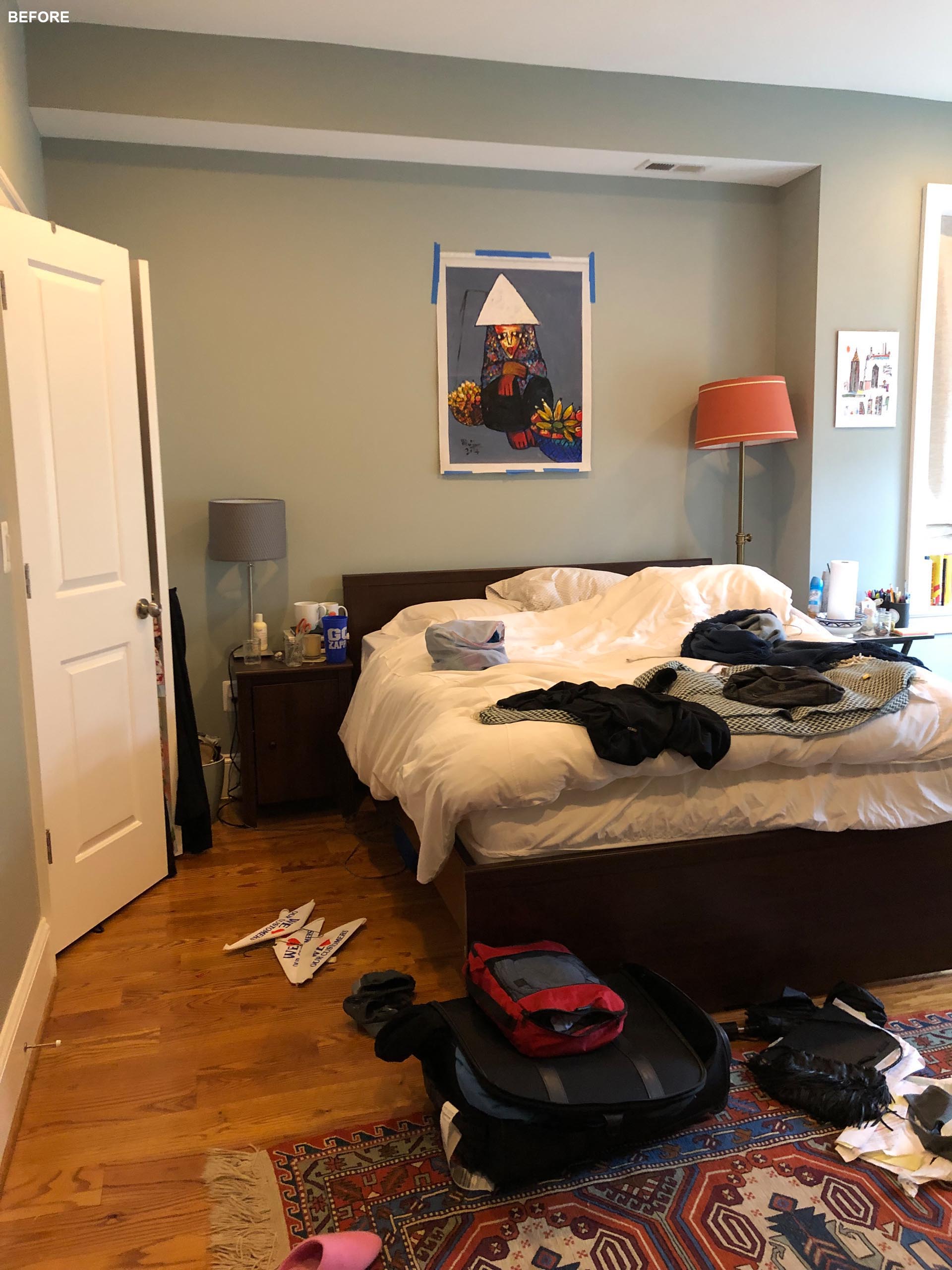
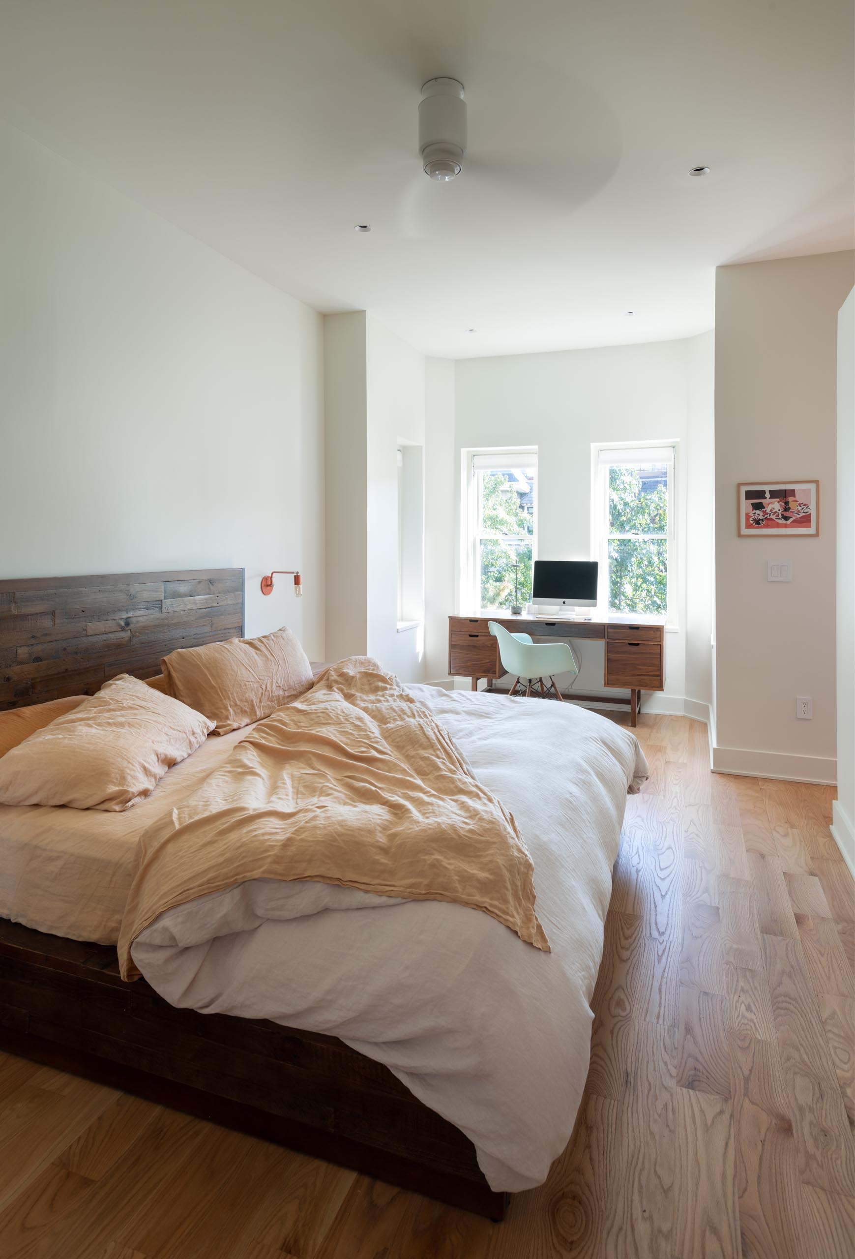
The remodeled bedroom has had the dark walls and bulkhead removed, which were replaced by bright white walls, and a home office by the windows.
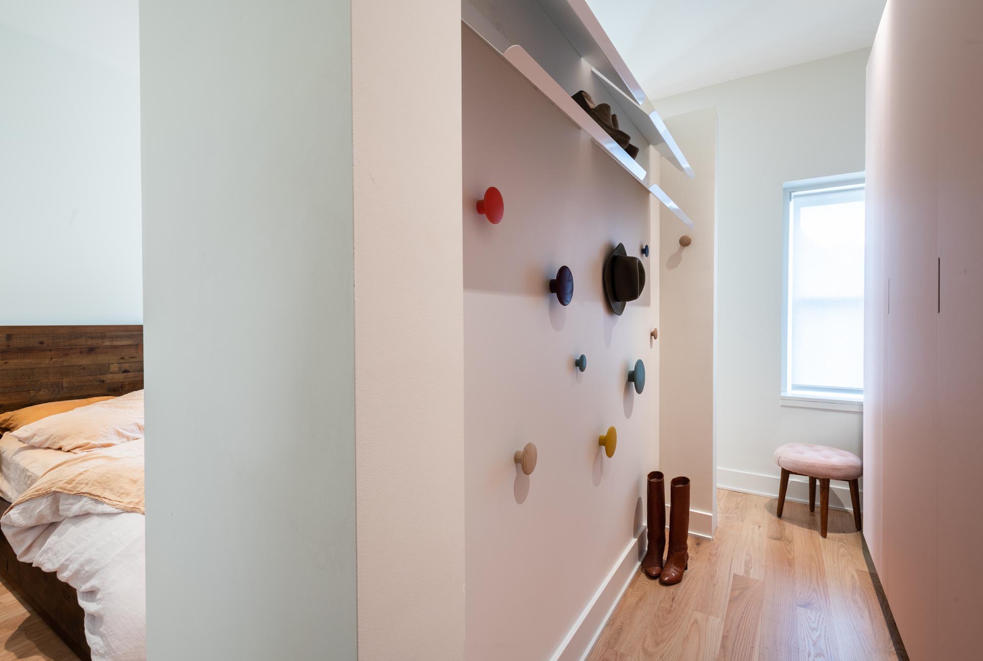
The vanity and wardrobe space also boast fun hanging elements and colorful walls to create a playful space. The dressing room wardrobe, which is sort of floating/ freestanding in the master suite is custom linoleum-fronted cabinets, designed very specifically to their clothing storage needs and adapted to the exact sit
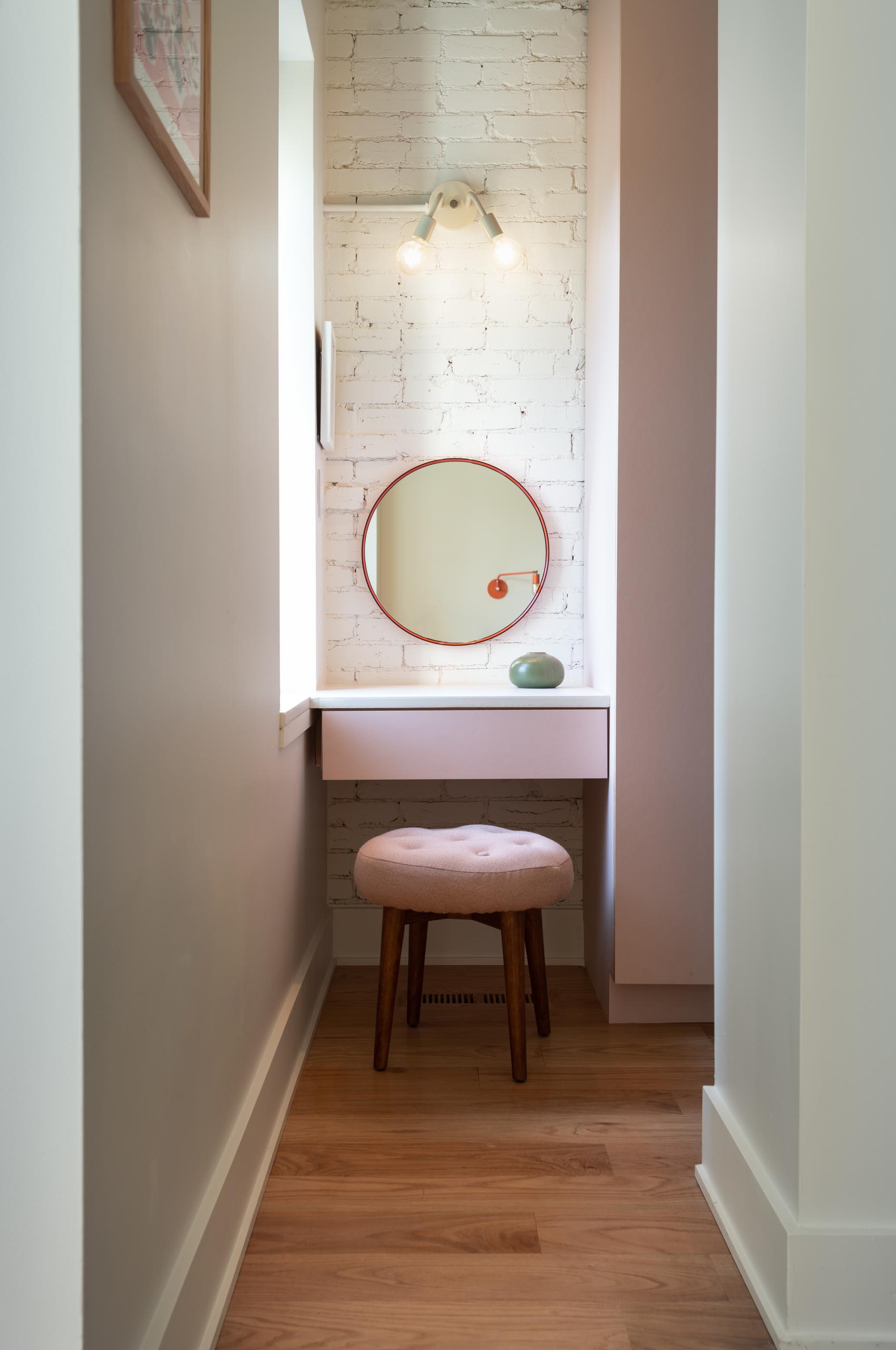
There is also a custom concrete-counter dressing area that seamlessly bleeds into the windowsill for extra surface area.
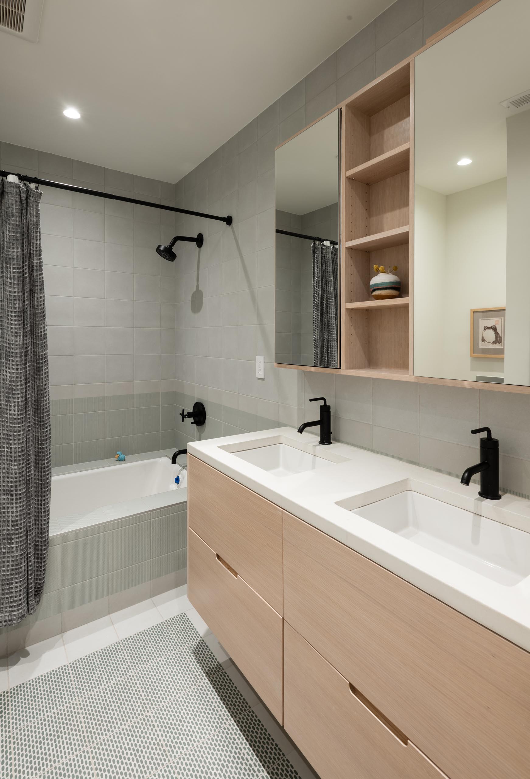
In one of the remodeled bathrooms, a dark countertop with dark wood vanity has been replaced with a white countertop and vanity. The formally dark shower with gray tiles now has lighter gray tiles and a built-in bathtub.
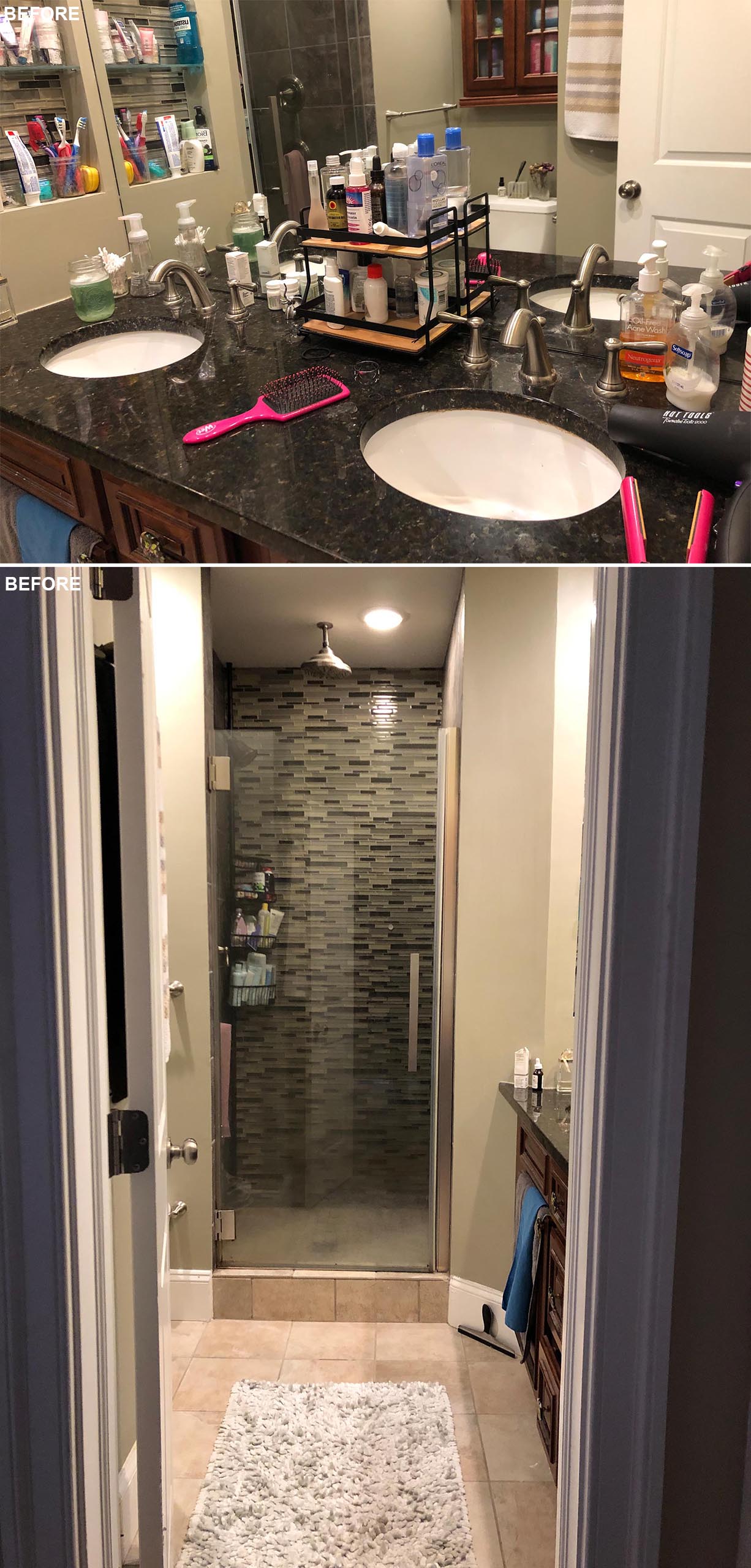
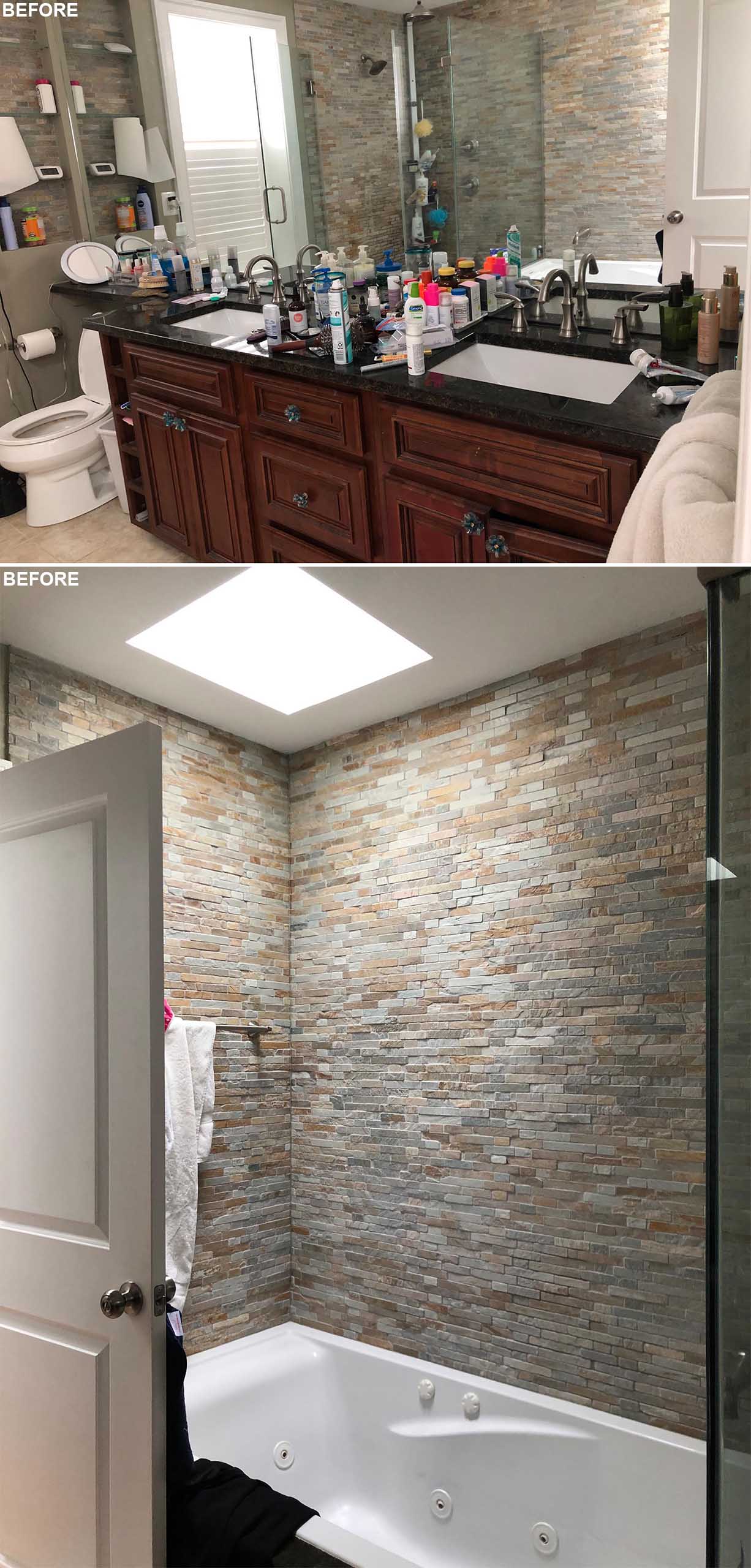
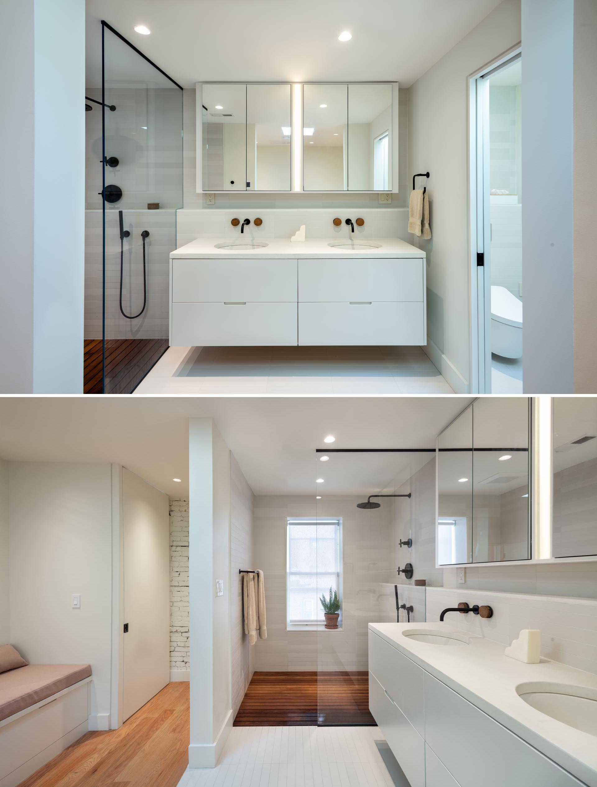
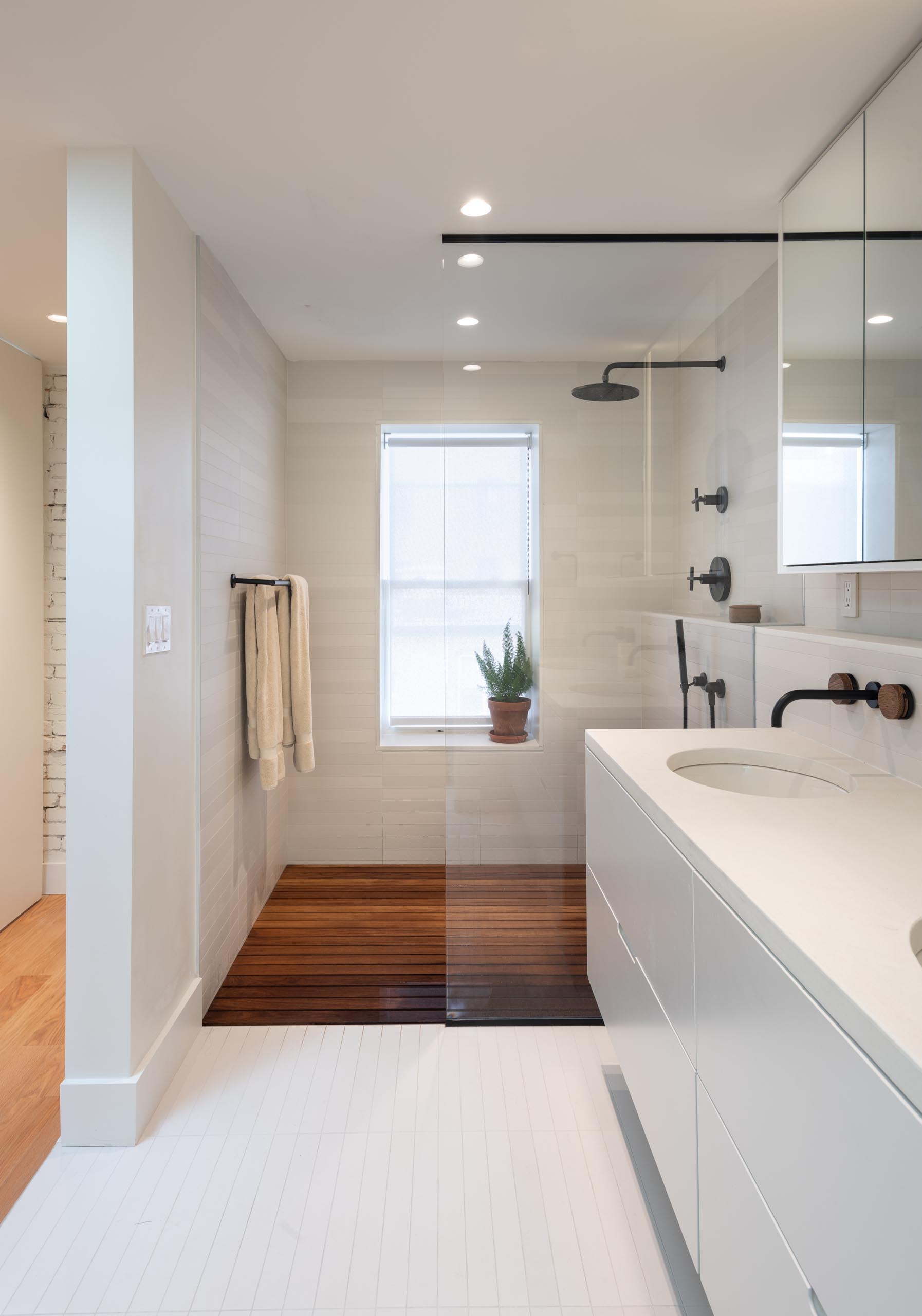
In a second bathroom, the bathroom has been expanded. The dark vanity has been replaced by a bright white floating vanity, while in the shower, light-colored tiles line the walls and a wood floor adds a natural element.
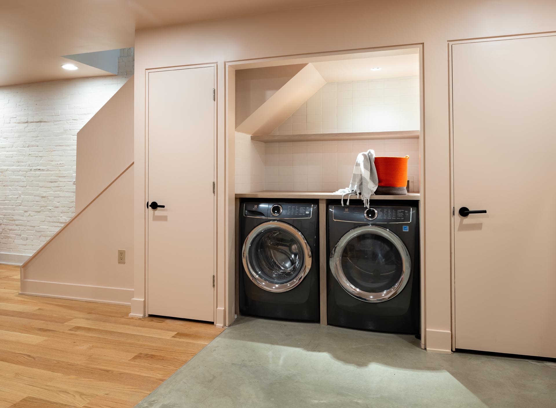
Also included in the remodel is a new laundry area, that’s located at the bottom of the stairs in the basement.
