Photography by Fangfang Tian
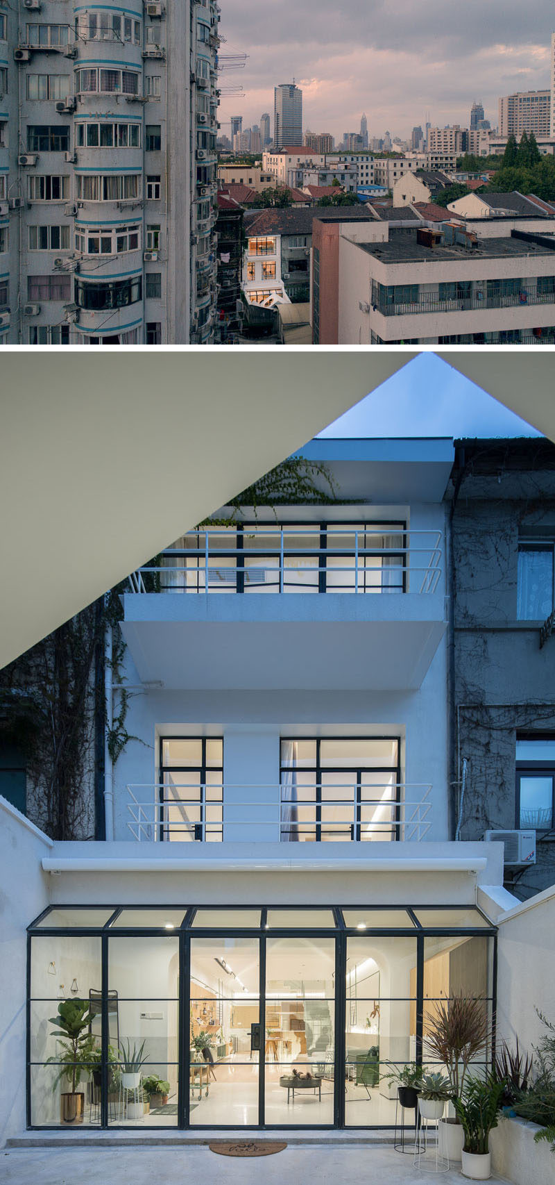
Design firm RIGI have recently completed the renovation of a building, transforming it into a bright and modern residence in Shanghai, China.
Dating back to 1947, the building is made up of 3 floors that measure in at 18 feet (5.5m) in width, and about 49 feet (15.2m) in depth.
Photography by Fangfang Tian
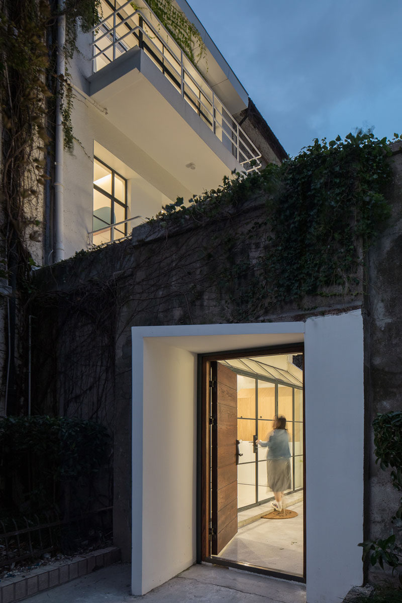
The white entryway and wood door stand out against its concrete and vine surroundings.
Photography by Fangfang Tian
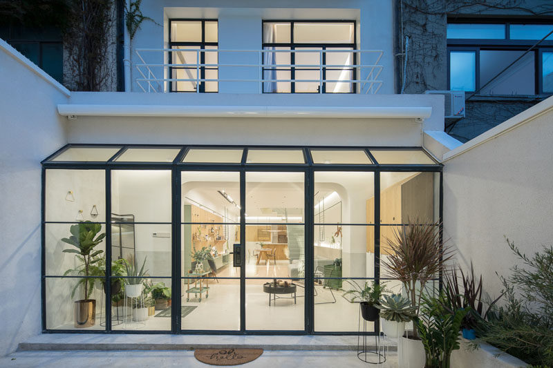
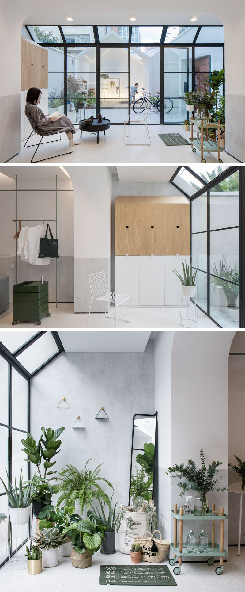
The front door opens up into a private courtyard. A wall of black-framed windows and doors blurs the boundary between indoor and outdoor. Inside, there’s a small sitting area with storage and on the opposite side of the space is an area filled with plants.
Photography by Fangfang Tian
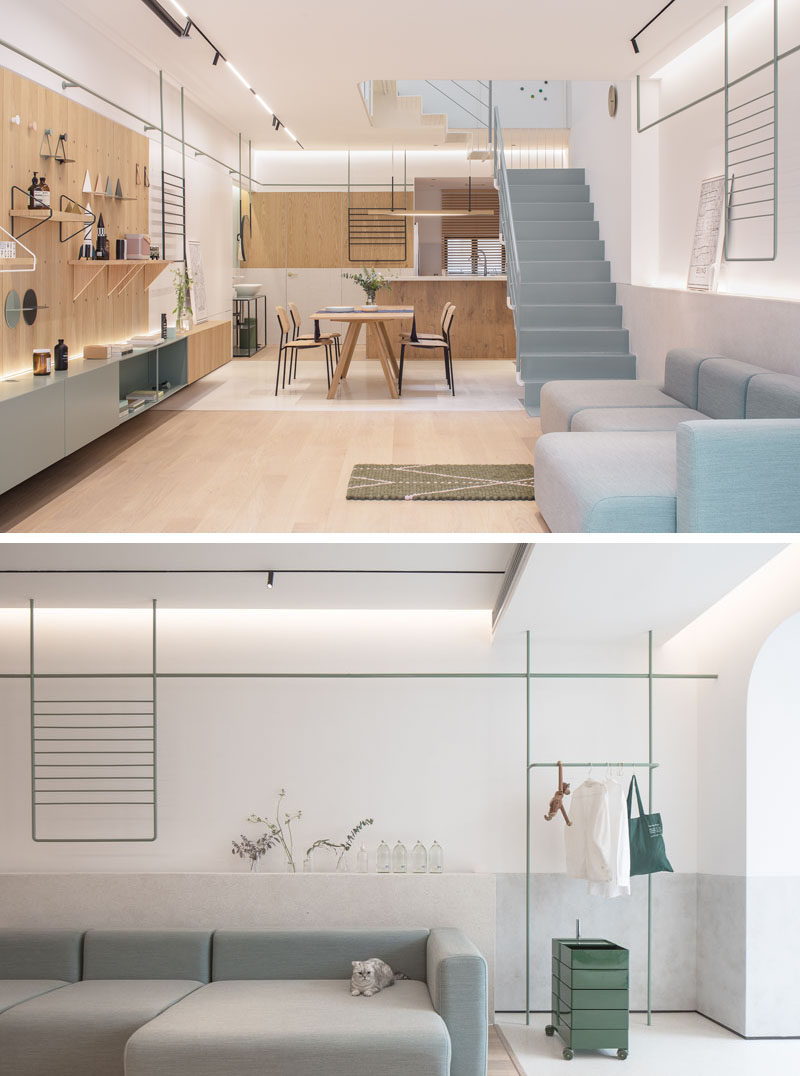
Next to the sitting area is a large open space that’s home to the living room, dining area and kitchen. A large couch sits against the wall, while hidden lighting brightens and highlights a display area.
Photography by Fangfang Tian
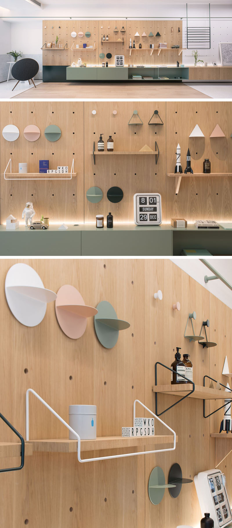
Opposite the couch is a modular furniture wall that the designers have called “life board”. It can be decorated or assembled by accessories in a variety of ways, changing as the family’s needs change.
Photography by Fangfang Tian
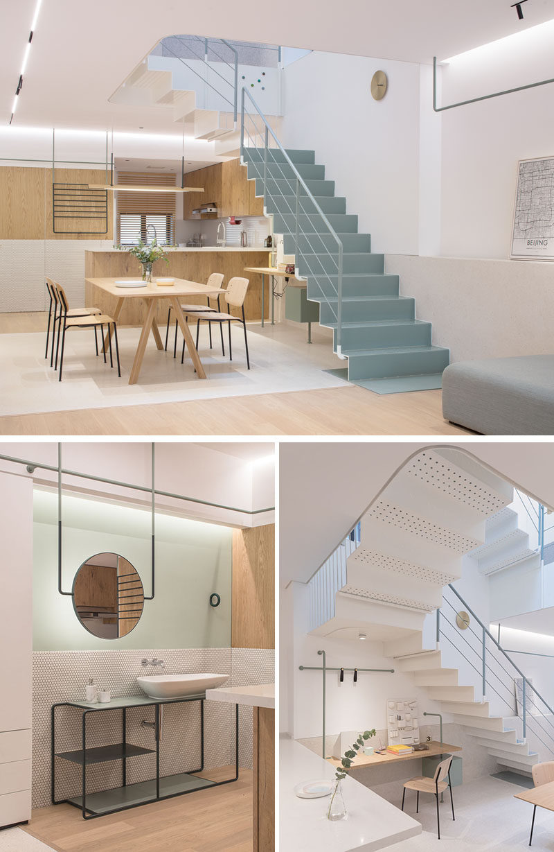
Beside the living area is the dining area and kitchen. Simple light wood furniture keeps the space bright and complements the kitchen design. On one wall, there’s a separate vanity area, while on the other wall and underneath the stairs is a small home office area.
Photography by Fangfang Tian
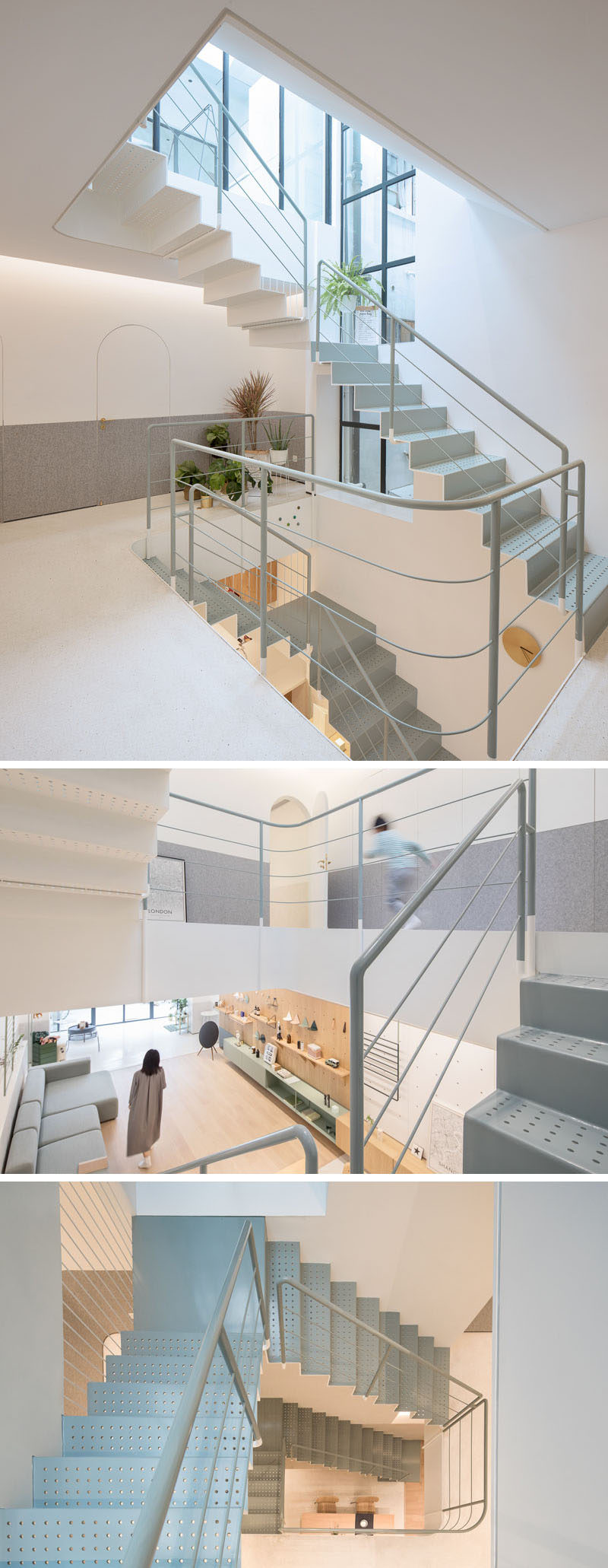
Center to the home is a skylight and staircase that connects the three floors of the house. The steel stairs have punched holes, allowing the light from the windows and skylight to travel through all of the floors.
Photography by Fangfang Tian
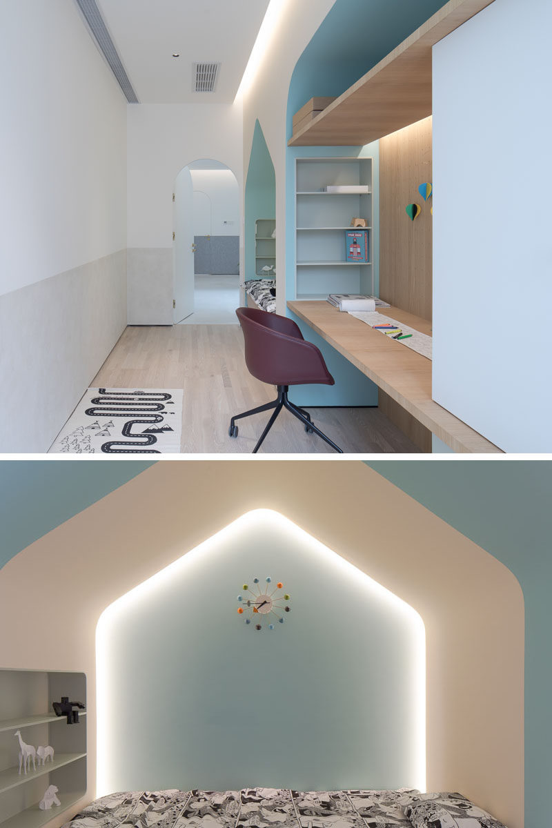
On the second floor of the home is a child’s bedroom with a built-in bed, desk and storage. Hidden lighting and soft colors create a calm environment for the room.
Photography by Fangfang Tian
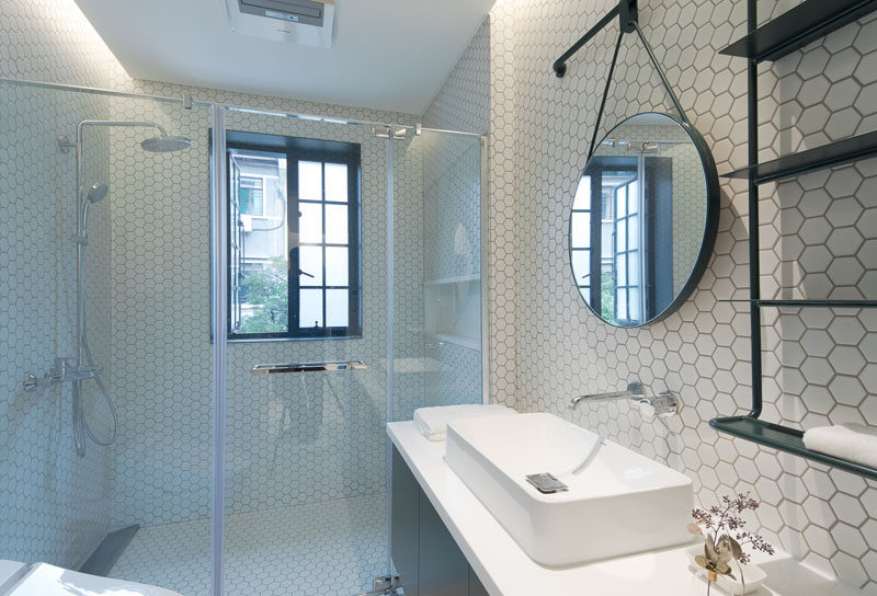
Also on this floor is a guest bedroom and a bathroom. In the bathroom, white hexagonal tiles have been used to keep it bright, while black accents create contrast.
Photography by Fangfang Tian
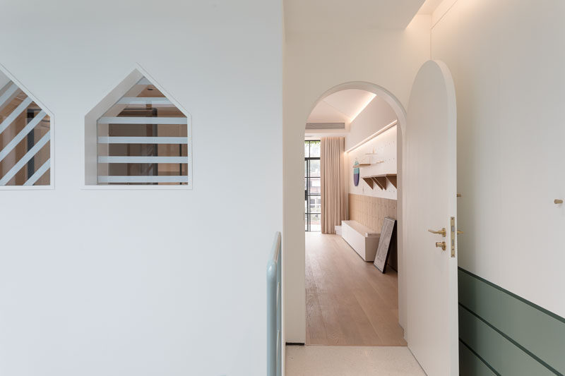
Throughout the home, the doors, like this one to the master bedroom, are arched, adding a curved element to the space.
Photography by Fangfang Tian
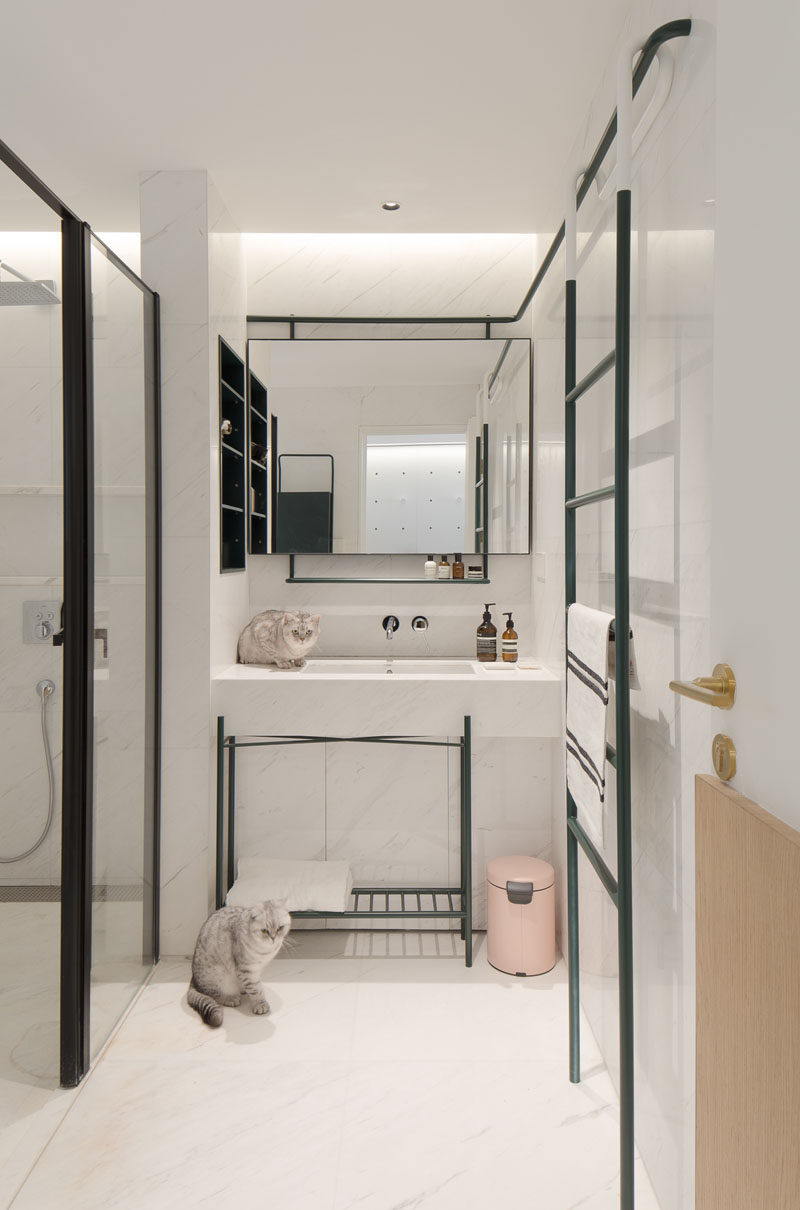
Directly inside the master bedroom is the master bathroom. Similar to the other bathroom, black accents have been used to contrast the white walls, ceiling and floor.
Photography by Fangfang Tian
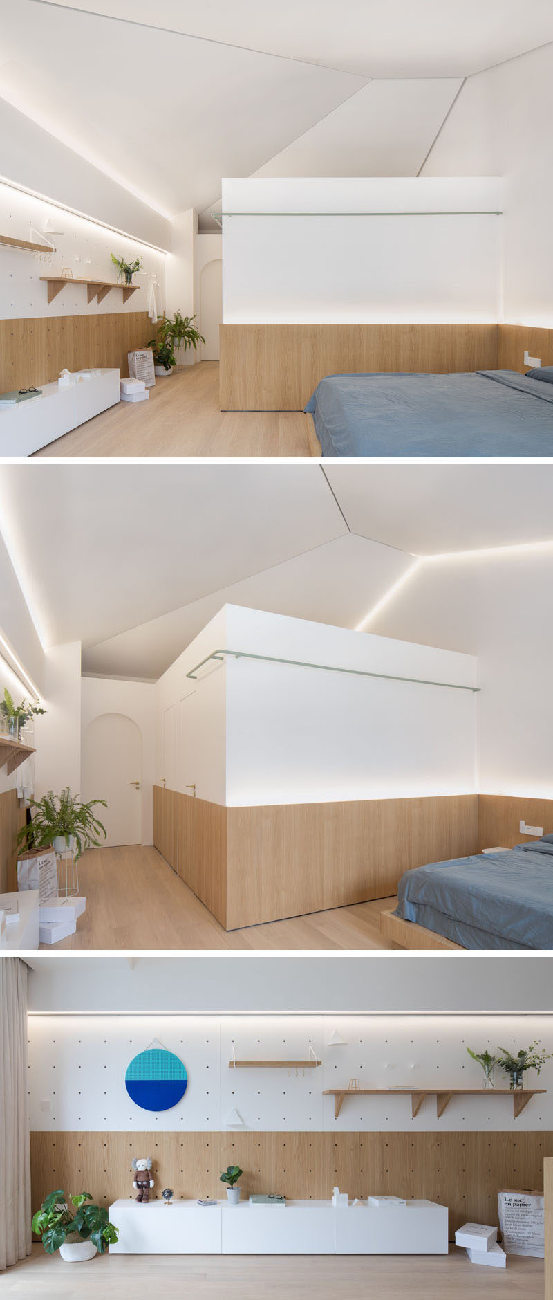
In the master bedroom, the designers kept the sloped ceiling structure of the original building. Wood wraps around the lower part of the room, and on the wall opposite the bed, there’s a display wall which can be changed up, much like the wall in the living room.
