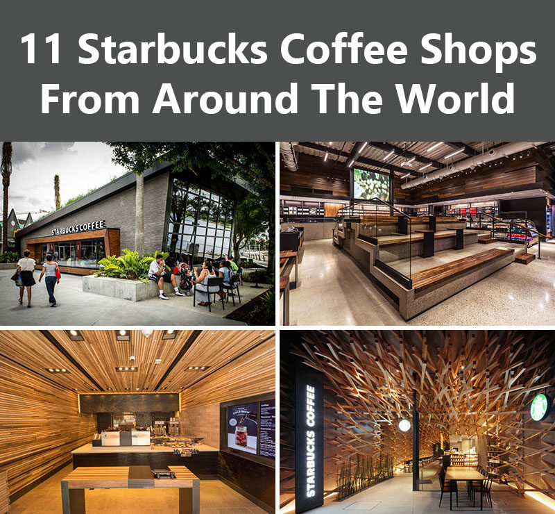
Despite having well over 20,000 locations worldwide, Starbucks still manages to create unique stores that combine their iconic style with details reflective of the culture and customs of the city in which it’s built.
By including locally sourced materials and incorporating elements unique to the area, together with rich coffee-inspired colors and natural materials, Starbucks is able to design locations that are original yet completely familiar.
Here are 11 examples of Starbucks shops that show how creating a familiar and consistent feel doesn’t mean sacrificing originality or uniqueness.
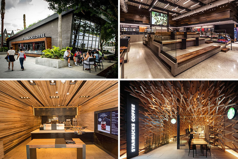
1. This Starbucks location in Downtown Disney in Orlando, Florida, has lemongrass growing on the sloped roof, while large windows allow people walking past to see into the interior that has wooden tables and chairs and comfy leather couches.
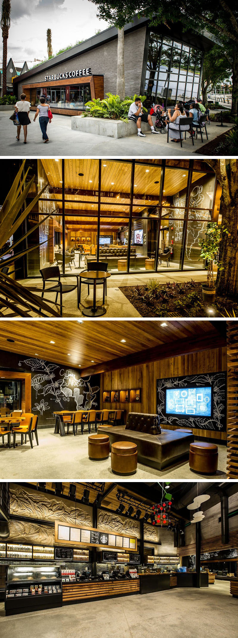
David Daniels (Starbucks senior designer) designed this Downtown Disney Starbucks location in Orlando, Florida.
2. The Starbucks location on the famous Las Vegas Strip features stadium style seating to accommodate up to 40 people, as well as a 150 square foot movie screen that plays a short film about how Starbucks coffee is made from bean to cup.
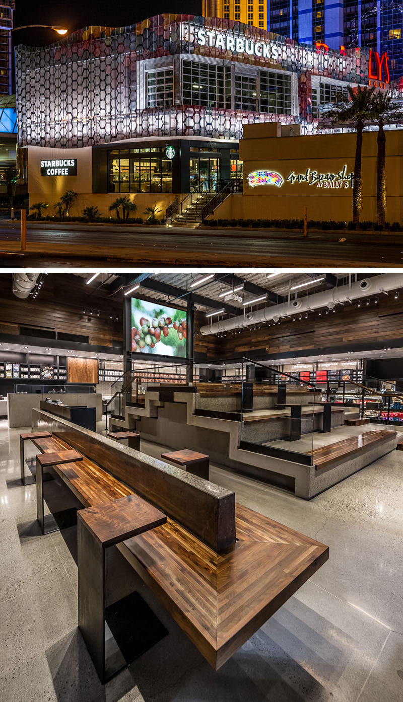
Eric Mele (Store Designer) designed this Starbucks location on the Las Vegas Strip.
3. This compact Starbucks location on Wall Street in New York City, has streamlined their process to make getting your coffee and snacks that much faster while at the same time maintaining a sophisticated style suitable for it’s Wall Street location.
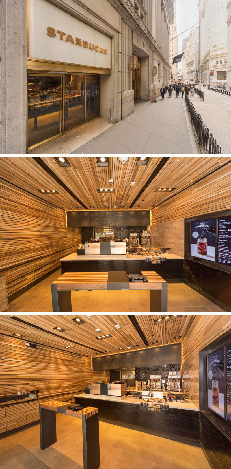
John Park (Starbucks senior architectural designer) designed this Starbucks location on Wall Street in New York City.
4. By including many Dutch elements in the design of this location and keeping original elements of the structure – like the marble floor – this Starbucks concept store in Amsterdam takes away some of the American feel and makes the store feel a bit more like a local coffee shop.
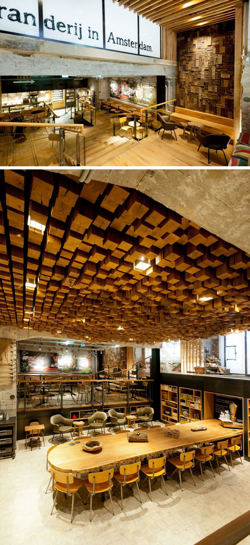
Liz Muller (Starbucks Concept Design Director) led the design of this Starbucks location in Amsterdam. Photography by Rien Meulman.
5. This multi-level Starbucks in Bangkok, Thailand took a page out of Thai design books when they designed the steel building with a gable roof on the lower part of the building to be reminiscent of traditional Thai farm houses.
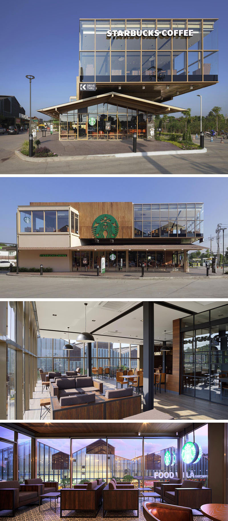
I Like Design Studio designed this Starbucks in Bangkok, Thailand.
6. In an attempt to connect this Starbucks location to it’s surroundings, interlocking wooden beams lead people from the streets deep into the shop. The wooden beams were also used in a nod to sustainability and recycling as they can easily be dismantled and used again somewhere else.
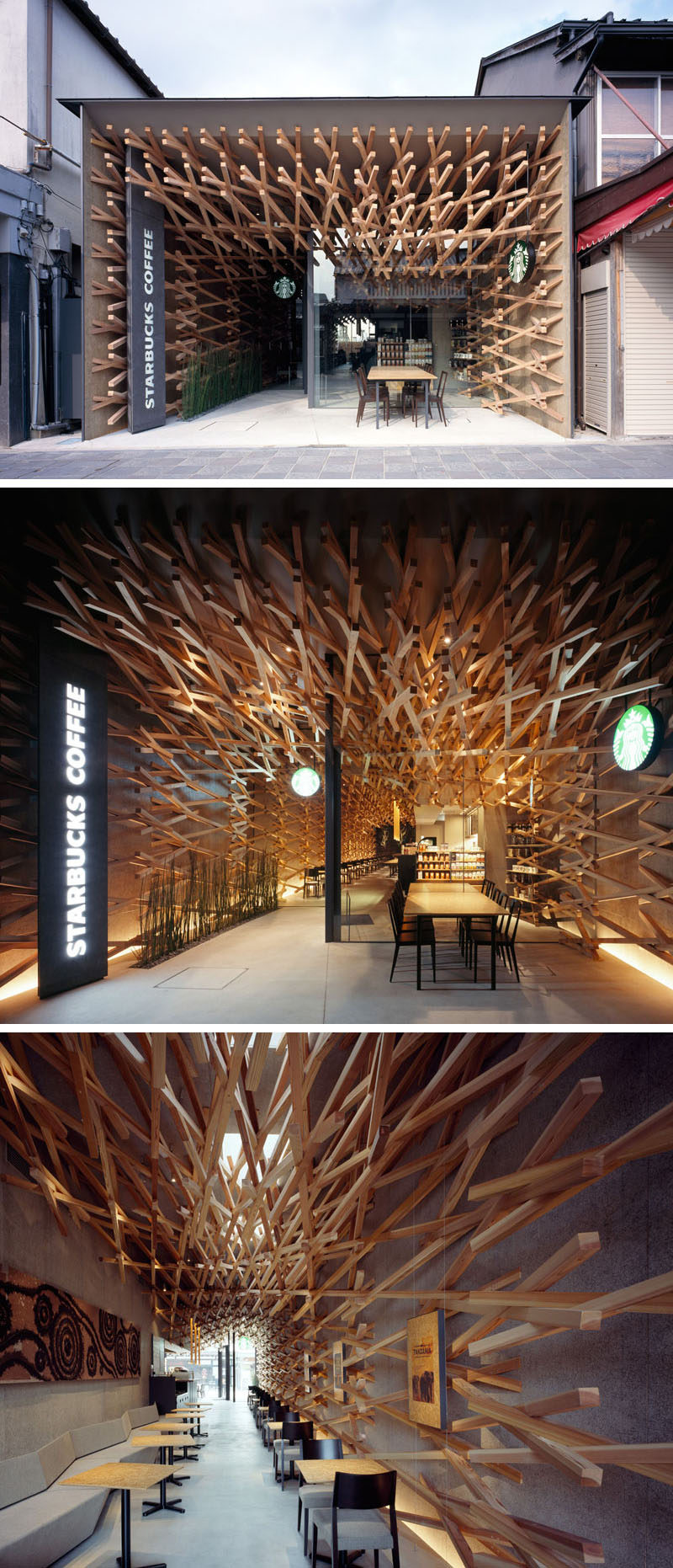
Kengo Kuma designed this Starbucks in Tokyo. Photography by Masao Nishikawa.
7. This Starbucks was redesigned to take advantage of the height of the building and the scenic views around it. The four level location features a rooftop patio that looks out over Istanbul’s Bosphorus Strait, and tall windows to allow those sitting inside to enjoy the views of the water and surrounding city.
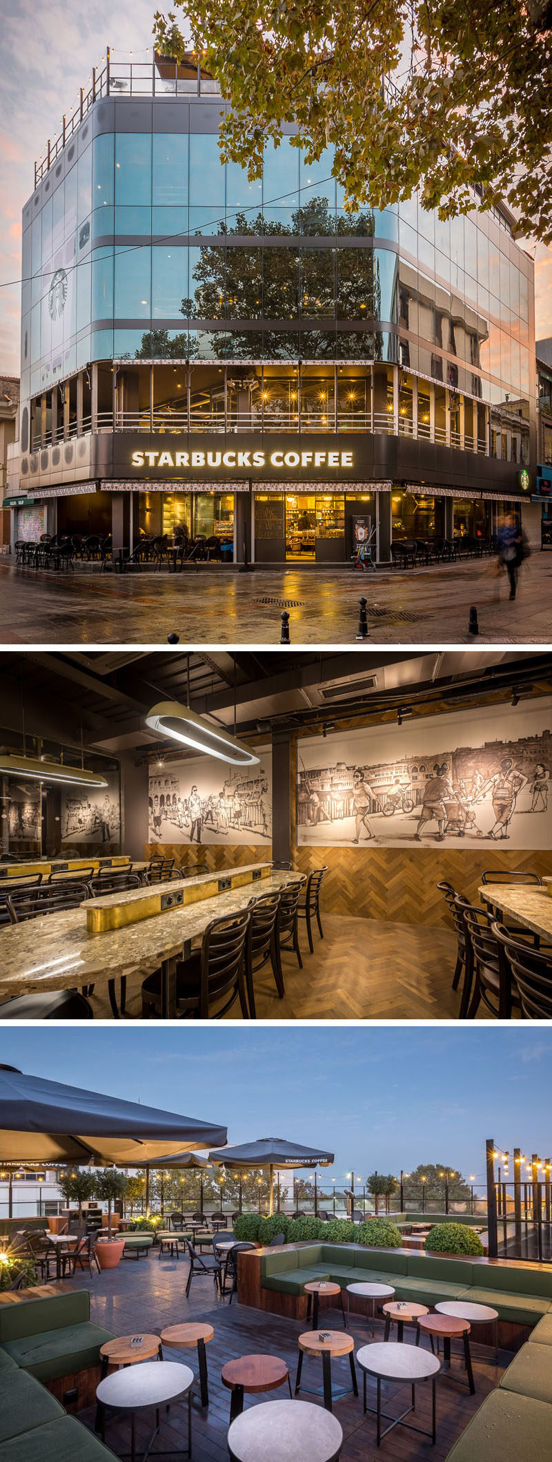
Eva Wieland (Starbucks store designer) designed the Kadikoy Starbucks.
8. This Starbucks location on La Brea Avenue in Los Angeles features a number of unique design details including two long bars that allow for two kinds of customers – those who are running in and out, and those who want to spend some time learning about coffee and the company. This location also includes a tasting bar and is one of the Reserve coffee bars that serves a selection of fine roasted coffee.
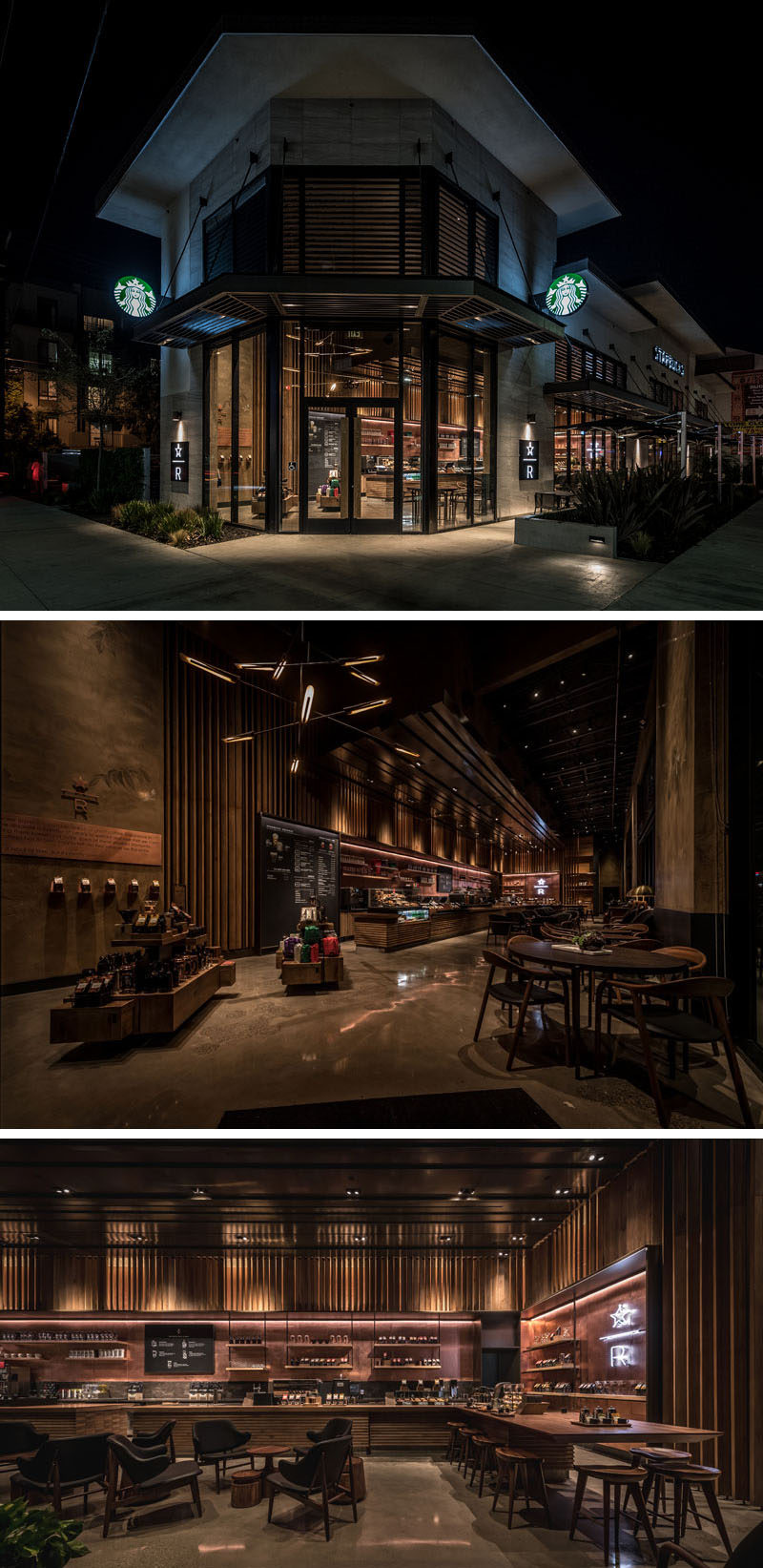
Min Cho (Starbucks managing director for store design) led the design of this Los Angeles Starbucks.
9. Just nine blocks away from their very first location in Seattle, Starbucks’ very own roasting and tasting facility, The Roastery, offers a unique experience unlike that of any other Starbucks location. Not only is the space huge and open, but guests at the Roastery are able to experience coffee in an immersive environment that allows them to engage with their coffee at every stage, including hearing the beans roast in the machines and watching the beans get transported through the pipes above them.
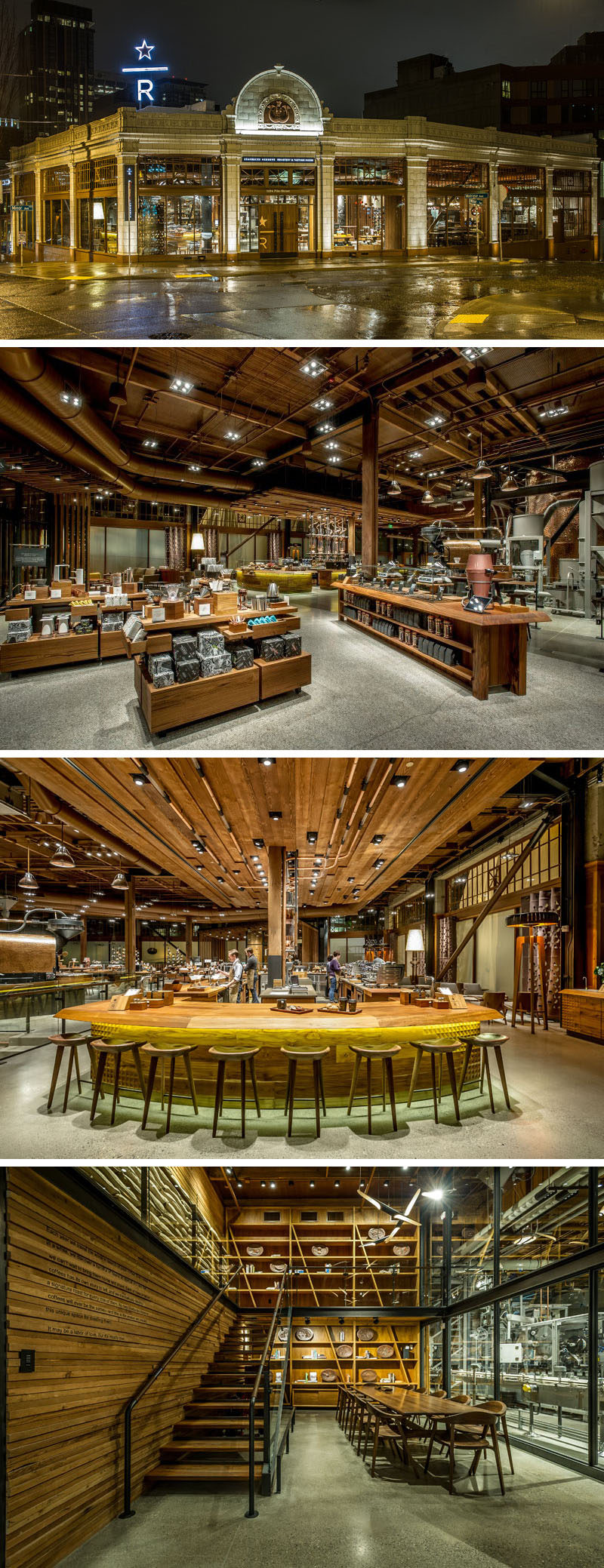
Liz Muller (Starbucks Concept Design Director) designed the Starbucks Reserve Roastery and Tasting Room.
10. The luxury of train travel gets even more luxurious with the addition of a double-decker Starbucks car, that features a walk up bar complete with a small food display as well as an upstairs in which train riders can order their food and coffee from the comfort of their padded leather seats.
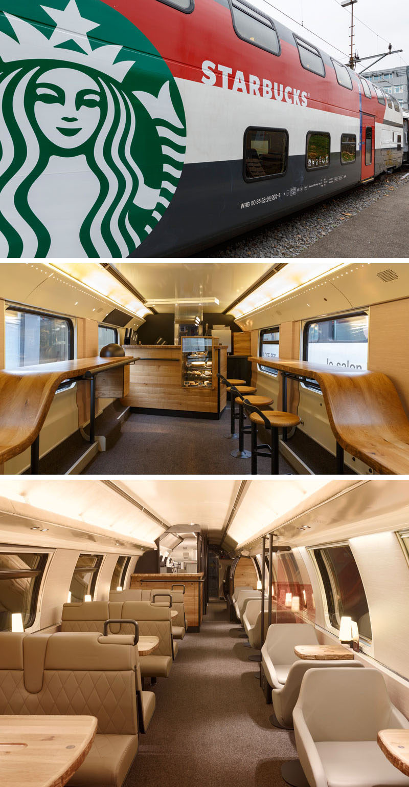
Liz Muller (Starbucks Concept Design Director) led the design of this Starbucks train car in Switzerland.
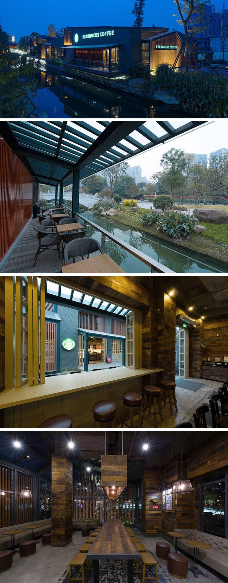
11. Made up of two freestanding buildings along the Jinjiang River in Chengdu, China, this Starbucks location uses large sliding doors and windows to create a feeling of connection between the two spaces and nature, and rich reclaimed wood and concrete floors to bring an authentic and sustainable look to the store. An outdoor patio also maximizes allows customers to enjoy their coffee outside while appreciating the natural landscape around them.
