Photography by Kyung Roh
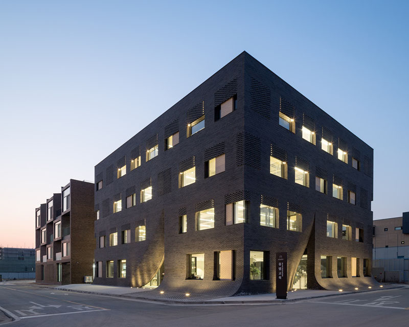
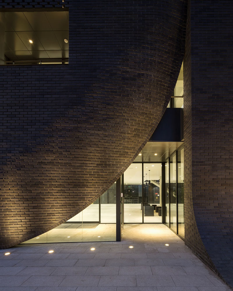
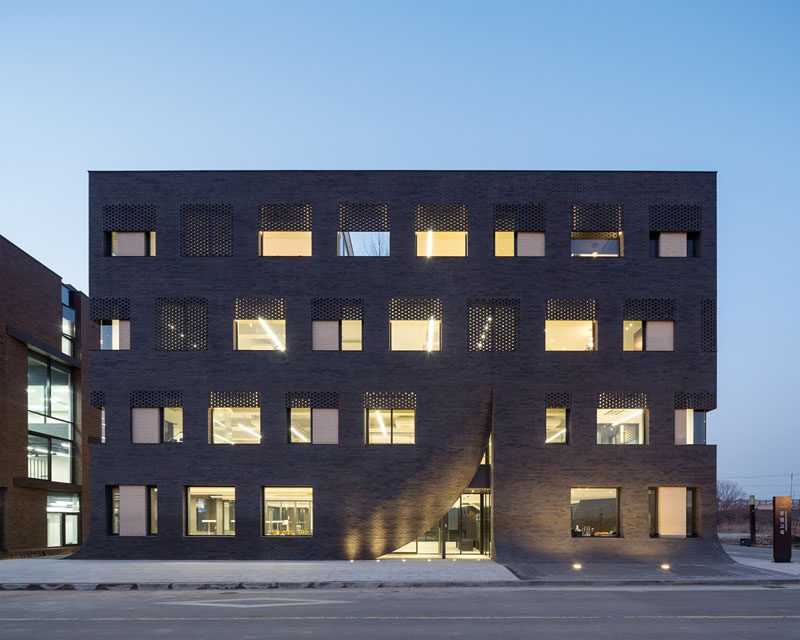
Wise Architecture have designed this building in Korea for MU:M, an English education company, that features a facade that looks as if it’s being parted like a curtain to expose the entrance.

Photography by Kyung Roh
The architects were inspired by the company logo of an owl. In the early stages of designing the building, it was suggested that the building should reflect a nest-shape building, however, in the end, the building took shape in the form of a stump looking naturally settled down on the ground.

Photography by Kyung Roh
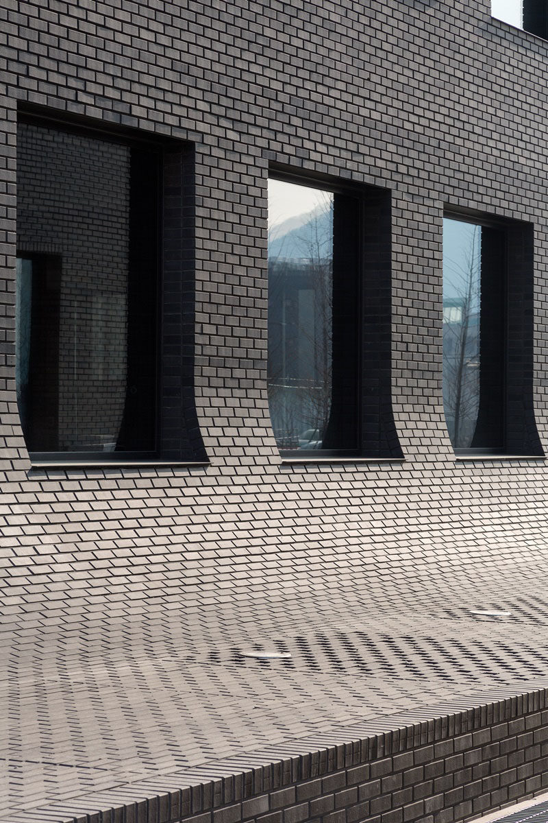
The building is entirely covered in black brick, and these ‘cracks’ in the building are similar to that cracks you would find in a wooden stump.

Photography by Kyung Roh
The curved sections on the other parts of the building also reflect the stumps, where the wood would naturally curve out to meet the ground.

