Styling bookshelves can feel like an overwhelming task. How much stuff do you put on the shelves? Are books really necessary? How much empty space should there be? These are all questions we ask ourselves when we decide to conquer our shelves.
To help make styling your bookshelves feel less daunting we’ve compiled a few ideas to help you create bookshelves that hold all your things and look great while doing it.
1. Create A Grid
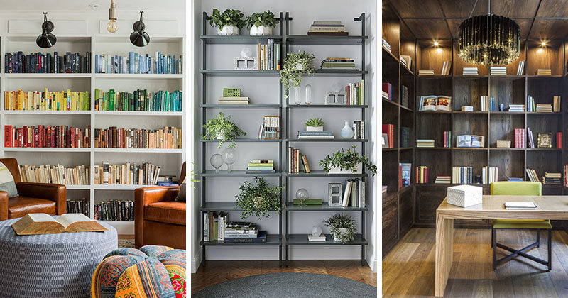
Rather than randomly placing things on your shelves, create a grid in your mind and place books and objects in the spaces of the grid. This helps keep things organized and prevents your bookshelf from looking cluttered.
Designed by Yamagata Architecture
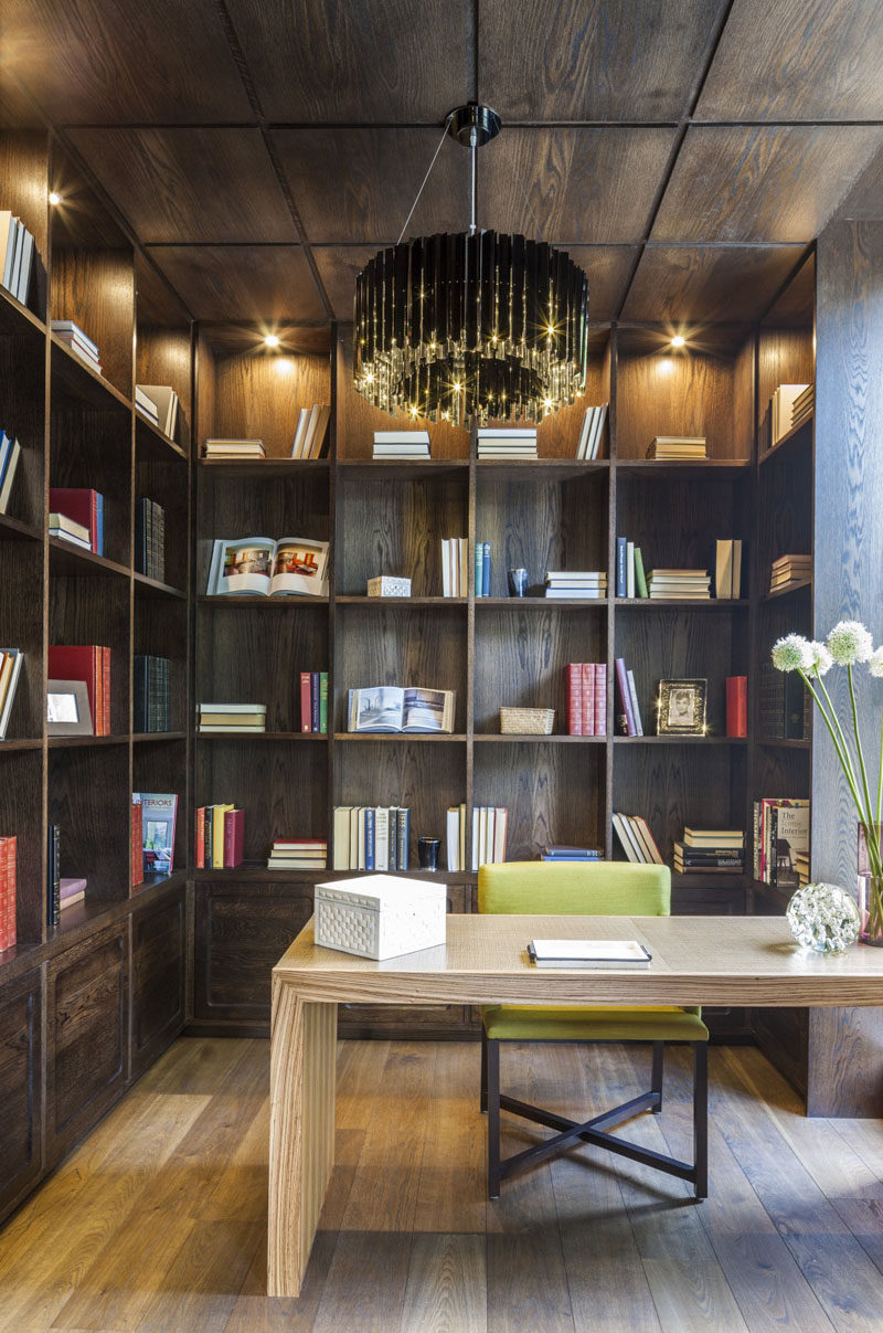
Designed by SHH. Photography by Alastair Lever & Gareth Gardner.
2. Accent Pieces Of Varying Heights
Bookshelves aren’t just for books. Using decor pieces of varying heights helps to create a more dynamic look on your shelves and can fill empty spaces.
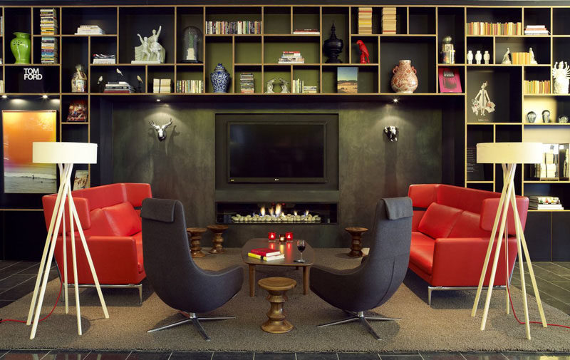
Designed by Concrete Architectural Associates.
3. Picture Frames
Including personal photos on your shelves individualizes your bookshelf.
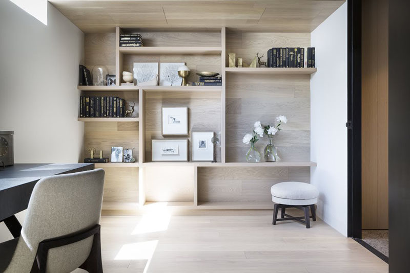
Designed by Wood Marsh Architecture, together with interior designer Kendra Pinkus. Photography by Lynton Crabb Photography.
4. Greenery
Plants literally give life to the shelves, and can be a great way to add height and depth to your display. They also help purify the air, making them great for your home environment.
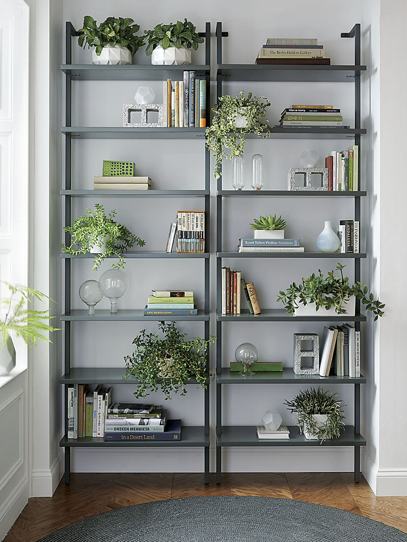
Inspiration and wall mounted bookcase from CB2.
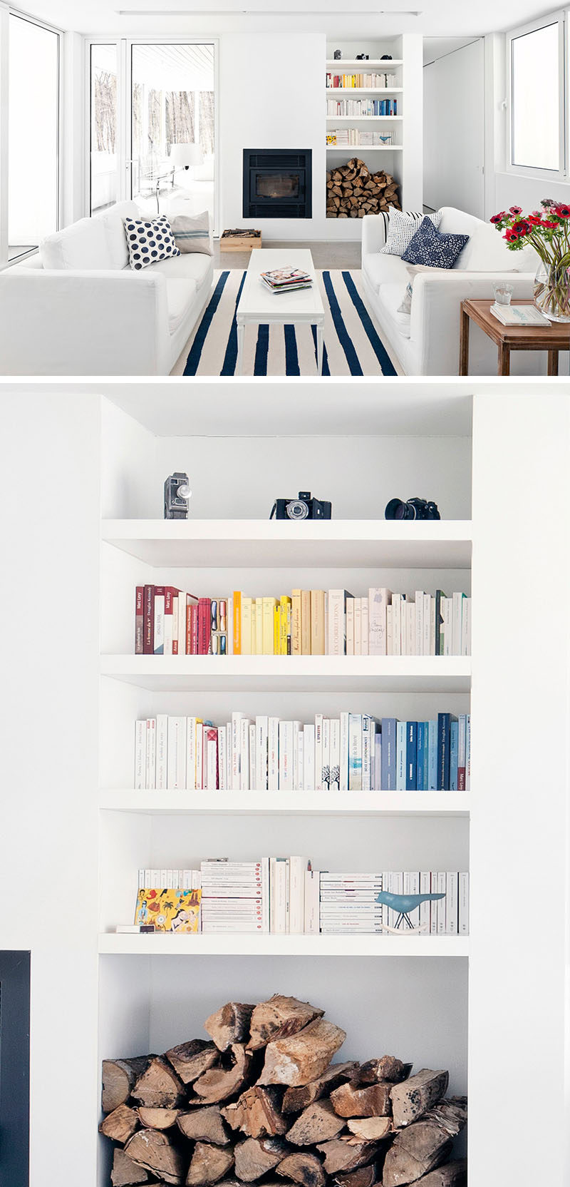
5. Color Blocking
If you have a lot of books, chances are you’ll be able to sort them into colors. Arrange them on your shelves in their groups of colors and you’ll have a creative display that will inspire all who visit to pick up a book and start reading.
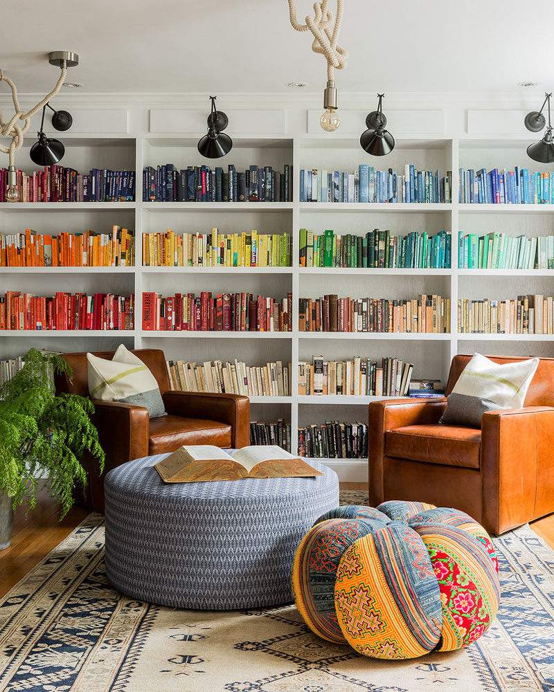
Interior design by Hudson Interior Designs.
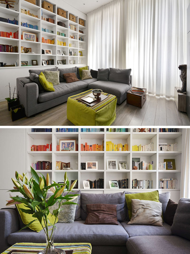
Designed by Daniele Petteno Architecture Workshop.
6. Beautiful Books
Big, hardcover books with beautiful spines or covers are the ones you’ll want to have sitting on your shelves. Don’t forget, if you do use hardcover books, take the jacket off to see what might be revealed underneath.
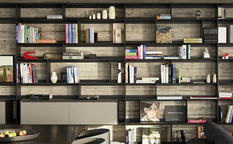
Designed by Pitsou Kedem Architects. Styling by Eti Buskila. Photography by Amit Geron.
7. Keep It Odd
Group similar objects in odd numbers rather than even ones for a more aesthetically pleasing look. Odd number of objects create dimension and depth, while even ones can look flat and unfinished. If you must have even groups, then think about using different heights.
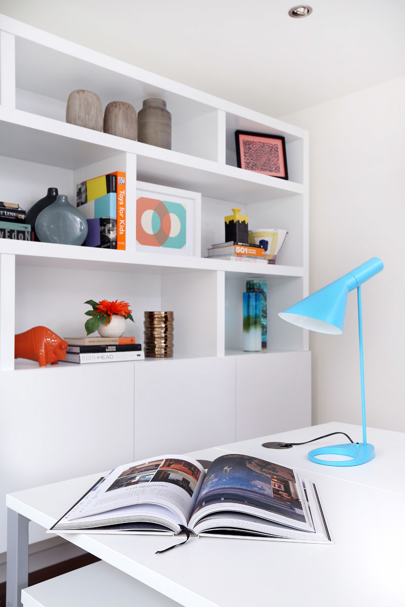
Designed by LLI Design. Photography by Alex Maguire Photography.
8. Don’t Fear White Space
Not every space on your shelves need to be occupied. Gaps around and between objects prevent your shelves from being overcrowded and lets each object or group of objects stand out on their own.
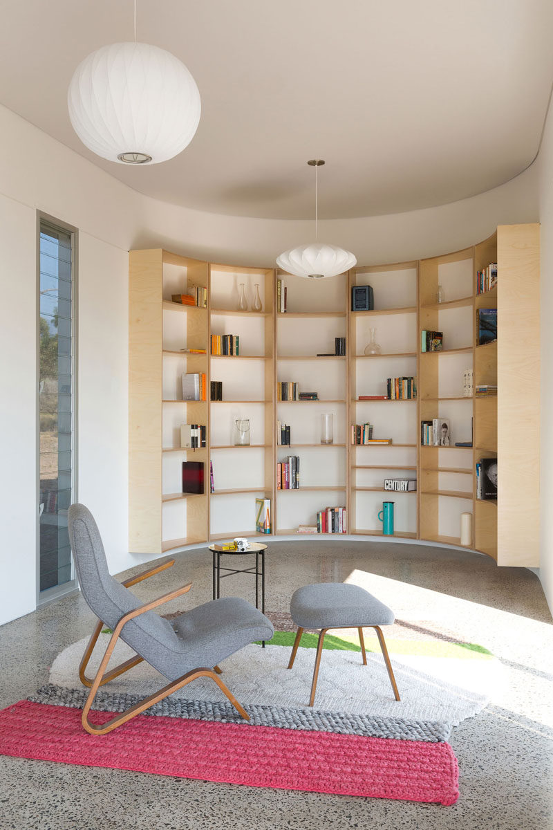
Designed by Benn & Penna Architects. Photography by Tom Ferguson.
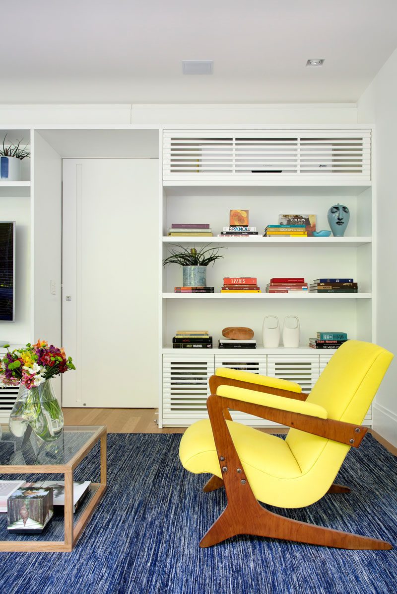
9. Add Pops Of Color
Adding a few touches of color to an all white display can make a big impact and help make your shelves stand out.
