Cabinet doors typically aren’t the most exciting design element in a room. They open and they close. Sure, they need to look nice but they’re usually all pretty similar. Except for these ones we’re sharing with you today.
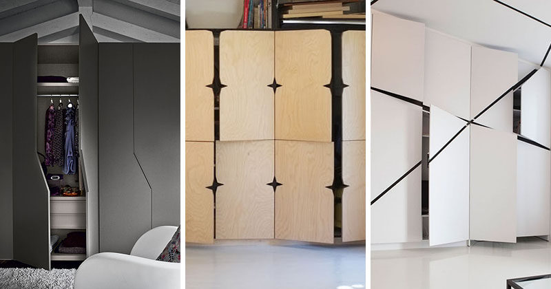
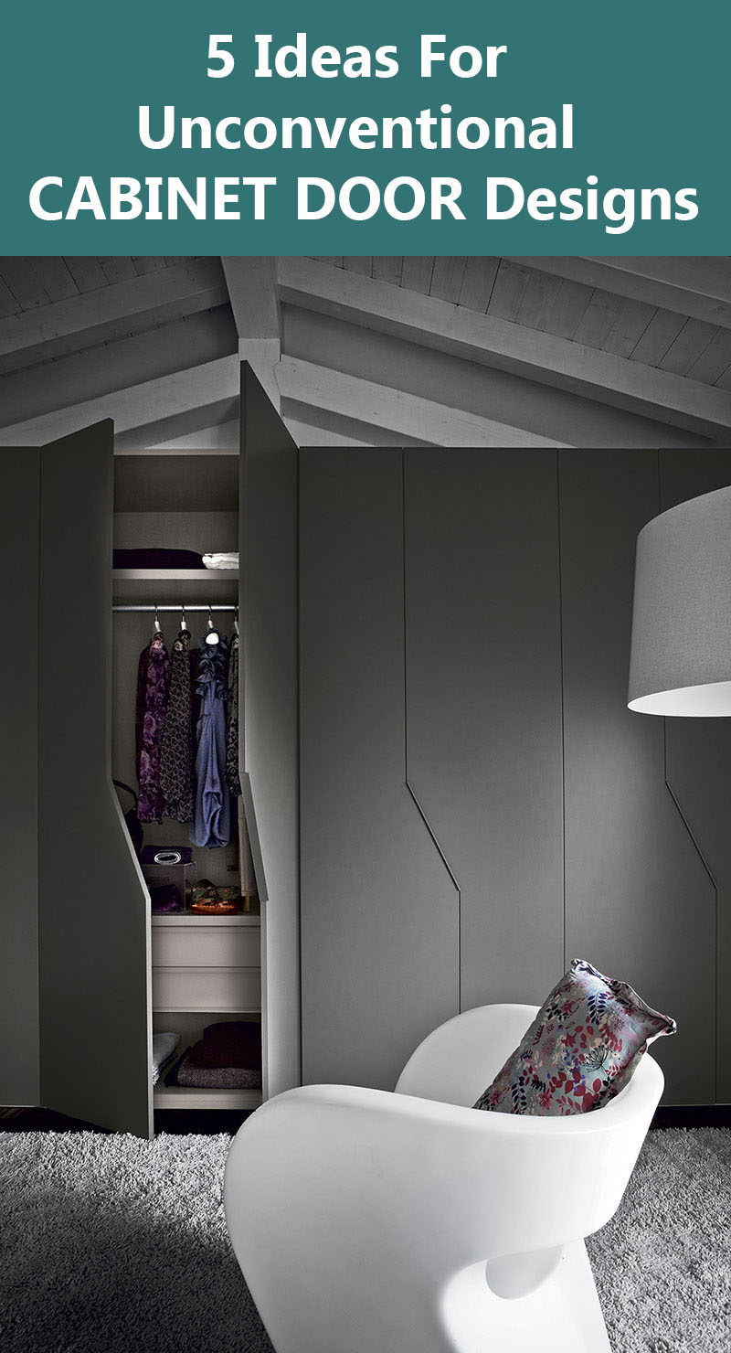
1. These wardrobe doors have been cut so that when they’re closed they have more interesting lines, rather than just vertical ones.
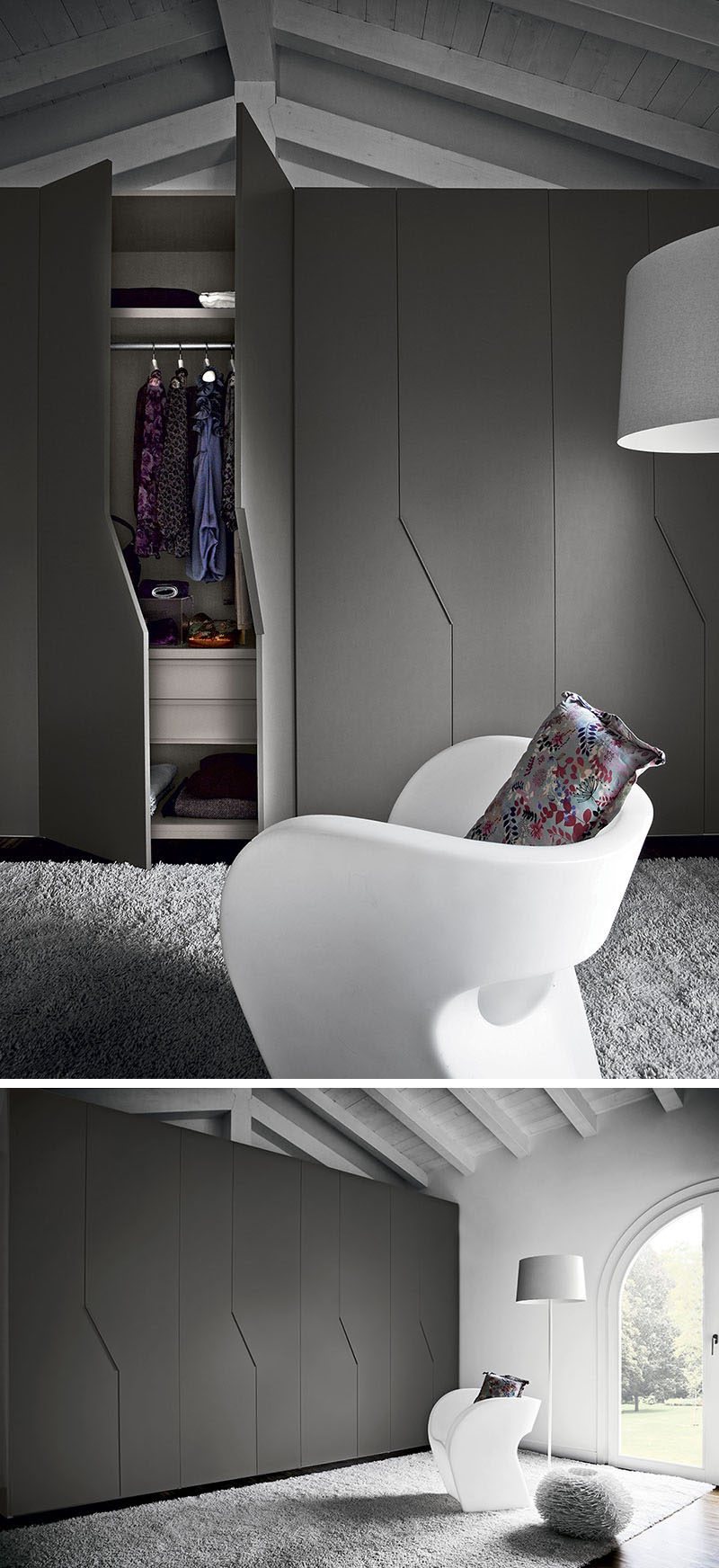
Amore Collection from Lawrence Walsh Fine Furniture
2. The pulls on these kitchen cabinets are tucked into the center of the door, creating unexpected but visually interesting doors.
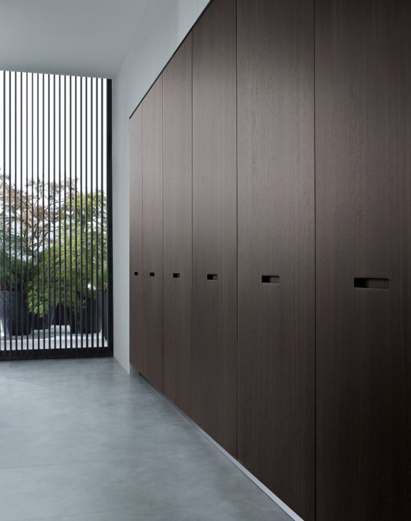
KYTON – Varenna by Poliform
3. These doors have cut outs, rather than door pulls, designed so that when the doors are closed, stars appear where they meet.
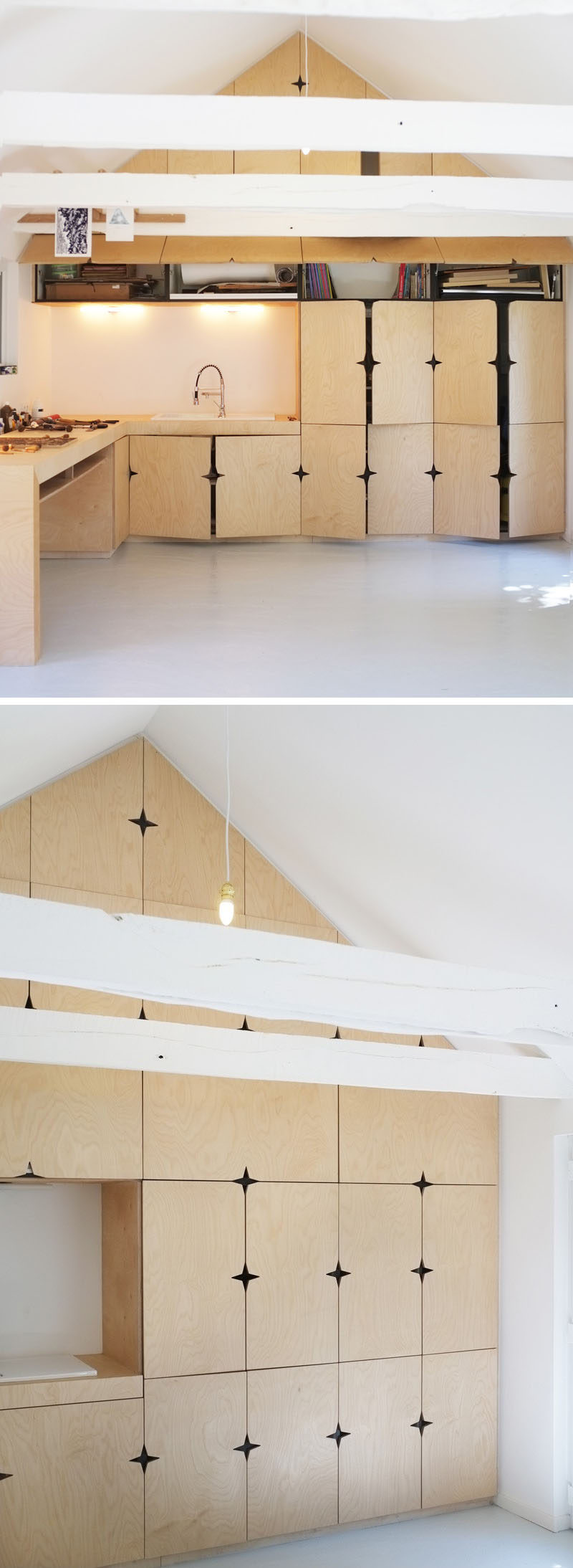
See more photos, here. Interior designed by Modal Architecture. Cabinetry made by Yvon Le Houerou. Photography by Monique Bastos and Gwendal Hervé.
4. Black slashes across these cabinet doors and up the ceiling add intrigue and break up the otherwise all white interior.
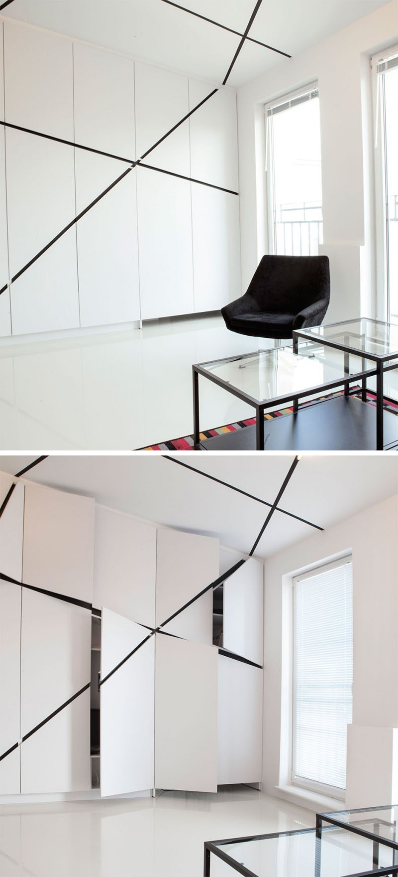
See more photos, here. Designed by Mili Mlodzi Ludzie. Photography by Lusia Kosik.
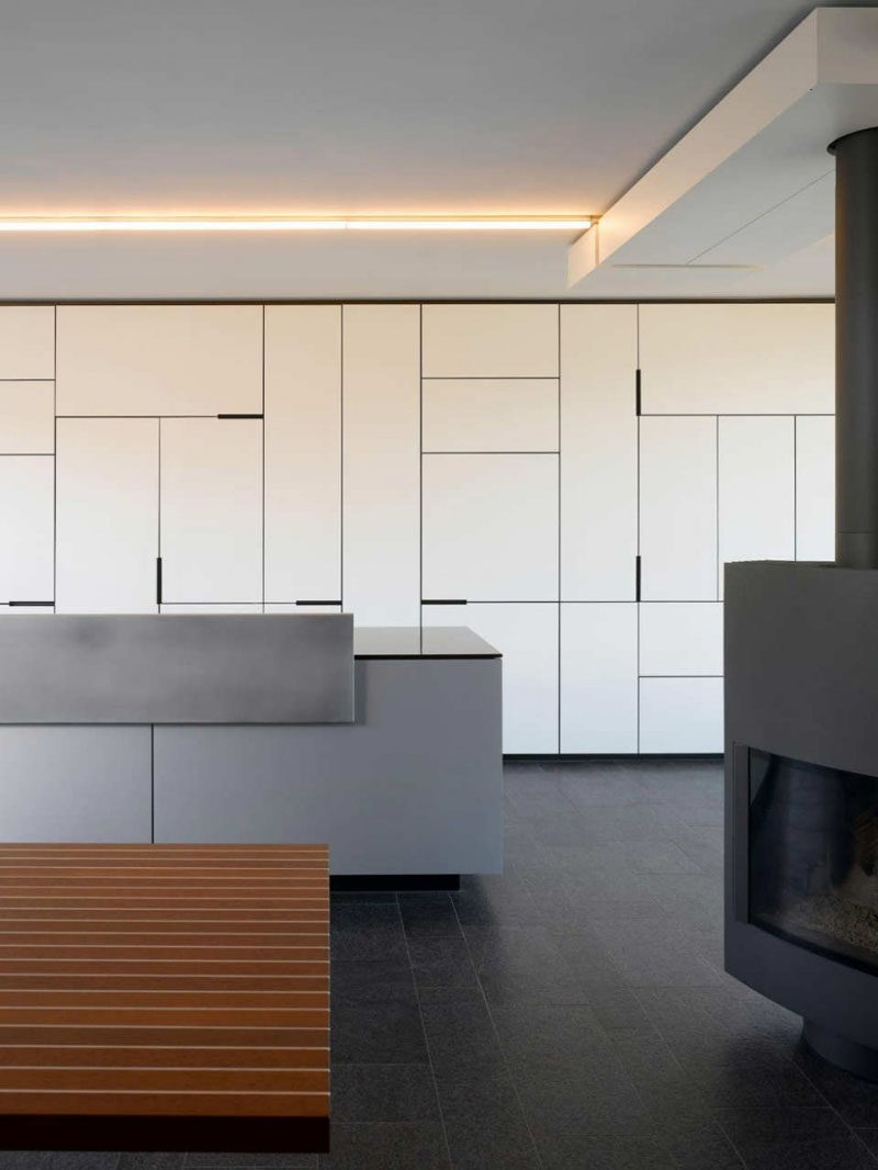
5. This jumble of kitchen cabinets play with the sizes of the cabinet doors to create an artistic detail far more interesting than an all white wall of vertical lines.
