Building exteriors usually aren’t all that exciting. They may look nice but rarely are they creative enough to make you stop and really appreciate the building. That isn’t the case with the exteriors we’re showing-off below. Let’s take a look…
1. Wood logs adorn the exterior of this forest museum in Sweden.
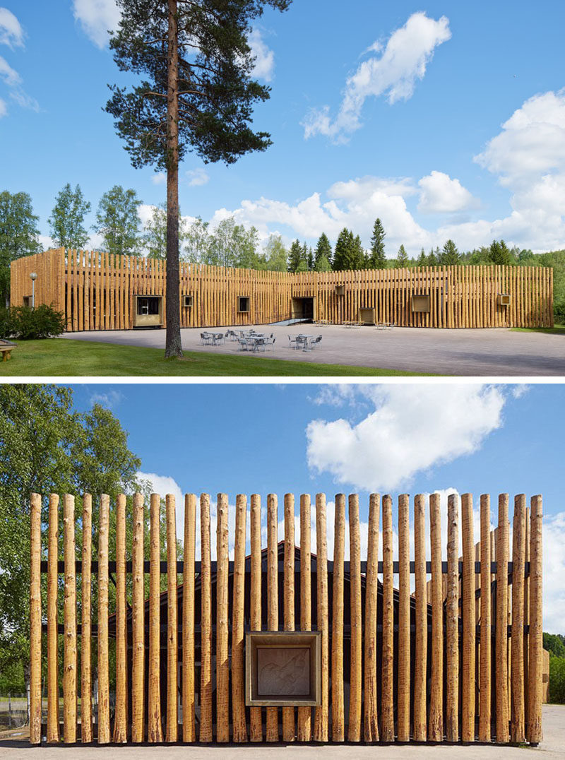
Designed by Bornstein Lychefors Architects. Photography by Åke E:son Lindman.
2. 4080 metal shingles in the shapes of leaves cover the facade of this London home.
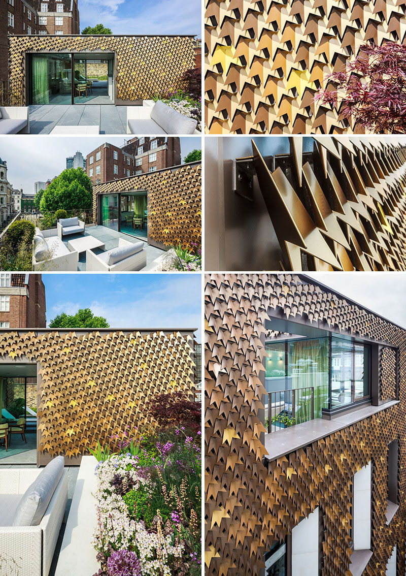
See more photos of this project, here. Designed by Squire and Partners. Photography by Gareth Gardner.
3. The white screen covering this home acts as a security measure and filters sunlight to help keep the house naturally cool.
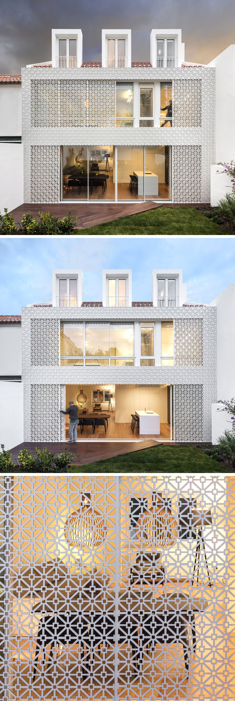
See more photos of this home, here. Designed by Joao Tiago Aguiar arquitectos. Photography by FG+SG – Fotografia de Arquitectura.
4. This rose museum is covered by a stainless steel facade with roses cut into it.
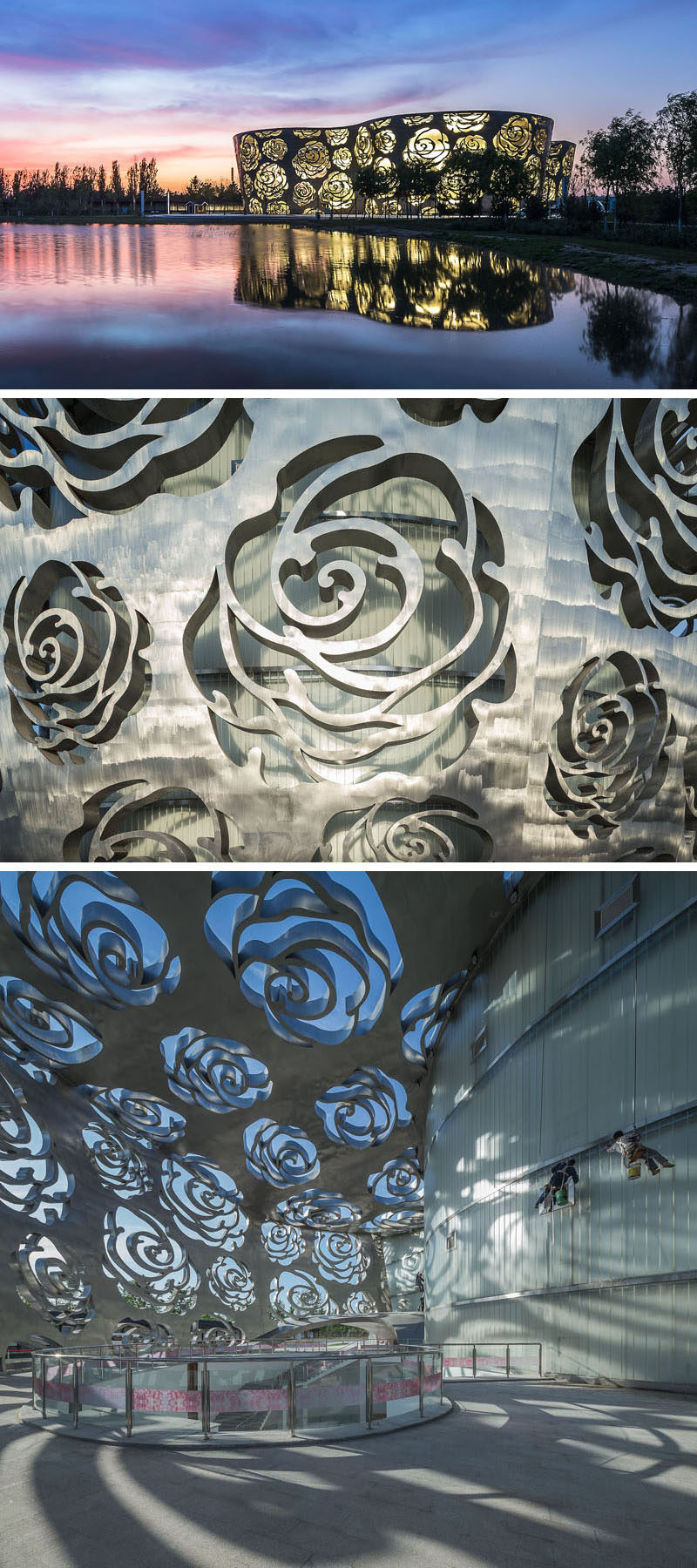
See more photos of this project, here. Designed by NEXT Architects. Photography by Xiao Kaixiong.
5. Curved weathering steel is worked into the rest of the wood-clad exterior of this home.
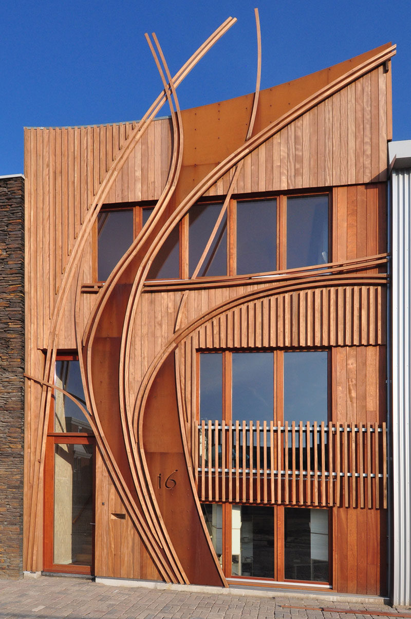
See more photos of this home, here. Designed by 24H Architects. Photography by Boris Zeisser.
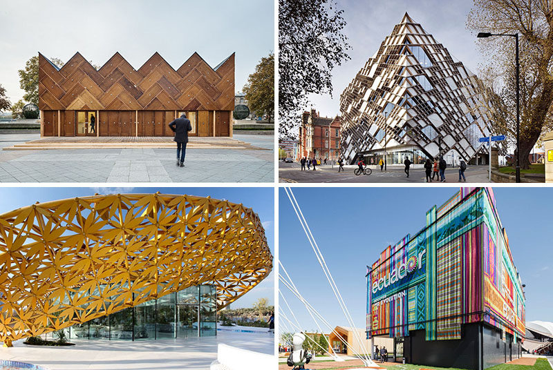
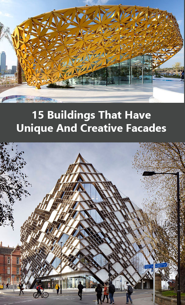
6. The exterior of this public building is covered with a shell of bright yellow metal flowers.
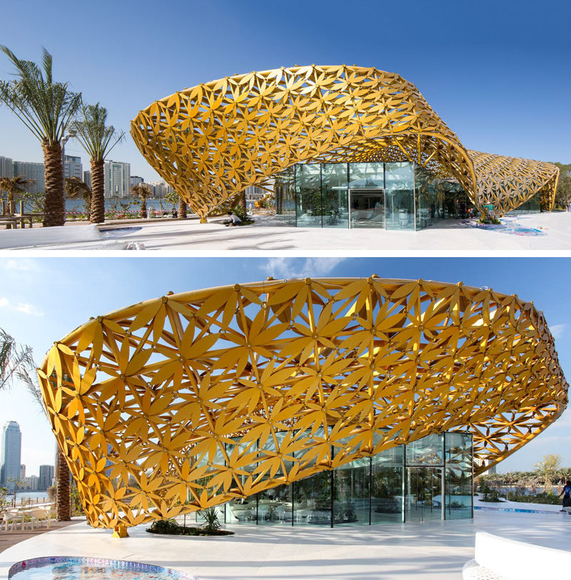
See more photos of this project, here. Designed by 3deluxe. Photography by Christian Bauer.
7. 180 recycled wood doors make up the facade of this pavilion while other recycled elements were used to build the rest of the structure.
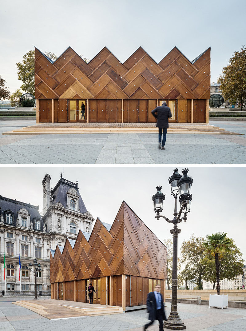
See more photos of this project, here. Designed by Encore Heureux. Photography ©Cyrus Cornut.
8. Aluminum chains on the exterior of this Ecuador Pavilion form colorful curtains with folkloric motifs inspired by traditional textiles of the region.
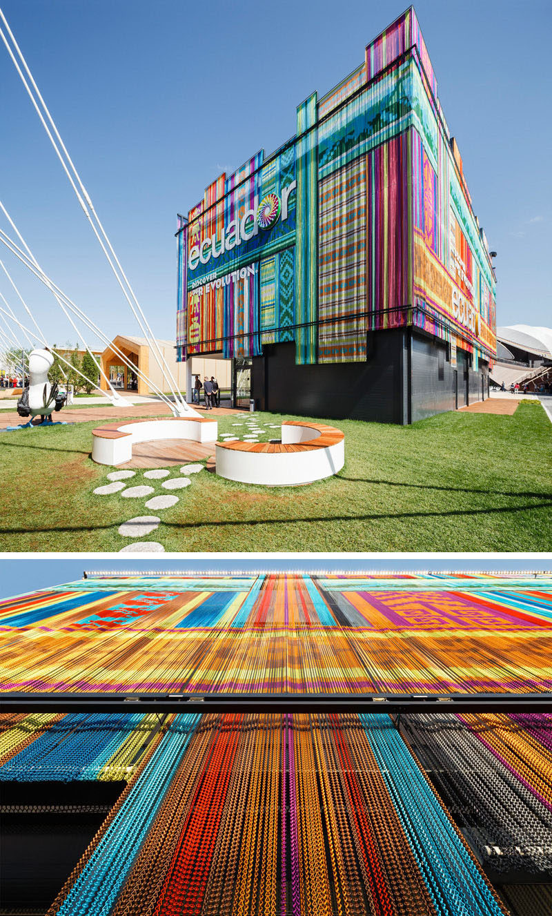
See more photos of this project, here. Designed by Zorrozua & Associates. Facade by KriskaDECOR. Photography by Marcela Grassi.
9. Large wood tiles in various shapes cover this exhibition hall that was built and designed in part by robotics.
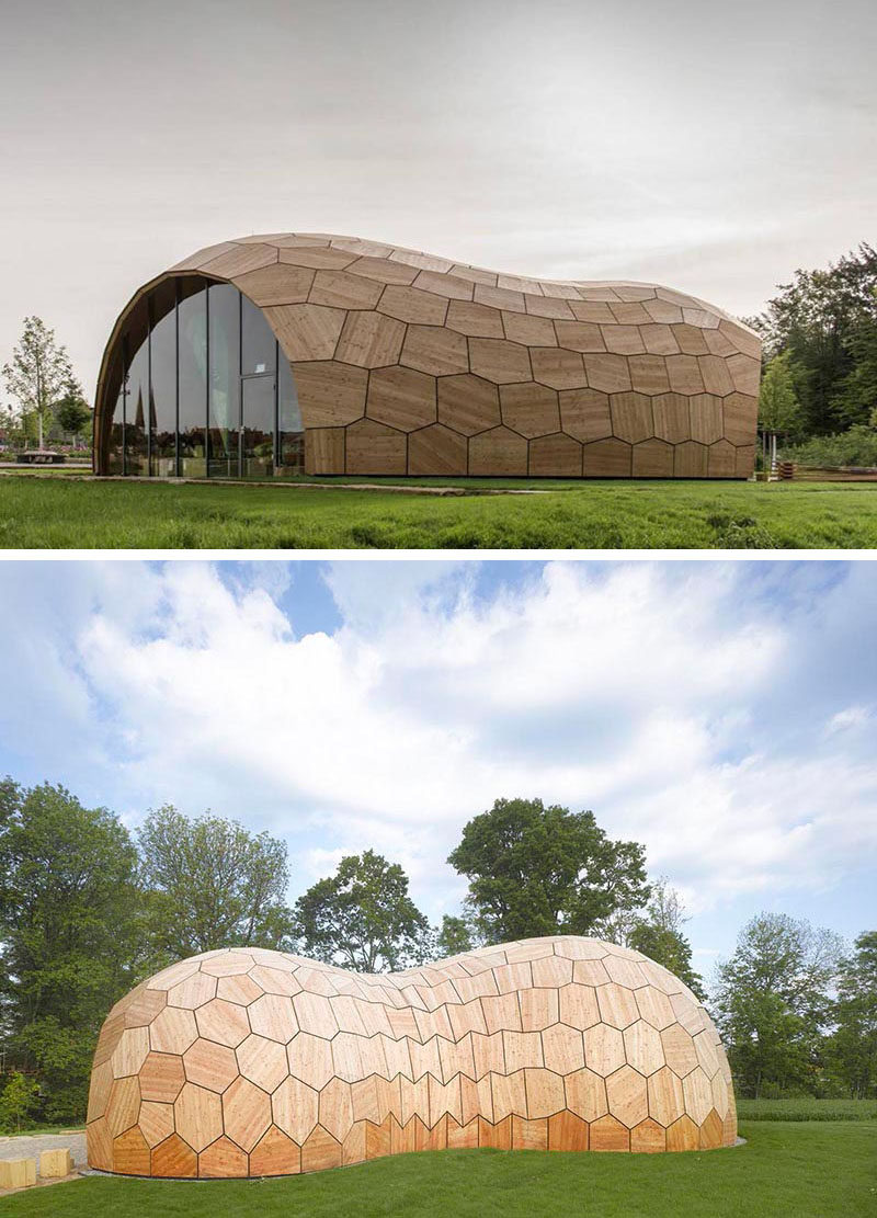
See more photos of this project, here. Designed by The Institute for Computational Design at the University of Stuttgart. Photography by © Roland Halbe and © ICD/ITKE/IIGS University of Stuttgart. See the “making of” video, here.
10. The exterior of this public building is covered with broken pieces of local ceramics to create a colorful mosaic that matches the benches and walkways throughout the rest of the park.
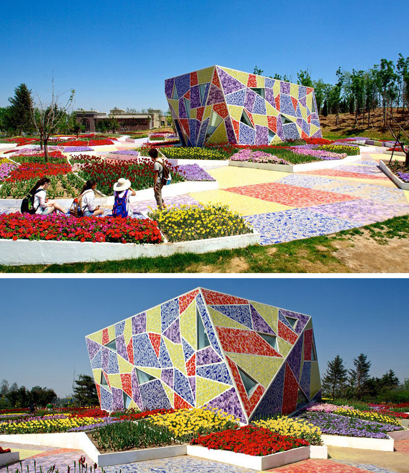
See more photos of this project, here. Designed by Casanova + Hernandez Architects. Photography by Ben McMillan.
11. Gold triangular panels positioned at various angles give this building, designed for gold dealer and goldsmiths, a shimmering, reflective facade.
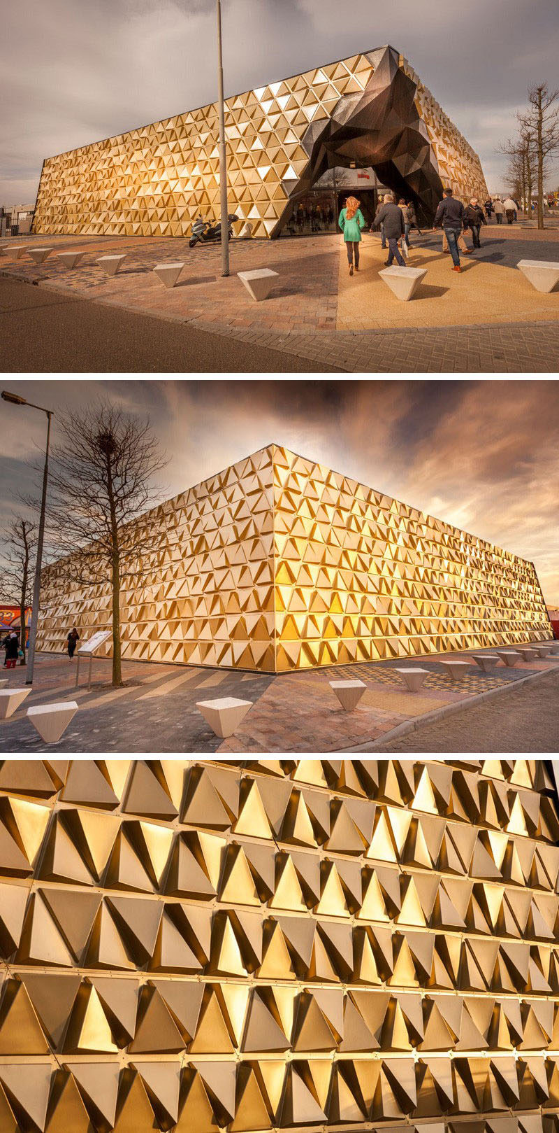
See more photos of this project, here. Designed by Liong Lie Architects and Leaders against routine. Photography by Hannah Anthonysz.
12. Giant letters and numbers transformed the generic exterior of this school and added a unique element of fun to the design of the building.
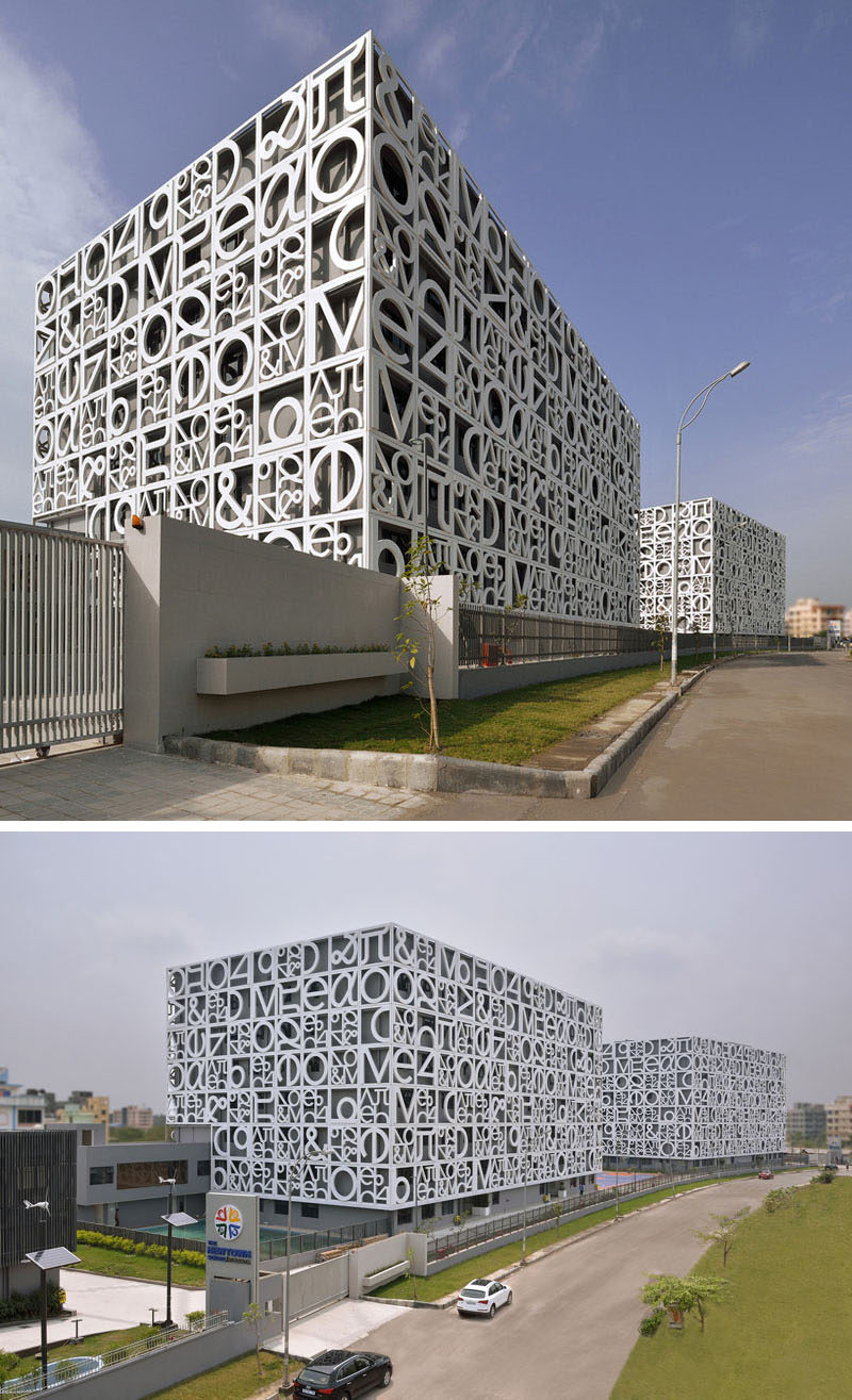
Designed by Abin Design Studio. Photography by Ravi Kanade.
13. 1200 pieces of brass tubing were turned into “grass leaves” that oxidize and naturally change color with the seasons, creating an ever changing facade on the pavilion.
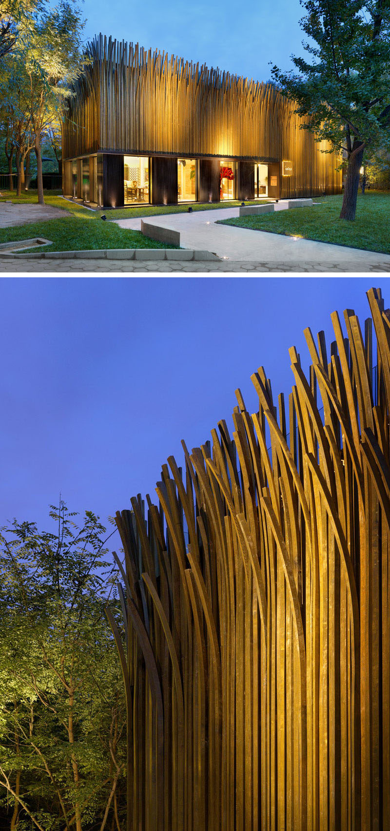
See more photos of this project, here. Designed by Luca Nichetto. Photography by Jonathan Leijonhufvud.
14. The facade of this university engineering building is made from anodized aluminum that was inspired by the detailed stone tracery of the neighboring church, and resembles a cellular structure commonly studied by students inside the building.
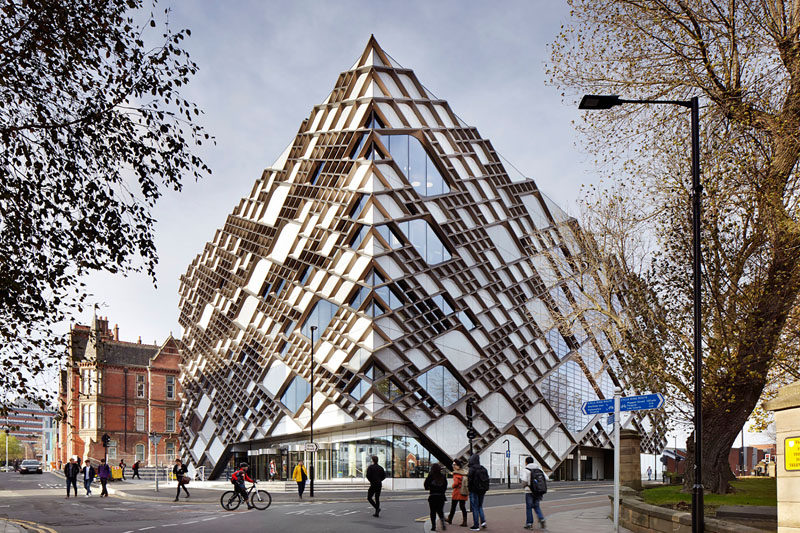
Designed by Twelve Architects. Photography by Jack Hobhouse.
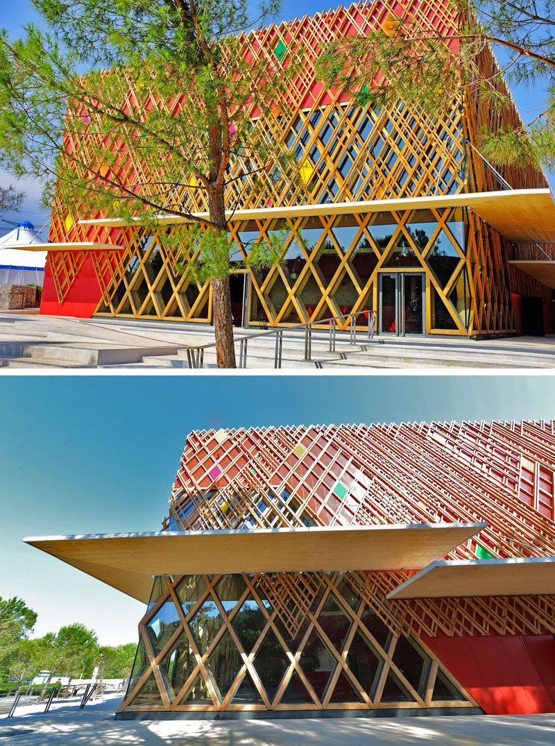
15. The exterior of this theatre is covered by a lattice-like grid pattern with pops of color scattered throughout it.
