After photography by Anice Hoachlander|Hoachlander Davis Photography
Balodemas Architects have sent us images of a renovation they completed on a family home,located in Chevy Chase, Maryland. that was originally built in 1968.
Let’s have a look at what was updated…
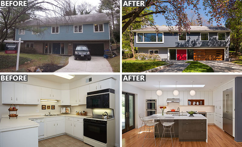
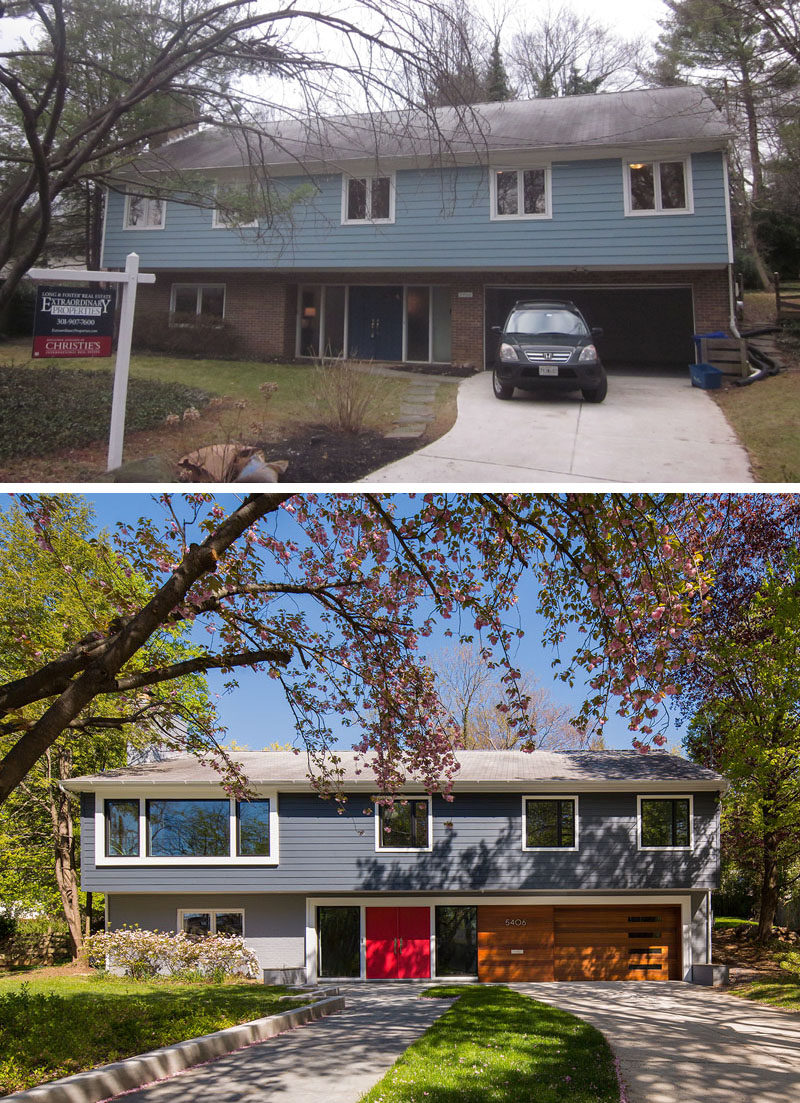
The home’s curb appeal was updated by installing a new entry door and sidelights. New windows were added, including an enlarged opening for the second-floor living room. The old walkway was replaced with a wider path that is separate from the driveway, and is accessible from the street instead of having to walk up the driveway.
After photography by Anice Hoachlander|Hoachlander Davis Photography
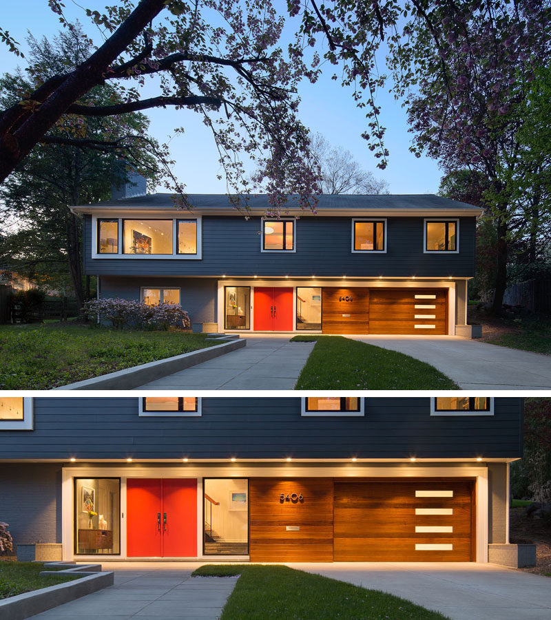
The home received new siding for the upper level and heavy trim was added around the entry, garage door and new living room windows to help balance the facade.
The original two-car garage door was removed and replaced with a sapele wood-lined, single-car garage door. The extra space went to storage for things like bicycles.
Photography by Anice Hoachlander|Hoachlander Davis Photography
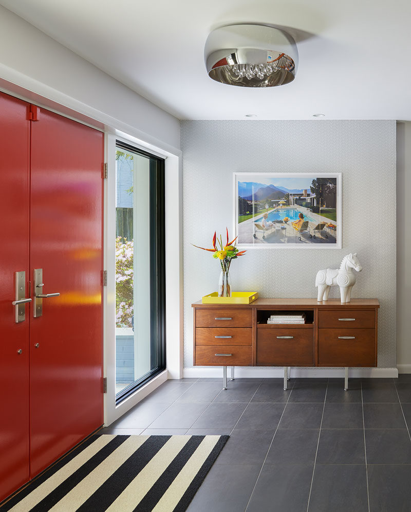
The front door is now a bright red, and the renovated entry to the home features a mid-century modern style with a console table, black and white striped rug, and a framed retro photograph.
Photography by Anice Hoachlander|Hoachlander Davis Photography
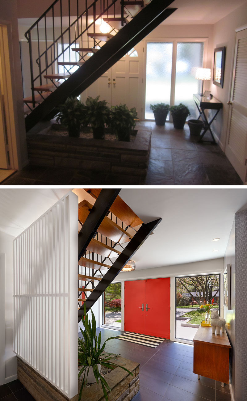
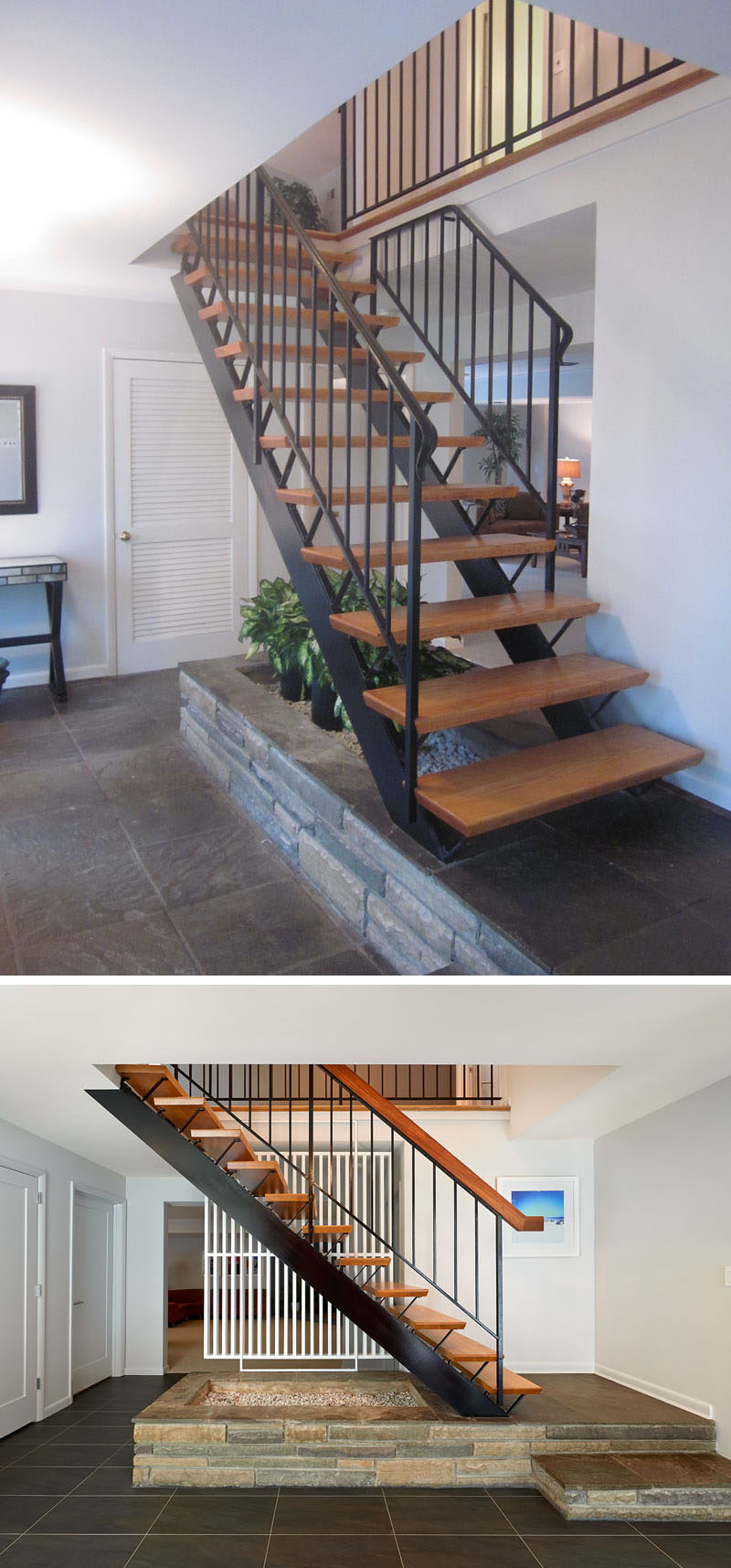
The designers left the staircase and fieldstone planter in their original condition, but added a painted wood screen to separate the stairs from the lower-level. Pushing out the entry door gave the foyer a bit more space, and new porcelain tile flooring updated the look.
After photography by Anice Hoachlander|Hoachlander Davis Photography
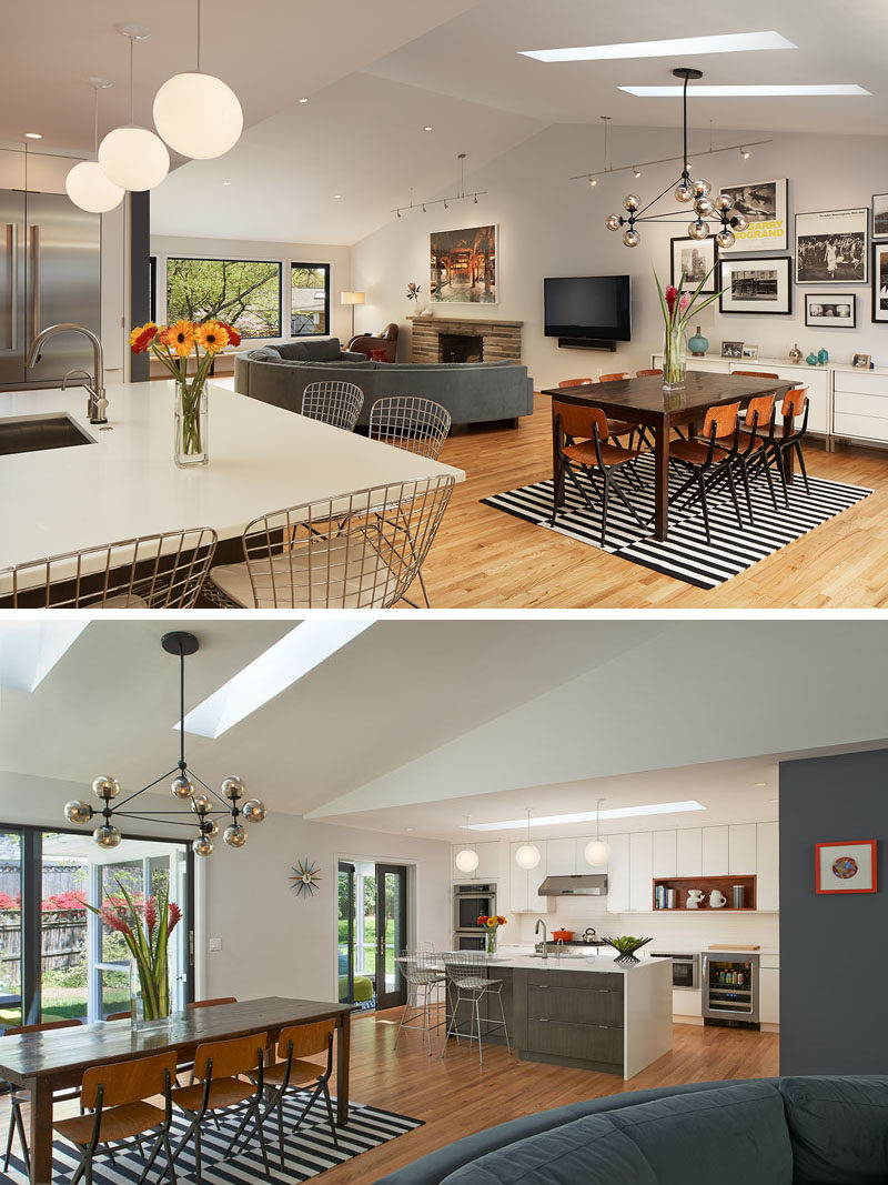
Walls were removed between the kitchen and dining room, and between the dining room and living room. Skylights were added to brighten the spaces.
Photography by Anice Hoachlander|Hoachlander Davis Photography
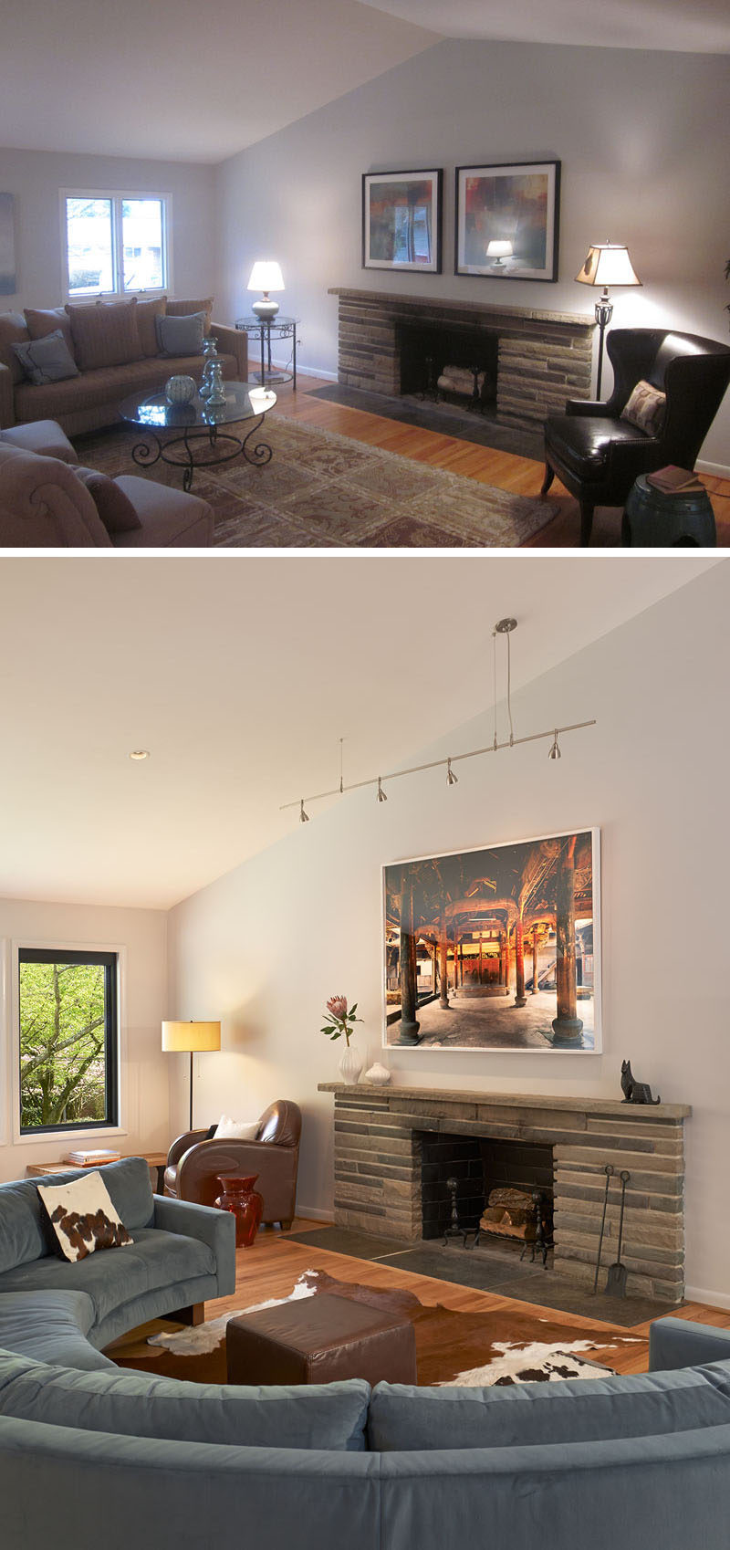
In the living room, a rounded blue sectional with a small leather ottoman and cowhide rug offer a cozy spot to sit by the fireplace. In the corner, a brown leather armchair provides a great reading nook.
After photography by Anice Hoachlander|Hoachlander Davis Photography
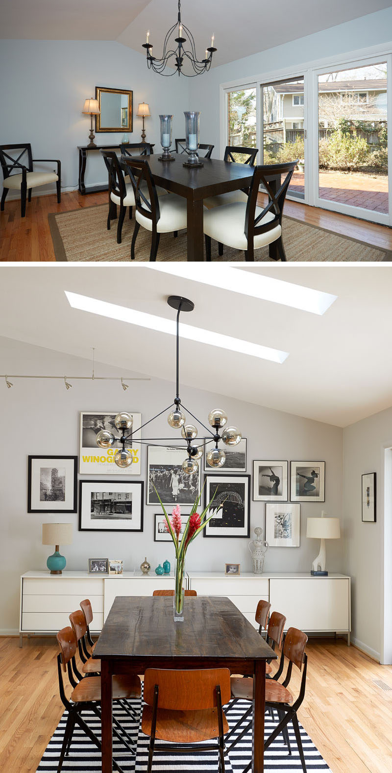
In the updated dining room, a black and white striped rug grounds the wood dining table and chairs in this mid-century style dining room. A long, white buffet provides essential storage for dinnerware, utensils and anything you might need for entertaining, and a large picture wall perfectly displays various photographs.
After photography by Anice Hoachlander|Hoachlander Davis Photography
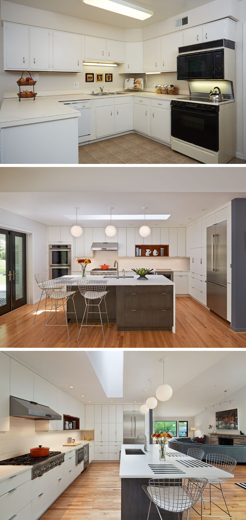
The kitchen was renovated to reflect stylish, mid-century modern design. Floor-to-ceiling cabinets provide essential storage, and a long island serves as a place to prep and dine. Bertoia barstools and light hardwood floors complete the fresh, open design.
The refrigerator was tucked out of view from the living room, and the oven was pushed to the far end to allow as much continuous counter space as possible. A contrasting finish for the island cabinets was chosen to be more furniture-like. New doors lead out to the backyard’s screened-in porch.
After photography by Anice Hoachlander|Hoachlander Davis Photography
Back by the foyer, the staircase leading to the second floor is an example of mid-century craftsmanship. Dark grey tile was added to accent the staircase’s style. The original treads and railing were left, and the handrail was replaced with the wood cap that the client requested for a more authentic finish.
After photography by Anice Hoachlander|Hoachlander Davis Photography
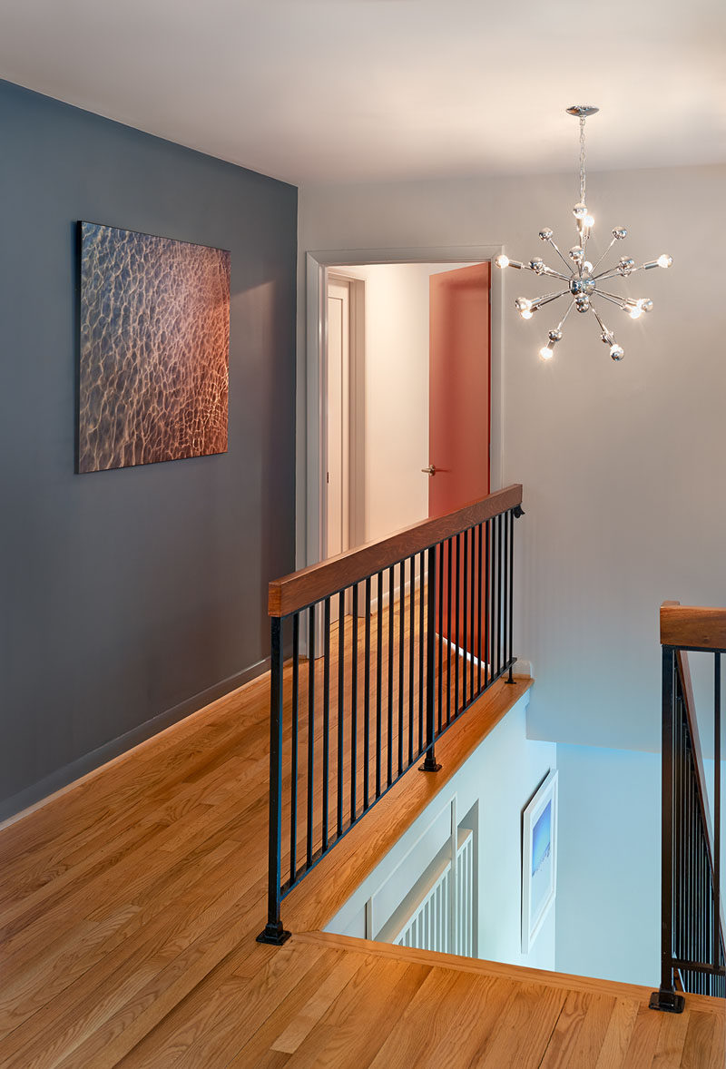
Upstairs, the hallway includes hardwood flooring, a dark gray accent wall and a black metal railing topped with wood. A sputnik chandelier illuminates the space.
Photography by Anice Hoachlander|Hoachlander Davis Photography
Other elements of the home were also updated, like the bathrooms. Here’s a look at them finished.
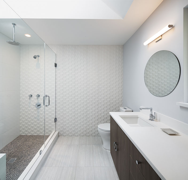
This bathroom design features a spacious walk-in shower with a rainfall shower-head, and a dark brown vanity adds contrast to the gray and white space.
Photography by Anice Hoachlander|Hoachlander Davis Photography
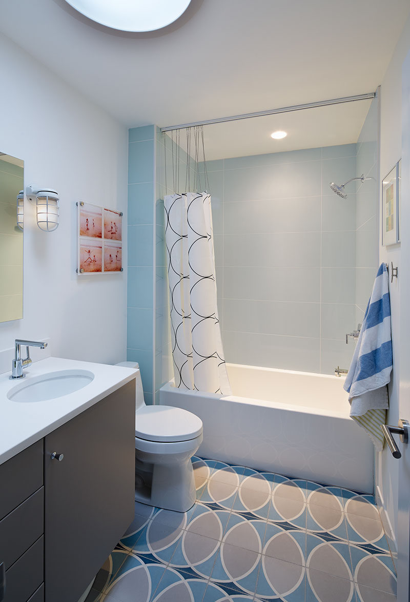
In this bathroom, light blue and gray create a serene look, with the circular pattern tile floor complementing the shower curtain and adds interest to the design.
Photography by Anice Hoachlander|Hoachlander Davis Photography
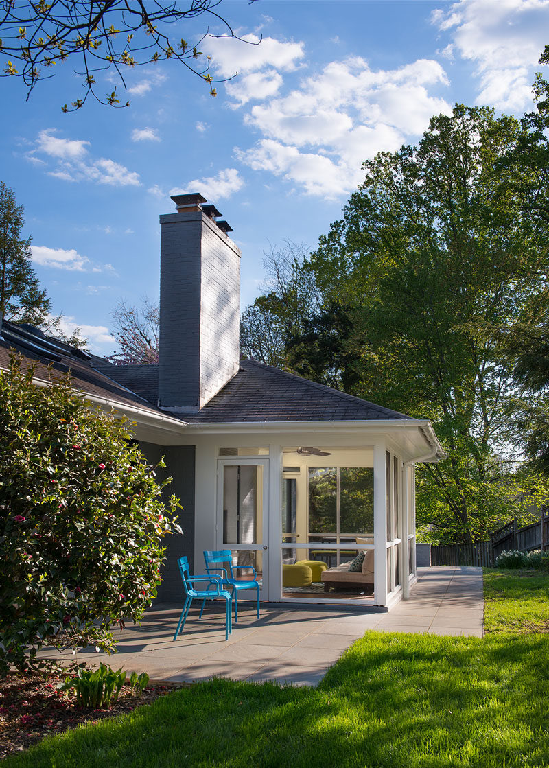
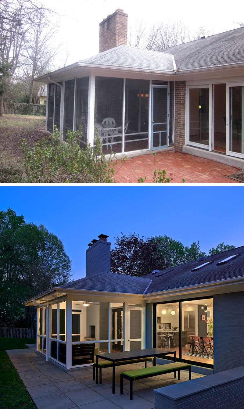
At the rear of the home is a screened-in porch and small patio that received a much needed renovation.
After photography by Anice Hoachlander|Hoachlander Davis Photography
On the opposite site of the screened-in porch, is a quiet space to sit and relax.
