Photography by Dustin Aksland
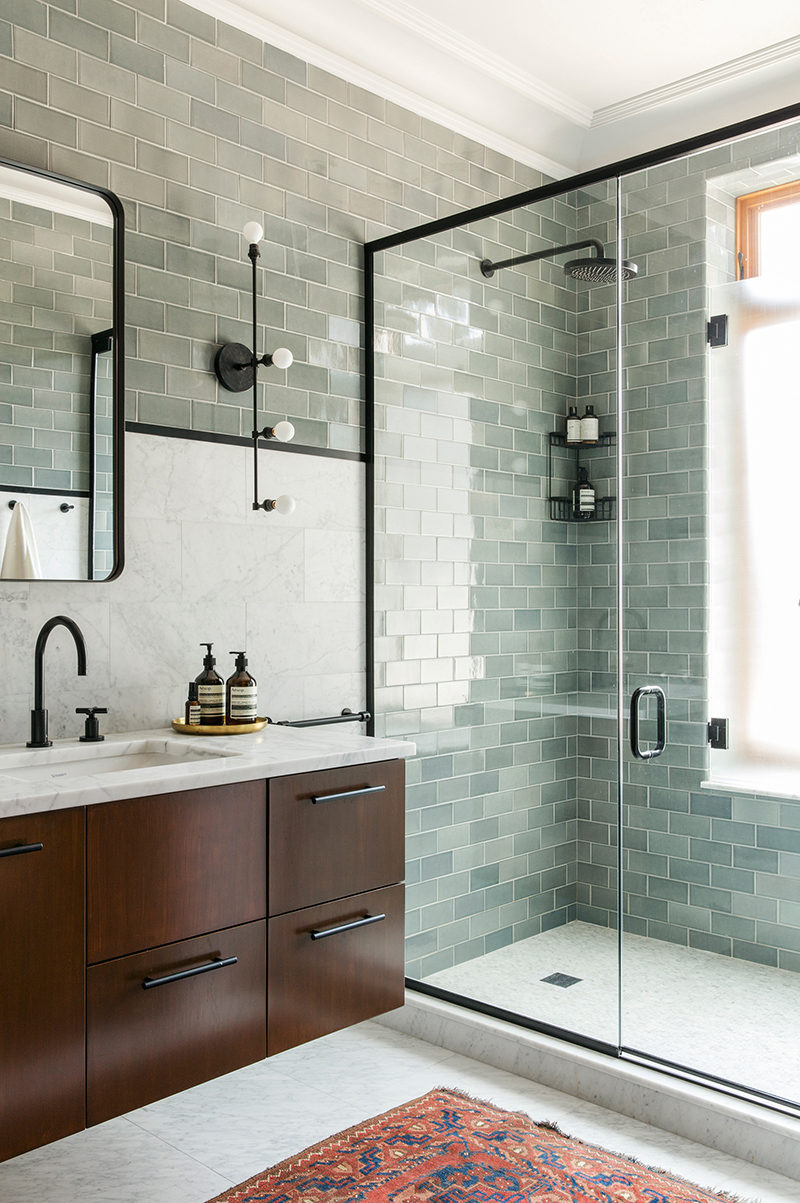
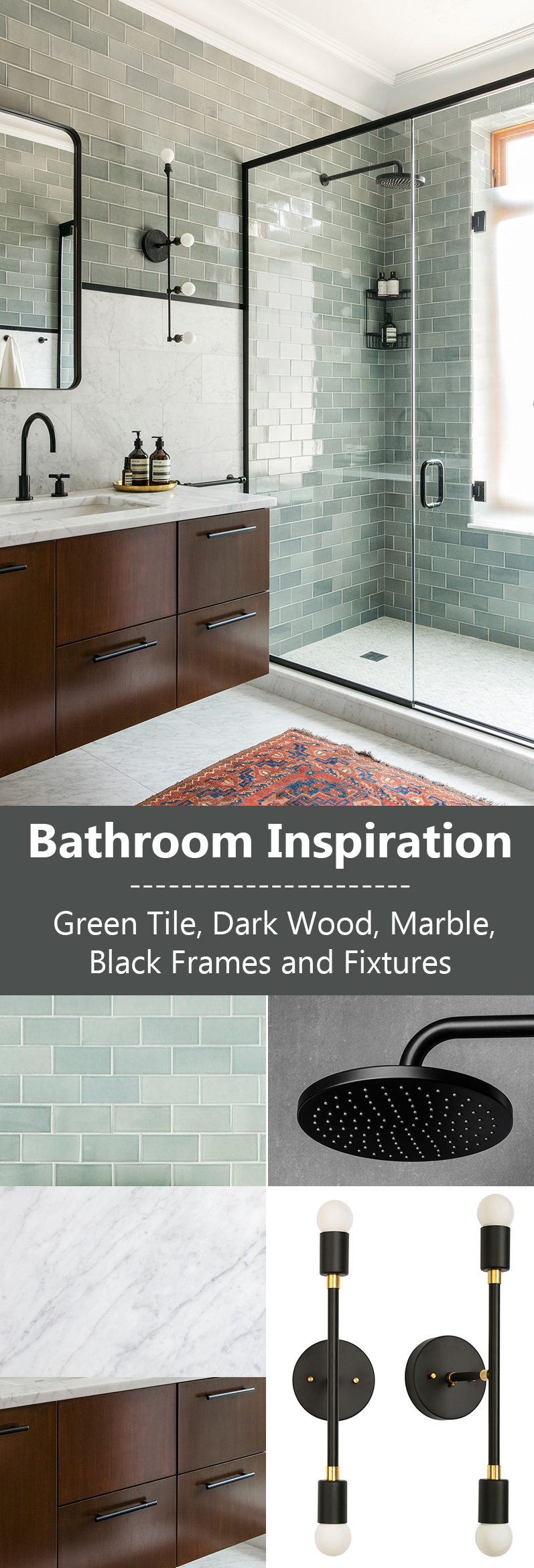
Quite often, we get contacted by people wanting to know what products have been used to achieve a certain look in a home that we’ve featured in the past, so we thought we would share with you some ideas on how to ‘get-the-look’ of this bathroom in a home designed by MADE Architecture and Elizabeth Roberts Design.
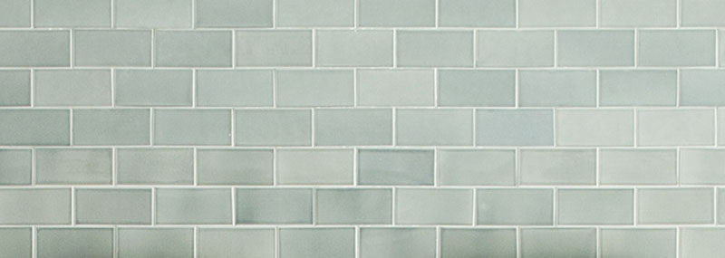
Rectangular blue/green tiles have been used in the shower and on the wall. You could use either ceramic or glass tiles to get a similar look.
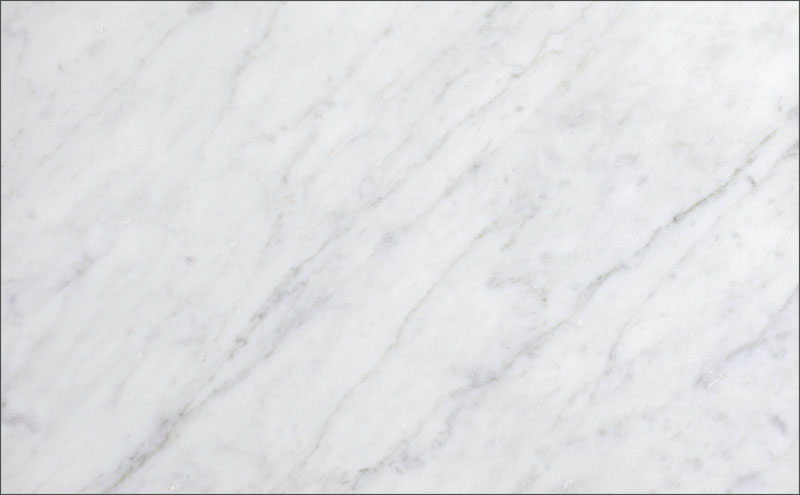
White or light gray marble for the countertop, backsplash, and flooring.
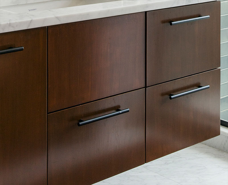
Use a dark wood, like walnut or rosewood, to achieve a similar look as the cabinet drawers, and add some minimalist drawer pulls in black.
Touches of black have been used throughout the bathroom, like the shower frame and the minimalist black faucet on the vanity.
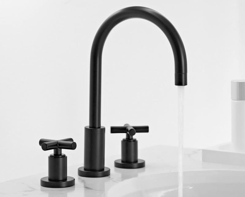
Tara Faucet from Dornbracht
There’s a black rounded edge framed mirror.
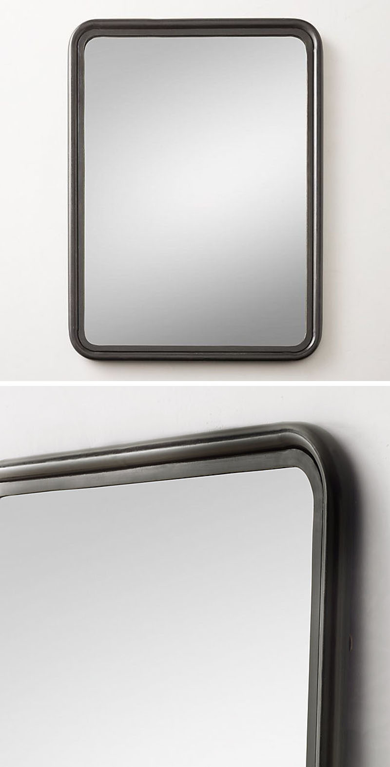
Black mirror from RH Teen
You can add some light with a black wall sconce with bare bulbs and touches of gold.
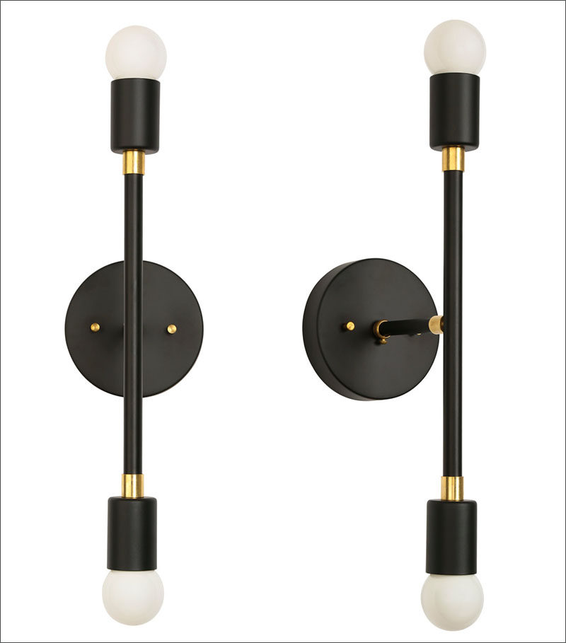
Tiburon Wall Sconce by parkstudioLA
In the shower, a black rain shower head makes a statement. Other shower options to include would be a black shower caddy.
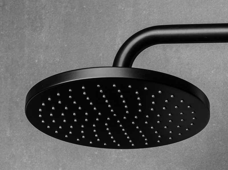
Shower head from Fantini
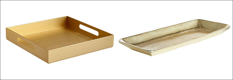
To tie in with the gold details of the wall sconce, think about grouping your hand-soap and moisturizer on a gold plate or tray.
