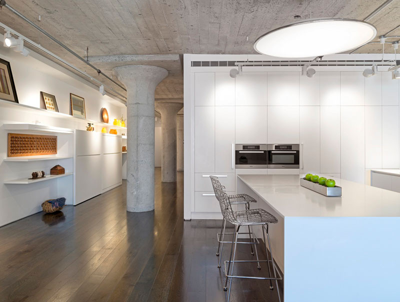
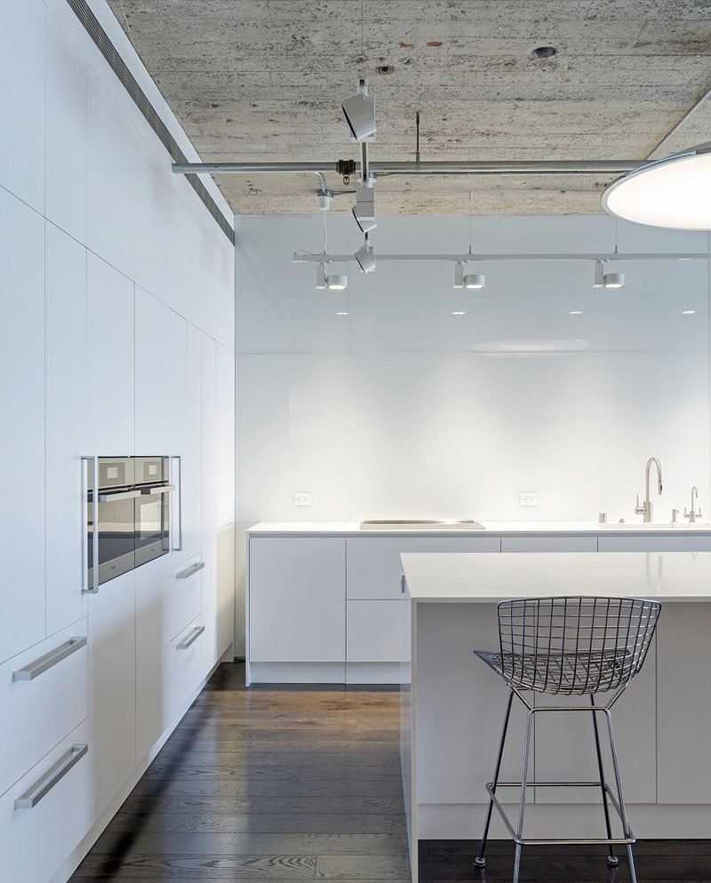
When the owners first encountered this apartment in San Francisco, they were attracted to its warehouse vibe, reminiscent of the 1924 building’s previous stint as a printing business. They saw the potential in the space and decided to renovate with the help of some architects.
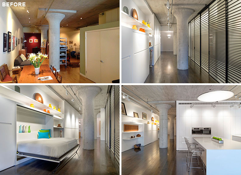
Let’s see what the loft looked like BEFORE they started the renovation.
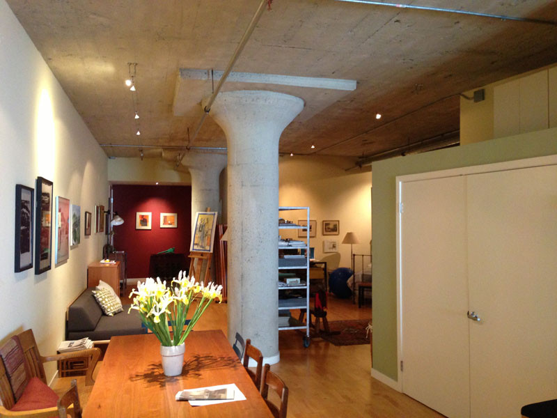
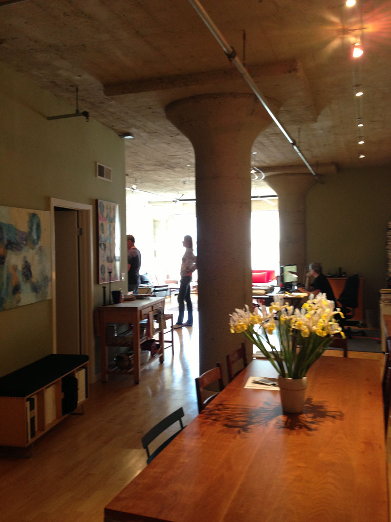
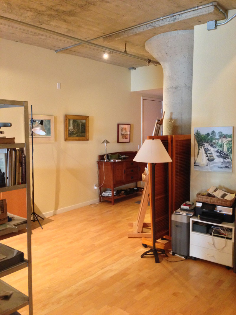
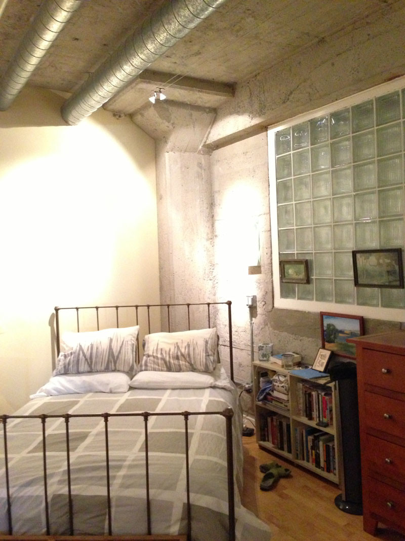
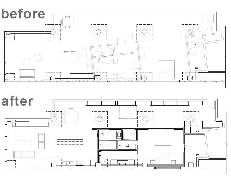
In the before floor plan, you can see how awkward the layout was. The new design was created by Steven Stept, who designed the project with his previous partner Irit Axelrod, and saw it through construction at Feldman Architecture.
OK, so now that we’ve seen what it originally looked like, here are the photos of the finished renovation.
The clients situated themselves at the heart of the design discussion by managing the project with the help of a superintendent in lieu of hiring a general contractor.
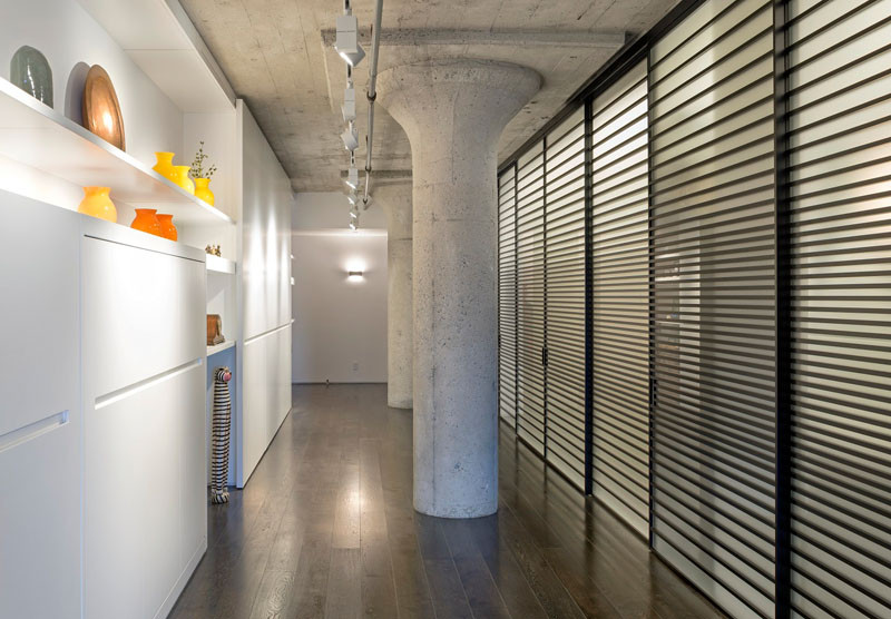
The remodel pulled one of the long, narrow apartment’s walls back from its previously angled position, allowing natural light from the largest window to fill the entire length of the apartment.
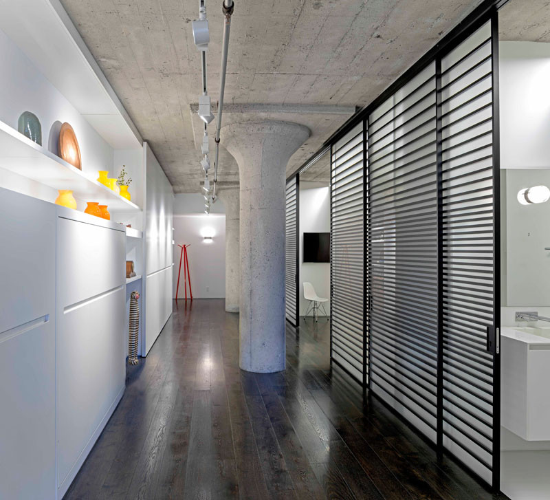
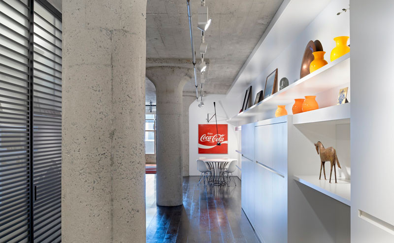
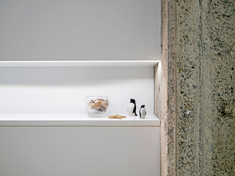
Custom shelving elongates the hallway and accentuates the length of the loft.
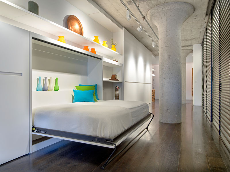
A murphy bed has been added to the wall for when guests stay over.
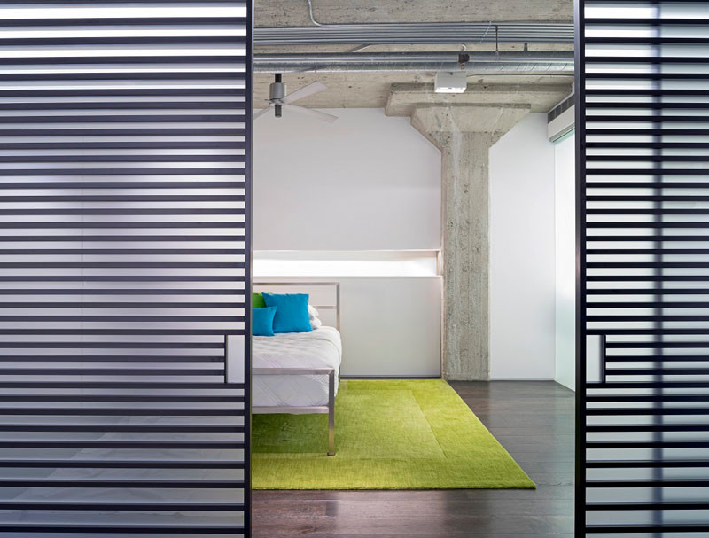
They included horizontal slatted aluminum and glass sliding doors from the Italian designer Adielle, that hide the master suite and a powder room.
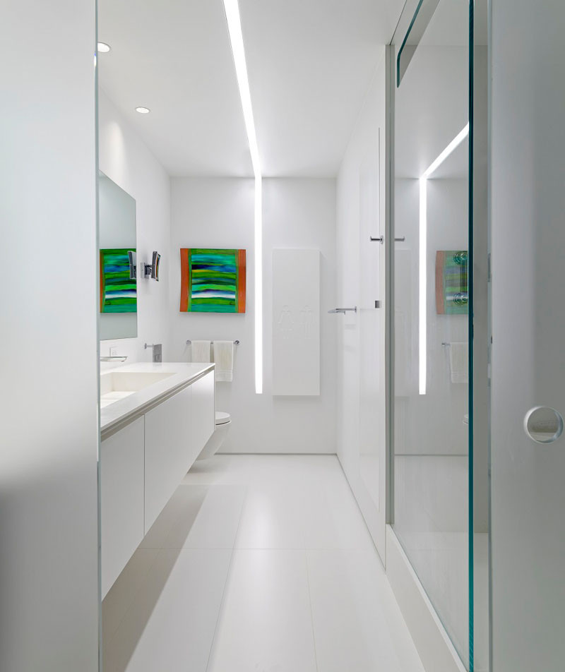
The bathroom is lit by a line of light that runs the length of the bathroom and down onto the wall.
The hallway has plenty of storage, so there is no clutter in the loft.
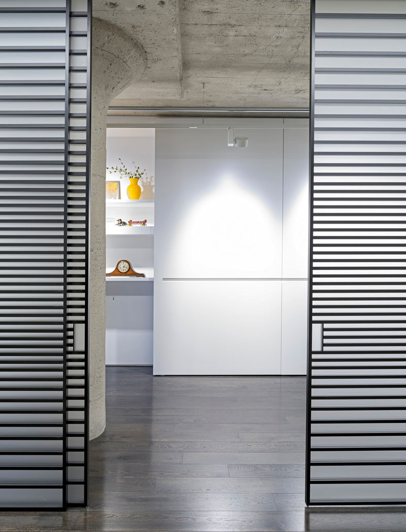
At the end of the hallway, it opens up into the kitchen and living area.
