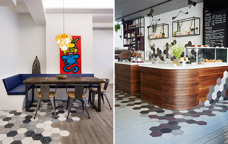
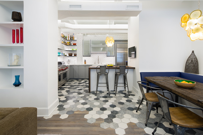
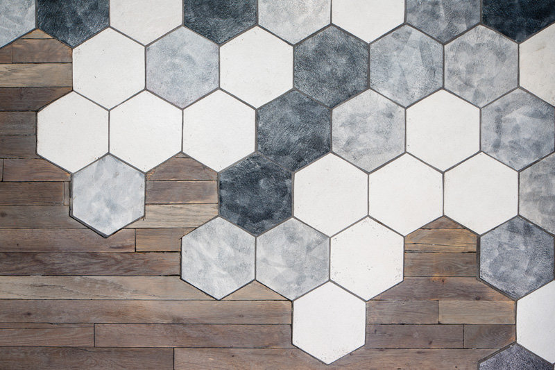
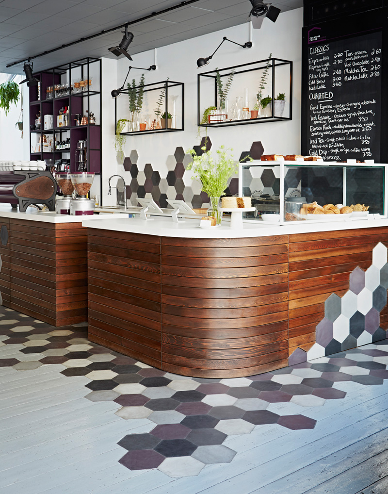
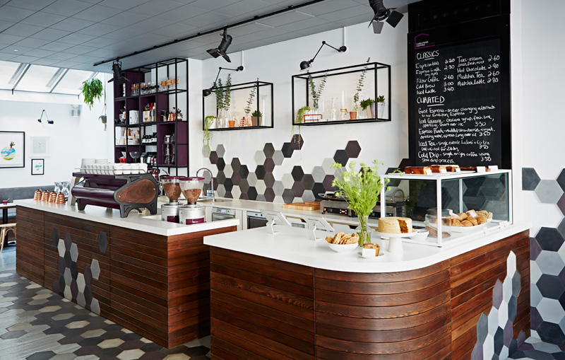
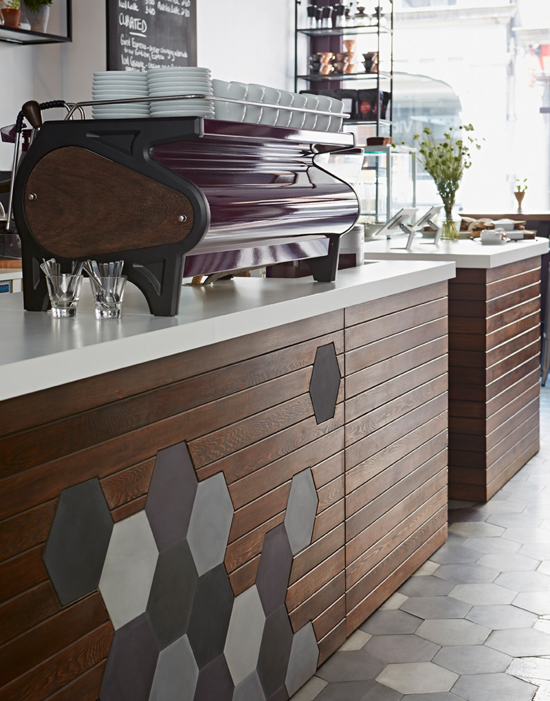
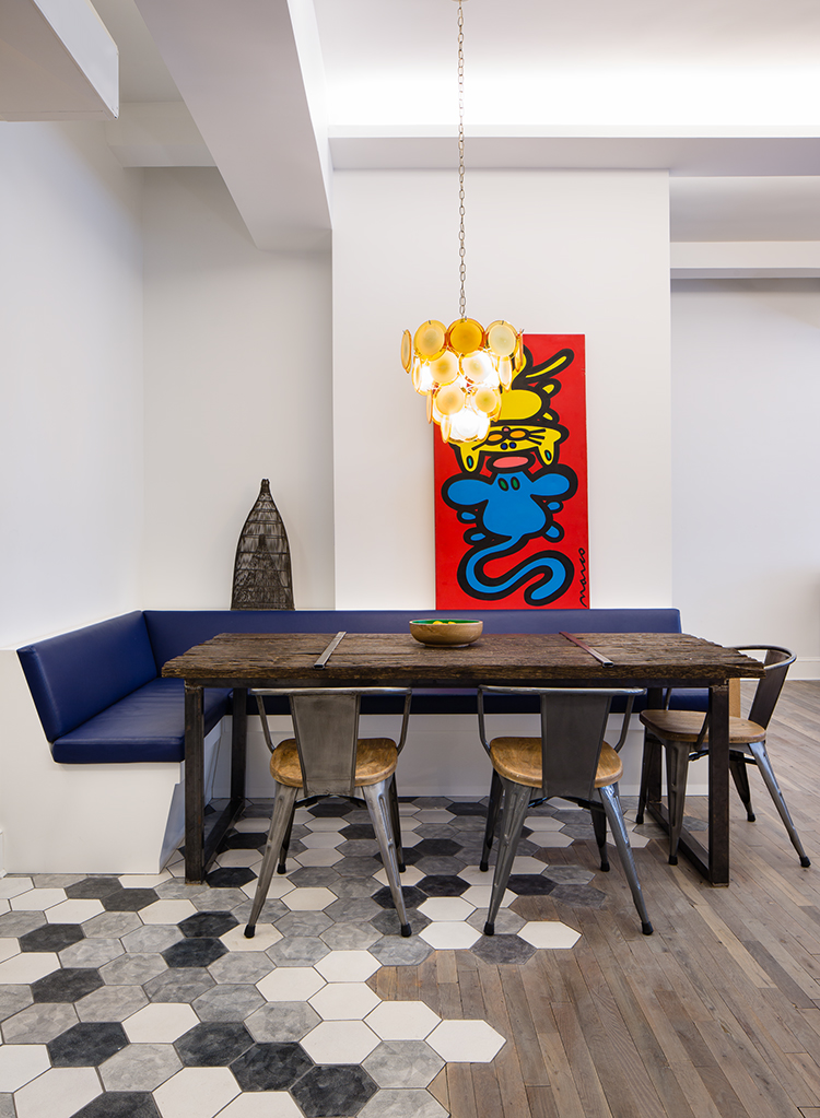
Hey contemporist friends! Here are two examples where designers have thought creatively about how hexagonal tiles should meet with the surrounding wood. Instead of a blunt abrupt edge, it’s more of a gradual transition from one to the other.
First up, we have an apartment in New York, that was designed by Matiz Architecture & Design (MAD).
Photography by Hidenao Abe
Photography by Hidenao Abe
Photography by Hidenao Abe
Next, we have the Curators Coffee Gallery in London, by interior designer Ana Foster-Adams.
