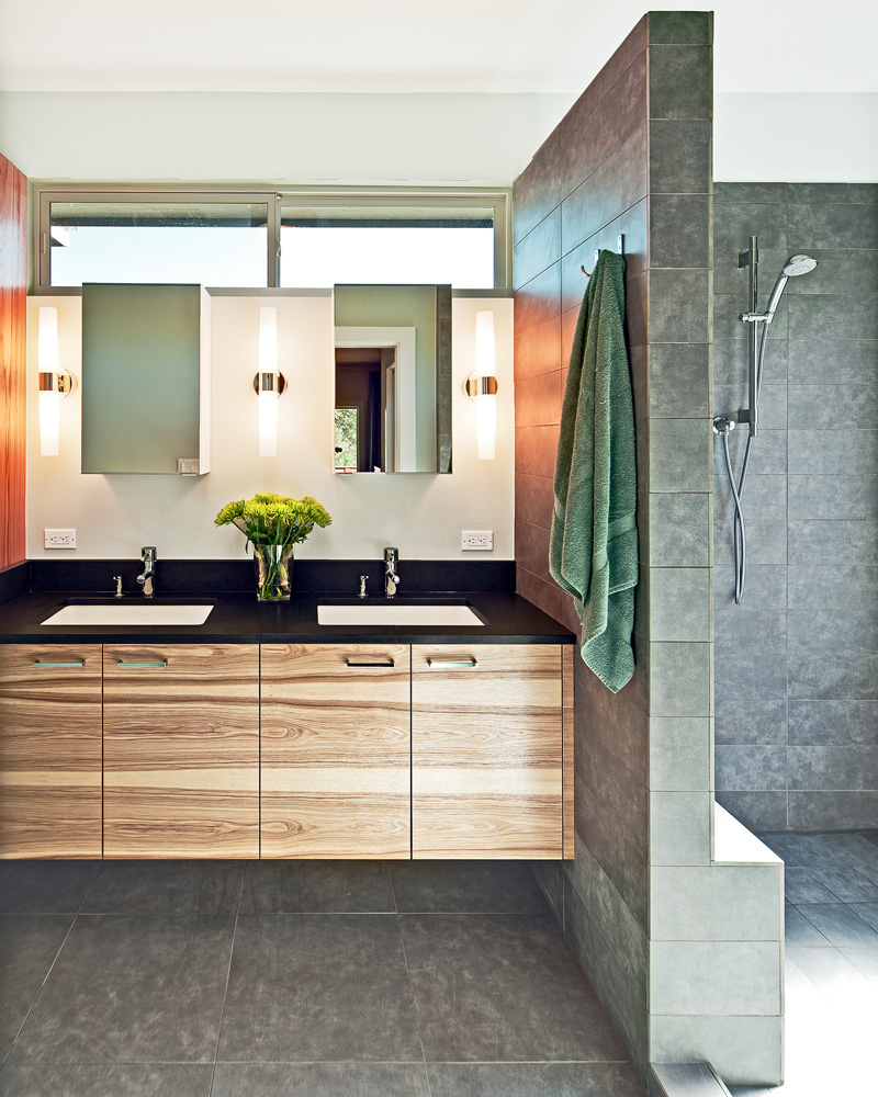
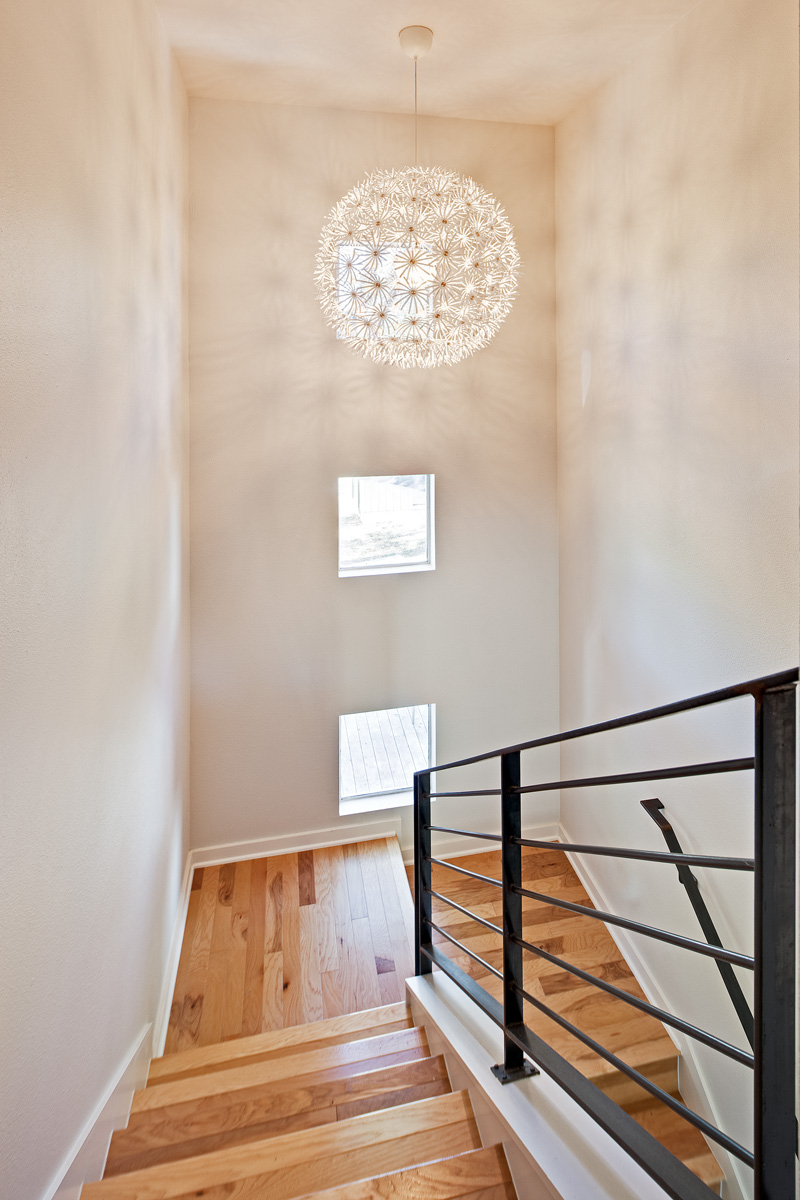
Jennifer Ott designed the interior renovation of her own home in Austin, Texas, before she sold the house and moved to San Francisco.
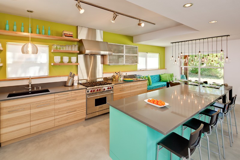
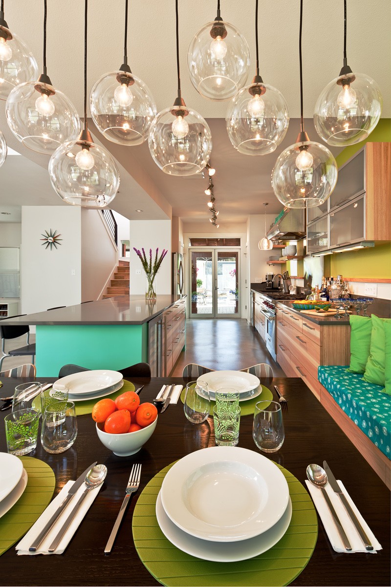
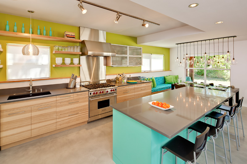
Inspired by her beloved George Nelson Sunburst clock, with its lime green, turquoise, and pumpkin orange hues, Jennifer made a bold statement in the kitchen with color accents mixed with natural wood.
Jennifer’s description
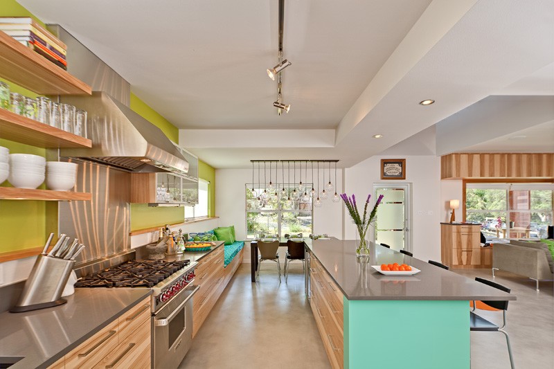
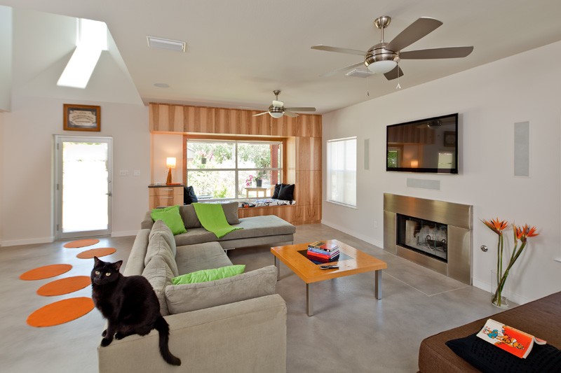
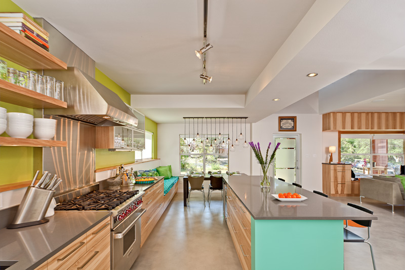
The home is located in Central Austin, just south of downtown and Lady Bird Lake, in the Bouldin Creek neighborhood My husband and I bought the house for the fantastic location and not so much for the original kitchen and downstairs layout. The original kitchen was small and closed off from the rest of the house. The dining room was very large and also closed off to the other spaces. We love to cook and entertain but are not formal dining kind of people, so we knew we needed to knock down some of those walls, take space from the underutilized dining room and give it to the kitchen, and just open up the entire first floor.
So I designed the space with functionality in mind, I wanted a ton of countertop workspace and plenty of room for two cooks and their guests to move around in. The high-performance range, quartz countertop, and concrete floor were definitely chosen for their durability. But when I have clients who want a nice kitchen to look at but not necessarily to cook elaborate meals in, I do not push them into blowing their budget on expensive pro-style appliances or materials. Nobody has an unlimited budget so it’s good to figure out what your priorities are and put the money into the items that make the most sense for you, for how you’ll use your kitchen. I don’t bake so I didn’t need two separate wall ovens. It may be a popular “must have” for a lot of people, but we just didn’t need it.
The most technically challenging aspect of the remodel was integrating the large beam that had to be installed to support the load of the second story after the walls dividing the kitchen, dining room, and living room were removed. This beam is a foot thick, so it required lowering the ceiling height in the area it spans.
The architect on the project, Christy Seals, turned this design challenge into one of my favorite elements of the remodel: she lowered the ceiling to match the height of the bottom of the new beam in the dining area as well as the area above the island seating. This creates a more intimate vibe in the areas in which folks gather and sit. It also plays well with the adjacent entry area in which the ceiling is open to the second story. The varying ceiling heights, how it pops up and comes back down, makes for a more interesting space to be in.
Design: Jennifer Ott Design
Photography by Patrick Wong | Atelier Wong
