Ana Williamson Architect have completed the remodel of a house in Menlo Park, California.
Project description
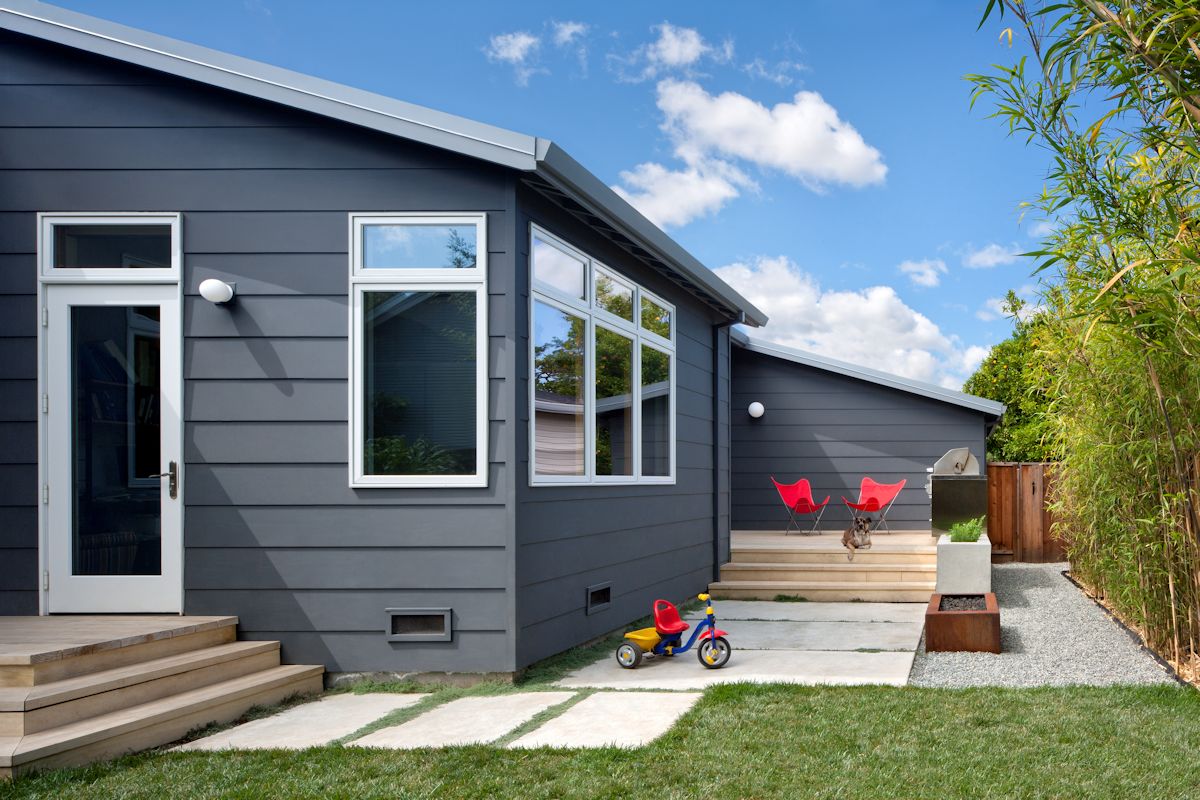
Cloud Street House began as a cramped 900 SF cottage on a 50’x100’ lot. Budget constraints required a single story solution, achieved by reusing the existing foundation while adding 500 SF of flexible indoor/outdoor space. The final design features abundant natural light, sustainable materials, and fully integrated indoor/outdoor rooms.
The primary goals of the project require completely rethinking the existing ill-conceived spaces, improving the overall flow to enhance connections to the outdoors and bring in as much daylight as possible. With this degree of compactness, all living spaces need to “work hard”, with every element serving double duty.
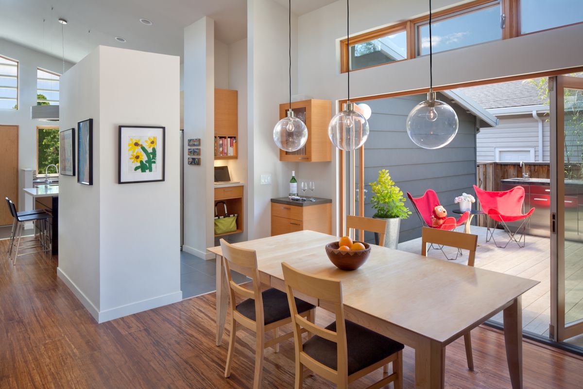
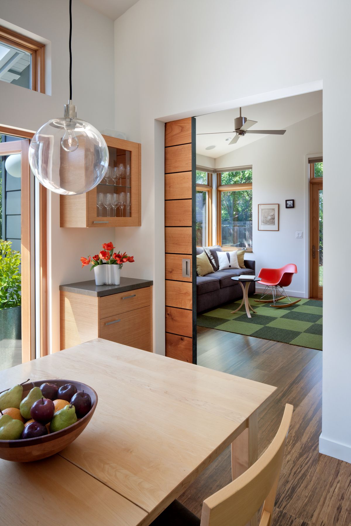
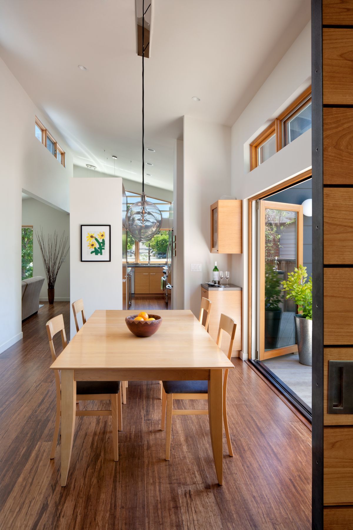
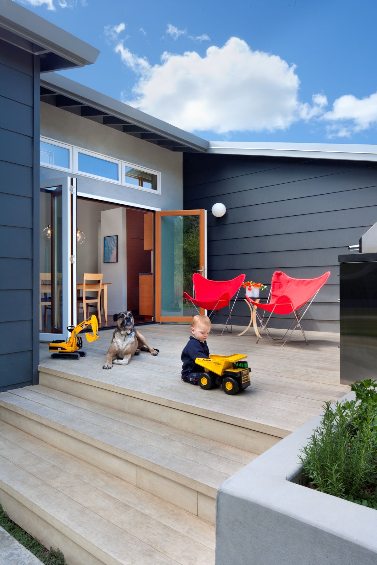
The new floor plan is organized along a vaulted central spine separating public and private zones. Large glazed bi-fold doors open the dining room to the patio, creating a courtyard. By maximizing the connection to the yards and creating accessible outdoor rooms, the entire site becomes integral to the everyday life of the homeowners and their young children.
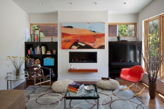
Although the finished house is a modest 1465 SF, it feels much larger because of its comfortable volume. The roofline is entirely reworked to vault the ceilings and allow for clerestory windows. The house is now maximally flooded with daylight for its orientation, passively warming the house in winter and contributing to natural ventilation in summer.
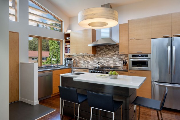
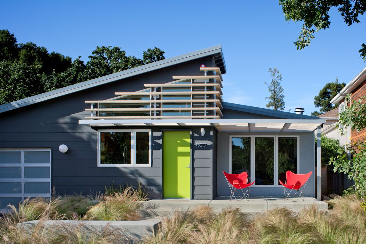
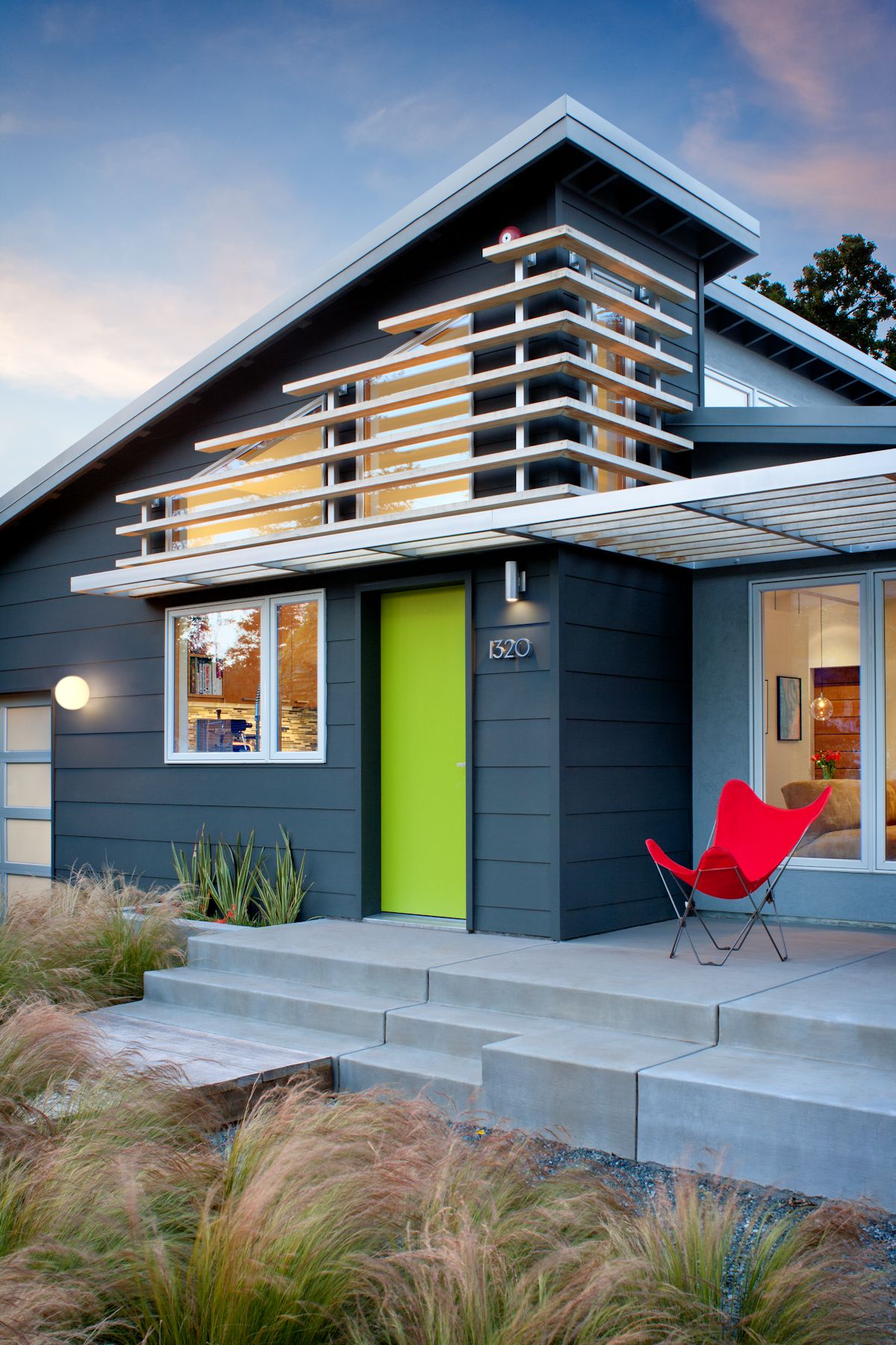
Designers by training, the homeowners enjoyed the process of material exploration and experimentation. Ultimately, they chose materials both for their aesthetics and their inherent and sometimes innovative sustainable properties. The peaked brise soleil and front and rear decks are constructed with acetylated wood. This material minimizes water absorption, making it extremely durable and more dimensionally stable. The kitchen cabinets are faced with a high performance fiber composite veneer developed to be a timber free alternative. Both of these are relatively new products to the sustainable market.
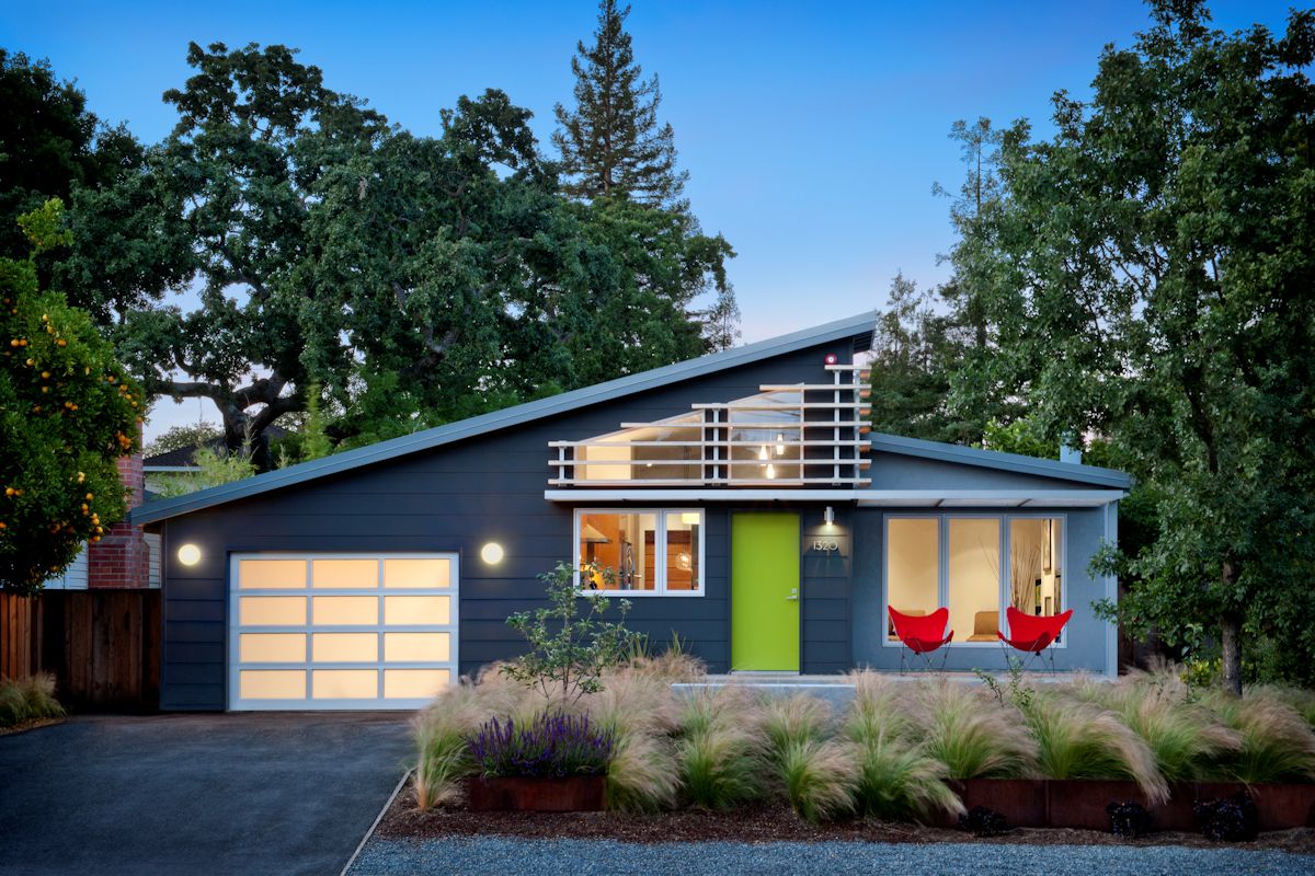
The front of the house, with its gracious porch and native landscaping, provides a neighborhood-friendly gesture towards the street. The house is more modern than its counterparts on the block and in careful keeping with the scale of the original context of the cottage. Its bold color scheme and sharp geometric lines often attract the interest of passersby and fosters impromptu interactions between the homeowners and their neighbors.
The combination of significant and challenging constraints, along with insightful homeowners presents an opportunity for great results. The full engagement and trust of the homeowners throughout this project were key elements of its success.
Design: Ana Williamson Architect


