Photography by Jeremy Bitterman
When the owners of this Seattle mid-century house were looking to renovate, they turned to mw|works architecture + design.
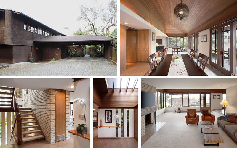
The house, originally designed by Ibsen Nelsen in 1961, had a layout that was very well considered, but the character and flow between spaces wasn’t a good fit for the daily patterns of the new owners. Here are a few ‘before’ photos…
Photography by Jeremy Bitterman
High on the owner’s wish list for the renovation was to increased the physical and visual connections between rooms and to the outdoors. Throughout the home, single pane windows were replaced and extended floor to ceiling.
Photography by Jeremy Bitterman
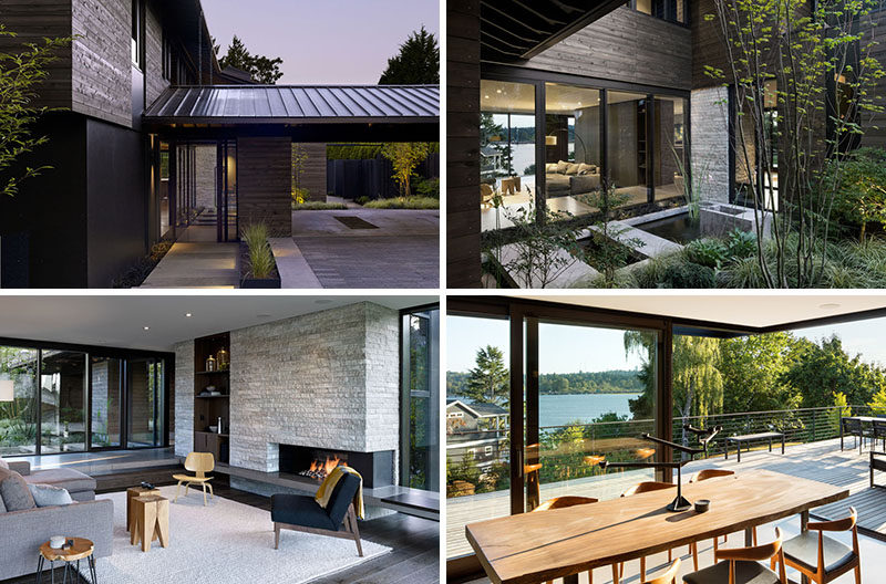
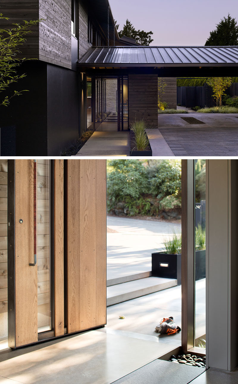
Upon arriving at the house, there’s a carport that has views of a courtyard and a path provides access to the deck around the side of the home. A large wood and glass front door greets visitors.
Photography by Jeremy Bitterman
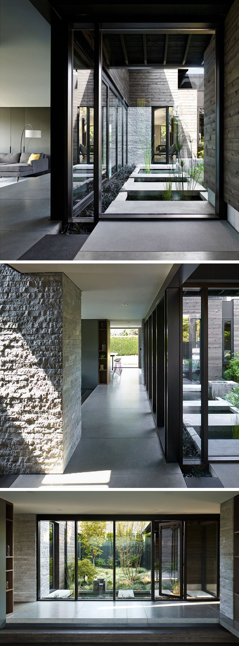
Inside, what was once a wall with three slim vertical windows, is now a large open window that provides views of the courtyard from inside the home. Around the corner and hidden in plain sight is a glass door that allows access to the courtyard.
Photography by Jeremy Bitterman
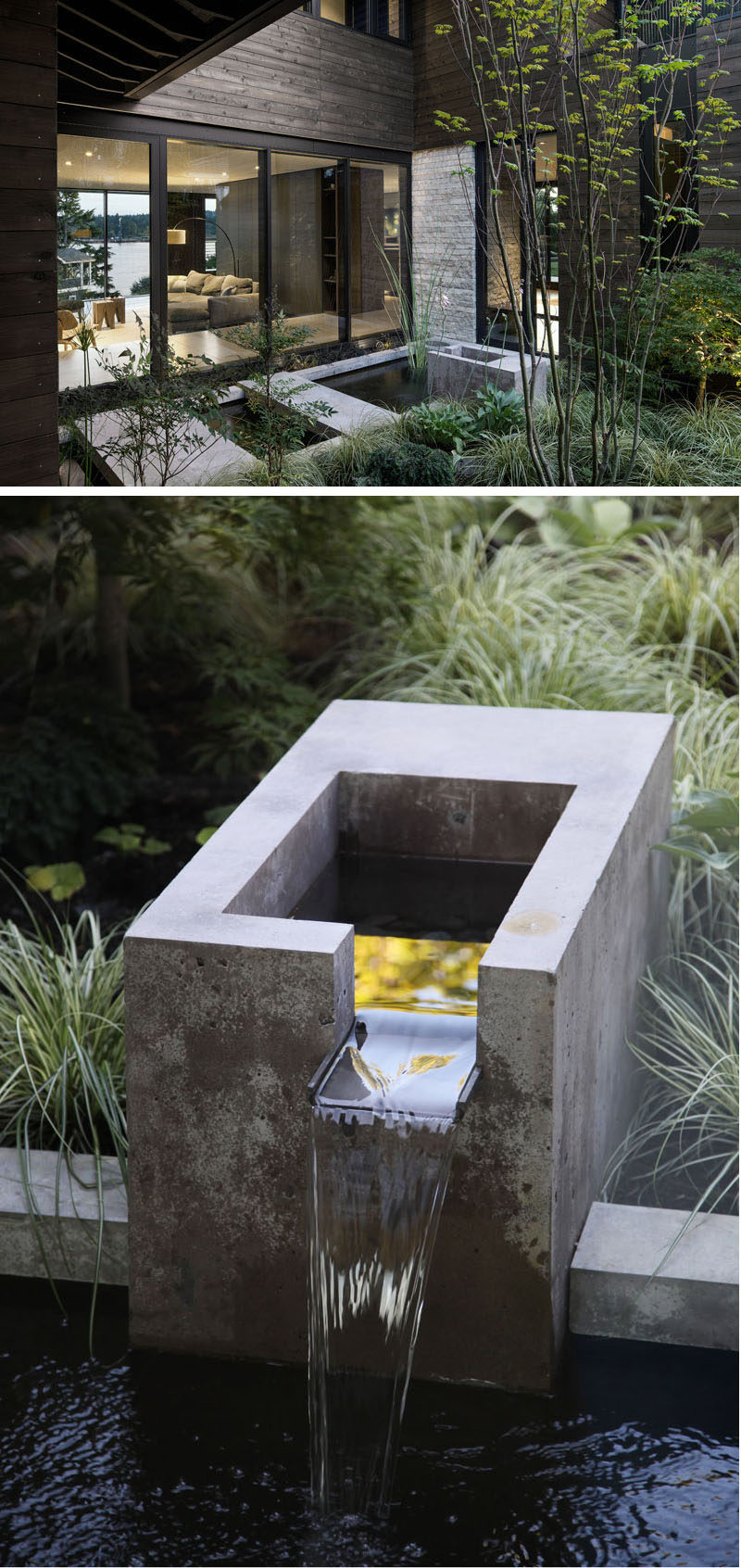
In the courtyard, there’s a concrete water feature and plants that can be viewed from both levels of the home.
Photography by Jeremy Bitterman
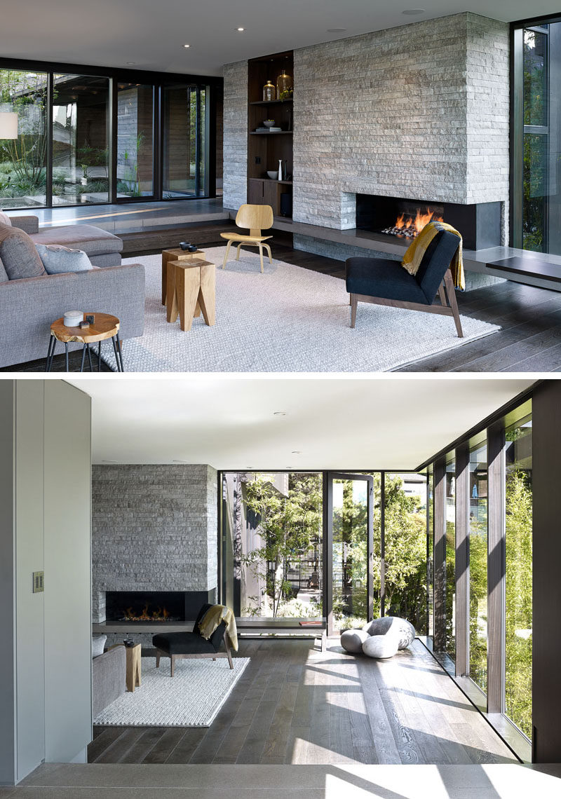
Opposite the courtyard and slightly stepped down is the living room. A stone accent wall has a built-in wood bookcase and fireplace. Large floor-to-ceiling windows flood the room with natural light.
Photography by Jeremy Bitterman
Around the corner from the living room is the dining room that opens up to an outdoor entertaining deck with lake views.
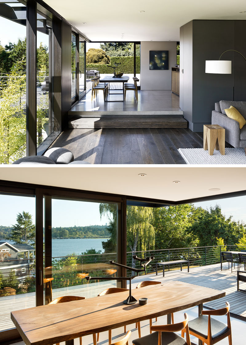
Photography by Jeremy Bitterman
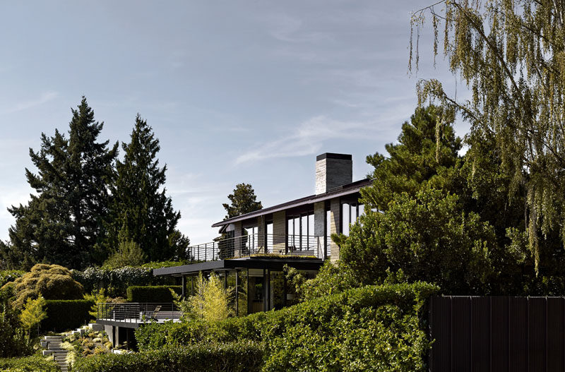
From the entertaining deck, you can see that the upper floor of the home also has access to outdoor space.
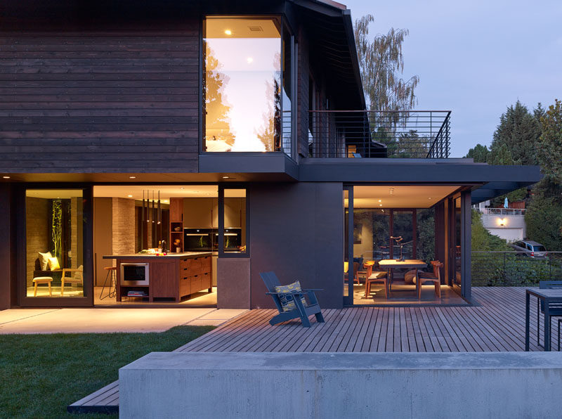
Photography by Jeremy Bitterman
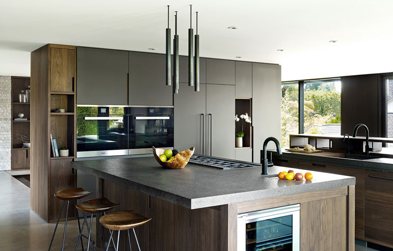
Stepping back inside and into the kitchen…the original kitchen was walled off from the dining area and isolated from the other living spaces, so the designers opened it up to the dining room and the deck. Dark wood has been paired with grey cabinets for a contemporary appearance.
Photography by Jeremy Bitterman
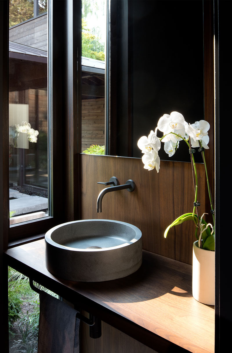
Just off the kitchen is the laundry room and a powder room. In the powder room, there’s a window with views of the courtyard.
Photography by Jeremy Bitterman
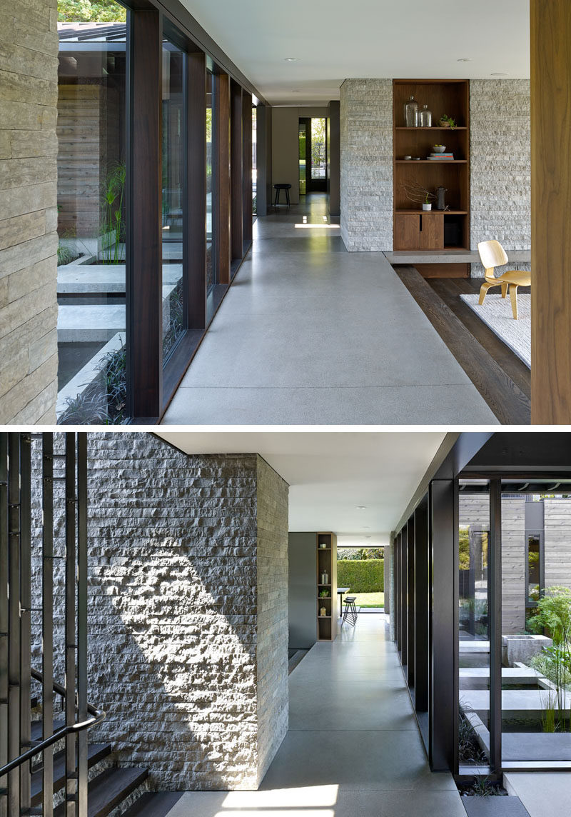
From the kitchen, you can see straight through the other end of the house that’s home to an office and bathroom. New heated concrete floors were installed during the renovation.
Photography by Jeremy Bitterman
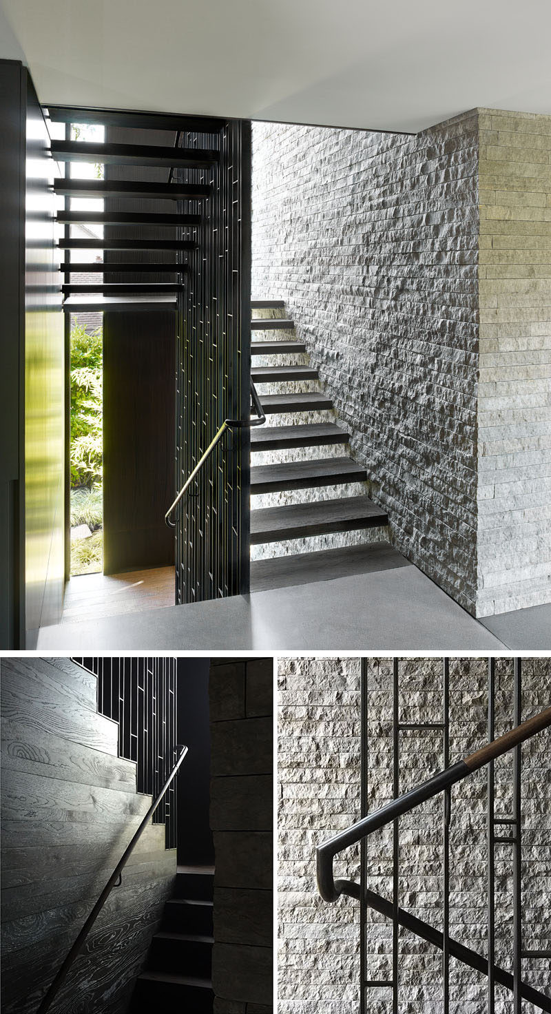
The stone wall in the living room wraps around and lines one side of the stairs that connect the various floors of the home. A light steel stair column was engineered to support the structural loads, eliminating the need for heavy stringers.
Photography by Jeremy Bitterman
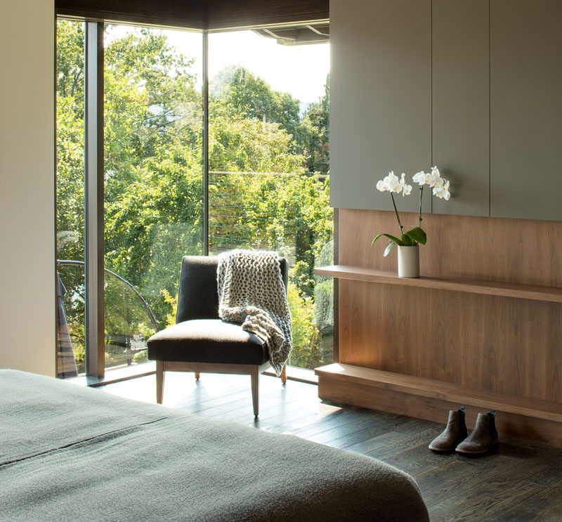
Upstairs, there’s a bedroom with corner windows that provide natural light and views of the trees, while a built-in wood shelf allows for a touch of nature to be displayed inside.
Photography by Jeremy Bitterman
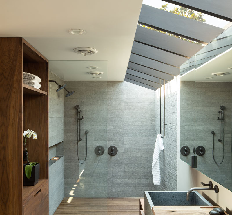
In the bathroom, a large skylight keeps the space feeling bright and open, while a glass shower screen separates the two person shower from the rest of the bathroom.
Photography by Jeremy Bitterman
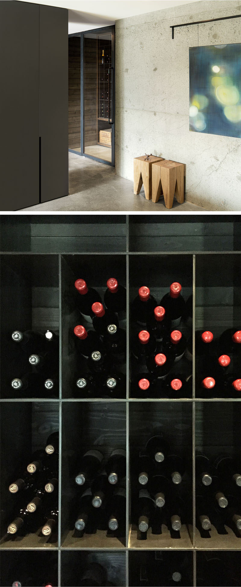
On the lower level of the home, an existing foundation wall was exposed in the hall that leads to a small wine cellar off the workshop.
