Photography © Katherine Lu
In a suburb in Sydney, Australia, TRIBE STUDIO gave a 1930s original brick bungalow a modern upgrade and extension to better suit the needs of the family living there.
The original brick structure and details were left untouched at the front of the home, while the back of the house had a brick and glass extension added to it that allowed the home to maintain the look of a single storey home while creating two extra bedrooms, a bathroom, and a combined living, dining, and kitchen area spread out on two levels. Let’s take a look…
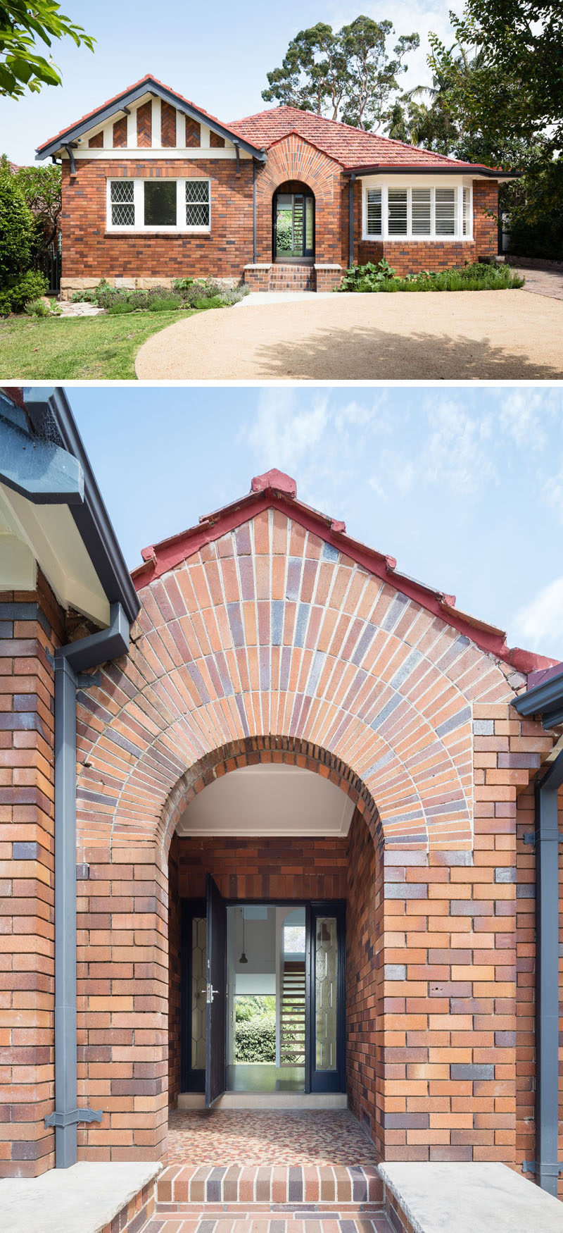
Here you can see the street view of the front of the house. Under the archway, with it’s sunburst brick arrangement, you can see straight through the house and into the backyard.
Photography © Katherine Lu
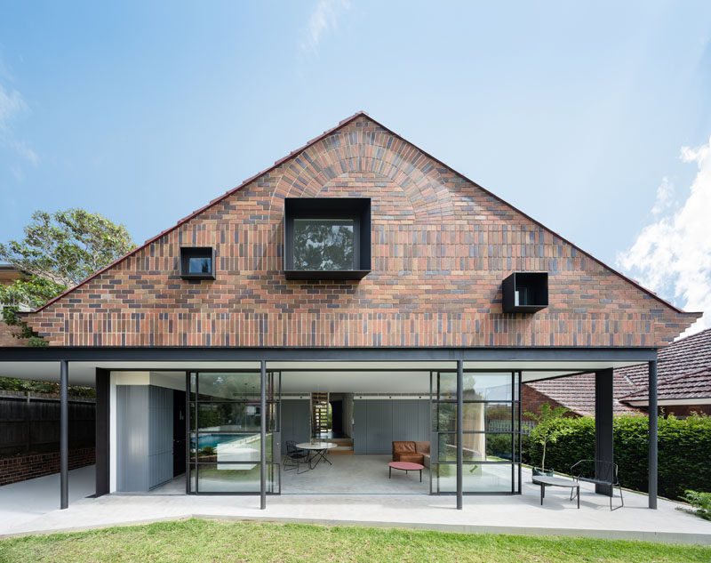
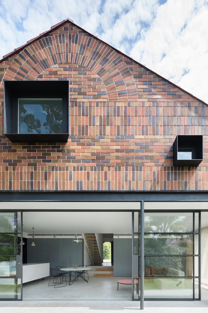
At the back of the home you get the full view of the two storey gabled roof extension, including the wall of windows on the first level and the brick second storey extension complete with newly laid brick in a sunburst arrangement similar to that of the original arrangement at the front of the house.
Photography © Katherine Lu
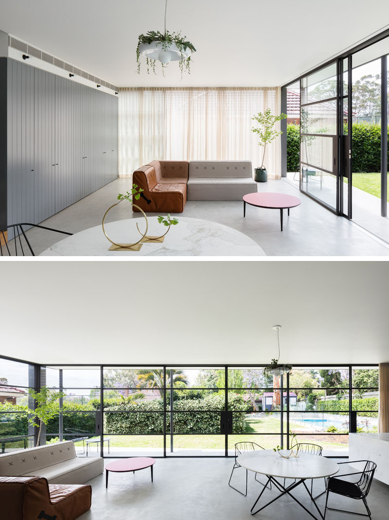
Inside the extension, wrap around black-framed windows make the combined living, dining, and kitchen area extra bright and connect the indoor and outdoor spaces. The grey concrete floor keeps the palette neutral and compliments the darker grey cabinets along the back wall.
Photography © Katherine Lu
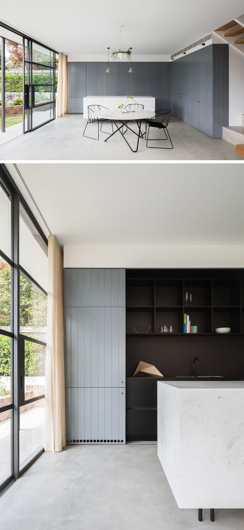
In the kitchen, grey cabinets that match the ones in the living space provide lots of storage and conceal the black work space behind sliding doors. The white marble island creates extra room for prepping meals and the simple modern table is just the right size for the small family.
Photography © Katherine Lu
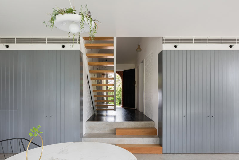
From the back of the house looking towards the front, you can see the concrete and wood steps leading to the main floor of the home which houses a formal living room as well as the master bedroom, bathroom, and the laundry room.
Photography © Katherine Lu
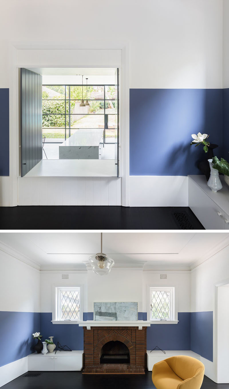
The formal living room features white walls with a thick blue stripe running around the perimeter. A window opens up to the kitchen and looks out to the yard in the distance. The original brick fireplace was left untouched to maintain some of the character of the home, while modern white cabinets were placed on either side of it to add storage.
Photography © Katherine Lu
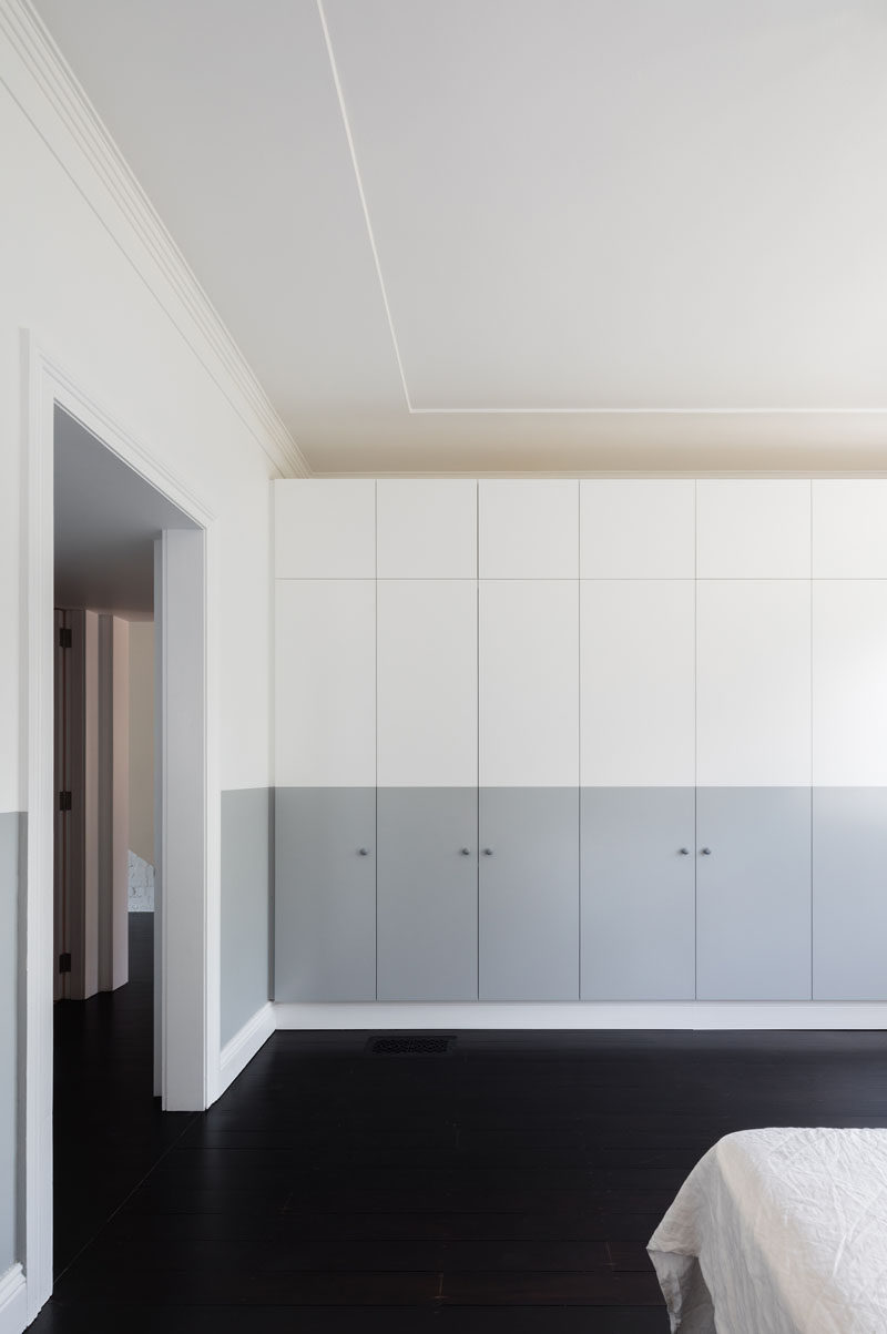
On the opposite side of the hallway sits the master bedroom. A wall of grey and white cabinets provides plenty of storage space and keeps the room clutter free.
Photography © Katherine Lu
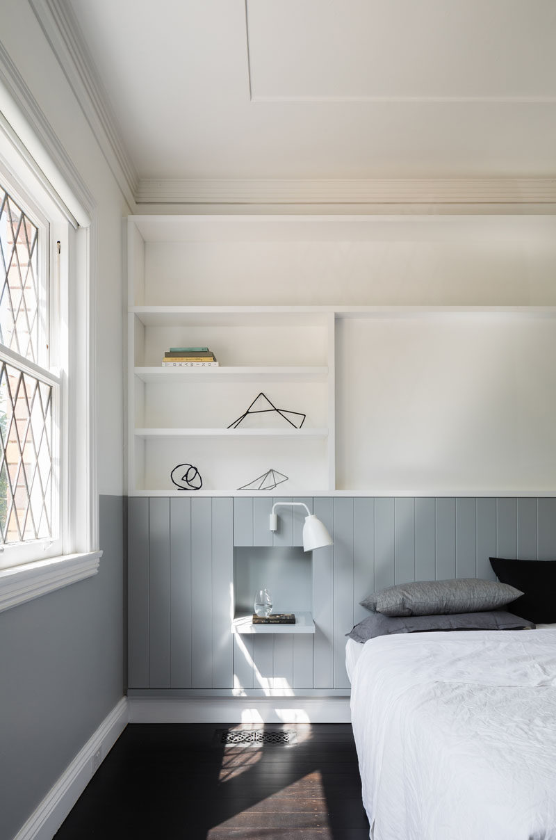
The grey strip along the bottom half of the cabinets continues around the rest of the room and turns into the headboard behind the bed. A white shelving system above the bed provides extra storage and display room for decorative items and family photos. A small built-in shelf becomes a bedside table.
Photography © Katherine Lu
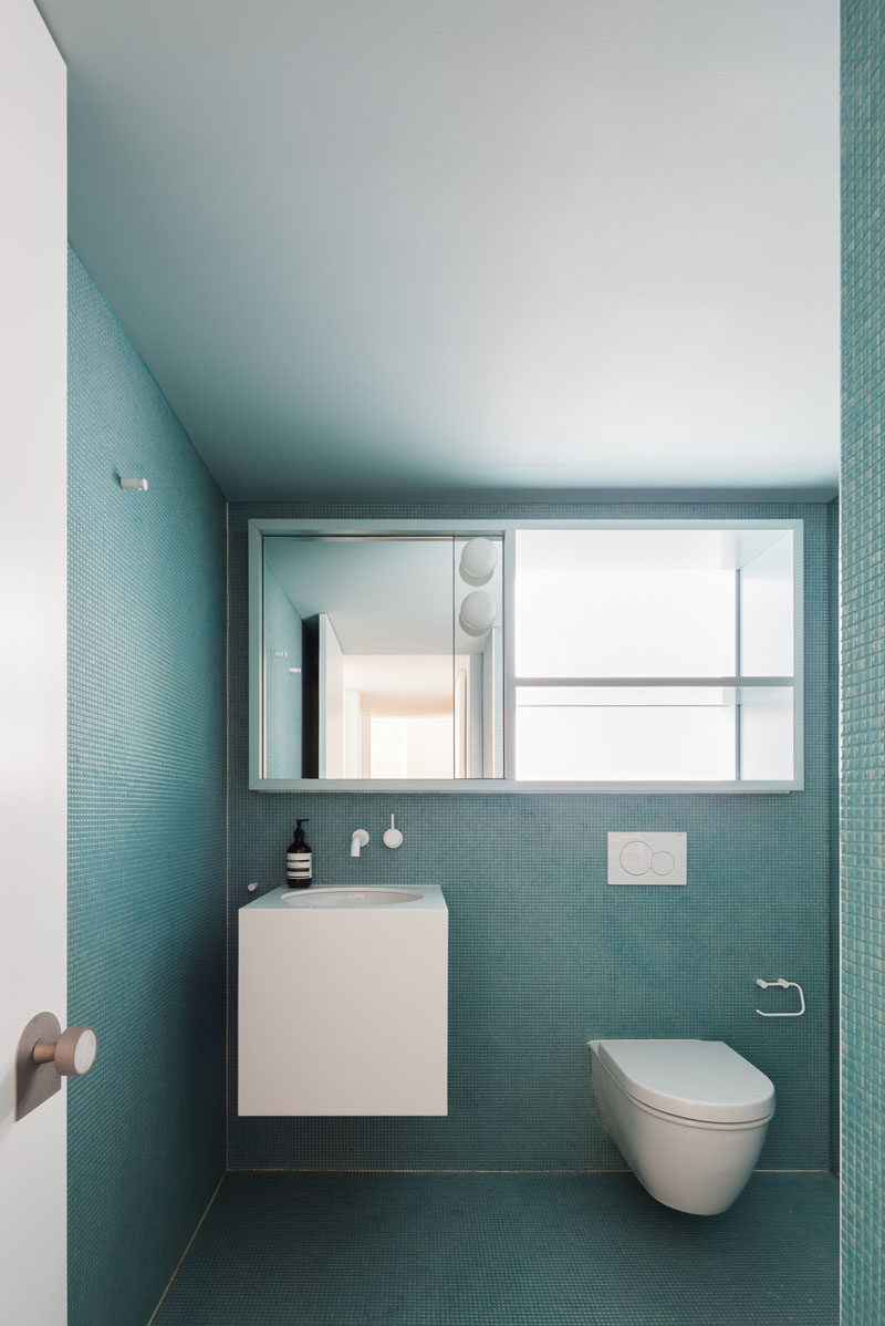
The master bathroom has been covered in tiny turquoise tiles on both the walls and the floor creating a monochrome look that’s interrupted by the floating white vanity, the toilet and the large mirror that doubles as a storage cabinet.
Photography © Katherine Lu
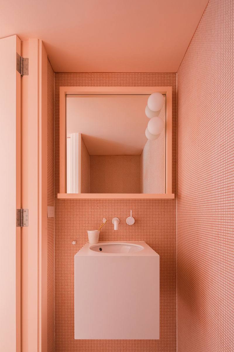
A second half bath, covered in tiny peach tiles and complete with a matching peach ceiling, creates another monochrome bathroom just outside the master suite.
Photography © Katherine Lu
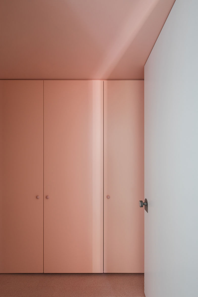
The peach tiles in the half bath continue out to the laundry room where matching cabinets conceal the washer and dryer.
Photography © Katherine Lu
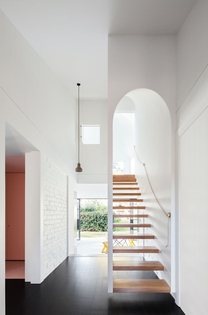
Back in the main hallway, an white arched wooden staircase leads up to the second story of the extension.
Photography © Katherine Lu
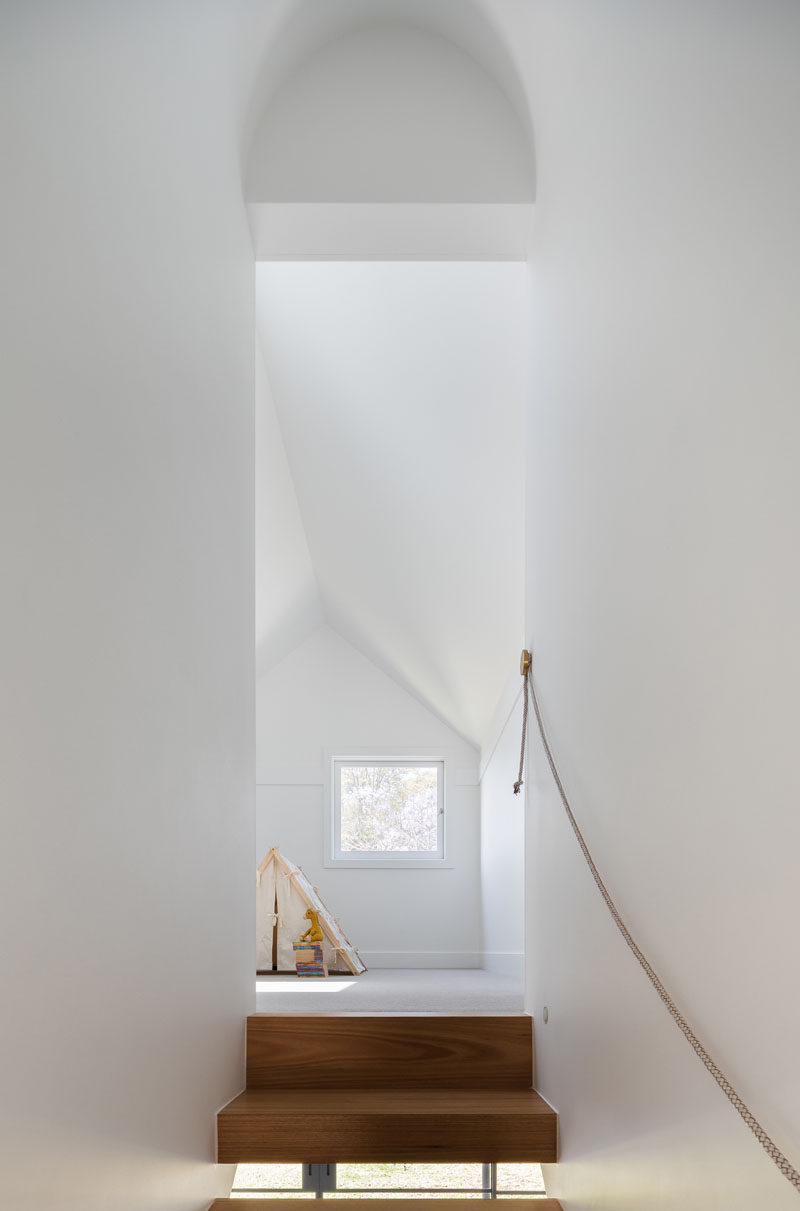
A landing at the top of the stairs provides a bright spot perfect for playing, and features a small window looking out to the backyard below.
Photography © Katherine Lu
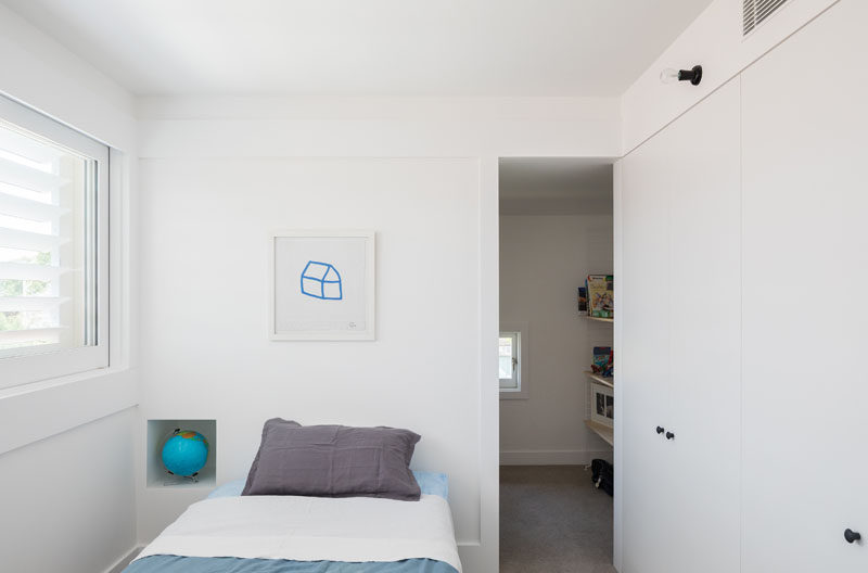
Just off the landing are two separate bedrooms with lots of storage space in the form of large cabinets and walk-in closets with more storage for clothes and toys.
Photography © Katherine Lu
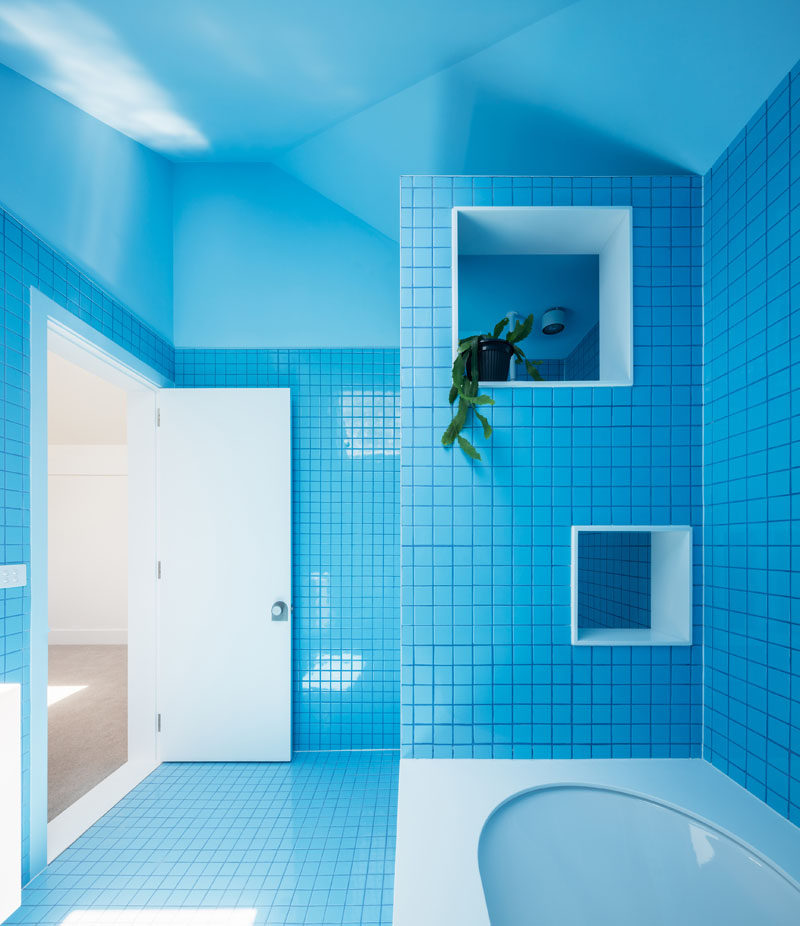
In keeping with the monochrome theme found in the other two bathrooms in the house, the upstairs bathroom features bright blue tiles on the walls and floor and a bright blue ceiling that keeps the space bright and fun. Square cut-outs on the wall next to the bath offer a place to store shampoos, soaps, and other bath essentials and help keep the area surrounding the tub clean and organized.
