Interior designer Catlin Stothers, has shared with us her latest project, the modern interior renovation of a home in Montreal, Canada, that has been lived in by a family for over 25 years.
Now that the children are adults and have moved away, the parents have decided to update their home, instead of moving and downsizing. In the past, the house was a venue for many social gatherings and family celebrations, and the homeowners wanted to keep that function, as well as update the master suite.
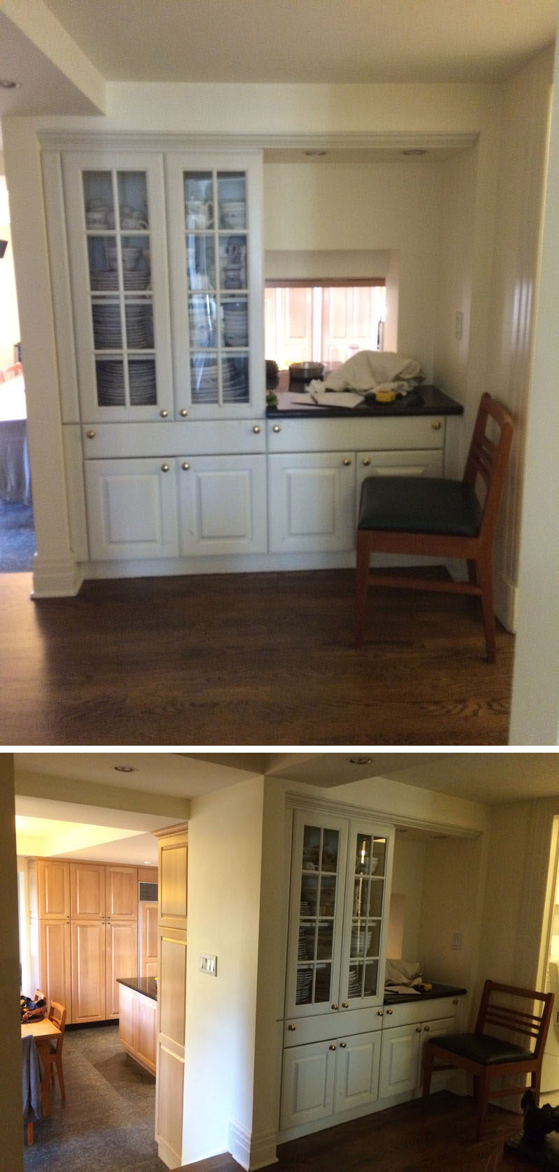
Stepping into the home, you’re greeted by the entryway, with built-in cabinetry.
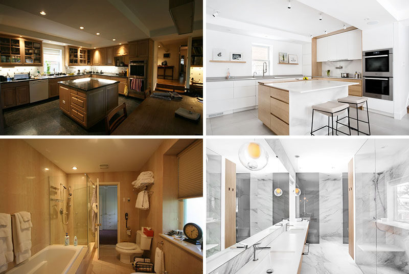
This is what the entryway looked like before the renovation.
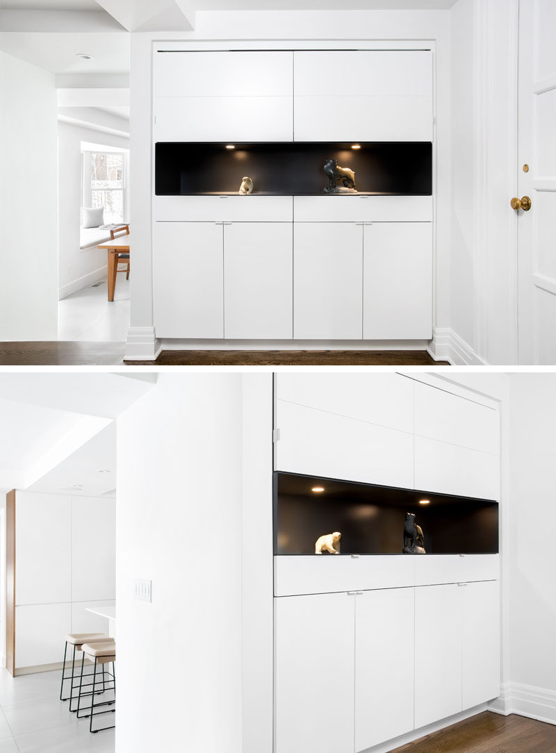
The entryway has been updated with a wall of white cabinets, with the middle section painted black to create a dramatic backdrop for highlighted artworks.
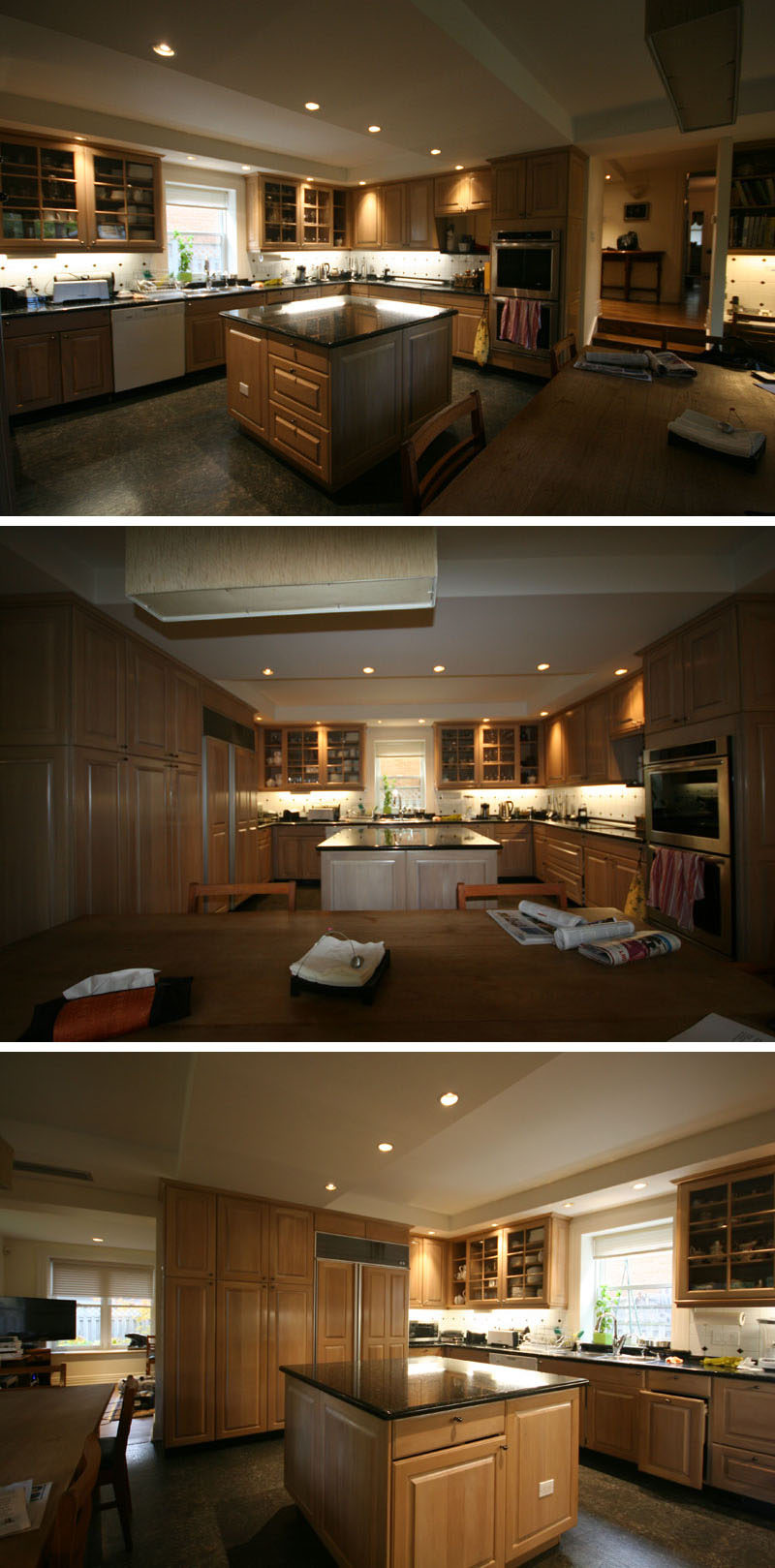
Next, the kitchen and dining area. In the late 80’s, the kitchen was relocated into the garage, and as a result, the kitchen has eight foot concrete ceilings.
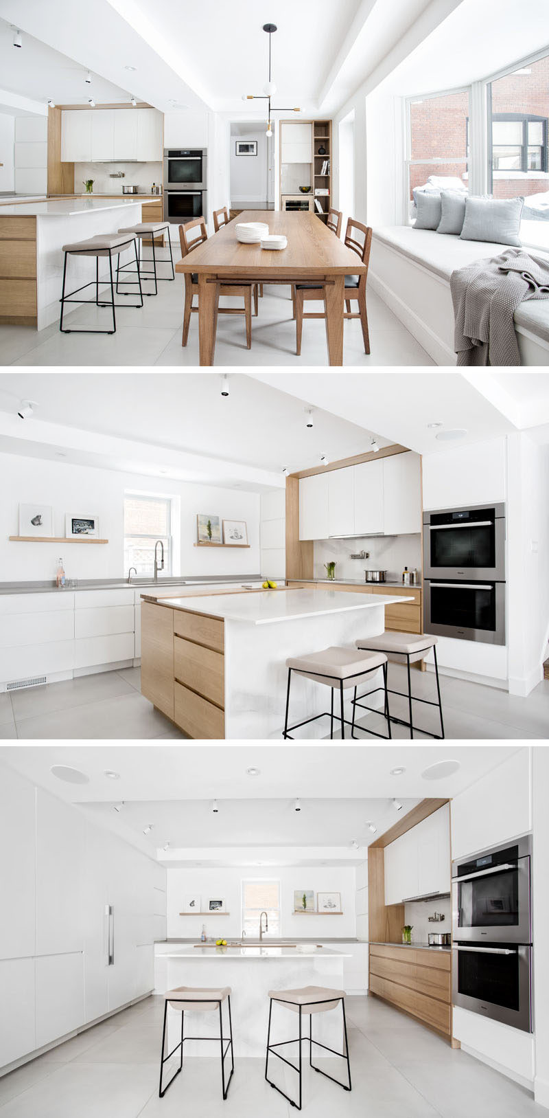
The new updated kitchen and dining area is bright and welcoming. The teak dining table and chairs were the only pieces that were preserved from the original kitchen design and inspired the new design. White with light wood elements was used to create the illusion of height and light.
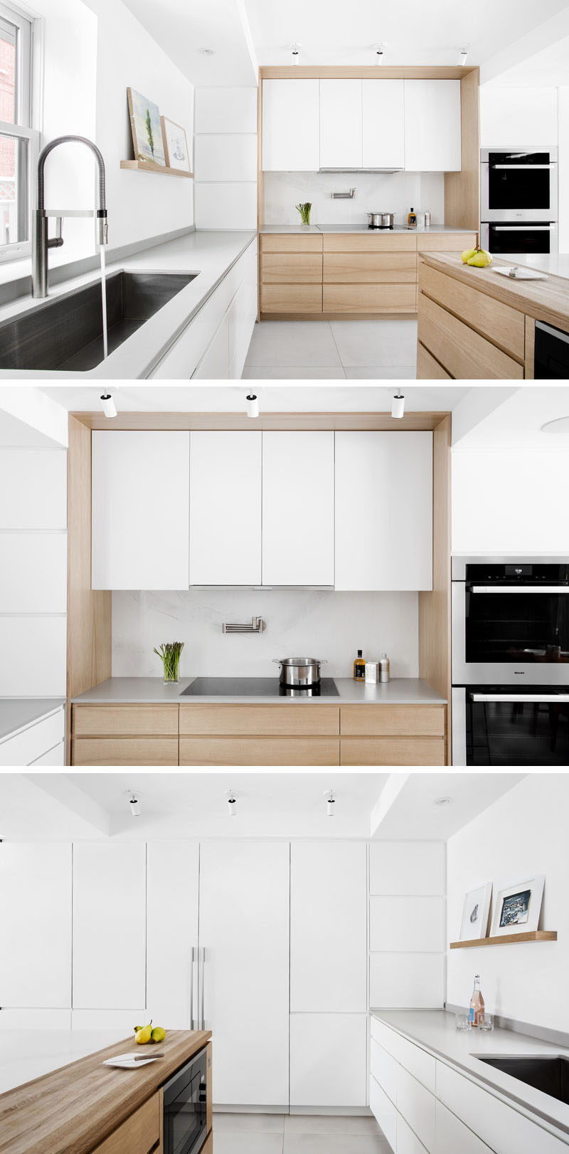
White lacquered doors for the kitchen cabinets and integrated fridge panels extend to the ceiling and cast a bright reflection into the room. Additional lighting was added and to tie in with the dining table, the island and some of the lower cabinets are made of butternut and oiled in a matte finish. Large, oversized heated tiles used for the flooring resemble soft concrete.
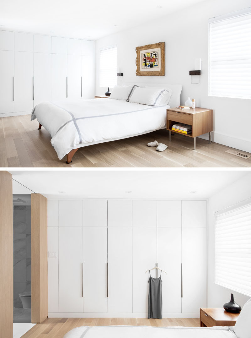
On the second floor of the home, there was a major overhaul of the master suite, creating his and hers closets, a library and a brand new bathroom. Walls were moved and the floor plan was reconfigured to make the space feel more open and luxurious.
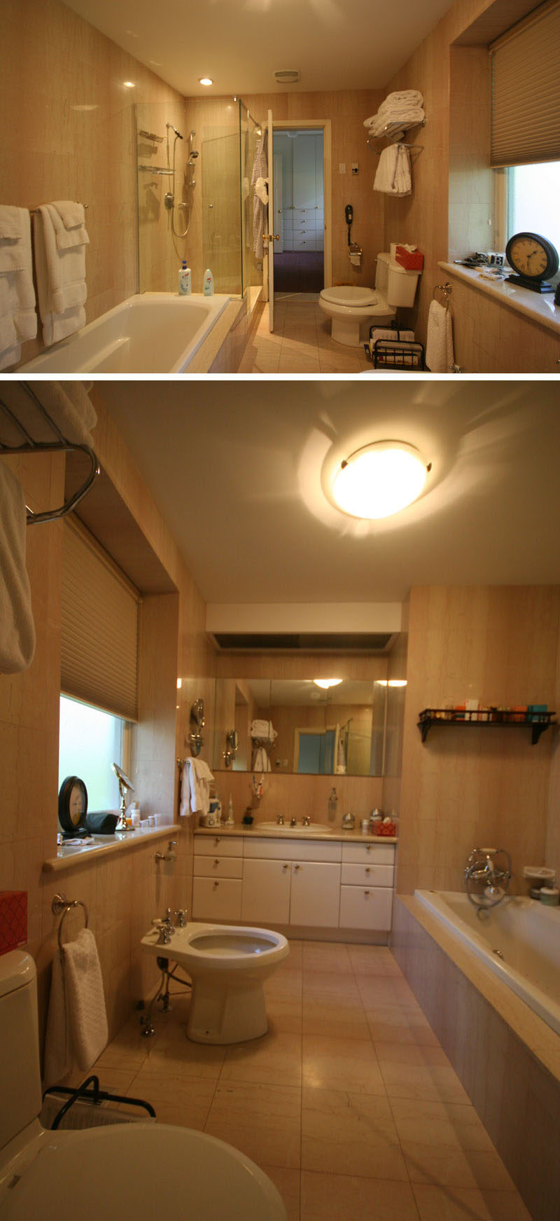
Before we show you the new bathroom, here’s what it looked like before.
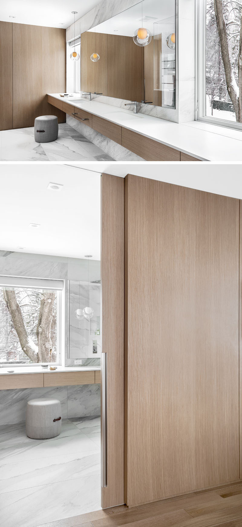
The new bathroom is a dramatic change from the previous bathroom. Located off to the side of the master, the bathroom features a walk-in shower, a partitioned toilet area and plenty of room.
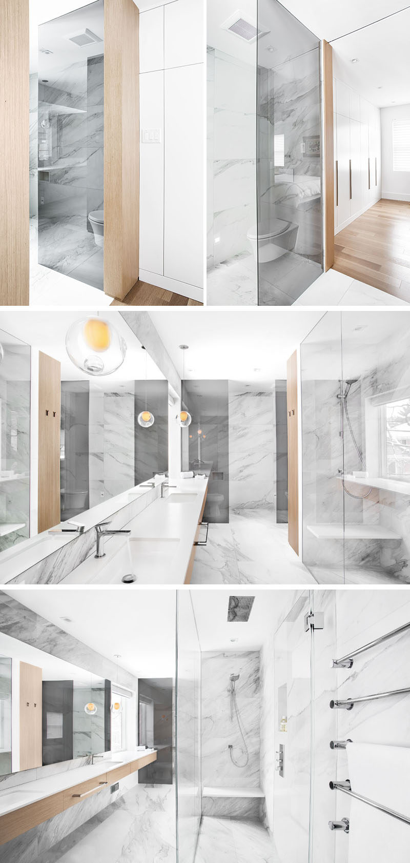
One of the most notable features in this bathroom is the use of a 18 foot vanity (5.4m), that runs the length of the bathroom. Windows on each side of the large mirror flood the bathroom with natural light. White oak panels that are featured in the bedroom, continue through to the bathroom, that’s separated from the bedroom by two full-height pocket doors in the same white oak.
