Paul McAneary Architects have designed Faceted House 1, a contemporary house extension in Hammersmith, London.
Project description
Paul McAneary Architects are delighted to announce the completion of the project Faceted House 1, an Edwardian terrace house located within a conservation area, in Hammersmith, London.
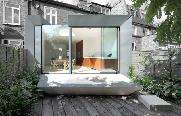
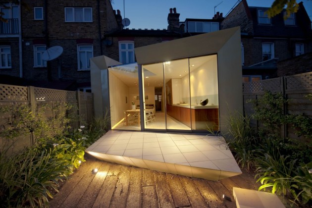
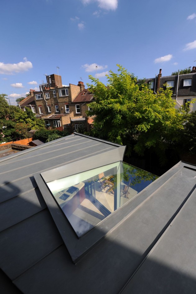
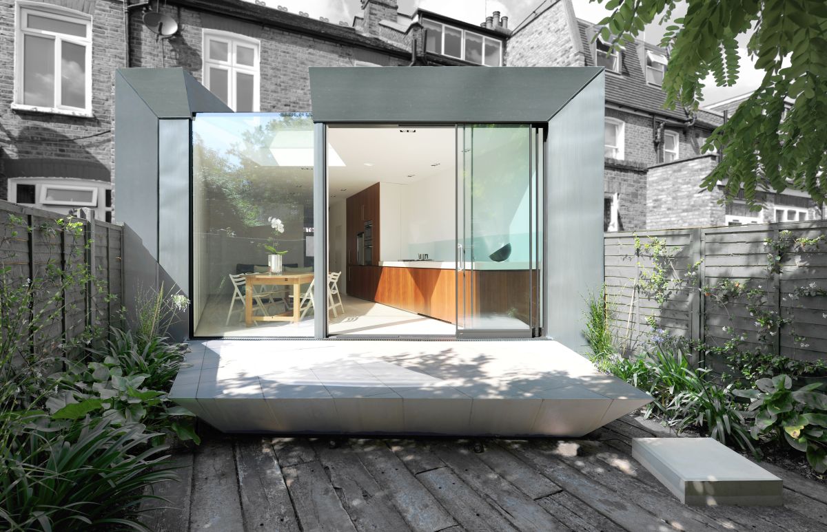
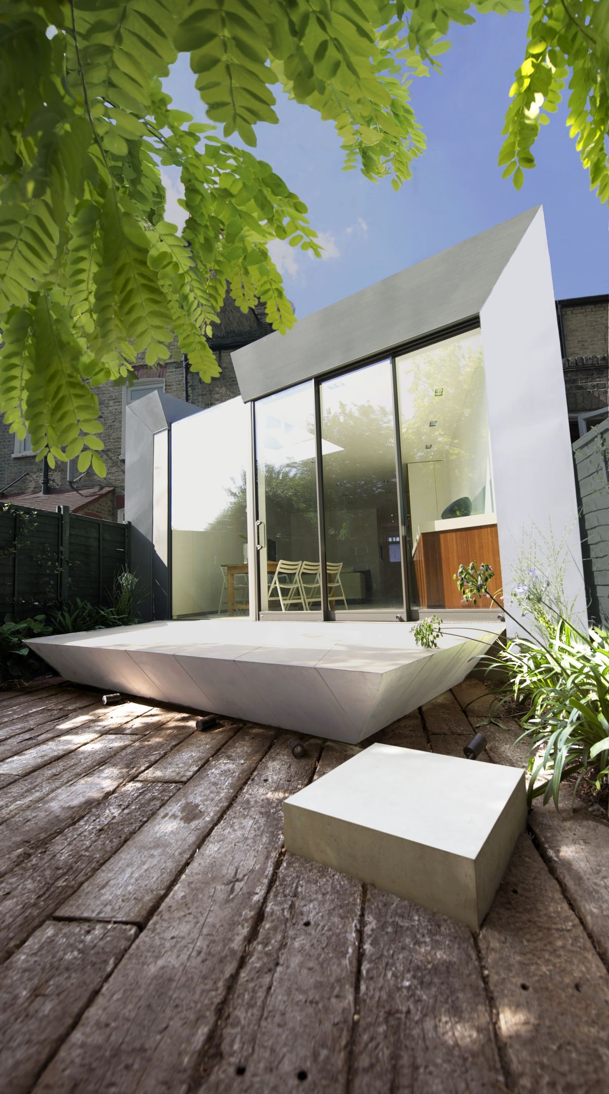
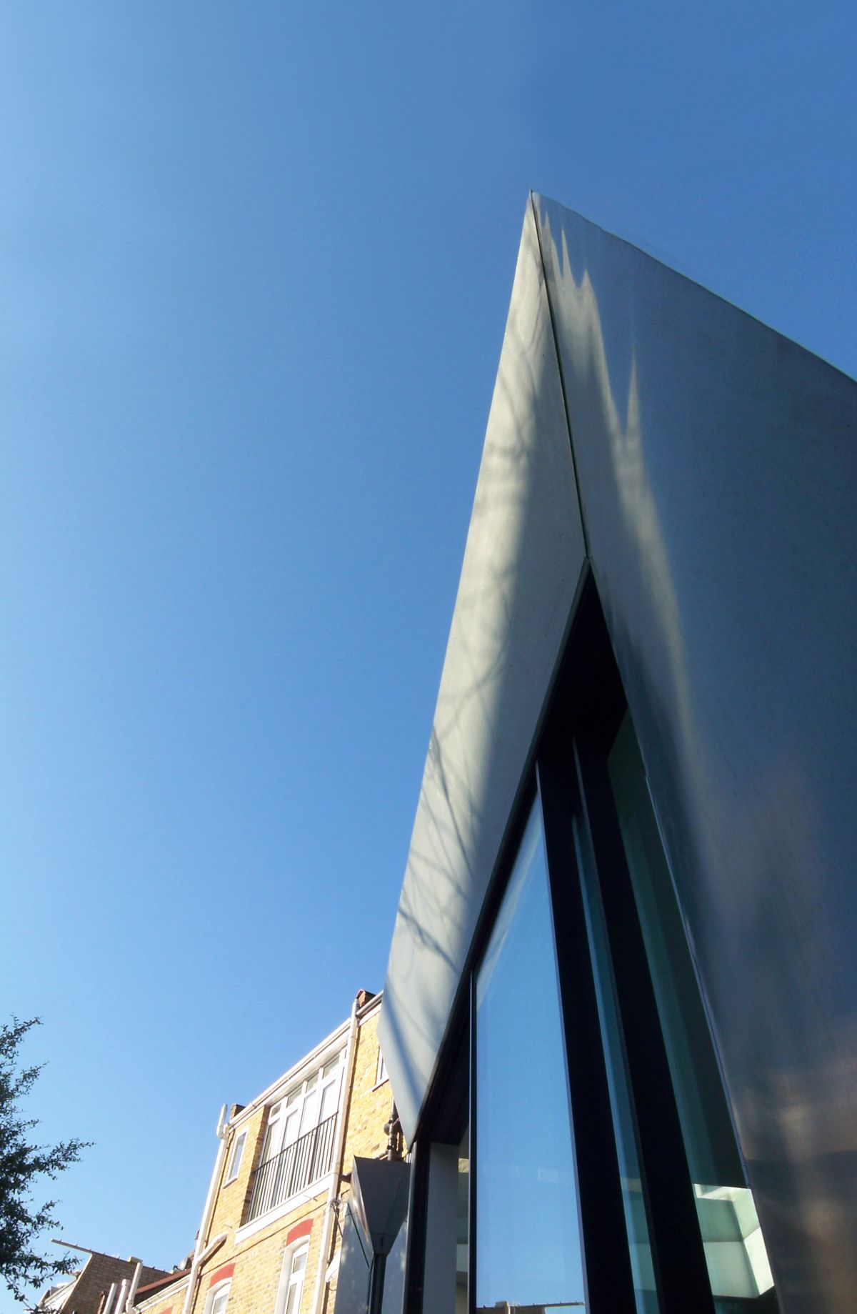
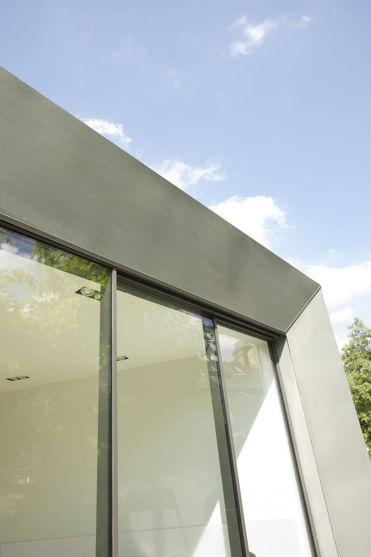
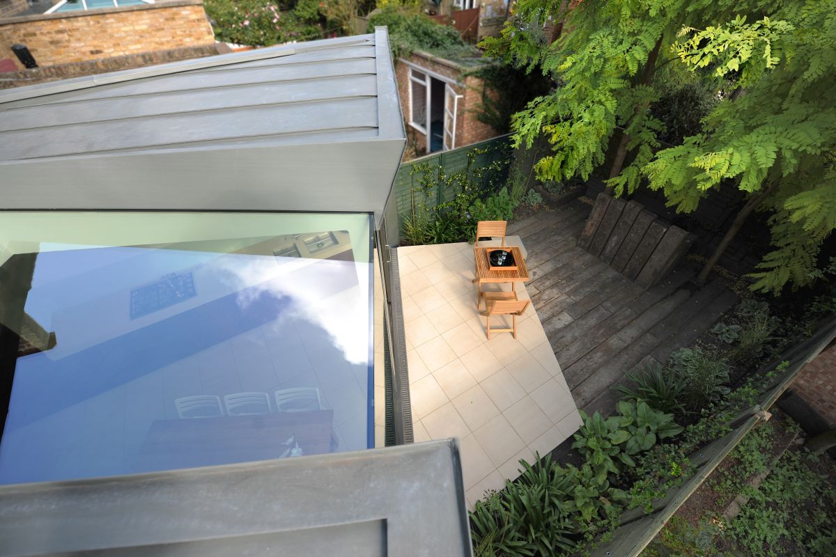
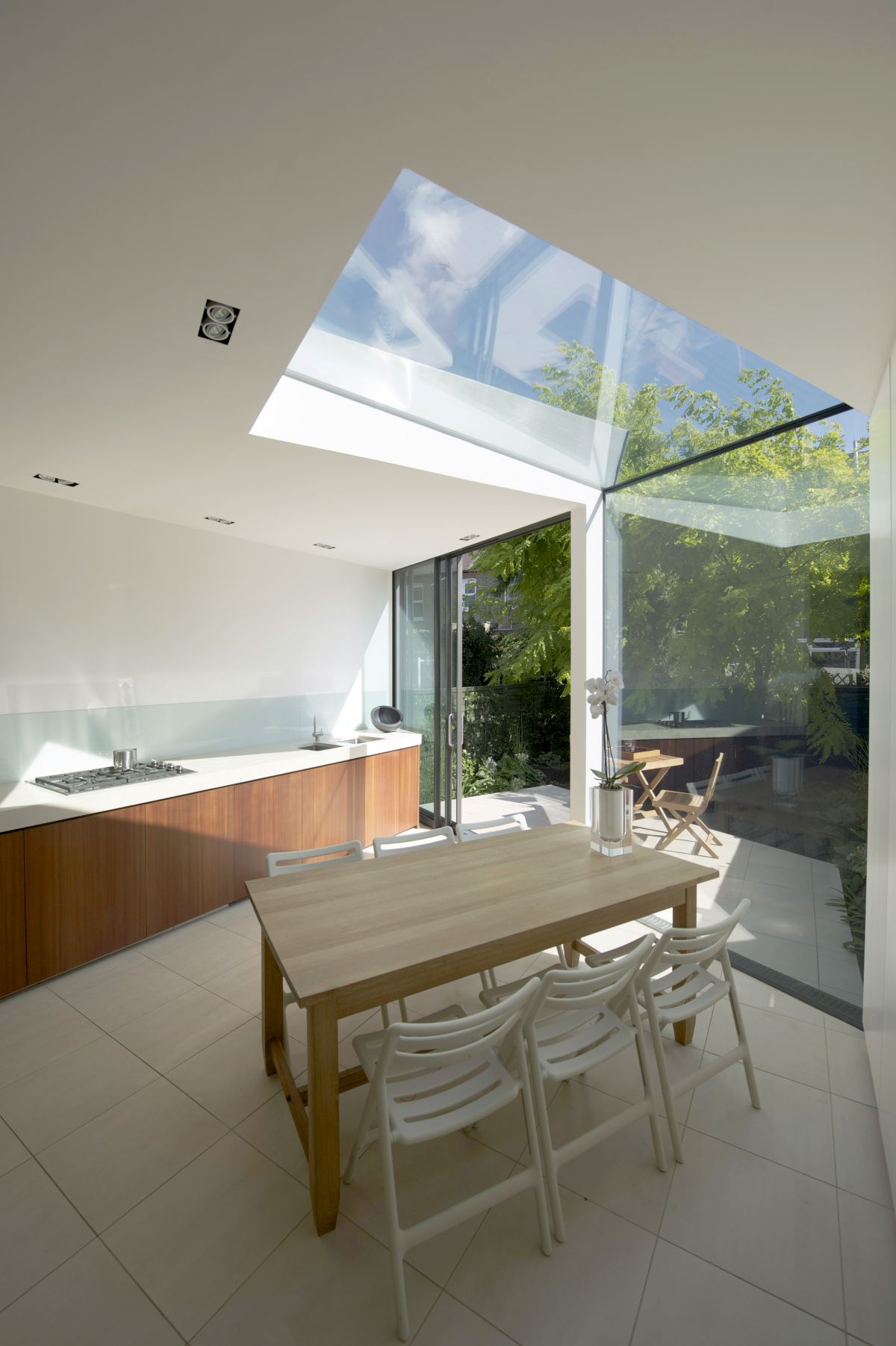
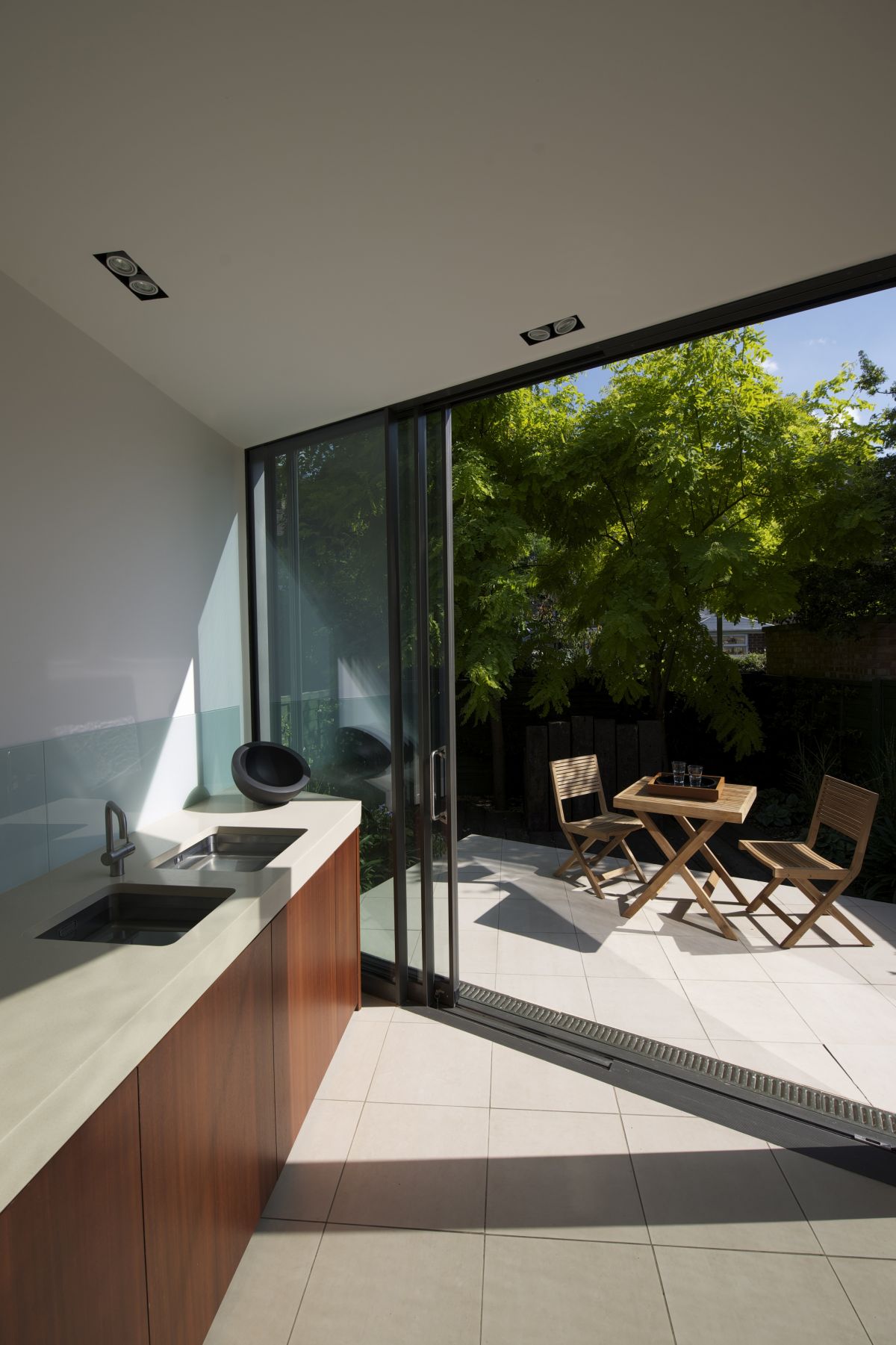
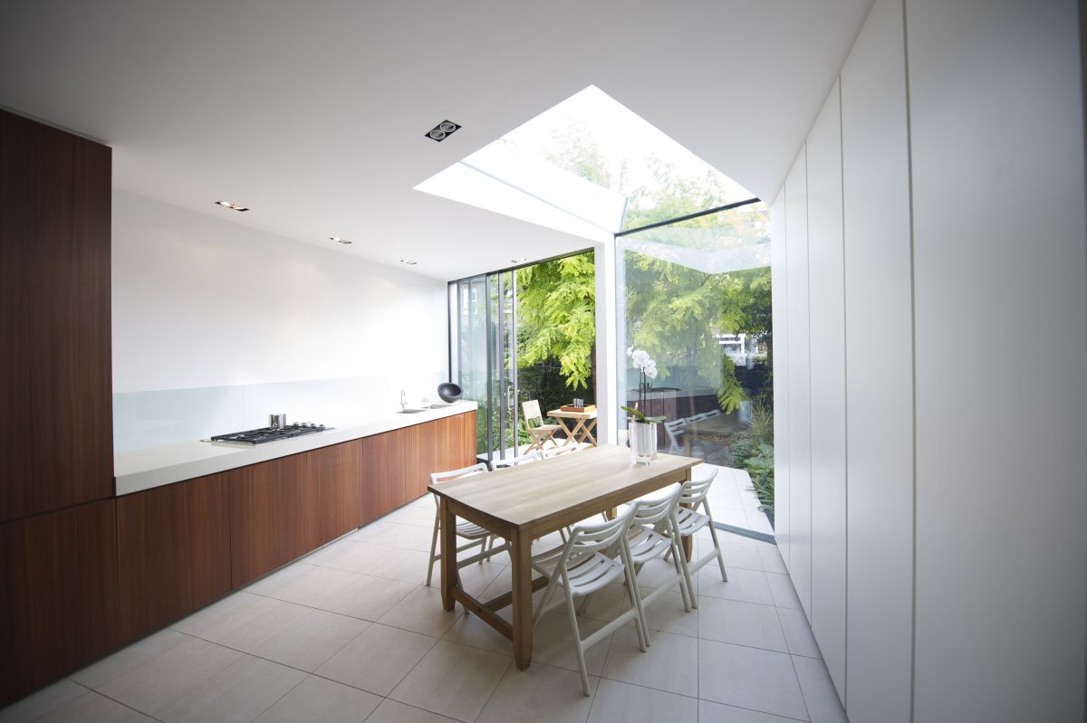
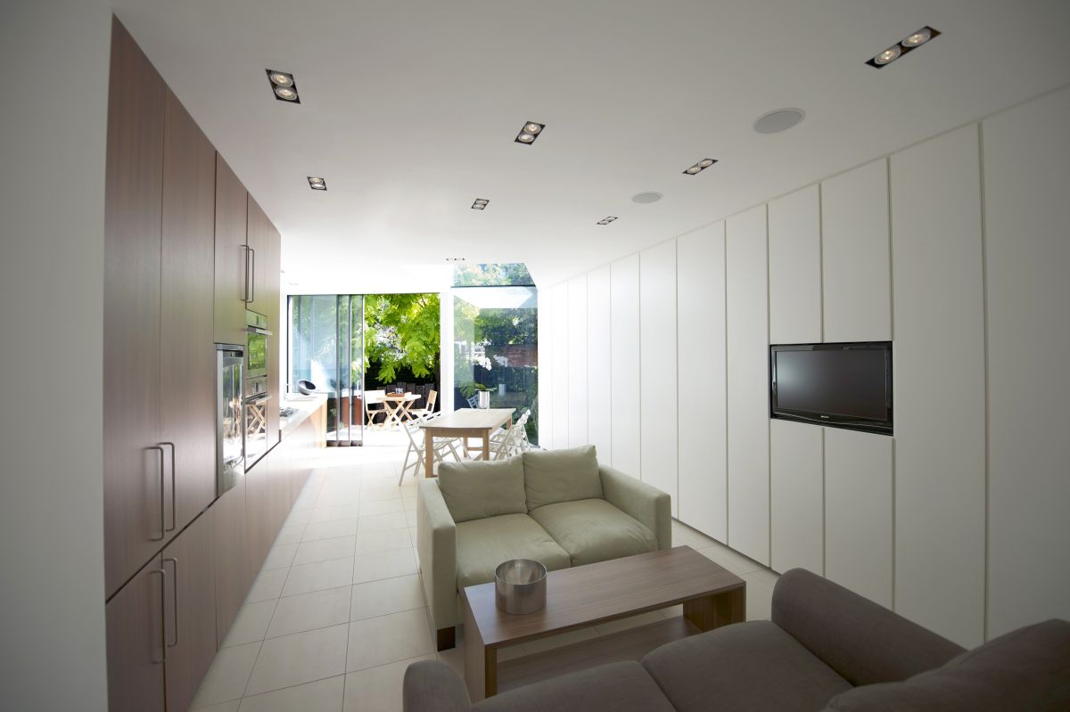
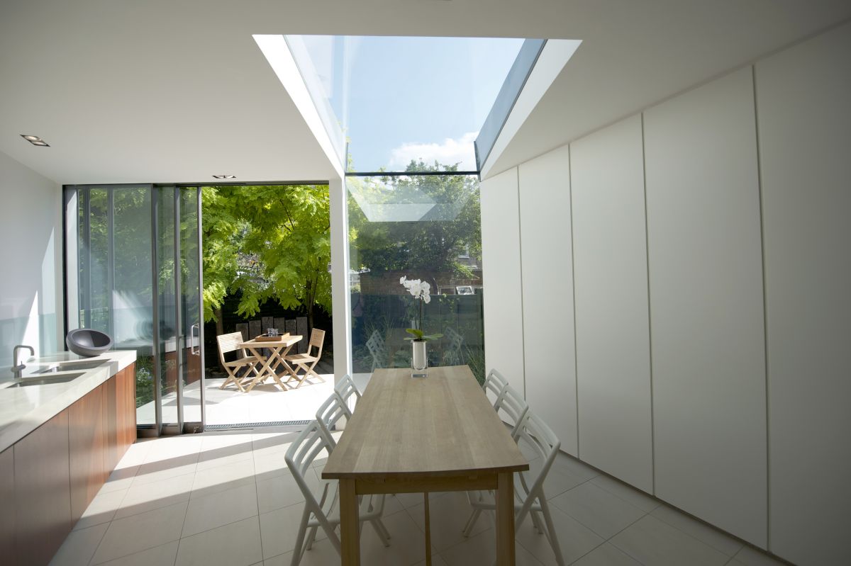
The project’s brief was to remodel and extend the three bedroom two storey house that was in a decrepit state and in need of considerable refurbishment and modernisation. The client asked for a contemporary design and functionality and he also expressed the desire to be able to perceive the garden as a continuation of the domestic space rather than ‘the outdoor’. Paul McAneary Architects responded to the brief by demolishing the existing 1980’s rear extension to the property that was crumbling and dilapidated. The new extension is added by a clean and clearly defined line to the rear that respects its heritage and gives this house a unique, uniform aesthetic. The sculptural façade is visually striking and elegant at the same time. Paul McAneary Architects reconfigured and expanded the existing space by designing a huge open-plan: the concept driving the whole design is a 30° twist that allows physical and perceptive overlapping between the indoor and the outdoor spaces, between the garden and kitchen thresholds – so whilst at the sink you feel the garden is actually behind you. This conceptual idea is manifest in the details of the faceted zinc facade and the floating external deck, being cut back to a fine angled edge. The garden becomes a vital ingredient of the living
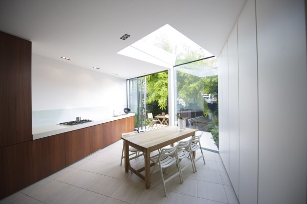
space.The client requested a clutter-free and practical house. PMA responded with their designed concept storage wall; a simple multi-purpose solution made of economical Ikea carcasses for the interior, and high quality lacquered handleless doors for the outer surface. They designed a concealed cupboard at the end of the kitchen bench top which carefully hides the toaster, kettle and all the other kitchen clutter in the same way that the WC and utility cupboard design solutions hide away these occasional functions. Technology is also hidden as much as possible, to fully integrate all requirements so as the space could remain as calm, uncluttered and contemplative as possible.
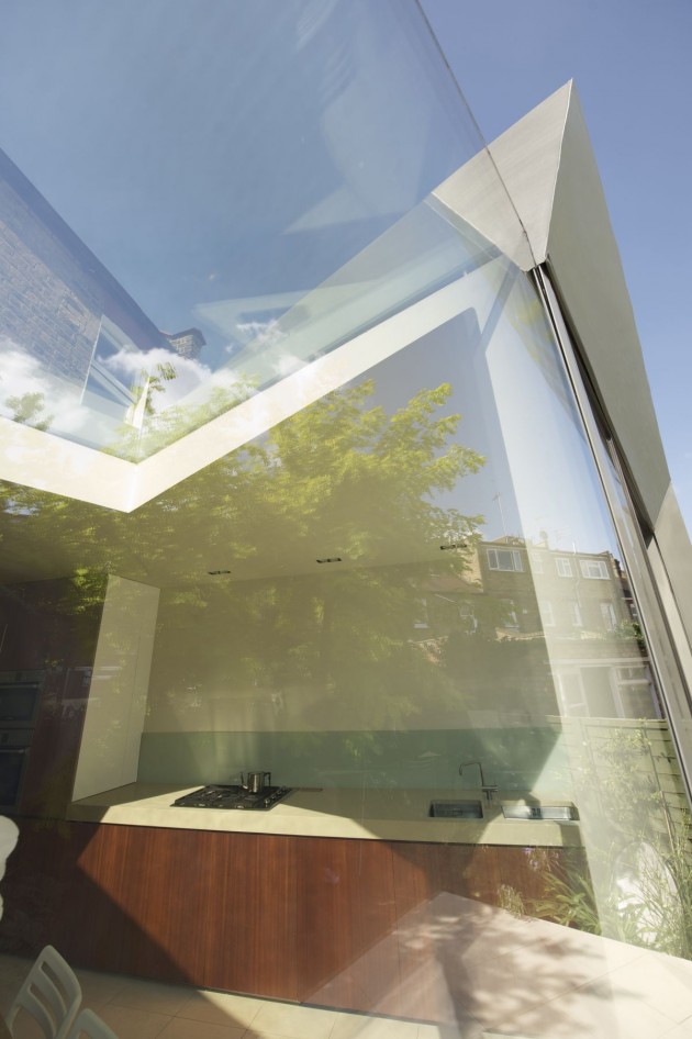
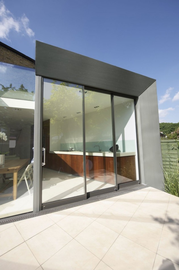
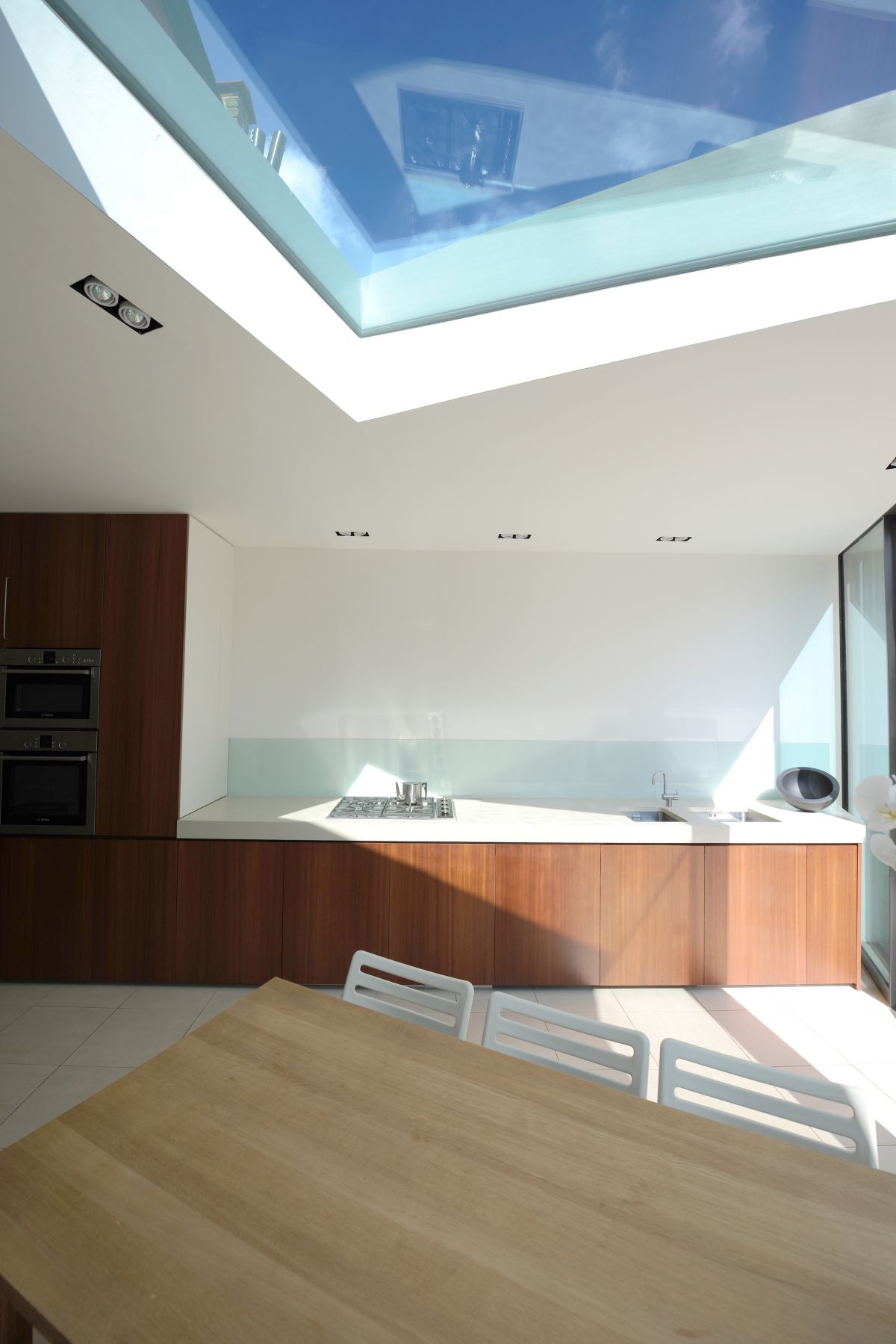
Light floods into the house via the finest possible sections, making up the sliding doors, combined with the large fixed frameless panel of the facade that folds back into the depth of the building with a frameless folded roof panel. A“ballet of light” is the result, as the light casts a sharp beam into the depth of the house which dances through the space during the hours of daylight extenuated by the light coloured floor and ceiling which bounce the light to the other end of the house.
Architect: Paul McAneary Architects

