Photography by Brett Boardman Photography
When these home owners wanted to add an extension to their home, they asked architect Christopher Polly to create a space that would expand the living and sleeping areas.
Photography by Brett Boardman Photography
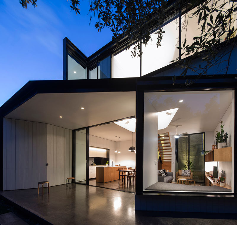
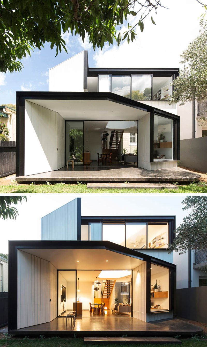
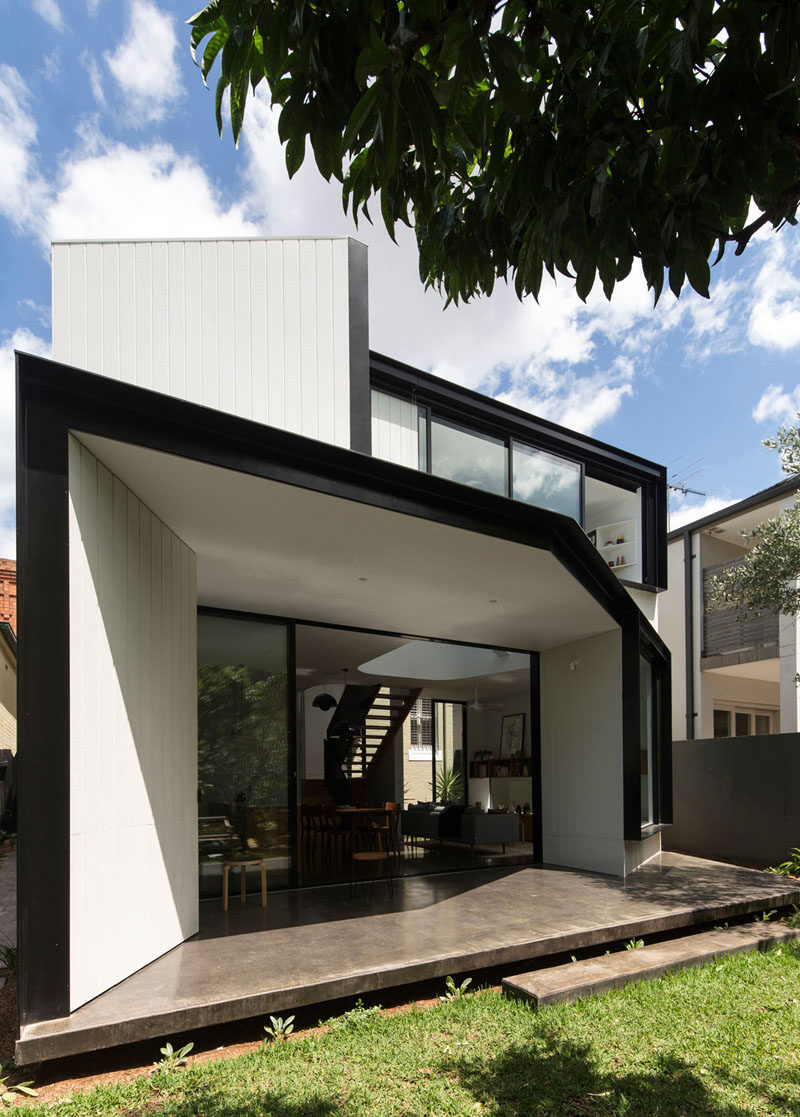
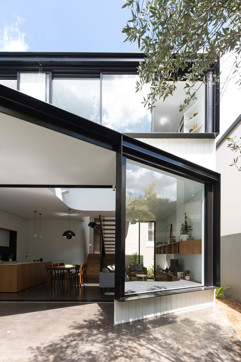
The home, located in Sydney, Australia, has a rear extension that includes a variety of angles.
Photography by Brett Boardman Photography
Black metal frames have been used to contrast the white siding and interiors.
Photography by Brett Boardman Photography
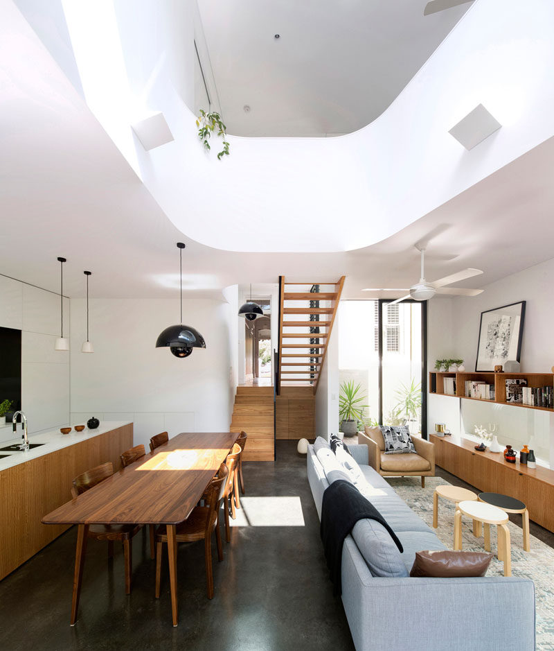
Inside, there’s a new kitchen, dining, and living area.
Photography by Brett Boardman Photography
The living room has a large window with built-in cabinetry and window seat, perfect for reading a book in the sun. The large sliding door opens the space up even further by allowing easy access to the backyard.
Photography by Brett Boardman Photography
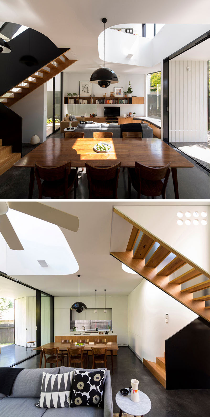
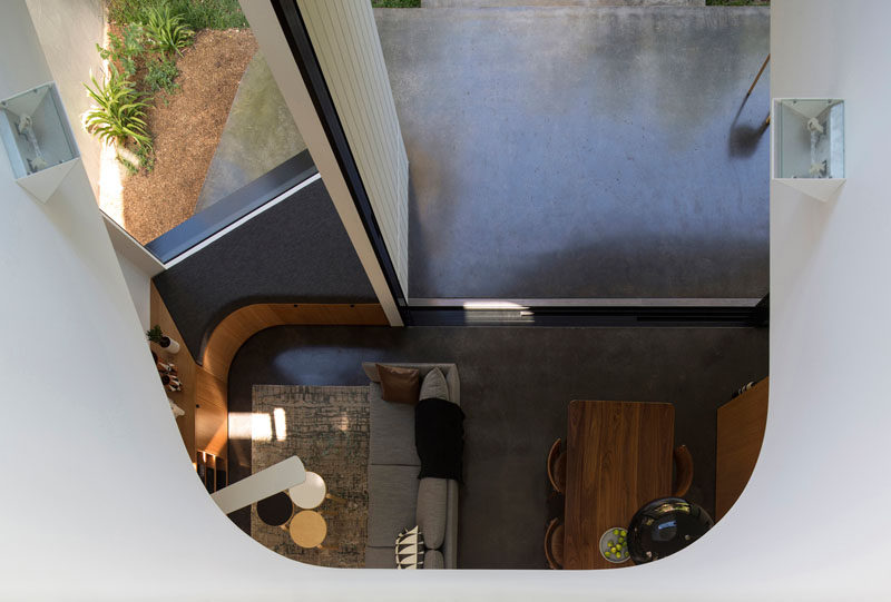
Above the living area there’s a void in the ceiling that reveals the second floor, and also aids in the air ventilation throughout the home.
Photography by Brett Boardman Photography
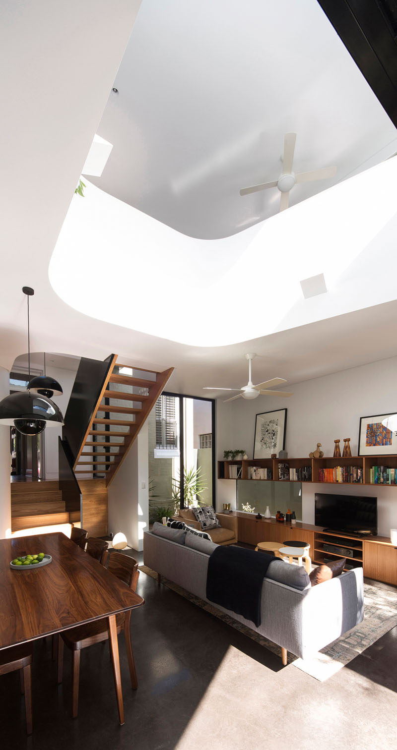
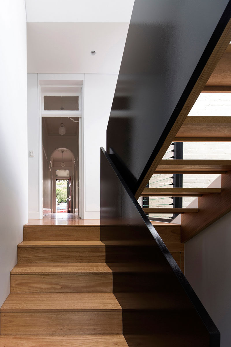
Heading upstairs to the upper floor of the new extension, you can see glimpses of the original house.
Photography by Brett Boardman Photography
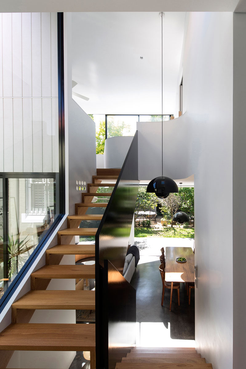
Black and wood see through stairs allow you to view the backyard as you walk up them.
Photography by Brett Boardman Photography
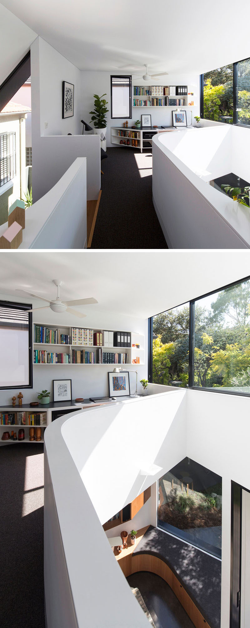
Upstairs, there’s a small reading area with lots of natural light.
Photography by Brett Boardman Photography
From the reading area, you can also look down to the living area below.
Photography by Brett Boardman Photography
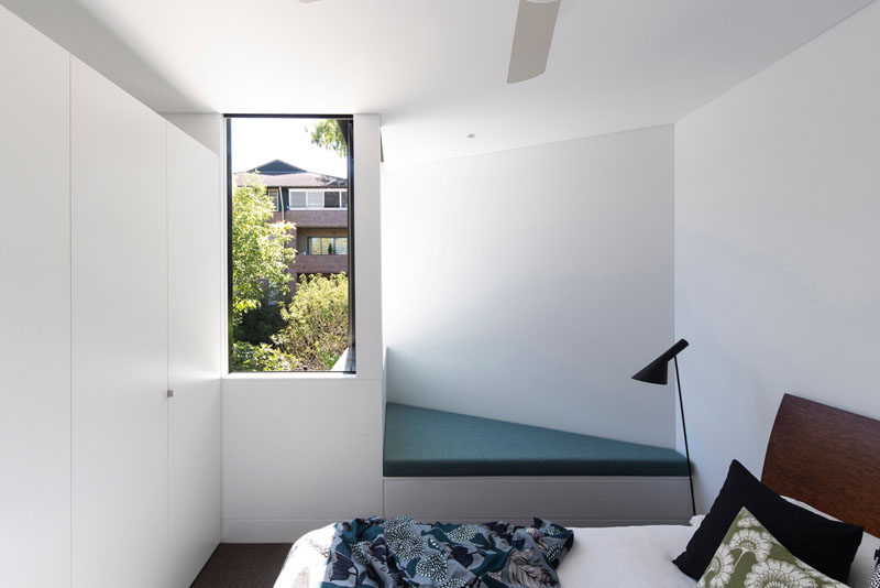
There’s also a bedroom and bathroom, with the bedroom having a small cushioned reading nook too.
Photography by Brett Boardman Photography
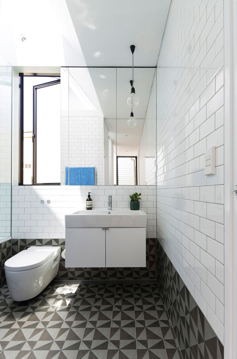
In the bathroom, white tiles match the white walls in the rest of the home, while the floor and lower portion of the walls are a bold graphic tile.
Photography by Brett Boardman Photography
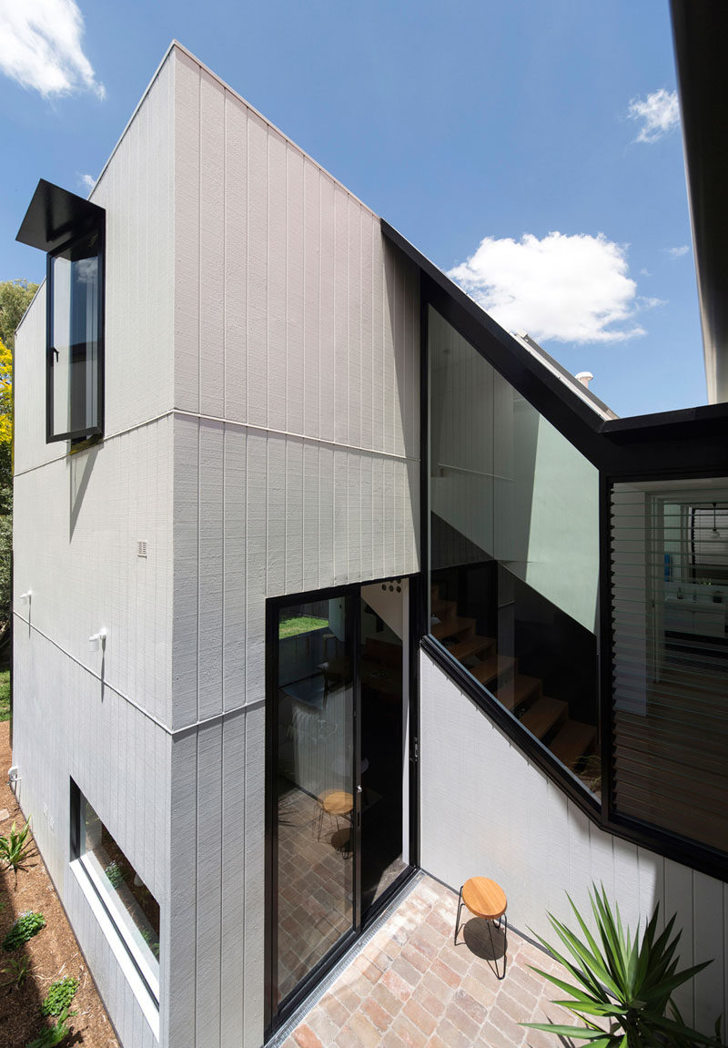
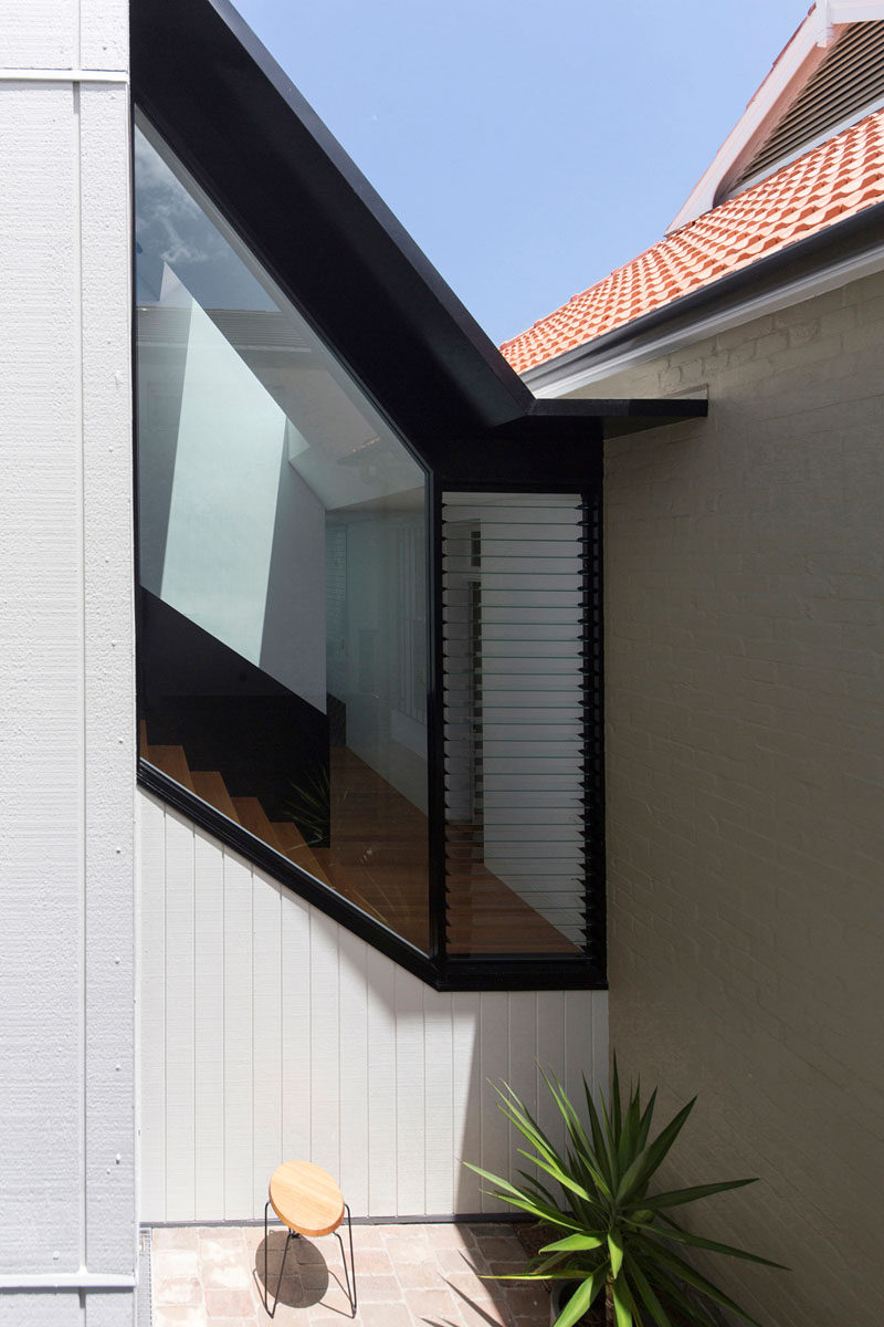
Back outside, here’s a look at where the new addition meets the original house. The angle of the windows perfectly match the angle of the stairs on the inside.
Photography by Brett Boardman Photography
There’s also a second small patio area tucked between the old house and the new addition.
