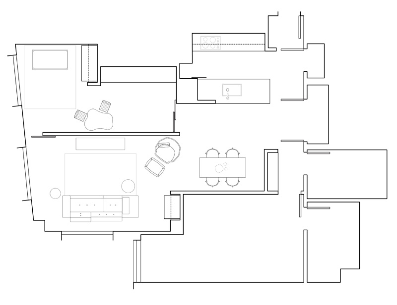
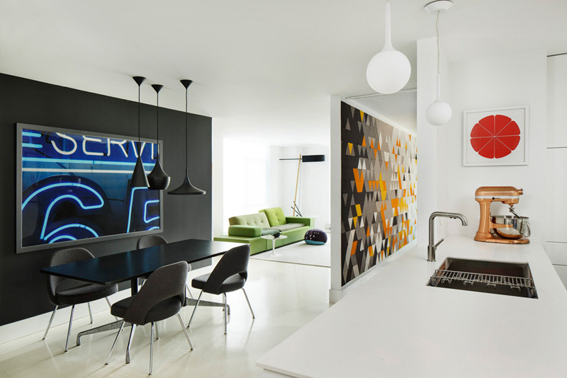
The designers at over,under, have transformed a two-bedroom 1,250 square foot apartment in Boston, Massachusetts, into a light filled space with custom cabinetry and a colorful felt wall.
About the project
Faced with a two bedroom apartment and a growing family, Chris Grimley of the Boston-based architecture firm over,under put his design chops to the test and remodeled his own home. The result is an open, light-filled space that showcases the talents of both the designer and his wife Kelly Smith.
The couple purchased their South End apartment under Boston’s first time affordable homebuyer’s program at a time when both were starting design businesses—an architecture and design studio (over,under), and a felt design and distribution company (filzfelt). Initially planned as a many-phased, multi-year renovation, they cut openings in walls, removed all of the carpet, and painted the floor with garage paint.
The imminent birth of the couple’s first child in 2012 sped things up drastically. Around this time, the felt company was acquired by Knoll, which allowed the couple to fast-track the design and implementation. The existing plan had many awkward corners and sequences that weren’t amenable to additional storage for the family.
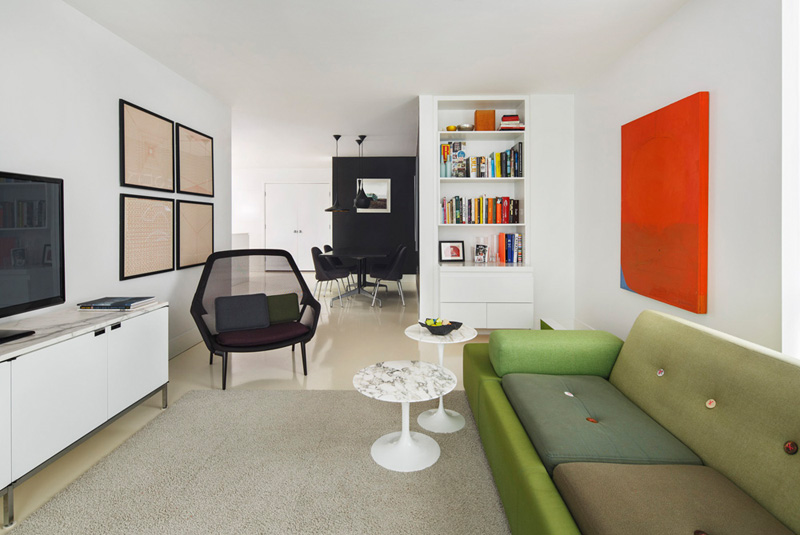
The design implements a series of perpendicular walls that act as framework to hold various items: cabinets in the bedroom and living room, linen drawers adjacent to the bathroom and an entry nook—which also serves to prevent initial views to the kitchen from the front door (a common, and disappointing plan strategy that many condominium designs use).
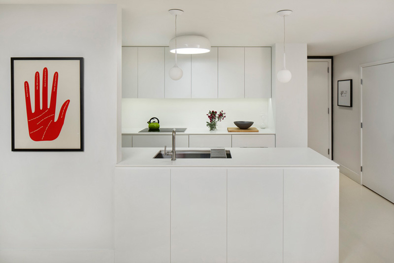
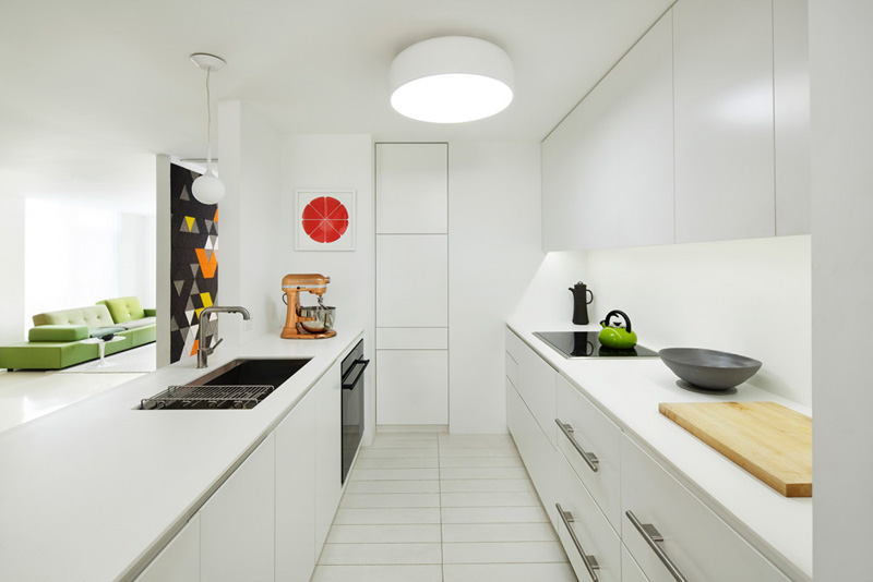
The kitchen was completely overhauled to take advantage of underutilized space and gain more counter surface. A built-in pantry was removed and a new pantry, reclaimed from the closets in the second bedroom, opened the kitchen up to the dining room. In addition, the existing full refrigerator was replaced by under counter appliances, which allowed the upper cabinets to span the full length of the kitchen, and gain more space for food preparation.
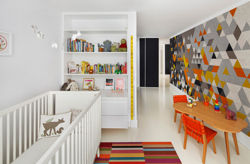
All of the millwork is push-latched. While initially for aesthetic reasons, the owners soon discovered that they had inadvertently provided built-in childproofing—no handles to grab. Later, as their daughter became a toddler, the family was able to stash most of her toys and crafts in her bedroom storage unit, which she could easily open and close by herself.

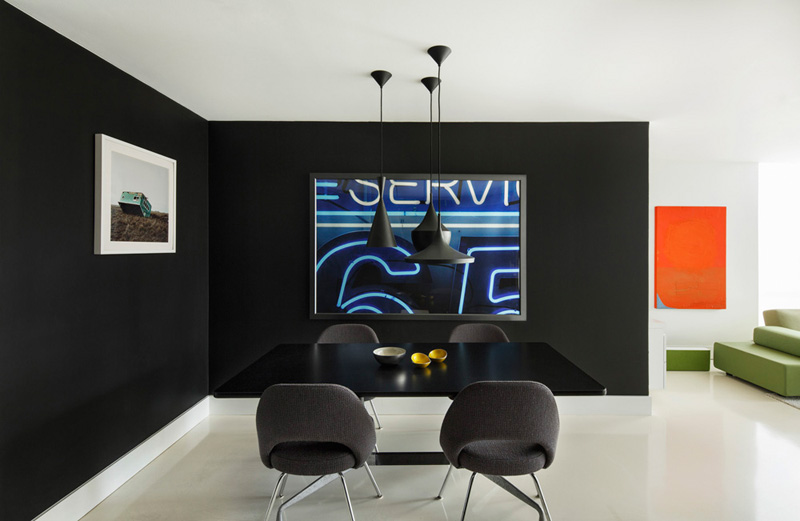
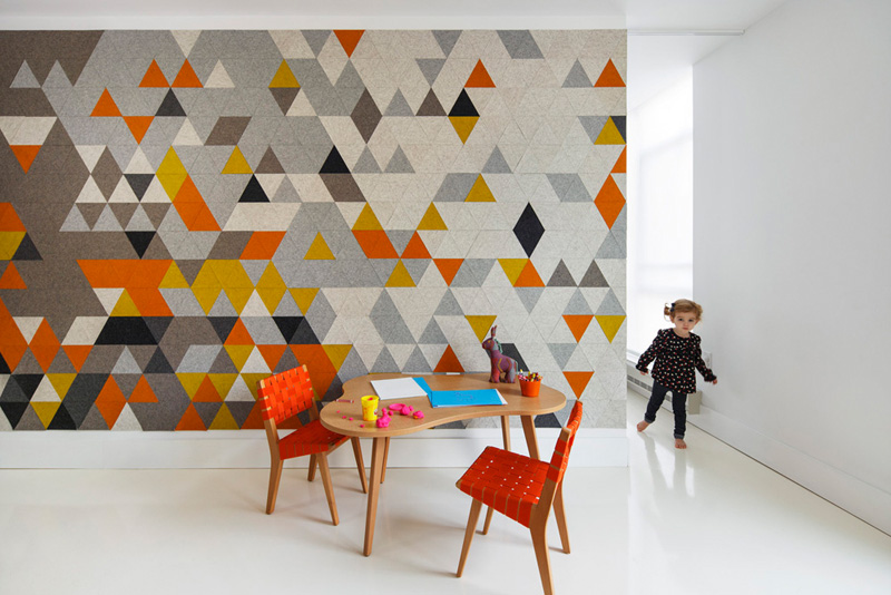
The couple kept most finish materials neutral—all surface treatments are white, with occasional black walls that frame programmatic elements—a dining area, children’s storage. These surfaces serve as a neutral backdrop to the color provided by the family’s burgeoning furniture collection and the occupants themselves. An experimental felt installation, made of multi-colored triangular pieces adds a burst of color to the Mies-ian wall separating the children’s bedroom and the living room.
