Masquespacio have designed the interiors and branding for the Nozomi Sushi Bar in Valencia, Spain.
From the designers
Briefing: Design the brand and interior for Nozomi Sushi Bar, a restaurant specialized in traditional sushi.
Solution: The project in which Masquespacio began to work in January 2014 starts with a previous study of Japanese culture and the origin of sushi. A study in which was involved the whole team of the Spanish creative consultancy to understand and represent the Japanese culture through the brand image and specially through the interior of the new restaurant from José Miguel Herrera and Nuria Morell.
The brand name Nozomi was chosen by the founders of this project being a ‘Japanese high speed bullet train’ and at the same time meaning ‘fulfilled dream’; two significances with which with José Miguel and Nuria felt identified and that create a duality present continuously through the whole project: “Emotional classic’ and ‘Rational contemporary’.
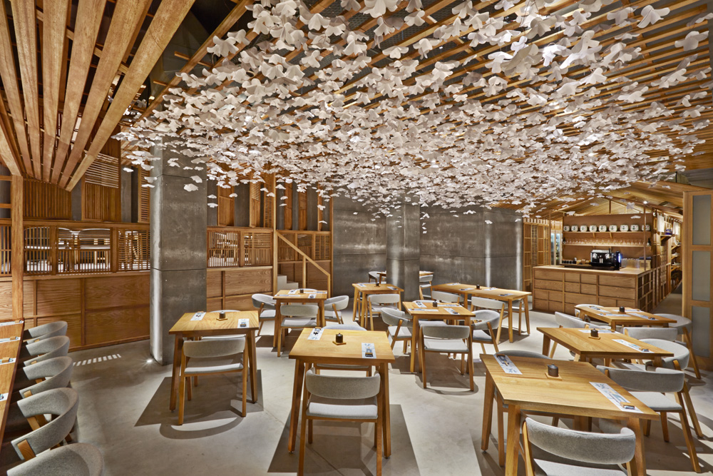
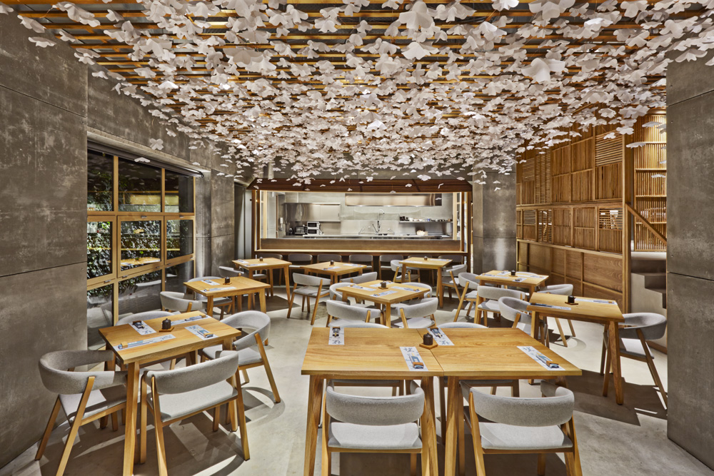
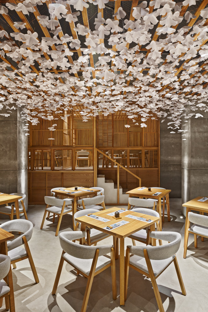
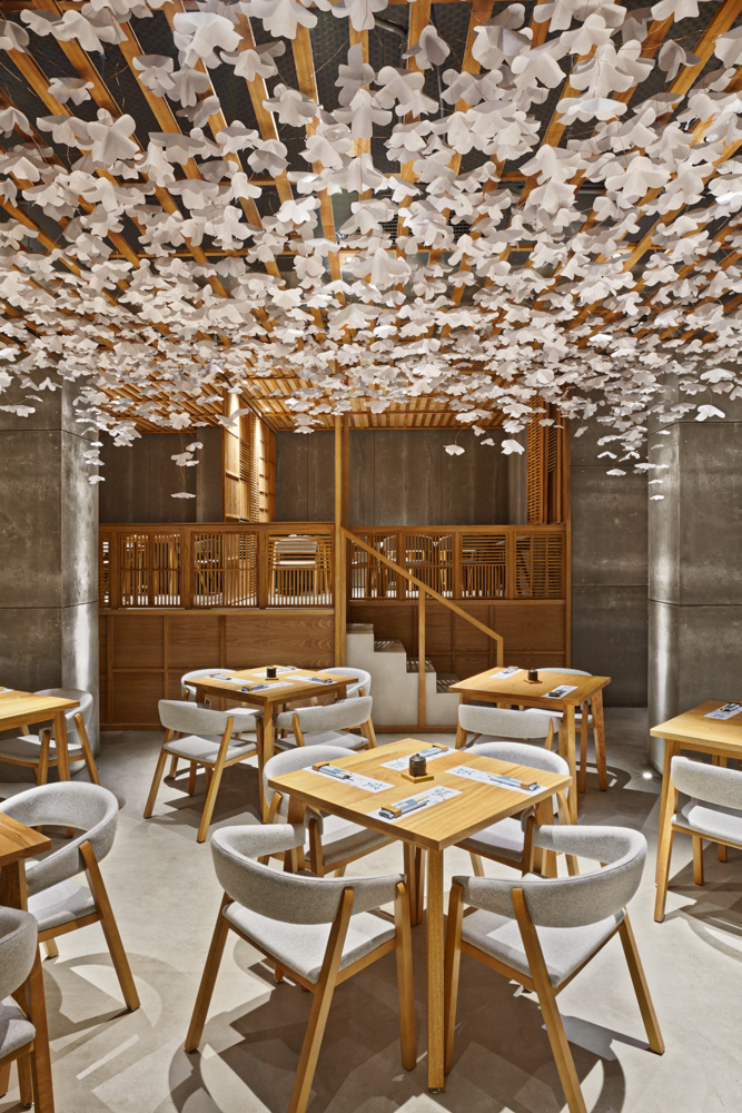
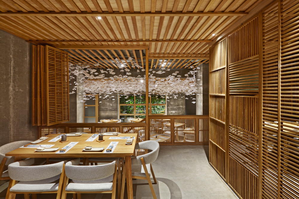
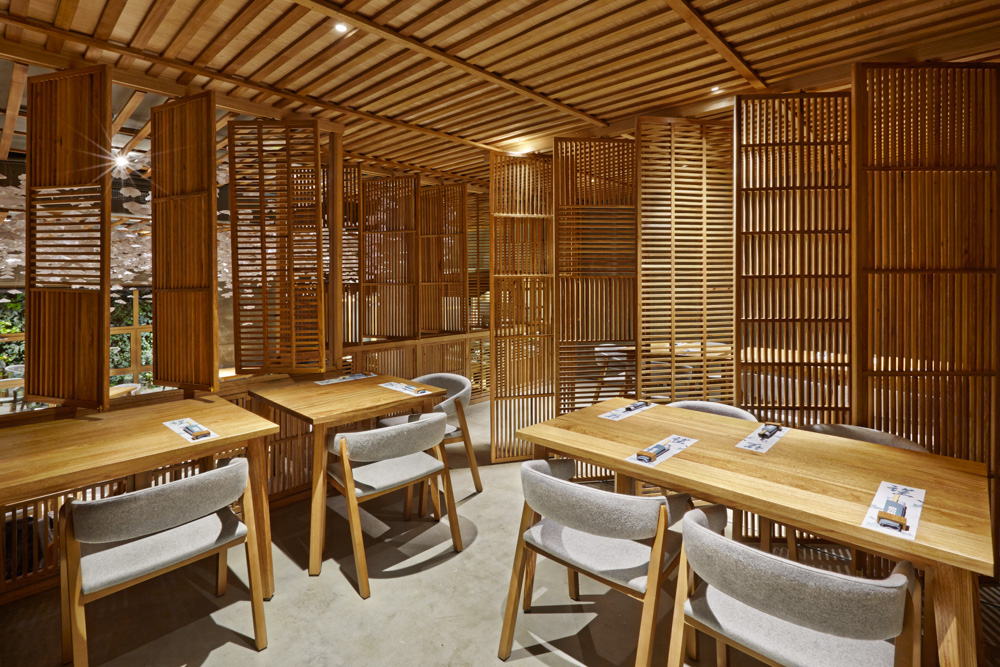
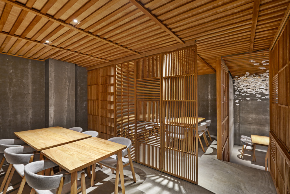
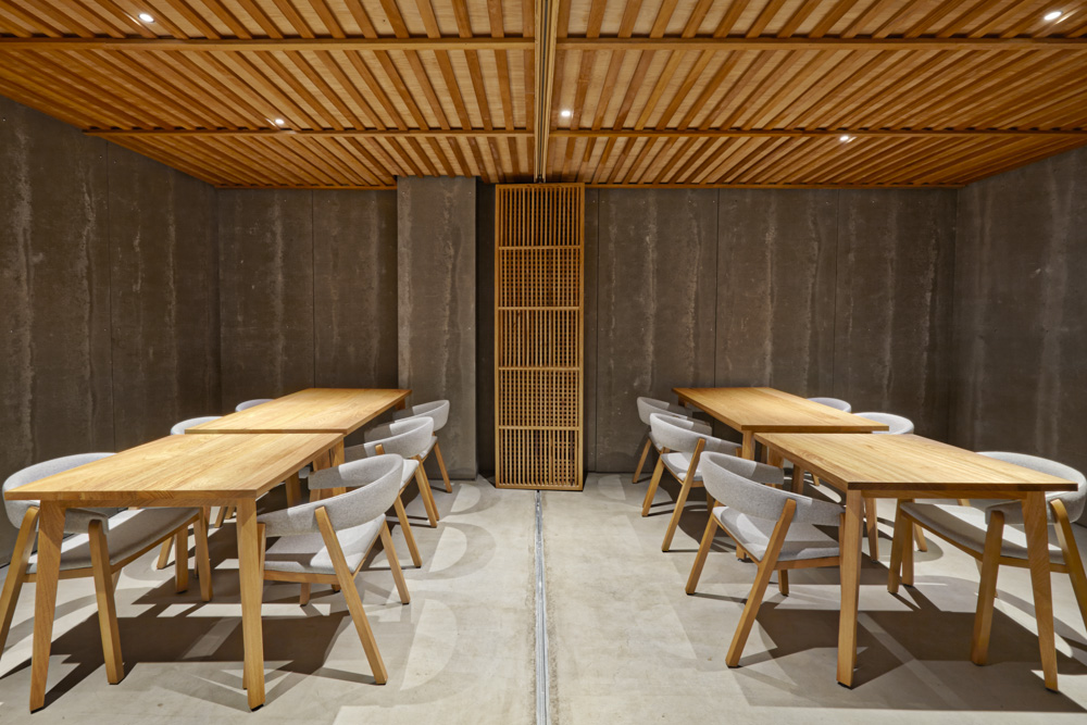
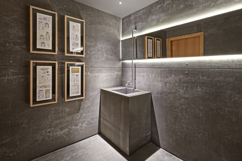
Interior Design: The interior design of this local of 233 m2 in Valencia plays more intensely with the expressed duality. On one hand being ‘Rational contemporary’ through the pure state of concrete and grays, mainly present in the most structural parts such as walls, ceilings and floors. On the other hand the ‘Emotional classic’ aspect makes its introduction thanks to the carpentry, its hand finishes and the warmth of natural wood.
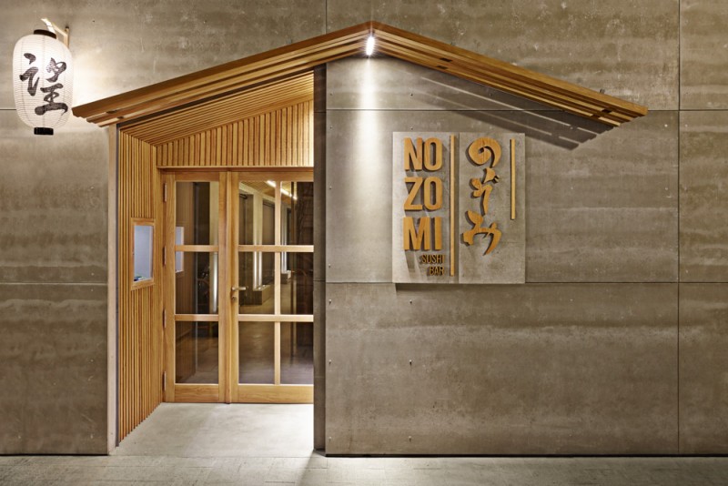
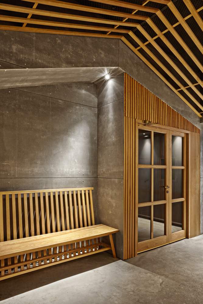
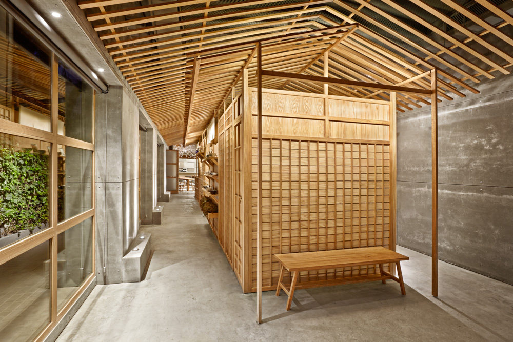
Arriving to the restaurant you can see how these two aspects are attracting the attention. The concrete from the facade and the entry that clearly represents the classic Japanese carpentry.
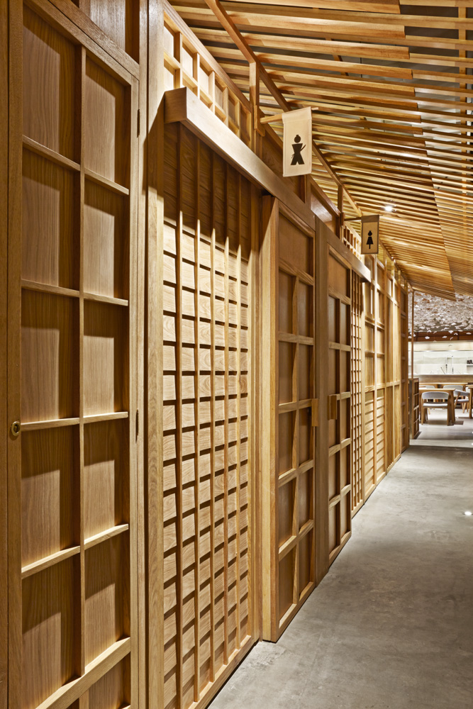
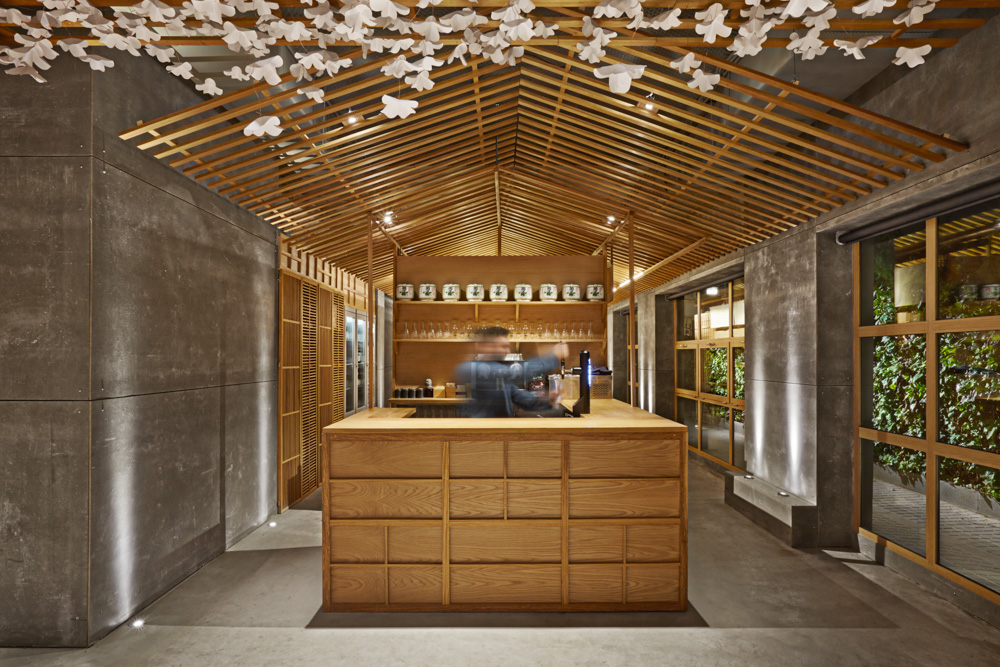
Walking through the door of the restaurant it can be appreciated how a central cube creates two corridors toward the central lounge that incorporates both decorative elements as well as the bathrooms and the warehouse, creating a continuous and open flow very typical for the architecture of the Eastern country.
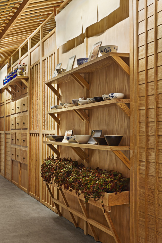
On the aesthetic level we can see how a Japanese village street has been reinterpreted through different modules, traduced here into a market, pharmacy, doors and windows. The rooftops in turn interpret the most contemporary and rational part with a clearly Japanese inclination.
The idea behind the first part of the restaurant is to make the customer live the experience of walking through a Japanese street, while he is being stunned by its beauty and getting excited about the construction details of Japanese carpentry, before reaching the principal lounge where he could enjoy not only an authentic sushi, but at the same time a unique experience below a cherry-tree as if he sits in a Japanese courtyard.
From his seat each diner looks up at the show created in the sushi bar that reinterprets a traditional sushi peddler, known as the first mobile fast food stall. In the meantime the cherry-tree’s flowers, inspired by the origami, bloom naturally.
Last but not least the private zone allows separate environments for major intimacy, without isolating the diner from the show projected more below and maintaining the shadows generated by the lightings, also inspired by the more minimal Japan, highlighting the irregular and unique carpentry.
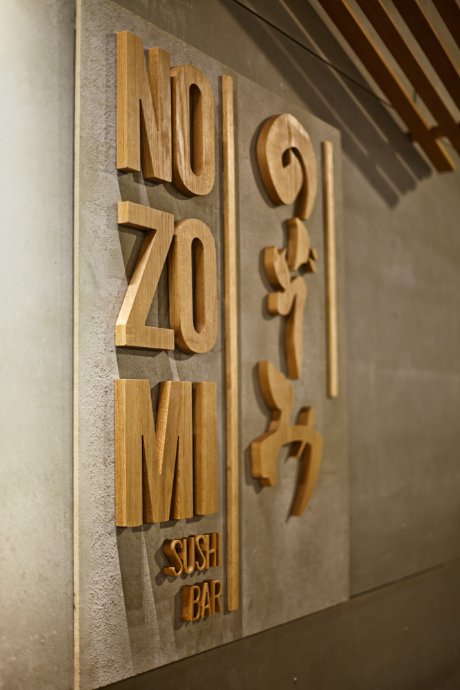
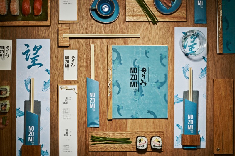
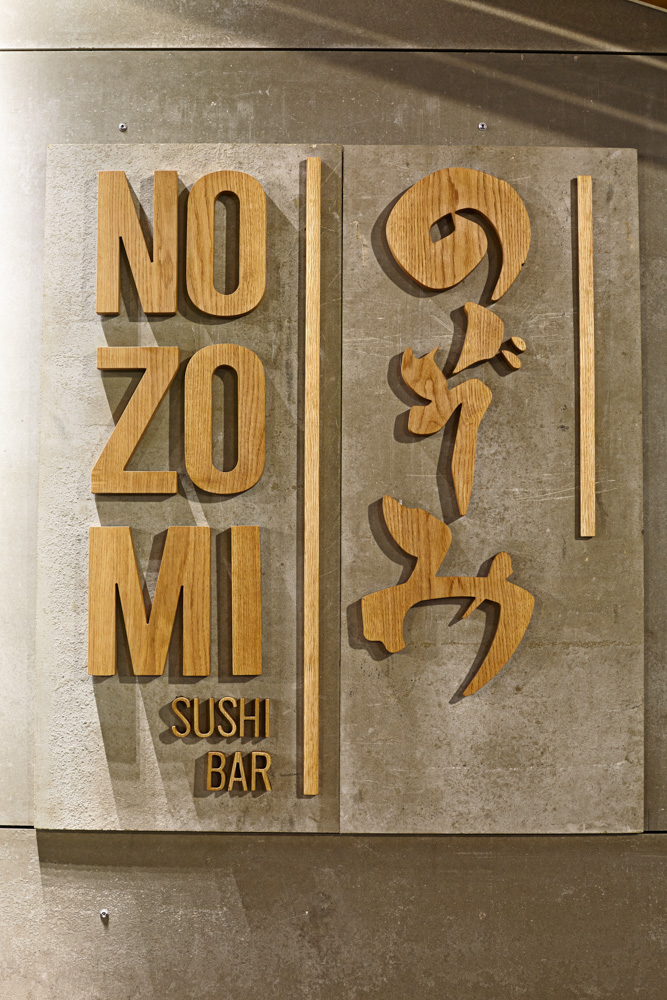
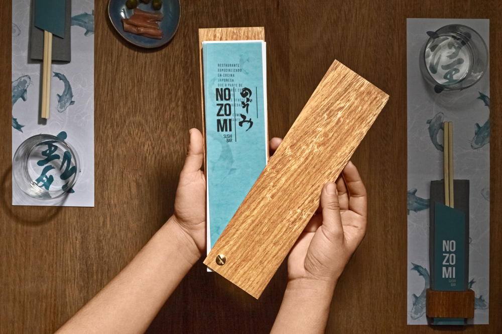
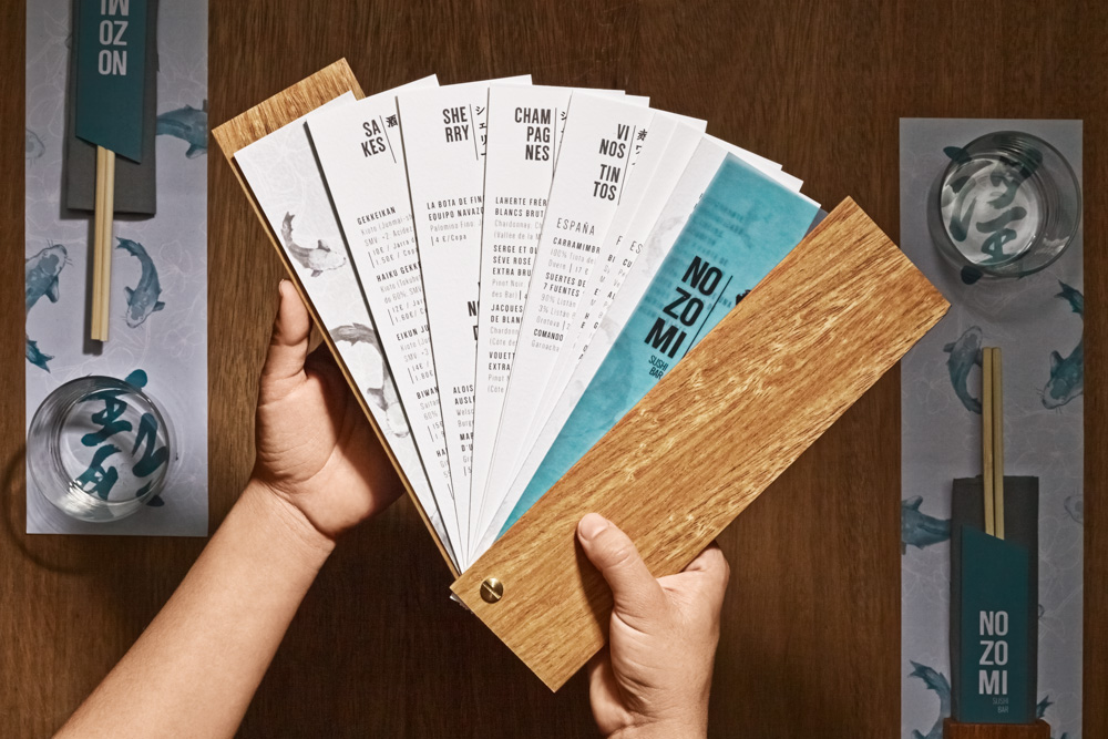
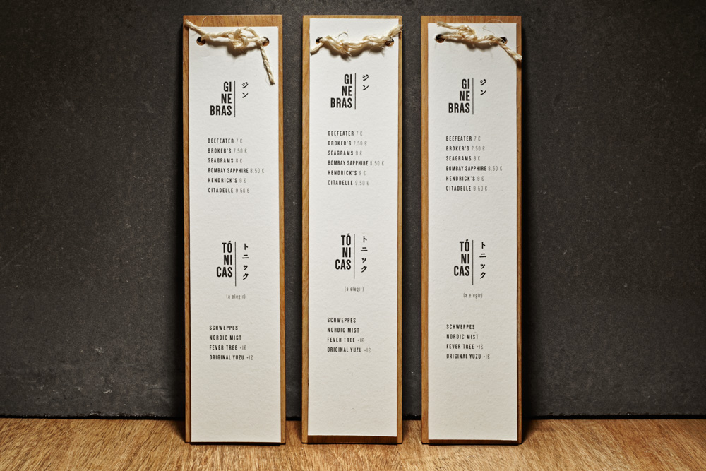
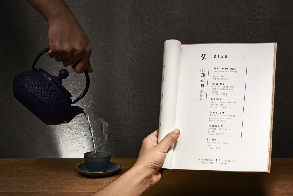
Branding: Starting with the brand image we can see how this duality is represented on one way as ‘Rational contemporary’ through the Western typography, while on the other the hiragana (Japanese writing) shows the “Emotional classic’ touch through its logo.
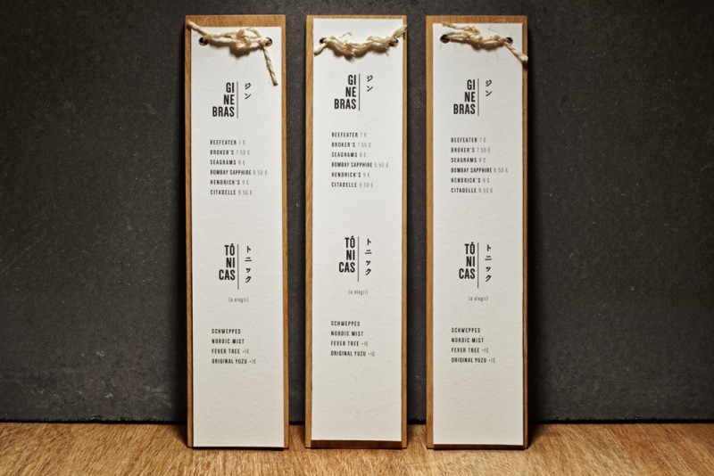
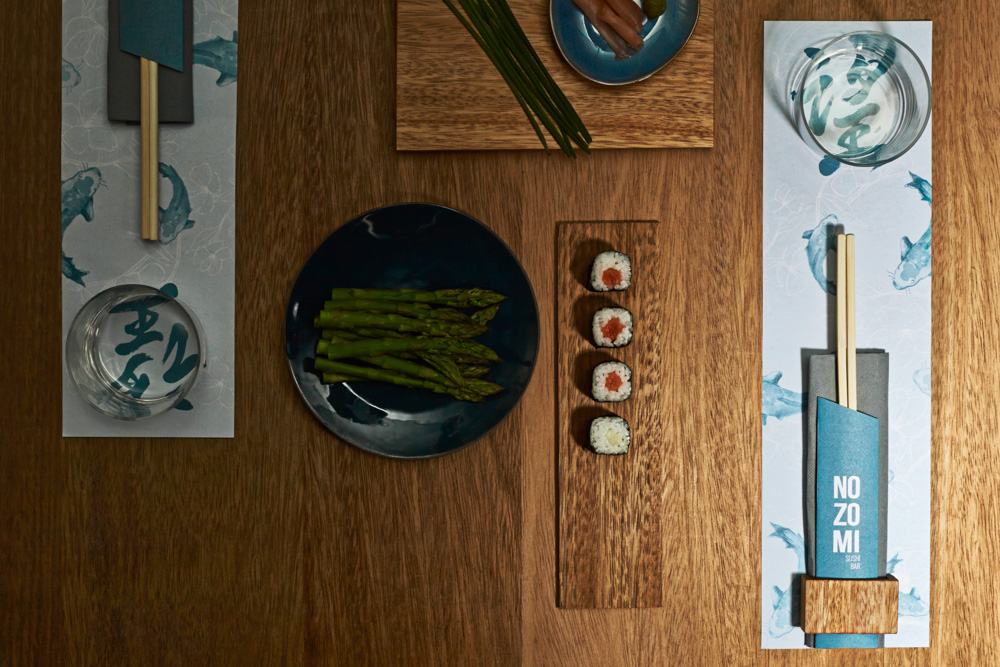
On the other hand Masquespacio for the branding uses the verticality typical for Japanese writing in this case both for the Western and Eastern writing form. A fact repeated for the tablecloth that contains an illustration of Koi fishes, a symbol of good luck and perseverance in Japanese culture.
A last fact to stand out about the logo is the election of hiragana: “We commissioned calligraphy in different Japanese writing styles: hiragana, kanji and katakana. The hiragana was the best choice for being best fitting graphically, although kanji can be recognized by some typical Japanese decorative elements in the restaurant like the entry lantern.”
Interior Design and Branding: Masquespacio
Photography by Carlos Huecas / Cualiti
