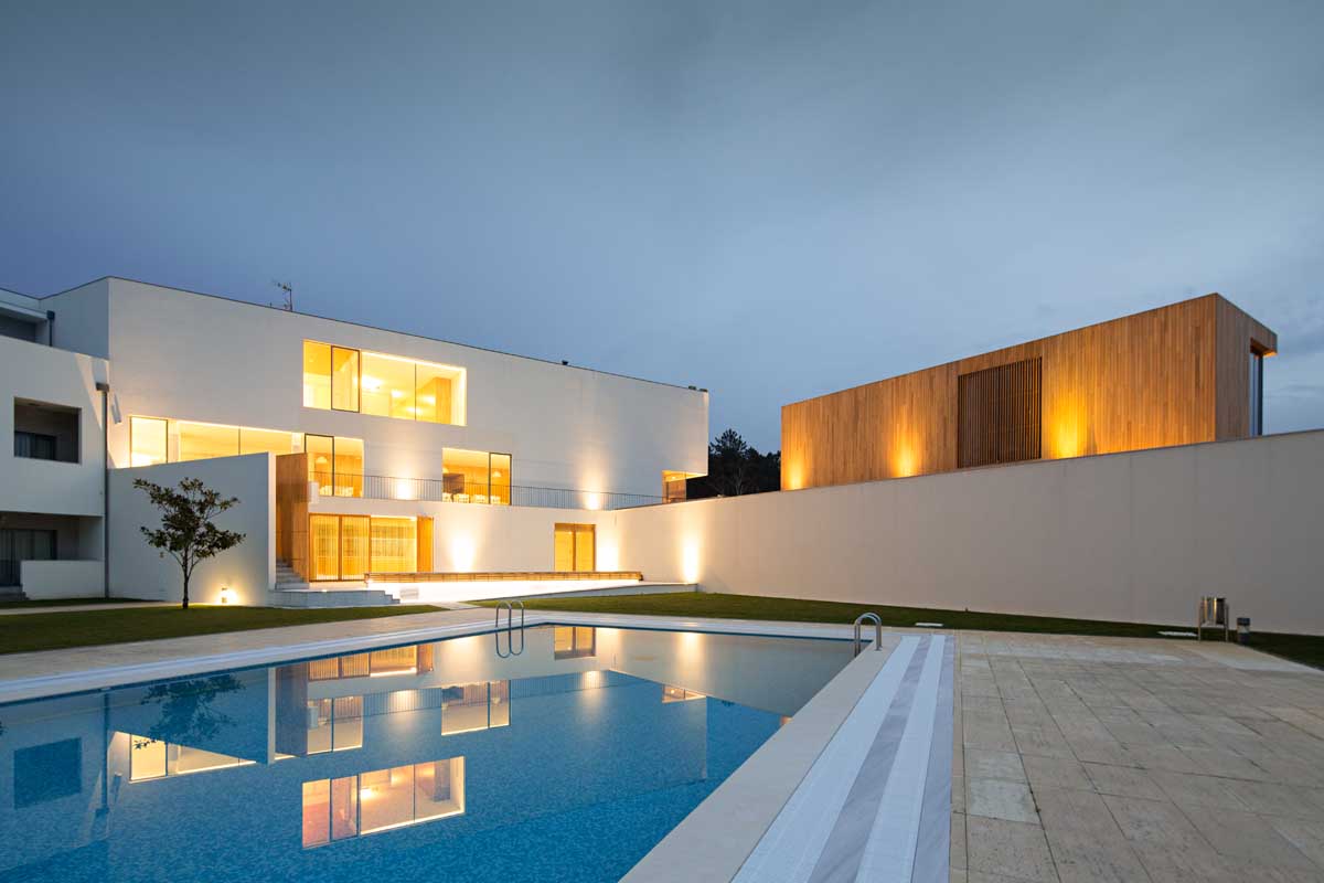
Architecture firm Vírgula i completed the renovation and expansion of Hotel Minho, located in
Vila Nova de Cerveira, Portugal.
From the architect
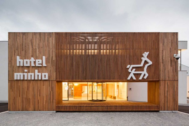
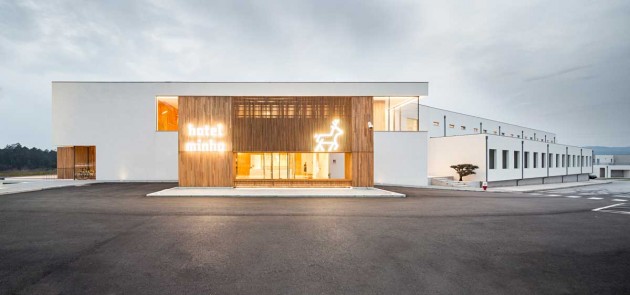
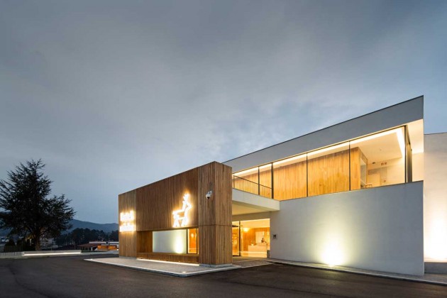
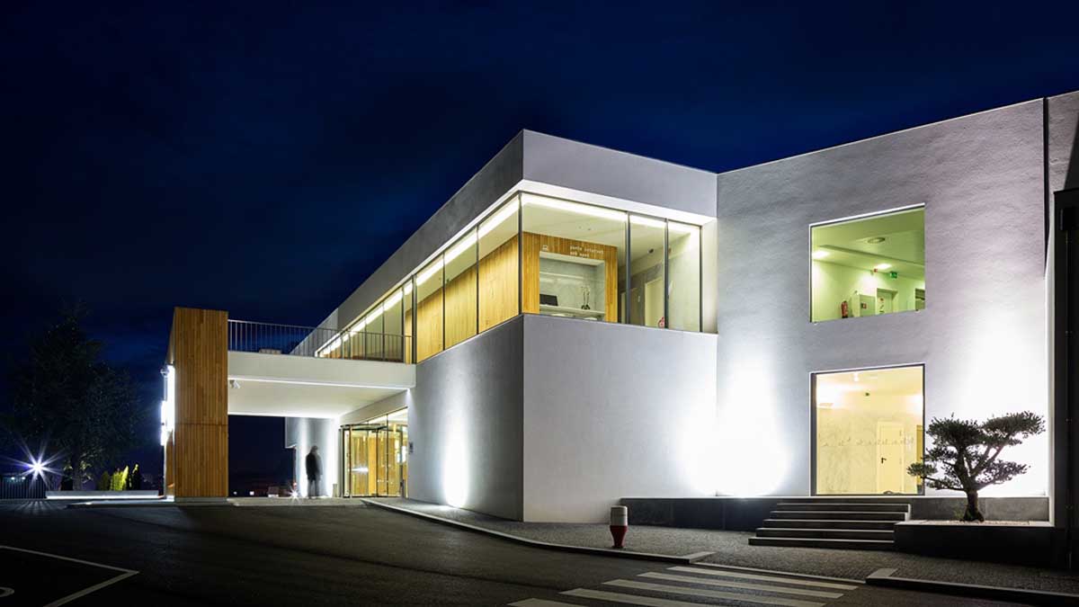
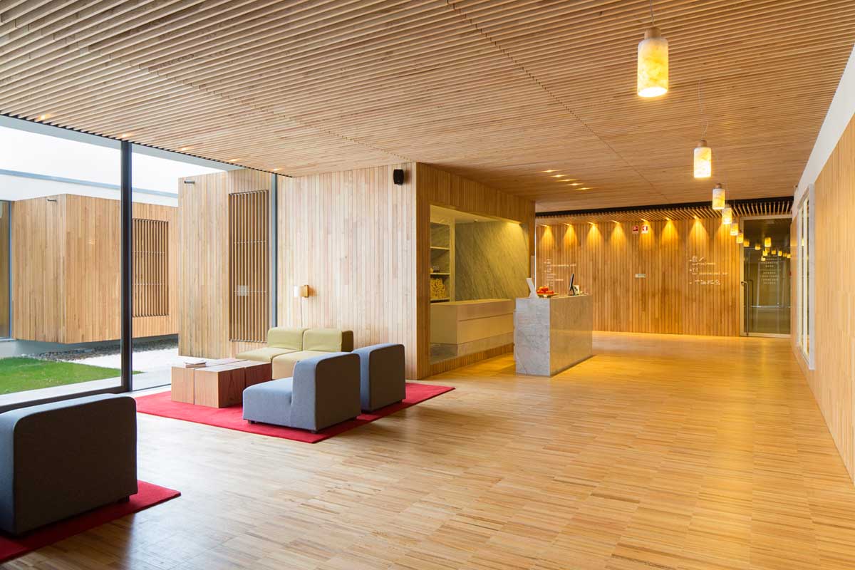
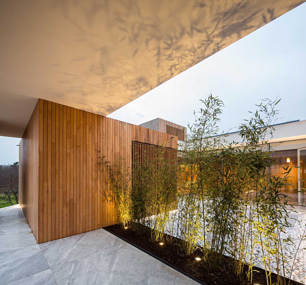
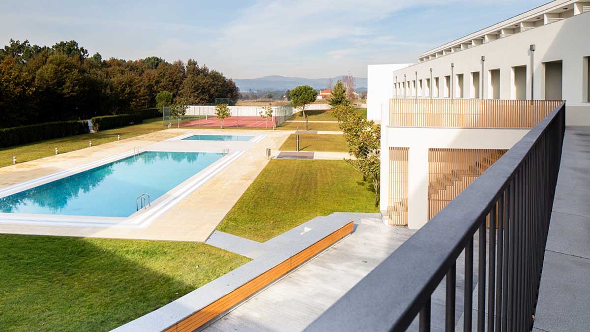
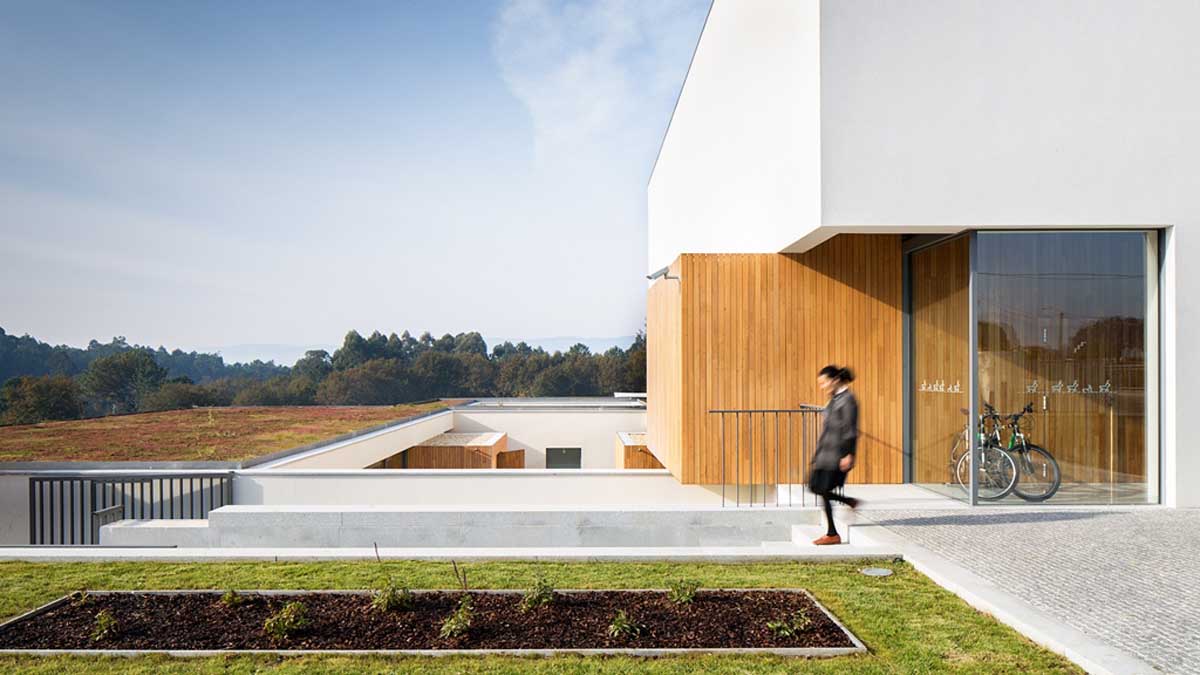
Hotel Minho renewal and extension project starts from a building constructed in 2006, renovated in 2014 with new public areas and spa. The extension was designed to maintain the existing building’s architecture, despite its plain and common design, introducing a more effective image to the hotel. The solution intended to be very simple and in some spaces, highly introverted, retaining the existing structures and introducing the new areas in the floors below the main entrance. The green roof and the continuity of the existing exterior white walls are intended to decrease to the highest level the visual impact of the new constructions.
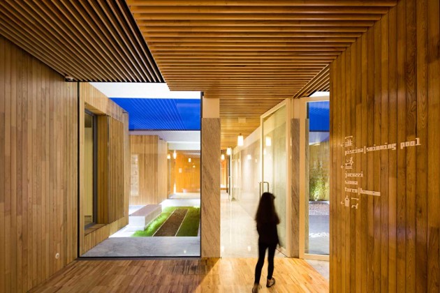
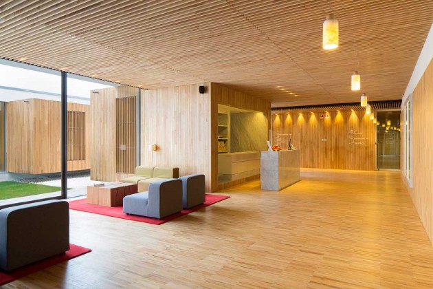
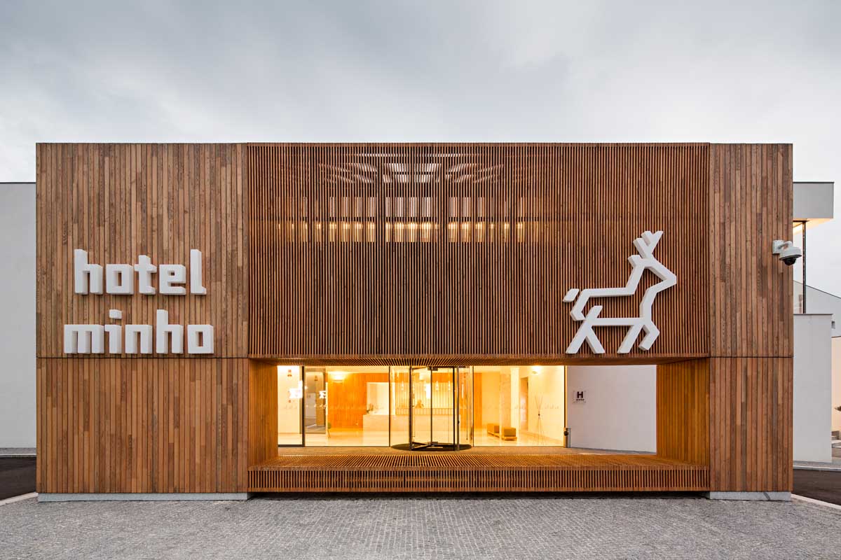
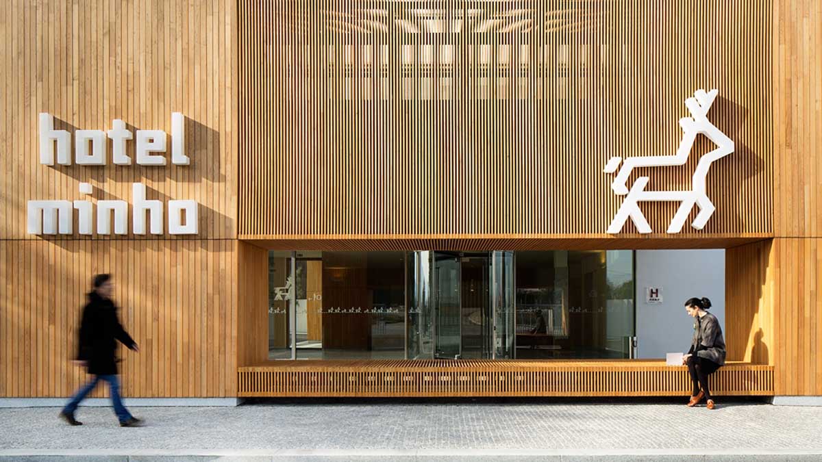
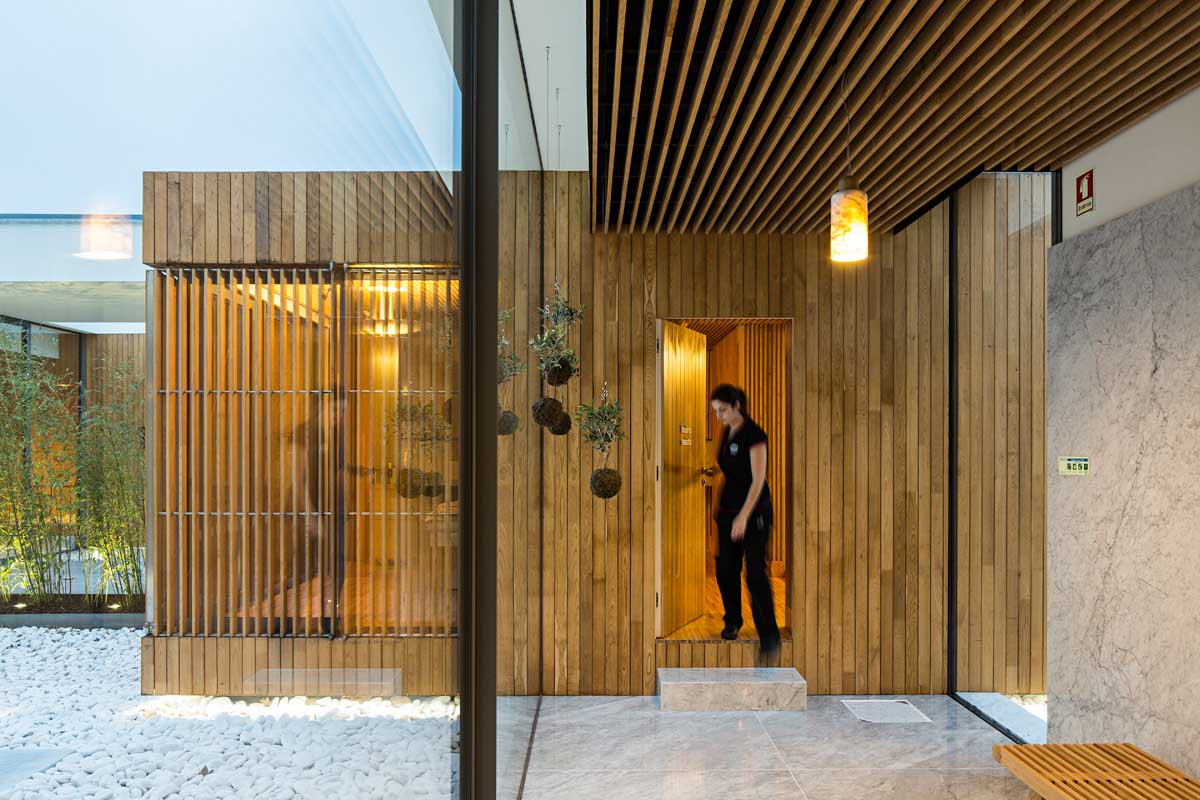
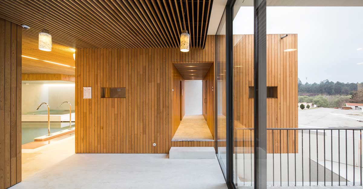
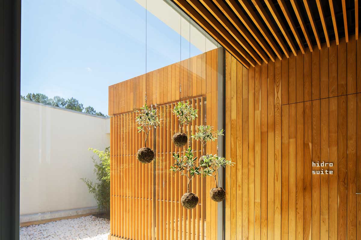
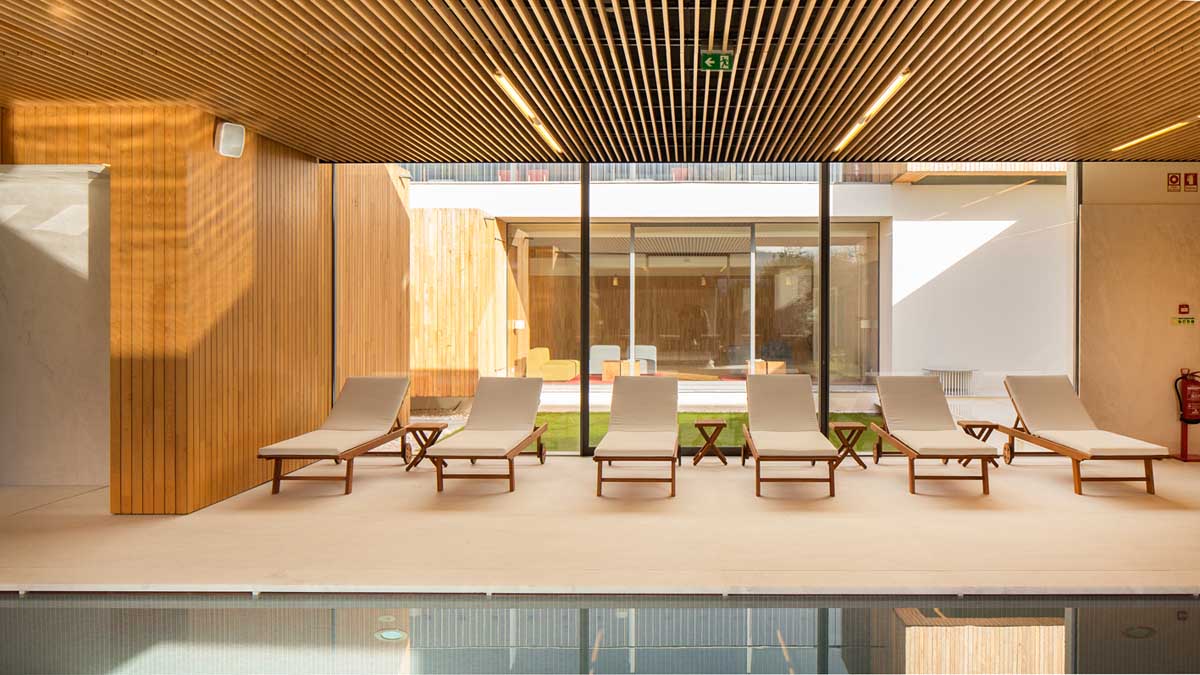
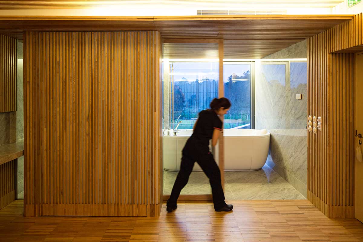
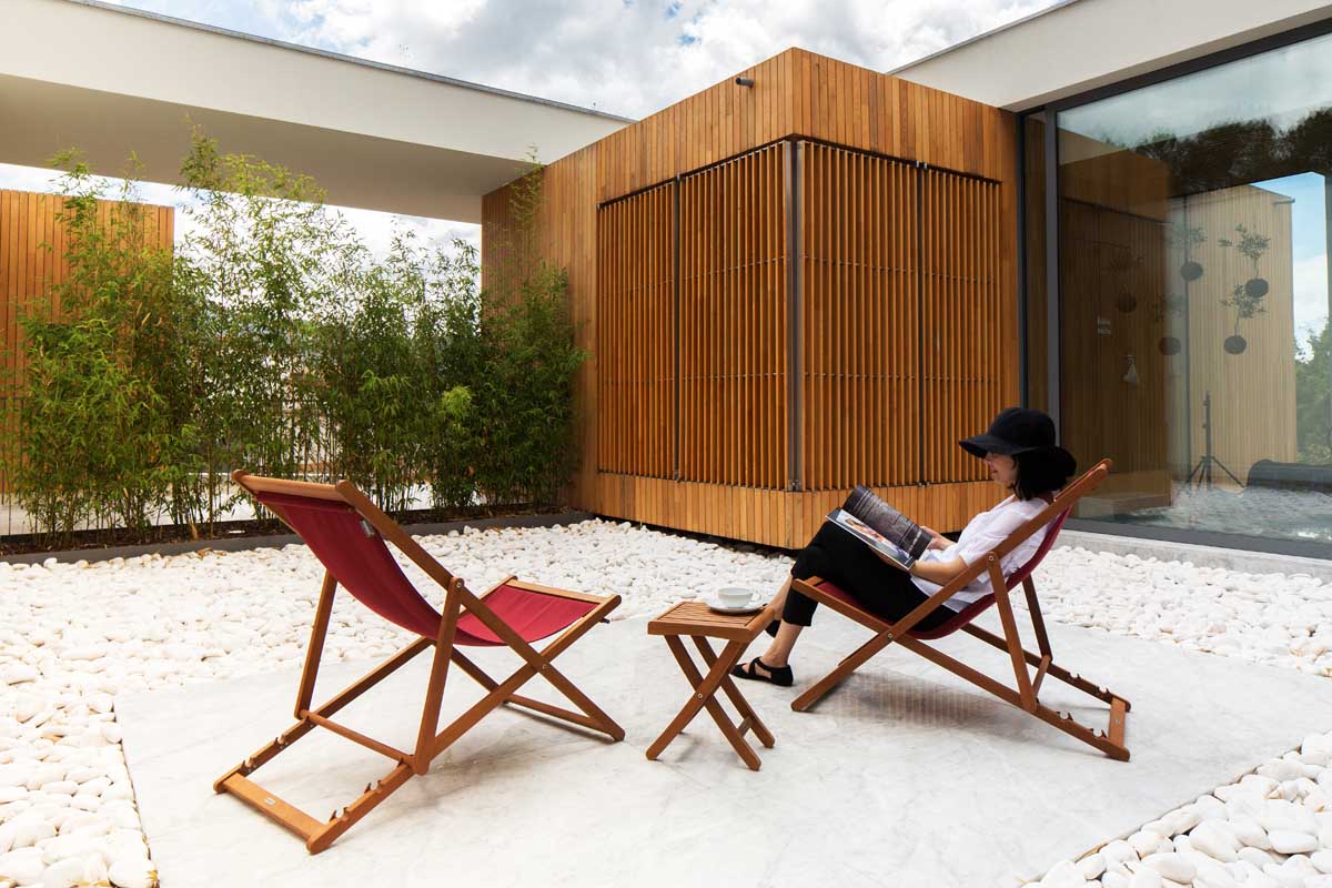
Pursuing a stronger relation with the site, local materials, constructive traditions and vernacular architectonic icons, the new extension used chestnut wood as one of the main features. This material, abundant in the surroundings, is used as the retainer of the new programs, being responsible for creating the limits of the new spaces. The wood boxes are the new element of organization of the hotel, creating the mood and the tone for the interior and exterior design, stating a strong continuity between every single floor.
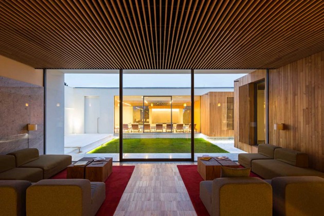
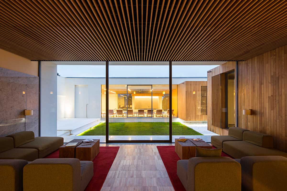
The project was developed to the smallest detail, integrating interior and exterior space, using efficiently the natural light, the visual philter of the inner patios and the design of several decoration items that might range from furniture, lighting or even the hotel sign system.
The interior design:
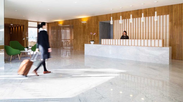
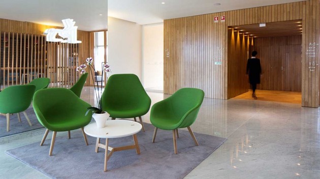
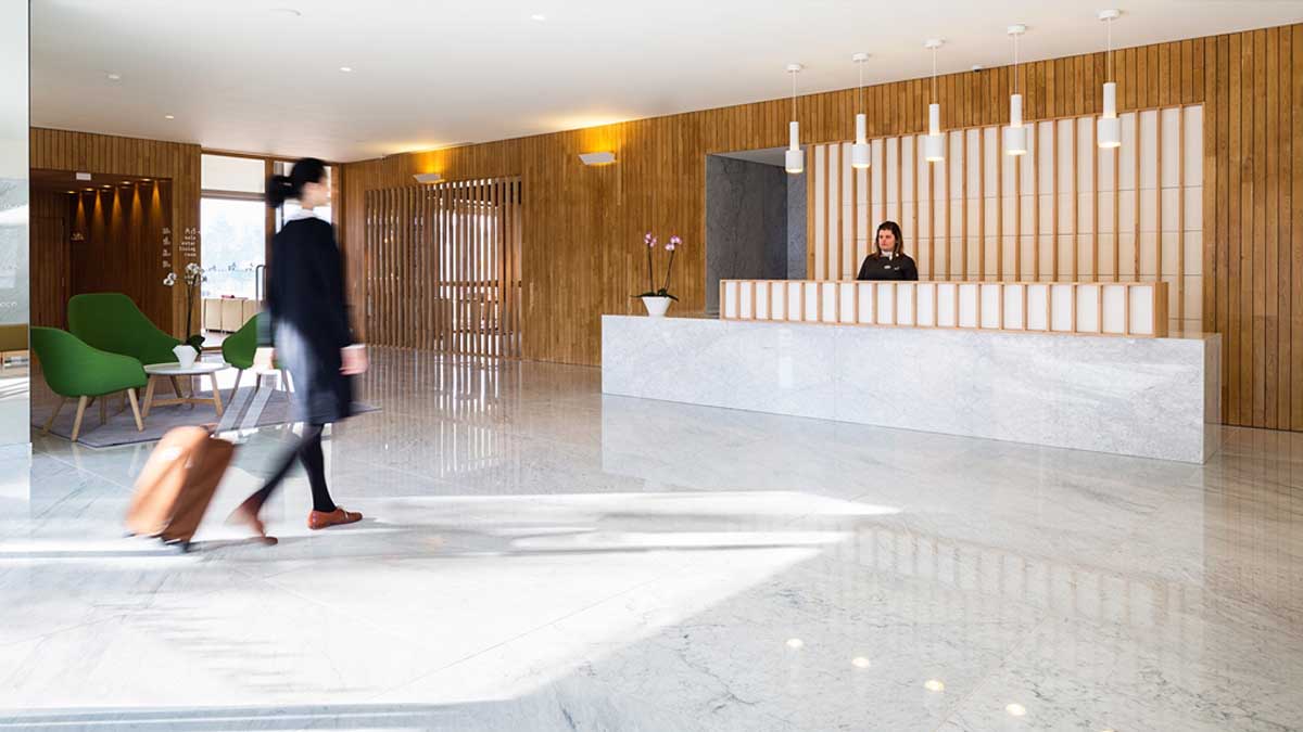
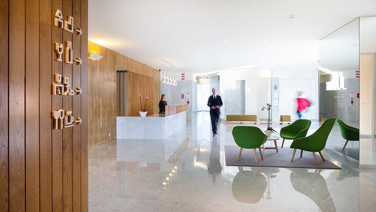
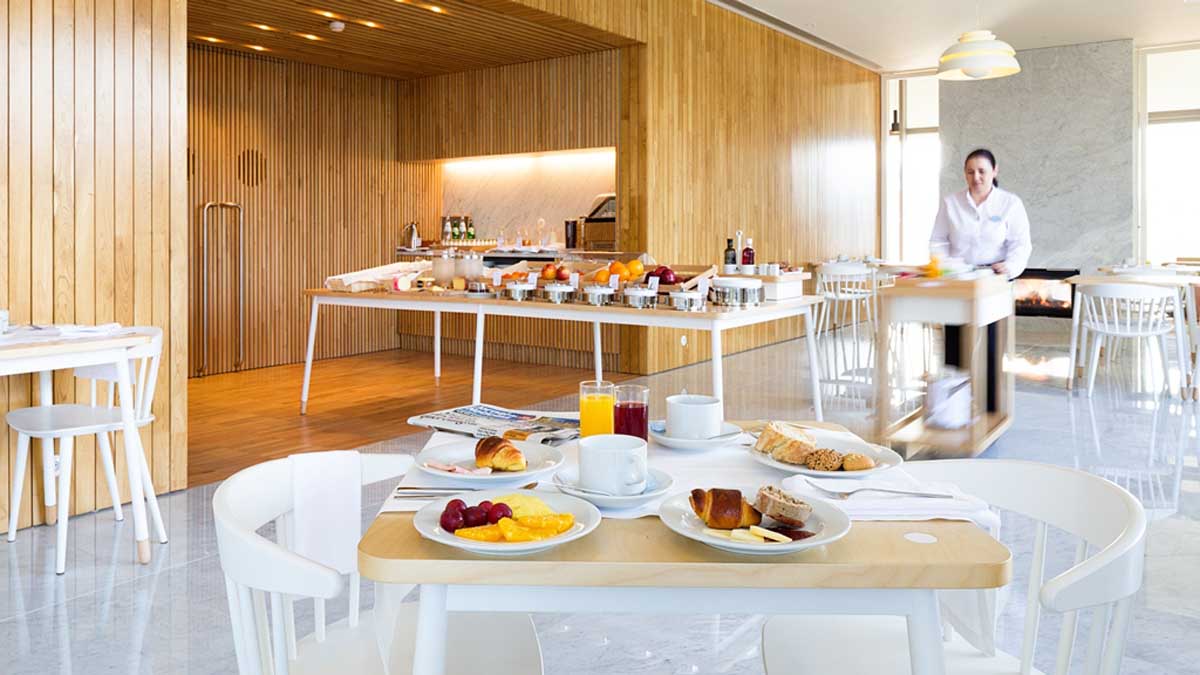
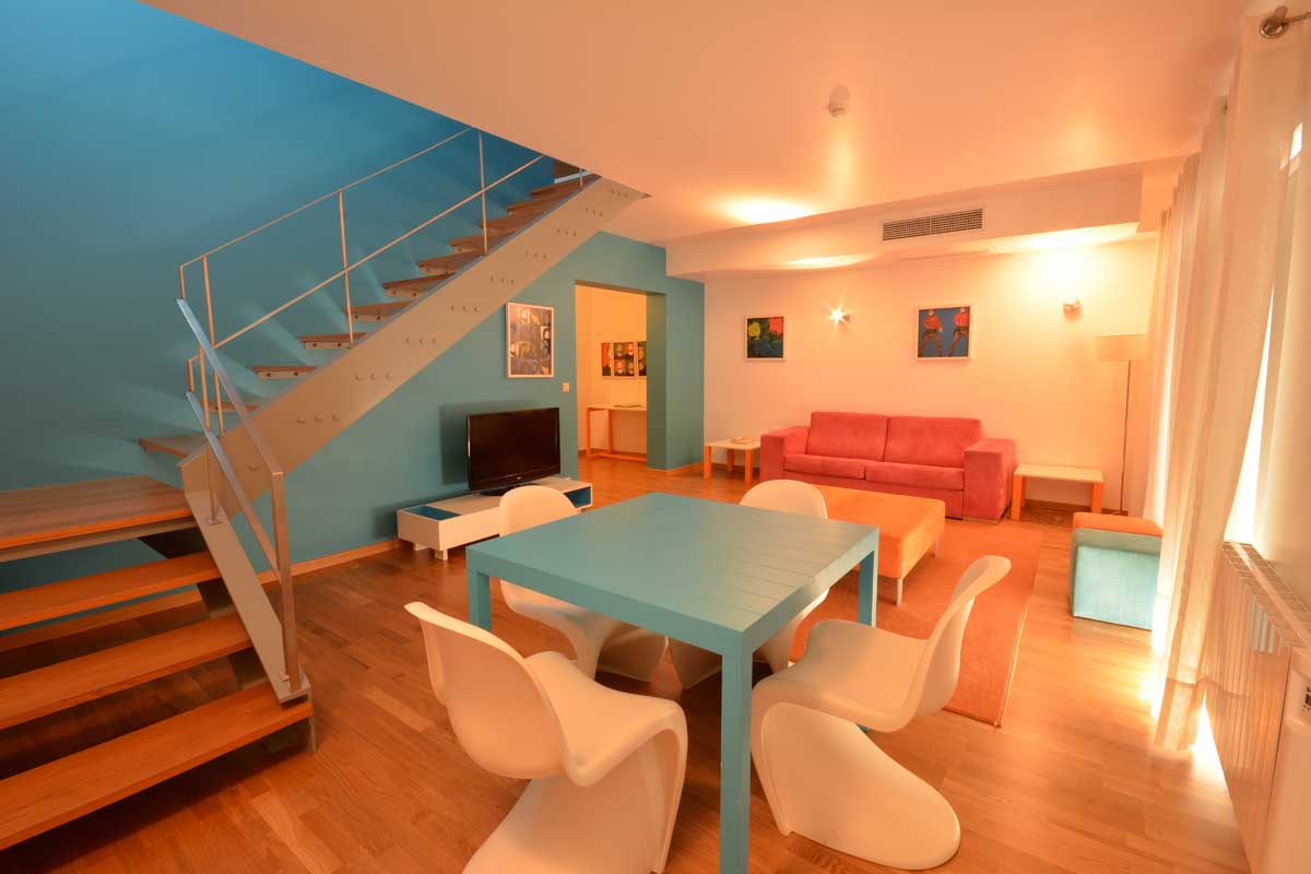
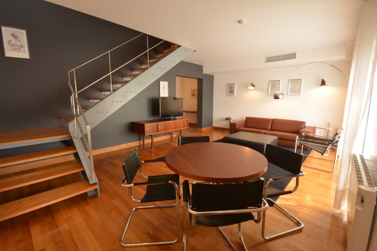
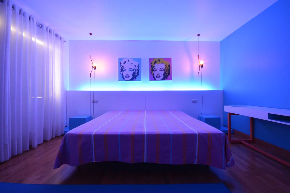
Hotel Minho architecture project determined the interior design as a strong part of the global architecture strategy. The difference between in and out, architecture as a shell and interior design as its core, was deliberately faded into one single solution.As mentioned above, because we were dealing with an existing building, the project intended to maintain the main features of the existing architecture on the outside, but working more freely on the inside. The materials, the furniture, the balance between finishes, the relation between the architectonic solutions and the mood tone of the interior design, were completely redefined by creating new ambiances for the hotel.
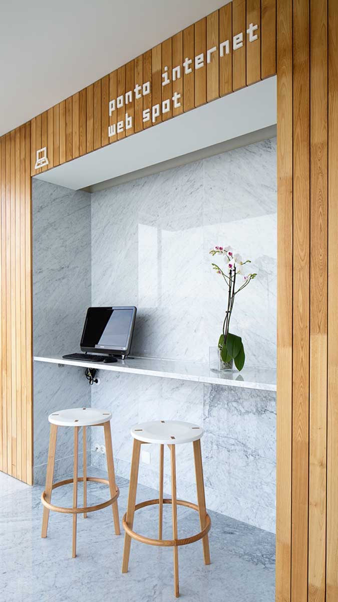
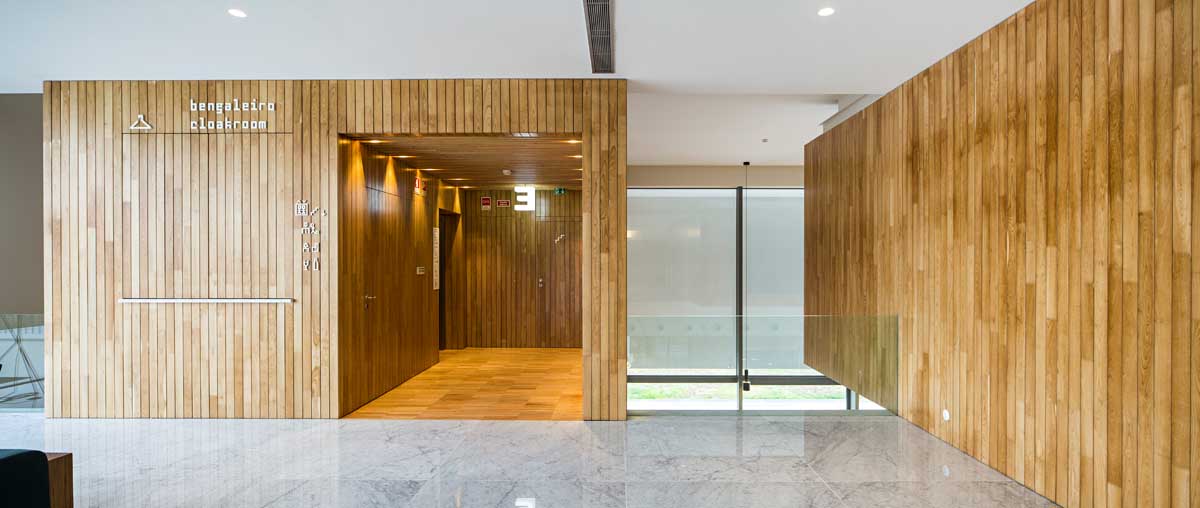
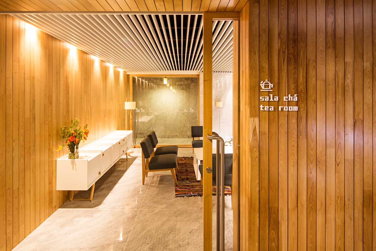
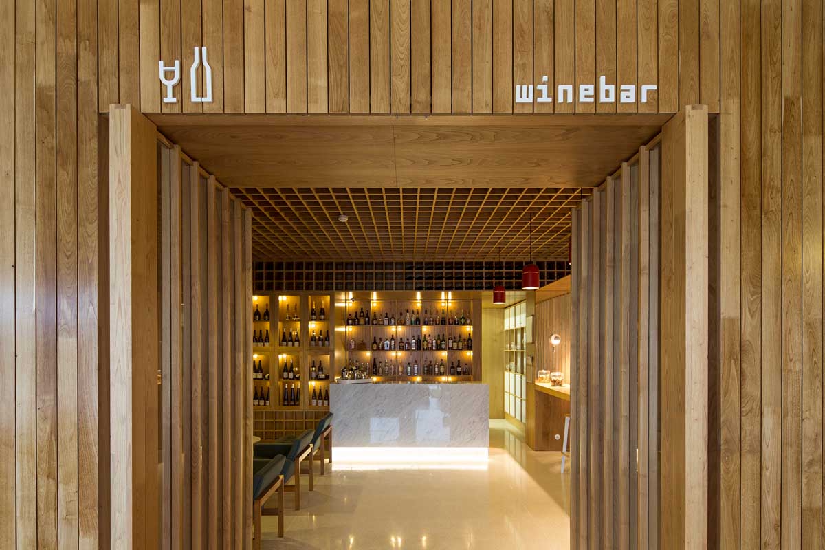
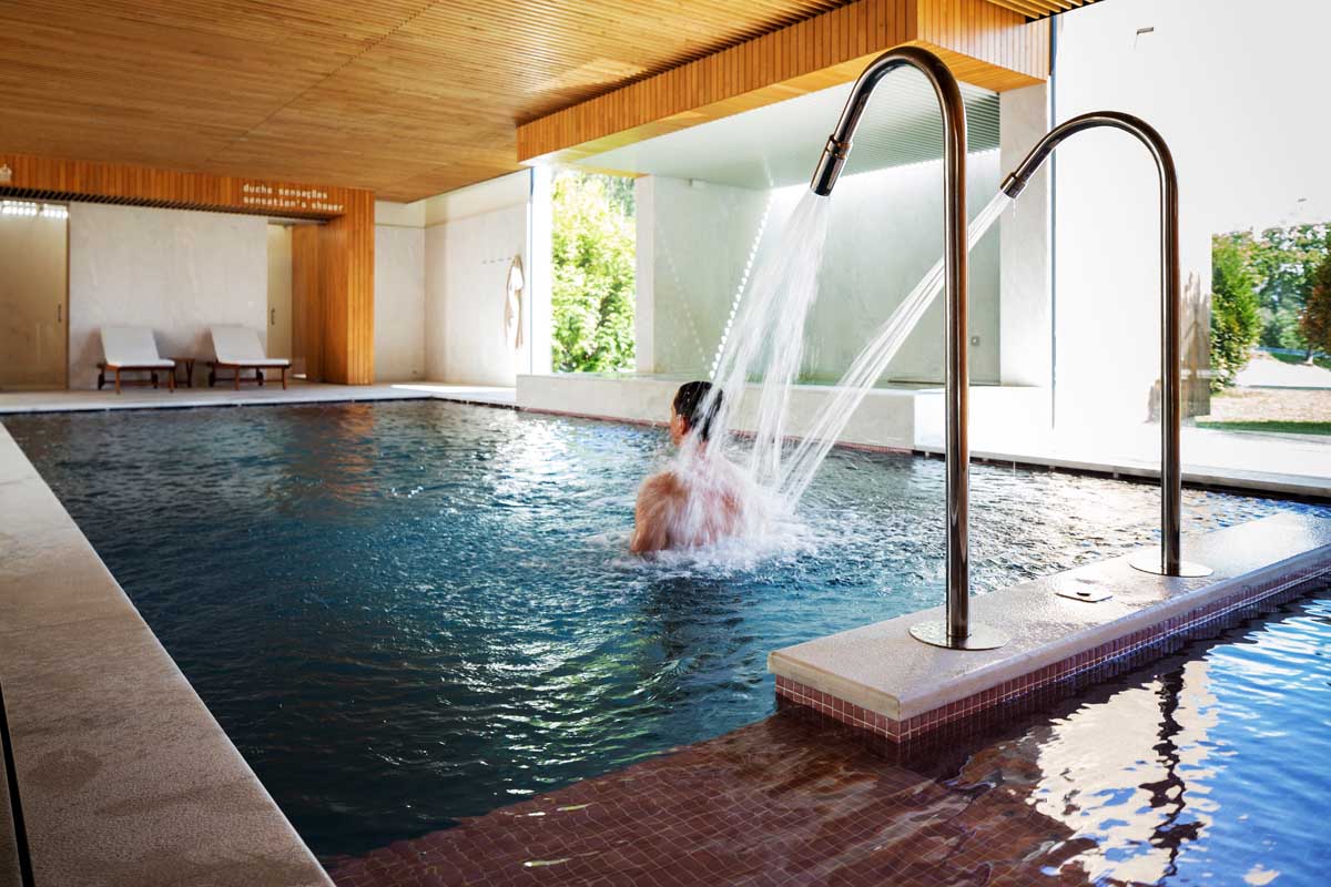
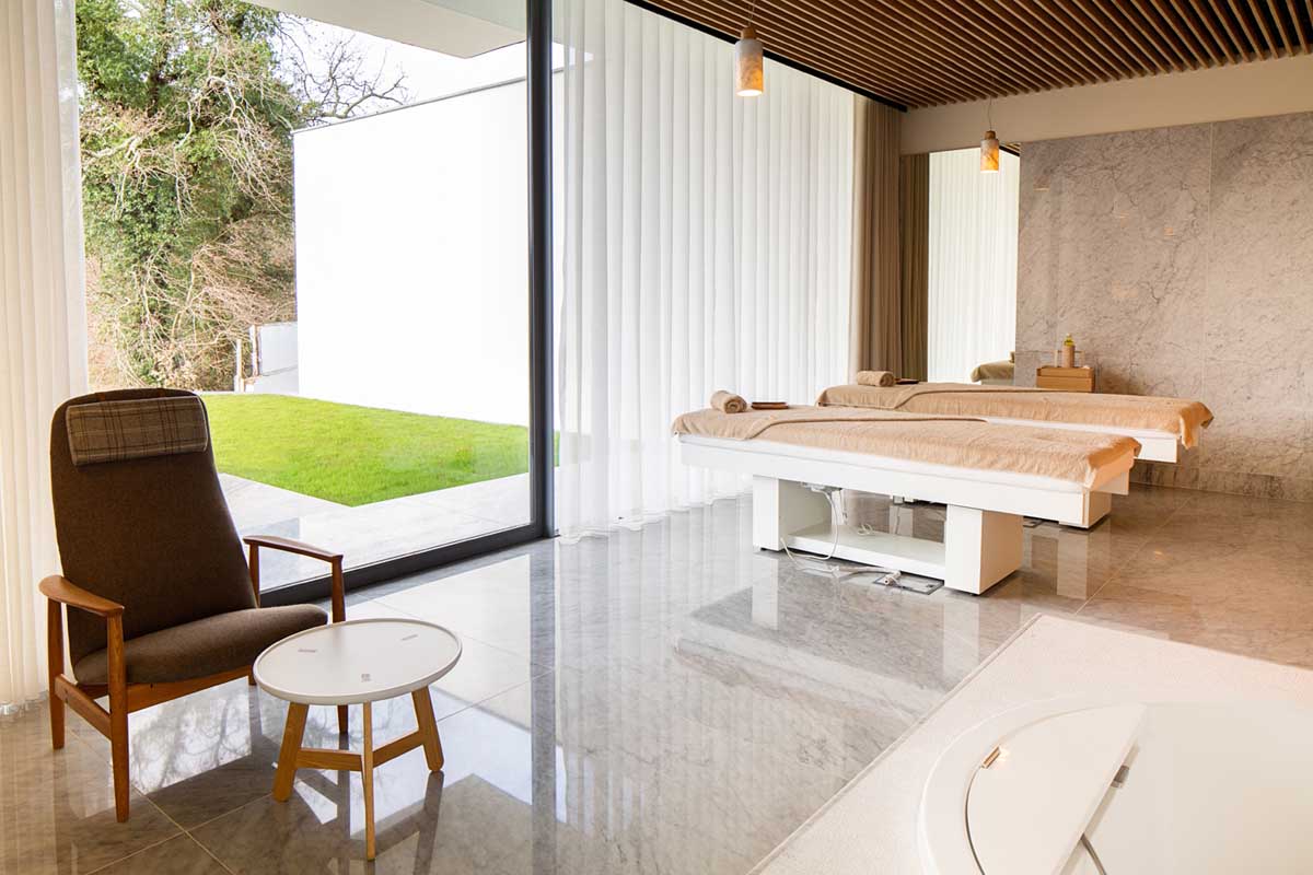
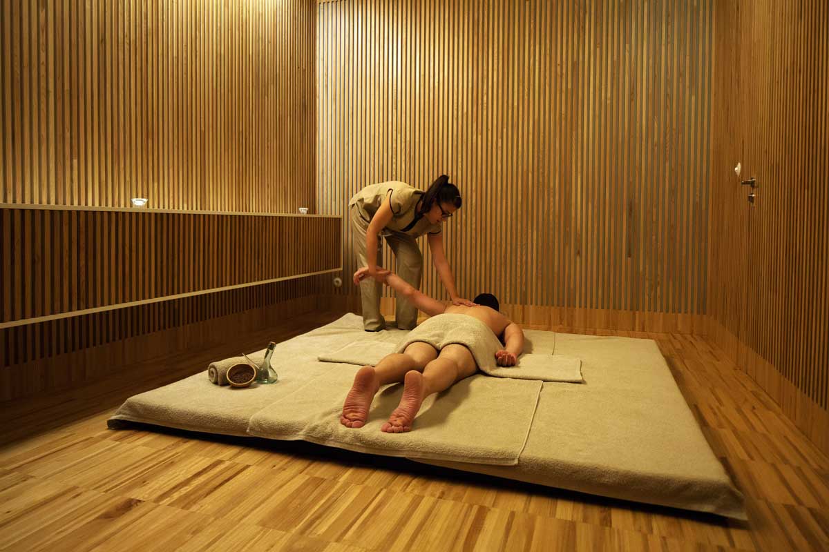
The wood volumes introduced in the several floors of the hotel, commonly going from the inside to the outside, link these two areas of the hotel and its surrounding. These volumes host the new hotel programs, such us the business areas, the spa treatment rooms, among others, all with very simple, plain, geometric and cladded in local chestnut wood, resulting in strong interiors, full of character, with the right tone of light and warmth. Because the hotel is located in a region where the woods, the river and the local traditions are the main attractions, the interior design intended to be very natural, seeming to be there since ages, opening its views to the best landscape of the surroundings or when not possible, opening itself to private exterior areas created by the new extensions. Its frequent the links established between modernistic details from the mid XX century to certain aspects of the architecture carpentry or furniture mercenary. The project rejected the trendy, the fashionable or the “hotel design” tendency. In fact, to achieve this, several items of furniture, lighting, upholstery and spa treatment features were developed by the studio in order to achieve the right visual impact that was demanded by this overall aesthetic.
The main inspirations were breathed in the Portuguese modern architecture and product design of the 60’s, as well as on the local vernacular architecture of the Minho region. International names as Arne Jacobsen, Alvar Aalto and local giants as Arménio Losa, Januário Godinho and Álvaro Siza, have strong direct and indirect influence in the work and some of them with furniture items introduced in the Hotel Minho project.
Materials and products:
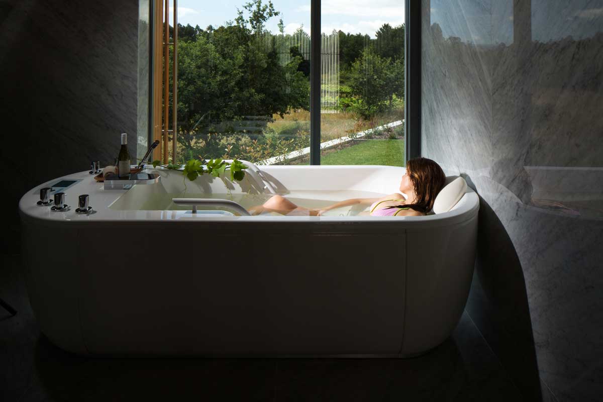
The wood used in all Hotel Minho construction items – interior and exterior cladding, ceilings, furniture, sign system – is Iberian chestnut wood, a common one in the northeast of the Iberian Peninsula. The project invested in having the right balance between this main material and the other ones, always neutral and based on a white palette. Among these, white Carrara marble was used both in walls and flooring, as well in some special items such as suspended lamps, counters and washbasins. White walls, white lacquered panels, glass and mirrors were frequently used to accentuate the neutral element facing wood. The rest is up to the furniture and all the remaining decorative items. On this matter, besides the numerous items developed by the studio (more than 20 products, repeated to a total of 131 pieces), the project used many vintage items collected from local stores, remanufactured important furniture design items left behind such as the Pousada easy chair (1951) by Januário Godinho, and used many contemporary and modern products in accordance with the same principles: warm, elegant and efficient design. The furniture developed to the project have now evolved to a new collection called Bracara, developed between our studio and Portuguese brand Paularte and will be release in the beginning of 2015 into the international market, with new items reflecting over the same concepts.
Architect: Vírgula i
Project lead architect and interior design: JP Pereira
Project team: Pedro Guedes, Teresa Aguiar and Pedro Durães Leite
Photography: Eva Sousa and Nelson Garrido
