Studio 53 have recently completed the conversion of an early 1900’s Australian workers cottage into a modern family residence.
Description from Chris Maher (of Studio 53)
The Hamersley Road Residence is the conversion of an early 1900’s Australian workers cottage to a practical, modern family residence. The external timberwork, moulded plaster, handmade tiles and flannel flower glass of the existing house give the home a distinct arts and crafts aesthetic. The house had been untouched for many years. As the new owners, and as an Architect and Interior Design team, we wished to provide a functional home for our family with flexibility for now and into the future. We also wished to respect and enhance the existing craftsmanship.
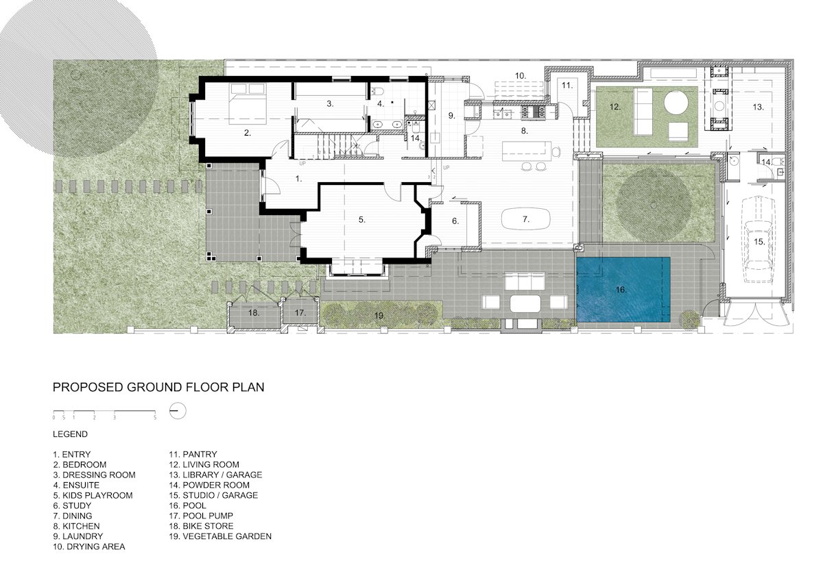
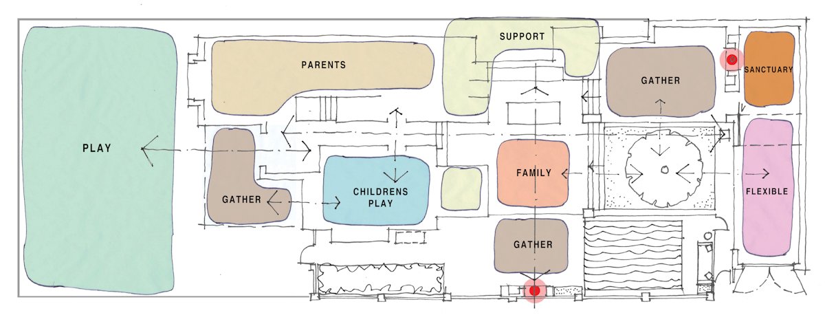
As we were designing a home for our family, we wanted to optimise the space of the relatively small site area. We were able to do this through the use of pure forms such as the ‘courtyard’ and the ‘box’.
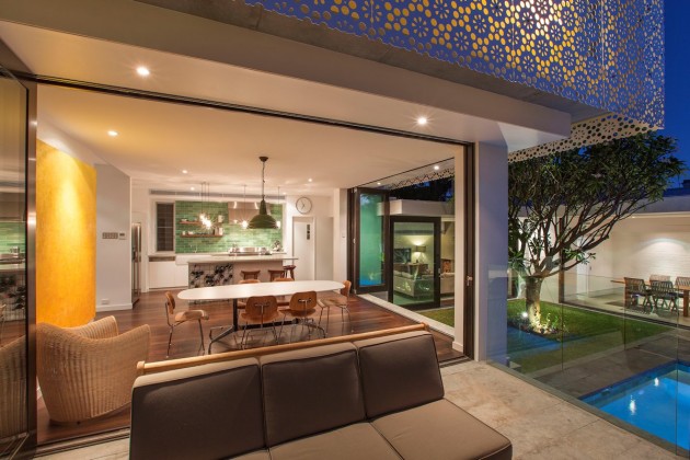
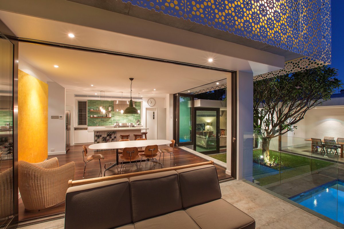
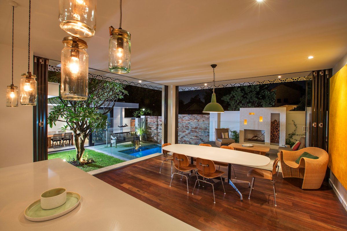
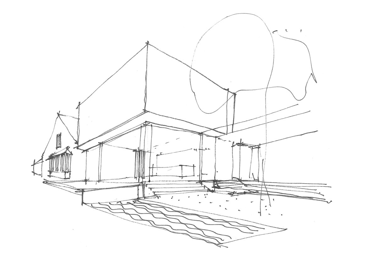
To the rear of the existing home we constructed a ground floor extension that envelopes a landscaped courtyard. Building to two boundaries and focusing the new ground floor rooms into the courtyard assisted in the creation and then blurring of the boundaries between indoor and outdoor. The intent was to provide multiple spaces of differing character, to be used at different times of the day and year, some inside and some outside.
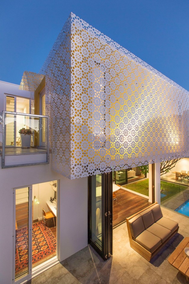
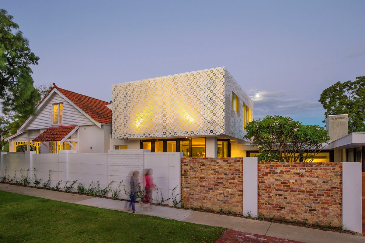
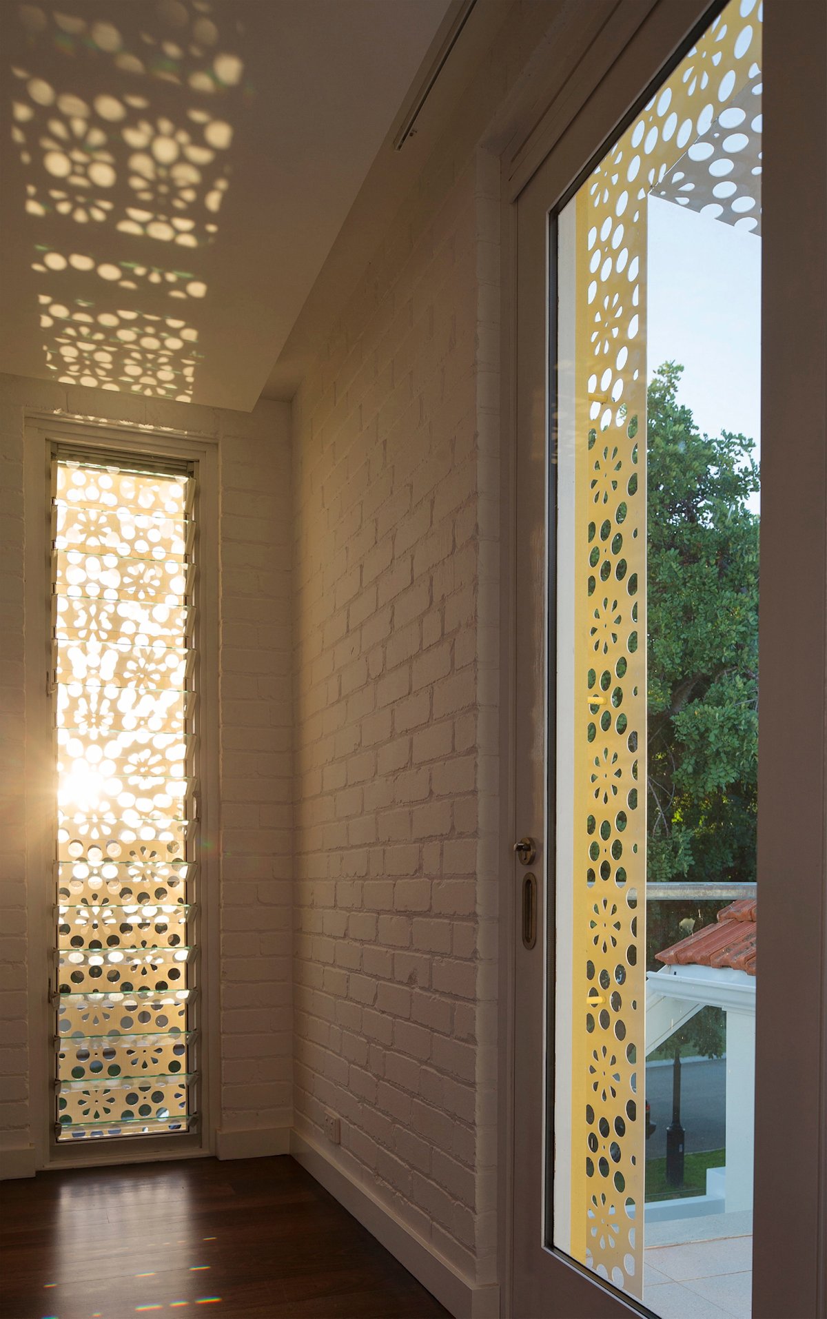
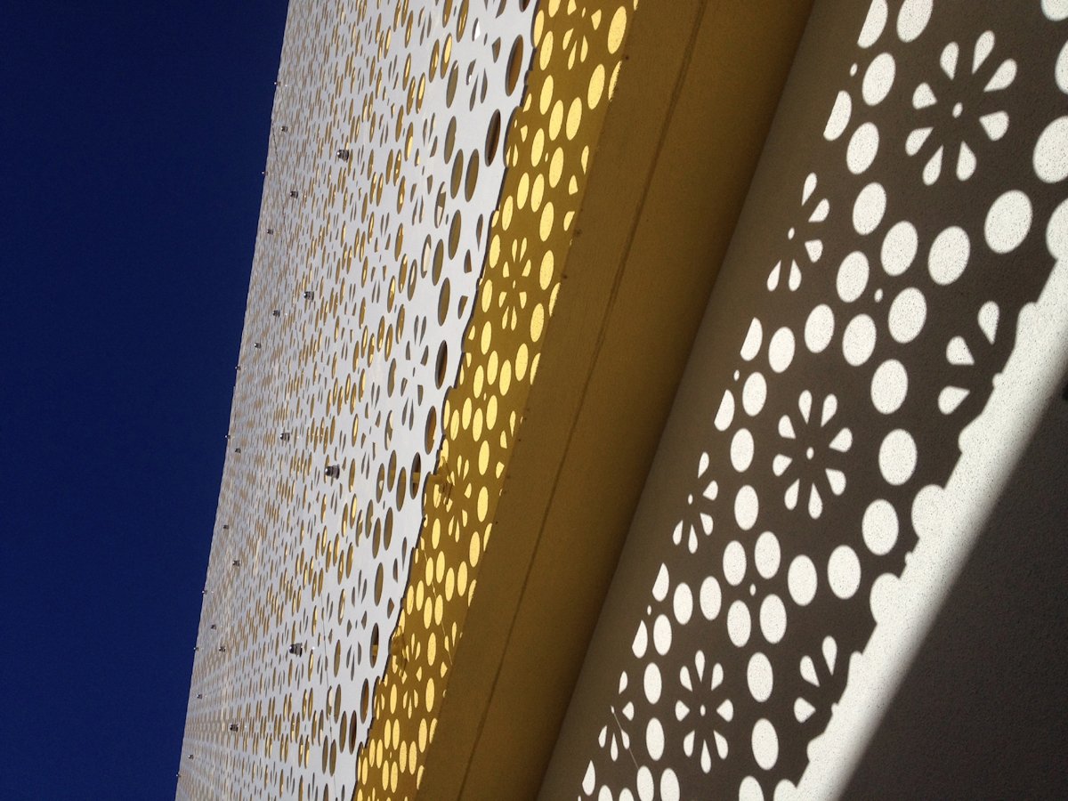
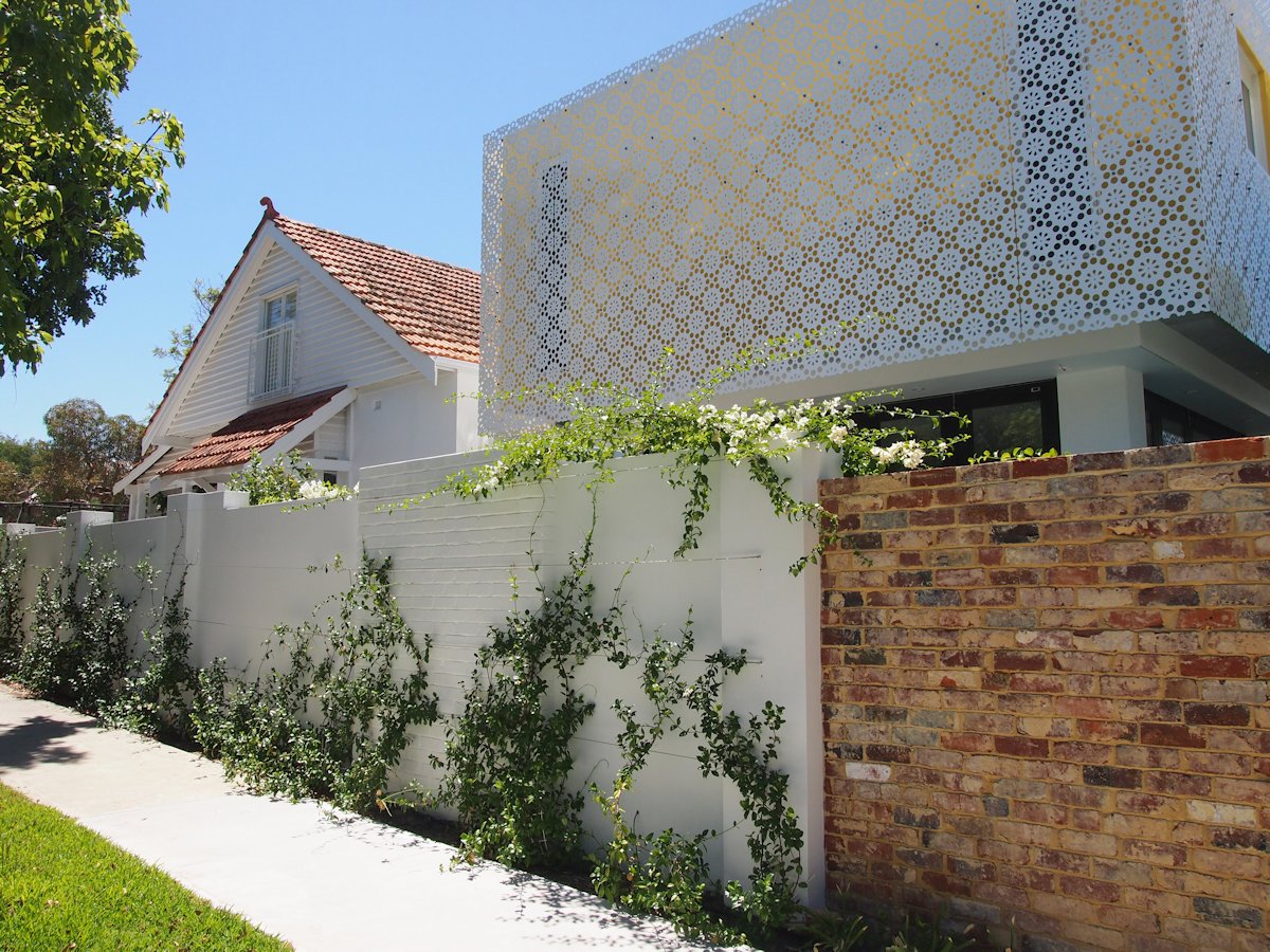
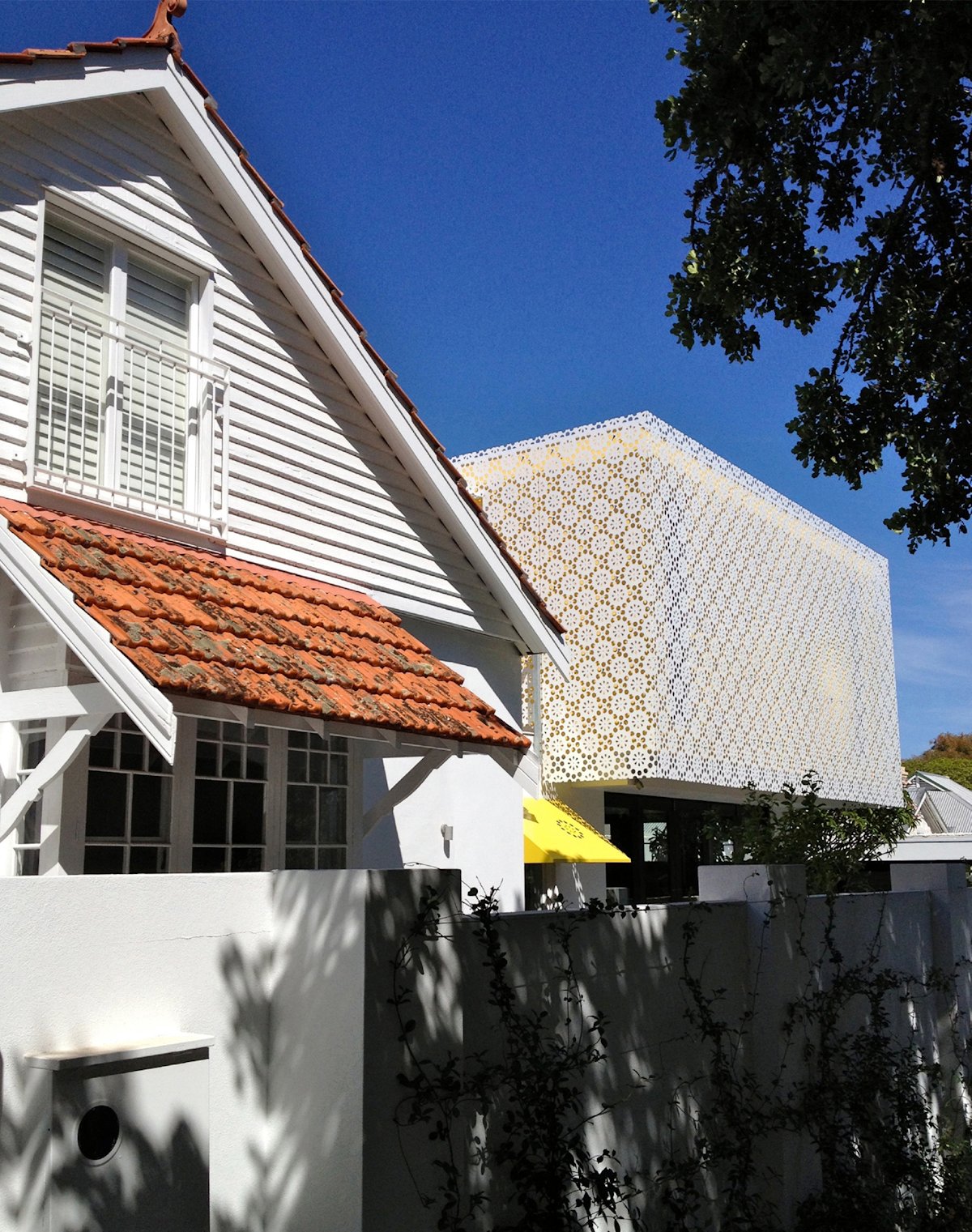
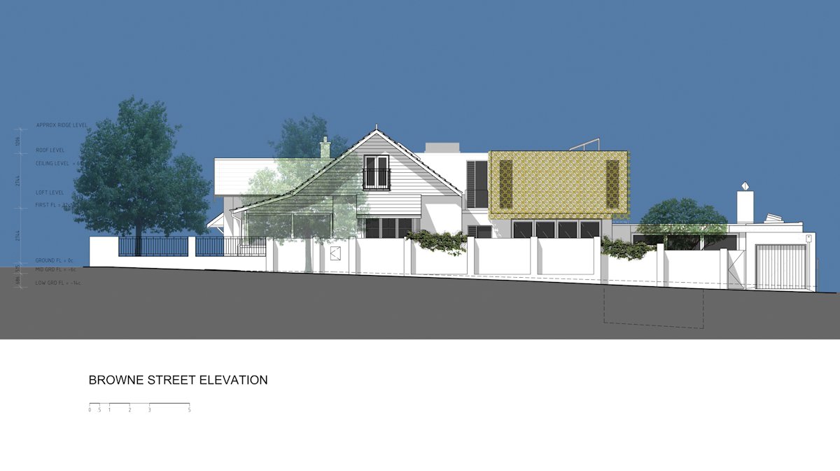
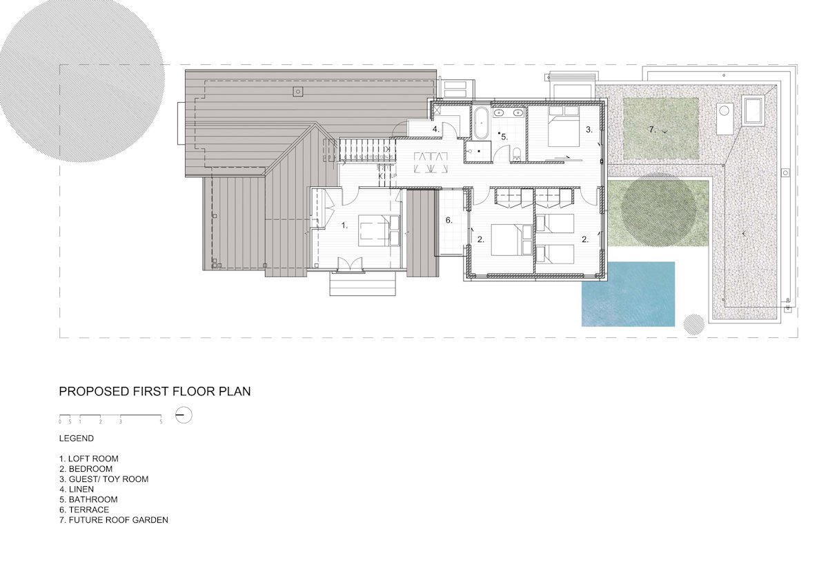
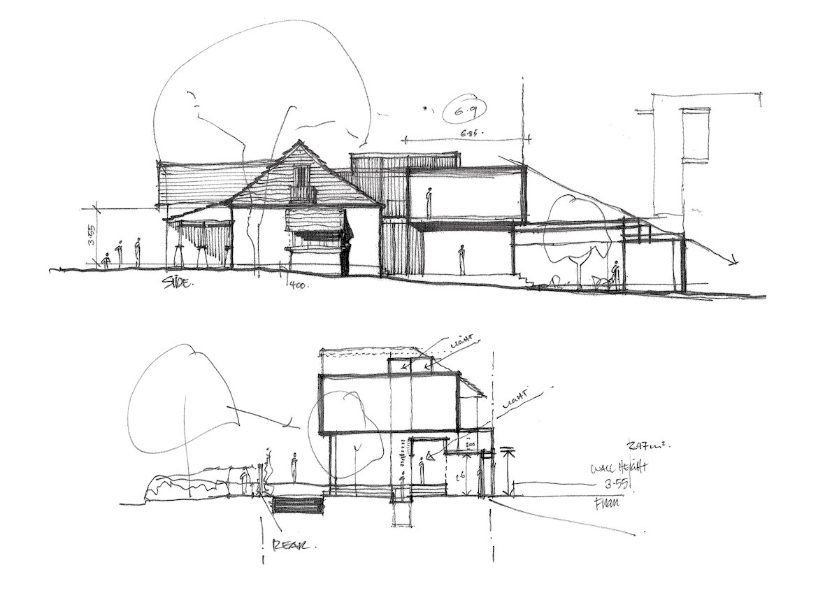
The upper level addition is delineated from the existing house by taking the form of a pure yellow ‘box’ gently placed on top of the ground floor behind the gable of the existing home. The Box is then further wrapped in a perforated screen to shade and protect it from the sun.
The conception of the ‘box’ is integral to the design of this house. Internally, the box is its own zone; bedrooms, bathroom and play room for the children. Externally the box defines the character of the extension, highlighting the change from existing house to contemporary home in a sympathetic but contrasting manner.
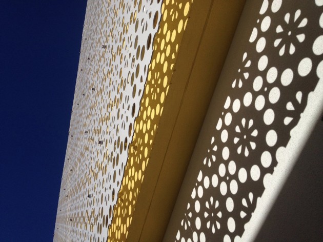
The intricately patterned and visually permeable screen envelops the box on all sides. The pattern is inspired from the floral motif of the original carpet and fireplace tiles; although given a contemporary edge. This screen provides visual richness, shade and protection to openings whilst offering opportunities for passive surveillance of the street. At night, the screen is illuminated, glows and provides a moment of joy for the neighbourhood.
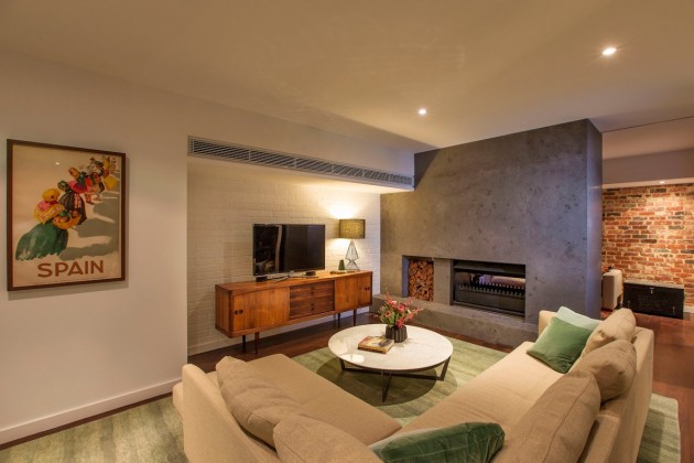
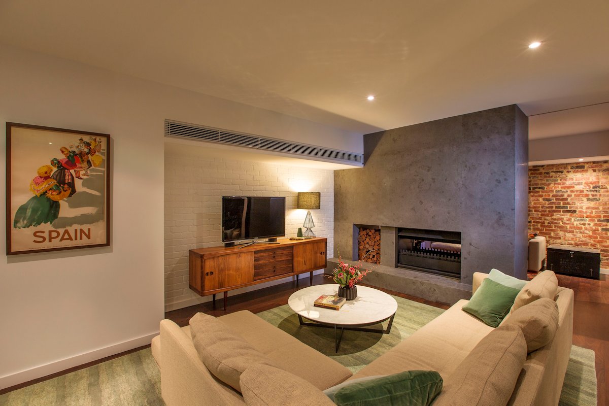
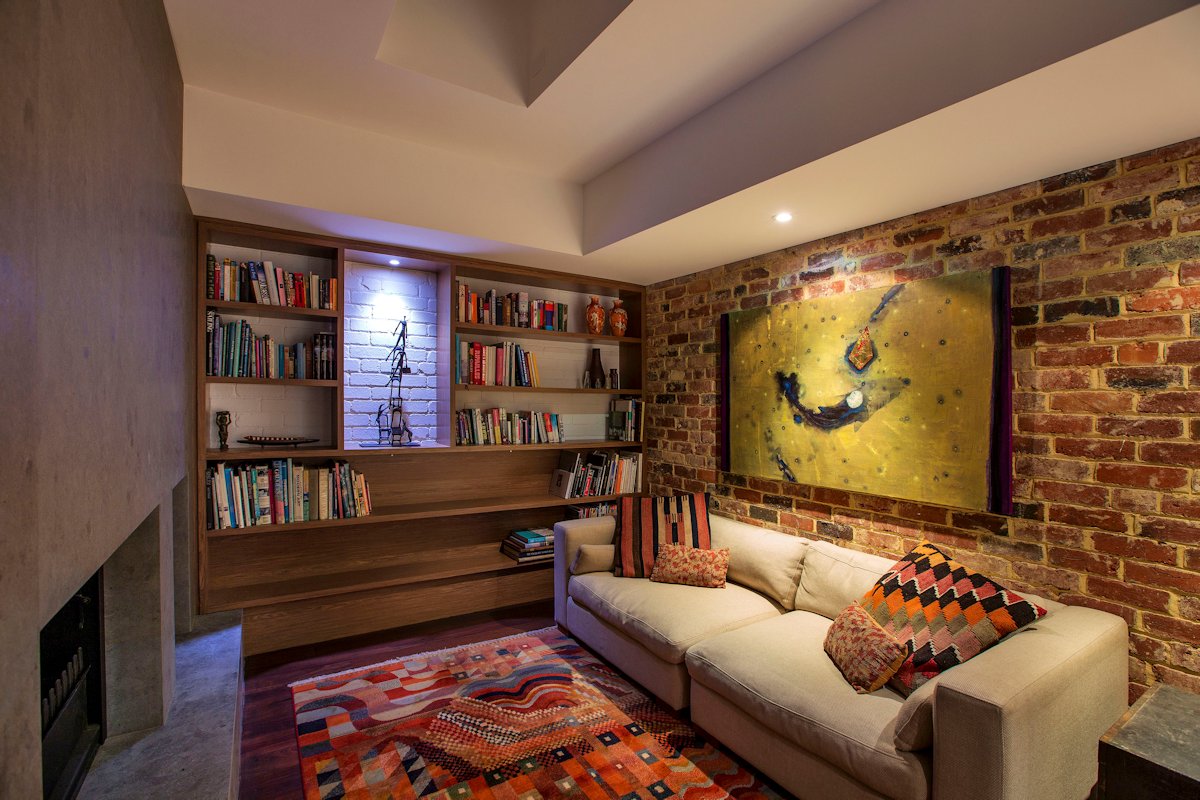
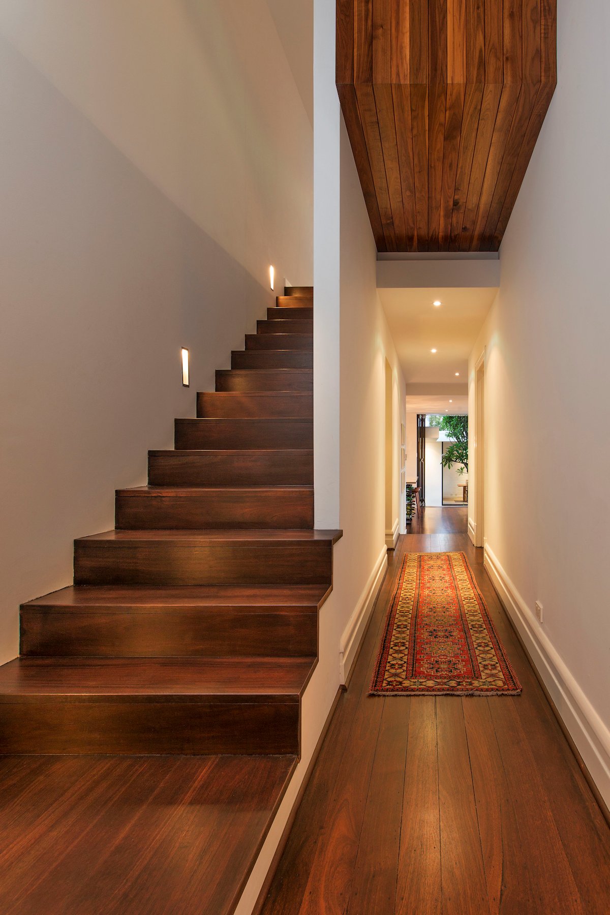
Throughout the design process, we re-used and recycled elements of the existing home to create a story of restoration. This included recycling bricks, light fittings, and even the old laundry trough, which is now a thriving herb garden. The original tin awning on the front of the existing house was resurrected with a coat of Dulux Weathershield in ‘Happy’ to match the ‘box’.
Despite being untouched for over 90 years, the existing home was rescued and rejuvenated. The honest values of the house have been maintained, continued and extended into the new addition, to breathe life into the existing cottage and to create a “happy” and contemporary family home.
Design: Studio 53
Photography by Christian Sprogoe and Chris Maher

