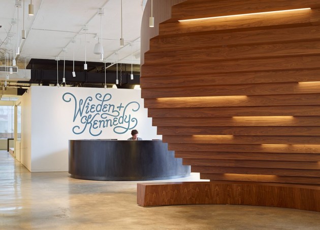
WORKac have designed the New York offices of Wieden+Kennedy.
Project description
Renowned advertising agency Wieden+Kennedy has developed a global reputation for innovative work dating back to their early Nike campaigns in the 1980s. The agency’s Portland headquarters designed by Allied Works cemented Wieden+Kennedy’s position as a patron of architecture and continues to influence the design of their offices around the world. WORKac’s design for the agency’s 50,000 sq ft New York office embraces urban density as its motto: a minimal compression of individual work spaces that opens up room for a gradient of diverse collective spaces.
The design for Wieden+Kennedy New York moves away from the office-as-playground to put work back at the heart of creative work. After a foray into the history of the workplace, research revealed that while advertising agencies have always been at the forefront of cutting-edge office design, no single workplace trend has replaced those that came before. Rather, the ways that people work have continued to evolve, layer and multiply.
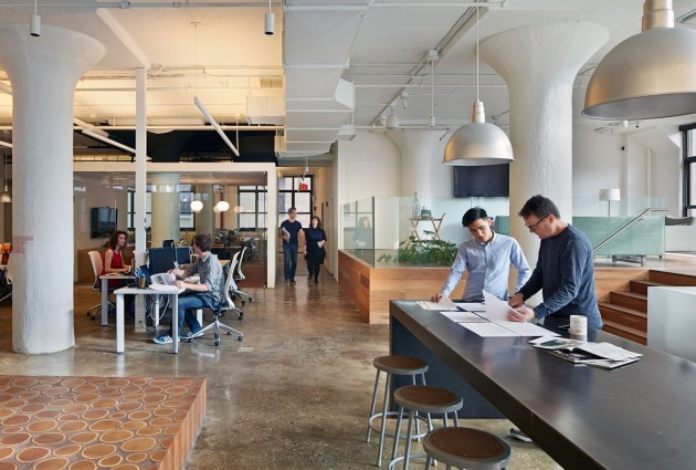
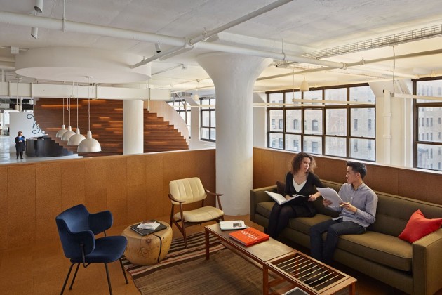
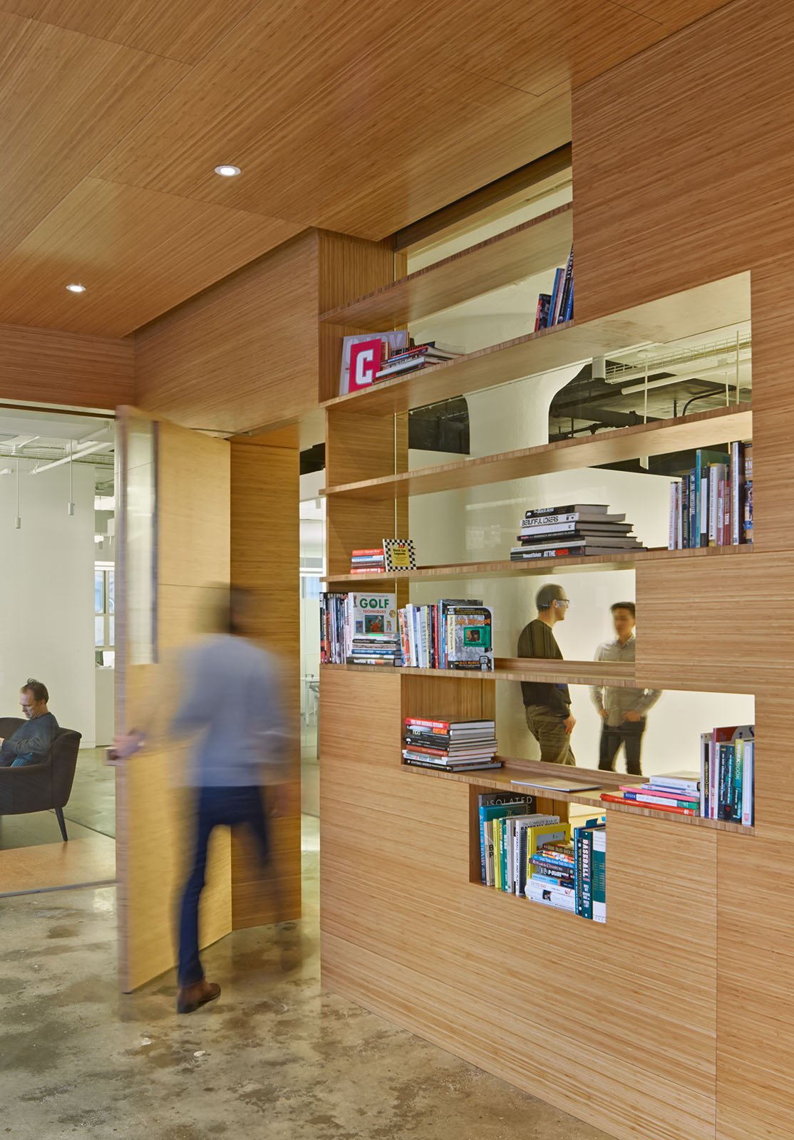
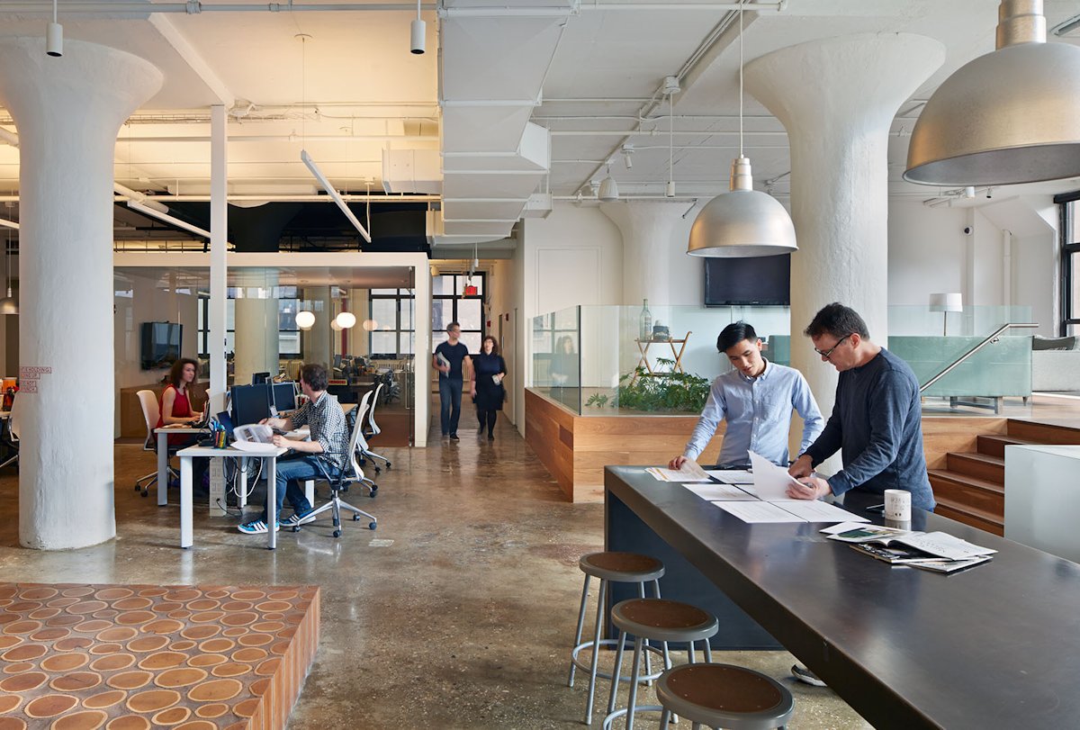
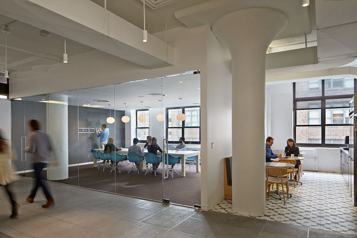
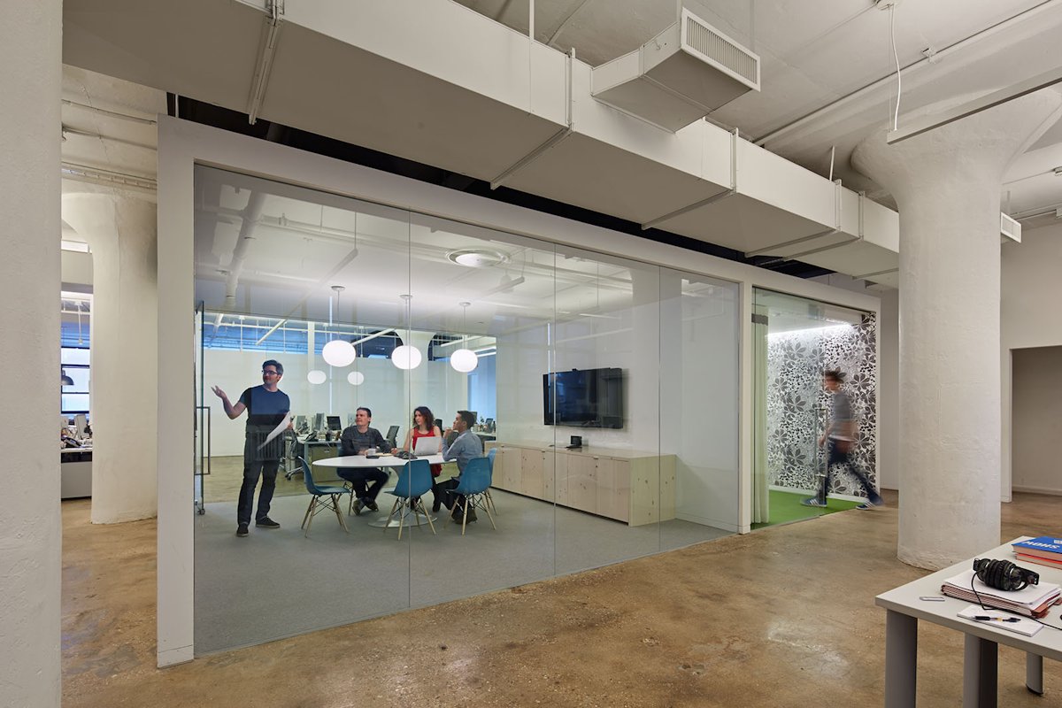
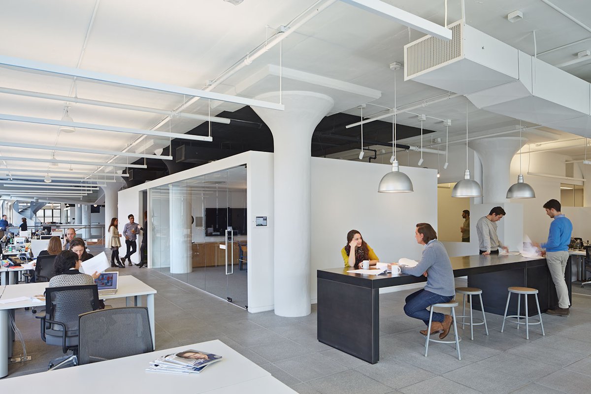
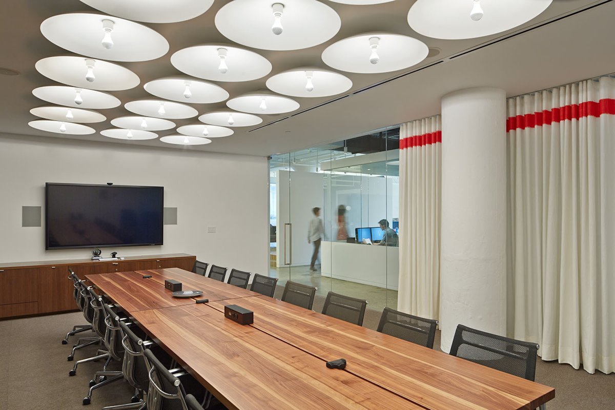
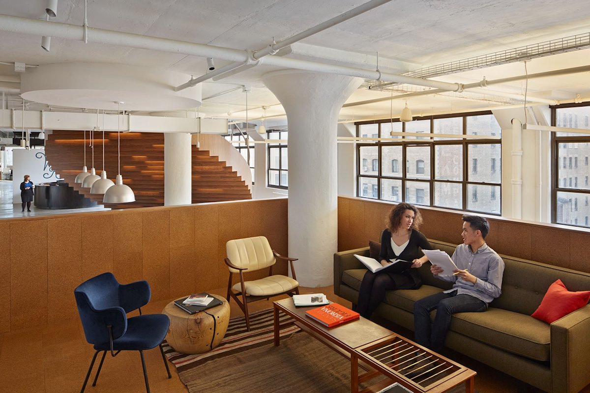
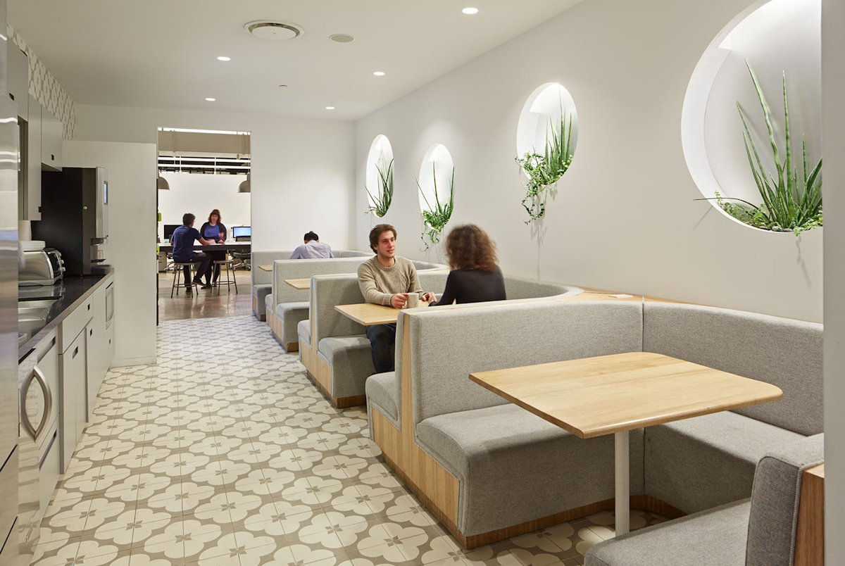
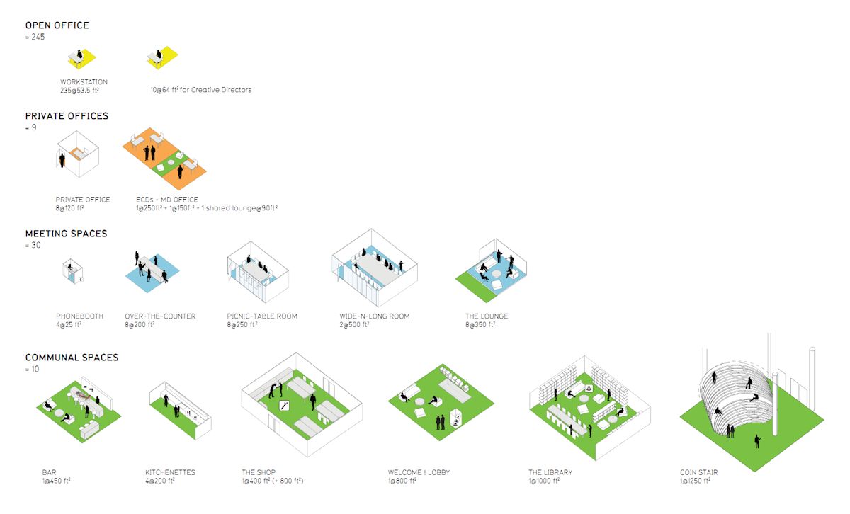
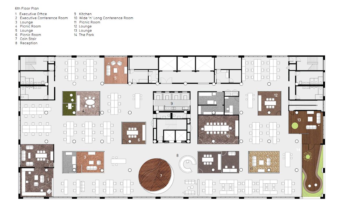
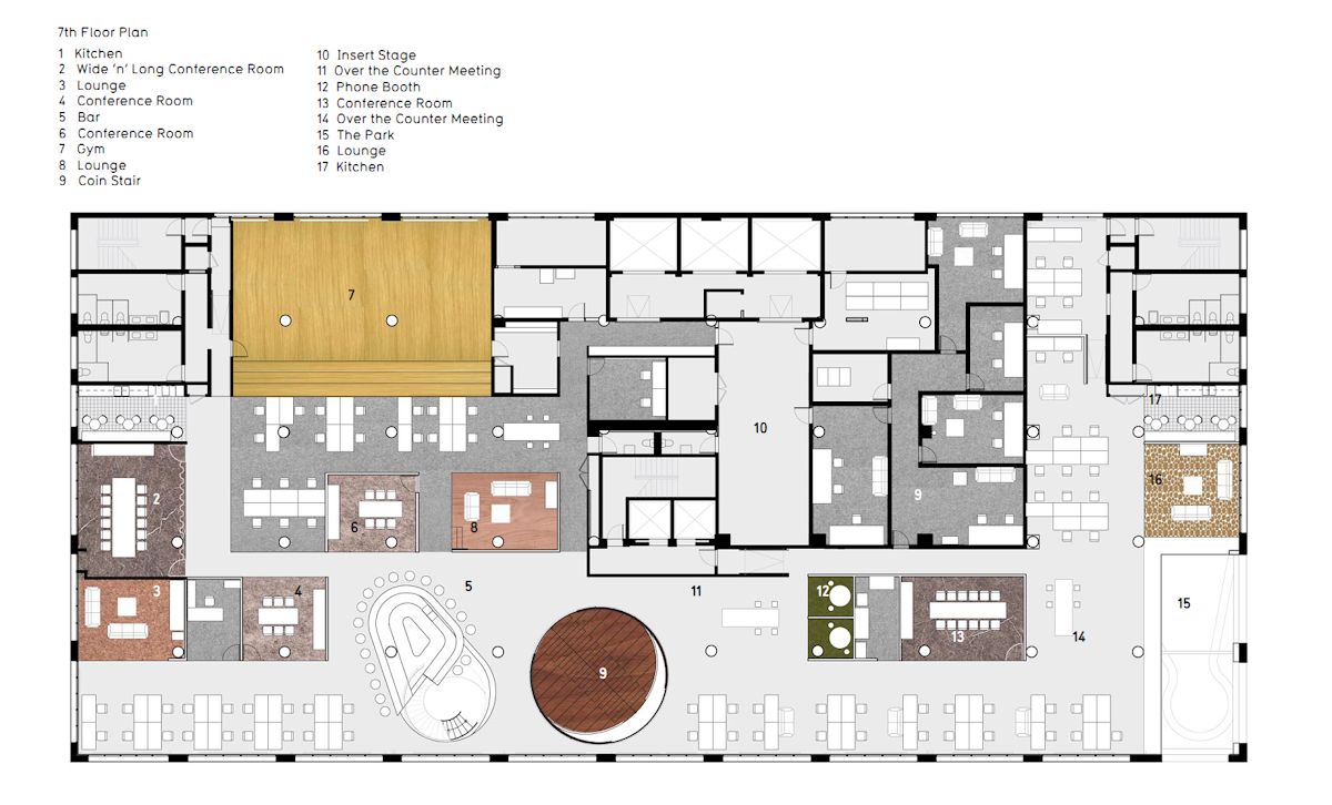
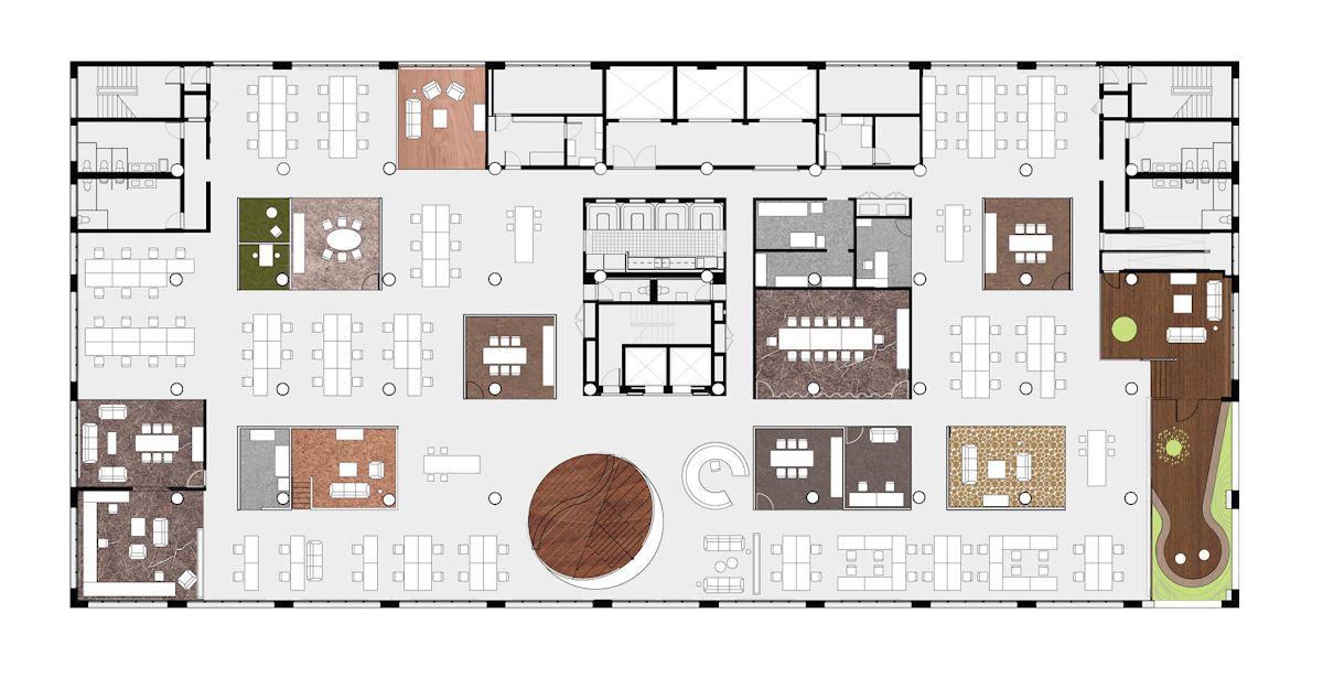
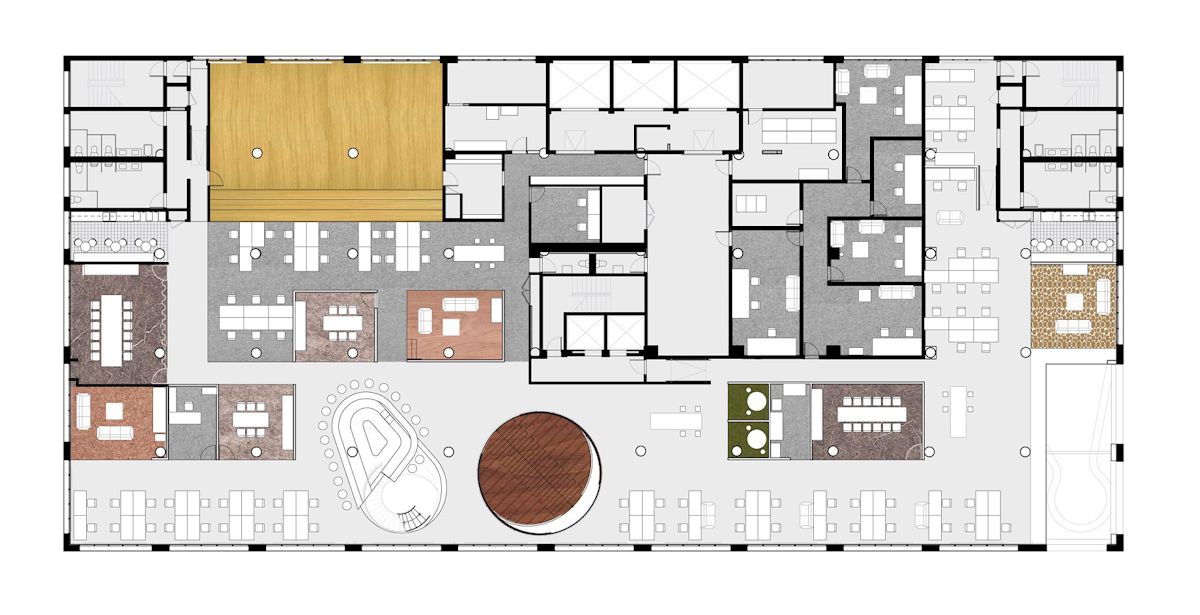
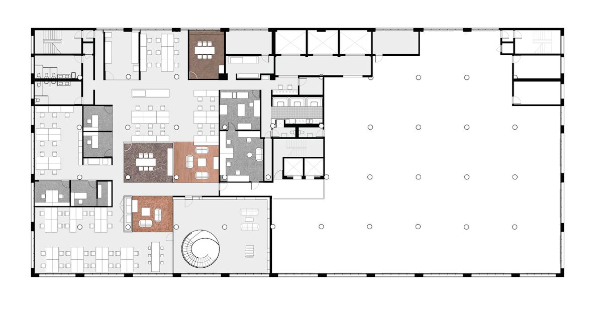
Because work at Wieden+Kennedy is highly collaborative, WORKac designed the widest possible range of discussion spaces to accommodate meetings and gatherings of varying size, privacy levels, and duration. Teams can choose to hold quick reviews standing up at 10 foot long “Over-The-Counter” blackened steel tables; have informal discussions in lounges with comfortable furniture and natural wood floors, raised to different levels to create a sense of privacy; or gather in the kitchens for working lunches. More traditional meetings can be held in conference rooms that range in scale from smaller, intimate “Phonebooths,” to “Picnic-Table” meeting rooms that accommodate up to 10 people to larger, formal “Wide-n-Long” conference rooms. Glass walls create a sense of lightness and transparency to the space. Clusters of these different meeting spaces are organized around groups of 20-25 people in open offices, featuring polished concrete floors.
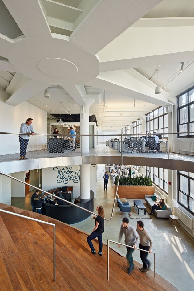
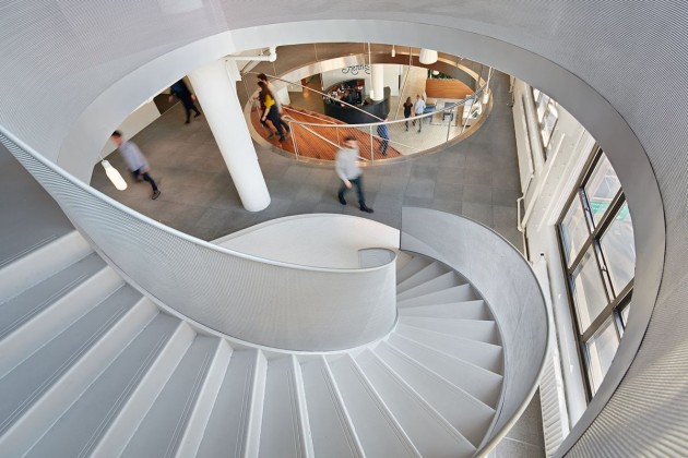
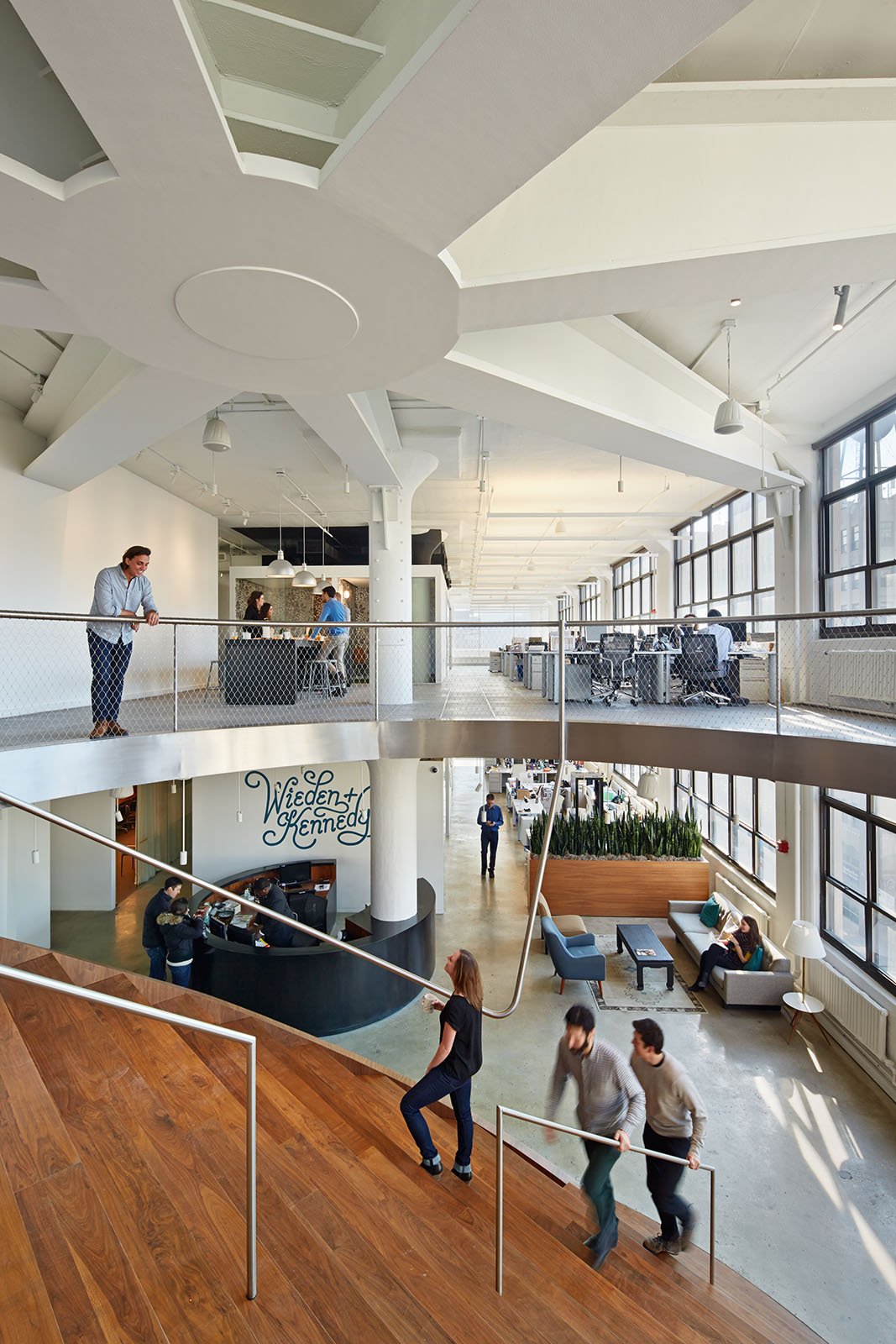
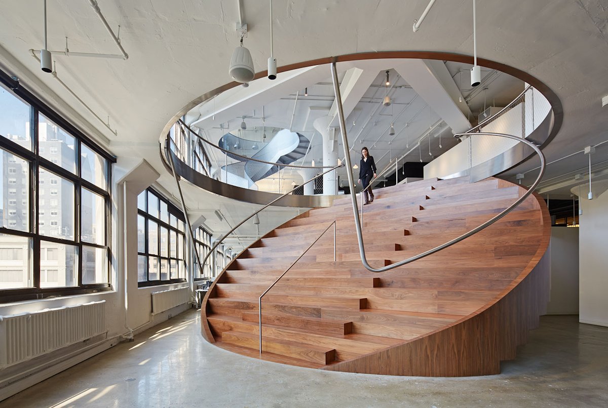
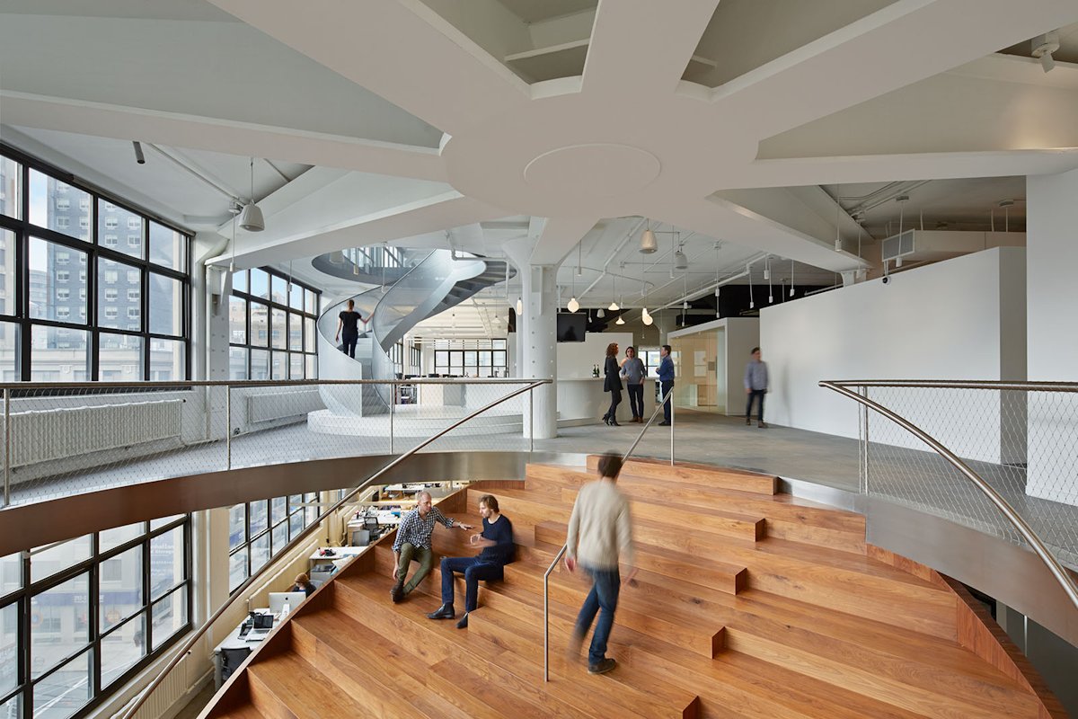
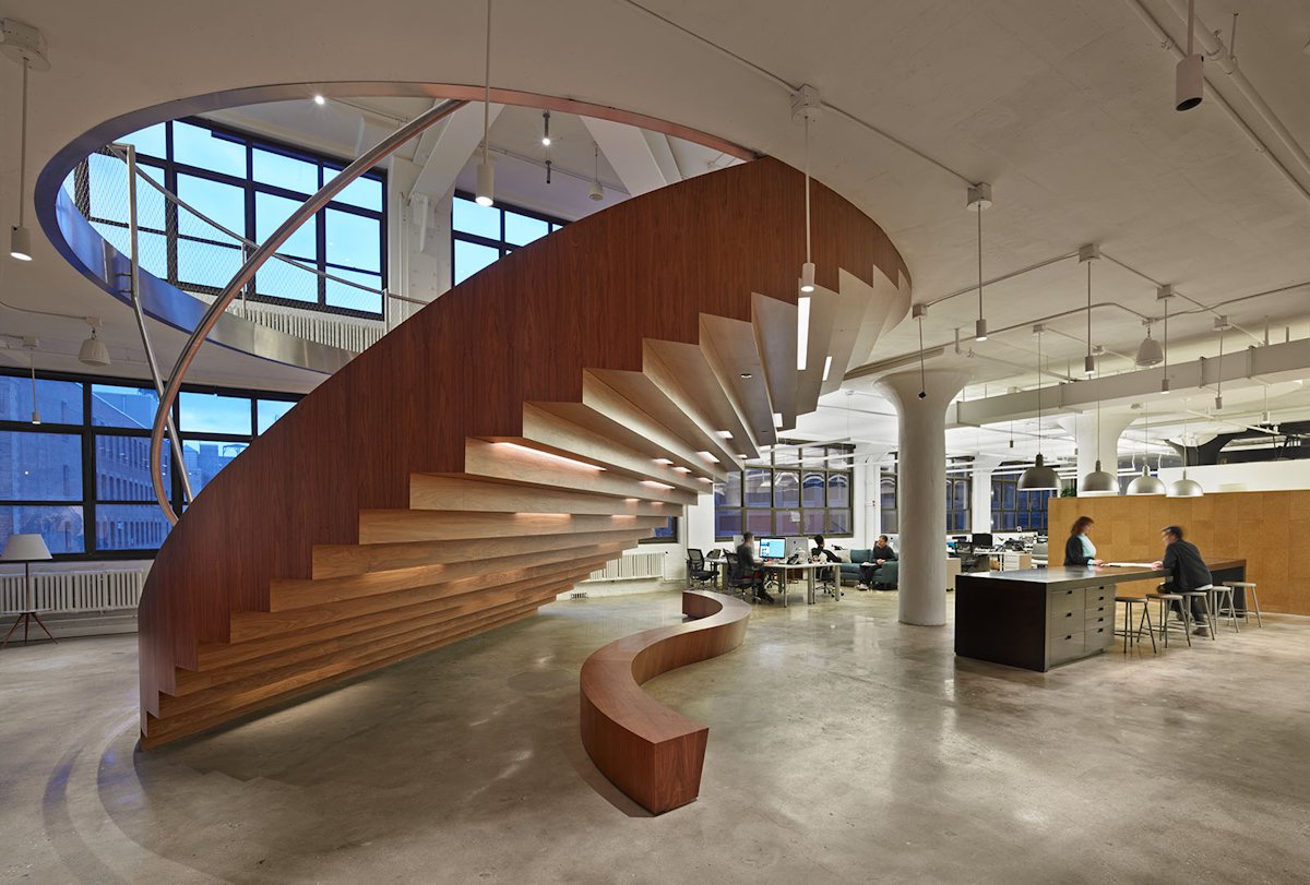
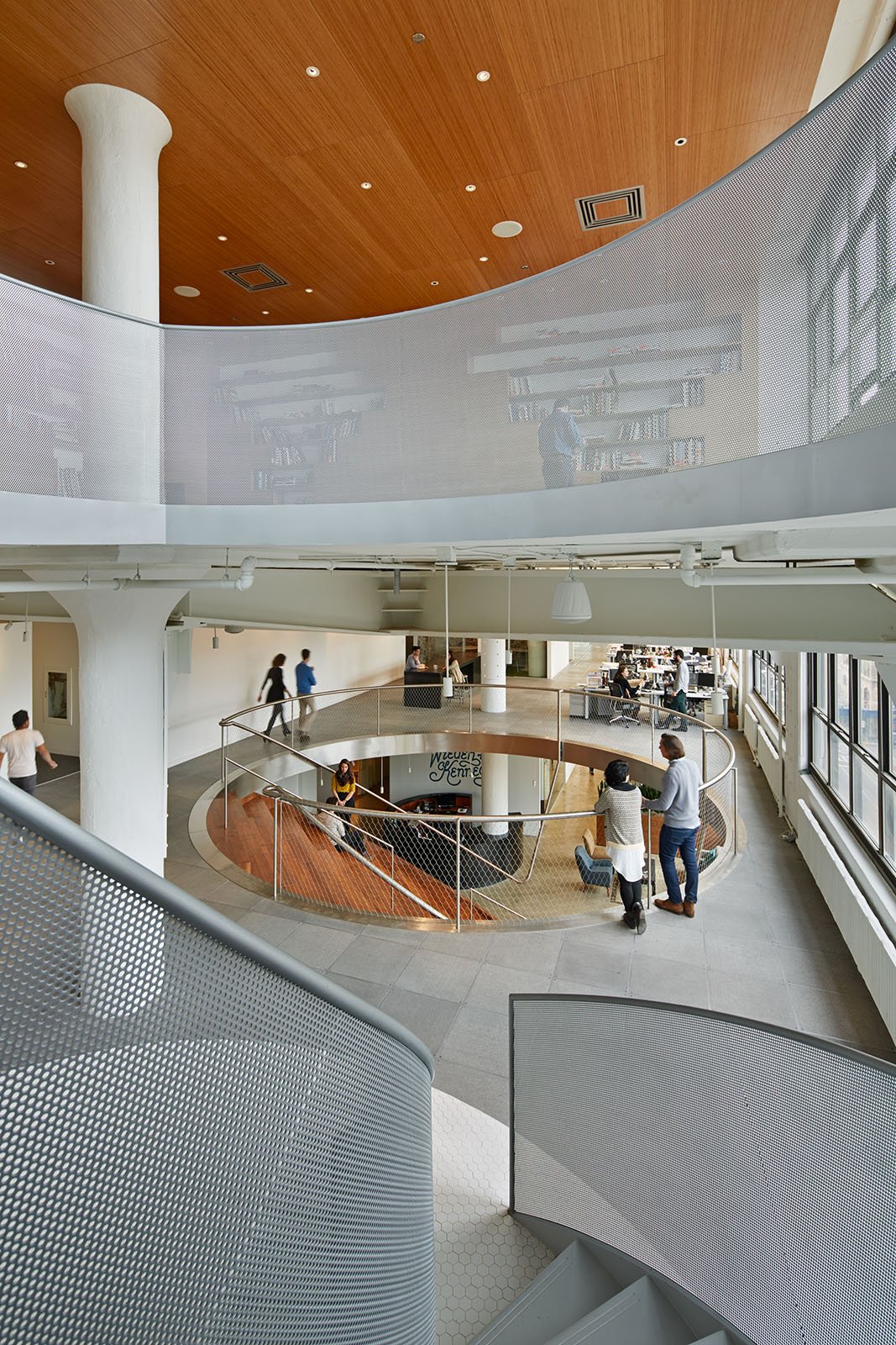
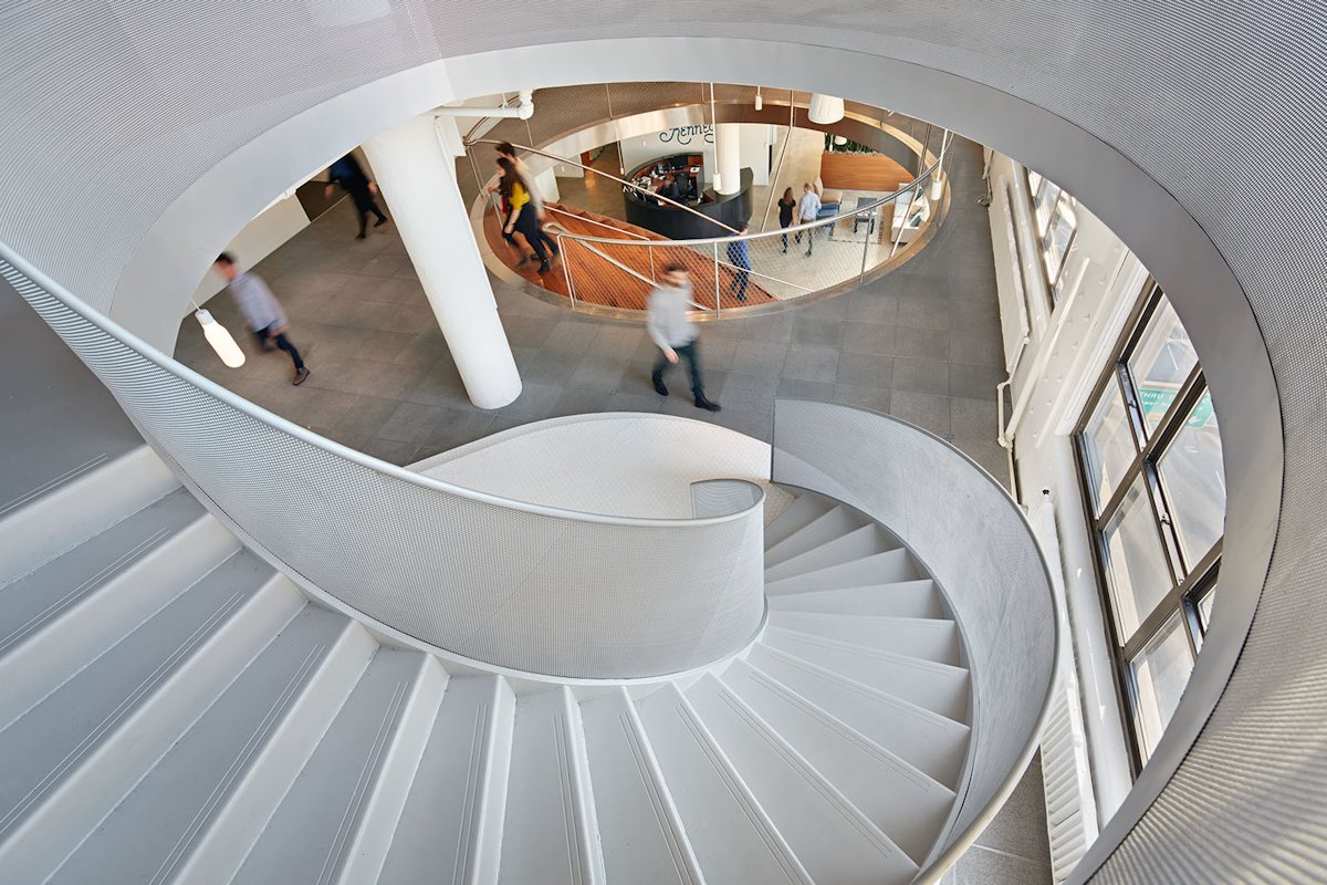
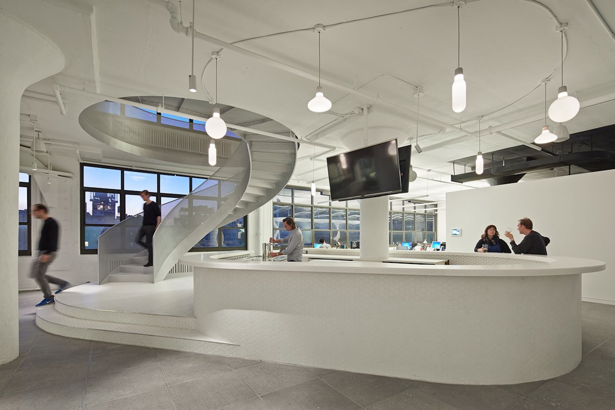
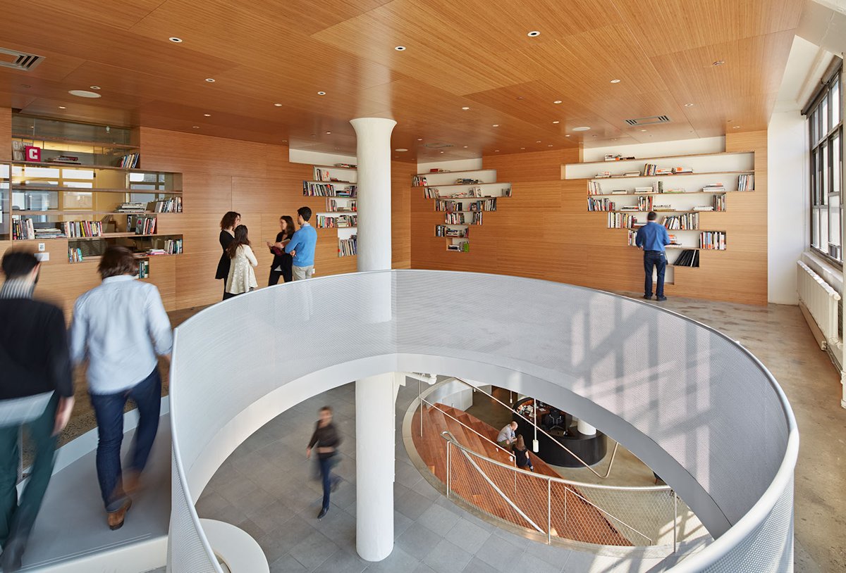
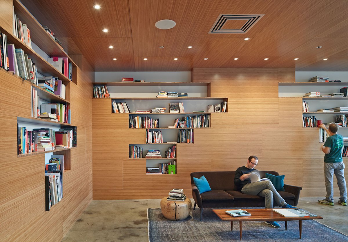
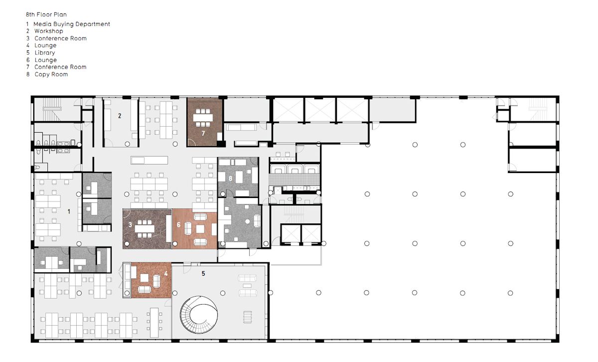
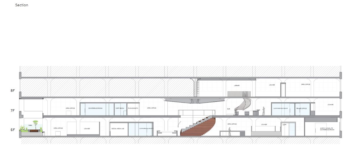
A series of larger collective ‘moments’ are distributed vertically to serve as the connective tissue for the agency. These spaces open up views across the office through circular oculi that create the largest possible openings in the floor slab while minimizing structural impact. Connecting the 6 th & 7 th floors, a circular-shaped, walnut-clad “Coin Stair” features bleacher seating that can accommodate office-wide meetings or informal discussions below a spider-shaped structure that transfers load from a removed column. On the 7th floor, a white-tiled bar provides an opportunity for end-of-day office celebrations. Connecting the 7th and the 8th floors, a perforated metal spiral staircase leads to a generous bamboo-clad, library “den” on the 8th floor.
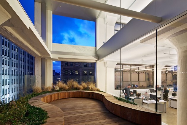
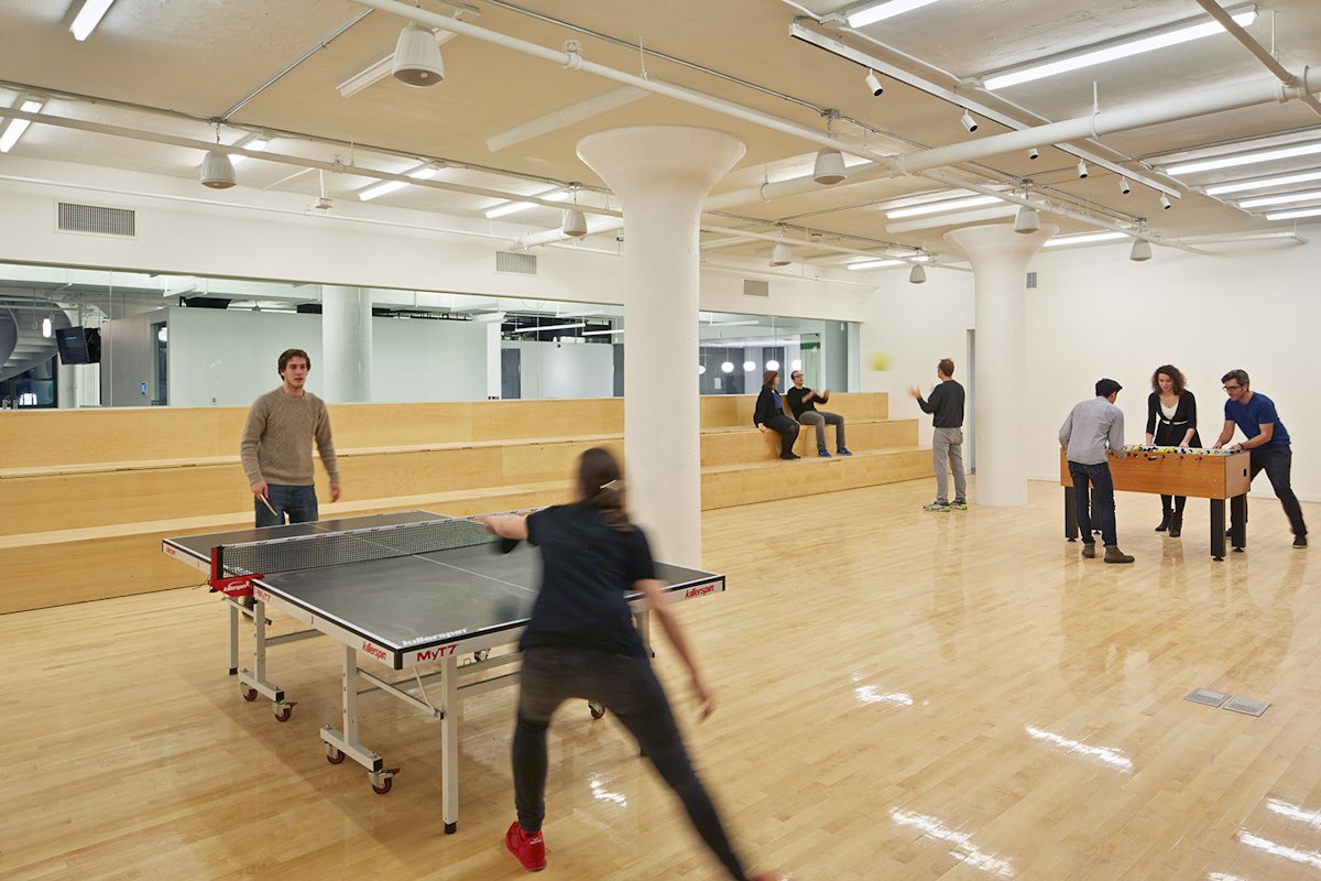
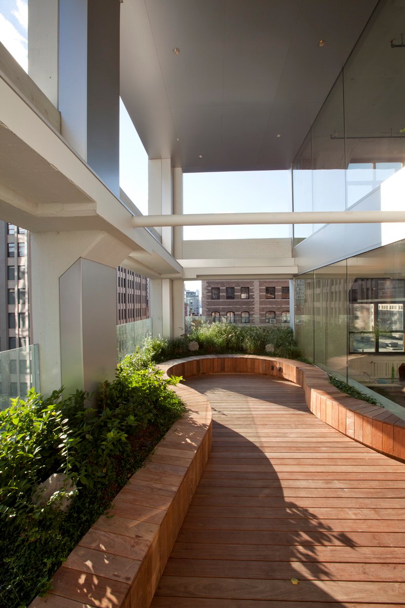
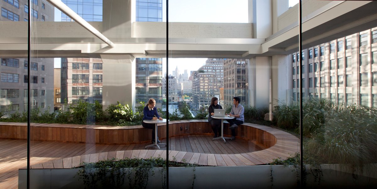
To bring the outside in, a double-height space on the 6th and 7th floors is combined with the removal of the existing windows and a new interior storefront to create an outdoor park surrounded by blueberry bushes and visible from the street. Completely wired for power, music and wi-fi , employees can use the outdoor space to meet, eat lunch or even take a bi-weekly yoga class. On the 7th Floor, inside the office, a large, multi-purpose gym offers additional space for interaction and recreation. The space doubles as a ‘black box’ to accommodate the whole office for lectures or film screenings.
Design: WORKac
Photography by Bruce Damonte and Raymond Adams

