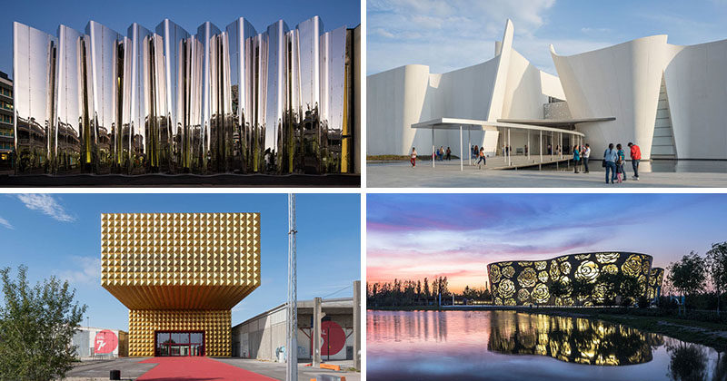
Typically people go to museums to admire the artifacts, sculptures, and art inside. But today we’re sharing 13 museums with architecture so amazing you’ll be drawn to them just to take in their design, regardless of what’s on display inside them.
1. The Biesbosch Museum in Werkendam, The Netherlands, is covered in grass and features a walkway on the roof that’s surrounded by small grassy mounds and leads to a look out at one end.
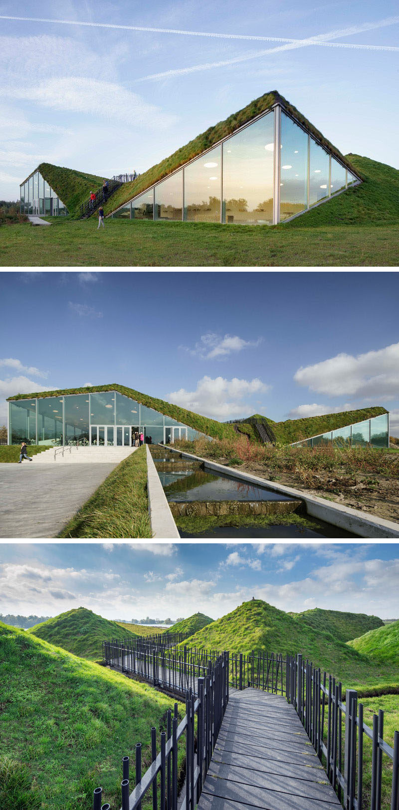
Studio Marco Vermeulen redesigned the Biesbosch Museum. Photography © Ronald Tilleman.
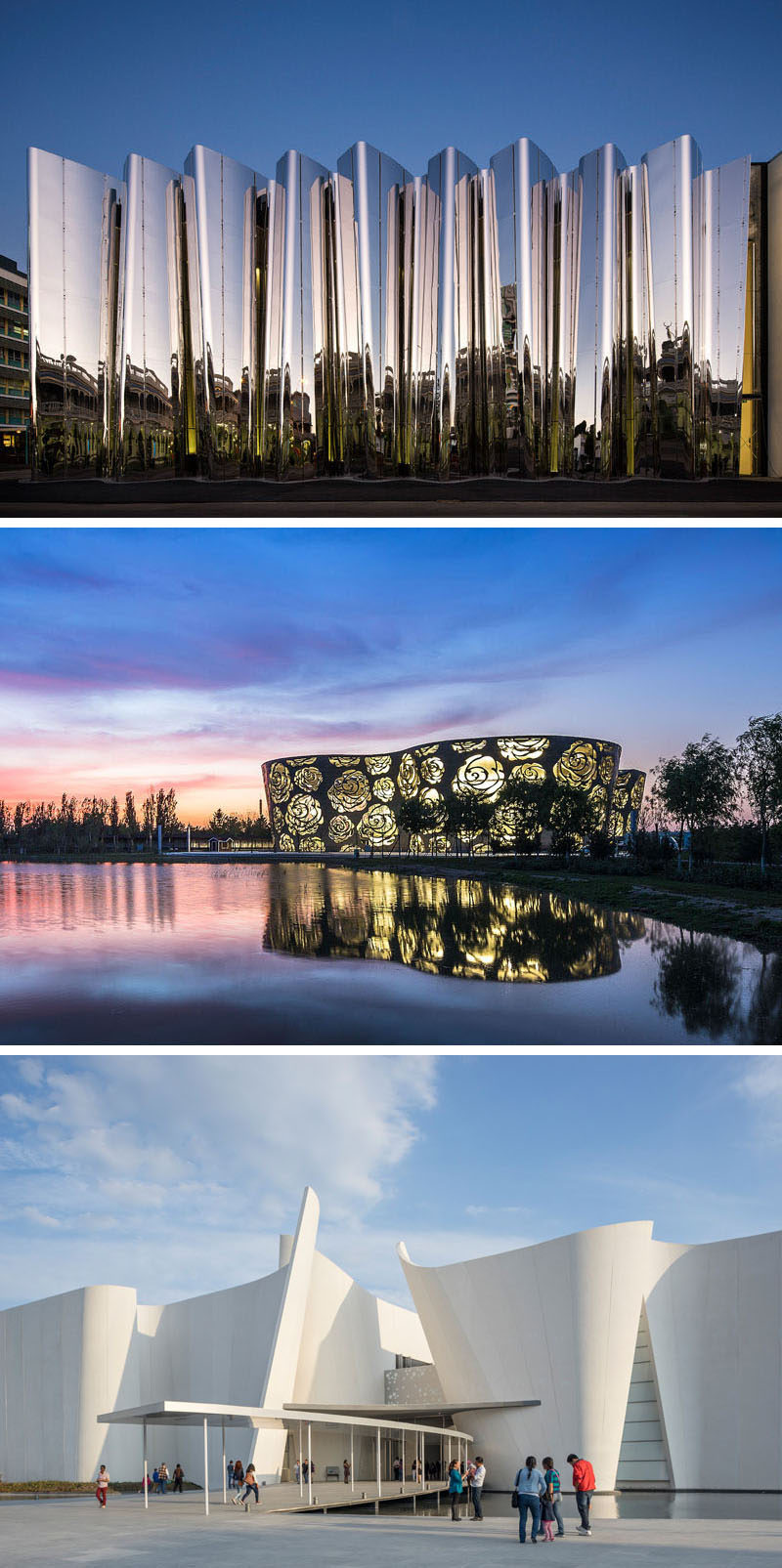
2. The Rose Museum in Beijing, China, is a large structure covered in a thick layer of stainless steel with a rose-shaped pattern stamped all over the exterior.
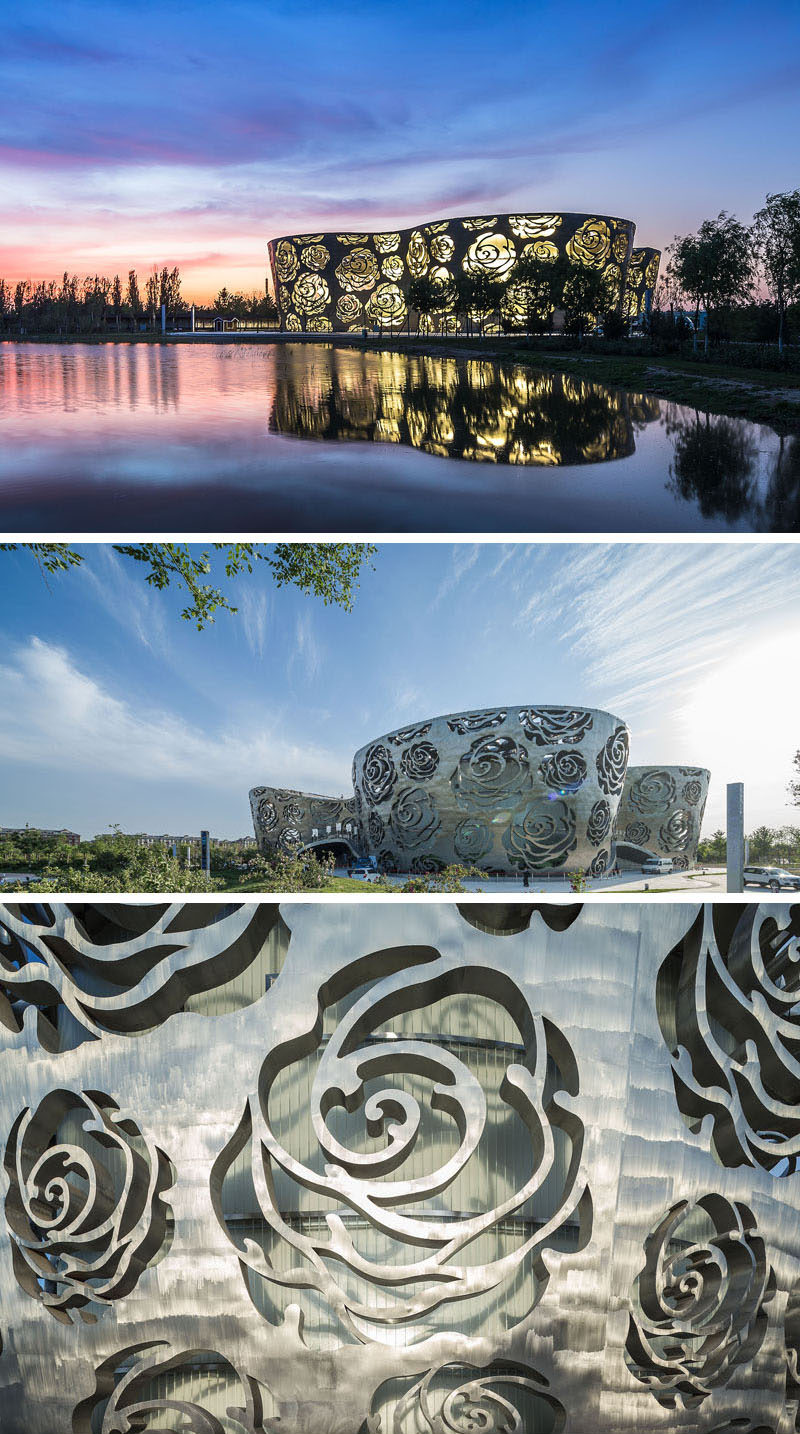
NEXT Architects designed the Rose Museum. Photography by Xiao Kaixiong.
3. The Messner Mountain Museum Corones in South Tyrol, Italy, is made from thick concrete and has been embedded into the mountain, projecting out to provide incredible views of the valley below and the mountains surrounding it.
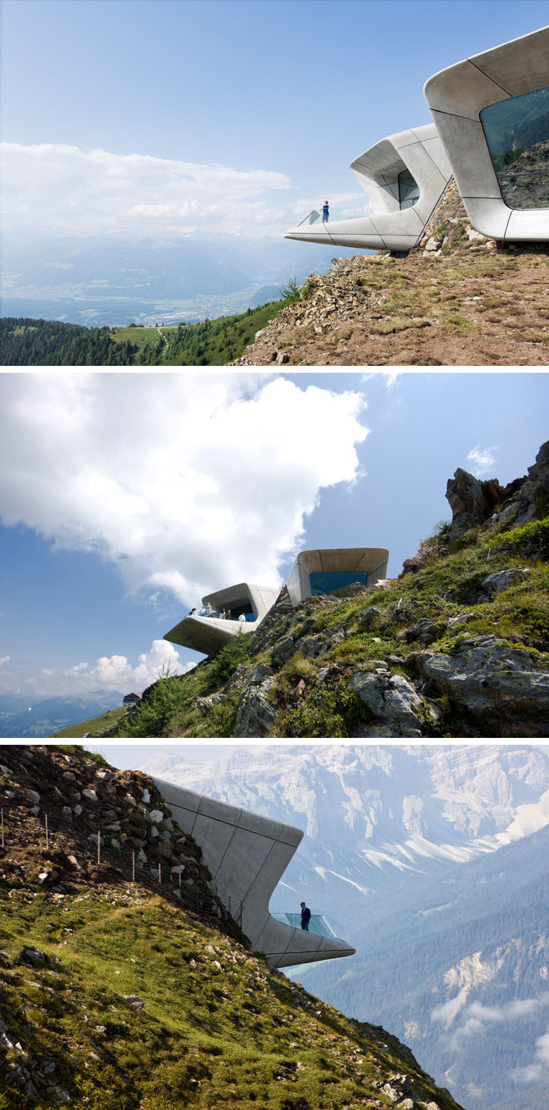
Zaha Hadid Architects designed the Messner Mountain Museum Corones. Photography © Werner Huthmacher (first image) and © Riccardo Bianchini / Inexhibit (second and third image).
4. Curved, reflective stainless steel surrounds the exterior of the Len Lye Centre, a combined art museum with the Govett-Brewster Art Gallery in Taranaki, New Zealand, to create a unique visual experience without even stepping foot in the museum.
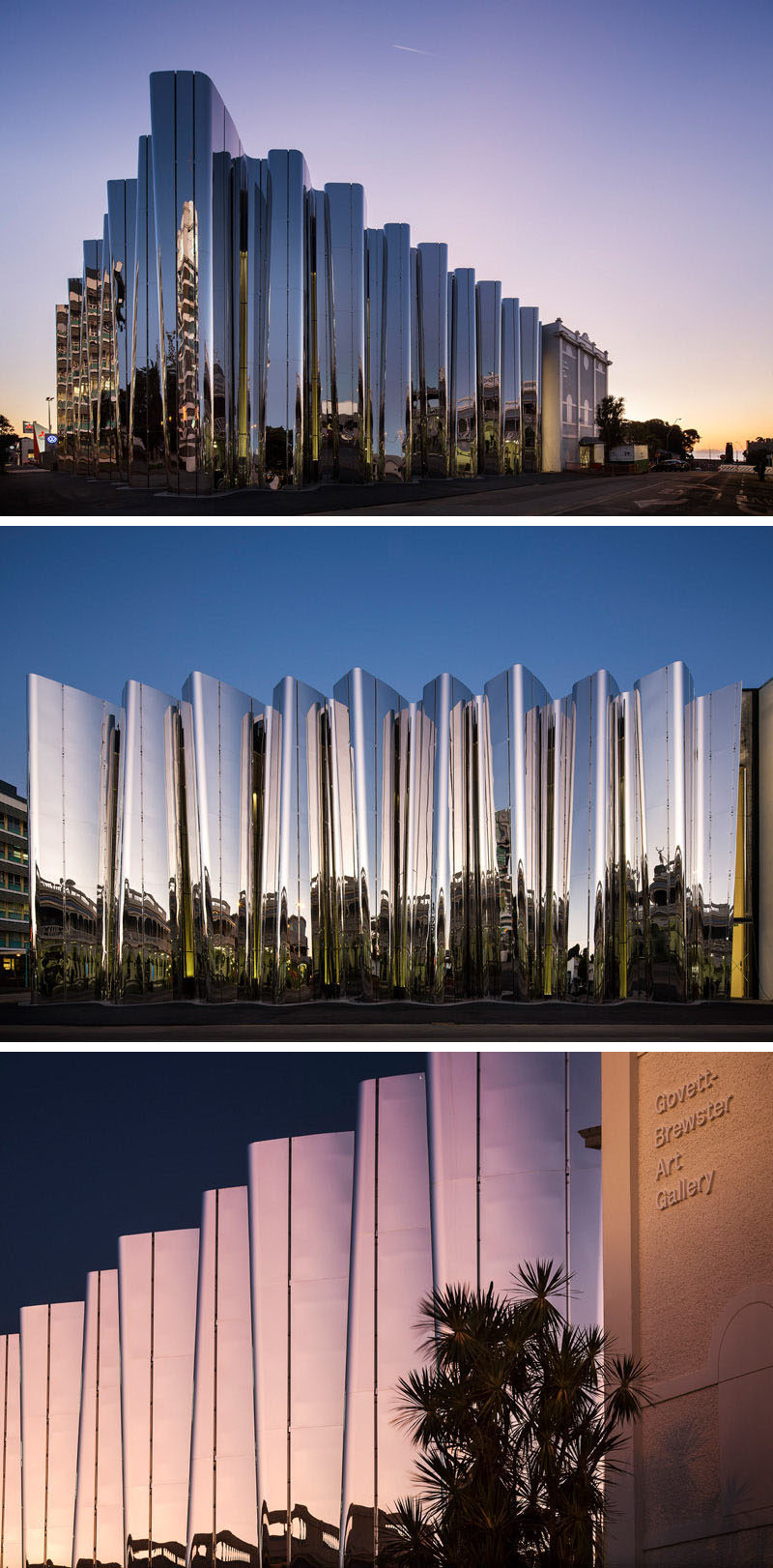
Pattersons Architects designed the Len Lye Centre. Photography by Patrick Reynolds.
5. The Broad art museum in Los Angeles, California, is covered in a perforated ‘veil’ that provides filtered light to the museum throughout the day and creates a skeletal system that protects the vault of storage and archives located inside the museum.
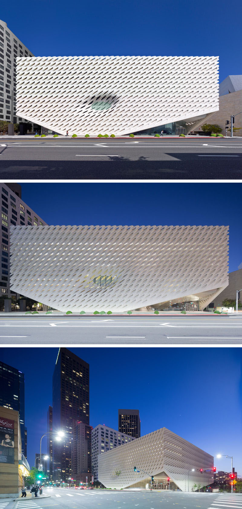
Diller Scofidio + Renfro designed The Broad. Photography by Iwan Baan, courtesy of The Broad and Diller Scofidio + Renfro.
6. The curved concrete surrounding the exterior of the Baroque Museum in Mexico, was in part meant to represent the exaggerated movements often associated with traditional baroque art while creating a modern looking structure.
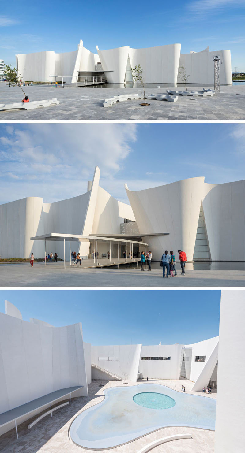
Toyo Ito designed the Baroque Museum. Photography by Patrick Lopez Jaimes / Danstek.
7. Copper plates cover the exterior of the Museum of Fire in Zory, Poland, as a tribute to the fire that took out an entire forest and made way for the development of the Polish city.
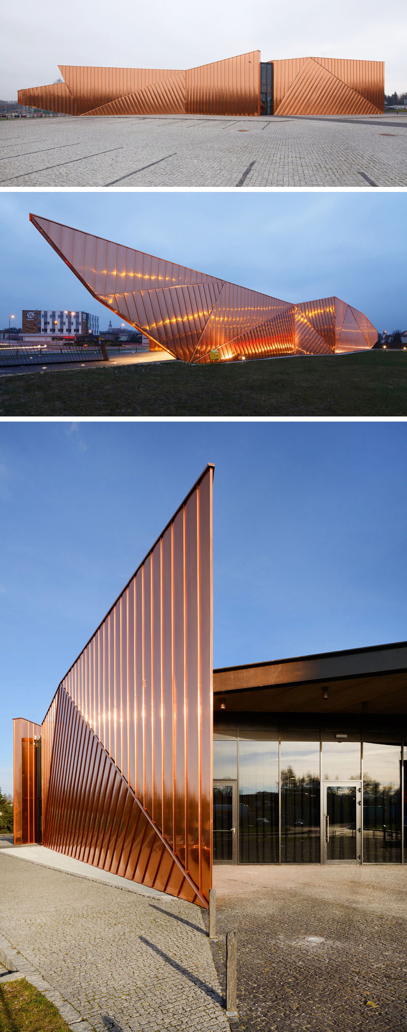
OVO Grabczewscy Architekci designed the Museum of Fire. Photography by Tomasz Zakrzewski / archifolio.
8. The geometric cutouts around the large Sumida Hokusai Museum in Tokyo, Japan, allow diffused natural light into the museum and give the structure a clean, modern design.
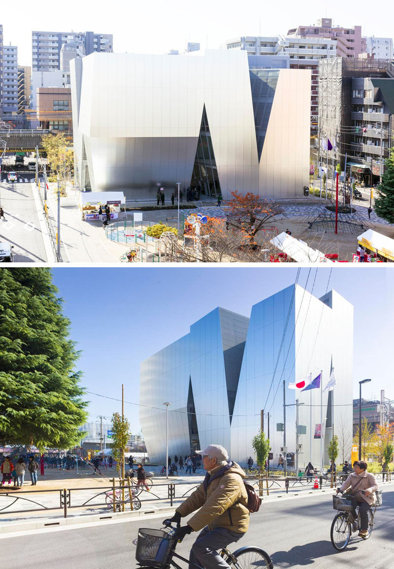
Kazuyo Sejima, from SANAA, designed Sumida Hokusai Museum. Photography by Vincent Hecht.
9. Golden anodized aluminum studs cover the exterior of the Museum of Rock in Roskilde, Denmark, as a tribute to the rock stars who often decked out their outfits in studs, while a red carpet entrance represents the red velvet inside a guitar case.
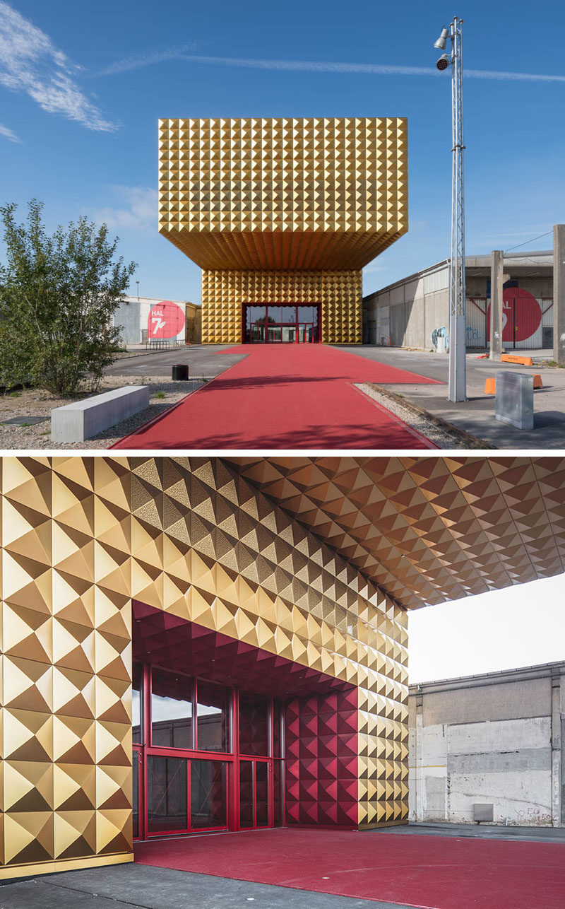
MVRDV and COBE designed the Museum of Rock. Photography by Ossip van Duivenbode (top photo) and Rasmus Hjorshoj (bottom photo).
10. The Shanghai Natural History Museum in Shanghai, China, incorporates various natural elements in the exterior design of the museum including the cellular wall, inspired by the cells making up all humans and plants, a green wall and grass roof that represents the vegetation found all over the planet, and a stone wall surrounded by water to represent the moving tectonic plates and the erosion that occurs over time from water and plants.
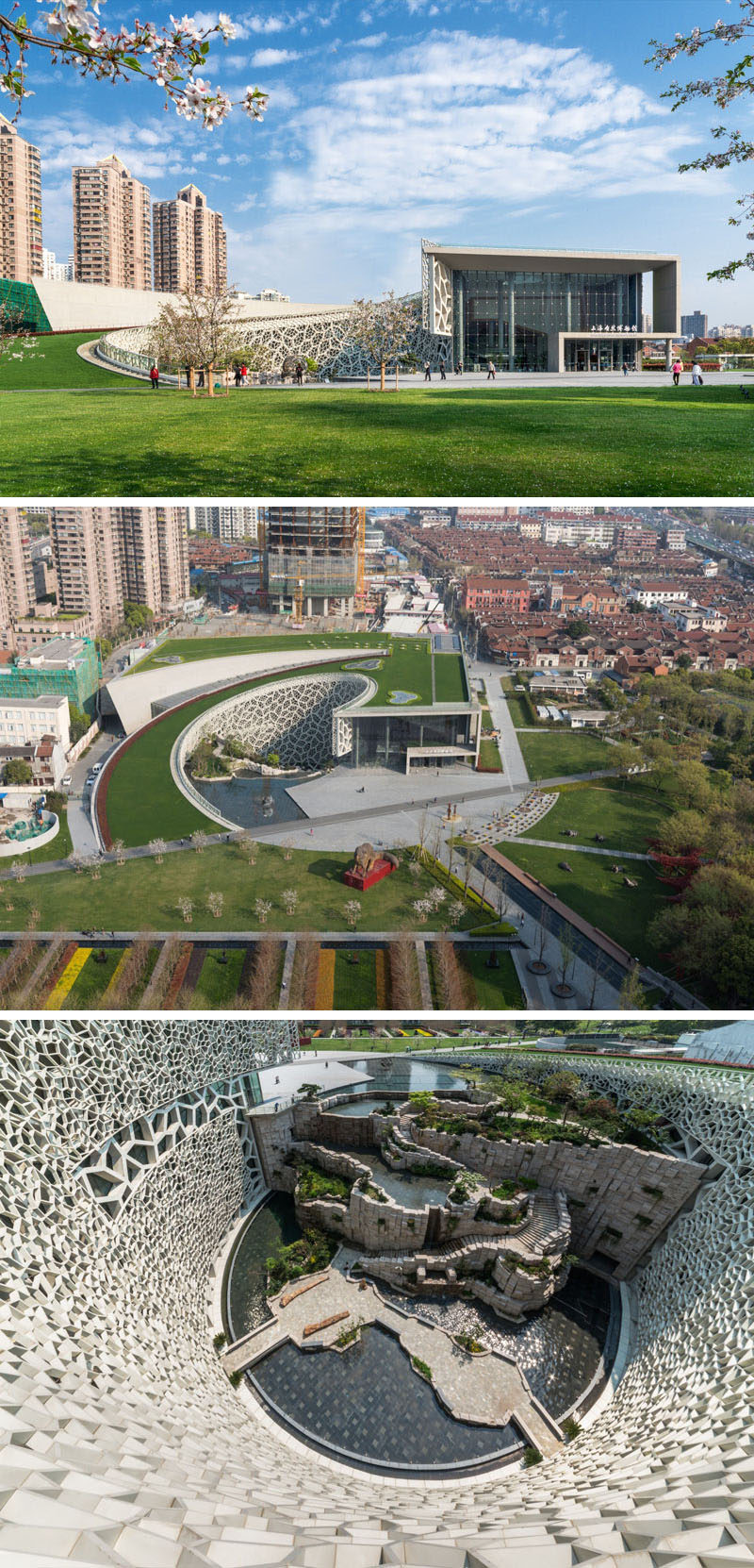
Perkins+Will designed the Shanghai Natural History Museum. Photography by James and Connor Steinkamp.
11. To represent the brick facades of the traditional brick builds that were used to dry tobacco, the exterior of the La Gota Cultural Center and Tobacco Museum in Navalmoral de la Mata, Spain, has been covered in a flexible ceramic that allows natural light into the building.
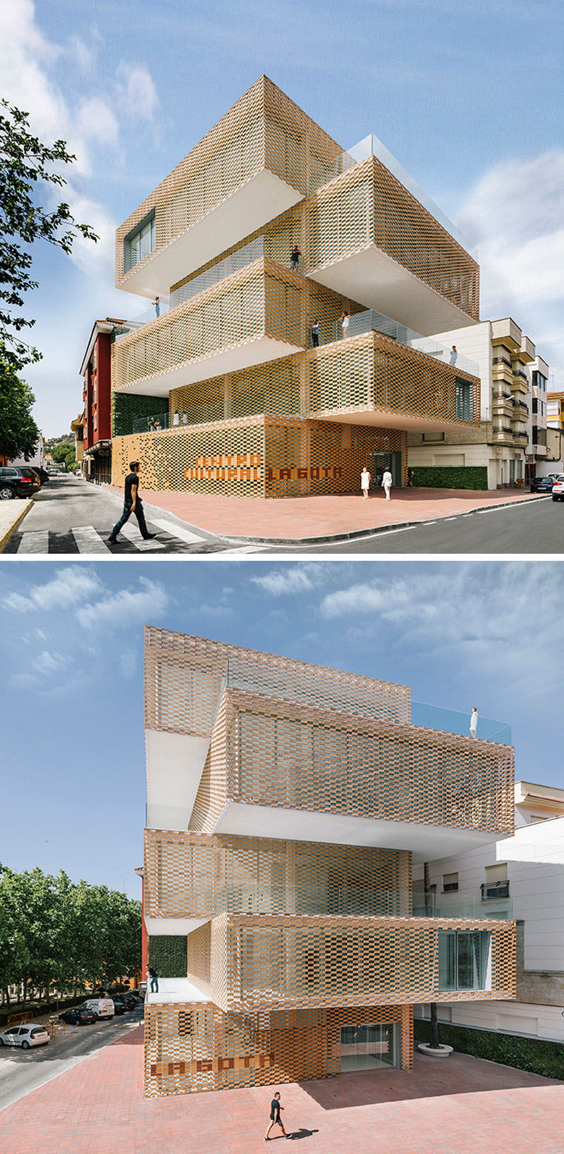
Ramiro Losada and Alberto García designed the La Gota Cultural Center and Tobacco Museum. Photography by Miguel de Guzman.
12. The wine museum and theme park, La Cite du Vin in Bordeaux, France, was given a swirl-like design on the bottom part to symbolize the swirling of wine in a glass, while the tower is meant to represent grapes growing on a vine.
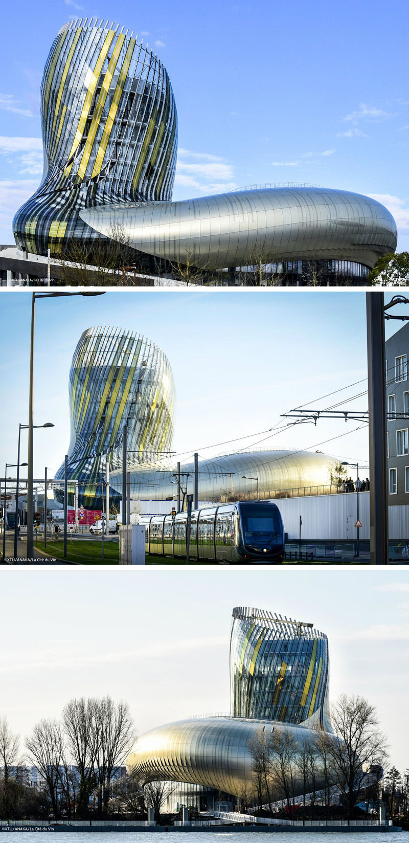
XTU and Casson Mann collaborated to design the La Cite du Vin. Photography ©XTU/ANAKA/La Cité du Vin.
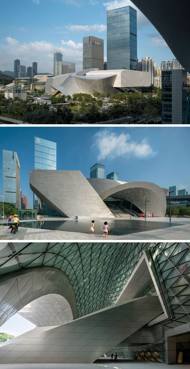
13. This massive building in Shezhen, China, is actual two separate structures, the Museum of Contemporary Art and The Planning Exhibition, that have been surrounded by a geometric facade made of natural stone louvers and insulated glass to create the look of a single modern building.
